
Statistics
We looked inside some of the posts by kaaatearnooold and here's what we found interesting.
Average Info
Notes Per Post
17
Likes Per Post
10
Reblog Per Post
0
Reply Per Post
7
Time Between Posts
5 days
Number of Posts By Type
Text
17
Last Seen Tumblr Blogs


Fun Fact
In 2020, Tumblr had 29.4 million users in the US.
Text
Artist Research - Lorna Simpson


Lorna Simpson’s work caught my attention for how it pushes against traditional portrait photography. Instead of showing full faces or clear narratives, she uses cropped bodies, repetition, and layered text to make space for reflection. Her pieces like Guarded Conditions and Backdrops Circa 1940s feel especially powerful because of what they leave out, creating a sort of tension in the silence and absence. It made me think about how photography can carry emotion even when the subject is partially or completely missing.
What stood out to me most was how she moves between mediums, whether through photos, collage, video, even felt panels, without losing focus. She uses restraint and minimal visuals to say something bigger or convey heavy intent, making her work subtle yet lasting.
0 notes
Text
Art Event Assignment


Art Event Response — "When You See Me" Exhibition
For my art event, I attended When You See Me: Visibility Through Contemporary Art History at the Dallas Museum of Art. Every piece was very moving, as the exhibit's focus on broadening historical narratives and creating richer representations of those traditionally excluded felt both urgent and hopeful. They layered history with emotion, using vibrant or fragmented techniques to comment on visibility, identity, and belonging. One piece that quickly caught my eye was I May Never Be What You Want by Michaela Yearwood-Dan. While the exhibit was filled with many examples of photo and new media work, this painting stood out for its intimacy through abstraction.
Yearwood-Dan’s piece creates a swirling visual field using sweeping, layered brushstrokes in greens, pinks, blacks, and reds. The overall tone of the painting feels as if it is grappling with a storm of internal and external expectations. The title itself is deeply confrontational and personal. In terms of composition, Yearwood-Dan uses color, texture, and negative space to create movement and tension. Its layering and abstraction relate closely to the kind of digital collage, layering, and glitch work I’ve explored in my own projects.
Through texture, color, and abstraction, I May Never Be What You Want speaks volumes about individuality, societal pressure, and the struggle for authentic self-expression. Like the video art and digital works I have studied throughout the semester, this painting resists easy consumption and instead invites slow, thoughtful engagement.
1 note
·
View note
Text
BLOG PROMPT - Passage 2
For my second interpretation of Passage, I wanted to explore the overlapping stories or lives that never quite meet. In this edited version of my first video, I layered in a second angle from the same location near Klyde Warren Park, where trees, movement, and people passing through show a more visual rhythm. I wanted to show contrast through movement and stillness, nature and city, and presence and absence.
I added a soft, faded filter to the original footage and layered in a second clip using a lighten blend effect at 50% opacity, which fades in and out in a pulsing or heartbeat motion. These pulses allow the base video to kind of "breathe" before the layered scene returns. The speed of the original clip gradually increases, ending on the empty patio cafe scene as the layered footage fades out. The audio also merges the chirping birds from the park clip with the city sounds from the original footage, creating a layered environment where natural life and urban routine coexist.
6 notes
·
View notes
Text
BLOG PROMPT - Passage
For this project, I interpreted “passage” not just as movement, but as a moment in time shared by strangers whose lives briefly overlap without ever truly intersecting. I filmed at a cafe patio outside the Dallas Museum of Art near Klyde Warren Park, a spot where people constantly pass through. The unedited video captures an ordinary moment: people walking, shadows shifting, sunlight falling on empty chairs. But behind that ordinariness is something more as each person in the frame is carrying their own story, routines, emotions, and unknown destinations. We’re all sharing the same physical space, yet mentally and emotionally worlds apart. The idea that I’ll never know who they are or where they’re headed is what makes the moment feel fleeting but meaningful.
1 note
·
View note
Text
BLOG PROMPT - Video Art
What is video art?
Video art is a form of expression that uses video technology as a creative tool rather than a purely narrative or commercial medium. It doesn’t follow strict rules. It can be anything from performance to abstract visuals.
The addition of sound and time adds more depth, and the meaning can shift depending on how it’s shown or watched. Interpretation and questions are more directly prompted.
Nam June Paik - TV Cello
Nam June Paik is often called the father of video art. One of his pieces that caught my attention was TV Cello. In it, he stacked TVs to form the shape of a cello, and Charlotte Moorman played it with a bow while the screens showed video footage including clips of her playing.
Joan Jonas - Vertical Roll
Joan Jonas’s Vertical Roll plays with the visual glitch of the TV screen rolling vertically. She performs in front of the camera, and the glitch breaks up her body into pieces, becoming fragmented and rhythmic. She uses the flaws of the medium to critique how women are represented in film and television. She becomes both the creator and the commentary.
Compare & Thoughts
Both artists use video in ways that make you think more about how we see and what we’re used to seeing. Paik is more playful and tech-focused, while Jonas is more critical and introspective. I liked Jonas’s piece more as it felt more intimate and personal, but I think Paik’s creativity and humor are just as engaging.
1 note
·
View note
Text
BLOG PROMPT - Gifs and Stop Motion

Stop Motion

Gif
For the stop motion, I used a tripod and my iPhone 14 pro to capture reading a book. For the gif, I captured lighting a candle. I put frames for both animations in photoshop, animated the layers, and converted as a .gif to create movement. I attempted to reduce the noise in the candle gif, which admittedly could have been avoided with better lighting (dim/no overhead lighting with contrast of lighting from fire). Despite this, I enjoyed this project in animating frames or stills and am excited to keep practicing in the future!
1 note
·
View note
Text
MIDTERM: Four Surrealist Photographs

IMAGE 01: Fragments of Past and Present
A surrealist self-portrait combining facial features from different time periods. The base image is a recent selfie from September, but the left eye is from 2009, the eyebrow is from 2020 before I began plucking them (a feminine practice in coming-of-age), and the hand with visible scratches from work and gym represents my current self. The plant in the background, photographed in my parents' house, symbolizing my growth and my roots. I color matched through curves, levels, saturation/contrast, and shadows.

IMAGE 02: Feminine Foundations
This composition features a black and white Venetian alleyway where my silhouette has been cut out and displaced, revealing a collage of images of my sister and myself, and my mother and myself. The collage uses reduced color filtering to abstract the details, with a subtle overlay of the original images at 30% opacity to allow facial features to emerge. The vibrant pink flowers emerging from the doorway and throughout the collage are the first flowers I received from my boyfriend, representing blossoming confidence and my evolution of feminine expression.

IMAGE 03: Reflection of Time
A poolside scene where I hold a gold ornate mirror (sourced from Anthropologie) that contains an impossible reflection—my face split three ways like a cracked mirror. The top left section shows me from 2009, the bottom displays my smile and chin from 2012, and the top right features my current appearance. The pool setting, composed of three different angles from my time tanning in Arizona, represents feminine beauty practices and self-presentation.

IMAGE 04: Celestial Bedroom
My current college apartment bedroom transformed through a surrealist interpretation. The ceiling and window have been replaced with a starry scene from "It's a Wonderful Life," my favorite film (where George Bailey's guardian angel is introduced, and he begins a journey discovering the beauty of life itself, his own life, and the people that comprise it, which I can relate to as of recently). The solarize filter applied to the entire image creates an otherworldly atmosphere with dream-like inspiration. The bedroom—an intimate space of rest and reflection, suggesting how our personal spaces contain multitudes of selves and possibilities. This image represents how our present environment is always influenced by our past experiences and future aspirations. Technically, I adjusted the shadows and highlights.
ARTIST STATEMENT:
In this series, I explore the duality of growing up female through surrealist self-portraiture that combines elements of my younger and current self. By seamlessly blending facial features from different stages of my life, I create portraits that represent the complex journey of feminine evolution.
These images speak to the tension between preserving childhood innocence and adopting practices of womanhood. As we grow, certain features become subjects of focus, while others remain untouched. The contrast between features from different periods reflects how we selectively maintain aspects of our authentic selves while adapting to the world's expectations.
I wanted to include my mom and sister, whose influence subtly shows through these images. While conventional wisdom suggests younger sisters learn from their older siblings, my life has been the opposite. During my adolescence, I struggled with femininity and self-presentation, harboring insecurities that made me resist traditionally feminine expressions. It was my younger sister—despite a one-year age difference—who helped guide me toward confidence in my identity.
The environments I've chosen—from private spaces like bedrooms to public scenes like poolsides—create contexts that frame these certain contradictions. Each setting represents a stage in my evolution, from childhood innocence to adult identity formation. Even my favorite film, "It's a Wonderful Life," appears in a window, suggesting how our personal narratives are influenced by the stories we cherish.
#surrealism#coming of age#femininity#it's a wonderful life#digital art#photography#photo manipulation#identity
1 note
·
View note
Text
BLOG PROMPT - Surrealism
Surrealism
Surrealism began in the 1920's as a subcategory of the DADA movement, and was formally defined in Andre Breton's Manifesto of Surrealism (1924). As he describes it, "the absence of any control exercised by reason, exempt from any aesthetic or moral concern."
Surrealism in photography can be shown through creating juxtaposition (like the adjacency to reality of the uncanny valley effect, especially in digital manipulation), altering color, and using forced perspectives with optical illusions or manipulating relative subject size/position.
Notable Artists
Tommy Ingberg describes surrealism as "trying to explain something abstract like a feeling or a thought, expressing the subconscious with a picture". Jerry Uelsmann manipulates his photography without editing software, instead only using darkroom techniques to create composite photographs.
0 notes
Text
Week 6 Reading Response - AI and Photography
What is AI in photography?
Artificial Intelligence in photography uses computer algorithms and technology to create, alter, or enhance images. As Charlotte Kent explains in "How Will AI Transform Photography," AI is "too broad a term, encompassing everything from self-driving cars to [...] personalized medical recommendations. It's supporting your Google searches as well as the object-selection tool in Photoshop" (Kent, 2023). AI can also appear in tools like text-to-image generators, GANs or Generative Adversarial Networks, or automated editing tools.
Personal Use of AI in Photography?
I don't currently use AI in my photography, however, many editing softwares have automated features, such as auto-enhance, removing an object's background, the automated filter libraries, etc. These tools can save time on technical adjustments or just be a helpful tool to photographers without much editing experience to enhance their work.
AI's Impact on Photography?
AI has both pros and cons in general, and there are just as many supporters as critics. In photography, it allows for creative expansion that may challenge authenticity, and some AI algorithms have been reported to be racially stereotypical or biased, flawed in the system's foundation that can be hard to recode. Photography Charlie Engman has used AI to explore body language and physical gestures that would be impossible to capture with traditional photography, creating "situations that he would never request of a subject, for ethical [...and] physiological limitations" (Kent, 2023). However, Rob Horning discusses that we are now being forced to reconsider what constitutes a "real photo".
My Perspective
I am mostly in support of AI, however, understand that the platform is headed in a harmful direction. If the approach to the tool is to learn how to enhance or complement your own original and honest work, it is a great tool for that. It becomes a problem now when the algorithm to generate work and falsify original content is stealing from other artists and recycling the same ideas to enter an age of boring, uninspired photographers and photography. Boris Eldagsen states that "all the boundaries [he] had in the past - material boundaries, budgets - no longer matter", emphasizing that the tool can be used to democratize photography and making it more accessible to more people. As long as the tool can find a balance of transparency and be mindfully regulated, it will be beneficial.
0 notes
Text
BLOG PROMPT - Joiners, Triptych, Grid

Intent:
For the joiners, triptych, and grid project, I created a composition to challenge architectural perspective inspired by David Hockney's innovative approach to digital photography manipulation. I took these photos of the Leaning Tower of Pisa with my iPhone 14, which includes an angle from the bottom of the entire tower (and the two people walking), a photo of the stairs I climbed up, a photo from the top looking down. The extreme distortion differs from Hockney's style, but I incorporated his multi-point perspective and use of negative space.
Technical:
To begin, I placed 7 images that ended up being narrowed down to 4. I removed the background of a very long shot of the tower, the photo from the top looking down, and the medium long shot/low angle of the tower. I arranged these in a way I was happy with, then added a layer with the stairs to go behind the left-most tower. I used the selection tool to cut out two people from the very long shot and placed them along the wall's natural curve. I then did around 30% opacity of the far tower picture, duplicated it 4 times, and placed them on the left-most tower's pillars to add to the surrealism. I applied free-transform to the right-most tower and really warped the tower to exaggerate the "lean". The two people were very shadowed, so I lowered the shadows and contrast, upped the highlights, and added some saturation/brightness to the entire composition. I wanted the two people and the red flag to pop against the neutral stone colors.
#david hockney#leaning tower of pisa#photography#joiners#triptych#grid#digital art#photo manipulation#collage
1 note
·
View note
Text
Week 4 Reading Response - Artists and Photographers
01: Rosa Menkman:
What makes Menkman's work really unique is her ability to turn digital mistakes into something intentional: she sees corruption or compression appearing in photography as something to transform or emphasize. In "The Vernacular of File Formats," she displays several different ways an image can break in an almost catalog-format, distorts them even more, giving each image their own personality. The edits are clearly intentional, and you can see the knowledge she has of image corruption to play into it enough to add her own personal style while allowing the original image to still feel recognizable.
02: Heitor Magno:
Heitor Magno's work in glitch art appears more controlled, as it's completely his own manipulations to architectural and urban photography. He keeps some parts of the original photograph, selecting portions of the image to warp, glitch, and colorize, creating a balance between structure/reality and manipulation/digital surrealism.
0 notes
Text
Blog Prompt 5 - GLITCH in Photography


Image 01: Architectural Wave
For my first glitched image, I decided to choose a photo I took of the Santa Maria delle Grazie in Milan, Italy, as it showcases both exterior and interior views. I wanted to keep it simple and not overcrowd the original composition with "glitching", so I mainly focused on the top half of the architecture. I first duplicated the image's layer and locked the base so that I could begin selecting the portion I wanted to distort with the magnetic lasso tool. Then, I applied -180 hue, 67 saturation, and kept the lightness the same with a hue/saturation adjustment layer. With the same layer, I did a distort>wave filter. I slightly adjusted the curves, brightness/contrast, and hue/saturation of the overall image.
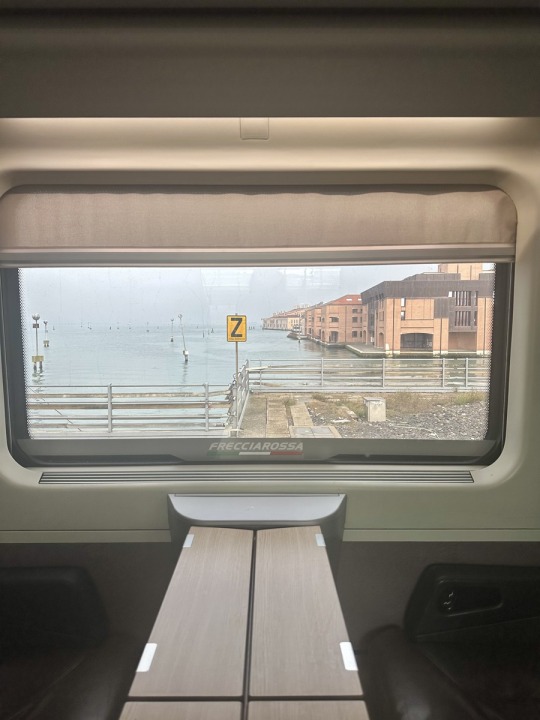

Image 02: Digital Melt
For my second glitched image, I chose a picture I took on a Frecciarossa train entering Venice, Italy. I wanted to create a subtle melting effect at the bottom of the train's window, and I did this by duplicating the image layer and adding a liquify filter that I manually stretched/dragged around the edges and from the bottom. I then added a 3D filter with Normal Mapping, manipulating the color with selective color manipulation focusing on blue/purple tones. This created an embossed/digital corrupting effect. I would've liked to reduce the noise on this particular image, but for now, I brought the brightness of the overall image down a bit.
Changed Meaning or Content?
The almost psychedelic or modern distortion I created, especially with the turquoise, pink, and purple tones, challenges the original peacefulness of historical Italian architecture. The untouched elements serve as a contrast or balance to this, like the original ground-level trees in the first edit and the train's interior in the second edit. This anchors to reality as central components of each photograph are heavily distorted: the architecture appearing to be living and breathing, and the train's view appearing flattened and melting. It adds a bit of surrealism to traditional Renaissance/Gothic/Byzantine architecture blending in the Santa Maria delle Grazie and the general architectural style in Venice.
0 notes
Text
Blog Prompt 4 - Photomontage

Symbolism and Intent!
My photomontage blends both personal symbolism and DADA principles, creating a dialogue between structured identity presentation and artistic disruption. My collage centers around a white cereal bowl from my Identity photograph, "Dinner", that I cut the middle out of to act as a frame for polaroids from my Identity photograph "Division of Time". These polaroids capture moments with my friends, family, and my boyfriend, commenting on how we "consume" and compartmentalize memories in this digital age. The bowl is surrounded by blue, pink, and purple hydrangeas (sourced online from Plant Addicts), representing more than the obvious symbolism of femininity along with blooming flowers as coming of age or coming to terms with identity and confidence. More personally, it is my favorite flower and references a scene from my all time favorite movie, It's a Wonderful Life. Like DADA artists' combination of different media forms, I integrated Italian, 1920's era fashion magazine illustrations from "Lidel" and a seashell closeup as the very background component from Getty images (credit: cheekylorns). In short, the seashell represents the beauty of naturality and the reoccurring, grounding presence of the beach in my life, fashion illustrations representing professional aspirations (product management within social or fashion communication/advertisement), and polaroids serving as "bite sized" contextual representation of self.
Design Process!
I created the photomontage in photoshop on 8x10 in dimensions and 300 DPI, sourcing images from my own Identity photographs, and online from cited locations. I removed all of my image's backgrounds to aid in cohesion, and allow for the seashell image in the background to create unity. I placed these in the document, cut out the middle of the cereal bowl with the lasso tool, and began rearranging the components. Once I did this, I added an oil paint filter to the hydrangeas, increased the saturation and vibrancy, and blended the fashion cut-outs and hydrangeas with a 3D magenta layer. The very background seashell component uses a "normal map" 3D layer that almost inverted the color/matched with all the purples and blues. I wanted to put the bowl right on top of the model silhouette's skirt portion of her dress.
#italy#lidel#photography#identity#photomontage#dada#dadaism#vintage#fashion#fashion ads#italian fashion#collage#saturation#polaroids
1 note
·
View note
Text
Reading Response 2 - DADA & Photomontage
What is DADA? Core Motivations?
DADA, both an artistic revolution and response to World War I's destruction, reflects and deliberately embraces the meaningless, as it can be taken as baby talk, a rocking horse, or "yes-yes" in Romanian. It originated in Cabaret Voltaire, a tiny nightclub in Zurich, Switzerland, and was essentially anti-everything: traditional art, war, and nationalism, as "rational" thinking led to crisis and chaos.
How did they express these ideas?
The "dada-ists" pioneered the photomontage, with artists like Hannah Höch cutting up and reassembling mass media images to create political commentary. Marcel Duchamp introduced "readymades", transforming everyday objects into art simply by declaring them so. They embraced chance or accidents, with Tristan Tzara creating poems by randomly pulling words from a hat, or Jean Arp making collages by dropping paper pieces and gluing them where they fell.
How do you see DADA's influence today?
I feel like the most similar phenomenon is meme culture, reflecting DADA's absurdity and sometimes political commentary. It manifests itself in several different artistic mediums, and in the music realm, can be seen through the work of artists all the way from David Bowie to experimental/indie artist Grimes.
How did specific DADA artists push boundaries and break rules?
Revisting Hannah Höch and Marcel Duchamp, they both challenged the definition of traditional art and art itself through their own artistic experimentation and expression. In 1919, Höch developed "Cut with the Kitchen Knife..." where she combined political figures, machinery, and dancers, addressing women's rights in Weimar, Germany.

Marcel Duchamp infamously showcased a urinal as "The Fountain", questioning every assumption about artistic value and creativity. His radicalism suggested that art wasn't about the creation of objects or how it manifests, rather, the ability to make conceptual choices.

How did they question and redefine photography?
The Berlin DADA group, particularly Höch, transformed photography from a documentation medium to a tool for radical artistry and political expression. They introduced the idea of combining photographs with other media forms, to question the relationship of reality and recorded image, in surrealistic approaches that influenced contemporary digital art and our current era of digital manipulation.
1 note
·
View note
Text
Blog EX - Editing and Sizing

BEFORE PHOTO: I decided to edit the first photo I used for the blog. November 28, 2024, 1:09 PM. Taken on iPhone 24mm wide lens, 1/303 shutter speed, 80 ISO.

AFTER PHOTO: I added warmth to the image's temperature, adjusted the white balance, shadows, highlights, and sharpened the picture. The new, edited image reflects the vibrancy of how I remember the scene in real life, without seeming overly saturated. Both linked images are resized to low-res, 900 x 1200 pixels, but exported as high-res, 3024 x 4032 pixels.
Exercise Response:
What is high-res and what is low-res?
High-resolution images contain more pixels, therefore showing fine details more clearly and taking up a higher amount of storage. Low-resolution images contain fewer pixels, therefore appearing fuzzy or blurry when enlarged, but are better for quick loading on webpages due to the smaller storage usage.
How comfortable are you with Photoshop and Lightroom?
I still consider myself a beginner on these programs, mostly because of the lack of accessibility. Adobe is not an affordable program, so I tend to use similar programs or programs with lesser, simplified capabilities.
1 note
·
View note
Text
Blog Prompt 5 - Visualizing Identity

Clutter: I strongly believe that the messier someone is the easier they are to read, and although I generally keep my space pretty tidy, my small (dining?) table next to my kitchen in my apartment has become the spot I'll throw stuff on when there's "no time" to put it away. My excuse since November has been a scrapbooking project of a recent trip that I can't bring myself to finish because then the trip will officially feel over. Surrounding the craft supplies are some Christmas decorations I still have to put away, a coaster at the bottom from my favorite restaurant, Hawker's, and three vases containing different collected things. The left-most vase is a couple of ball ornaments mixed in with wine corks, the middle has seashells from when I went sea-shelling with my grandmother in Galveston, and the right-most vase has wax flowers from an antique shop with a couple dried flowers I saved from my boyfriend, Josh. I will save and accumulate anything I feel can be displayed in a vase or scrapbooked, a trait verging on hoarding passed on from my dad, but I do try and organize some things out in periods I'm not as busy as a full-time student working full-time. Indoor lighting, photo details in ALT, 7:16pm.

Division of Time: I chose to include this picture as a visualization of my identity because it carries more symbolism than it appears to. The most obvious part of the photo is the Polaroid images I have sticking to my wall, each telling a story of the different relationships and memories I have captured in photograph over the last year and a half. In the mirror's reflection in the middle of the photo is much less crowded and feels calm in contrast, a more accurate representation of my day-to-day when I get home from work or class. I feel we are as much defined by our fast-paced, eventful, accompanied moments as the moments that may be slower, self-oriented, and quiet. As fun and freeing as college can be, there are times that make you feel lost or lonely, and finding a good balance is a process that really allows you to get to know yourself. Indoor lighting, photo details in ALT, 7:20pm.

Dinner!: I may not be the best at it, taste and appearance-wise, but I really, really enjoy cooking: alone and with others. I like to play around with certain ingredients I have, especially when I didn't plan very well and there are some unlikely pairings I have to use together to avoid waste. Indoor lighting, photo details in ALT, 9:29pm.
2 notes
·
View notes
Text
Blog Prompt 4 - Paying Attention to Light

Early Morning Shot (7:04 AM): For my series of shots showing texture, lines, repetition, details, and color, I decided to take photos focused on my apartment window's view throughout the day. The vertical, opened blinds shows repetition and lines, details from the view outside into the parking lot and a couple visible bushes/trees, color from my couch, and texture from the pillows and (to be honest) streaky windows. I used my iPhone 24mm (Wide) lens, and the shutter speed and ISO information is in the image description. At this time of day, you can see the shadows coming from my patio furniture.

Midday/Afternoon Shot (4:51 PM): For my midday shot, you can immediately tell the lighting has changed. In the morning, the sun wasn't as intense, and therefore photographed more balanced with the natural and overhead lighting. Midday, with focus on the outside, the overhead lighting or scene from inside is washed out to avoid overexposure from the intense sunlight. At this time, the sun was directly at eye level from my positioning in front of my window, shining right into my camera's lens and adding to the washed-out, dark effect.

Later in the Day Shot (6:28 PM): Golden hour for me, around sunset, appeared to be at around 6:20-6:30 from my apartment window. This image is ironically the brightest, even with the darkest outside/natural lighting through the window, due to the contrast of the overhead lighting inside. The sky outside really exhibits color for this scene this time of day, and detailed with the reflected ceiling fan lighting in the window. As opposed to the first two images with 1/6000 shutter speed and 80 ISO, this image only required 1/40 shutter speed and an ISO of 640.
0 notes