
Third Year Photography at Norwich University of the Arts
Don't wanna be here? Send us removal request.
Statistics
We looked inside some of the posts by kateblamirephoto and here's what we found interesting.
Average Info
Notes Per Post
0
Likes Per Post
0
Reblog Per Post
0
Reply Per Post
0
Time Between Posts
4 days
Number of Posts By Type
Text
17
Last Seen Tumblr Blogs


Fun Fact
Tumblr is available in 18 languages.
Text
Portfolio | Reprints
After printing my final images I showed my portfolio to James again to see if there were any final adjustments which he felt that should be done. Although I produced test prints, there were a few images which came out darker than I had thought and the detail within areas of shadow had become lost.
This was easy to rectify as I simply went back to the proofed files and adjusted accordingly.
Although in a previous discussion James suggested switching the two images in this diptych (below), after looking at it printed we decided that it looked better the first way round, with the portrait image on the left.

The two arrangements. The first print (left) and the original layout reprinted (right)
0 notes
Text
Portfolio | Image Sequencing
Although I am producing a box portfolio and I do not necessarily need to have a set sequence for my image as they will get rearranged when people view them, I wanted to come up with an order which my images would initially be viewed.

As it is important to start and finish on strong images I chose to begin and end on the 2 images which are being shown in the degree shows. As I also have a number of visually similar, I felt it spread them throughout my portfolio, rather than have a block of the same kind of image. I also wanted to spread my diptychs out, ensuring that there is variety throughout.
0 notes
Text
Portfolio | Further Image Refinement
When putting together my template for printing I decided to remove another image from my final selection:

When looking at it with the other images I feel that this one is not nearly as strong as others in my selection and I don’t feel that it would work as a singular image, not surrounded by others from similar shoots.
0 notes
Text
Portfolio | Diptychs
After my discussion with Ross and James I looked at which images work well with one another. Within my final selection there are a number of images from the same shoots which complement each other and work well as diptychs:


0 notes
Text
Portfolio | Soft Proofing & Printing
Now that I have a finalised selection and sequence of images I can start the process of preparing my files for print.
Looking at the coherence of between images within individual shoots, I started by ensuring that the colours and tones within the shoots matched, going back and re-processing images where needed. I also then looked at images between different shoots and looked to create an element of coherence, creating consistency throughout my portfolio. For example, the images from Blakeney and the Lakes contain similar yellow tones within areas of grassland, so where possible I tried to ensure that the tones were as similar as possible.
For me the printing process was relatively straightforward as I did not need to worry about binding margins or printing double sided, and I did not have any particular problems during this process.
0 notes
Text
Degree Show Image Selection
Within this session we selected the image to show at both Norwich and Free Range. As the majority of my images within my portfolio are from my project exploring the landscapes within East Anglia and Northern England, I wanted to show two images to reflect this idea. I had initially planned to show images from Blakeney and Slaley Forest but when Andy and Jaspar looked through my images they felt that my choices weren’t as strong as some of my other images. The following images are the two that they felt the strongest as they work together to still showcase the concept behind the project but create a contrast between a vast open landscape of the Lakes and a quite closed in environment of Thetford Forest.


Within the Thetford Forest image Andy suggested cropping a small amount of the ground out to draw the focus up to the trees more, as well as bringing back in some of the detail in the darker areas towards the edges of the image.
Although not what I had initially intended to show, I am happy with this choice of images as they still represent the ideas that I want to show.
0 notes
Text
Portfolio | Refining Image Selection
Once I had my shortlist of images I wanted to discuss my selection to ensure that there were not any images which seemed out of place.
I showed my images to both Ross and James who agreed that generally my selection was good. There were a couple of images which didn’t seem as refined or show my visual style as well as they could so we agreed it would be best to remove them:


Both of these images are ones which I was initially unsure about including so the fact that others also had reservations about them was reassuring for me to not include them in my final prints.
They also suggested that I should consider how I layout my images on each page, considering how the images work with one another, perhaps including some diptychs.
0 notes
Text
Portfolio | Image Selection
The following are my selection of images for my portfolio. I wanted a good range from each of my shoots, showing the contrasting landscapes of East Anglia and the North. There were also two images I had shot outside of the unit but were taken in Northumberland and the Lakes so they fitted in well with the rest of my images.

Blakeney

Slaley Forest

Pennines 1

Pennines 2

Lakes

Thetford Forest

Other Images
0 notes
Text
Thoughts on my concept
Reflecting on the body of work I have produced I have stared to realise that there is an underlying personal aspect to the concept behind my images.
As well as being an exploration into the physical formation of these landscapes, I feel that there is also a link to a personal sense of home and belonging. I have lived and produced work between these two areas of the UK and I feel very much connected to these landscapes.
My previous work has very much been a documentation, with less of a personal meaning behind. Coming to this realisation about this body of work was refreshing; I feel that the images are much stronger with this added element of meaning and I now feel much more confident in the body of work as a whole.
0 notes
Text
Shoot | Pennines Second Shoot
Whilst travelling back from the Lakes I went through an area of the Pennines which I did not shoot previously so I took the opportunity to capture some more images.
The images were shot at dusk so the raw files were somewhat underexposed. The raw files also contained some telegraph poles and wires which I was unable to avoid when shooting so they required some light retouching to remove these distracting elements.

After / before shot showing the retouching required.
Although spur of the moment, I prefer these images over those shot previously as I feel that they show the scale of this landscape more effectively as well as containing more detail, creating a much more visually interesting image.


0 notes
Text
Jo Metson Scott | The Borderland
The Borderland is a collaborative project between photographer Jo Metson Scott and writer Sarah Saey. Influenced by the Scottish Independence vote in 2014, the project explores stories of the people and places along the English border.
I was drawn to the project as I grew up in this area and although I would not have directly been affected by the politics of the referendum, many of the places documented are places which I was familiar with growing up. I found it interesting to get more of an insight from the people who live in the Border areas.


The tones within the images work well in giving the images a soft, easy quality, creating a sense of familiarity for the viewer. The tonal range is much more limited than that of Jess Gough’s work, even the darkest areas of the images do not contain black. Although I like the contrast and dynamic qualities of Gough’s work, I feel that my images would benefit from being somewhat softer and that finding a balance between this softness and dynamic contrast would work well.
0 notes
Text
Shoot | Lake District
Although not Northumberland, I wanted to shoot in the Lakes as growing up I would often come to the area around Derwentwater and Keswick so it is a very familiar environment. The dramatic hills of the Lakes also provides a good contrast between my forest based and East Anglian shoots.
My main priority during this shoot was to start to build up more of a portfolio of images. Reflecting on the most successful images from my previous shoots, I expanded my exploration into the use of scale, shallow depth of field and more abstract imagery without horizons.
There were some interesting low storm clouds which obscured the tops of the mountains, which is another aspect which I have not shot in my previous images, again giving me diversity.
Due to the changeable weather I experienced, the exposures of some of my images were not as precise as they could have been, resulting in some more extensive colour correction and retouching in post.


0 notes
Text
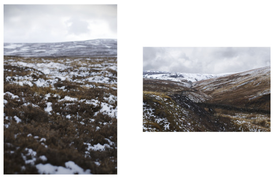
Shoot | Pennines
Another area of the North which I wanted to include in this series is the Pennines, a vast area of hilly countryside predominantly covered in moorland, which contrasts but also relates to the flat openness of East Anglia.
Although shot during the Easter weekend, there was quite a lot of snow on the ground which was unexpected but I feel creates a nice contrast with my images shot in the South, especially those shot during sunny weather at Thetford. The snow also proved to be an issue as another quite heavy snowstorm meant that I did not have very long shooting at this location.
The hilly terrain of the Pennines offered the opportunity to shoot semi-abstract images of the landscape which fill the frame and do not feature a horizon, which I was unable to achieve in East Anglia. I like the effect that this produces as it also removes a point of reference for scale within the image and it is definitely something that I would like to expand upon in future shoots.


0 notes
Text
Shoot | Slaley Forest
Over the Eater break whilst I am home in Northumberland I want to get out and shoot as much as possible as the landscape in this area of the country is vastly different to East Anglia. There is also a good variety of different locations I could shoot, from forests to moorland on the Pennines, and the Lake District being relatively easy access.
The first location I visited was Slaley Forest, a small area of woodland close to the North Pennines.
Whilst out shooting I was caught in a heavy hailstorm, generating a large amount of mist / steam which rose from the ground which I had never seen before. The mist only lasted for about 5 minutes after the hailstorm so I had to shoot quickly in order to get some good images.
Within this shoot I also continued my exploration into the use of a shallower depth of field and capturing small details, as well as starting to experiment with low angles and creating slightly more abstract imagery.
Within the edit process I started to further explore the visual approach. Looking back to Jess Gough’s work, she uses a strong contrast to emphasise details and textures. Within this set of images, I feel that the use of added contrast helps to create more depth as some of my raw images were quite flat tonally, particularly those which feature a large amount of mist.
In terms of colour, I want to create an element of coherence between my shoots in the North and those in the South. Looking back to the images shot a Blakeney they predominantly feature yellows and greens so I aimed to replicate this within these image, adjusting the saturation of each of these colours accordingly.


0 notes
Text
Shoot | Thetford
After my one-to-one with James about shooting stills vs. moving image, this is my first shoot in which I only shot stills. I followed James recommendation of heading to the Brecks which will help me to create some more diversity within my images. Also following my unsuccessful shoot at Wells I wanted to use a forest location again. As well as having lots of dense forest for me to explore there are also large open areas of breckland, featuring the unique windswept trees which the area is known for.
On the shoot day the weather was a lot brighter than at Blakeney which created some nice shadows and beams of light within the forest.
Taking on board James’ thoughts on creating interesting imagery, and the approach within Jess Gough’s Topographies I, I started to explore how I can use different angles and focus to create interesting imagery.
Landscapes are most often associated with large a depth of field and sharp focus throughout, so I wanted to also experiment with using a shallower depth of field. I am particularly happy with the effect I achieve in the first image below. The very slight amount of blur at the bottom of the image gives the image almost a more intimate feel but is not distracting to the viewer. I also started exploring the idea of capturing smaller details within the landscape, as shown in the second image below. Although more conventional, this type of imagery would sit well within a larger body of work, not only to break up the wider landscapes but also to give the locations more depth and context.


0 notes
Text
Shoot | Wells-next-the-Sea
After my shoot at Blakeney I wanted to explore the North Norfolk coast some more. I want some diversity between the landscapes I shoot so for this shoot I decided to focus on Wells-next-the-Sea. The coast around Wells and Holkham is quite distinct with a large area of woodland directly leading onto the beach. This creates a unique juxtaposition between the vastness of the beach and the more enclosed nature of the forest.
The weather was a lot sunnier during this shoot, resulting in more defined areas of highlight and shadow within my images. although this made for a more interesting image, I don’t feel that it necessarily works with the tonality of my images shot at Blakeney.
Reviewing my images after the shoot, I found that they were very soft, with not much definition around the edges of objects, even within the images where I had used a large depth of field. To try and figure out the issue that was causing this I shot a test image using the same exposure settings, to compare the lens that I had used at Wells with a different lens; there was a noticable difference in sharpness between the two images.
Taking both the weather conditions and lenses that I use into consideration, I plan to head back to Wells to reshoot, as the location is unlike anything else within East Anglia and would provide some diversity to my portfolio.
0 notes
Text
Jess Gough | Topographies I
Jess Gough’s series Topographies I is the first part of an ongoing series exploring the formation of different landscapes. This instalment explores south-west Iceland and focuses in on smaller details such as rock formations, streams and beaches. Gough then contrasts these with images of the wider landscape.
The use of darker tones and contrast within Gough’s images partially reflects the effect I was aiming to achieve within my Blakeney shoot: to create a more dynamic and interesting image.
The use of contrasting scales within the series is also something which I could employ within my own work. On all of my shoots up to this point I have been concentrating on capturing the wider landscape, this use of differing scales could work well in creating a series of images which has variety and which maintains interest from the perspective of the viewer.


0 notes