
Communication Design Student, currently in my sophmore year
Don't wanna be here? Send us removal request.
Statistics
We looked inside some of the posts by knr99 and here's what we found interesting.
Average Info
Notes Per Post
7K
Likes Per Post
4K
Reblog Per Post
2K
Reply Per Post
25
Time Between Posts
17 days
Number of Posts By Type
Photo
12
Text
4
Quote
1
Last Seen Tumblr Blogs


Fun Fact
If you dial 1-866-584-6757, you can leave an audio post for your followers.


Text
While the concept of technology helping people find the right partner is interesting, I personally think that when it actually comes to choosing a partner, it should be up to the person, and not a computer. Because there are certain things a person can pick up on that a computer can not. There may also be the possibility of this technology limiting quality communication between people, which is the most important part of finding and maintaining a relationship.
Essay #1: “ Love, Optimized” by Victoria Solan, 04-28-16 / By Brittany Zuehlke
In the 2016 article by Victoria Solan, “Love, Optimized”, the topic of finding a partner in intimacy with marital potential is brought to the light quite literally. In a series created by Shelly Ronen, the artist explores options with future technology that could improve the process for how humans chose their partners. One of these pieces depicts a “tiny device” that “…floats above the user’s ring finger, adapting the quality of light to signal whether the wearer is “flaunt mode, threat mode, or single mode”.” This type of invention could bring forth a positive beginning in a relationship, as it would require both parties to be expressive in their wants and wishes. The device, based on the original composition by Ronen, is a quite a simple design that is subtle enough that it does not bring all of the attention away from the interaction. Another technological invention that is a piece within the series is “…a device which allows singles to sleep through first dates while a computer does the dreary work of assessing sexual and personal compatibility”. In much simpler words, the machine does all the talking. It could be argued that the design of this does not allow for a pure ‘human’ type of interaction. But, within this, there is a deeper understanding that can be developed by the device between the two individuals that originally could not be obtained with modern technology. It ultimately boils down to our chemical make up within the human body that defines our interactions with others, including a possible romantic partner. This is the entire point that Ronen is trying to make, expressing the basic humanity in our need for a relationship that fulfills our deep instincts that are apparent from birth. Just with a few enhancements.
I find this article to be fascinating because it brings forward the concept of love and intimacy, but while also implementing a new technological design that emphasis where the world is going in this field. There is no interest that cannot be advanced in the modern age. Walls are being broken down that previously were kept off limits by prior generations by this. Traditional elements in the design field as well are being changed by the series itself using the display of the subject matter in a mixed media type of form. Although the design are simple, causing the subject matter to be easily understood, it opens the door for a more developed and complicated way of approaching human interactions.
Humans themselves are a design that, though structure has remained the same, has changed over multiple, multiple generations. We have adapted physically to best fit the needs of our ever changing environment round us. But within this, our emotional and chemical make up has changed vastly, creating a greater variation that we have come to realize through both science and technology. Thus, Ronen uses these facts to present in the series how far we’ve come as human beings, as well as how far we still have to go.
Citation:
Solan, Victoria. “Love, Optimized.” Design Observer, Observer Omnimedia LLC, 28 Apr. 2016, designobserver.com/feature/love-optimized/39283.
2 notes
·
View notes
Text
It’s interesting to see the different viewpoints on tiny houses, one being for financial reasons, the other being a way to help homeless people. And how designing tiny houses with human centered design not only provides these people with homes suited for their needs, but also takes into consideration when they eventually will get their own place, so in order to help them adjust to that the have them get used to paying rent.
Human centered design
Human centered design is a fundamentally empathetic way to pursue an artistic endeavor. There’s an element of compassion in being able to recognize a strong need for something and being able to present a solution through design and planning. It’s a privilege to be able to manufacture a solution that will be a great benefit to the community.
For some, exploring the avenue of a tiny home is an exciting opportunity to exercise freedom in a very unique and cost-effective manner. For others however, the reality of a tiny home is the solution to temporarily providing a safe haven for homeless individuals. An article titled ‘Tiny Homes’ for working homeless headed to Castro Valley explores this reality. These tiny homes constructed with the funds from a local church are 157 square feet with a bathroom, shower, and kitchen. The coordinators of this project want their residents to maintain dignity in a clean space that feels like an actual home while also giving them the breathing room to become more independent in the future. While the First Presbyterian Church of Hayward does take on a majority of the costs, there is a significant amount of materials donated and a lot of time volunteering in the construction of the homes. The ideal candidate for these spaces are those who have jobs yet are still homeless. The candidates are welcome to stay for 18 months while paying a type of “rent” that they will actually receive back in full at the end of their stay. This helps them get accustomed to the reality of paying rent while also providing them with substantial savings to transition into permanent housing.
The concept of a tiny home for the homeless is the essence of human centered design. The church and professional constructors architect a comfortable and livable space to help homeless people regain their independence. They recognize the hard work of individuals who are just in unfortunate circumstances and extend a hand to help. Hopefully there can be more endeavors such as this one that encourages community among neighbors and highlights the importance of helping those in need.
Having enough compassion to identify a need outside of your own as well as the artistic ingenuity to create a solution, helps foster an environment for human centered design. It seems as though this type of design tends to show itself most in a three dimensional setting, however I believe that all artists, regardless of specialty, are able to help make their community more suitable for those to navigate it.
https://www.ktvu.com/news/tiny-homes-for-working-homeless-headed-to-castro-valley
1 note
·
View note
Text
Importance of Human Centered Design
https://www.wired.com/insights/2013/12/human-centered-design-matters/
In this article it discusses the importance of human centered design. It started by telling the story of how W.K Kellogg, the founder of Kellogg's cereal, came up with the cereal by accident when he left a pot of boiled wheat out overnight when trying to come up with a more digestible breakfast for his brother’s hospital patients. He rolled out the wheat and then baked it, the grains became a crispy flake. Eventually he went out to create a cereal brand out of this to be sold to the public, and his brand is still popular today.
The article states that the reason for Kellogg;s success wasn’t just for his “flair of food product invention”, but because he kept the customer in mind when considering the entire product experience, from the packaging design to the marketing and distribution.
Finally the article continues by listing ways you can improve you human centered design thinking, by asking the right questions whenever you feel like your in a design rut, to getting out from behind your desk and observing the world, to thinking of design as a team sport that requires a good amount of group communication, and asking for user feedback.
The entire field of communication design centuries around coming up with new and innovative designs that people can use and understand, to create a connection between the product and the customer or viewer. Because of this, human centered design plays a crucial role in the design process.
When designing a product with a certain group of people in mind, you must take into consideration things like “will this help them?”, “will this interest them?” and “how can I design this product in a way that it is suited for the specific needs of these people?”. By keeping this mentality during the design process you can better come up with creative solutions to certain problems. And as the article states, you can better improve you human centered design skills by going outside and observing the context in which people are using a product. And if you want to know how well a certain design in helping people, ask for their feedback so you find out what about your product works and what needs to be improved.
0 notes
Text
The Role of Creative Thinking in Design and Business
https://www.altitudeinc.com/understanding-power-creative-thinking/
In this article, the role and importance of creative thinking for businesses is discussed. Here, the business Altitude talks to their founder, Brain Matt, about creative thinking and innovation. Brain defines creative thinking as “generating new ideas, evaluating them effectively, and taking action to turn them into new goods and services to solve problems…”. He also discusses that if creativity goes down, then innovation decreases as well.
The article lists three main reasons people are driven to innovate, those being the need for novel, varied and complex inspiration, communicating ideas and values, and the need to solve problems. It also states that in order to be creative one must be able to “view things in new ways or from a different perspective. Among other things, new possibilities or new alternatives must be generated”.
The article concludes by saying that “creativity is the primary driver of innovation”, and how if any business is to survive, they must have good strength in creative thinking. And that “assessing creativity is subjective,''with people basing their assessment on things like personal opinions, perceptions, values, beliefs and preferences. Innovation, however, is much less subjective than creativity.
This relationship between creative thinking and innovation can be applied to the field of design too. Creative thinking, just like in business, plays a very important role in design. One of the roles of a designer is to create a connection between the visuals and the viewer, and to make a design that reflects a certain concept. And because communication design is such a competitive field, it is necessary to innovate and come up with new and unique solution to certain problems. And as it is stated in the article, in order to innovate, you much have the ability to think creatively, to come up with new ideas and to incorporate them into your design.
In conclusion, although the role of the creative thinking process in business and communication design differ, what is the same is the importance of creative thinking in both fields. Without it, the chances of survival or making an impact in a very saturated and competitive industry are small.
0 notes
Photo

For the Sans Serif K initial the font chosen was Helvetica and the object shaped into the letterform was a traffic light post with a walk sign. The lower half of the stem was formed by the traffic light pole, while the upper half was formed by the traffic light itself. The walk sign makes up the arm of the K, with the leg of the letterform not shaped by a specific object but made to look like it is attached to the main pole.
0 notes
Photo

For the Serif R initial the font chosen was Adobe Caslon and the object shaped into the letterform was a snail. The lower half of the R’s stem and one of the bottom serifs is formed by part of the snail's body, while the upper half of the R and the top serif is formed from the back of the snail's shell. The rest of the shell makes up the shoulder of the R while the swirl inside is shaped like the counter or bowl. Finally the neck and head of the snail forms the R’s leg and other bottom serif.
0 notes
Photo

The theme of this project was Organic/Mechanical. The organic object chosen being a skeleton, and the mechanical object being gears, specifically clockwork gears. With the message being just how important the clock has become in our lives, and how we orbit and organize ourselves around the clock so much that it might as well be a part of our body. The gears and clock hands are placed in and on top of the ribcage, appearing to be woven in and out of the ribs. The use and placement of clockwork gears specifically in the chest illustrate the common comparison of the beating of a heart to the ticking of a clock. The gears in the background serve the purpose of adding depth and layers to the composition and add to the mechanical theme.
0 notes
Photo

The theme chosen for this project was predatory fish of the Amazon river, with the chosen fish being a Red Tailed Catfish, a Payara, a Piranha and an Arapaima. Many of these fish are known more for their head shape/teeth, with the acceptation being the arapaima who is known less for their head and more for their tail shape. So the best position for the fish would be a pose that displays both their heads and tails, and creates a balance of positive and negative space shown in each pictogram. Which is turn would help create a cohesive style among all the fish, as they are very distinct from each other in body shape.
12 notes
·
View notes
Photo

Don’t have access to my tablet at the moment but I felt like uploading some art so uh...have some random sketchbook drawings??
0 notes
Photo

Don’t have access to my tablet at the moment but I felt like uploading some art so uh...have some random sketchbook drawings??
0 notes


Quote
“But the seeds of creative thinking may sometimes be found in mental illness, and people underestimate the power of the human brain to adapt and to create.”
Successful and Schizophrenic - NYTimes.com (via diamondsace)
24 notes
·
View notes
Photo

Human-Centered Design
The Hidrate Spark water bottle is a great example of human-centered design in regards to drinking more water. Most people do not drink the suggested amount of water each day and even when you are being cognizant of it, are you successful?
The workday can be stressful and busy, so while we may be making a conscious effort, we can easily get off track with this goal. We need something that catches our attention and encourages us to reach the goal. This water bottle quite literally catches your attention with the glowing light that reminds you to drink. A blinking water bottle isn’t thoughtful enough on its own, but paired with a tracking system, it’s an excellent solution to meeting all of your water-drinking tracking needs! It also makes it a little competition to have with yourself to see if you can complete the goal, and that’s pretty cool. 😎
5 notes
·
View notes
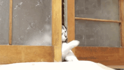
Photo

How to design doors to be less confusing
You’ve encountered a door like this. One that looks like you should pull on it, but really you’re supposed to push. Those doors you hate have a name: “Norman doors.”
They’re named after Don Norman, a UC San Diego cognitive scientist, who identified this phenomena in his book “The Design of Everyday Things.”
According to Norman, pushing on a door that says “pull” isn’t necessarily your fault. It is just poorly designed.

So what’s the solution to this mess?
Norman explains two principles of design that make objects, including doors, more intuitive to use.
One is discoverability — that is, just by looking at the door, you should be able to detect what you could do with it. So a door with only a flap would be more intuitively interpreted as something you push on rather than pull.
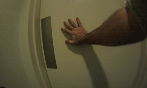
A well-designed object should also provide you feedback while using it.
Feedback involves any visible, tactile, auditory or sensible reactions that help signal whether your attempted use of the object was successful. In the case of doors, the twistable knobs would signal to you whether the door is locked or not.

And perhaps the true test of a well-designed door may be whether your family cat can open it with ease.
Watch the full @vox video on Norman doors (and human-centered design)
1K notes
·
View notes
Photo

This was the collage I designed for our 4th project. We were supposed to make a collage of different typography found in a place of our choice.
4 notes
·
View notes