
Skye, late 20s, she/her. Member of the Renegade Bookbinding Guild. Bindery sideblog, main @bobafett
Last active 60 minutes ago
Don't wanna be here? Send us removal request.
Statistics
We looked inside some of the posts by kolutshanpress and here's what we found interesting.
Average Info
Notes Per Post
5K
Likes Per Post
3K
Reblog Per Post
1K
Reply Per Post
55
Time Between Posts
2 days
Number of Posts By Type
Text
17
Last Seen Tumblr Blogs


Fun Fact
Tumblr has a low social media market share in South America.
Text


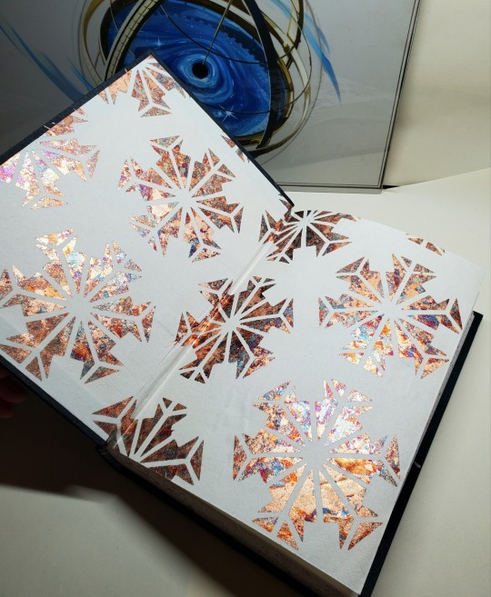
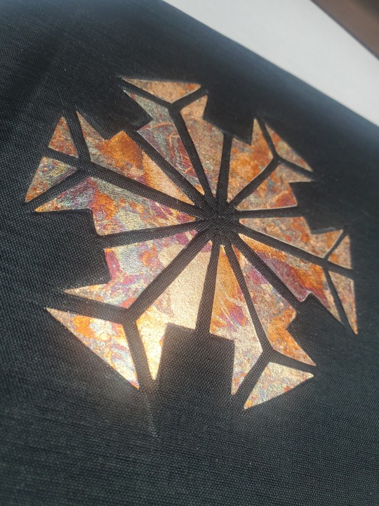
👢 The Complete Novels of Jane Austen 👢
This was my contribution to the #averyspringaustenexchange made for the wonderful @ldm.binding!
So fitting that it is the 250th anniversary since Jane Austens birth. What kind of world would it be without her works? I dont want to fathom.
Another embroidery though this one was made months ago, Im so happy with how it came out. Really wanted a beautiful spring color so the cloth really pulled through!
124 notes
·
View notes
Text


If I Loved You Less by Misthios
I knew I wanted to bind this lovely Austen-esque story on chapter 1, and the design came to me like a divine blessing.
💐 The cover is a nod to the wonderful Penguin Clothbound Classics series, with the image ptinted directly on linen. This was my first attempt at the technique, and I'm VERY happy with the result (though lining up the straight lines to the lines of the cover was very challenging).
💐 I proceeded to go full hog on the violet theme, with the endpapers being purple with an extra leaf of yellow, to echo the colors of a pansy, with the endbands repeating the same color scheme.
💐 The title page is a true star of the show, as this graphic was what inspired the rest of the design, and the chapter titles are all done in Jane Austen font.
232 notes
·
View notes
Text


Fanbinding: Merlin Ambrosius, King of Carthis by @clotpolesonly for @merlinmausi (Renegade Bindery Bound Fic Exchange 2024)
This was my actual first attempt at edge painting. Attempt 1 was to do gold foil with a hair dryer, which worked on my tests on thicker paper, but absolutely did not work here. I think I sanded it off like three times, after gluing all the pages together by accident at least once. I ended up resorting to acrylic paint, with a layer of acrylic ink over it for extra shiny.
Title page was mostly done by the heat foil head for the cricut, but for some reason it didn't do the last couple letters, so I stole a foil quill from a friend and traced them. The cover is also a foil quill: I made the design on Illustrator based on a pattern I found, and then printed and traced it.
The story with the endpaper is that I got it in 2012 at Hollanders (in person, moment of silence.) I loved it enough that I have not used it in the, uh, 11 intervening years. I finally decided that this had gone on a ridiculous amount of time, and also, it looked great with the cover. Problem: that paper really wasn't intended to be pressed against itself. It got itself extremely stuck every time the text block was in the press, and I had to very carefully pry it apart with a bone folder. (Eventually I remembered to start putting blank pages in between.)
The cover is moire, with a very cool sort of wavy pattern that doesn't quite come through in these photos. It's incredibly trippy to work with though because it throws off my depth perception:
610 notes
·
View notes
Text


Tarnished Gold by @primtheamazing / prim_the_amazing
Becoming emperor of the cultivation world will start with a first step as small and basic as becoming Head Disciple of Huan Hua Palace. For that, he must steal the position away from the current Head Disciple. Luo Binghe will sabotage, upstage, and completely and utterly best him. The road to destroying everything and everyone who has ever wronged him, to becoming the highest ruler so that no one will ever have the right to control him ever again - it will start as simply as ruining Gongyi Xiao’s life. Compared to everything else he’s already done, this should be easy. - Luo Binghe brings all his skills of cunning and brutality to bear on Gongyi Xiao, Head Disciple of Huan Hua Palace Sect. It… doesn’t go too well for him.
title/chapter numbers/drop caps: Almendra body text/page numbers/headers: Ibarra Real Nova
118,837 words | 342 pages
First of all I really want to say thank you to the author for such a wonderful fic, it was both my first big fic I read in the fandom, AND it is the reason that I have been absolutely CONSUMED for the last 9 months or so reading SVSSS fic. I enjoyed this fic so much when I first read it that I reread it not even a month later, and bc of that I really wanted to do it justice ❣️ it is suchhh a good Luo Binghe character study!
For the design I really wanted to try out some things, so I used my foil quill pen to foil the chapter heads. For the edge decoration, I tried out painting the edges using this Glenn Malkin youtube video which while very satisfying with the finished product, it is also quite disheartening if you don't sand enough. I went up to 1500 grit to get the edges looking good. I would really like to thank @copticcowgirl a whole bunch for all the hand-holding and cheerleading she did, along with all the tips she so readily gave. I really appreciated it. I made my cameo do the hard work for me by cutting out the lotus design on the back cover and the little goldfish on the front using some gold paper and marbled paper, respectively. The front is representative of the important scenes in the fic that take place near the goldfish pond, and the back is for the golden medallion one of the key players in the fic wears.
I had fun designing it! And then after designing it, I procrastinated 5 months on making it and despite the fact that literally every step was a struggle I am very proud of this book ahh! This copy was gifted to the author, and I am very keen to make my own copy. Probably in a couple months time haha. Thank you so much for the fic, prim!!!!
518 notes
·
View notes
Text
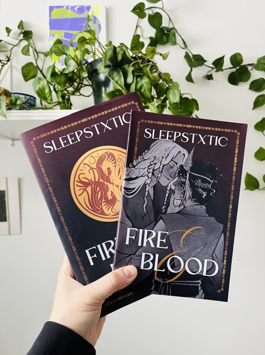
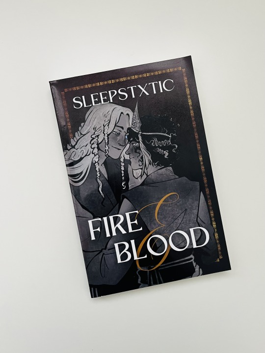
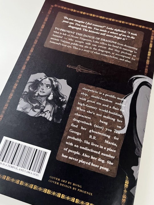
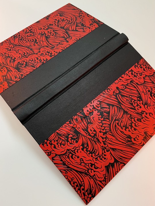
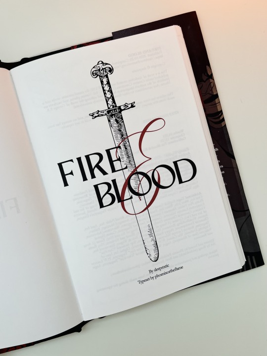
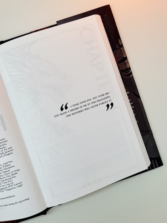
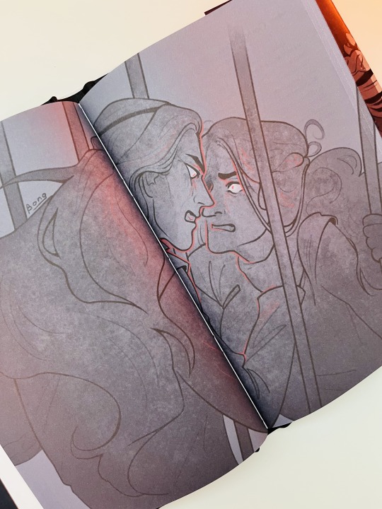
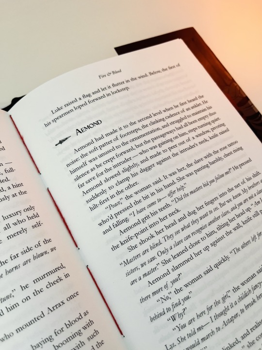
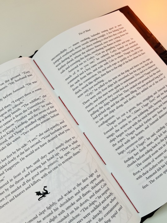
Bound: Fire and Blood by @sleepstxtic
Typeset and bound by: me, @phoenixortheflame. Featuring art by: @wickedcircle
To prevent the Dance of Dragons from decimating what is left of House Targaryen, Luke offers his hand in marriage to Aemond — who accepts with one caveat: that they perform an ancient Valyrian public-sex rite in the dragonpit, as recompense for Aemond’s lost eye. This is a story of what comes before, and after.
I had the pleasure of alpha/beta-reading this fic. Or, as I said to Kat, this "whole-ass fantasy novel". It's got epic battle scenes, espionage, political turmoil, and sexy times on dragon-back.
I knew even when Kat was still writing it that I'd be binding it.
And not just because the fic is amazing. KAT is amazing. If you've ever had the chance to chat with her, you know she's one of the kindest, smartest, most charming humans on the planet. It's such a joy to call her my friend — and to have the privilege of reading her amazing writing.
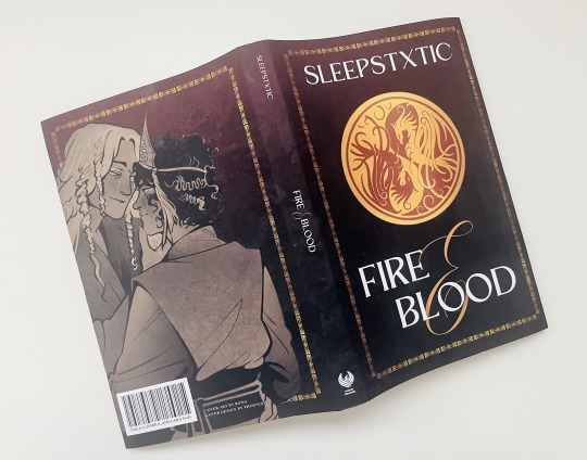
For my design concept, I knew I wanted it to emulate George R. R. Martin's high-fantasy covers, which often features some sort of emblem or crest along with some very bold lettering.
I also had the opportunity to use this incredible fan art from @wickedcircle, which is just begging to be on the cover. So, I did what any sane person would do and created an alternate cover, which I used to make a paperback for myself.
The hard cover case is made with black book cloth and Lacquered Yuzen Paper, which has an embossed texture and gorgeous shine. I knew the second I saw it that I needed it for this bind.
As always, I made a cheeky little barcode for the dust jacket. It's a quote from a very, err, HOT scene. Hot! Like, temperature-wise. Sort of.

The typeset was made in Affinity Publisher. In fact, it was my first typeset made in Affinity, and I'm super happy with how it turned out!

It's not my typical aesthetic, and I was worried it might look tacky. But I think it fits the vibe perfectly. It probably helps that I included the other pieces of art @wickedcircle made to go alongside this fic, because, well LOOK AT THEM!!!!
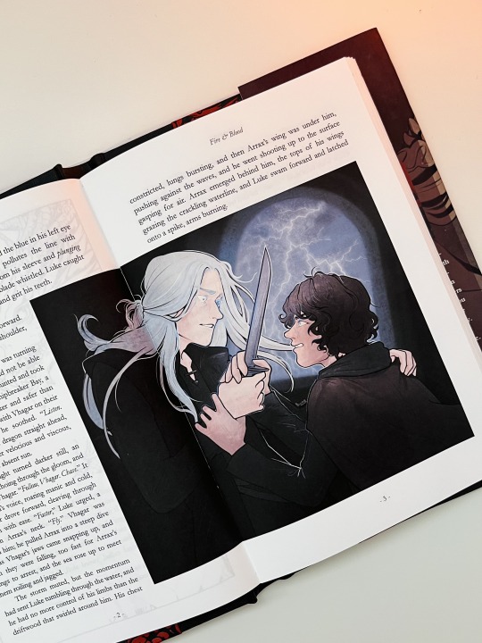
Also, peep the red thread, which I used to sew the signatures together. I'd seen a few people use red thread for their binds, and I've been itching for an excuse to bust it out.
231 notes
·
View notes
Text
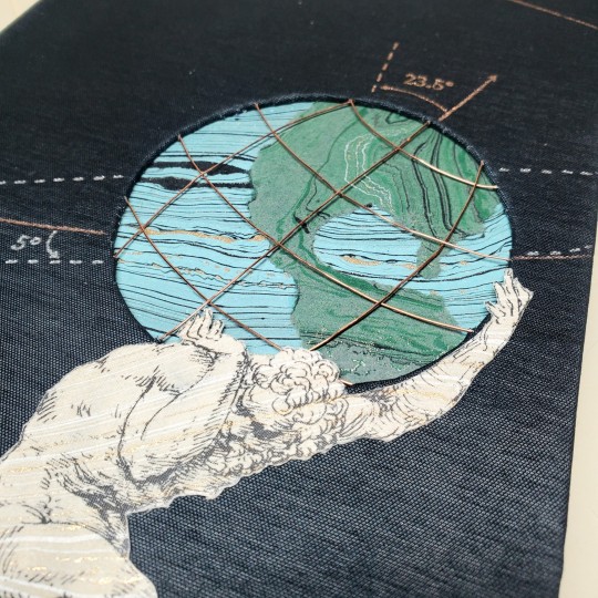
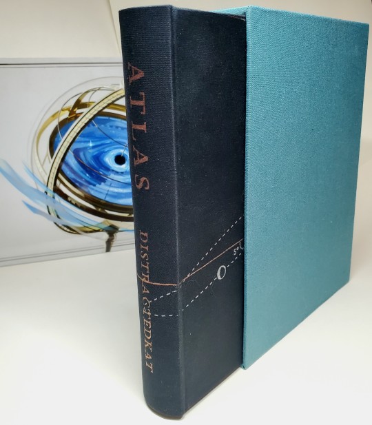
Fanbinding: Atlas, by @distractedkat
(pls click photos for better quality)
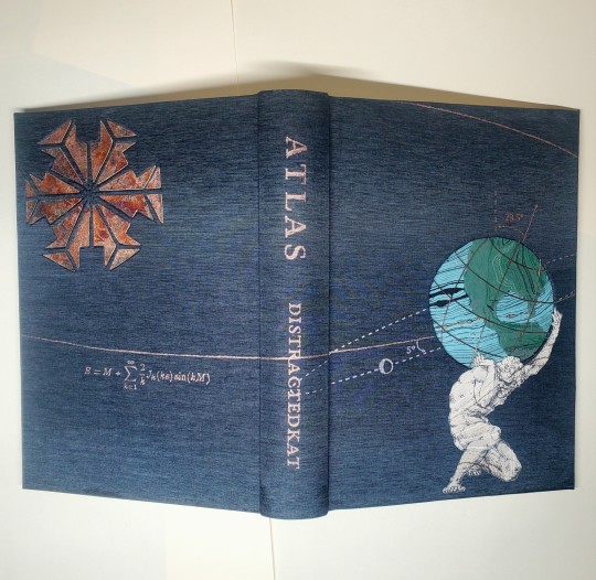
Between what was and what will be stands James Tiberius Kirk, in all his fractured patchwork glory. Because saving the Federation was only the beginning.

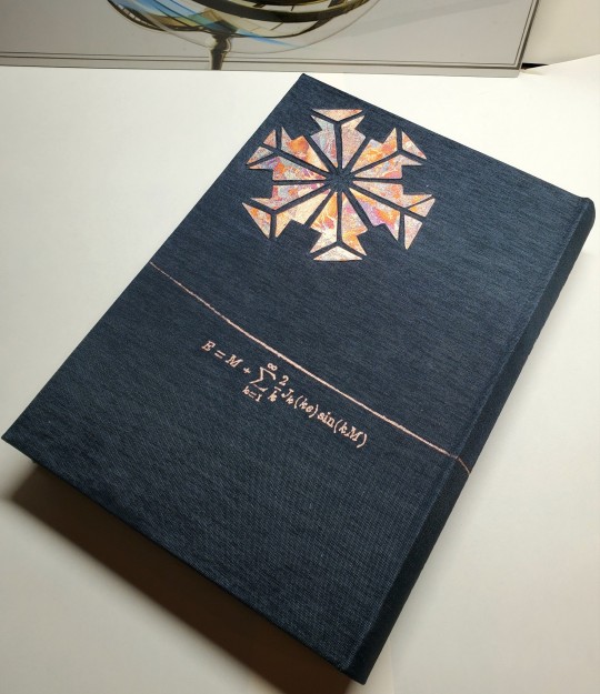
This fic has been on my to-do list for a long time, and serendipitously got pushed up for me to do RIGHT NOW because I needed a fic I could use to demonstrate layering boards for cutouts for a class @pleasantboatpress and I taught for Binderary. @finalfrontierpublishing had a great typeset, so I rushed to get the text ready enough for the class demo that I could start the cover... and then things got out of hand. Whoops.
I started with a basic circle cutout for the globe, which then grew a secondary layer for me to sandwich copper wires into. Atlas got printed onto marbled paper and added in on top. Then I developed a plan to have the moon-earth orbits, etc on the cover...
...and I needed a sun & I had this awesome paper I decided to use for endpapers, so we get a stupid complicated paper inset too...
...and I had been meaning to try out French double core endbands so why not do those in the colors of the earth from space...
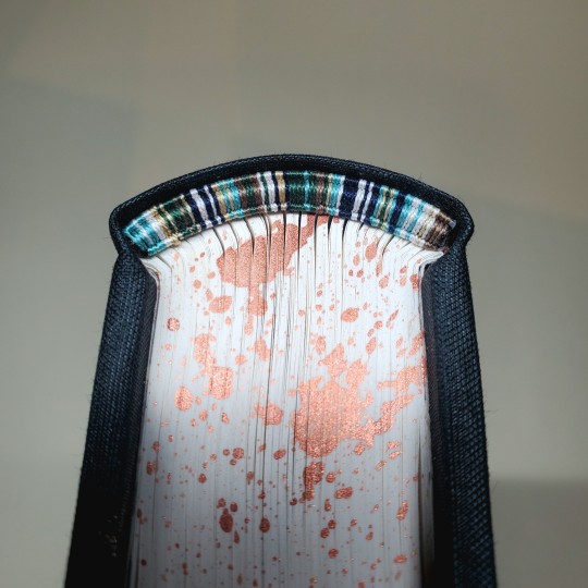
Annnnnd then I was going to a box-making class & this is the kind of delicate that kinda needs one. so. here we are!
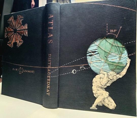
bonus: that art peep in the background is a super awesome metal print by @natureintheory
bonus bonus: cutting out the sun, and the cardstock layer goes under the bookcloth to create the indents that the pieces of the sun fit into like a puzzle
materials notes: colibri uran bookcloth, extremely delicate handmade Japanese paper for endpapers (did an adapted form of made endpapers) that i think? is from Itoya?, marbled jute paper for Atlas + globe, copper wire, copper acrylic ink for the edge, silver + rose gold foil applied with handheld foil quill pen, japanese hand-sewing silk for endbands.
445 notes
·
View notes
Text
I made this copy of With and Without You by @shewhomustnotbenamed and sent it to her. It’s an amazing story that explores the deeper meaning behind our scars, both the ones we can see, and ones we cannot. In this story Draco is an artist exploring the stories behind scars. I wanted to show this in couple of ways.
I created a typeset featuring art by Ted Meyer, who used scars to create art. The art Draco creates is way different (read it to find out how!) but I loved the parallel.


I also use acrylic ink to create a splatter effect on the book cloth. Like one would see on a painters drop cloth.


Finally, the design I created on the back was an ode to the fire escape that Draco and Harry spend time on in their apartment building. Many thanks to loml @phoenixortheflame for help with the idea!!!
As always, I hand sewed the endbands. Lots of colors for this artists bind!


78 notes
·
View notes
Text
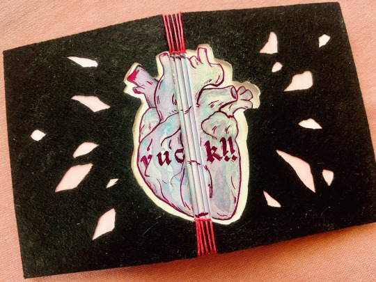


necro elysium (yuck!!) by @mercyisms
A confession: I LOVE fics that use the Disco Elysium format, and The Locked Tomb is just the perfect fit for this type of AUs (and going over the top with book design). And this one is so so so good!
🫀 I knew I wanted to mimic the layout of the text in DE basically as soon as I finished reading and saw the gorgeous illustration by @smapis.
🫀 The cover is inspired by the description of the card, but instead of trying to recreate it exactly (and messing with glitter) I went for the same theme and the kind of DIY arts and crafts style project vibe. Hence my first buttonhole stitch binding, with the heart painted with chromatographic ink (the color is called Unicorn’s Tears) and inked it over in hot pink with a glass dip pen. I also painted the folds of the pages and filled in some of the frames (where the narrator is YOU).
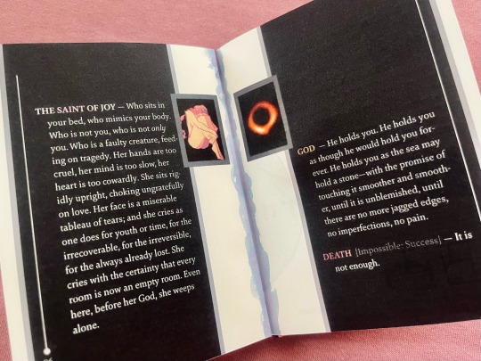
🫀 The rest of the portraits are cropped out of the aforementioned gorgeous illustration, except for Jod’s, which is a photo of a black hole (presented without comment).
🫀 I always want to play with textures for TLT fics, so this time the cover is black felt over a pink gift bag with nice leather-textured pink endpapers, and the textblock paper is a gorgeous 125gsm half-cotton that bravely took everything I threw at it.
I had so much fun working on this 🥰
602 notes
·
View notes
Text
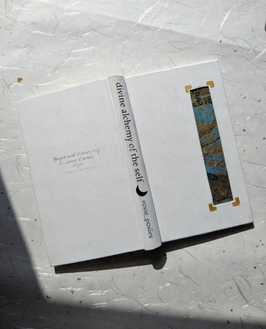
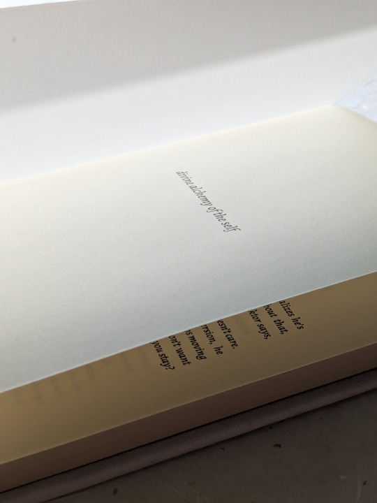
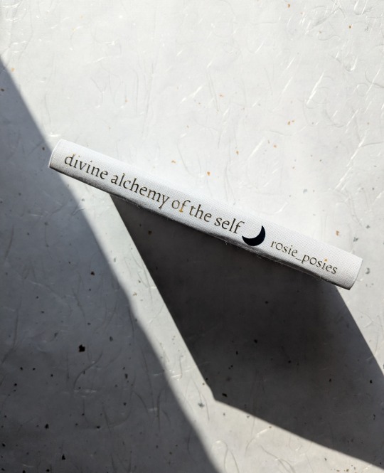
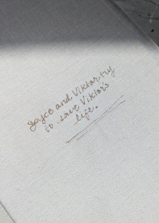
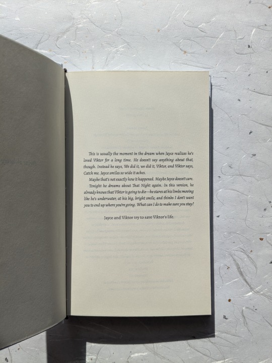
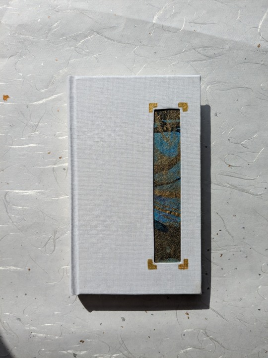
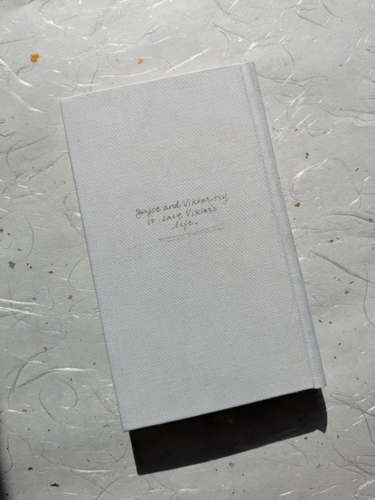
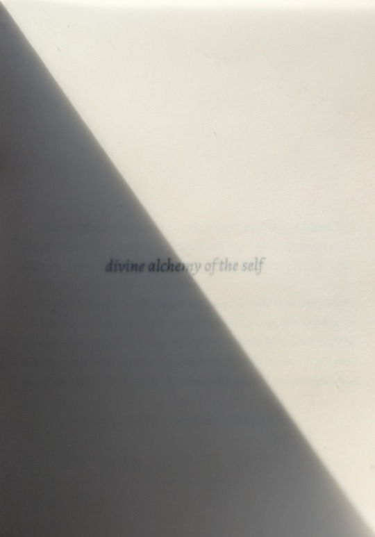
Another jayvik book!!! This is the incredible divine alchemy of the self, by r0sie_p0sies.
This fic was recommended to me by dear friend @ilgaksu and holyyyyy shit. It was written pre-s2 and yet somehow ends up in the exact same emotional place as the finale; the similarities range from larger scene beats all the way down to certain dialogue choices. Rosie just gets these characters, through and through!
As usual, process chatter under the cut!
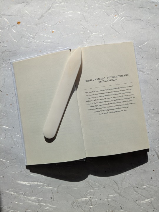
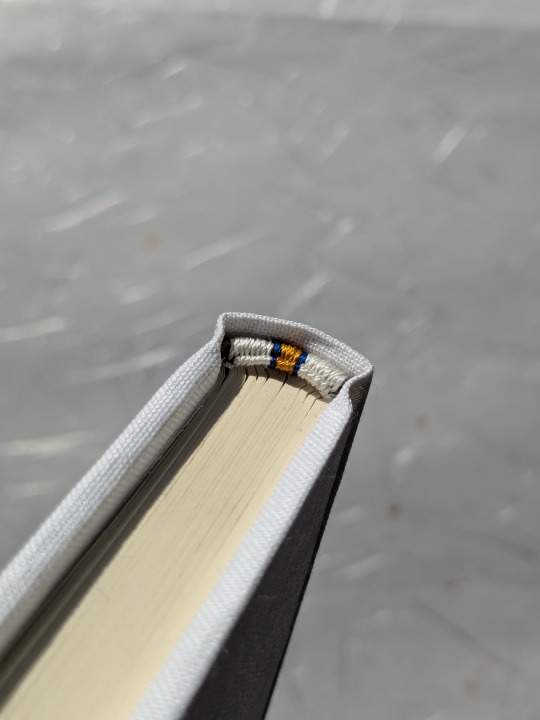
It's fitting for a jayvik book that this first attempt was chock-full of experiments and new techniques! This is my first hardcover quarto Legal size, which I really loved doing. I also finally have a proper finishing press, so I was able to properly round and back a book for the first time! The shoulders are a little weak, so I'm hoping to improve when I make Rosie's author copy. I also used my foil pen for the first time and handwrote the little blurb on the back.
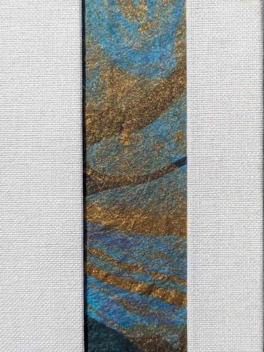
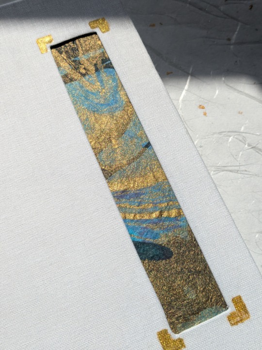
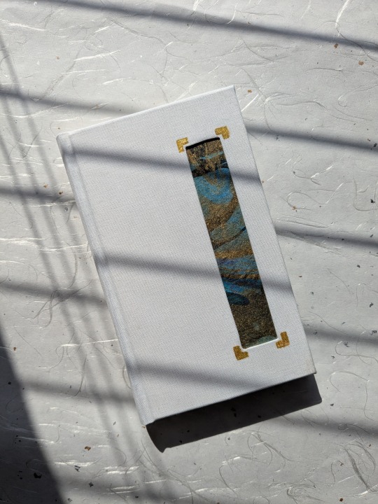
Most exciting, this was the first time I tried an inset! I used some of my favorite blue Momi marbled paper; rectangle placement is heavily inspired by one of @pleasantboatpress's gorgeous binds. Loveee me a good rectangle, heh. I thought an inset was fitting for this story; as you can probably tell from the title, the fic is all about transforming oneself--through grief, through illness, through love. I wanted this to be a book of contrasts--stark white for a kind of blank canvas (also a nod to Viktor's hexcorized dolls in s2), blue and gold for magic/hextech. Here's an abridged version of what I sent Rosie while chatting about design (please picture me as that It's Always Sunny conspiracy meme, but in DMs):
The framework of the fic being alchemy, creation, a literal step-by-step guide for how to create something divine, is something I really want to explore! I really like the idea of this kind of blank canvas casing + swirling paper inset. All the love and life and messy tendrils of illness surrounded by this...blank divinity. That divinity as a medium, a container, for the complicated human experience. But also the inverse--the blankness of the canvas drawing attention to the brilliant blue/gold of the inset. The bright light shining through the windows of their living room in the ending scene juxtaposed with the moment of their (possible? wonderfully ambiguous?) deaths; those two moments being, in many ways, the same. A window into their lives loving each other, seen from both the outside and within. *insert lots of keyboard smashing*
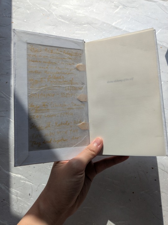
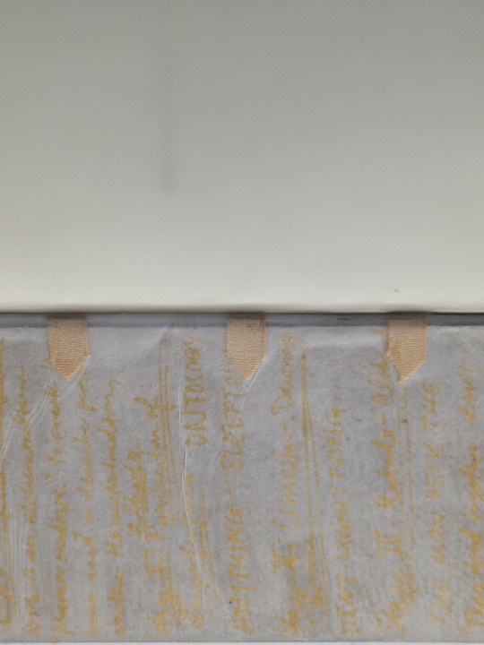
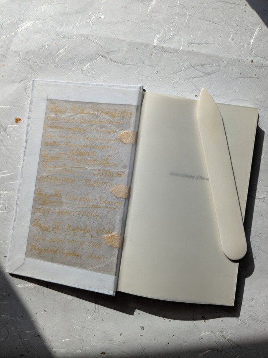
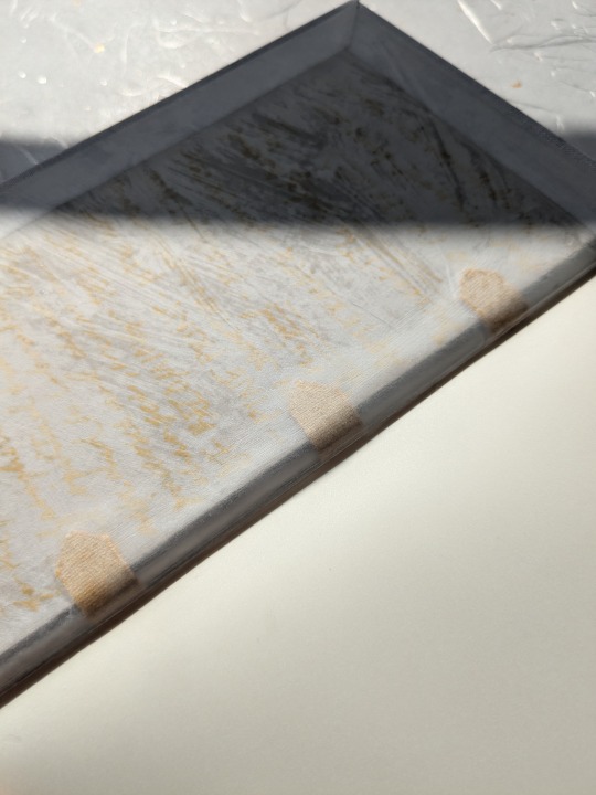
Interiority and vulnerability were also two themes I wanted to convey. So with that theme in mind, I tried something very, very new to me, and thought, fuck it, let's try to use paper vellum for the endpapers:
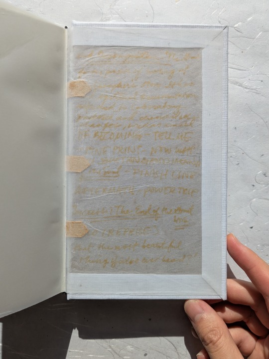
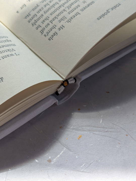
You're not really supposed to use paper vellum for endpapers because 1) it wrinkles and curls like all hell and 2) since it's translucent, it means you can see the inside of the boards and the tapes. But for this bind, I decided to lean into that effect--I scribbled the four stages of the alchemical process (the framework of the fic's chapters) onto the boards so you could see them when you opened the book (I wanted to evoke jayvik's "mad scientists" vibe lol); I cut the supporting linen tapes into points (a nod to the rune Viktor carves into his leg brace) and painted them gold so they'd stand out more (they reminded me of Vik's spine brace; I mean hell, they're literally sewn into the spine of the book for extra support. It felt criminal to not incorporate them in some way!); I tried to be more intentional with the glue brushstrokes while casing in to give the paste-down a more painted effect; and finally, probably the thing that was hardest to let go (and which I'm still a little unsure about, to be honest), I let the damn endpapers wrinkle, for more ~texture.~
The overall effect is something I'm still mulling over, even as I write this--it kind of goes against everything I've learned as a bookbinder, and almost makes me feel (or rather, the book feel lol) naked. These are the parts of the book you aren't normally supposed to see, put on display the moment you open it. But! I think that even if it's not the strongest from a design perspective, I think thematically, it works. Reading this fic made me feel like I was being carved open, so I wanted the experience of reading the book to be a little vulnerable, too. Also: beauty in imperfections, right? :3
Aaand that's all for today! A million thanks again to Rosie for letting me bind her wonderful work <3
And once more for the road: you can read divine alchemy of the self on ao3!
#oh this bind fucks SO hard#making the strutural elements of the book visible#and in a way that's both beautiful and deeply engaged with the themes at play in the work....#fabulous work holy shit#fanbinds
386 notes
·
View notes
Text

This typeset of Pentimento by orange_crushed was created by @teleportbooks for me in the 2022 @renegadeguild typeset exchange! (And bound as part of my Binderary 2023 stack, and look, I am REALLY behind at posting right now, and going to schedule some posts to catch up.)
This fic is a MDZS Wangxian modern AU set in a museum, where Lan Wangji is an art conservator, and Wei Wuxian is an art handler. (Drama! Tension! Meeting after years apart!) One of the joys of a well-constructed AU is seeing how the author recontextualizes canon, and I really enjoyed how the pieces fit together in this fic, as well as Lan Wangji's voice and point of view.


I raided my wife's art supplies for this one (also for the most themed photo op I've done to date) and used two different types of canvas for the book cloth. The lighter cover is just untreated canvas, backed with fusible interfacing and tissue, run through a home laser printer for the cover, and the title on both the cover and spine is acrylic paint using a Cricut-cut stencil. The darker canvas on the spine was gessoed and had a backing on it, and it did NOT want to stick with wheat starch paste, and only held with great reluctance with straight PVA glue. But it worked in the end! The endpapers are some of my wife's gelli-plate printing experiments, for a modern art vibe.


The typeset is lovely and elegant, with a title page set up like a gallery placard, and @teleportbooks included all of the artwork referenced in the fic as if they were colour plates in an art book! Look at this gorgeousness...


I'm pretty happy with how this one turned out overall, and the setting was definitely fun to riff off with the materials used. (Although I will only use that darker canvas again under duress... or for something else where it's the perfect fit, honestly.)
120 notes
·
View notes
Text

The Only Way Out is Down by @avelera
Hi, hello! First post here (I finally decided to make a separate bookbinding tumblr)
This is The Only Way Out is Down by @avelera
I love this fic a lot. It is so clever and beautiful and well crafted and I needed it on my shelf!
A few words about the typeset:
Because the story structurally follows Dante's Inferno, I included a Gustave Doré illustration at the start of each chapter, which I chose to fit each theme and title (and then I spent far too much time editing them so the chapter title would fit on the same page).
The book has 16 chapter illustrations and you can see a couple of them here:


More photos and me yappin' under the cut


I used red for POV names and the sewing thread.

The font used for the body text is EB Garamond, chapter titles are in Perpetua Titling MB bold, and POV titles are in Felix Titling.
I also included tiny illustration ornaments for text breaks and page corners that I made from Doré's illustrations.


For the author's notes at the end, I've included the matching chapter illustration for each entry :)

Though the bind isn't perfect (e.g. I made the spine piece the same width as the textblock’s spine without accounting for the board thickness - and I'm not sure if that is a big problem structurally but I think it looks a bit weird), I'm thrilled with the final result! I really enjoyed all the work that went into making this :)

Many thanks to the Renegade Bindery Discord Server @renegadeguild for opening up the world of fanbinding to me.
#the combo of the black ink illustrations and the red is making me vibrate out of my skin#god it's so good. it's so good! such a stylish bind#fanbinds
137 notes
·
View notes
Text


This is How You Lose the Time War by Amal El-Mohtar and Max Gladstone
This is an updated version of my July 2023 design of the book
223 notes
·
View notes
Text
Fanbinding: The Desert Storm (series) by @blue-sunshine-mauve-morning

MAY THE FOURTH BE WITH YOU!
This is 1 of 2 posts for today, a massive project that I have hit a significant milestone for: completion of both my & the author's 15-volume set of the 1.1 million word The Desert Storm. This is the fic series that got me into Star Wars as an actual fan.
Four years after Order 66 and the fall of the Jedi Order, a grieving, struggling Ben Kenobi finds himself inexplicably taken back in time, crashing headlong into the foundations of fate. Grasping hope and vengeance with both hands, Ben rebuilds his identity and seeks to change the course of history: by saving Anakin Skywalker, the Jedi Order, the galaxy - and just maybe saving Obi-Wan Kenobi along the way.
My design for this typeset was significantly influenced by mem, who had begun a typeset before me and selected black & white images for the title pages, a trend I continued.

As this fic series has meteliculous attention to both canon & EU lore, I stuck with aurebesh characters for titles wherever appropriate, which occasionally gave me some fun opportunities for chapters & tables of contents like this:


For scene dividers, I used a image you can interpret either as twin suns, or as an eclipse.

While I committed to a more classic and less elaborate design for this series, I still rounded & backed every volume in the set. "Editioning" high numbers of similar books like this is often considered in bookbinding circles as necessary to practice skills (I am at 37/45 volumes), and I can certainly say that I have gotten much better at a number of things along the way. The largest book in this series is 616 pages; the smallest, 160 - and I needed to round & back both.


Further thoughts...
Blue_Sunshine (the author) has a fantastic skill for foreshadowing; reread of this series are a must. On top of that, character relationships are consistently and realistically fleshed out and developed. And critically for a "go back in time" story, Blue has a wonderful grasp of the dominoes - what changes trickle down and ripple out; and how that could come back to bite some people. Finally - if you live a badass Obi-Wan Kenobi, this is definitely a fic series for you. Also Blue is a lovely person & our little bits of correspondence has been such a bright spot for me.
Material notes: Duo oatmeal bookcloth, orange marbled jute from Sustain and Heal, hammermill cream paper, gold foil + paint for titles.

435 notes
·
View notes
Text


Last @fandomtrumpshate book is done! This is Solar Flare, by @heliopauseentertainments. Made as a gift for pretzelbaron's generous donation to the Transgender Education Network of Texas <3
Crafty details! pretzelbaron requested reds/yellows/oranges and a marbled endpaper, and I said "I have JUST the paper in my stash," heh :3 They also described one of the themes of the fic as "dazzling light set against the darkness," which was so evocative I just had to incorporate it into the design of the title page!
Bookcloth is Brillianta in the color black. Title is Siser iron-on HTV. Endbands are double-core French endbands in Trebizond silk thread (I always follow @no-name-publishing's tutorial for these. Thank you Kam I owe you my life). Sun inset is a really gorgeous textured paper I bought in 2021 with members of @renegadeguild <3
This was also my first time trying this style of bradel bind! I really enjoyed it and found it much simpler than the three-piece bradel bind, haha. As always I owe my life to Mr. DAS Bookbinding on YouTube for the wonderful tutorial.
A million thanks to pretzelbaron again for their generous donation! I can't wait for you to receive your book :D
162 notes
·
View notes
Text
Bound: Steinway!verse by @toomuchplor


I had a brief dalliance with the Inception fandom a year or so ago when @pennyplainknits mentioned this really great coffee shop AU that they'd recorded. After listening to it, I went in search of more Inception fics recorded by Penny, and I recognized this author, @toomuchplor from Drarry, and dove right in, even though I know basically nothing about classical music, piano playing, or opera. (I mean, now I'm basically an expert.)
Anyway, I decided to bind the whole Steinway!verse series, which is 29 fics totalling 175,000 words. It was fun.
The fics varied wildly in length, from under 1000 words to over 26k. Each fic got a line drawing of a piano that I then foiled with gold toner foil. (That was really fun, cutting the foil so I didn't get any gold on the letters!) Sadly I could only find about 15 different piano designs, so I had to repeat some of them, and I nearly lost my mind trying to make sure I didn't put any twins too close to each other. 😅

The cover! I love the cover. I went to a big used book sale while I was working on this and bought this booklet with the music and words for an opera, which just seemed fitting since Eames is an opera singer in the fics. I scanned it and cleaned it up and changed out the wording, obviously. It's printed on canvas, and I was so freaking pleased that the spacing was perfect.
I hand sewed the endbands but forgot a bookmark ribbon. Oops.
More details:
Printable canvas
End papers (so dreamy!) from Paper Source
Body font: Corundum Text
Chapter headers, drop caps: Thirsty Script
Art on title page: The Musician, Louis Casimir Ladislas Marcoussis, 1914
PS Penny also recorded two of the fics in the series. The first fic in the series is here and another is here.
255 notes
·
View notes
Text


Party Favours by @howlsmovinglibrary
"You want to go down this road?" asked Shadowheart. "At least do it well. If you need a fake date who’s pretty, charming, and distracting for both yourself and others? Who won’t take it too seriously, but also won’t fuck it up by being embarrassed the entire time? You don’t ask me. You ask Astarion.” A year after their adventuring party officially disbanded to enjoy their fame and immense wealth to the full, tiefling wizard Rosalie (reluctantly) asks Astarion for some help with a large, fake-date, ex-girlfriend sized problem.
Now this... this is a bind that got away from me somewhat. The typeset is one of @besidekick's lovely typesets made for the 2024 Renegade Exchange. I had read Party Favours a while ago and loved it (such a fun Astarion/Tav dynamic, funny as hell, deeply tender, and I'm weak for a fake dating trope), so I immediately squirreled the typeset away for future use. Turned out that the future was about two weeks later when I attended the Renegade Binderary workshop on cover cutouts and thought, "Hey, wouldn't it be cool to design a cover for Party Favors that incorporates the astrological elements of Rose's divination spell and a window cutout." Which was a good thought, actually, because this bind turned out incredibly well.
About the Bind
This particular bind is a legal quarto, printed on cream 20/50 lb long grain paper. It was also my second try at chisel trimming a text block, an attempt that mostly went off without a hitch.
Endpapers are a lovely chiyogami. Front and back covers each feature a window cutout to reveal some delightful foiled scrapbook paper that I scavenged from one of those weird collage pages that appear in every scrapbook pad for some reason.
The cover was my first attempt at foiling a full cover design. That was... a battle. But we eventually got foil onto the bookcloth. Now, did it take me three tries? Perhaps. But we... we don't need to talk about that part.
This was also my first in-boards three-piece bradel construction. (Lot of firsts on this bind.) Somewhat more involved than previous casebound binds, but it was so satisfying to assemble.
#having the common renegade experience of 'i made a legal quarto and a 3 piece bradel and now i will never make anything else ever again'#fanbinding#fan binding#bookbinding#baldur's gate 3#bg3#astarion#astarion ancunin#tavstarion#astarion x tav#my binds
176 notes
·
View notes
Text


to lie down with dogs by @motorghost
Hanzo and Cole are on a top-secret reconnaissance mission in the industrialized wasteland of post-Crisis North Dakota, hunkered down in a factory ill-fit for human occupation. Cole seems fine with the situation, but Hanzo's doubts extend far beyond their little room.
Now, as we all know, the number of hours I have logged in Overwatch is between me, beloved indie game developer Blizzard, and God. That said, after a certain number of hours logged in a game, you become somewhat obligated to at least sample the AO3 archive, and believe me when I say that I have far surpassed that number. to lie down with dogs was one of the first fics I read, and it more or less set the standard for Hanzo characterization for me. The writing is incredibly snappy and voice-y, and it's filled with descriptions that still to this day will randomly pop into my head when I think about the characters.
About the Bind
Typeset designed in Affinity Publisher. Titles set in Ruas, main text set in Charis SIL.
Scene dividers (which match the decoration on the back cover) are vectors from The Noun Project designed by Tatyana (wheat) and Uswa KDT (feather).
Flat back legal quarto, printed on 24/60 lb warm white paper with lacquered chiyogami endpapers (and to answer the question that gets asked like once a month in Renegade: yes, the coating causes a very faint stickiness that in no way affects the structure of the book or damages the papers).
Covers designed in Affinity Designer and applied using custom vinyl stencils and acrylic paint.
Samples from the typeset under the cut.


115 notes
·
View notes