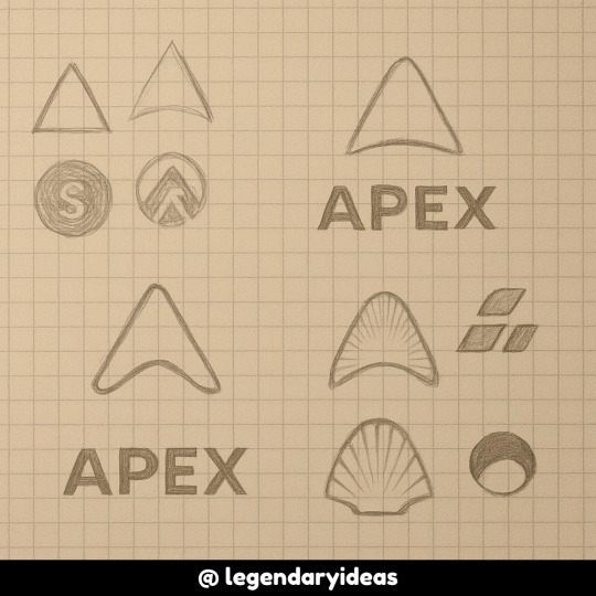
A space for visionaries, creators, and strategists to collaborate on building unforgettable brands. Whether you’re crafting a logo, redesigning a website, or scaling an eCommerce empire – share insights, critique designs, and discuss trends that shape the future of branding.
Don't wanna be here? Send us removal request.
Text

3 Logo Common Mistakes Listicle
5 notes
·
View notes
Text
🚨 TOP 3 LOGO NIGHTMARES I SEE CONSTANTLY 🚨
The "I paid $5 on Fiverr and got exactly what I paid for" special Features generic icon + company name in whatever font was at the top of the dropdown menu
The "I tried to include literally everything we do" monster Has 17 different elements, 6 colors, and requires a magnifying glass to decipher
The "This looked amazing in 2010" fossil Heavy gradients, drop shadows, and design trends that died with MySpace
I'm not here to judge (ok maybe a little) but I AM here to help you avoid these mistakes. I just published a complete guide to creating the perfect logo design that will still look amazing in 5+ years.
Because nobody wants to be featured in a "worst logos" listicle.
Save yourself from logo regret! Get the Full guide
0 notes
Text
Ever wonder why some logos just work while others fall flat? 🤔
I spent three weeks researching the science behind perfect logo design (yes, there's actual SCIENCE to this) and discovered something fascinating: the most memorable logos activate specific neural pathways in our brains.
Take the FedEx logo - once you see the arrow in the negative space between the E and X, you can never unsee it. That's not an accident. That's brilliant design psychology at work.
My latest guide breaks down exactly how color psychology, shape theory, and typography work together to create logos that stick in people's minds like that annoying song you can't stop humming.
And no, you won't need to drop $10k on a design agency to get it right.
Curious about the science of unforgettable logos? Check out the Full guide
1 note
·
View note
Text

Ever wonder why some logos just work while others fall flat? 🤔
2 notes
·
View notes
Text
🖋️ Your logo is literally the FACE of your brand—but is it sending the right message? 👀

Take this quick self-quiz:
🔲 Does your logo look like it was designed in MS Paint circa 1998? 🔲 Do people squint and tilt their head when they see your business card? 🔲 Have you ever said, “Well… my nephew is good with computers…”?
👉 If you checked ANY of these boxes, it might be time for a glow-up.
We've all seen those logo evolution charts where brands go from "what were they THINKING" to sleek modern icons. The difference? Understanding the psychology behind what makes a perfect logo design actually work.
I just published a complete guide to creating an unforgettable logo that won't make future-you cringe. No design degree required.
Ready to level up your brand? Check out the full guide
2 notes
·
View notes