#DesignPsychology
Explore tagged Tumblr posts
Visit Tumblr Blog
Explore Tumblr blogs with no restrictions, modern design and the best experience.
Last Seen Tumblr Blogs


Fun Fact
There are dozens of funny blogs to kill time on Tumblr.
Text
🖋️ Your logo is literally the FACE of your brand—but is it sending the right message? 👀

Take this quick self-quiz:
🔲 Does your logo look like it was designed in MS Paint circa 1998? 🔲 Do people squint and tilt their head when they see your business card? 🔲 Have you ever said, “Well… my nephew is good with computers…”?
👉 If you checked ANY of these boxes, it might be time for a glow-up.
We've all seen those logo evolution charts where brands go from "what were they THINKING" to sleek modern icons. The difference? Understanding the psychology behind what makes a perfect logo design actually work.
I just published a complete guide to creating an unforgettable logo that won't make future-you cringe. No design degree required.
Ready to level up your brand? Check out the full guide
2 notes
·
View notes
Text
🧠 Your Design Might Look Good — But Does It Feel Good?
Most designs attract the eye. Only a few connect with the mind.
✨ Design Psychology isn’t just about colors or layouts — it’s about how humans think, feel, and act.
If you're creating designs without understanding behavior, you're just decorating. This carousel breaks down how to design with purpose — using emotional triggers, color psychology, and layout science that actually converts.
👇 Swipe through & level up your brand design strategy today.
🔗 Check out more at: www.sansarahub.com


#designpsychology#uxdesign#brandstrategy#visualcommunication#marketingtips#userexperience#designthinking#conversiondesign#humanbehavior#creativecontent#sansarahub
2 notes
·
View notes
Text
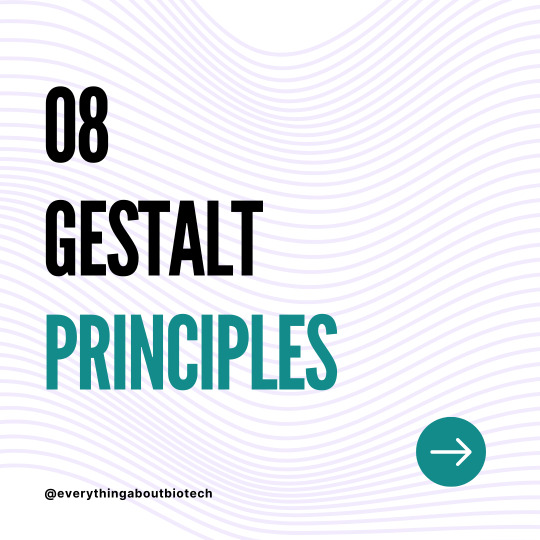
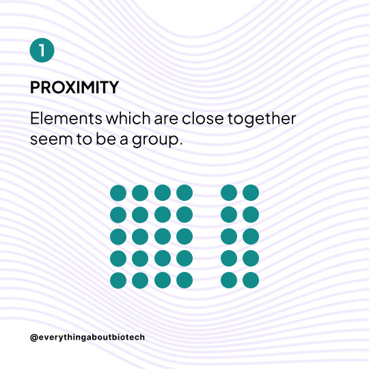
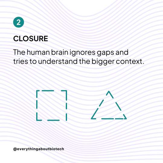

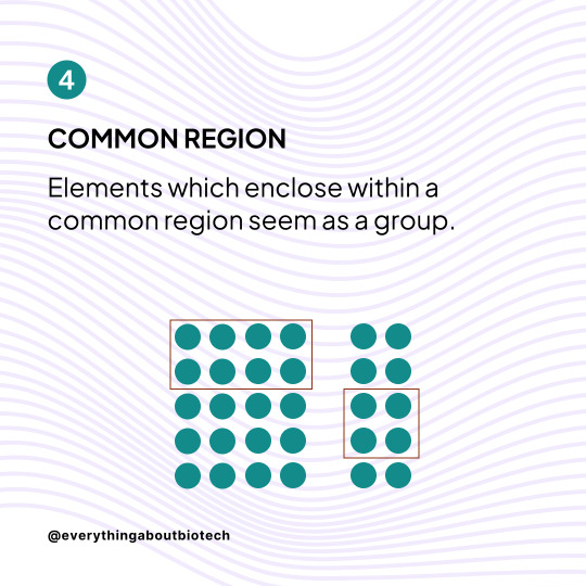
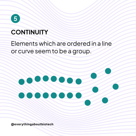
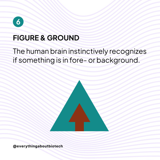
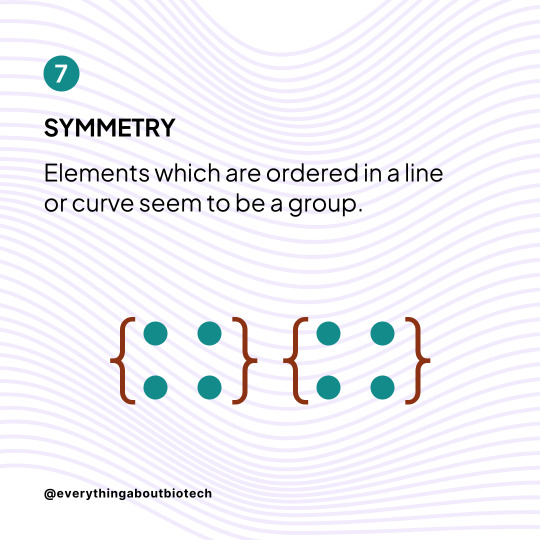
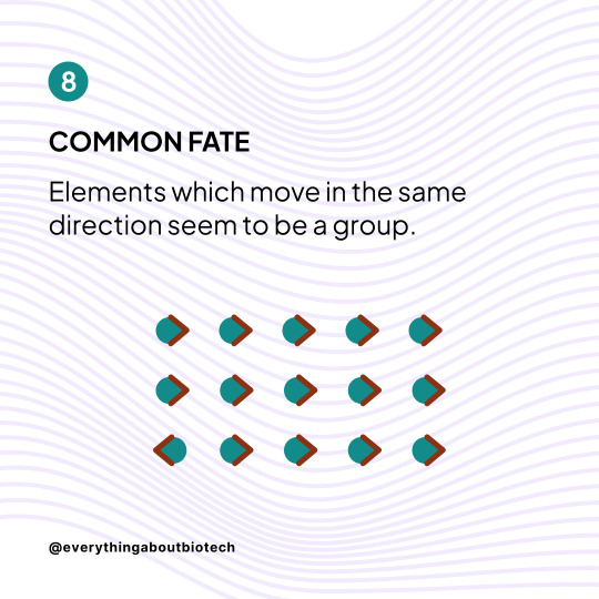

Learn how to use the 8 Gestalt Principles to improve your designs
These Principles determine how people naturally perceive visual elements. If you understand them, you understand how to create better designs.
Follow @everythingaboutbiotech for more useful posts.
#GestaltPsychology#VisualDesign#DesignPrinciples#ClosureInDesign#ProximityPrinciple#SimilarityInDesign#ContinuityDesign#SymmetryBalance#FigureGroundRelationship#GestaltTheory#GroupingPrinciples#VisualOrganization#FormInDesign#DesignHarmony#AestheticsPrinciples#UXDesign#GraphicDesignFundamentals#WebsiteLayout#UserExperience#DesignPsychology
10 notes
·
View notes
Text
Design to Dominate: Proven Frameworks for Creating Market-Leading Logos
Designing Logos That Command Attention: The Art of Visual Brand Differentiation In today’s saturated marketplace, a brand’s logo serves as its visual ambassador- the first handshake with potential customers. The most effective logos don’t just recognize a brand. They differentiate it. These logos communicate its values. They create lasting impressions that cut through the overwhelming noise of…
0 notes
Text
The Psychology Behind Exceptional UX Design
Ever wondered why some websites feel easy to use while others are confusing? It’s not just good design—it’s smart psychology. Great user experiences are built on understanding how people think, decide, and react. That’s where cognitive science comes in.
Cognitive science explores how the brain processes information. When applied to design, it helps create digital experiences that match how users naturally behave. Things like attention span, memory, and decision-making all influence how people interact with a website or app.
Using this knowledge, UX designers build interfaces that guide users smoothly—reducing confusion and helping them reach their goals faster. Techniques like visual hierarchy, clear buttons, and simple navigation make users feel in control and reduce mental effort.
This mix of design and psychology leads to more enjoyable, intuitive, and user-friendly products. When users feel understood, they’re more likely to trust the product and return.
In today’s digital world, understanding the psychology behind UX is key to designing experiences that truly work.
#UXDesign#DesignPsychology#UserExperience#CognitiveScience#UIUX#HumanCenteredDesign#UXTips#DigitalDesign
0 notes
Video
tumblr
Concrete calms, wood warms, and glass opens the mind. The psychology of materials shapes how we feel in a space more than we realize. A rough texture slows us down, while a smooth surface invites movement. Ever wonder why luxury spaces feel grounded? It’s the weight of stone underfoot. Architecture is about what we experience. What material speaks to you the most?
0 notes
Text
Sensory Experiences in Design Psychology

Sensory experience is an interior design principle that uses design elements to engage our senses; sight, smell, touch, sound, and taste. By incorporating sensory elements, designers can influence how we perceive, interact, and feel in the space. Let's break it down a bit below.

Visual stimuli elements including colour, lighting, texture, and spatial layout, are the most obvious sensory elements in design. Colours evoke feelings, while light creates mood and affects how we experience a space. Texture, through patterns and contrast can add visual interest and spatial layout can establish how we behave within the space.

Acoustic comfort plays a crucial role in shaping the atmosphere of a space. Loud environments can increase anxiety while pleasant soundscapes enhance relaxation and productivity. Soft background noise can reduce distractions while nature sounds can create a calming ambiance. Soundproofing materials like carpets, acoustic panels, or heavy drapes can help create quiet zones for rest or work.

Texture adds depth to your design and can influence our comfort and emotional response to a space. Plush fabrics like velvet, silk, or wool evoke cosiness and comfort, making spaces feel inviting. Hard textures like glass, stone, metal, or polished wool add modernity and sophistication to your design. However, it can feel cold and uninviting if overused. Layering textures, for example, soft throws on a leather sofa can add depth and interest to your design.

Scent has a powerful effect on our feelings and memories, as it directly engages the limbic system in the brain. Relaxing scents like lavender and chamomile are ideal for calming environments such as bedrooms and spas. Comparatively, citrus, peppermint, and eucalyptus are invigorating scents making them suitable for offices and kitchens. Retail spaces use vanilla and cinnamon to evoke warmth and nostalgia, encouraging shoppers to linger longer.

Taste is a subtle but influential sensory element in kitchen and restaurant design. Thoughtful design with colour and lighting can enhance our dining experience by creating an atmosphere, stimulating the appetite and enjoyment. Restaurants often use cosy seating arrangements, warm lighting, and rich colours to enhance the sensory experience of dining.

An impactful design will engage multiple senses simultaneously, creating holistic and harmonious environments. For example, a spa may combine dim lighting, soft music, calming scents, and warm textures to create a relaxing experience. A home office may feature lots of natural lighting, ergonomic furniture, minimal noise, and energizing scents like citrus to promote productivity and efficiency.
Sensory design is personal and is often influenced by our cultural background and individual preferences and experiences. For instance, a family room for a nature lover might include wood textures, green tones, and a diffuser with pine or cedar scents.
So, we must consider these factors as designers to create environments that emotionally resonate with users.
Interested in more interior design tips? Subscribe to our newsletter: https://kaleidoscopeliving.beehiiv.com/subscribe
#designpsychology#userexperience#visualcommunication#behavioraldesign#cognitive psychology#psychologyinspireddesign#colourpsychology#environmentalpsychology
1 note
·
View note
Text
Design Psychology in Signage: How to Captivate Customers and Boost Your Brand
In the bustling business environment of Melbourne, signage is more than just a way to display your brand name; it’s a strategic tool to capture attention, evoke emotions, and drive customer actions. The psychology behind effective signage design is a crucial aspect often overlooked. By understanding how visual elements influence human behavior, businesses can create signs that not only stand out but also attract the right audience.
At Signarama Truganina, we specialize in crafting signs that speak directly to your target customers. Here’s how psychological principles in design can transform your signage into a powerful marketing tool.
1. The Power of First Impressions
Your signage is often the first interaction a customer has with your brand. Within seconds, they form an impression that influences their perception of your business. A well-designed sign with thoughtful typography, balanced layouts, and compelling colors sets the tone, whether your brand is professional, fun, or eco-conscious.
2. The Psychology of Color
Colors evoke specific emotions and associations:
Red triggers urgency and excitement.
Blue conveys trust and reliability.
Green signals eco-friendliness and growth. Choosing the right color palette for your signage can align your brand’s identity with the feelings you want to evoke in customers.
3. Typography: More Than Just Letters
Font choice significantly impacts readability and the tone of your message. Bold, sans-serif fonts like Arial and Helvetica are easy to read and project modernity, while serif fonts like Times New Roman convey tradition and authority. Your typography should reflect your brand’s personality while ensuring readability from a distance.
4. Strategic Use of Space
White space, or negative space, is the area around text and images. It prevents visual clutter and helps the main message stand out. Signage with balanced spacing appears more professional and is easier for customers to process quickly.
5. Shape Psychology
The shapes used in your design can also influence perception:
Circles suggest unity, harmony, and community.
Squares and rectangles convey stability and trust.
Triangles indicate action or progress. Incorporating these shapes can subtly reinforce your brand’s values.
6. Eye Movement and Visual Hierarchy
Design elements such as size, color, and positioning guide the viewer’s eye. Typically, larger or brighter elements attract attention first. Using a clear visual hierarchy ensures that the most critical information—like your brand name or a call-to-action—gets noticed immediately.
7. Emotional Connection Through Imagery
Including relevant imagery can evoke emotions and enhance the effectiveness of your signage. For instance, a restaurant might use images of fresh, appetizing dishes to stimulate hunger, while a fitness center could display photos of people achieving their health goals.
8. Call-to-Action (CTA): Guiding Customer Behavior
Effective signage always includes a clear call-to-action, whether it’s “Call Now,” “Visit Us Today,” or “Limited Offer.” A strong CTA motivates potential customers to engage with your business.
Why Professional Sign Writers Matter
Creating impactful signage requires a blend of art and science. That’s where professional signwriters come in. At Signarama Truganina, our expert team understands the psychology of design and uses it to craft custom signs that resonate with your audience. This unique combination of creativity and strategy has earned us a reputation as some of the best signwriters in Melbourne.
Conclusion: Leverage Psychology for Signage Success
Understanding design psychology is key to creating signage that not only looks great but also drives customer engagement. From color theory to visual hierarchy, every element plays a role in capturing attention and influencing decisions.
Ready to transform your business with signage that connects and converts? Contact Signarama Truganina today at 1300 459 117. Let’s design a sign that reflects your brand’s identity and draws in your ideal customers.
#SignwritersInMelbourne#CustomSignage#DesignPsychology#BusinessBranding#MelbourneBusinesses#VisualMarketing#BrandIdentity#EffectiveSignage#SignageDesign#BusinessGrowth#CustomerAttraction#MarketingStrategy#SignageExperts#LocalBusinessSupport#CreativeDesign#BusinessTips#MelbourneSignage#EyeCatchingSigns#SignaramaTruganina#SmallBusinessMarketing
0 notes
Text


One of the most interesting design aspects that I discovered through my MA was the theory of Kiki and Bouba. Which links up everything from shapes, sounds to typography.
🔺 Kiki — Spiky, sharp, edgy.
🔵 Bouba — Round, soft, flowing.
Research has found this is a universal phenomenon, transcending language and cultures. This is SO important to understand in ethical design, as it could be the key aspect that could help something be a success. In design, we don’t just create for functionality—we create for human experience. The Kiki-Bouba effect reminds us of the subconscious cues we send.
.
Here's how this influences ethical design:
Accessibility:
Designing for inclusivity means understanding how shapes, sounds, and even visual elements trigger emotional or sensory responses.
🟢 Rounded buttons may feel more inviting and safe than sharp, angular ones.
Emotional Design:
Want users to feel calm? Opt for "Bouba-like" visuals—soft, rounded, and smooth. Need urgency? “Kiki” elements can create a sense of action or alertness.
😌 Calm = Rounded shapes.
⚠️ Alert = Angular shapes.
Avoid Manipulation:
Ethical design is about trust. Misusing these associations to manipulate user behavior (e.g., making aggressive designs to cause anxiety or urgency) can harm users’ well-being.
.
.
By understanding Kiki & Bouba, we can craft experiences that feel intuitive, fostering empathy and trust in our designs. Let’s build with intention, not manipulation. ✨ (looking at you marketing teams)
.
I also wanted to share some interesting research that presents animals understanding this theory! Which in itself is so fascinating and could be used to design for ecology, conservation and a resilient future.
#EthicalDesign#KikiBouba#DesignPsychology#UserExperience#UXDesign#InclusiveDesign#AccessibilityInDesign#EmotionalDesign#visualcommunication
0 notes
Text

🌀 Navigating the IKEA Labyrinth: A Maze of Marketing Psychology 🏠
The paradox of IKEA's store layout being called a "maze" when it's essentially a straightforward path lies in the intentional design choices that mimic a labyrinth. Beyond a mere linear journey, IKEA's layout is a carefully crafted maze-like experience, strategically influencing customer behaviour.
1. One-Way System:
IKEA employs a one-way system, steering customers along a predetermined path. This intentional design limits clear alternatives, guiding customers from entry to exit. Much like the mythological labyrinth, once entered, the journey unfolds in a predetermined sequence.
2. Circular Design:
The circular design reinforces the maze effect. Customers wind through sections, creating a sense of exploration. This intentional disorientation aims to keep customers engaged and exploring, providing opportunities for unplanned purchases.
3. Strategic Disorientation:
IKEA's maze strategy aims to create a controlled disorientation. Customers may feel lost or compelled to explore, much like navigating the twists and turns of a labyrinth. This disorientation contributes to prolonged stays and increased chances of spontaneous purchases.
4. Marketing Psychology:
IKEA's layout isn't just about directing traffic but influencing purchasing decisions. The maze serves as a psychological exercise in marketing. By guiding customers through various displays and setups, the layout prompts them to envision a more comprehensive home transformation, leading to additional purchases.
5. Corbusian Growth:
In a subtle connection to Corbusier's concept of endless growth, IKEA's layout perpetuates exploration. Customers are led through a curated journey, unveiling a wide array of products. This parallels the notion that the journey through the store, like Corbusier's buildings, is ever-evolving and expansive.
6. Aligning with Corporate Vision:
IKEA's key message, "To create a better everyday life for the many people," aligns with the maze strategy. The journey through the store isn't just about buying furniture; it's about envisioning an improved living space, reflecting the company's commitment to positive impact.
In summary, IKEA's labyrinthine layout serves as a psychological exercise, leveraging the maze metaphor to influence customer behaviour, encourage exploration, and enhance the overall shopping experience. This intentional disorientation, reminiscent of architectural concepts like thermal labyrinths and Corbusian growth, illustrates how design can shape perception and consumer choices.
🛋️🌐✨
0 notes
Photo

Here I am you a basic idea about various font styles and the psychology behind them.... #thekailashchandra #font #fonts #fontpsychology #fontstyle #fontemotions #serif #sansserif #script #display #slabserif #uidesign #uxdesign #uiux #uidesignideas #graphicdesign #graphicdesignpsychology #marketingpsychology #designpsychology #typography #typographyinspiration #branding #rajeevmehta #photoshop https://www.instagram.com/p/COpwMCsA5v1/?igshid=1mcoy526ko0gx
#thekailashchandra#font#fonts#fontpsychology#fontstyle#fontemotions#serif#sansserif#script#display#slabserif#uidesign#uxdesign#uiux#uidesignideas#graphicdesign#graphicdesignpsychology#marketingpsychology#designpsychology#typography#typographyinspiration#branding#rajeevmehta#photoshop
0 notes
Text

THE PSYCHOLOGY OF SHAPES
Simple geometric shapes contain innate psychological properties that we instinctively recognize.
CIRCLE
Community, love, unity, inclusiveness. Positive emotions.
SQUARE
Stability, balance, strength, efficiency, professionalism.
TRIANGLE
Mystery, power. Used for sci-fi, religious, or law themes.
VERTICAL LINE
Commitment, strength, progress, goals.
HORIZONTAL LINE
Movement through time, futuristic, tech-savviness.
Follow @everythingaboutbiotech for useful posts.
#scicomm#science communication#ShapePsychology#DesignElements#VisualCommunication#GeometryInDesign#PsychologyOfDesign#ShapeSymbolism#VisualStorytelling#GraphicDesign101#EmotionalDesign#SymbolicShapes#ArtAndPsychology#DesignThinking#CreativeSymbols#ShapeLanguage#VisualImpact#DesignPsychology#FormAndFunction#GraphicElements#ShapeMeaning#DesignInspiration
8 notes
·
View notes
Photo

Do you know why illustrations matter so much in design? You see, mostly, it’s because people are… Ok, we won’t be able to share all the information in this post anyway. And a new article in Cadabra Studio Blog will tell you everything about it!
Tap on the link to read the article right now and make the next 7 minutes of your life really useful☝️ https://cadabra.studio/blog/purpose-of-illustration-in-design-more-than-image
0 notes
Text
Harmony and Balance in Design Psychology
Harmony and balance are foundational principles of interior design, deeply influencing how a space feels and functions. These elements ensure that all design components—colours, textures, furniture, and lighting—work together cohesively, creating environments that promote emotional well-being and comfort.
Harmony: Creating a Unified Space Harmony in design occurs when every element contributes to a unified aesthetic or theme, fostering a sense of peace and order. It’s achieved by maintaining consistency in style, colour palettes, and materials throughout a space.
Harmonious spaces reduce mental clutter and promote relaxation. A room where all design elements complement one another feels soothing and invites calmness, compared to disjointed or chaotic designs that can provoke stress or discomfort.
Balance: Distributing Visual Weight Balance ensures that the visual weight of elements—furniture, decor, and architectural features—is evenly distributed across a space. It can be achieved in three forms:
Symmetrical Balance: Mirrors elements on either side of a central axis, creating stability and formality.
Asymmetrical Balance: Uses elements of equal visual weight, fostering a dynamic and modern feel.
Radial Balance: Arrange elements around a central focal point, evoking unity and focus.
In a bedroom, a large bed balanced by matching nightstands and lamps creates symmetry, while the asymmetrical decor placement (e.g., a painting offset by a plant) adds visual interest.
Harmony and balance are essential for creating interiors that feel cohesive, inviting, and emotionally supportive.

0 notes
Text
Improving Your Decor With Stylish Office Desks and Furnishings
Studies show that businesses with stylish office furnishings tend to be run more efficiently, which naturally improves the company's profitability. When people enjoy coming to work every day because of their surroundings, they tend to perform better, improve the office's efficiency and increase the bottom line. Have a look at Office desks for more info on this.

Right from the Start
The very first desk your visitors see when entering your establishment is the reception desk. It is an integral part of your business, and makes first impression when your customers, clients or patients arrive. Consider purchasing a large quality constructed reception desk, that fits the size of the room. A larger desk tends to be less cluttered, and makes a more professional appearance to your visitors.
The Worker Bees
The only way your company makes money is to keep your workers continuously doing their job throughout the entire day. They should have office desks that are suited to their needs including large storage areas in the drawers, and a substantial desktop area that is large enough to hold the computer monitor, along with the telephone and files, while still providing enough area to do their work.
The Leader of the Band
Now that you have made it to the top, consider purchasing a stylish office desks for yourself as a way to make a proclamation to your visitors that you are there to do business. Your desk makes a quiet understatement that you can do your job effectively, and that your customers can trust you to get the work done. By providing everyone from the top down with high-quality office desks, you can improve your decor, make your employees happy, and increase your profits.

You may think that in business, it's all about getting the job done quicker, better, and more inexpensively than anyone else. But, the truth is that things are not that simple. In many ways, how you look can make or break clients' decision to hire you. This does not refer to your professional image solely; it refers most of all to your company's professional image. If you want to impress clients, start by making sure your office has the image you want to project. Nothing does the job quicker than the right interior designPsychology Articles, office desks and other furnishings included.
0 notes
Text
Psychology Of Color To Improve Site Conversion
Psychology Of Color To Improve Site Conversion
Studying the psychology of color is crucial for maximizing your site’s web design. Using the right colors can help put your customers in the frame of mind that compels them to take action. Color has the power to improve conversions by grabbing customers’ attention and triggering the right emotions for sales.
Colors often define the public’s perception about your brand and what you stand for. However, the ultimate question remains unanswered: Which color is right for my brand? What color should I choose for maximum impact?
#DesignPsychology #Psychology #psychologyofcolor #SiteConversion
https://plus.google.com/105759962738209092133/posts/GmZdStSdUUJ
0 notes