
Don't wanna be here? Send us removal request.
Statistics
We looked inside some of the posts by lunamsofie and here's what we found interesting.
Average Info
Notes Per Post
1
Likes Per Post
1
Reblog Per Post
0
Reply Per Post
0
Time Between Posts
8 hours
Number of Posts By Type
Text
6
Last Seen Tumblr Blogs


Fun Fact
Tumblr has been providing a Korean-language service since 2013.
Text


Image 1: The design and typography in this image to me symbols rhythm with the way they wrote out the text.
Image 2: On this DayQuil bottle they use hierarchy by making the most important information bigger in text size and also by making it bolded. The most important is also towards the top of the bottle.
Image 3: On this poster that I found in the library there uses a lot of ascender letters, the one that is most seen in the letter b and h.
Image 4: On this body butter the name of the body better has two descending letter both being g.
Image 5: The title of this book has alot of counters the E, A as all examples of closed counters and on the other hand the M, and K has examples of open counters.
Image 6: In this newspaper there are a lot of letters with a crossbar. The ones that stand out most are the T and N in the title The State News.
Image 7: The tic tac font has a large x-height because all the letters meet high up, what I mean by that is the bar in the t is fairly high and then the I, C, and A match up to the same height.
Image 8: The font of the letter has a small x-height because all the letters are towards the bottom.
Image 9: A piece of design that appears to be “Modernist” is the YOU NEED YOUR ID signs that you can see all around campus, the text size is all consistent and has a modern feel.
Image 10: The font at the top of this flier reads The Challenge your eyes go directly towards Challenge because of how bold the best is and also because it is in all caps.
0 notes
Text
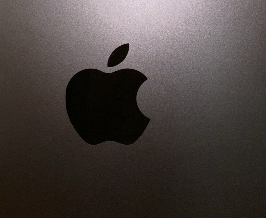
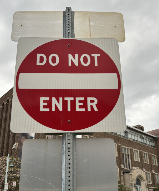
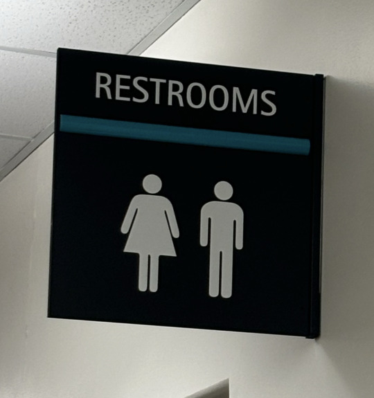
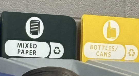
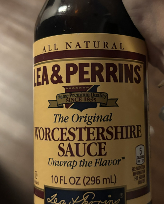
Image 1: The design that I chose to capture was the apple logo, the apple logo is very iconic in today's society and it can be used as a status symbol. The apple logo is a simple apple with a piece taken out of it and all big apple products contain the logo somewhere on the product. Denotatively the design represents the fruit shape.
The connotative meaning of the design is one of simplicity and uniqueness. The logo is a pretty simple design but it has been around for a while and has built an economy off it from phones, headphones and much more.
Image 2: The design that I chose was a DO NOT ENTER sign, it is very iconic in the America traffic signs realm. The red circle with the white letter on it is iconic and many people know the meaning of it.
Image 3: The recycling system is a very known symbol with the three arrows forming a triangle shape. The shape of the arrows represents the cycle of reuse, reduction and recycle.
Image 4: The symbolic design that I chose to capture was the bathroom sign, the triangle shaped dress is associated with the women's bathroom and the straight figure is known as the men's bathroom. Even if the sign has no words on it saying men or womens by seeing the symbol you know which one is which.
Image 5: The design of the label for this worcestershire sauce has a past “style” with the colors they choose and the tones of the label it gives an old fashion vibe to it. Also by including an older typography style and the logo saying SINCE 1835.
0 notes
Text
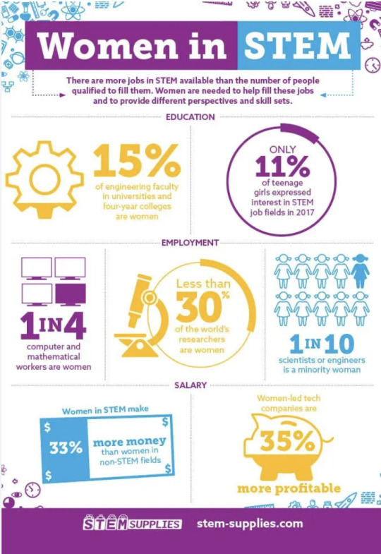
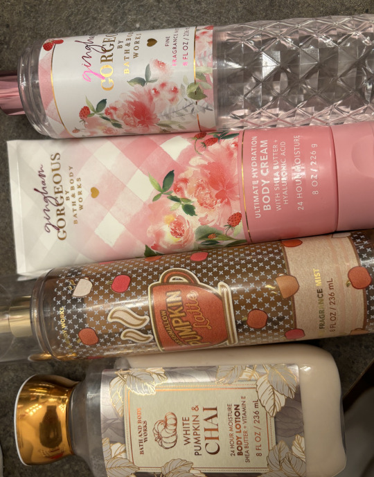
Image 1: This is an infographic I found online and it has statistics in regards to women in stem. The underlying agenda that the infographic is trying to push is to get more women to join STEM related fields, they do this by putting percentages and numbers. For example, women in STEM make 33% more money than women in non-STEM fields.
Image 2: Bath and Body Works is a large identity system that offers a wide selection of products. They have hand sanitizer, body mist, body scrubs, lotion, lip products, candles and so much more. The brand achieves consistency by maintaining the logo in the same font and size throughout all their products. The alignment of their logo with it being aligned to the middle also allows consistency.
0 notes
Text
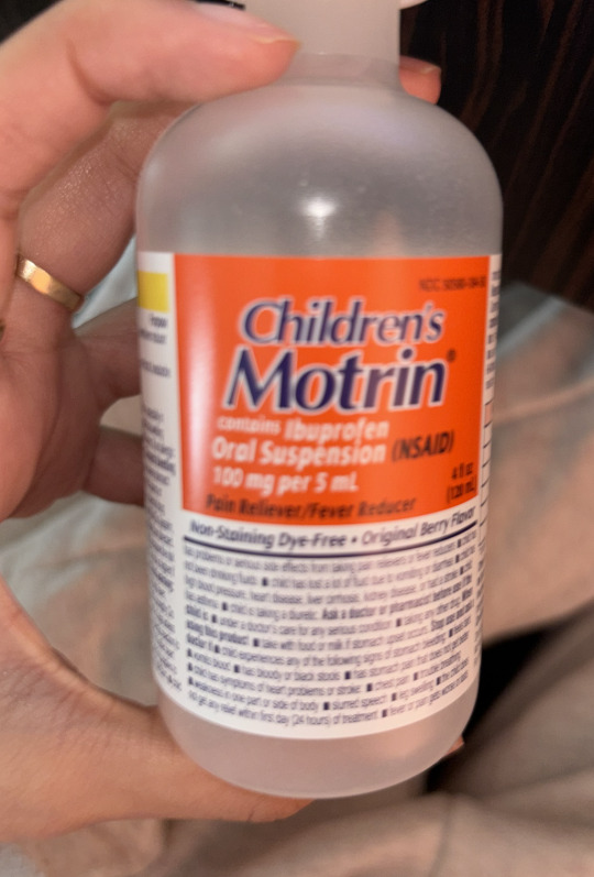
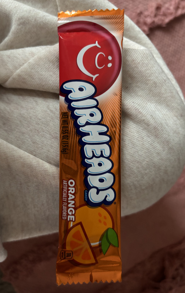
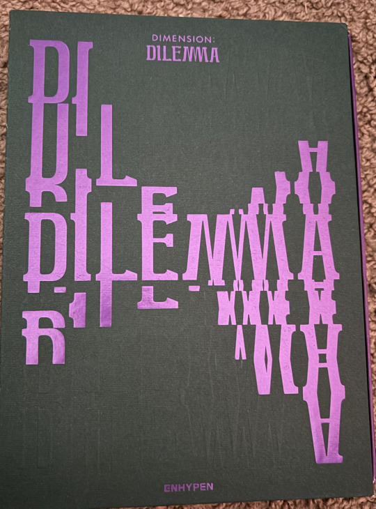
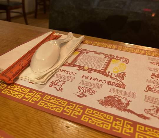
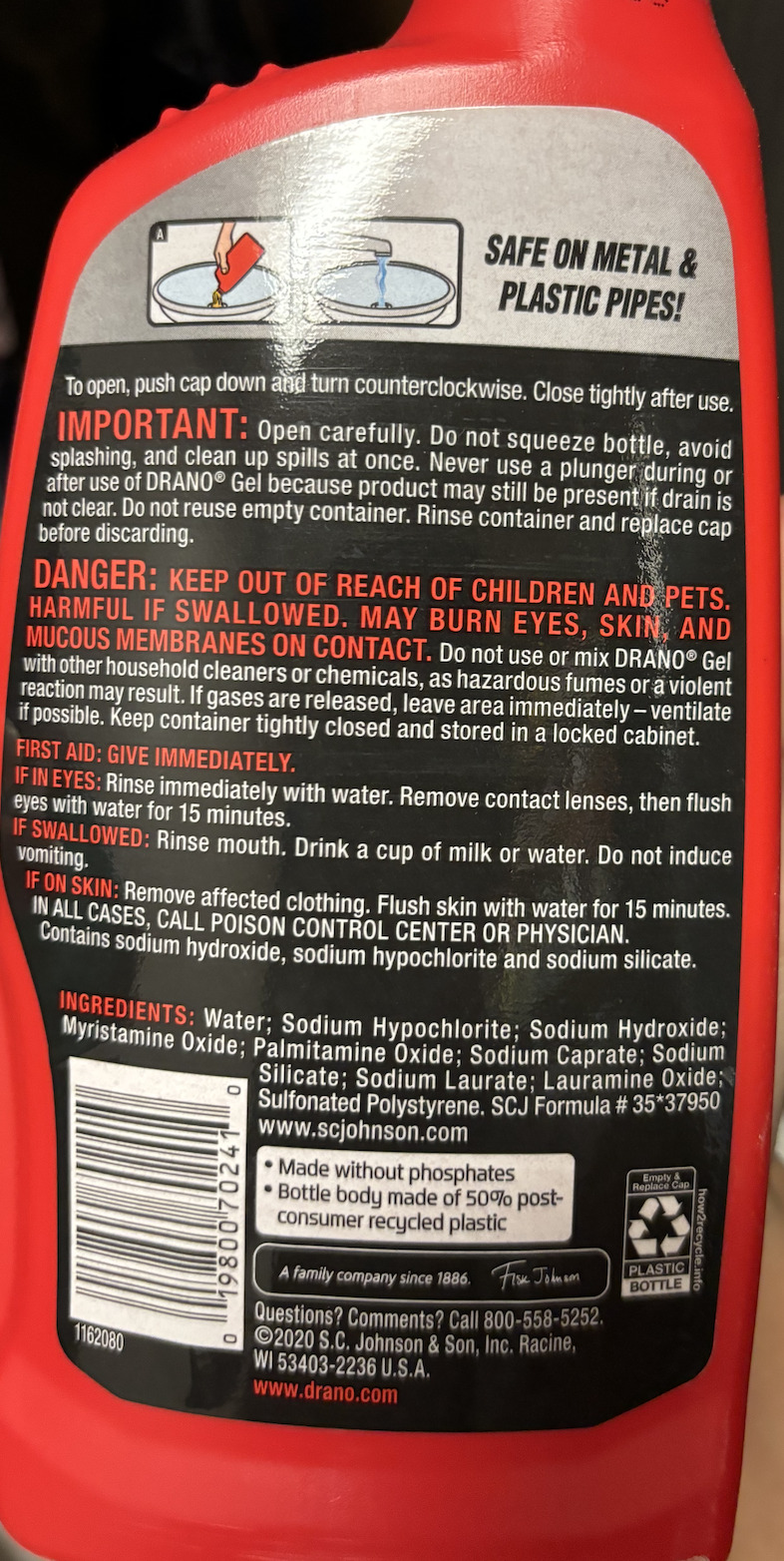
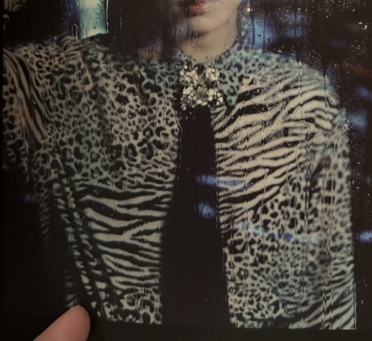
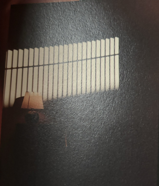

Image 1: This is an image of a children's medicine bottle, the complementary colors that you see are orange and navy blue. The contrast in color allows your attention to be drawn to the label and the name of the medicine.
Image 2: An example of analogous color that I chose to capture was an airhead specifically the orange flavored one. The wrapper of the airhead is mainly made up of orange but the icon airhead head is still popping out in red, they also added in green ro showcase the leaves of the orange.
Image 3: This is an image of the design of an album cover , the design is made up of predominantly cool colors with a deep green as the background colors and a purple to write out the title and edition. The designer is hoping to elicit luck, health and creativity with the use of color in their design.
Image 4: This is a picture of the place mat that is set at a Vietnamese restaurant. The design is predominantly red, orange and yellow which are warm colors. The warm colors are trying to signal a warm environment and the colors are also traditions to Asian cultures. Red is seen as good luck and is used widely in Asian culture with orange or yellow.
Image 5: They used the color read to communicate important information in regards to the product. The color red grabs the attention of a person and makes them read the information. Red is often associated with stop since stop signs and traffic lights use read as stop by this company using red it helps the audience stop and read.
Image 6: The proximity of the different shapes and prints on the shirt allow there to be a unique design within the short. The designer used proximity of dots and lines to create a masterpiece that is unique in every way.
Image 7: The picture of this light is an example of figure-ground relationship because it has a solid black line that runs through all the light and allows the viewer to follow the black light's direction. Without the line in the middle your eyes would not be drawn to the light and lack direction.
Image 8: This is a picture of a flier that I saw at the main library . It gave historical vibes with the neutral colors they chose but also the old fashion looking tickets.
0 notes
Text


Image 1: This is a picture of the book we are reading in this class. Contrast is achieved in this book cover by having the title of the book be bold and a solid black color and then the author and addition of the book are in a little color, this contrast in colors allows the reader to easily tell the title and other information in the book apart from each other.
Image 2: Contrast is achieved in this candle by using different shapes, lines, and typography. The use of contrast in the candle allows there be like hills of snow and allows the name of the candle to stand out. My attention is first brought to the title that is centered in the middle.
Image 3: Contrast is achieved in this butterfly by using different mediums, shapes, line and dot. My attention is drawn to the variety of different lines that help make out the different sections within the butterflies wing.
Image 4: This is a picture of a night light that I have in my room. The contrast allow the butterfly to shine through and reflect onto my wall. They achieve contrast by using lines in different directions and rotating them and they achieve contrast by using dots all throughout the wings.
Image 5: Contrast is achieved in this picture by using a variety of different textures, shapes, and colors, The different texture of the food allows you do be able to tell the ingredients apart from each other the main part of the dish is the biggest shape.
0 notes
Text
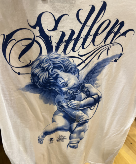


Image 1: It is a picture of a shirt I saw while shopping at Buckle. The lettering above the angel is the brand of the shirt and the typography is very distinguished and unique to that brand, you see that typography and you associate it with the brand.
Image 2: This is a picture I took while volunteering at Ronald McDonald House. There logo can be seen in the left corner, it has the icon clown arm and hand and also the colors that represent McDonald's red and yellow.
Image 3: Anyone But You is a movie that I saw a while back but the poster for it is still up. The poster provided just enough information for the audience to be integrated and go in and watch it.
Image 4: This is an image and text that is displayed in Tesla when you turn the A/C on without the key in the car. The typography and white balloon dog is very known to be Tesla.
Image 5: This is the front cover of my physics book, the cover offers a bit of insight of what lies being the cover.
1 note
·
View note