
Statistics
We looked inside some of the posts by mackenziecooper123 and here's what we found interesting.
Average Info
Notes Per Post
0
Likes Per Post
0
Reblog Per Post
0
Reply Per Post
0
Time Between Posts
13 hours
Number of Posts By Type
Text
17
Last Seen Tumblr Blogs


Fun Fact
130K people were victims of a chain letter scam that affected Tumblr in May 2011.
Text
Term evaluation:
Overall I think this term has been very useful and I have learnt alot as a designer. I loved taking part in the EPM brief as it gave an insight into the professional world which is very important as heading into year 3 where internships etc are very useful. The idea generating was very fun and a good way to practice working at a fast pace. My favorite project of all this tern was the individual project. I found it very valuable and learnt alot. I learned how to take on advice and most importantly it became clear to me that sometimes less is more. Thinking about logistics in the real world and how it portrays a brand are very important elements to consider when doing a branding project.
If I were to change anything about this last project, it would be to spare my self a little bit more time at the end to be able to make the tweaks to the back of my packaging to fix the text. Apart from that I think all elements fit the brand by making it prominent that the brand is eco friendly and has a cause but also includes the important elements in order to be a successful trustworthy and appealing brand for Genz.
0 notes
Text

This is the final poster design. We wanted to use clever wording to really emphasise on the fact that meal deals are becoming more pricey and you are getting less of a fulfilling meal. We used the exact products from the article to visually portray what Sainsbury is trying to sell as a meal but are 3 snack items. I think this was a good outcome for such a short time to come up with a final outcome and I think it deffinetly gets the message across.
0 notes
Text


Then we looked at current sainsburys meal deal advertisements for inspiration.
0 notes
Text


This was a project in which we had to create a final outcome from an article given to us. Jess and I got an article about how a yogurt is now classed as a main in a meal deal, specifically Sainsburys. We started by idea generating and sketching some ideas.
0 notes
Text


Final printed packaging. I really enjoy how the front of the packaging has turned out. Althought it was very hard to seamlessly cut out the circles within the packaging with a scalple. This lead to some more rugged cut lines in the tricky areas which im not a fan of, but this was the most precise way of cutting the packaging. I love how the jewekkery sits within the packaging on the front and back. If there were one thing to fix for next time, it would be how bold the text on the back was printed. Apart from that im very pleased on the packaging
0 notes
Text

Here is a better view of the wall which will display the products. This wall would be larger in person and would have more space to display higher numbers of products. I love the originality and feel that using the fishing net provides to the shop itself. Really reinforcing the fact that this brands priority is the coral reefs.
0 notes
Text

Here is the front and back to my final packaging. I took my classmates advice and added a bold colour to the background of the logo and moved it at the bottom of the packaging. I also took Sally's advice and moved the 'our story' section to the back and renamed it ' the back story as a clever play on words and also making it more visually pleasing.
0 notes
Text
Final Crit feedback:
I presented all my work in the final crit this week to Sally and other peers. This presentation went very well and overall have my project done apart from a few suggestions and tweeks to try out. Mainly within the packaging. I got suggested to try adding a colour behind the logo name on the packaging and testing it out in different areas of the packaging. I also was suggested to try find a way to move the 'our story' segment to the back of the packaging in order to let the image and jewellery shine alone.
0 notes
Text
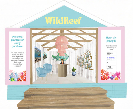
This is the final shop. The posters on the outside promote how WildReef is helping protect coral reefs and how we are working with Coral guardian. One of the posters shows the current statistics for Coral Guardian authenticating the work we do and how we are working with them.
The left wall of the shop consists of images on the wall of a turtle and the coral image used for the packaging. Under these images you can find 2 shell inspired chairs for those who are either waiting to be attended or conversing.
The back wall is where the employee is based and where the checkout area is. Behind the employee is a large sign, one of the watercoloured fish icons designed earlier in the project.
The left wall is where the products are displayed. I decided that instead of having the products layed out on a desk or hung up against the wall to display them in a more creative way. I decided to hang them on a large old fishing net. This not only uses less items and cost for the company but also visually represents overfishing whilst giving an inshop experience.
0 notes
Text


This process took place in photoshop where I added and skewed the elements in order to change the angels and make it look realistic.
0 notes
Text
Designing the shop:


The shop is inspired by beach huts, specifically those here in Bournemouth. I sketched a large sized beach hut and started the design process from there. Creating a 2.5D mock up of the shop.
0 notes
Text
This is what the Stories look like when flicking through the different highlight sections.
0 notes
Text
Coral Reef highlight:

This highlight gives information on Coral Guardian. It gives the viewer the NGO's current statistics so far on their journey to safe the reefs. At the bottom of this page there is a link that can easily take the viewer to their website to learn more about the NGO itself.
0 notes
Text
Thank u highlight:

This highlight is so the customers get an understanding of how them as individuals and us as a community are supporting the coral reefs. Over time this highlight will fill every quater with updates on how much the brand has donated to Coral Guardian updating the followers on this journey to save the reefs.
0 notes
Text
Reviews highlight:


This reviews highlight is more to assure followers that our products are good quality and gives them a sense of trust when purchasing. This highlight is more of a way to connect with the buyers more than anything else.
0 notes
Text
New in highlight:


In this highlight bubble I wanted to showcase new products and interact with the followers by creating polls and getting their opinions on products, this will create excitement for new items and release dates.
0 notes