
Desconstrucion and analysis of artwork and photos, book covers, film posters, magazine illustrations, adverts, etc., created for a persuasive purpose. My name is Dave Wilt and my mission is to inform and entertain.
Don't wanna be here? Send us removal request.
Statistics
We looked inside some of the posts by mexcine2 and here's what we found interesting.
Average Info
Notes Per Post
14
Likes Per Post
9
Reblog Per Post
5
Reply Per Post
0
Time Between Posts
4 months
Number of Posts By Type
Note
1
Photo
16
Last Seen Tumblr Blogs


Fun Fact
Users from the US are the majority of Tumblr visitors.
Note
Hi. Have you ever seen this poster or film? “Chivato, the Bearded Betrayer.” I’ve had the poster since the 70s and I’m curious. Thanks I can’t figure out how to attach a photo of the poster
This was completely new to me! I'm building up a file of pop culture references to Castro and this fits right in. Will have to do some research on the origins of this film.
1 note
·
View note
Photo

A Hair-Raising Tale (Hair-Growing Beatles, 1965)
Were the Beatles the first “hair band?” Not like Poison, RATT or Twisted Sister, of course, but the Beatles’ hairstyles were an integral part of their public image. They weren’t called the “mop tops” for nothing, and while their hair (and outfits) seem positively conservative today (at least until the latter part of the Sixties when they turned into a bunch of hippies--get off my lawn!), there were many jokes about their “long hair.”
[“One day a boy with exceedingly long but untrained hair walked into a barbershop, sat down in the chair and demanded, "Make me look like Ringo Starr." The barber studied the tonsorial problem for a moment, carefully picked up his hairbrush, took aim and broke the boy's nose.” ‘Think and Grin’ in Boys Life magazine, October 1965]
The Beatles were frequently referred to as “long-haired” and even “shaggy,” adjectives which in the 1960s weren’t necessarily positive. The conventional style for men in this era was short hair, clean shaven. “Beatniks” were disparaged as hairy, unkempt, unclean (and later in the decade “hippies” were tarred with the same brush, even moreso). The Beatles weren’t beatniks by any stretch of the imagination, and were consistently better-dressed than their short-haired rivals like the Beach Boys. Still, that hair!
In the “Los Angeles Times” (11 February 1964), a critic wrote: “With their bizarre shrubbery, the Beatles are obviously a press agent's dream combo…the hirsute thickets they affect make them rememberable…” Newsweek (Feb. 24, 1964) referred to the Beatles’ “great pudding bowls of hair.” Many of these early critics (presumably middle-aged men) also disparaged the Beatles’ musical ability and found the intensity of Beatles’ fandom puzzling and upsetting.
Merchandisers got into the long-hair act as well, selling Beatles wigs, board games (“The Beatles Flip Your Wig” game, 1964), Beatles combs and brushes, Beatles shampoo, Beatles hair spray, and so on. There was even a Beatles’ alarm clock featuring artwork of the Fab Four adorned with actual hair.
A number of these items would probably have been sold regardless of the notoriety of the Beatles’ hairstyles (since there were countless other Beatles-labeled items which had no specific connection to their life, such as nylon stockings!), but it’s undeniable that their hair was part of their brand, for good or ill.
The particular advertisement analysed here (from the comic book Teen-Age Love 43, 1965) is an item which doesn’t appear to have an actual name--or at least not one that’s discernable from the advertisements. The ad header just says THE BEATLES, and the text never settles on a specific product name, referring to the “fabulous BEATLES,” “your Beatles,” “miniature BEATLES,” and “LIVING BEATLES.” No image of the product is shown, and the description of what a buyer gets for her/his $1.00 and what happens thereafter is quite vague. Intensive research (alright, I spent some time searching the web) provides no concrete information about the product.
It’s not a “game” or “toy” or even a personal product. The ad says “you can even give them haircuts!” but most of the time the buyer is expected to sit around and watch “RINGO, GEORGE, PAUL AND JOHN grow their famous hairdoes right before your very eyes.” Yep, next to watching paint dry, watching hair grow is about the most exciting thing I can imagine. But your impressionable friends will “gasp with awe and delight.” Come visit next week and I’ll let you watch the mildew spread in my shower.
It’s “a scientific wonder” and a “fantastic scientific method” will allow the BEATLES to GROW BIGGER AND BIGGER, FASTER AND FASTER EACH AND EVERY DAY. Soon they’ll take over your room, your house, your town, the world!! Mwa ha ha!!
Could this have been a precursor to the “Chia Pet,” first created in 1977? There actually was a “Chia Beatles” set available in the 2000s, but this 1964 product certainly doesn’t refer to that. Although the ad clearly states “grow their own hair,” one assumes this is marketing hyperbole, and actual human hair didn’t grow on these…whatever they were. The text provides a slight hint by stating “All you have to do is lead them to a cup or glass of water and give them a drink,” from which we can infer that the “hair” is some sort of renewable plant. Are these just weeds that are named RINGO, GEORGE, PAUL AND JOHN (I bet Ringo was happy to get top-billing at last)? Or are there 4 little clay pots with images of the Beatles on them?
It seems significant that the ad not only doesn’t go into detail about the nameless product, the product isn’t pictured. This wasn’t entirely unknown, and even ads which do include artwork of items for sale must be taken with a grain of salt. But given the extreme mystery surrounding this item, suspicion is aroused.
But did Beatles’ fans in 1964 care what they were getting when they sent their $1 (plus $.25 for postage and handling) off to Novel Products Corp.? (Another ad for the same product lists A&B Industries as the seller, at a different New York address) Probably not. Fans will buy anything.
1 note
·
View note
Photo


Bowling for Dictators
Deconstructing propaganda is an interesting exercise. Like advertising (in fact, the word “propaganda” is used almost interchangeably with “advertising” in some countries), propaganda is intended to motivate the recipient towards a particular action or to reinforce and/or instill a specific mindset (as opposed to simply educating or entertaining the consumer of such material).
Wartime propaganda tends to be ubiquitous, obvious and strident. During the First World War, propaganda appeared in print media (newspapers, magazines, books), visual media (posters), audio recordings, and motion pictures (commercial radio was not yet in place and television and the Internet hadn’t been invented). The Second World War added radio to the media mix, and some might argue that this was when propaganda reached its peak, since no subsequent wars have been as widespread (and thus had so many different countries producing propaganda).
Even 70+ years later, WWII propaganda still resonates. “Keep Calm and Carry On,” “Rosie the Riveter,” “Loose Lips Sink Ships,” and other phrases and images are re-purposed as memes, advertisements, etc. In some cases, people doing this “ironically” may not be especially aware of the significance of the original, seeing it as just something old and amusing.
There were certain repeated themes and motifs in WWII propaganda (some of them are common to all propaganda). In Allied media, Hitler is crazy & demonic but also a vain buffoon. Mussolini is also a buffoon, and Hitler’s toady. The Japanese are “treacherous,” and “stabbed us in the back” at Pearl Harbor. They’re also more likely to be depicted as animals, insects, or monsters. The Nazis and the Japanese are prone to committing atrocities, such as murdering women and children. All of these themes and many more can be seen in different forms of propaganda, from comic books to posters to motion pictures.
Occasionally the motifs are so specific that one can’t imagine they would have been widespread, but one learns that sometimes one can be wrong (one need not be embarrassed about it). Today’s deconstruction subject is the “Axis as bowling pin” metaphor--aka “Bowling for Dictators”--which exists as a War Production Board propaganda poster (probably the earliest example, dated 1942--there are both colour and sepia-tone versions of the poster online), actual bowling pins (possibly just novelties and not really used in a bowling alley), a home bowling game (“Bo-Lem-Ova”--see above), at least one other piece of merchandise (an illustrated envelope or postcard) and two comic book covers. It’s possible, even likely, that “Hitler, Mussolini and Tojo/Hirohito/generic Japanese officer as bowling pins” also appeared in other formats.
The comic book covers and the bowling game will be the primary focus of this essay, although first, a few words about the overall meaning of this motif. Two basic statements are being made. First, “we will punish the Axis leaders (and by extension, their soldiers).” Bowling is one way to symbolise this punishment; other propaganda motifs with the same idea utilise a boxing metaphor or simple and direct depictions of Hitler, Mussolini, and a militant Japanese figure--either the actual characters or some stand-in such as a photo or poster--being punched, kicked, slapped, and so forth. Hitler dartboards and Hitler pincushions also existed. It’s not enough to defeat the enemy on the battlefield, their leaders or surrogates must suffer personally and physically.
The second idea conveyed by the Axis bowling pin motif is that the dictators are unsteady and can be “toppled” if the proper pressure is brought to bear on them. This is fairly specific to the bowling metaphor, although similar precarious situations could be imagined (a dictator on a high-wire, a dictator out on the limb of a tree, and so forth).
The “Bo-Lem-Ova” game was issued in 1943 by Kindred MacLean & Co., a “window display” company based in Long Island City, NY. They also produced at least one other game in this era, “Luk-E-Star” (somebody at Kindred MacLean liked hyphens and phonetic spelling). The bowling “pins” are printed on cardboard, and were assembled with stand-up bases. The bowling “balls” are marbles, which are rolled down the cardboard “alley” (which looks pretty nice--an assembled version can be seen on page 34 of this 1943 toy catalog). As the box notes, this is “2 Big Games in 1,” since there are two sets of pins: one featuring Hitler, Mussolini, Generic Japanese Militarist Man, and 7 Nazi soldiers, and the other with 10 cardboard fascimiles of regular bowling pins. I suppose Kindred MacLean was hedging their bets, either trying to make the game acceptably non-partisan in case it was sold in a neutral country, or hoping to extend its shelf-life past the war’s end, when “K-O the Axis” was no longer relevant.
If you look closely at the box, you’ll see the figure of Mussolini has printing on its chest: “One Down July 25, 1943 Two to Go,” an allusion to the date when Mussolini fell from power in Italy. It’d be interesting to know if this figure was originally conceived with this printing, or if it was hastily added at the last minute. “Bo-Lem-Ova” newspaper ads exist from as early as November 1943 (and began appearing again in the run up to Christmas 1944), so--given the lead time required to design and manufacture the set--it may have been a close-run thing. Many (but not all) pop culture depictions of the Axis largely ignored Mussolini after his downfall, so it is possible Kindred MacLean wanted to include him even though he had been deposed just before the game was created, to highlight the fact that there were still “two to go” to defeat the Axis powers.
The Nazi soldier figures are individualised, a nice touch: some look mean, some are deadpan, and a few appear fearful. The Japanese character grimaces fiercely, and Hitler is giving his signature “Heil!” salute. Out of all the “bowling pin” material bearing the Axis images, only the novelty envelope (or is it a postcard?) has Hitler, Mussolini and their Japanese partner reacting as if in pain to the impact of the bowling ball, for what it’s worth.
The two comic book covers utilising this motif were dated January 1943 (Sensation Comics 13)--on sale in November 1942--and “Winter” 1944-45 (Bomber Comics 4). Sensation Comics was published by All-American Publications, which later merged into what is now known as DC Comics (although the cover of Sensation 13 features the “DC” logo, the two companies were separate-but-related at the time). All-American superheroes included Green Lantern, the Flash, and the cover star on every issue of Sensation from numbers 1-106, Wonder Woman.
The cover was drawn by H.G. Peter, the original and primary Wonder Woman artist from 1941 until 1957. Peter had a distinctive style, neither rigidly realistic nor overtly cartoony. Wonder Woman was generally drawn “straight,” as she is on this cover, while her sidekick Etta Candy (the pudgy redhead at right) was more of a caricature. [This was not unique in the Golden Age: the mostly-realistic “Blackhawk” strips included the grossly exaggerated Asian caricature Chop Chop, for instance.] Etta and the other young women in the upper right-hand corner of this cover are wearing what one assumes are athletic outfits for Holliday College, hence the “H.” Either the bowling lane is very short, and the bowling ball and pins are huge, or Peter was forced to cheat on the perspective so as to make Wonder Woman sufficiently large and prominent and still squeeze in the large Hitler, Mussolini, Japanese militarist figures in the foreground.
The cover of Sensation Comics 13 is neither allegorical nor realistic, falling somewhere in between. An “allegorical” cover might, for instance, show Wonder Woman waving the American flag, while “realistic” covers depict Wonder Woman in some sort of action situation (fighting criminals and so forth). This cover has the main character participating in a realistic activity (bowling) but the Axis-themed bowling pins are symbolic of anti-fascism.
Both the cover of Sensation 13 and Bomber 4 are drawn so that the reader is seemingly situated behind the bowling pins, rather than putting the pins at the rear of the page and placing the reader behind the bowler. The cover of World’s Finest 9 (Spring 1943) features an example of the reverse perspective: Batman, Superman and Robin are in the left foreground, throwing baseballs at Hitler, Mussolini, and a Japanese caricature in the right background, which seems a more logical layout.
The cover of Bomber Comics 4 is very similar to Sensation Comics 13, and could very well have been “inspired” by the earlier issue. The design is practically the same: the hero is in the left background, bowling towards the pins in the right foreground. The bowler is superhero Wonder Boy, while the spectators are Kismet “Man of Fate,” a Muslim superhero, and a young woman (who may be Sally Benson, a character from the Wonder Boy strip). Such multi-hero covers were fairly common in the Golden Age, even if cross-overs in comic stories were not (in fact the cover of Bomber Comics 3 depicted Kismet, Wonder Boy, and numerous other characters from interior stories in a single scene).
While the bowling pins on Peter’s Sensation cover looked more like chess pieces, with large carved heads on top of each pin (making them rather top-heavy, one would imagine), the unknown artist on Bomber Comics goes with standard pins bearing the painted likenesses of the Axis leaders, a more practical design. Oddly enough, Hitler appears to be wearing a German Navy cap, and Generic Japanese Militarist is also dressed in an atypical blue (naval?) uniform. The inclusion of Mussolini on this cover is less logical than it was on Sensation, which was published while he was still in power; Bomber Comics 4 was released no earlier than late 1944 (possibly even early 1945), a year and a half after Mussolini had been deposed (although he was later the titular head of a Nazi puppet government). It’s highly unlikely this cover was drawn in 1943, so Mussolini’s appearance on Bomber Comics 4 makes little sense: in late 1944, the “Axis” in the public mind was Hitler and the Japanese, period.
Bomber Comics was one of only 2 titles issued by Elliott Publishing in the 1944-45 period (the other was Spitfire Comics). Oddly enough, Bomber features characters formerly published by Quality, including “Wonder Boy”--these don’t seem to be reprints, but may represent unused Quality inventory. This doesn’t explain the covers, however, since Kismet was not an existing superhero, appearing only in the four issues of Bomber.
How did the “Bowling for Dictators” motif develop and why was it used multiple times? We may never know. The permutations of propaganda are varied, but not unlimited, so a good metaphor is often recycled.
1 note
·
View note
Photo

Fish With Human Hands Attacked Me! (True Weird magazine)
As cartoon Leonard Nimoy said in an episode of The Simpsons: “The following tale of alien encounters is true. And by true, I mean false. It's all lies. But they're entertaining lies. And in the end, isn't that the real truth?” The word “true” is frequently used in marketing to literally add a veneer of verisimilitude to whatever is being sold. Magazine titles with “true” in the title include the long-running True, True Action, True Confessions, True Crime, True Detective, True Experience, True Love Stories, True Romances, True War, and True West, to name a few. Also, True Weird and True Strange, the subjects of today’s desconstructive criticism.
Setting aside the odd-sounding titles, which consist of two adjectives but no subject (the titles aren’t True Weird Stories or True Strange Tales, for instance), these two relatively short-lived magazines are notable chiefly for their provenance (published by a body-builder), their prescience (foreshadowing future publications dealing with “weird but true” events), and their interesting covers (of primary interest to us).
True Weird and True Strange were published by Joe Weider, a body-builder and fitness guru born in Canada in 1919. In the 1930s he started selling nutritional supplements and in 1940 began his magazine career with Your Physique. As time went on, he sold body-building books and courses, and expanded his publishing empire with physical culture magazines like Mr. America, All American Athlete, Muscle Builder, American Manhood, and Junior Mr. America. Weider branched out into other genres as well, issuing Animal Life, Fury, Outdoor Adventures, Jem, and Monsieur (the latter two were Playboy-esque girlie magazines), and historical magazines such as Armchair General and Civil War Times in the 1980s . He died in 2013 and is survived by his wife Betty (who, as Betty Brosmer, was an incredible glamour model in the 1950s).
True Weird lasted 3 issues, and was apparently (if not strictly technically) succeeded by True Strange, which ran for 7 issues. True Strange followed mostly the same format as its predecessor: “true” stories about historical oddities, ghosts, and so forth. The cover of True Weird’s second issue depicted Abraham Lincoln (the other 2 covers are the one we’re looking at today, and the one with a large image of the Devil), while 6 of the 7 True Strange covers (all painted by Thomas Beecham) featured contemporary celebrities: Elvis Presley (twice--one solo cover and sharing a cover with Bill Haley), Marilyn Monroe, Sophia Loren, Anita Ekberg, Bill Haley, and James Dean. This was probably an attempt to improve newsstand sales, although trying to connect these people with the supernatural was a stretch in some cases (“Did the Devil Send Elvis Presley?”, “The Weird Sex Magnetism of Anita Ekberg” and “The Miracle That Made Sophia Loren a Star”) but easier in others (“James Dean Speaks from the Grave”). True Weird’s covers, on the other hand, seemed aimed at readers interested in more esoteric topics.
True Weird’s first issue, shown here, was dated November 1955. One writer calls it “an exuberantly trashy magazine that offered articles on historical oddities and mysteries.” The cover is a trash-literature classic, showing a bikini-clad woman surrounded by “Fish With Human Hands.”
This cover was painted by Clarence Doore (who also painted the “Abraham Lincoln’s ghost” cover for True Weird #2). Doore, born in Montreal in 1913, moved to the United States with his parents as a child (his parents were both U.S. citizens). Doore began working as an illustrator in the late 1930s, serving in the Army during World War II. He painted covers for pulps, comic books, paperback books, and men’s magazines, retiring in 1966. Doore died in 1988.
Doore, although not a household name (not even in households where pop culture artists’ names are common currency), has a solid reputation even today: a cursory online search brings up a number of references to him and examples of his work. His cover painting for True Weird’s first issue is quite popular on the web: numerous bloggers snark on it and numerous image sites reproduce it. It was never immortalised in a song by Frank Zappa in the manner of Wil Hulsey’s painting “Weasels Ripped My Flesh” (first seen on the cover of Man’s Life, September 1956), but it’s still well known among aficionados of such things. The original painting sold for $18,750 in a 2015 auction (none of 7 other Doore paintings sold by Heritage Auctions went for more than $3,000 and several sold for less than $1,000).
The True Weird cover is fine, well-rendered and dramatic. It combines horror and sex, a familiar and effective combination in popular culture. “Nature attacks” covers on men’s magazines--like Man’s Life mentioned above--seem to be slightly tilted towards rugged outdoorsmen battling hostile weasels, crabs, turtles, rats, bats, sea snakes, spiders, baboons, wildcats, scorpions and so on. On some of the covers a woman-in-peril is also present, and a relatively small percentage feature a woman as the primary or sole target of ferocious fauna. “Monster attacks” artwork, on the other hand, often specialises in female victims. Doore’s cover shows only one person, a young woman wearing a red bikini, confronted by 2 fish-men. “Nature attacks” covers, even those featuring a female victim, usually portray the predators as solely interested in killing the human(s) in their midst, whether to eat them or simply out of savage spite. “Monster attacks” illustrations, on the other hand, often have an inherent undertone of sexuality. So file “Fish With Human Hands Attacked Me!” in the “Monster attacks” genre.
The fish-men on the magazine’s cover are partially obscured by water and mist; the story’s main illustration (drawn by Warren Knight, scroll down) inside this issue of True Weird shows a single fish-man--who does resemble Doore’s version--standing upright, suggesting the creature is a true fish-man (with arms and legs), not just a “fish with human hands.” As I discussed in a previous post, 1954’s Creature from the Black Lagoon helped popularise the fish-man (or frog-man) in popular culture.
One odd point is the fish-men’s eyes. Those horizontal, slit-like pupils give me the creeps. Seriously, goats have pupils like that, and they bother me as well. The Creature from the Black Lagoon has round pupils, why don’t these fish-men? The interior illustration depicts its creature with similar eyes, suggesting either the original story describes them thusly, or Doore & Knight collaborated on the imagery of the fish-man (i.e., one of them used the other’s artwork as a model).
The cover painting differs significantly from the interior artwork: Doore’s woman-in-peril is clearly a contemporary skin diver, given her bikini, face mask, and spear-gun, whereas Knight’s drawing shows a single monster grabbing a woman in 16th -century (I’m guessing) garb, as an armour-clad conquistador and four other men attempt to rescue her. The caption says the scene takes place on a “lonely Nicaraguan beach,” during the Spanish Conquest period. None of this is reflected in the cover painting, of course, presumably because the editors figured a modern setting for a fish-man assault on a woman would sell more copies of True Weird. However, Knight’s interior drawing does make the fish-man’s intention slightly clearer: he’s abducting the woman, possibly for nefarious & sexy purposes, whereas the two menacing fish-men on the magazine’s front cover might only be considering murdering the young woman (and then eating her, or not).
In Creature from the Black Lagoon, the Gill-man’s attraction to Julia Adams is romantic, if not (for biological reasons) sexual. Humanoids from the Deep (1980) depicts fish-men who kill men and rape (some) women, romance be damned. Having not read the “Fish With Human Hands Attacked Me!” story, I don’t know what the fish-man’s purpose was, but some human-like motivation is assumed. It’s not just their hands that are human, if you get my drift.
It’s a bit of a mystery why the first issue of True Weird has a gaudy, exploitative cover, and the second and third issues have more strait-laced artwork on their covers (if you can call a giant Devil looming over a stylised medieval city “strait-laced”). True Weird almost appears to have deliberately walked back from the policy of their eye-catching first issue, choosing a more sedate, “serious” tone. Sales may have played a factor: issue 1 was cover-dated November 1955, #2 February 1956, and #3 May 1956, giving the editors enough time to review the sales figures for each preceding issue. One supposes the news wasn’t good--True Weird folded, and True Strange wouldn’t appear until October 1956, at which time the Weider group made the decision to showcase current celebrities on the covers (James Dean, on the cover of the March 1957 issue, had died in September 1955 but was possibly even more famous after his death than while he was alive).
If you ask me, a more powerful sales gimmick would have been to showcase publisher Weider’s wife Betty Brosmer on every cover. One month she could have been a sexy witch, then a sexy vampire, then a sexy werewolf, then a sexy zombie, then a sexy ghost, then a sexy fish-woman…
#true weird#monsters attack#nature attacks#betty brosmer#joe weider#creature from the black lagoon#1950s magazines
1 note
·
View note
Photo

“A Picture Crammed With Guts!” (Shield for Murder, 1954)
Shield for Murder was a 1954 crime film adapted from a novel by William P. McGivern, co-directed by and starring Edmond O’Brien as a “Dame-Hungry Killer-Cop” who “Runs Berserk!” Shut up and take my money! The posters for this movie, released through United Artists, have a number of interesting, exploitative touches--so let’s start deconstructing, shall we?
Edmond O’Brien had a long career on the stage and in films and television; most often seen in second-lead and supporting roles (winning an Oscar as Best Supporting Actor for The Barefoot Contessa), he did play some “character leads” in pictures like D.O.A. and Shield for Murder. He retired from performing in 1974 and died a decade later. While reasonably handsome as a young man, O’Brien quickly aged into a sort of a stolid, slight-paunchy “everyman,” frequently cast as a cop or press agent or lawyer or military man. In addition to co-directing (with Aubrey Schenck) Shield for Murder, O’Brien directed some episodic television and one other feature film (Man-Trap, 1961, which he also co-produced but did not appear in).
Shield for Murder is about a schlubby cop named Barney (O’Brien), who kills a “runner” for a bookie and steals $25,000 from him. The mob doesn’t like being ripped off and pursues Barney, who winds up murdering an innocent witness to his initial crime and a private detective, and even slugging his former partner. He tries to skip town with his girlfriend but winds up being shot to death by his fellow policemen.
The “poster” for Shield for Murder we’re examining today may not actually be a film poster. The same image--minus the “Dame-Hungry Killer-Cop Runs Berserk!” text--was used for the one-sheet (the National Screen Service information at the bottom of the poster verifies this), and thus it is possible that this augmented version was a magazine ad or something of the sort (it’s not the pressbook cover, though). However, I like the “Dame-Hungry Killer-Cop” tagline so much that I decided to use this one (the authors of the recent BluRay release also chose this version for their cover).
This is one of the “yellow background” posters I’ve mentioned before, a design quite popular in the 1950s (or perhaps it was just popular with one ad agency who was creating posters, and I’ve just happened to see a lot of them). The design is clever and effective, with a smaller box inside the outlines of the poster itself, but a box which is ruptured by Edmond O’Brien’s head at the top and by a small, borderless text “balloon” in the lower right. The yellow background attracts attention, but the interior box frames most of the graphic imagery against a white background.
Curiously, the large figure of O’Brien and the thumbnail illustration in the lower right are black-and-white, while the image of Marla English (at left) and the photo-sourced picture of O’Brien kissing Carolyn Jones (at right) are in colour. I don’t know the rationale behind this decision, but it actually works, at least for the full-length art of O’Brien--the lack of colour ironically makes it stand out against the colourful backdrop. The verified one-sheet for the movie has all of the images in colour. Both posters are fine, but I still prefer the “Dame-Hungry Killer-Cop” version.
The central artwork, while certainly competent, is odd in another way. It’s not a very good likeness of O’Brien, looking too young and handsome (compare the figure’s face to the smaller image of O’Brien at right). Indeed, it slightly resembles a younger O’Brien/William Bendix hybrid, with maybe a little early Wallace Ford mixed in. Also, he has a rather quizzical look on his face, not much like a “killer-cop.” I imagine this image may have been photo-sourced as well (many film posters, even though that used artwork rather than photographs, sourced at least some of their imagery from publicity stills): I’ve seen a screen shot that shows a sweaty O’Brien with a pistol in one hand and a stack of cash in the other, but he’s wearing a police uniform and isn’t in the same pose as the artwork. This doesn’t mean a publicity shot of more or less like this image didn’t exist, but even if it did, that doesn’t excuse the apparently deliberate glamourisation of the film’s flawed protagonist/anti-hero. Also, he’s wearing loafers.
The other images are probably all retouched photographs. Although I haven’t been able to locate the exact stills used, I’ve found a reasonable facsimile for the O’Brien-Jones smooch here, and the pistol-whip image here. The closeup of bad-girl Marla English could have been taken from almost any glamour shot of her.
The text on the poster is both strategically placed and fantastically hyperbolic in content. As noted above, the giant red lettering reading “Dame-Hungry Killer-Cop Runs Berserk!” is only present on this version. It doesn’t obscure much of the artwork and adds some much needed emotional punch and provides the potential audience member with important information. He’s a crooked cop! He kills people! He likes “dames!” And he’s running “berserk!” So you’ve got a pretty good idea of what to expect. The taglines beneath the picture at right reinforce these attributes: he’s got a “wild trigger finger,” “a lust for money,” and a “weak spot for fast blondes,” who left the “straight-and-narrow” and went down a “crooked one-way road!” Got it.
That text was primarily descriptive rather than qualitative, suggesting the studio was too modest to claim that Shield for Murder was “Terrific!” or “Packs a Punch!” The last bit of non-credits text, hovering about the pistol-whipping art, tries to make up for this, but in a rather diffident manner. “If ever a picture was crammed with guts--this is it!” “If ever?” Aren’t you sure? The phrase “crammed with guts” is a good (if awkward) one, albeit surprisingly graphic for the time period. The phrase is “tough,” gangster-ish talk that meshes with the theme of the film, but it’s still surprising to see it on a movie poster intended for a mass audience. Maybe the distributor thought the intended audience for Shield for Murder could handle it: the movie is clearly a hard-boiled crime picture and anyone who’d be offended by “crammed with guts” probably wouldn’t want to see Shield for Murder anyway.
The rest of the poster text is just the title and credits information. The pyramidal layout of “Edmond O’Brien” and “Shield for Murder” is aesthetically pleasing: the star’s name is between his legs and he’s standing on the film title, with the rest of the credits outside of the framed white area. This is all more or less contractually-required boiler-plate and had little to do with selling the picture, but I’m a little surprised by the extremely large print for “A SCHENCK-KOCH Production.” Aubrey Schenck and Howard W. Koch were producing partners for most of the 1950s, grinding out mid-level genre pictures like Shield for Murder, Big House U.S.A., The Black Sleep, Voodoo Island, Tomahawk Trail and Fort Yuma. It’s unlikely that any potential ticket-buyer would have recognised their names and/or cared enough to make a see/don’t see decision based on this information, but this may have been an attempt at “branding.”
In any case, the Shield for Murder poster is competently executed, effectively conveys the subject matter and tone of the film itself, and invites the viewer to ascertain for himself (or herself) if there ever was “a picture crammed with guts!” (Aside from The Goofy Movie, that is)
0 notes
Photo


“Your girl will gasp with wonder…” (Glow in the Dark Neckties)
The “Glow In the Dark Necktie Company” (215 N. Michigan Ave, Chicago, IL) seems to have been a classic “niche” company. “We know our market. We make glow in the dark neckties, that’s all.” There is very little information on the web about this business (the address still exists but appears to be a more modern high-rise office building), which advertised in comic books, newspapers, and popular magazines during the 1940s. At least 3 different designs were offered in this era, one “patriotic” and 2 risqué (one moreso than the other).
The earliest necktie design for which I’ve been able to find an advertisement is for the “Blackout Necktie.” It shows up in a multi-item ad that appeared in Blue Bolt 3/7 (December 1942): the tie is said to glow “in dark for 20 minutes after exposure to electric light” and cost $1.00. By December 1943 the tie was now called the “Victory Necktie,” and the price had dropped to $.98 (plus postage). Advertisements for this version appeared throughout 1944 in newspapers, pulp magazines, and comic books. One assumes, since the ads in 1943 and beyond made a point of referring to the tie as the “Victory (also called Blackout) Necktie,” that the design was the same from the beginning, but the 1942 ad neither provides details nor shows the tie clearly enough to determine what it looks like.
Renaming the tie from “Blackout” to “Victory” reflects (perhaps not unconsciously) the shift from a defensive posture and attitude in World War II to an offensive one. The USA had been attacked in December 1941: civil defense precautions were instituted, and “blackouts” were a common-place thing, often mentioned in popular culture. By late 1943, the Allied war effort was making progress, and it was permissible (even encouraged) to look forward to ultimate “Victory” over the Axis. The ad copy mentions the patriotic design in passing, referring to the “strange, luminous pattern of the patriot’s universal fighting code. . . . - - - “V!” and later describing the design as “the fighting man’s…Victory Code.”
Otherwise, the tie’s aesthetic and utilitarian attributes are the selling points. By day, the tie is “wonderful” as well as “stylish, wrinkleproof, high-class…fine material…Ties up perfectly!” At night, the glow in the dark design has “magic beauty,” produces “the most unique effect you have ever seen” and “its [sic] actual protection in blackouts, or dimouts, for its light can be seen at a distance.” Avoid being struck by cars while crossing the street in a blackout! Driver: “My gosh, I nearly ran you over! Lucky you were wearing that luminous necktie! I’d hate to have injured such a patriotic individual!”
[As an aside, the exact technology used to create the glowing effect is not known, but it was probably not paint containing radium. This was notoriously used on wristwatches, which had resulted in horrible injuries to the women who manually painted watch dials. You can look it up, but I’d advise skipping the photographs. Radium glows because it’s radioactive, and the original “Blackout Necktie” advertisement (although none of the later ones) refers to charging up the tie by exposing it to an electric light, which indicates the tie has a phosphor substance embedded, rather than radium.]
The ad reassures readers that the tie bestows true distinction and pride of ownership upon those fashionable individuals willing to part with 98 cents (plus postage) to purchase a tie (or 3 for $2.79). “Creates a sensation wherever you go…Everywhere you go, by day or night, your Victory…Tie will attract attention, envy, and admiration…both men and women rave about its magnificent beauty…”
Eventually, World War Two came to an end and there was little inherent value in wearing a tie emblazoned with three dots, three dashes and the capital letter “V.” Unless you were a Morse code fanatic, or your name was Victor. The Glow in the Dark Necktie Company, never one to rest on its laurels, came up with two new designs.
The “Kiss Me Necktie” was actually available even before war’s end, since an advertisement can be seen as early as Dynamic Comics 15, cover-dated July 1945 (and printed several months before that). The price has escalated to $1.49 (plus postage), perhaps because this tie doesn’t merely affirm your patriotism, it issues “a Call to Love in Glowing Words!” “Your girl will gasp with wonder!” The “Kiss Me Necktie” will “surprise and thrill every girl you meet!” (in the dark) “Be different and the life of the party in any crowd!” (in the dark) “See how it excites and thrills.” (in the dark) Yes, “in the dark it seems like a necktie of compelling allure, sheer magic! Like a miracle of light there comes a pulsing, glowing question--WILL YOU KISS ME IN THE DARK, BABY?” Sure, but only if you keep the tie on and the lights off. Once the lights are on, the spell is broken, jerkface.
There is slightly more artwork in the “Kiss Me Necktie” ad than in the “Victory Necktie” version. We get the identical little drawings of Daytime Man and Nighttime Man (whose face inexplicably turns black when his tie lights up, possibly due to radium poisoning…), but in keeping with the babe-magnet concept of the “Kiss Me Necktie,” there are 3 drawings of women admiring the tie itself--bow down to the Almighty Tie!--and one of a kissing couple, presumably before-and-after depictions of the tie’s magic power. Why, it’s “a Hollywood riot wherever you go!” (sounds good, sign me up!)
The coupon for the “Kiss Me Necktie” includes the standard offer of one tie or multiple ties, but also throws in an additional, surreptitious opportunity, the chance to purchase a “Glowing Gorgeous Pin-Up Girl Necktie.” Could this be the same item later offered as the “Strip-Tease Necktie” by our old friends at the Glow in the Dark [Neck]Tie Company, beginning in 1947? “She Loses Her Clothes As She Glows in the Dark.”
The ads for the Strip-Tease Tie differ from its predecessors in several ways. First, they appear not in comic books, but in magazines like Popular Science and Modern Detective between (at least) 1947 and 1950. Also, they aren’t full-page, but appear as a one-column, black-and-white ad, often “stacked” with offers for other dodgy products (in Modern Detective, the Strip-Tease necktie ad is below one for mail-order false teeth, and above ads for an asthma remedy and a mail-order detective school). Obviously, the Strip-Tease Tie is an “adult” product, offered only to discerning grown men who read serious magazines rather than those frivolous, juvenile comic books. And even then, the tie is only “for men who demand the distinctive and unusual!”
Given the smaller size of the ad, there’s less redundant descriptive text. The tie will “Bring[s] gasps of sheer wonder [and] thrilling admiration the first time you wear it!” (but every time you wear it after that…nothing.) It won’t save you in a blackout or compel women to kiss you, but it does depict “a glorious goddess of light revealed for all to see! A glorious, gleaming blonde beauty revealed in daring pose in the briefest of costumes, mysterious and magnificent!” Definitely worth the increased price of $1.64 (plus postage), because the briefest of costumes, that’s why.
Of the 3 neckties on offer in these ads, one imagines the “Victory Necktie” was the most versatile (or least offensive), although its topical relevance after 1945 was seriously diminished. The “Kiss Me Necktie” would have to be hidden under one’s coat until just the proper moment--when you’re in the dark and in close proximity to someone you’d like to kiss. Otherwise, it’s just awkward (you wouldn’t want to flash it while sitting in the cinema with your grandma, would you now?). The “Strip-Tease Necktie” isn’t fit for mixed company: wear it to your lodge meeting, to poker night with the guys, or when you visit the local gentleman’s club, but avoid wearing it to midnight mass on Christmas Eve or to a candlelight vigil.
Sadly, the Glow in the Dark Necktie Company is no more. I blame Casual Fridays.
0 notes
Photo


“Needs More Lightning Bolts!” (House of Horrors Realart film poster)
In the days before television, home video, and the internet, most films effectively vanished after their theatrical release. Film exhibition often involved a circuitous path (roadshow for some, then first-run, sub-run, etc.) but once a film was played out, it went into the vaults. Extremely popular movies (The Wizard of Oz, Gone with the Wind) could be periodically re-released nationally, but this wasn’t a widespread practice.
There were companies that specialised in re-releasing older films for lower-tier cinemas. Some films were resurrected when a new marketing aspect appeared (for example, a supporting actor suddenly shot to stardom, or a particular theme became topical), others were simply given a different title and exhibited in hopes that audiences wouldn’t remember (or care) that they’d seen it before. [Or, given the vagaries of exhibition, it’s very possible that someone living in a town with only one or two cinemas had never had the opportunity to see 50% or more of Hollywood’s annual output because those films never played in their local theatres when new. No television or home video, remember.]
The re-release sector of film distribution had existed for years, but became more prominent in the late 1940s. The Paramount Decision of 1948 compelled the vertically-integrated major studios to divest themselves of one aspect of their organisation (most chose to drop exhibition), and the studio system began to slowly crumble. The eight "majors" released 363 feature films in 1940; by 1950 this total dropped to 263, and in 1955 it was only 215. To compensate for this shortage of new product, cinemas began to show more independent films, foreign movies, and re-releases.
The two predominant re-release companies of the era were Astor Pictures and Realart. Astor Pictures released independent films (and late in its existence, some prestigious foreign movies) as well as re-releasing older studio product, and lasted from 1930-1963. Realart was founded in 1948, and had a 10-year lease on Universal films made between 1930 and 1946. It didn’t, obviously, release all of Universal’s output from these years, just those which seemed saleable: this amounted to 34 movies in Realart’s first year, 48 in the second season. The ten-year contract was in some ways prescient, since at the end of the 1950s even the major studios were selling their back catalogs to television, limiting the market even further for theatrical release of old movies.
While Realart’s rentals included pictures by directors like Alfred Hitchcock (Shadow of a Doubt), “classics” such as All Quiet on the Western Front, and those starring John Wayne (Pittsburgh) and other “A”-level actors, the company’s bread-and-butter was the Universal horror film catalog, with numerous entries in the Frankenstein, Dracula, Mummy, Invisible Man, and Wolfman series, not to mention team-ups and one-shots. One of these horror-film re-releases, House of Horrors, is the focus of today’s examination.
House of Horrors was originally shown in 1946, and Realart re-released it six years later in 1952. The film deals with an ill-tempered, impoverished artist who rescues a brutish, facially deformed man from drowning and utilises him as the model for a sculpture of "the perfect Neanderthal man." Out of a twisted sense of gratitude, “the Creeper” murders the artist’s enemies. This film, and the subsequent The Brute Man (produced by Universal but released by PRC after Universal became Universal-International and stopped making “B” pictures…for a while) both star Rondo Hatton, who suffered from acromegaly and became a cult figure many years after his death.
While there are similarities between the two ad campaigns, “Realart put fresh coats of paint on campaigns they inherited from Universal. Posters were new and sometimes more arresting than originals.” Today we’ll compare the half-sheet for the 1946 Universal original and the one-sheet for Realart’s re-release.
[As an aside, Universal's one-sheet for House of Horrors is quite nice as well, but its design is significantly different than the half-sheet--with entirely different images--and thus doesn't match up as nicely with the Realart poster. It's interesting to note that the House of Horrors Universal one-sheet is quite similar in layout and content to the 1943 poster for Universal's Son of Dracula.]
Both the Universal poster and the Realart version sell House of Horrors as a thriller/horror movie, with Rondo Hatton’s “the Creeper” as the monster. [Ironically, there was an independent film titled The Creeper released in 1948, but it had no relation to Rondo Hatton’s character, instead dealing with a mad scientist whose hand turns into a cat’s paw. Really.] The essential elements of the two posters are the same: a large portrait of menacing Rondo Hatton, and a photo of a cowering blonde. The Universal half-sheet adds photo-sourced portraits of Robert “Batman” Lowery, Virginia Grey and Martin Kosleck, while the Realart poster substitutes painted artwork, to be discussed shortly.
The tagline on the Universal posters (both the one-sheet and the half-sheet) is simply “Meet the Creeper!”, an indication the company envisioned Hatton’s character as a continuing one, but also evidence that he was the designated “monster” (“Meet the Murderer!” is not as evocative). Realart’s marketing team opted for different phrases on their one-sheet and half-sheet. The one-sheet bills Rondo Hatton “as the Creeper” but the tagline is “Monstrous Murderer of Artists Models!” while the half-sheet ballyhoos “Beautiful Artists Models and a Beastly Killer!” [Someone didn’t like apostrophes.] Both phrases are considerably more exploitative than the text on the Universal posters.
Lest one criticise both the Universal and Realart publicity departments of blatant cheesecakery (although “sex sells” was probably discovered by the very first ad man, back in prehistoric times) due to the inclusion of the scantily clad blonde on the posters, the film itself provides some justification: while Martin Kosleck’s character is a failed “serious” artist, Robert Lowery’s art career is much more successful, dedicating himself as he does to painting pinup girls. The blonde on the posters is Joan Fulton (later known as Joan Shawlee), one the models-- in the film’s narrative--for the aforementioned cheesecake artwork.
While the Universal poster image of Joan is from a publicity still for House of Horrors, suitably colourised, the Realart one-sheet is retouched to depict her in a strapless gown that exposes her shoulders and 75% of her breasts (but covers up her bare mid-section--no visible navel, though, that was forbidden). Curiously, the Realart half-sheet uses a different publicity still of Fulton--one in which she’s standing, albeit still in a “horrified reaction” pose--but once again puts her in the more revealing red dress outfit rather than the halter-and-skirt combo.
Aside from the costuming of the "woman in peril," the biggest difference in the two posters is the depiction of the Creeper. The Universal half-sheet features a photograph of a menacing Rondo Hatton, while the Realart posters replace this with artwork. And what artwork!
Many of the Realart re-release posters--especially for the horror movies--utilised retouched photographs in a montage style; those consisting primarily or wholly of new artwork are relatively rare (All Quiet on the Western Front and Saboteur are two examples). The posters for House of Horrors contain a photographic element but the artwork predominates (the Realart half-sheet for Night Monster is also a mix of art/photo).
The image of the Creeper on the Realart one-sheet for House of Horrors was clearly modeled after the publicity photo used for the Universal half-sheet, but the artist eschewed a realistic style (because you could just use the photo itself if you wanted realism, right?) and let his/her freak flag fly. The Creeper is rendered in garish yellow-and-green, he loses one hand and the other is displaced to the lower left-hand quadrant of the poster (the better to menace the blonde). [In the Realart half-sheet, the Creeper keeps both hands, which surround the blonde, and it's obvious that these were copied from the still used for the Universal half-sheet.] But best of all...HE SHOOTS LIGHTNING BOLTS FROM HIS EYES!!
Sure, in the film itself, the Creeper is just a strong, rather dim-witted sociopath who murders people by strangling them, but film marketers never let the "facts" get in the way of a compelling movie poster. [Exhibit A: The Wasp Woman poster.]
The artist also added artwork of a spooky old house (although the film is set in a big city) and some decorative green, yellow, black, and purple swirlies for atmosphere. The art isn’t particularly accomplished, but has a nervous energy and flair that compensate. “This movie is exciting, one might even say…shocking!” the poster implies. Did audiences really expect to see a movie in which the monster kills using eyeball-lightning? Probably not, but there was always that possibility…maybe this time the poster won’t be just hyperbole…
Although created for the same film just 6 years apart and featuring much of the same content, the two posters for House of Horrors are considerably different in tone. Universal, while it wasn't one of the "big five" (MGM, Warner Bros., Paramount, 20th Century-Fox, RKO Radio), was a major Hollywood studio, albeit one that made a lot of economical, popularly-focused product (lowbrow comedies, musicals, genre pictures, serials). Its horror film posters were atmospheric, glossy, dramatic, even "classy," despite the genre, and the House of Horrors poster shown here illustrates that.
Realart, on the other hand, was renting its product to theatres which were desperate for product, not worried about showing "old" movies, probably located in smaller communities, and--certainly in 1952, when House of Horrors was re-released--battling the encroachment of television. This required a harder sell, with more garish poster design and content. The television-jaded audience demanded thrills in exchange for putting on trousers, driving to the cinema and paying for their entertainment, instead of sitting at home in one’s underwear and watching the home screen for free. House of Horrors (the film) may not necessarily have provided these thrills, but House of Horrors (the poster) promised them.
1 note
·
View note
Photo
Post-Apocalyptic Fashion Show: "Let Out the Beast" (1950) and Planet Comics 35 (1945)
What does one wear after the apocalypse (assuming you’re one of the survivors, of course)? Pop culture has some suggestions, from “whatever you were wearing before the apocalypse” to “rags & furs” or, perhaps, “futuristic outfits.” Today’s essay takes a look at two extremes, the 1950 Canadian paperback “Let Out the Beast” and Planet Comics 35 (March 1945).
“Let Out the Beast” was written by Leonard Fischer, about which little is known (one website gives his birth/death dates as ?1903-?1974), and who doesn’t appear to have written any other books, at least under this name. Although I’d never heard of this novel before, it’s apparently rather well-known, as least among post-apocalypse literature aficionados, although it doesn’t exactly have a stellar reputation: “There are tons of novels and short stories better than this effort…” , “badly written…inept” and “I tried to read this but it was, without a doubt, the worst novel I've ever started” are typical comments.
The book was published by Export Publishing Enterprises in January 1950, in both Canadian and U.S. versions, and does not seem to have ever been reprinted. The highly readable and informative Fly-By-Night website indicates Export published 28 paperbacks in U.S. editions, and 20 of these had dust jackets, a rare but not unknown phenomenon. The dust jacket for “Let Out the Beast” is a stylised image of an explosion, with the tag-line “The World Destroyed by Atomic Blast in 1965,” whereas the cover of the actual paperback is what we’ll examine here (where the tag-line is much smaller and simply reads “The World Destroyed by Atom Bombs”). Most of the Export dust jackets featured similarly toned-down and symbolic images as opposed to the representational art on the covers of the books themselves, presumably to allow these rather lurid, exploitative novels to be sold in more conservative venues.
The actual cover of “Let Out the Beast” was the work of artist D. Rickard; Fly-By-Night discussed him a number of times, but concrete information is hard to come by. It seems his name was Douglas Rickard and he probably worked for a Toronto advertising agency at one time. “He was one of only two artists to have worked for the big three publishers” of the era, painting numerous covers in the 1949-53 period but apparently vanishing afterward (possibly because his market dried up: Export went out of business after a fire in late 1950, White Circle ceased publishing in 1952).
The cover of “Let Out the Beast” depicts two men fighting over a woman in the middle of a post-apocalytic, ruined landscape (or possibly a municipal garbage dump…or maybe Detroit). The man on the left is clad in what appears to be a sports jacket, buttoned for modesty’s sake, since he doesn’t seem to be wearing anything underneath it. So, you found a coat but you couldn’t find any trousers? His blonde opponent wears a toga and tennis shoes, although it’s just as likely that the “toga” is a repurposed table cloth. This is a better look than jacket-no pants, however: at least a toga is a recognisable article of clothing, whereas Blackbeard resembles a pre-apocalypse flasher (who is also wearing tennis shoes or--given this is a Canadian novel--“runners”).
Let’s stop to consider the no-pants world of “1965” (when “Let Out the Beast” takes place). In the modern Western world, trousers have been popular for quite some time (even the Scots generally wear kilts only for ceremonial occasions now), and if the atomic cataclysm of 1965 destroyed the world’s supply of pants, this would be one more source of anxiety for the (male) survivors. It’s going take some getting used to, all this fighting for survival and such, especially if you’re going commando, the full Monty, free-balling, whatever.
The unconscious redheaded woman on the cover wears a standard (for pulps, paperbacks and other pop culture literature) dress--which is to say it exposes her shoulders, 50% of her bosom, and her legs--not much the worse for wear. Perhaps Blackbeard is battling Toga-Man for the right to claim her outfit (alternately, one might cynically speculate that she’s dead and the men are fighting for the right to barbecue and consume her corpse).
Attire aside, there are some other things to like about this cover. Notice their weapons: Toga-Man has a barbecue fork, while Blackbeard is wielding what looks like a microphone stand. Also, Toga-Man apparently believes a bird in the hand is worth two on the barbecue fork. The background features mostly indistinguishable garbage, but a bed (on the left) and a toilet (on the right) can be glimpsed, which unfortunately only reinforces the impression that this cover doesn’t really depict desperate men struggling to survive the apocalypse, but a confrontation between two impoverished people in a landfill. Or, as they might say in Mexico, a pleito entre pepenadores (a clash between trash scavengers).
The art on Canadian original paperbacks in this era, whether by D. Rickard or anyone else, tends to be less polished than contemporary U.S. paperback covers. This is not necessarily a negative value judgement, since Canadian publishers were drawing from a smaller pool of artists, selling to a smaller potential audience, and were thus constrained financially and technically. Nonetheless, and contrary to the opinion of some people, I like the cover of “Let Out the Beast.” It’s a bit “naïve” but isn’t artistically incompetent, does convey the basic theme of the novel (mankind reverting to savagery), and is rather eye-catching.
The second entry in our Post-Apocalyptic Fashion Show is the cover of Planet Comics 35 (March 1945). Planet Comics was published by Fiction House, a company that put out both comic books and pulp magazines. In both media, Fiction House specialised, although not exclusively, in certain genres: science fiction (Planet Stories and Planet Comics), jungle tales (Jungle Stories, Jungle Comics, Jumbo Comics), and aviation-themed (Wings pulp and Wings Comics). [They also put out Fight Stories and Fight Comics, but the pulp was boxing oriented and the comic was generic action.] The pulp magazines were certainly aimed at a somewhat older, presumably more literate audience, but Fiction House comics--as evidenced by their cheesecake-laden covers--were also a bit more "adult" than many of their competitors' works.
Planet Comics ran from 1940 until 1953 (Fiction House got out of the comic book business in 1954). Although most of the Fiction House titles were genre oriented rather than "starring" a single character, there were recurring series in their comics. Planet Comics featured space heroes like Flint Baker, Reef Ryan, Gale Allen, Star Pirate, Mysta of the Moon, and Auro, Lord of Jupiter. Another continuing strip was "The Lost World" (issues 21-69), set in the 33rd century: "Civilization on Earth died--crushed by the inhuman Volta hordes--but Hunt Bowman and Lyssa lived and roamed the devastated planet."
The cover of Planet Comics 35 is based on "The Lost World" strip, and depicts Lyssa in the grip of a Volta Man, while (in the background) Hunt wields his bow-and-arrow (his name is "Hunt Bowman," after all) against the despotic conquerors of Earth. Since we're concentrating on post-apocalyptic fashion in this essay, let's admire the wide variety of costumes on display here. But first, a few words about the cover artist, Lily Renée. One of a relatively small number of female artists who worked on comic books in the "Golden Age," Lily Renée Wilhelm was born in Austria in 1925 but her family fled the country after the 1938 Anschluss which left the country under Nazi domination (the Wilhelms were Jewish). Eventually, Lily and her parents wound up in the USA and the artistically-talented teen went to work for Fiction House, which was trying to replace male artists drafted into the armed forces. Renée worked for Fiction House and other publishers until the mid-1950s. She was (much later) re-discovered by feminist cartoonist Trina Robbins and feted by comics fandom.
On the right-hand side of the cover is a Volta Man. The primary menace in most (but not all) of the "Lost World" saga, the Volta Men appeared in the very first series story (Planet Comics 21) but looked considerably different than their later incarnation: their faces were yellow and skull-like, and they wore space-type helmets with spikes on the top. However, it was not until the next time they showed up (Planet Comics 25) that their classic "look" emerged--sort of a green, mummified Creature from the Black Lagoon-ish face, and a helmet definitely reminiscent of the German military pickelhaube. This story was drawn by Graham Ingels, best known for his later work for EC horror comics in the 1950s, and subsequent artists, including Lily Renée, would follow his lead. [It's probably not a coincidence that the change in the appearance of the Volta Men--from generic aliens to quasi-German soldiers--occurred in 1943, right in the middle of World War II.]
The Volta Men on this cover are garbed in their familiar outfits, although the unknown colourist went wild, giving the main figure a golden helmet (instead of grey), a yellow tunic and blue leggings (instead of uniform military green) and absolutely fabulous fuschia boots (rather than the boring black ones seen inside the comic). It might also be noted that one of the other Volta Men in the background has a blue tunic--in the actual series, the Volta Men were rarely individualised and were garbed identically. Still, it's a jolly look for the normally sinister alien invaders.
Lyssa, Hunt's main squeeze, is the primary focus of the cover of Planet Comics 35. Although her usual costume in the interior stories was a tight blue top (exposing lots of cleavage) and a red miniskirt (sometimes skin-tight red shorts--she later switched to a tattered red mini-dress), Lyssa obviously dressed up for her rare cover appearances. She's wearing a red mini-dress on the cover of issue 33 (also drawn by Lily Renée), and a tattered skirt & blouse combo on issue #30 (Joe Doolin art--he also changed the spike on the Volta Man's helmet to a shark fin!). For Planet Comics 35, Lily Renée went all out to create a slinky emerald green dress that showcases Lyssa's lithesome lines (although, ironically-- given the plentiful cleavage on display in the interior art--she's technically covered up to her neck).
In the background, Hunt is garbed in his usual leather suspenders and kilt outfit, proving that Planet Comics was not averse to beefcake in addition to cheesecake. It's amusing to compare the always clean-shaven, short-haired Hunt with the shaggy, scruffy looking battlers on the cover of "Let Out the Beast"--apparently an alien-invasion apocalypse is less disruptive to personal grooming than an atomic-war apocalypse.
[If you're interested, the cylindrical object partially obscuring the word "Comics" in the masthead is a reasonable facsimile of a Volta spaceship, pointy protuberance (which resembles the Volta helmet spike) and all. I'm not sure why the craft is shooting, given that Volta soldiers are clearly in the target range. One assumes the warlike Volta are not averse to sacrificing their own troops to "friendly fire" if they can eradicate the pesky Hunt and Lyssa.]
The covers of "Let Out the Beast" and Planet Comics 35 share a similar but not identical vision of the future. Both covers depict deadly struggles in a post-apocalyptic, ruined landscape. While D. Rickard clothes his disheveled opponents in cast-off rags, Lily Renée presents a future where the opposing sides are both stylishly clad. In "Let Out the Beast," the survivors are armed with makeshift weapons, but Planet Comics shows that alien high-tech (ray guns, a spaceship) can be effectively countered with a traditional Earth weapon (a bow-and-arrow). On the cover of the Canadian novel, we see a fight for survival between two humans: symbolic, because humanity has destroyed itself in atomic war between "Americanada" (probably pronounced "Ameri-Canada" rather than "American-ada") and "Europasia." Planet Comics, on the other hand, is about the aftermath of an alien invasion of Earth, and the opposing forces--humans and Volta Men--are the antagonists in the artwork as well.
The media are different: "Let Out the Beast" is a paperback book with a serious theme: "... clearly intended as an awful warning..." about the moral consequences of nuclear holocaust. The novel was aimed at an adult audience and the cover, while mildly exploitative, reflects that. Planet Stories 35 is pulp-light, a space opera comic book whose readers would have been, on the main, younger than those for a text-heavy pulp magazine, let alone an actual novel.
So, a similar premise, depicted differently: but in both cases, the colourful, outré artwork is intended to catch a buyer's eye and hint at the fantastic content within.
#post-apocalyptic#science fiction#planet comics#lily renee#let out the beast#d.rickard#science fiction comic#golden age comic book#canadian science fiction#post-apocalyptic fiction
0 notes
Photo


Hey Mickey! Hey Minnie! Oh, wait… [The Skipper 459 and Ribtickler 2]
First seen on-screen in 1928, Mickey Mouse quickly became globally famous. From his very first cartoon, Mickey had a sweetheart: Minnie Mouse. In addition to the Disney animated cartoons, the anthropomorphised rodents appeared in various print media, were immortalised in song, and spawned a never-ending stream of merchandising tie-ins.
Very quickly there emerged imitators, bootlegs, and parodies of Disney’s falsetto-voiced, round-eared money machine. Where they could, Disney’s lawyers expressed their legal displeasure. Some homages, like “Mickey Rodent” (Mad, 1955) and Robert Armstrong’s ‘70s underground comix character “Mickey Rat,” skated by, while others--the underground comix created by Dan O’Neill and “The Air Pirates”--did not. It was obviously impossible to identify and prosecute all of the dodgy companies around the world making unauthorised Mickey Mouse toys, figurines and such (although clearly Disney would have liked to).
Today’s two objects of deconstruction represent “cameo” appearances of (pseudo-)Disney characters in pop culture which somehow avoided the wrath of Disney, possibly because they were fleeting and not overly egregious or mercenary.
The first example comes from the British “story paper” The Skipper, number 459 (17 June 1939), and appears to show Mickey Mouse and (possibly) Daffy Duck as opposing cricketers. It’s Disney versus Warner Bros. on the pitch!
British “story papers,” which flourished in the first half of the 20th century (they began in the 19th century, and a few hung on after 1950, but they were basically all gone by the early Seventies) are a publishing genre largely unique to the United Kingdom, although they bear a certain resemblance to American “dime novels” and pulp magazines in form and content. Story papers, sometimes called “boys’ weeklies” (there were some aimed at girls, however), had many fewer pages than pulps (usually 28 pages compared to over 100 for a pulp), were aimed at a juvenile audience, and often contained continued stories (feasible because of their weekly schedule).
The Boys’ Own Paper (which ran for more than 70 years), The Champion, The Gem, and The Magnet were among the most popular and longest-lived story papers (Girls’ Crystal was possibly the most popular story paper aimed at girls, lasting nearly 30 years). The contents varied: many, particularly in the 1920s, specialised in tales set in British “public schools” (which, as is often pointed out, were actually private schools, like Eton and Harrow); others were more or less straight adventure genre works, some focused on fantastic content, and others featured a variety of types of stories. Many stories were set in the American West, Canada, Africa, India, the Far East, and other “exotic” locations, to balance the stories about school hijinks, sport (especially football and cricket), and other traditional British topics and settings.
Additional material included editorials, readers’ letters, joke pages, contests, and premiums (such as photos of footballers). Most stories were illustrated (usually quite well) and in later years story papers would incorporate the odd comic strip (there were distinct “comic papers” as well).
Amalgamated Press was the predominant publisher of story papers but D.C. Thomson also put out a number of them (as well as the long-running comic paper Beano). The “Big Five” Thomson titles included The Hotspur, The Wizard, Adventure, The Rover and The Skipper.
The Skipper was published from 1930 until 1941, when wartime paper shortages resulted in its cancellation. Over 100 issues of The Skipper can be read online.
This issue of The Skipper contains 7 stories: 2 “school stories,” a Western, a cricket story, one set in Australia, one set in India, and a science fiction/crime tale that takes place on the Devon coast. The cover painting illustrates a situation from the “Big-Handed Arthur” cricket story. [The protagonist’s name evokes “Big-Hearted Arthur,” the nickname of British comedian Arthur Askey.] Arthur convinces an Australian cat-burglar to join his cricket team for a match, but both he and the burglar resort to wearing “huge and grotesque paper maché heads”-- “last seen in the Bidworth Hospital Carnival procession”--to avoid identification for their misdeeds. “Arthur was wearing the head of a merry looking mouse with large ears. Harold’s head was that of a duck.”
The Mickey Mouse resemblance is down-played on the cover art (and the interior illustrations don’t feature this scene), but the ears are definitely Mickey-ish, and the juxtaposition of an angry-looking black duck (one supposes the artist deliberately avoided making the duck white, to avoid the too-obvious Donald Duck comparison) and a cartoon mouse is certainly no coincidence.
The name of the artist who painted this and many other covers of The Skipper is not known. This particular cover is almost surreal, compared to the more or less realistically representational covers of other issues (some may have had odd comedic or fantastic content but realistic settings): we’ve got two cricketers with giant, cartoon heads on human bodies charging at each other (I know, this is part of the game, but it looks like they’re going to fight), and three “normal” players, apparently participating in a match taking place in a purgatory-like void. The blank white wall surrounding the pitch seems to indicate this is taking place in some sort of gladiatorial arena. Possibly the teams have been abducted by the Grandmaster and this is a preliminary for the much-anticipated Thor vs. Hulk rematch?
The second cover features a Minnie Mouse clone. Ribtickler was a comic book title used by Fox in the 1940s, then resurrected by Green Publishing and Norlen Magazines in the late 1950s. The later versions contained reprint material, but--oddly enough--not always from Fox comics! The cover shown here was used three times (they were really begging for Disney to complain, weren’t they?): for Ribtickler 2 (Fox, 1946), Ribtickler 8 (Green, 1957) and Ribtickler 8 (Norlen, 1959). The contents of all three comics were completely different, by the way: the Green version reprinted some Fox material but was mostly reprints of the “Noodnik” strip (previously seen in Comic Media comics and later reprinted by Charlton), and the Norlen comic contained re-used Charlton “L’il Genius” and “Timmy the Timid Ghost” strips!
We’ll go with the original Ribtickler 2 (1946) for analysis here (although the cover was basically identical each time it was re-used). The cover has no direct connection with any of the interior content, which is mostly funny-animal humour strips (no mice or giant caterpillars, though). If the cover of The Skipper was “surreal,” what would we call this? A human photographer (vaguely Jerry Lewis-like, although this was well before Jerry Lewis started his career in earnest) says “Just for the fun of it!” and pretends to take a photograph of Minnie Mouse and her cat (possibly Figaro, although he doesn’t look like it--the concept of a mouse having a pet cat is mind-blowing enough, but that’s Disney for you), but a giant, laughing, bow-tie wearing caterpillar erupts from the lens instead!
You might say, “Minnie Mouse, that’s a bit of a stretch, innit?” Oh, I don’t know, take a look at this image from the main title of “The Barnyard Broadcast,” a 1931 Mickey Mouse cartoon. The “real” Minnie Mouse and Ribtickler Minnie are both black mice wearing high heeled shoes, a polka-dotted skirt with exposed bloomers, and a modified stovepipe hat (although real Minnie’s hat sports a flower while Ribtickler Minnie opts for a feather). Sure, Ribtickler Minnie is wearing a blue blouse while real Minnie is topless (she apparently didn’t cover up until the Sixties), but it wasn’t Fox’s fault that Disney’s Minnie was shamelessly parading herself around for 3 decades.
One commenter on comicbookplus.com suggests the giant caterpillar was inspired by “Mr. Mind,” a super-intelligent alien worm who was one of Captain Marvel’s arch enemies in this era. There are points of similarity: both can talk, both have mostly green, segmented bodies, have antennae sticking out of their heads, and both have something around their neck (Mr. Mind has a radio-shaped “talk box,” while Ribtickler Caterpillar has a purple bow tie). The biggest difference is their relative size: Mr. Mind was two inches long; Ribtickler Caterpillar is closer to Monster That Challenged the World size.
The burning question is, however: does this cover seem funny? Or, more relevant, does it encourage someone (presumably an adolescent boy or girl) to buy the comic book? The comic is called Ribtickler after all, strongly implying humour, and yet this cover is horrific, bizarre, even nightmare-inducing. The giant caterpillar is laughing (“Ha! Ha! Ha!”) but Minnie and her cat are plainly terrified, not just startled.
I don’t know, this cover just doesn’t seem that appealing to me. Not that the contents of the comic book are great--not by a long shot--but they’re not as brain-numbing as the cover image and all that it implies. But what do I know? There aren’t too many comic book covers that were used three times over the space of 13 years, so apparently somebody thought it was…good enough.
0 notes
Photo
One-Way Ticket to Hell: Teen-Age Madness!
Although this series of essays concentrates on the analysis of print materials, we’ve bent the rules slightly this time to present a two-fer: a one-sheet poster and a theatre marquee display for One-Way Ticket to Hell (1955).
One-Way Ticket to Hell (better-known today as Teenage Devil Dolls, the video release title) was originally titled One Way Ticket. The film was produced, directed, and written by Bamlett “Bam” Lawrence Price Jr. (who also plays the main villain), a film student at UCLA (and married to actress Anne Francis from 1952-55). Picked up for theatrical release by Eden Distributing, it was sold as an exploitation film, although it is actually rather serious in tone. Like some other notorious future “cult classics” (such as The Creeping Terror), One-Way Ticket to Hell features no “name” actors and has no sync dialogue.
An extensive collection of One-Way Ticket to Hell “paper” can be found here, including a one-sheet (27x41 inches) poster, a 40x60 poster, a lobby card set and a still set. We’ll examine the one-sheet poster, as well as the marquee display for the film’s December 1955 exhibition at the Globe Theatre in New York City.
The one-sheet poster is colourful, lurid and well-crafted. The overall “look”--including the printing--seems a bit old-fashioned for 1955. Posters for mainstream releases in this era tended to be much brighter, even for movies in the exploitation/crime genre.
The text elements--the tagline and two text boxes--are common to both the one-sheet and the 40x60, although the larger poster reduces the number of separate images from 5 to 2. The “reclining woman in green” art appears in the same, lower position in both posters, but the upper sections are very different.
The 40x60 has a single key illustration of a man injecting a woman with drugs as another woman looks on, while the one-sheet gives us 4 different images from the film, as well as two newspaper headline mock-ups. This makes the one-sheet a little “busier” that the 40x60, but it also provides the potential ticket-buyer additional information about the film’s contents.
Interestingly enough, while both posters depict a woman getting a drug injection from a man, the images are different, featuring the same, presumably evil, man but a different woman. This “key art” ties directly to the film’s tagline: “One Touch of the Needle--A Lifetime of Torture!”
[As an aside, the lobby cards may have been produced for a different release, since they carry the “Bamlet L. Price Jr. presents” credit (the posters have no company name). The lobbies do feature a line-drawing version of the “reclining woman” art and the secondary tag-line “The Story of Teen-Age Madness,” however, both of which link them to the poster versions.]
Thanks to the aforementioned website containing the lobby card set and still set for One-Way Ticket to Hell, the photographic “inspiration” for the individual images on the one-sheet poster can be identified. Woman getting injection? Yes. Man picking up unconscious woman? Yes. Woman tries to prevent a sinister-looking guy from choking another woman? Yes. People on motorcycles? Well, this image isn’t on the extant lobbies or stills, but it’s in the movie so the poster artist probably got a photo for reference. In fact, there’s a chance that a fair amount of the artwork was pasted-up from the photographs themselves and then retouched and colourised. No shame in that.
These additional images, as noted above, provide the potential audience member with a broader idea of the film they’re about to see. Yes, it’s about youthful (female) drug users, but you’ll also see…motorcycles! The Wild One was a popular movie released in 1953, and gave motorcycles a sort of counter-culture image (prior to that time, pop culture motorcyclists were often cops, couriers, or speed demon daredevils). There’s also violence! Unconscious women! Languid women! And if you couldn’t figure out from the “One Touch of the Needle” tagline or the artwork of a woman being injected, the newspaper headlines make it clear: One-Way Ticket to Hell is about “Girls Drugged” and “Teen-Agers Held” in “Narcotic Raid.”
The textual elements in the bottom half of the poster don’t provide any additional information--they’re not specific to the film itself, serving chiefly as exploitation ballyhoo. The first text box reads “It’s New! It’s Powerful! It Pulls No Punches!” which is fine, even though the printing doesn’t quite fill the available white space, which looks awkward. These phrases are just empty comments about the recency and alleged visceral impact of the film: “Shocking!” “The Untold Truth About Dope!” and so on would have been better. “The story of TEEN-AGE MADNESS!” is slightly more relevant, exploitative and lurid, and was used on the lobby cards as well. The banner across the bottom of the poster vouches for the verisimilitude of the exposé: “See It On The Screen As It Actually Happens in Real Life!” Not exactly clear what “IT” refers to, but generally satisfactory. Exploitation-film promotion often laid a thin veneer of “informing the public” to “expose this evil” and “prevent it from happening to YOU” (or in YOUR town or to YOUR kids). “It’s TRUE!” (by which I mean, fictional).
The other image included here represents the initial engagement of One-Way Ticket to Hell at the Globe Theatre in New York City in December 1955 (read the review in The New York Times). The Globe was located at Times Square and Broadway in New York City: it opened in 1910 as a “legit” theatre (for stage plays), then converted to a cinema in the 1930s, reverting to its live-show origins in 1958 as the Lunt-Fontanne Theatre (which still exists).
Motion pictures in the pre-Internet days were advertised in various ways: in newspaper & magazine ads, on radio (and later, television), via billboards and window cards (which were displayed in shop windows, often in exchange for free tickets), using “heralds” (small paper documents--showing the title, some art, perhaps a brief synopsis, with the local cinema’s name often over-printed---liberally distributed throughout a particular geographical area), and through various publicity gimmicks (dress up someone like a gorilla, send him out on the street wearing a sign-board reading “Follow me to the Rialto Theatre to see KING KONG”).
Much of the “paper” discussed in my essays--one-sheet posters, lobby cards--was primarily displayed on the premises of the actual theatre, to attract passersby and to alert audiences to movies to be shown in the near future. Thus, these methods are somewhat less useful in selling tickets to the masses, since you had to be in relatively close proximity to the building to see them (there might have been some walk-in traffic, though).
This caveat also applies to the special exterior displays that some cinemas erected for certain “special” films. In addition to the actual marquee (listing the current bill), theatre managers used “standees,” banners, giant-size posters, and other ostentatious and elaborate decorations that drew attention. The Globe Theatre gave One-Way Ticket to Hell the star treatment, with a giant (text-only, too bad) display over the marquee itself, a piece of art (the “injection” scene used on the 40x60 poster) and tag-lines on the marquee, and an inverted-U shaped display under the marquee featuring a flipped version of the “injection” image, a humungous syringe, and lots of text. [It’s possible that the top part of this is a banner, and the two “legs” are separate sign-boards.]
You’d have to be standing across the street (where the photographer who took this photo obviously was) to get the full effect of the giant sign, but it’s pretty impressive seen from this perspective. Again, this is largely “localised” advertising, intended to provoke spur-of-the-moment ticket purchasing by people who see it: such a display probably wouldn’t convince anyone in New Jersey to cross the river and pay to watch One-Way Ticket to Hell, since they’d likely not even see it. Consequently, such displays weren’t used for every film, and would rarely if ever appear in venues where there wasn’t a substantial amount of traffic passing by the cinema every day.
Still, it’s amazing to see this display and realise it was advertising essentially an amateur/student film made for about $14,000. One-Way Ticket to Hell was the only feature film ever directed by “Bam” Price, but it made quite a splash and--more than 50 years later--can still be seen online and on DVD. I’m sure there are numerous “mainstream Hollywood” films released in 1955 about which this cannot be said. Hopefully Mr. Price (who passed away in 1996) lived long enough to appreciate the longevity of his magnum opus (well, his only opus, but regardless...).
#Teenage Devil Dolls#One-Way Ticket to Hell#exploitation movie poster#exploitation movie#Globe Theatre
0 notes
Photo


“Don’t be a Faux Pas!” (How to Write Love Letters ad)
Does anyone write personal letters any more? I never do, nor do I receive any. Of course, I have no friends or relatives, so perhaps I’m a special case, but (at least in this regard), I think not. Even the jokes about “grandma” writing letters are probably no longer accurate (people, old and young, still send hard-copy greeting cards via snail-mail, but actual letters? I doubt it).
We might even be past the era when people use e-mail for their personal correspondence. In the ‘70s, ‘80s and ‘90s I exchanged semi-personal letters (which is to say, not directly business-oriented but not simply “how are you doing?”) with numerous people with similar pop culture interests, but my romantic “letters” were mostly confined to multi-page missives at the end of relationships (“I can change!”—didn’t work…these letters never work). A decade or so into the Internet era, when I was young(er) and foolish(er), I sent literally hundreds of e-mails to a long-distance “friend,” some (if printed) running to multiple (and I mean double-figures) pages, but I hardly think that’s done today (it wasn’t all that appropriate even then, but for other reasons). Still, it’s hard to imagine trying to convey deep feelings, philosophical beliefs, or even the details of one’s eventful vacation or first day at a new job in texts or tweets. Yes, I’m cursed with prolixity, but even if I weren’t, I wonder how much information and emotion I’d be able to cram into brief bursts of characters. I LUV U…MOR THAN STARS ABUV…U R AIR I BREATHE…WE R MENT 4 EACH OTHER…*heart emoji heart emoji heart emoji*
[There may very well be hipsters who still write letters—possibly with artisanal quill pens—and if the 2013 film Her is accurate, in the future there’ll be a company that hand-writes personal letters for people.]
This was not always the case, of course. Not only did people write personal letters, other people wrote books about how to write such letters. Advertisements for these books appeared in numerous comic books (and, probably, pulp magazines—maybe even “slicks”) in the 1940s and 1950s. The example to be deconstructed here is from First Love Illustrated 41 (June 1954). “How to Write Love Letters” was sold by mail by “Stravon” as early as 1943. Based on the cover (which can’t be seen very clearly in the ad), this is a reprint edition, possibly revised, issued by Plaza in the 1950s.
“How To Write Love Letters” was written by Walter S. Keating. Keating (sources indicate this was a pen name for Henrietta Rosenberg) wrote numerous “sex” books, including “The Pleasure Primer,” “The Sex-in-Scene from Freud to Kinsey and After” (possibly an updating of his/her earlier “Freud to Kinsey”), “Paradise for Males,” “Love Fever,” and “Marriage Mischief,” as well as the other two books included in this ad, “How to Get Along With Girls” and “How to Get Along With Boys.” He (she) occasionally branched out with self-help books on other topics, such as “How To Get a Job In New York.” [And under the Rosenberg name, she apparently wrote fiction as well, assuming it’s the same Henrietta.]
But we’re not here to review Walter/Henrietta’s writing style, but instead to critique the work of the anonymous copywriter and artist who scripted and did the layout for “Be Lucky in Love!” The “Partial Contents” material in the ad is boilerplate text from previous ads (presumably taken from the table of contents of the book itself): “How to Make Everyday Events Sound Interesting,” “How to Propose by Letter,” “How to ‘Break the Ice’,” “How to Make (or Break) a Date,” and so on. I have to say I’m disappointed by one omission in the 1954 ad, which leaves out an earlier phrase: “How to discourage the ‘too romantic’ friend.” Apparently friend-zoning was a thing in the 1940s! Who knew?
The “trial offer” wording is different than in earlier ads, but was clearly based on them: in every version of the ad I’ve seen, the purchaser can get his/her money back if they’re not “delighted.” Not just “satisfied,” you must be delighted!! The text on the left-hand side of the page seems to be original to this version, although (as noted below) some of it was cannibalised from a 1952 ad.*
The new material is written in a more colloquial and dramatic tone than earlier ads. Instead of serious, pedantic phrases such as “Think of the thrill when your sweetheart gets a love letter that really contains the things you’ve been wanting to write. No longer will your letters be dry, awkward and uninteresting,” the text now asks “Is love—or lack of it—giving you a rough time? Avoid disappointment, heartbreak! Save yourself lots of tragedy. Don’t be a Faux Pas!” [I’m impressed by the fact that faux pas is correctly italicised, but I’m not sure a person can “be” a faux pas.] “Put psychology to work. Make your own lucky breaks.”
Like “How To Write Love Letters,” “How to Get Along With Girls” and “How To Get Along With Boys” were written in the 1940s and reprinted later. The “Read For Yourself” section of the advertisement may refer to the contents of these books: “How To Interest Someone in You,” “Win His or Her Love,” “Be a Personality” [instead of a Faux Pas?], “Improve Your Conversation, Looks Manners” and “Overcome Inferiority,” all admirable goals. Like some of the other self-help books we’ve discussed before—notably the “Bonomo Ritual”—these books seem to contain innocuous, well-intentioned, common-sense advice. No sleazy tricks or mystic secrets to bewitch the object of your affections (alright, the “Put psychology to work” phrase suggests a bit of manipulative skullduggery).
*[Weird Tales of the Future 2 (June 1952) contains 2 separate ads, one for “How To Write Love Letters” and one for the “How To Get Along With Girls/Boys” books. The latter ad (reproduced here) is practically a dry run for the 1954 version: clip art of a couple embracing (this time they’re actually kissing!), identical “Read for Yourself” and “10-Day Trial Offer” text, and some of the same selling points: “Avoid disappointment, heartbreak,” “Don’t be a Faux Pas,” and “Put psychology to work.” However, the 1952 advertisement has its own charms: “Every Romance Has Pitfalls,” “Save Yourself Lots of Tragedy,” and “no more clumsy mistakes for you!” (read the last phrase in the Soup Nazi voice). In contrast, the “How To Write Love Letters” 1952 ad is rather staid and dull.]
Other, even earlier comic/magazine ads for the “How To Write Love Letters” book can be readily found on the web. The 1940s versions often feature servicemen who are stationed far away from their sweethearts, a logical reason to write letters. By the 1950s, this was not quite as relevant (although thousands of men were still in the military and living all around the world), so the ad eschews these references (and artwork of men in uniform) and instead uses clip art of a guy who slightly resembles Dale Robertson or Rory Calhoun, and a young woman in very close proximity to each other. Why do they have to write letters when they’re close enough to embrace? Well, maybe this was the last time they saw each other, just before he was sent off to state prison to serve 5 years on an armed robbery charge? More charitably, perhaps her wealthy parents are sending her to a ritzy boarding school in California to get her away from this gas station employee of a boyfriend, and they can’t be together until she turns 18. The overall design of the ad is fine, with neatly balanced text around the colourful “Be Lucky in Love!” phrase and the image of the two lovers. We’ve discussed bright yellow backgrounds before (albeit in the context of movie posters) and in this case it nicely sets off the other colour elements.
Each of the books (running well under 100 pages, so they’re barely more than pamphlets, really) costs 98 cents (nearly $9.00 today, counting for inflation). If you could only afford one, I’d suggest you buy the book that tells how you how to “Save Yourself Lots of Tragedy” and avoid being a Faux Pas! Nobody wants that.
5 notes
·
View notes
Photo

Everybody Loves a Clown, So Why Don’t You? (Super-Mystery Comics 4/4, October 1944)
When did the “scary clown” trope begin? Perhaps there have always been people who found clowns disconcerting and frightening, but the popular culture image of clowns seems to have been (generally) benign for many years. There were exceptions, and since we’re discussing 1940s (“Golden Age,” if you want to sound like an expert) comics in this essay, consider the multitude of clown villains (alright, maybe half a dozen), not even counting The Joker (who isn’t exactly a clown, but looks like one). Who fought bad clowns? Bozo the Robot (in 1941; I wonder if this was somehow subliminally responsible for the later “Bozo the Clown?”), Mr. Scarlet (“The Black Clown”), Green Hornet, Madame Satan (“The Jester,” that’s a kind of clown, right?) the Star Spangled Kid (and Stripsey!), and the Bouncer, to name a few. [On the heroic side we’ve got “The Clown” who lasted for a mere 2 issues in 1941, and “The Jester,” who had an 8-year run from 1941-49.]
But, after the Joker, the most successful (if, by “successful,” you mean having your sinister plans repeatedly foiled, often getting a savage beating for good measure) clown villain was “The Clown,” the nemesis of Magno and Davey. Magno and Davey were a super-hero duo for lesser comics publisher Ace, and appeared in 47 (well, Davey was there for 44) stories between 1940 and 1947, mostly in Super-Mystery Comics but with a run in Four Favorites as well. They met “The Clown” in 24 (51%) of their adventures! Now that’s a nemesis!
The Clown originally wore a yellow outfit with a green ruffed-collar, belt and boots (over striped boxer shorts, as revealed in one story), although in later issues the colour scheme was reversed so that green predominated (the cover art wasn’t always consistent with the interior art in this respect, however). Facially, he resembled a balding Joker, although—due to colouring inconsistencies--sometimes he had pasty white skin (especially on the covers) and sometimes mostly flesh-coloured skin (in most interior stories). The Clown seems to be wearing a thin, black domino mask, or perhaps it’s makeup—in one story, he’s badly hurt and lying in a hospital bed without his costume…but the mask is still on! (Maybe it’s a tattoo?)
The Clown was introduced as “the craftiest, most vicious arch criminal of all time,” and in his first few appearances he (a) wrecks a library, (b) tries to burn the American flag, ( c ) sets off explosions in the subway (and vows to “kill MILLIONS”), (d) exploits refugee children, (e) assaults senior citizens and (f) repeatedly commits brutal murders. The Clown has no apparent super-powers, but is an inventor (a chemist, according to the first story) and uses a “degravitating solution” so he can make “long leaps” (in a few stories). He wields a sword and likes to use various types of gas. The Clown doesn’t seem to have a particular idée fixe or a long-term villainous goal: he occasionally claims he wants to “rule the” country or--less ambitiously--”rule” crime in the USA, but in later issues he’s primarily focused on getting revenge on Magno and Davey.
One thing to mention about The Clown is that there’s no particular reason he’s called “The Clown.” He doesn’t have an origin story, he isn’t based in a circus, and he doesn’t use clown-like gimmicks to commit crimes. He doesn’t even rattle off evil-but-humourous quips as he’s doing bad things. Maybe he just likes the way the costume feels and looks. Or perhaps The Clown was created because somebody at Ace Magazines read Batman 1 (Spring 1940) where The Joker was introduced. The Clown made his debut in Super-Mystery Comics 1/5, December 1940. A coincidence? I think not…
The cover of Super-Mystery 4/4 is signed by “Ferstadt,” about whom more later. Early Magno adventures were drawn by Jim Mooney in a significantly more realistic style than Ferstadt’s work; later issues and covers were done by various artists including Rudy Palais, L.B. Cole, Walter Davoren, Harvey Kurtzman, Tony DiPreta, and the Ferstadt studio.
I didn’t (and, to be honest, still don’t) have a great appreciation for Louis Ferstadt’s comic book art. Golden Age comic book artists fall into several categories, including excellent, competent, and terrible. Ferstadt’s drawing isn’t terrible, but his work seems deliberately distorted, cartoony and intentionally crude. However, my respect for Ferstadt grew considerably when I saw some of his non-comic book work. Louis Goodman Ferstadt was born in 1900 in what is now the Ukraine, and moved to the USA with his family at age 10. Ferstadt studied art and then went to work producing commercial art, newspaper comics (including a strip for “The Daily Worker,” published by the Communist Party of the USA), murals, and comic book stories. He also established a comics studio in the 1940s; among his employees were L.B. Cole and a young Harvey Kurtzman. Ferstadt and/or his studio contributed to comics published by nearly every company of the era, including DC, Timely, Ace, Harvey, Hillman, Fox, Better, Holyoke, and Quality.
A glance at images of Ferstadt’s murals and paintings indicates he was a talented artist, but that the type of stylisation used in these media did not necessarily translate to comic book art. There are several other possible explanations, including (a) Ferstadt didn’t consider his non-political comic book stories to be worthy of his full efforts (although the cover of Super-Mystery Comics 4/4 isn’t bad at all—many artists tended to lavish more care on cover art, for obvious reasons), and/or (b) some of the comic book art attributed to him is actually the product of less-experienced artists in his studio (Harvey Kurtzman went to work for Ferstadt when he was just 18, his first professional job).
Super-Mystery Comics was published from 1940-49 by Ace Magazines. Interestingly enough, while a variety of features appeared in each issue, the “Super” type of stories predominated for the first 6 years, then the superhero characters (Magno, The Sword, some lesser costumed heroes like Buckskin and Vulcan) were dropped and “Mystery” (well, crime-type, mostly) stories took over for the final few years. It’s almost as if they planned it that way when they chose the title!
Magno was the comic’s star, appearing on the cover of the first 29 issues of Super-Mystery Comics before yielding his spot to the non-costumed crimefighter Mr. Risk (Magno came back for one more cover, shortly before he was dropped completely from the comic).
One of the interesting things about the cover of Super-Mystery October 1944 is that the image of Magno is so small (and his assistant Davey is even smaller, and has no face). The dominant figure on the cover is The Clown, looking rather more feral than usual as he brandishes a stick of dynamite. Although there are some scenes set in a circus in the interior story (which is about The Clown using trained rats to steal stuff and murder people), the cover is mostly symbolic, which was prevalent in the Golden Age (the presence of a particular villain on a cover usually signified that character’s presence inside, however—the comics didn’t cheat that much).
Magno wasn’t the most charismatic superhero, but he was the best Ace had, and yet this cover reduces him to a tiny, almost irrelevant figure and makes The Clown the center of attention. Covers highlighting a colourful nemesis were not unknown during the Golden Age: The Joker appeared on 22 DC covers during the 1940s, and Captain Marvel’s main villain Sivana on a dozen. Lev Gleason’s The Claw can be seen on 11 covers in this era, although (a) he was a “starring” villain (sort of like Fu Manchu) and not just a secondary character in a superhero strip, and (b) 7 of these covers just show The Claw as a thumbnail image, alerting readers that his misadventures were included in that issue. Over at Timely, The Red Skull shows up on only 6 covers of the Forties, compared with 11 stories in which his character menaced Captain American and/or the Young Allies. The Clown made 10 cover appearances (including one thumbnail-only image): most of these covers depict him in combat with an equally-sized Magno, so that this particular issue of Super-Mystery Comics stands out as an especially Clown-centric cover.
Three other clowns are shown on the cover of Super-Mystery 4/4, each mimicking The Clown but with firecrackers rather than dynamite. My favourite is the fellow at left wearing a bowler hat and a fake “horse” body: he has a delightfully evil look on his face, and the fact that he’s a “real” clown (as opposed to The Clown, whose makeup and costume don’t really resemble a circus clown) makes him a bit more sinister. Just look at him! He’s creepy! Bowler-Hat is about to be pranked by Prone Clown, who’s lighting a firecracker under his compatriot’s horse-butt: this is more like it, a typical clownish thing to do, and not at all weird or nightmare-inducing. In the background (but still larger than sidekick Davey) is Tall & Moustachioed Clown, setting off multiple firecrackers in one of his ludicrously oversized hands. Risky, but comedy requires taking risks!
[As an aside, the banner across the bottom of the cover annoyed me with its apparent error—CHUCK Full of Action and Excitement—until I did a (very little) bit of research, and learned that “chuck full” is an acceptable if “less common” (and probably out-dated) spelling of “chock-full” (which, it is claimed, was originally “choke-full”).]
The cover of Super-Mystery Comics 4/4 (October 1944) is colourful and amusing, if not an outstanding example of comic book art. However, the backstory of Louis Ferstadt and the prominence of The Clown in superhero Magno’s oeuvre make it “chuck full” of interest. Alright, perhaps not chuck full, but reasonably interesting. To me, anyway.
[btw, if you think this blog entry was timed to capitalise on the U.S. release of the new film version of It (2017), you’re...partially correct.]
4 notes
·
View notes
Photo


Art Imitates...Other Art
We’ve discussed “swipes” before (notably in the re-creation of a Wings comic book cover for Captain Science), but this time we’ll credit to “coincidence” the similarities between several 1920s Weird Tales covers by C.C. Senf and scenes in films created decades later.* Probably. Maybe it was psychic powers! Usually it goes the other way, artists “borrowing” (deliberately or unconsciously) images they saw in a movie (or a magazine, or a comic book, or...wherever), which is understandable.
*[Senf was not the only Weird Tales artist whose work sometimes seems prescient. The “Tellers of Weird Tales” blog shows another eerie example of similarity between a 1938 Virgil Finlay cover and a scene from Plan 9 From Outer Space. ]
German-born Curtis Charles Senf (1873-1949) painted 45 Weird Tales covers between 1927 and 1932. Margaret Brundage (who did 66 Weird Tales covers from 1933 to 1945, the only person who did more than Senf), Hannes Bok, Virgil Finlay, J. Allen St. John, and other artists were also closely affilated with this pulp magazine in the post-Senf era (Senf returned to commercial art after 1932).
Senf’s Weird Tales covers don’t all feature monsters: some depict relatively normal looking people engaged in what appear to be non-supernatural (albeit somewhat criminal or violent) activity. Senf wasn’t a master stylist like Brundage, perhaps due to his commercial art background, and his paintings aren’t especially outré or imaginative, but they are technically competent and often interesting. Terence E. Hanley, of the aforementioned “Tellers of Weird Tales” blog, calls Senf’s work “old-fashioned” but not in a pejorative way.
The first “prescient” cover we’ll discuss is the one for Weird Tales April 1927, which illustrates a scene from “Explorers into Infinity” by Ray Cummings. An evil but seemingly jolly giant caveman has uprooted a tree and is about to drop it on a sunbathing beauty. I have to say that while the caveman is amusingly rendered (he looks so happy that he’s about to squash his victim—in the story, it’s described as “a grin, but with a leer to it—horribly sinister”), the young woman is posed in a rather awkward fashion (notice she keeps her legs demurely crossed, although the fact that she’s wearing a transparent gown makes the whole exercise rather pointless).
This cover reminds me of a scene from the cult movie Equinox, made by independent filmmakers in 1967 (released in 1970). This picture features some interesting stop-motion animated creatures but also a giant caveman represented by an optically-enlarged guy in makeup. The colour scheme of the Equinox caveman is the inverse of the Weird Tales cover: one has blue (sometimes green, depending upon the print you’re watching) skin and a brown fur costume, while the other has brown skin and a blue animal-skin costume (notice the visible animal claws on the “tail” of the caveman’s suit). Both have monstruous faces, although the Equinox caveman has a far more serious demeanour than Senf’s smiling menace. In Equinox the giant has relatively little screen time; in Cummings’ story the image of the caveman (described as looking like a “gnome” but “ten times” taller than the girl) is seen via a “myrdoscope” that gives scientists the glimpse into another dimension, but part 1 (the story was continued in the next issue) concludes without the scientists travelling to rescue the girl (contrary to what one would expect--maybe they save her from Smiley the Giant Caveman in parts 2 or 3).
Its similarity to Equinox aside, does Senf’s cover for Weird Tales April 1927 sell the magazine? “Leering monster threatens scantily-clad young woman” aside, the tone of the cover is a bit stiff and “illustrative" rather than exploitative, probably a function of the artist’s training and background, as well as the general style of magazine illustrations of the era. Within a few short years—some titles coming around sooner than others—pulp covers would set aside this sort of storybook, fairy tale style and become more modern and innovative. However, this is still a well-crafted, evocative cover that probably sold some extra issues of the magazine.
The second Senf cover is from the September 1928 issue, and represents the short story “The Devil-Plant,” by John Murray Reynolds. I had a number of choices of filmic dopplegangers to choose from, since giant, man-eating plants appear prolifically in films and other popular culture media. I picked The Angry Red Planet as an example because I’d just re-watched that picture in preparation for the upcoming issue of Screem magazine (self-promotion is the best promotion). Since the Weird Tales cover depicts a woman in danger of being eaten by a plant, you'd think The Woman-Eater (1957) would have been the best choice, but there are basically two designs for man- (and woman-) eating plants, the "giant Venus flytrap" model (for example, 1973's Please Don't Eat My Mother-- "Audrey Jr." in Little Shop of Horrors is also anthropomophised to a considerable extent, but it's Venus flytrap origins are still visible) and the "tree with multiple tentacle-arms" model.* Since Senf's painting (and the original story) specifically mention that the monster was based on a Venus flytrap, and since The Woman Eater uses the "tentacle-arms" style, I reluctantly moved on to The Angry Red Planet (although to be precise, the carnivorous plants on the pulp magazine and in this film both have a Venus flytrap-like "mouth" and tentacle-arms).
*[The "killer plants" in films such as From Hell It Came, Day of the Triffids, Navy vs. the Night Monsters, etc. tend to be mobile and more humanoid in form.]
Killer plants are, as noted, a common pop culture menace, but--excluding the rare "walking plant" exceptions mentioned above--are not really that dangerous if you are paying attention. Most victims are done in by their curiosity or by extreme carelessness. Consequently, they're not often the central "monster" in longer-form fiction like movies.
The killer plant in The Angry Red Planet is only a minor threat in the film: it's the first "monster" encountered by a crew of Earth explorers when the arrive on the red planet, and clueless scientist Iris practically crawls inside the plant before it decides to try to eat her. She's saved by machete-wielding Colonel Tom O'Bannion (promoted from "Major Tom," presumably) and then comic-relief crewman Sam blasts the plant with his freeze-gun. In contrast, the Weird Tales short story that inspired the cover is literally entitled "The Devil-Plant," so we know where the dramatic focus lies.
I suppose it goes without saying that "Venus flytrap-shaped" is convenient terminology, because otherwise we'd have to refer to this design as "vaginal-shaped" (clutches pearls in shock). Honestly, a real Venus flytrap doesn't resemble a vagina that much, but Senf's giant mutated killer plant and especially the plant-monster inThe Angry Red Planet are pretty suggestive. I won't go so far as to suggest that these plants represent a subconscious fear of female sexuality, but I wouldn't argue too strenuously against some sort of feminist reading. Or not. Go ask Georgia O'Keefe.
When compared to the April 1927 cover, Senf's painting for the cover of Weird Tales September 1928 demonstrates a definite evolution in the artist's style. The later painting is more dynamic, more exciting, and more exploitative as opposed to story-book illustrative. Instead of a "leering" cave man threatening a demure maiden in a forest glen, we get a machete-wielding explorer in a solar topee charging an over-sized vagina-plant as it's devouring a young woman in distress. The earlier cover sets up the potential for violence (although it's possible the cave man is smitten by the young woman and is bringing her the uprooted tree as a gift, like a bouquet of flowers) but the second cover plunges us into the midst of a life-and-death struggle with an inhuman creature.
Consequently, the cover for Weird Tales September 1928 is much more eye-catching and marketable than its predecessor, a significant step towards the "golden age" of pulp magazine cover art.
0 notes
Photo

The Amazing Colossal Irishman -- Get Outta Town (1960) poster
Although I generally choose subjects for these essays which—in addition to providing fodder for my witty commentary—are reasonably competent in both an artistic and marketing sense, today’s poster doesn’t necessarily fit that criteria. This poster isn’t especially inspired and doesn’t seem to have that “hook” that might pique the ticket-buying interest of movie audiences. However, Get Outta Town is a sentimental favourite and the poster is worthy of examination.
As noted above, I have a soft spot for Get Outta Town (the movie, not the poster so much). Clearly a low-budget vanity project for actor Doug Wilson, the film has nice noir-ish feel to it, the location shooting adds verisimilitude, and the vernacularised title* draws attention (apparently the working title was “The Day Kelly Came Home,” which isn’t bad; the picture was re-released in 1964 as Gangster’s Revenge, which sounds like a generic translation of a Japanese yakuza movie title).
*[ Get Outta Town was the first in a planned trilogy, to be followed by Fuhgettaboutit and Whatsamattayou. Alright, that’s totally not true. As far as I know.]
Most of the behind-the-camera personnel behind Get Outta Town don’t have extensive Hollywood credits. Executive producer William B. Hale might be the same “William B. Hale” who made a 1950s documentary on the Watts Towers entitled “The Towers,” but this is unconfirmed. Co-producer/director Charles Davis is only cited by IMDB as the director of one other, later independent film (assuming this is the same Charles Davis); cinematographer Larry Raimond has a handful of credits spanning nearly 3 decades. Scripter Bob Wehling seems to have had the most work experience, directing a couple of features and doing some acting in additional to his writing chores. Co-producer and star Doug Wilson has a handful of TV appearances on his resumé, and IMDB also indicates he was a film editor, although no credits are provided.
[To be fair, technical credits on episodic Fifties television series are not well documented, so at least some of these people could have been hard-working professionals, just not on theatrical features. As an aside, Get Outta Town’s on-screen credits are in the familiar “Sixties TV sitcom” font, which subliminally reinforces the television-industry connections of the cast and crew.]
Get Outta Town carries a 1959 copyright date by “MCP Film Distributing Co.” (the production company is listed variously as “Albex Films” and “Davis-Wilson Productions”) and was released in 1960 by Sterling World Distributors (the 1964 re-release was handled by Beckman Film Corp.). A fair amount of “paper” can be found for Get Outta Town, including the one-sheet poster illustrated here, lobby cards (I think I even own one), and an insert.
The poster for Get Outta Town (which spells the title Get Outta’ Town, although the film itself doesn’t have the apostrophe) isn’t horrible, but is rather bland. The yellow background was, for some reason, a popular motif in some Fifties-Sixties cinema posters: perhaps the designers thought it was eye-catching or made the artwork “pop” more than a white background would. To me, it signifies “cheap indie film,” though, but I suppose that could be a conditioned response based on the number of posters I’ve seen like this, as opposed to a strictly artistic evaluation.
[More yellow-background posters, from a quick scroll thru www.wrongsideoftheart.com: Carnival Rock, Because of Eve, Cage of Evil, Curse of the Faceless Man, Eighteen and Anxious, Fingerprints Don’t Lie, Girl Fever, Girl on the Run, Liane Jungle Goddess, Red Lips, Right Hand of the Devil, Teenage Zombies, The Violent Years, Wild for Kicks, The Naked Road, Teenage Thunder, Operation Conspiracy, New Orleans Uncensored, Five Guns West, The Party Crashers, Chained for Life, The Incredible Petrified World, The Woman Eater, Voodoo Island, and many more. The titles alone give you an idea of the class of movies that used the garish yellow background in this era.]
The main image is, of course, of producer-star Doug Wilson. He’s big, burly, with muscular arms and a hairy chest revealed by his unbuttoned shirt. There’s a sort of John Wayne-ish vibe about this portrait, and it was probably not coincidental. I’m of two minds about this. First, the art does convey the impression of a tough, action-oriented, even working-class protagonist, perhaps a truck driver or an oil rig worker or a longshoreman or a construction boss, etc. (this is somewhat at odds with the tone of the film itself, which is more of an urban crime picture). On the other hand, Doug Wilson stars in the movie but he’s not a movie star, so a gigantic painting of him, mostly devoid of context, might not be the best sales tactic. He’s looming over a cityscape, there’s a dead body and two women, but mostly this is DOUG WILSON, TOUGH GUY. Take it or leave it.
Two women are pictured on the poster. The poster’s text (to be discussed shortly) suggests these are the protagonist’s “two girl friends,” and we can surmise that Lefty is the good girl (modest top and skirt combo, tasteful necklace) and Righty is the bad girl (spaghetti-strapped gown with a fringed hem, bare shoulders), but they are both awkwardly posed and both share the same shocked and apprehensive expression. They’re his “girl friends?” They seem to be regarding him fearfully, not affectionately. Maybe it’s awe of his massive masculinity that makes them look that way.
Thus, while the artwork and design aren’t crude or confusing, the exact nature of the film is hazy. Perhaps the text can clear this up? But if you’re relying on the printed words on a poster to educate your audience about what to expect, you’ve got one strike against you to begin with.
The Get Outta Town poster’s text is relatively on-point. “Kelly turned the town upside down the day they killed his kid brother!” Got it: revenge motive for town-inversion. “He took the law into his own hands!” His own big, meaty, tough-guy hands. How would you describe Kelly? “A two-fisted Irishman with two girl friends!” One girlfriend for each fist, it seems.
[Doug Wilson is credited as “Kelly Oleson”—I don’t remember if his heritage is explained in the film itself, but “Oleson” is a “Danish-Norwegian patronymic surname,” according to the unimpeachable source for everything, Wikipedia. Even if you spell it “Olson,” it’s still Scandinavian, not Irish. But I guess “two-fisted Irishman” sounds better than “two-fisted Scandinavian.” Unless of course you’re Scandinavian.]
The poster indicates the film has an “All-Star Hollywood Cast.” You keep using those words. I do not think they mean what you think they mean. Perhaps you do know, you’re just hoping we don’t call your bluff. “All-Star Hollywood Cast?” Doug Wilson was in an episode of “Rawhide.” And two episodes of “Science Fiction Theater!” Jeanne Baird did a lot of television in the Fifties and Marilyn O’Connor played “Rita—Saloon Gal” in an episode of “Tombstone Territory.” The rest of the cast is a mixture of people who made a few other appearances (mostly on television) and those whose sole IMDB claim to fame is Get Outta Town. So we’ll give them “Hollywood Cast,” but I’m calling shenanigans on “All-Star.”
The text on the Get Outta Town insert poster is significantly different than the one-sheet’s. The top tag-line is hilarious: “ ‘Squirrel’s’ Tongue Slipped!” No, it’s not an erotic movie shot at a furry convention, “Squirrel” is the name of a minor character in Get Outta Tongue. He let something slip, you see, “...and Kelly’s Fists Went Into Action!” [btw, “Kelly’s Fists” would have been a good alternate title for the film.] “This Irishman cleaned up gangland when police didn’t!” Also “His love for two girls solved a nasty crime!” However, it also caused considerable heart-ache.
The poster for Get Outta Town isn’t bad—technically speaking, the art and design are professional—but it’s not unique or compelling, especially given the no-star nature of the production. In a way that’s too bad, because the film itself is rather enjoyable in its way.
0 notes
Photo
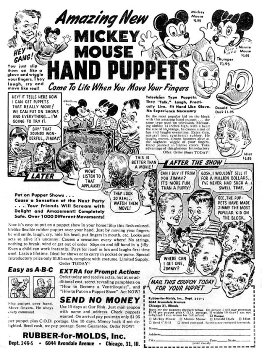
“More Fun Than a Puppy!” (Mickey Mouse Hand Puppets, 1949)
Although I was once a child, I don’t have children of my own and I don’t associate with anyone who does. [That sounds as if I’m deliberately avoiding people with young children, which is not entirely true.] So I don’t know what “kids today” do for recreation. Play video games? Watch DVDs and television? Go down to the old fishin’ hole with their pals? Stage scorpion vs. ant fights? I assume young children still play in groups, until they reach the age when they get a phone and start texting, says the grumpy old man (P.S.--get off my lawn). So I guess it’s vaguely possible that kids still put on puppet shows and other amateur theatricals for and with their peers.
Today’s object of scrutiny is an advertisement for the“Amazing New Mickey Mouse Hand Puppets,” back in the day (1949) when children had to make their own fun, darn it. Television was in its commercial infancy, “first” computer ENIAC had only recently been completed and—at 50 tons—was too large to be carried around in one’s pocket to play Fruit Ninja, and child labour laws had stripped kids (in the USA at least) of the opportunity to put in 12-hour days in factories, so they had a lot of free time that needed to be consumed. Hey kids, let’s put on a show!
As has been mentioned before, the advertisements in comic books of the late 1940s and 1950s are not always appropriate for what one would perceive to be the intended audience of the publication. This advertisement, seemingly aimed at children, appeared in the December 1949 issue of Romantic Confessions, a comic book whose readership was probably largely female and almost certainly teen-aged and above. There are only 3 ads in the whole issue (the inside front and back covers, and the back cover): for the Mickey Mouse puppets, the “Dornol treatment” for acne, and a photo enlargement service. On the other hand, perhaps the thinking was that adults (or older siblings) would purchase the puppets for children of the appropriate age to enjoy them.
[As an aside, Romantic Confessions was also where the “Giant Movie Cartoon Toy” ad appeared, discussed here. It’s interesting to note that in less than a year, Romantic Confessions went from 3 pages of ads to 10.]
There are many aspects of this advertisement worthy of comment. It’s loaded with art and text, requiring a considerable investment of time and effort on the part of potential buyers. You’ve got to read a lot to learn about this product, but that’s only fair when you’re being asked to spend $1.95 per puppet (equivalent in “buying power” to $19.51 today). That’s alright, more content for us to snark on!
Let’s start with the art, shall we? There are two basic visual components of this ad, the products themselves, and a comic-strip narrative. The strip artwork appears to be by the same person who drew the famous “Shoots Like a Real Gun” ad, while the drawings of the puppet heads resemble those in another Rubber-for-Molds ad. In particular, the “Idiot” puppet is identical to the “Idiot” mask. (As noted in the earlier article, this character somewhat resembles Alfred E. Newman and/or George W. Bush.)
The puppets themselves don’t look particularly interesting. Mickey Mouse is adequately represented, but Minnie has a glazed expression on her face. Thumper (from the film Bambi) is a grotesque cartoon rabbit, deliberately not resembling Bugs Bunny, while Donald Duck is not especially on-model (his head is too smooth, he’s missing his iconic cap, and his beak doesn’t look right). And then there’s “Idiot,” that famous Disney character...?
In case you were wondering, these puppets “are the same type used on television. Measuring almost 14 inches high, with a head the size of an orange...Extra thin, natural (not synthetic) rubber...hand painted in lifelike* colors.”
*[In another part of the ad, the puppets are referred to as “flesh-colored”—I suppose that means mouse-flesh, duck-flesh, and rabbit-flesh, in addition to Idiot’s human-flesh?]
The comic strip narrative tells the story of Jimmy’s journey from social outcast to the envy of his peers in only three panels. Jimmy reads an ad (just like this one) in a comic book (just like this one—spooky!) and learns he can “get puppets that really move!” Not like those puppets that...don’t move? Those are called “dolls,” Jimmy. His little sister Babushka approves.
Some time later, “Jimmy’s Puppet Show” is a sensation, despite the outrageous ticket price of two cents. Let’s see, he spent $3.90 on the two puppets we see, plus something for the sign, so he needs to sell approximately 200 tickets to turn a profit. Good luck kid! But it seems he’s on to something—or the children in the audience are truly starved for entertainment—because there is “applause” for his puppet show which is “better than a movie!” (but is it better than...a Disney cartoon?) We don’t get much detail about the content of the show, although in the scene depicted, Minnie appears to be demurely waiting for Mickey to kiss her, which he seems to be enthusiastically about to do.
“After the Show,” Jimmy is beseiged by admirers, one of whom offers to buy the Mickey puppet, claiming (rather obscurely) “It’s more fun than a puppy!” Jimmy refuses to sell, realising that “the puppets have made Jimmy the most popular kid on the block,” and once he no longer has his puppets, he’ll return to his previous grim and friendless existence, hated and shunned by all.
There are also two pieces of artwork for those unclear on the concept of what a “puppet” is: you “slip them on like a glove and wiggle your fingers...Slip puppet over hand. Move fingers. He obeys every command...Come to Life When You Move Your Fingers.” OK, I think I’ve got it. Put hand inside puppet, move fingers. Is that right? I don’t want to miss a step even though you claim it’s “Easy as A-B-C.” To be fair, it’s possible the copywriter wanted to distinguish these hand puppets from marionettes, and in fact the text emphasizes “No strings, nothing to break, wind or get out of order.”
The ad text reinforces the 3 basic themes introduced in the art: (a) these things are amazing; (b) they are easy to use; ( c ) they will change your life for the better.
How amazing are they? “They laugh, cry and move like real!” Yeah, no they don’t. These “Television Type Puppets”** can “’Talk’, Laugh, Practically Live” (notice “talk” is in quotes even in the ad copy). “He laughs, moves, almost becomes alive at the slightest wiggle of your fingers.” “Looks and acts so alive it’s uncanny.” In fact, we advise you to securely lock up these puppets at night, to avoid...accidents, if you know what I mean. Haven’t you ever seen those horror movies? “Completely safe,” the ad reads. Hmm...why did they feel compelled to say that?
**[Perhaps the most famous TV puppets were the Muppets (and the Sesame Street gang), Shari Lewis’s Lamb Chop, Howdy Doody, et al., but puppets were ubiquitous on television—local and network--from its earliest days. Early television programs utilised puppets because they were cheap and simple entertainment: the “costumes,” sets, and so on were miniature, multiple “characters” could be interpreted by one or two people, and these factors allowed shows to create a fictional world (or bring fictional characters into the “real” world) for much less than live-action or animation.]
Alright, I agree these puppets are pretty amazing. But aren’t they difficult to operate? I didn’t major in theatre arts at university, after all. Actually, “it’s easy to put on a puppet show in your home!” “Just by moving your fingers, he will smile, laugh, cry, hide his head, put fingers in mouth, etc...Slips on and off hand in a jiffy. Even a child can work instantly. No experience necessary.” “Over 1000 Different Movements!” (Sorry, complete list of movements not available.) For those who are still insecure about their abilities, purchasers also receive “secret revealing pamphlets on ‘How to Become a Ventriloquist’ and ‘How to Put on a Puppet Show.’” If there ever was something that deserved to be called “idiot-proof,” this product is it!
But wait, didn’t you mention something about these puppets changing my life? Why yes I did, very observant of you. If you put on puppet shows, you’ll “Cause a Sensation at the Next Party...Your Friends Will Scream with Delight and Amazement!” [Unlike the last party, where you demonstrated how to slaughter & disembowel a hog. Your friends screamed all right, but probably not in Delight and Amazement.] You’ll be “the most popular kid on the block,” if you don’t count Jonathan, Jordan, Joey, Donnie or Danny.
And don’t think your options are limited to backyard puppet shows only! These puppets are “Ideal for shows or to carry in pocket or purse.” Stuck in traffic? Waiting for a doctor’s appointment? Killing time in a holding cell until your bail bondsman shows up? Stuck with a boring blind date? Whip out your puppet and play with it! “Pays for itself in fun and laughs first time used.”
Don’t think a hand puppet can make your life better? Just watch Mel Gibson in The Beaver (2011). I never saw the end, but I assume it worked out well for him. (hint: it sort of didn’t)
Thanks Rubber-for-Molds! I didn’t want that puppy anyway!
0 notes
Photo


“Oh no! It’s My Undead Husband!”
(Horror from the Tomb & Mysterious Adventures horror comic covers)
A common trope in pop culture is the phrase “Oh no, it’s my husband!” uttered by a wife about to be caught cheating with another man (or a woman, a cartoon animal, etc.). [There are also examples of philandering husbands shouting “Oh no, it’s my wife,” but these seem to be less prevalent, possibly because the archetypal cuckold situation is a husband coming home early from work to catch his wife in bed with someone else, whereas pop culture suggests men cheat on their wives in motel rooms.]
This situation, tragic in real life, is used for both humourous and dramatic effect in popular culture. [Coincidentally, I was re-watching David Lynch’s Mulholland Drive last night and it contains such a scene.] It can be a joke (the lover hides under the bed, or in the closet, or jumps out the window, or the unfaithful wife makes a snarky comment to her husband, or the cuckolded husband makes a snarky comment to his wife), or result in violence or terrible emotional anguish. It’s interesting to discover that the set-up can also be used for...horror. And I don’t mean the horror of the betrayal of one’s marriage vows.
In today’s entry, we’ll examine several Fifties horror comic book covers which take the “Oh no, it’s my husband!” trope to an extreme. A quick perusal of horror comic covers turns up a not insignificant number of examples, including Beware 6, Dark Mysteries 4 & 15, and related covers (undead husband confronts wife, albeit not in the presence of her new lover) on Strange Mysteries 11 and The Vault of Horror 19. The two covers chosen for our post-mortem (see what I did there?) are Horror from the Tomb 1 (September 1954) and Mysterious Adventures 4 (October 1951).
Horror comics and crime comics were the primary offenders that caused the eventual creation of the Comics Code Authority in late 1954, which then led to the bowdlerising of comic book content for the next 3 decades (at least). Although comic books dedicated to “realistic” crime stories began in the early 1940s with Crime Does Not Pay, horror comic books came along later in the decade. EC became famous (and infamous) for its horror titles (Vault of Horror, Tales from the Crypt, Haunt of Fear, etc.) but many other companies jumped on the horror bandwagon in this era.
Horror from the Tomb, from small publisher Premier Magazines, lasted just one issue, becoming Mysterious Stories with #2. In his testimony at the Senate Subcommittee Hearings on Juvenile Delinquency on 4 June 1954, George B. Davis, president of distributor Kable News, said:
Mr. Davis: Let me give you a couple of illustrations. A man, one of our publishers, put out a comic last week. I found out about it and I insisted he kill it immediately. I have had people look through the editorial content and can't find anything too wrong with it, but the title itself.
[Chief Counsel Herbert W.] Beaser: What is the name of it ?
Mr. Davis: Tomb Horror. [sic] We killed it. I told the fellow not to print another one yesterday, when I heard about it.
Horror from the Tomb’s cover artist is unidentified, but—based on work appearing in the successor title Mysterious Stories--it appears to be George Woodbridge on pencils, inked by Angelo Torres. Before we get to the art and the wonderfully lurid text box, the extremely blatant ripoff nature of the cover design should be noted. Essentially, this is a “fake EC” comic. (1) the round, white company logo in the upper left corner (PM, “A Premiere Comic” and two stars) is virtually identical to the round, white logo in the upper left corner of EC publications (EC, “An Entertaining Comic,” and two stars). (2) The title logo lettering and placement “HORROR from the TOMB” resembles EC’s “The VAULT of HORROR” logo. (3) The inset thumb-nail artwork of the comic’s “mascot,” “The Keeper of the Graveyard” is extremely similar to EC’s “hosts,” “The Vault-Keeper,” “The Crypt-Keeper,” and “The Old Witch,” who were also depicted in thumb-nails on the EC covers.
[The interior stories in Horror from the Tomb were hosted by a very EC-like trio--The Gravedigger, the Graveyard Keeper and Grandma Gruesome—although only the second is featured on the cover (as “The Keeper of the Graveyard”: his name in the interior story is thus even closer to the EC nomenclature).]
Premier was hardly the only company to imitate EC’s cover style: Harvey (Chamber of Chills, Tomb of Terror), Ajax-Farrell (Haunted Thrills), Superior (Journey into Fear) and others were also shameless in their attempts to trick potential customers into purchasing their comics. It is interesting to note that when Horror from the Tomb was resurrected (heh, see what I did there...again?) as Mysterious Stories, the cover style was revamped, keeping the “PM” company symbol but changing the title logo typeface and dropping the thumb-nail of the Graveyard Keeper. Mysterious Stories began to carry the Comics Code Authority stamp with issue 3 (April 1955).
But, you may say, what about the undead husband?! Sorry, I got side-tracked there for a minute. First, the cover art is very good, certainly not a given for Fifties horror comics, with lots of style and detail on the skeleton-man and the gnarled tree & roots, etc. This is actually a quite “modern” looking comic book cover. It’s also nice how the revived corpse seems to be smiling as he lies in wait for his visitors. The dialogue balloons indicate Mr. Crewcut Cigarette-Smoking Hoodlum (possibly Mickey Spillane) and his Blonde-in-a-Slinky-Gown have returned after “five long years” to retrieve money they “buried with him.” Him? Who him? We’ll get to that. However, a couple of questions come up. Did they leave the shovel there for five years? Is her dress really appropriate for exhuming a corpse in the woods in the middle of the night? He’s wearing a purple jacket with a popped collar, but she’s got exposed shoulders and cleavage, isn’t she chilly?
Although the art and dialogue balloons explain the cover’s premise adequately, someone felt a text box loaded with the purple prose would be just the right touch of overkill: “This reeking, slimy corpse...was brutally murdered and his money buried with his crushed body! Now, his killer returned for his reward, bringing with him the faithless wife, who once loved this dead thing!” Ooh, now I get it...very slightly more than I got it before.
The text box concludes with “It can’t be, you say...but read...The Corpse Returns!” Sadly for any newsstand browser who was captivated by the exciting art and melodramatic writing style, no story entitled “The Corpse Returns” appears in this issue of Horror from the Tomb. But really, wouldn’t it have been anti-climactic anyway?
The second “oh no, it’s my husband” cover we’ll deconstruct today is Mysterious Adventures 4 (October 1951), a product of Story Comics.
Story Comics published only a handful of titles in its relatively short existence (1951-1955). The horror comic Mysterious Adventures was the company’s longest-lived publication, producing 25 issues over 5 years, the last two issues in the Comics Code era. William Friedman and Morton Myers were the publishers of Story Comics, which had fuzzy relationships with other ephemeral comic book companies like Master Comics, Ribage, Merit, Men’s Publications, etc. Like George B. Davis, publisher Friedman also testified in front of the Senate Sub-Committee on Juvenile Delinquency in 1954. The sub-committee questioned him primarily on the comic Dark Mysteries, about which Friedman said, vaguely “I am associated with the publisher and one of the people interested in the company as an officer of the company,” and was “assisting in the editing of that magazine.”
The cover of Mysterious Adventures 4 is also patterned after the EC horror comic cover style, albeit to a lesser degree than Horror from the Tomb. The vertical box reading “Amazing Tales” in the upper left-hand corner imitates similar boxes reading “Horror” (on Vault of Horror), “Terror” (on Tales from the Crypt), and “Fear” (on The Haunt of Fear), sort of a genre keyword. The title logo changed significantly five times during the magazine’s years of publication, but the version shown here was the most prevalent. The “motto” across the top of the cover—“Strangest Tales Ever Heard”—appeared on the first 10 issues, although it was moved down into the artwork with #6 and replaced on the masthead by “Thrilling Tales of Suspense” with #7 (and even this was later altered to “Thrilling Tales of Terror,” “Thrilling Tales of Mystery,” and, on the last issue, back to “Thrilling Tales of Suspense”). The text box reading “Tales of Horror” appeared on most issues through #13.
As an aside, “Strangest Tales Ever Heard” seems an odd choice for a comic book tag-line. Wouldn’t “Strangest Tales Ever Told” or “Strangest Tales Ever Read,” or “Strangest Tales Ever Written” have been more media-appropriate?
The last, minor bit of text on the cover is a box in the lower left-hand corner reading “Little Coffin That Grew.” This, contrary to what one might guess, is not at all related to the cover art, but neither is it a total red herring a la Horror from the Tomb’s ballyhoo of the nonexistent story “The Corpse Returns.” The first story inside Mysterious Adventures 4 is entitled “IF the Coffin Fits...Get In!” and this involves two brothers who buy miniature coffins that...grow. So it appears the cover blurb for “Little Coffin That Grew” references this story in an odd, oblique manner.
But on to the main attraction, the main cover art. We’ve got a green monster who looks like a cross between Shrek and the Hulk (he’s even got the purple pants!), standing in a cemetery holding a woman in his arms, as another man looks on, while being restrained by a skeleton. Makes perfect sense. The art is attributed to Bill Fraccio, a journeyman who worked in comics for more than 30 years (for 23 years he was a Charlton stalwart, often teamed with Tony Tallarico). Fraccio’s art here (and elsewhere) is a strange hybrid of cartoony (the moronic and catatonic looking monster) and realistic (the man and woman). This is not the worst drawing ever seen on a Fifties’ horror comic cover (not by a long shot), but it’s not very good, either. Fraccio is credited on one interior story in this issue of Mysterious Adventures, and his work is marginally acceptable there as well.
The “story” behind this cover is just about as well delineated as the one on Horror from the Tomb, but doesn’t have a text box to provide additional details. Unlike Horror from the Tomb, there’s no explanation as to why the blonde and her boyfriend are visiting a cemetery at night. Alright, maybe this is what happened: the blonde was getting ready to go on a date with her new boyfriend, when Shrek-Hulk burst into her room and abducted her. Boyfriend follows them to the graveyard, where the blonde shouts “It’s my husband!” [Question 1: did you recognise him? If so, Question 2: why did you marry a guy who looks like that?] “He says I must go with him! But look—that grave!”
Boyfriend, in the grasp of a skeleton (presumably one of the green monster’s supernatural friends), says “It can’t be! Jim was reported killed in Korea!” Once again, this raises some questions. If he was “reported killed in Korea,” that means his body would not have been sent back to the USA (because then his death would have been confirmed). And thus the grave where Jim aka Shrek-Hulk seems to be taking his wife can’t be his grave. Maybe it’s an empty one? Except...a headstone is visible. So Jim dug up someone else’s grave and is going to climb in there with his wife? Maybe it’s all a misunderstanding, and Jim doesn’t intend to chuck his wife into the open grave at all. Perhaps he’s taking her to Olive Garden for dinner!
[The reference to being “killed in Korea” is an interesting topical reference to the Korean War. A surprising number of non-war comic book stories in the first half of the 1950s allude to the war in some way, with boyfriends/husbands going off to fight, wives becoming widows, injured veterans returning, and so on.]
An alternative explanation would be that Jim was not killed in Korea. Instead, he became a dopey-looking green monster as the result of some sinister Communist mad scientist’s experiment, and he’s been sent back to the USA to destroy the rotten capitalist system from within. He’s the original Manchurian Monster Candidate! But he got sidetracked when he bumped into his wife, foiling the Reds’ plan. So she’s actually sacrificing herself to save her country. She’s the Greatest American Hero!
[As another aside, is anyone else suspicious of the boyfriend? “Oh, I can’t get away!” Yes, I’d love to fight that ugly monster to save you, my darling, but I’m being restrained by this skeleton. How tragic! I’d gladly risk my life, honestly, but I’m helpless, as you can plainly see!]
Marriage, so I’ve been told, is a wonderful institution. Unfortunately, marriages occasionally (alright, frequently) have problems, and infidelity is one of these. So as long as we have cheating spouses, we’ll always have situations where we’ll hear “Oh no! It’s my husband!” Bad? Sure. But “Oh no! It’s my undead husband!”? Worse.
0 notes
Photo

“In Blinding Color!” She-Devils on Wheels poster
The late Herschell Gordon Lewis is best-known for his ground-breaking gore films of the 1960s, beginning with Blood Feast and continuing with 2,000 Maniacs, Color Me Blood Red, The Wizard of Gore and so forth. However, his directorial career also included some non-horror pictures such as The Blast-Off Girls, This Stuff’ll Kill Ya! and Suburban Roulette. She-Devils on Wheels was one of these, a combination of sexploitation and the popular biker genre (Hell’s Angels on Wheels, The Wild Angels, Hell’s Angels 69, etc.). While the majority of biker movies had male protagonists and featured women only in subsidiary, sex object roles, there were some woman-centered examples, including Hell’s Belles, The Mini-Skirt Mob, The Hellcats, and She-Devils on Wheels (1968).
Like female-centric Westerns, the lady-biker films got a lot of mileage out of playing against gender and genre expectations: OMG, there are women riding motorcycles (and not as passengers, clinging to their hairy boyfriends’ backs)! They’re tough! They’re assertive! And they’re also sexy! Maybe even a little kinky (lesbianism is either strongly implied or overtly stated in most of these).
This one-sheet poster for She-Devils on Wheels is a good example of exploitation marketing. If not spectacular in terms of its graphics, it’s well-designed and well-written. [A quick web search will turn up some other versions, including re-releases, which use some of the same tag-lines and images (one of them repeats the “foot stuck out” photo seven times!), but this is the best and probably the original poster for the movie.]
It’s ironic that one of the tag-lines is “In Blinding Color!”, given that the poster is a cheap duo-tone job, rather than a full-colour piece of promotional paper. The orange and green colour scheme is effective and the black-and-white photos are satisfactory, but this type of printing merely reinforces the low-budget nature of the production (and while most U.S. movies were in colour by 1968, perhaps the “Blinding Color!” tag-line was meant to reassure potential audiences that the film itself was not black-and-white).
As an aside, I’m not sure “Blinding” is an appropriate adjective for a colour film. Would you promote “Deafening Sound!”? Perhaps H.G. Lewis—who later had a lucrative career in direct marketing, but is not necessarily the person who wrote the poster text—was influenced by his posters for Blood Feast (“Nothing So Appalling in the Annals of Horror...You’ll Recoil and Shudder...”), 2000 Maniacs (“Brutal...Evil...Ghastly Beyond Belief”), Color Me Blood Red (“It will Leave You Aghast!”), and The Gore Gore Girls (“Nothing Has Ever Stripped Your Nerves as Screamingly Raw”). These tag-lines all promise emotions and experiences one would not normally associate with entertainment. Blood Feast and 2000 Maniacs! were advertised as being in “Blood Color,” while Color Me Blood Red ballyhooed “Crimson Color,” The Wizard of Gore claimed to be in “Devastating Color," and the hillbilly film Moonshine Mountain was in “Lightnin’ Bright Color” (referring to “white lightning”). So perhaps they simply couldn’t think of an adjective that related to motorcycle gangs. Roaring Color? Violent Color? Cycle-Pathic Color?
The design of the poster is effective, with two large blocks of solid colour at the top and a montage of black-and-white photos in the lower left quadrant. In the upper right is an image of a woman riding a motorcycle, leg out-thrust, and a diagonal line that leads the viewer's eye to... a photo of a motorcycle rider getting his head cut off!? Yes, this represents the actual climax of the film, in which the female gang (known as the Man-Eaters) eliminates their arch-rival by stringing a wire across the road and decapitating "Joe Boy." On the poster it isn't exactly clear what’s going on, but it's amusingly shocking nonetheless. [In the film itself it's not very impressive, accomplished by a couple of quick cuts and a shot of a mannequin head spinning through the air.]
The leg-out cycle rider image is more or less the "key art" for She-Devils on Wheels, appearing in the movie itself multiple times (as a spinning scene transition) and on variant posters. The large photo of a woman reclining on a motorcycle is also seen in other media: it's actress Betty Connell, who plays "Queen," leader of the Man-Eaters. In this image she's wearing white jeans and black boots, but in the film she also displays a variety of other colour-coordinated outfits, including yellow pants and pink boots, black pants and white boots, etc. She also favours long-sleeved tops and a leopard-print vest.
The four black-and-white photos at left are typical of the vignette or thumbnail movie poster style, although the “See!” comments are moved to the right-hand side of the poster and do not appear to directly correlate with the images. The pictures are split between two shots of motorcycles and two interior scenes: one shows a couple of Man-Eaters roughing up a man, and the other features a fully-clothed “orgy.” This photographic quartet thus encapsulates the film’s motifs: women riding motorcycles, violence, and sex.
The poster’s text starts off with a pull-quote from “The National Insider” (not to be confused with “The National Enquirer”). “The National Insider” was an actual publication—“a second tier tabloid” published by Ralph Ginzburg from at least the early Sixties into the early Seventies—but it’s not known if this particular quote comes from their review of She-Devils on Wheels or not (probably not—heck, I don’t know if they even ran movie reviews). “By far the most exciting picture of its type ever filmed”—of its type! That’s quite a qualifier. Do you mean the female motorcycle gang picture “type”? The low-budget, shot-in-Florida, exploitation picture “type”? A decapitation-featuring picture “type”? The dominant-woman themed picture “type”? A “H.G. Lewis-directed “type”? [National] “Enquiring minds want to know!”
The two major tag-lines--“Soft, Hell!” and “Guts as Hard as the Steel of Their ‘Hogs’!”-- seem more suited for a war movie than a motorcycle gang film, but they do attempt to convey how tough these women are. For anyone who’s been disappointed by the disconnect between a film’s content and the merchandising, She-Devils on Wheels more or less delivers: the Man-Eaters are anti-social and violent, despite their pastel-coloured shirts. So yes, they’re tough women.
If the major tag-lines reinforce the rough and violent nature of the Man-Eaters, the tag-lines that appear under the film’s title tilt in the sexual direction. “See! The Authentic Initiation Ritual Never Before Dared on Film.” I’m not fond of the “never before dared on film” phraseology—shouldn’t it be “never before shown on film?”—but I’ll let it pass. “See! Man-Eaters on Motorcycles, Feared By The Men They Use As Lovers.” “See! Female Hellcats Ruling Their Men With Tire-Irons As Their Instruments of Passion.” Both of these seem to be pitching She-Devils on Wheels to the submissive-male demographic, flipping standard genre/gender-tropes by making women bikers the sexual aggressors. That’s fine, but I’m not too sure about using “Tire-Irons As Their Instruments of Passion”!!? Does that mean what I think (and fear) it does? Well, clearly not, since this is a mainstream (albeit exploitation) movie that doesn’t even have any nudity. But I can’t really think of any alternative explanation, unless the Man-Eaters are getting erotic thrills (“passion”) from hitting men with tire-irons. Yeah, that’s got to be it, erase any other, potentially painful images from your mind.
She-Devils on Wheels, according to most reviewers, doesn’t live up to its ballyhoo*. Are you surprised? It doesn’t cost anything or take much of your time to just look at a film poster (or a book/magazine/comic book cover): but if you fall prey to the siren’s song and decide to invest your money and time in actually purchasing the product, well...don’t blame me.
*[As of this writing, you can watch it yourself here and see if you agree.]
#movie poster#herschell gordon lewis#she-devils on wheels#motorcycle movie#biker movie#dominant females#exploitation movie poster
0 notes