Statistics
We looked inside some of the posts by michellekarenw and here's what we found interesting.
Average Info
Notes Per Post
36
Likes Per Post
20
Reblog Per Post
16
Reply Per Post
0
Time Between Posts
1 day
Number of Posts By Type
Text
5
Photo
12
Last Seen Tumblr Blogs


Fun Fact
China blocked Tumblr because of pornography and censorship problems in 2013.
Text
Online Reflective Journal
I had genuinely enjoyed this course. Not only did I learn a lot of new knowledge and understandings from the tutorials and lectures, but I had also honed my skill-set to be a better designer. The tutorials and lectures of this course are entertaining while also informational, the teachers and lecturers are humorous and I have never been bored of the sessions from this course. Even though we had sadly switched to online classes due to the pandemic, the classes were still very entertaining and effective.
I felt that the projects were different than the other courses - they were a lot more enjoyable, it gave more space for personal creativity. They were quite liberating, however in certain times I would get confused on what to create since there were no specific set of rules attached. This would result me into brainstorming for hours while also scratching different ideas multiple times. I also realized that somehow I tend to hold myself back when making a design as my authentic style may not look as aesthetic or professional, thus I restrained that urge and created more 'pleasant’ works, however it does not express myself fully but I am making progress changing this.
The projects are definitely pleasurable to complete, especially making the zine. My favourite part of that project was during the page layout and collage design and finding an aesthetic which suits the topic well. Initially, I did not like the idea of documenting things I have learned or created in tumblr since I am not the type of person who likes updating daily on my activities, but overtime as I post more often, I find myself more keen in using this platform.
It is quite sad how this course must come to an end. It was a great experience and this course marked a great impression towards me and made me grow as a better designer.
2 notes
·
View notes
Photo
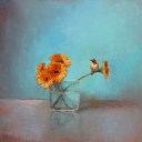
Wow! I love the layout page, it fits the aesthetic perfectly. Page design looks neat and easily readable. Great use of colour and I like the illustration on the cover. Amazing!


Zine - Final Work in progress
This is how my final layout looks like for my zine after I have discussion with Ben through email and in class. I was quite confident after I get feedback from Ben about my layouts.
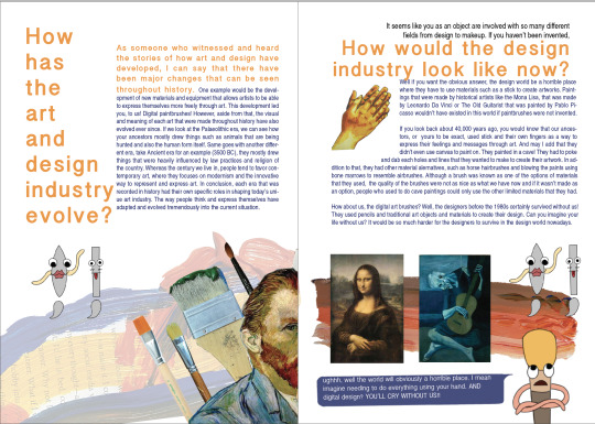
During the process for my final, I have changed some of my layouts from previous one as some of them looks lack of elements to support my subject and I felt like something is missing. I changed the arrangement of my elements (geoetric shapes/ lines and typeface) as when I exported my pages into spread pages and I realised that my layouts are not quite attractive. So, in my question 3′s layout, I have added some elements on the right part so it doesn’t look too blank. Same with the layout for my question 4, which I decided to move the ‘Basker’ type into middle so it can fill my entire pages in both sides. I have play with negative space but I didn’t left it a lot, in order not to look boring.
6 notes
·
View notes
Photo
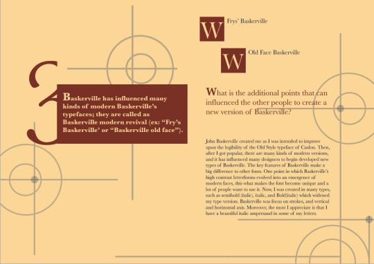
I really like the idea how you characterized the brushes, it makes the zine fun to read. Love it!! This is such a great zine wow.

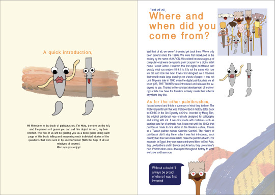


Project 3
After the consultations and feedbacks I’ve gotten from Ben, here is my final design. I had chosen a natural colour palette to tie the pages all together. In the pages where the interview questions are shown and written, I had decided to keep the background white to represent with the colour of a canvas. This way it’ll represent how each questions were painted and crafted on a piece of canvas. Secondly, I decided to allow the zine to have two particular characters that I am interviewing to represent the rest of the paintbrushes. This way it’ll help the audience to understand the content of my zine better and to prevent the zine being overwhelming to read. Thirdly, to show what paintbrushes create, I decided put a number of different paintbrushes strokes to both decorate the pages itself and to what paintbrushes do and make in the art/design world. Finally, I tried to make my zine to have a fun atmosphere by creating a comic of scenes of what the paintbrushes have to go through every time they’re being used and also short dialogues of the paintbrushes’ opinions in between each questions. This way, it can also show the characteristics of each paintbrushes that I was aiming on showing on my last design.
11 notes
·
View notes
Text
Great video! I loved the editing and effort you have put in the video. It was very informative and engaging. It must’ve took a lot of time but it turned out amazing :)
Project 3 Video

Red Telephone Booth - Giles Gilbert Scott | Hananta Dharma
This is my final work on the video and oh boy that took some time. This was my first time editing a video that is very detailed in all aspects such as sound, graphics, and effects. I found myself enjoying the process because I also learned lots of things in doing it from Google and YouTube. However, it was also quite frustrating and challenging at the same time. There were lots of times that what I did, did not match my expectation and is just different from the tutorials I watched on YouTube. Finding the right theme for this short documentary is quite tricky for me because I never actually made a theme for a video. Another challenge that I had to face was to find the information on Giles Gilbert Scott. There is just not much information about him and just a handful of YouTube videos about him and his works. It felt like the information I gave was very shallow and I did not dig enough. Making the visual effects also took me a long time. I had to make sure that it corresponds to what I am talking about.
All in all, I am happy with what I made and I hope it is informative as well as easy to be understood.
Link to the video on YouTube: https://youtu.be/SnBWlG4f7ZE
5 notes
·
View notes
Photo
Week 12 Lecture
Recap + Decolonising Design
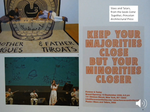
This week’s lecture we recapped about the previous lectures we had through the semester. Andy and Karen also added a bonus content with the topic of decolonising design. The idea of decolonising design is to open up our perspectives and look at questions of gender in design. Female designers are mentioned to not get as much recognition than male designers. However, nowadays female designers are thriving and getting more of the appreciation they deserve.
[Thought] This was the final lecture of the course, and after looking through at what has been discussed in the lectures, I realized how much it expanded my knowledge regarding the whole idea of design. I never really looked into how female designers have been underappreciated compared to male designers, but now I understand the issue more clearly and glad that is changing for the better of female designers.
Anni Albers
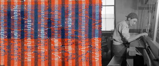
Anni Albers (12 June 1899, Berlin - 9 May 1994, Orange) was one of the most significant textile artists of the 20th century. She works with striking geometric patterns and her works are noted for a radical use of color that helped pioneer the Modernist movement. She studied under Martin Brandenburg and also with Paul Klee at the Bauhaus school, where she became a teacher herself. Throughout her life she experimented with materials and inspired a cultural reassessment of fabrics as an art form.
Tolu Coker
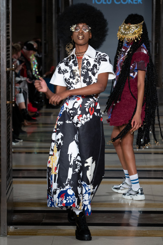
Tolu Coker is a young British-Nigerian Fashion Designer, Textile Designer and Illustrator from London. Following several successful stunts at Maison Margiela, J.W. Anderson and Celine, Coker graduated from the prestigious Central Saint Martin's Design school in June 2017 with First Class Honours. Mostly inspired by the politics of identity and social climates, Coker’s designs are influenced by her multi-disciplinary practice and artisan craftsmanship merged with the use of innovative technology.
Nina Katchadourian
Nina Katchadourian is an multidisciplinary artist whose work includes video, performance, sound, sculpture, photography and public projects. Her possibly most famous project is called the “Sorted Books”, in which Katchadourian rearranges the contents of private and public bookshelves so that the books’ spines read as a consecutive statement. Other series have featured such idiosyncratic subjects as subway maps, mascots of common cleaning products, the sound of popping corn, car alarms, birdcalls, and items available on airplane flights.
image 1 is from the lecture
image 2 https://www.tabletmag.com/sections/arts-letters/articles/anni-albers-tate-modern
image 3 http://www.tolucoker.com/
image 4 http://www.ninakatchadourian.com/languagetranslation/sortedbooks-bookpace.php
Resources:
http://www.artnet.com/artists/anni-albers/
http://www.tolucoker.com/new-page
http://www.ninakatchadourian.com/bio.php
https://www.artsy.net/artist/nina-katchadourian
0 notes
Text
Zine Wrap Up
Finishing the zine created a sense of achievement. This was my first time designing a self-published work and found myself enjoying the process of creation. It was fun yet quite challenging to think of the different aesthetics and concepts to match the topic. At first, I was absolutely clueless on what topic should I do for my zine, how to come up with decent questions and design the zine. I had to look for inspirations online, and after what felt like endless browsing, I found a concept that hit the target for me: Dada. I love out-of-the-ordinary art and finding dada felt like hitting the jackpot for me.
There were quite a number of challenges I faced during the process. One was when I was researching it had turned out that dada did not have a vast amount of information. Sure, the sources of research were abundant but information felt limited. The numerous of websites I went to had similar, if not the same repeating knowledge, regarding dada. Thus, this is the reason why I had to change several of my original questions. Thinking about the different layouts for the pages were also quite challenging since dada pages are usually quite wonky and experimental. Nonetheless, I genuinely enjoyed doing this assessment!
Link to my zine on issuu:
https://issuu.com/michellekarenw/docs/dadazine
2 notes
·
View notes
Photo

I incorporated the same colour spectrum to suit the aesthetic I was aiming for. This does seem quite plenty to look at, however it was my intention to design a more chaotic dada zine rather than a calm-looking one. As I progressed through designing the pages, I had solidified my decision to stick to a neutral-brown colour palette and included a “Dada renaissance” theme for my zine.
I find that the colour brown suits the concept of dada very well - it was an art movement birthed a long time ago and brown seems like a “mature” colour; a lot of the artworks incorporate faded or pastel colours; generally bright and vivid colours (such as blue yellow pink) are leaning more towards more modern art movements. You might also ask me why I had chosen to create a renaissance-based theme for my zine. Going back to when I first googled about dada, I had been browsing the images to get the basic grasp of what the art looked like, and the first image which caught my eye was the painting of the Mona Lisa with a moustache. I had found it quite comedic and liked the idea of using renaissance paintings to be part of my collages.
5 notes
·
View notes
Photo

Tried different layout placements for one of the pages of my zine. The layout of the page was inspired by a 2017 graphic interpretation, created by Camilla Serrao, of the Dada manifesto by Tristan Tzar (bottom right picture).
1 note
·
View note
Photo

Tried to experiment more with collage and incorporate different elements.
0 notes
Photo


These are more layout trials. I had thought the first two looked quite messy and it was difficult for the eye to concentrate on which section to read first. I decided the third layout was the best since it had a good amount of negative space and the text is properly placed on one side, however with a mischievous tail at the end.
0 notes
Text
Dada Research References
Artland Magazine. n.d. What Is Dadaism, Dada Art, Or A Dadaist? [Complete Guide]. [online] Available at: <https://magazine.artland.com/what-is-dadaism/> [Accessed 2 June 2020].
Griffin, B., n.d. Dada. [online] SlideServe. Available at: <https://www.slideserve.com/benedict-griffin/dada> [Accessed 2 June 2020]
Kordic, A., 2016. DADA Movement In Practice - From Collage To Readymade. [online] Widewalls. Available at: <https://www.widewalls.ch/dada-collage-readymade/> [Accessed 2 June 2020].
Moma.org. n.d. Moma | Dada. [online] Available at: <https://www.moma.org/learn/moma_learning/themes/dada/> [Accessed 2 June 2020].
Slideshare.net. 2011. Modern Art Powerpoint Pdf. [online] Available at: <https://www.slideshare.net/trinapowers/modern-art-powerpoint-pdf> [Accessed 2 June 2020].
Tate. n.d. Dada – Art Term | Tate. [online] Available at: <https://www.tate.org.uk/art/art-terms/d/dada> [Accessed 2 June 2020].
The Art Story. n.d. Dada - Important Paintings, Collages, Photos. [online] Available at: <https://www.theartstory.org/movement/dada/artworks/> [Accessed 2 June 2020].
Trachtman, P., 2006. A Brief History Of Dada. [online] Smithsonian Magazine. Available at: <https://www.smithsonianmag.com/arts-culture/dada-115169154/> [Accessed 2 June 2020].
Wilshere, A., 2018. The Dada Movement: 5 Lessons For Today’S Designers. [online] Available at: <https://trydesignlab.com/blog/dada-movement-art-5-lessons-designers-dadaism/> [Accessed 2 June 2020].
Visual-arts-cork.com. n.d. Dada Art Movement: History, Characteristics, Artists. [online] Available at: <http://www.visual-arts-cork.com/history-of-art/dada.htm> [Accessed 2 June 2020].
zuerich.com. n.d. 10 Facts About Dada. [online] Available at: <https://www.zuerich.com/en/visit/10-facts-about-dada> [Accessed 2 June 2020].
0 notes
Text
Dada Questions Refresh
After diving deeper into research, I noticed how it was difficult to find answers for some of the questions which I originally planned on using for my zine. Thus, I have changed and refined a few of the questions. Now my questions are:
Q1: You’re known for your nonsensical art, do you think you have reached the limits of adding nonsense in art?
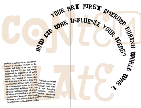
Q2: Your art first emerged during World War I, how did war influence your ideas?
Q3: You were short-lived lasting around 5 years, what caused your death?
Q4: Your peculiar concepts broke the rules of art, did it have any significant impact to art itself?
Q5: Can anyone be a dadaist or are there any specific criterias for your art?
0 notes
Photo


Before continuing further with my Dada zine, I looked at some modern book page designs relating to Dada for inspiration. All of the examples displayed a well-considered Dada aesthetic. While scrolling through the pages of these books, I observed a few features which I might be able to add to my designs:
1. There should be a colour theme.
2. The use of negative space should be included.
3. Play around with different angles and capitalization of text.
4. Use different fonts to highlight what is needed to be read.
5. Fonts are usually small to help with negative spacing.
Resources:
https://www.behance.net/gallery/50868933/DADA-zine-Sreda-issue-12
https://issuu.com/nadhirahfaiz/docs/dada
https://issuu.com/camserrao/docs/dada_2o17
0 notes
Photo


Week 12 Tutorial (Last Week of Class)
This was the last online learning session for the first semester. Ben showed us some more examples of zines and shared very useful websites to get inspiration from. Afterwards, we did a photoshop exercise where we had to re-design the page layout. We had to change the layout of the original normal page to become image-dominant, text-dominant and also experimental. The images above are the designs I have created in the brief period of time. Personally, I love experimenting with designs so I did enjoy creating these! After some time, Andy joined the class and I find that the personalities of Ben and Andy are really fun, lively and humorous and I do like listening and learning from them. This semester’s classes (tutorials + lectures) in communication design have been a blast and I thoroughly loved and enjoyed learning from this course.
2 notes
·
View notes
Photo

I had e-mailed Ben to get feedback on the progress of my zine. He had showed me a few examples of dada zines, and the pages were a lot more simple than the ones I created. However, I noticed how the text placement was different and scattered. This technique of putting text in random places will be influential to my zine.
http://dada.lib.uiowa.edu/items/show/56
0 notes
Photo


I tried to experiment with collage to create a couple of pages for my dada zine, which I have done with Adobe Photoshop. I had planned the first image to be the opening image after the cover, the other to be a page to put the question in. The page showcases a “dada poem” with the idea of ‘the abstraction of the world’ as dada poems had co-existed with dada art. I had also thought that the collages in dada had many elements that were “stacked” and “duplicated” with each other, thus I had attempted to recreate that as well.
2 notes
·
View notes
Photo


Week 11 Lecture
What’s next for Communication Design?
During this lecture session, Andy and Karen discussed about the future of communication design. Many examples were included in the discussion, such as creative technology which can be beneficial for society. They discussed about parametric design and also the idea of working with data to change design. Karen and Andy also shared the machines which they had make, Live Draw, Trumpet of the Swan and Library of Nonhuman books, which are inventive.
[Thoughts] I understand that design has been more digital-based nowadays and parametric design does help to give accuracy into a design. It is very exciting to see new innovative inventions being created in this modern society, with the benefit of advancing technology and artificial intelligence. However, I have quite a fear that AI can replace designers in the future since they may be considered to be more efficient and precise. Hopefully technology and new design systems will benefit designers, rather than replacing them, to create other-worldly creations.
Parametric Design

Parametric design adds dimensions and any other specific information needed for functionality and manufacturability. It supplies all the dimensions, tolerances, and detailed materials information critical to the design consistent. Parametric design lets you specify the key parameters of the project and make changes interactively, with the model updating automatically.
Inspirobot (https://inspirobot.me/)


“I am an artificial intelligence dedicated to generating unlimited amounts of unique inspirational quotes for endless enrichment of pointless human existence.“ This website generates random posts which are ‘inspirational’.
This Person Does Not Exist (https://thispersondoesnotexist.com/)

The site is the creation of Philip Wang, who is a software engineer at Uber, and uses research by chip designer Nvidia to create a never-ending stream of fake portraits. It uses AI to generate fake visuals. The algorithm behind it is trained on a huge data set of real pictures, then incorporates a type of neural network known as a generative adversarial network (GAN) to create new examples.
first two images are from the lecture
image 3 http://www.parametricdesign.net/
image 4 and 5 generated from https://inspirobot.me/
image 6 generated from https://thispersondoesnotexist.com/
Resources:
https://www.sciencedirect.com/topics/engineering/parametric-design
https://inspirobot.me/
https://www.theverge.com/tldr/2019/2/15/18226005/ai-generated-fake-people-portraits-thispersondoesnotexist-stylegan
0 notes