
Statistics
We looked inside some of the posts by mika-rd and here's what we found interesting.
Average Info
Notes Per Post
0
Likes Per Post
0
Reblog Per Post
0
Reply Per Post
0
Time Between Posts
2 days
Number of Posts By Type
Text
10
Photo
7
Last Seen Tumblr Blogs


Fun Fact
Tumblr has a low social media market share in South America.
Text
Figuring put exposure
showing the mixed medium approach
sizing for poster - done with the measurements given for the shelf

I want it to simulate a teens girls wall, so it quite mismatched and I decided not to print just one thing to an exact dimension, it will be printed on different papers
the space to work with

*updates to come, poster printed
need:
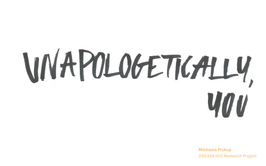
1. unpaolgetically you in a3 cut and printed opposite colour to the others chose
2. explanation in a3 or a4?
3. anything else thats needed, that’ll looked good, mirror?, imagery?
4. cause you are worth on shelf no panel printed normal writing
5. business card, design figure out if needed
6. layout
7.photograph
8.buy bigger rice paper to compliment
9.domain name
10. things you’d write with
but what if i want to be me
0 notes
Text
Presentation and Script
there were some small changes in what I submitted and what I showed as it was rushed mainly in background colour and look, not content as it coudln’t make changes like that
Presentation


Script


0 notes


Text
Report Designed
it will be printed and sew bound like the zines with same thread colour


0 notes


Text
Poster and intro
I felt like the kit needed to keep the teens interested and be a reminder but also a pretense
Intro
I felt like you needed something that when you first open you read, I thought about having the steps on it but it seemed a bit redundant, having too much info in the introduction as the first thing you read...
One

Two


*dropped the second page, plus half of the page gets cut off to fit into the kit's box
The poster
Ideas - as understand new perspectives - know that the perspectives you feel pressured by are not the only way - or cause being you is fucking worth it to keep it consistent.
a remembrance that can be left up, trying to choose between the colour was just too hard as I’ve used both throughout and this is exactly my colour palette, so I choose to do it double-sided to leave the decision up to the teen to what they are feeling and what suits them more


and printed it ended up looking sick double sided
Test prints
The orange felt too much I needed to match it to the zine, otherwise, there would be too much orange with the intro already orange, but not only that I was on my last large orange piece and it got stuck in the printer, I guess fate works in funny ways.


0 notes
Text
Journals
the journals are intended for the outlet aspect of the kit, all emotions are welcome, I know what I want and these are meant to be quite simple
The og working it out ideations


*a lot of noting on the pages
Development Two


figuring out sizes to go on the books with overlap, still not set on what four prompts should be one the covers, but think I have the final two
Final Developments before printing


Final printing developments just needed a load of test printing to get it right, it was a process to get it towards the rice paper, which was not originally intended but I loved the aesthetic and felt like it fit with the very DIY look but like the slip I originally intended to a have card instead of paper but it was far too rigid.
the process


0 notes
Text
Zine Two
Less refining as it was done on paper and I knew exactly what I wanted as it was a follow on from the first zine to empower teen girls into being themselves


Developments, before final
*there were edits in between but I saved over oops
But continuing on with the halftone imagery theme as well as the vibe of the first zine.


0 notes
Text
Slip
Measurements needed for the slip

sizes needed for a slip to cover the box

Figuring out the slip - sizes, card or paper thickness, and colour
although I was pretty set on orange I trialed others..as much as I wanted the card to work around the box it just didn’t so I stuck with paper in the end and it worked even better than I thought it would.


Words, figuring it out, test printing before printing at a2 size - it will be 14cm in height


Final print file


*will be printed on orange paper
0 notes
Text
Colour Palette and the Kit
Final colour palette,Orange to end the Colour Palette battle
aswell as it being a pretty sick colour, it is orange energizing empower, Orange - empowering-pink not a slickly leading through the awkward times for growing up in this male orientated world
Inpsiration

*I am going to look through Pantone orange to find an orange colour that suits better, I will complement with greys and black
The Kit is a intro to being yourself, prompted through the obvious tin to hold all material and...
two zines
4 journals
a intro to the kit
a poster
earlier brainstorming that i forgot to add, that was benefically to the making of the kit


0 notes