
Don't wanna be here? Send us removal request.
Statistics
We looked inside some of the posts by millanowinski and here's what we found interesting.
Average Info
Notes Per Post
1
Likes Per Post
1
Reblog Per Post
0
Reply Per Post
0
Time Between Posts
15 days
Number of Posts By Type
Text
6
Last Seen Tumblr Blogs


Fun Fact
Premium Tumblr themes are available from anywhere between $9 to $49.
Text


Photo 1: This is a data visualization. In this graphic, I believe that it is trying to spread misinformation visualization by flipping the y axis from where it traditionally has always started. This makes the visualization of the data seem opposite of what it really is, which in this case would make people think that Florida's "Stand Your Ground" law has decreased gun deaths when it has actually increased in the years surrounding it. It is attempting to change the viewers perspective of what they are seeing and or manipulate it.
Photo 2: This design is part of a larger identity system. The design and logo on the remote is part of a larger identity system for the company Amazon. The design is consistent with the typography, text alignment and imagery that the company uses on the rest of the products. Amazon has achieved one of the most recognizable large identity systems by using a consistent logo and design across all their products no matter what it may be.
0 notes
Text


Photo 1: This piece of design has a denotative meaning. The denotative meaning of the design is that the name is "alloy". This is because the main ingredient in the product comes from aluminum alloy. It is only expressing its main meaning and it has no ideas or emotions that people can try to connect it to. It is telling you what the product consists of and what the product is. It has no other intentions besides telling you what it is.
Photo 1: This piece of design also has a connotative meaning. The connotative meaning of the name "alloy" could be that the product is as strong and resilient as aluminum alloy. Aluminum alloy is exceptionally strong and it may be trying to express other ideas to imply its strength and resilience besides just a main idea of what it is. It could be trying to get people to think more deeply about its meaning over just the product itself.
Photo 2: This design has an iconic function. This sign's iconic function signifies that the road comes to an end and you could either turn right or left by using the arrows pictured. It represents the meaning of what you are supposed to do and what you are supposed to acknowledge. It is only showing a picture, yet it is expressing a meaning to drivers when they come across it. It's simplistic and its only goal is to represent its function.
Photo 3: This design has an indexical function. This sign uses the picture to indirectly suggest that this item should not be used or associated with young children because it could be a hazard. It is a picture that indirectly represents its meaning. It can be associated with something else than just the actual picture and it associates its function. It's not telling you directly what its meaning is but the picture is still expressing it.
Photo 4: This design has a symbolic function.This sign clearly portrays its meaning by using words in the design that clearly state "STOP" to signify that there is an intersection where a stop is required. It is a symbol that signifies its meaning with the words that tell you its function. It is telling you what you are supposed to do with a design using words.
Photo 5: This design references a past idea. I think that this design is trying to represent the history of the university. This design is more intricate and shows more detail of the classic values and history that the university is trying to portray with the retro design on the jacket. It is attempting to signity its values by referencing the style that was used.
0 notes
Text
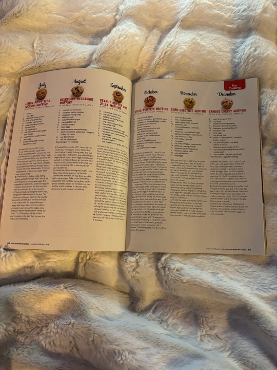

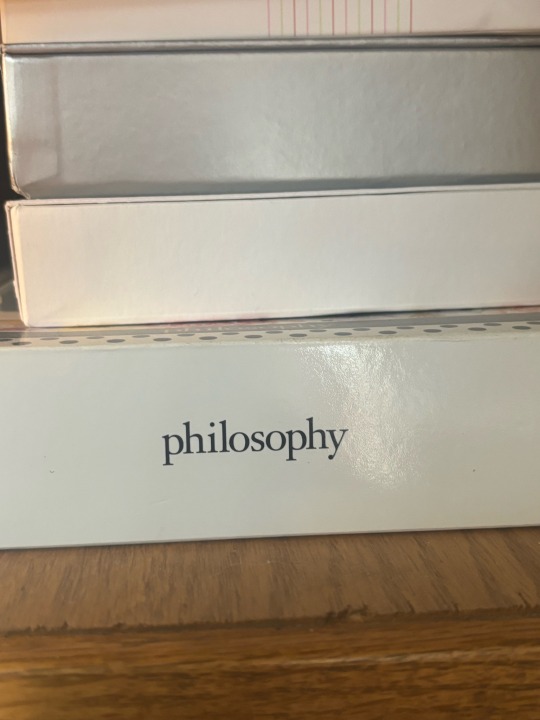
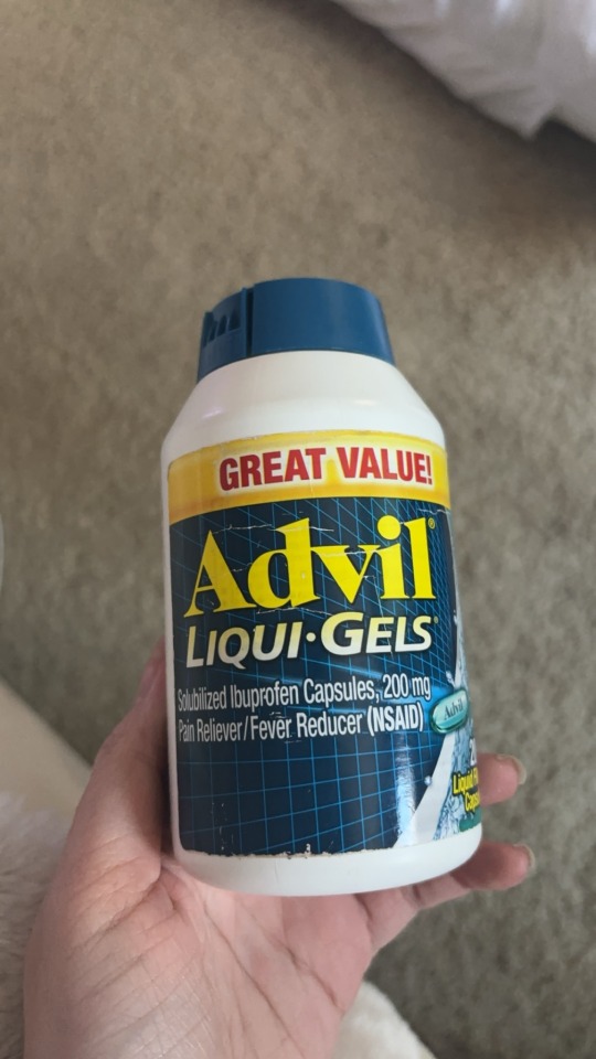
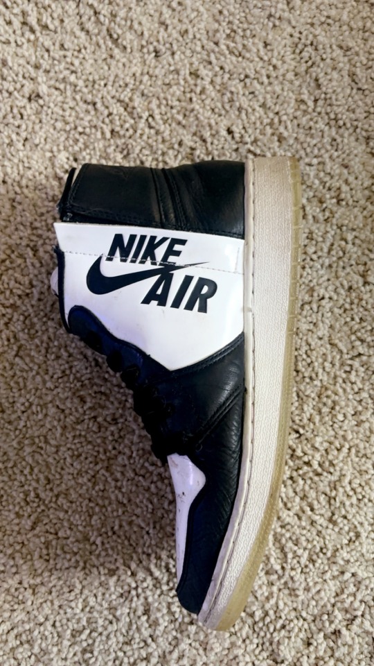
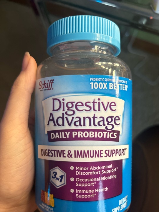
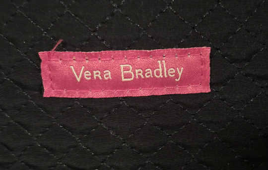
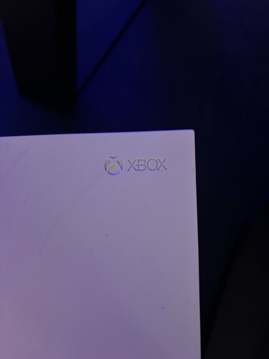
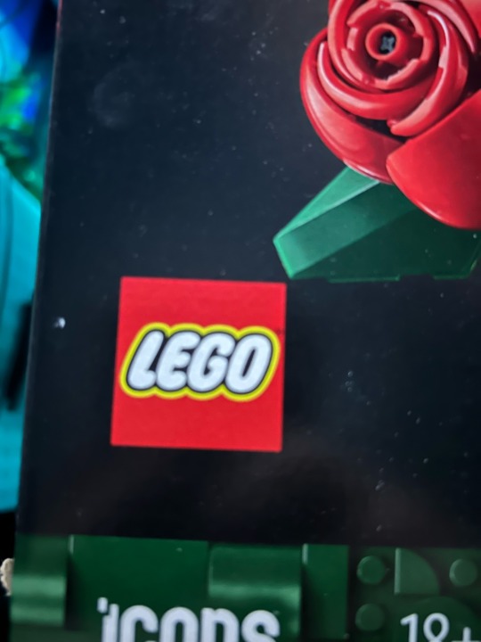
Photo 1: There is a use of rhythm in this magazine. This page allows the viewer to view the instructions of how to make certain muffins without being distracted. The focus of the topic flows from one page to the next. It allows the viewer to pick up the importance of the topic.
Photo 2: The page in this book uses typographic hierarchy. You can see that section of the book is in bold (the topic of what you are about to read) whereas the rest of the writing below it is not bold, using a smaller more simplistic font. It allows the reader to understand the focus of the reading before reading it and also keeps focus on the actual reading itself.
Photo 3: In this photo you can see the word “hismile” with letters that have an ascender. These letters are “h” “i” “i” and “l”. An ascender is the section of a lowercase letter that goes above the mean line, which marks the top of lowercase letters except ascenders.
Photo 4: In this photo you can see the word “philosophy” with letters that have a descender. These letters are “p” “p” and “y”. A descender is any lowercase letter that drops below the baseline, which is the bottom of where letters sit.
Photo 5: In this photo you can see the word “Advil” with letters that have a counter. These letters are “A” and “d”. A counter is when a letter has an enclosed space inside of it.
Photo 6: In this photo you can see the words “NIKE AIR” with a letter that has a crossbar. This letter is “A”. A crossbar is any letter with a horizontal stroke moving across its center.
Photo 7: In this photo you can see a font in “Digestive Advantage” that has a large x-height. The x-height is the distance from the baseline to the mean line. You can tell that it has a large x-height because the ascenders are shorter than they usually would be.
Photo 8: In this photo you can see a font in “VeRa BRadley” that has a small x-height. You can see that it has a small x-height because the ascenders are larger than they usually would be.
Photo 9: In this photo you can see a piece of design being the logo “X-BOX” that is “Modernist”. This design is “Modernist” in the terms of “Helvetica” because it expresses its meaning while remaining simplistic. It tells you what the product is without any “distraction”, keeping the viewer focused on the product and the meaning over the actual design.
Photo 10: You can see the word “LEGO” where a font is being used which is trying to connote something more than just the word “LEGO” typed in that font. The font is in bubble letters to possibly imply “fun” and “playful”. “LEGO” is associated with fun building toys for children and adults which could be the reason for using this font, attracting people and explaining its purpose.
0 notes
Text
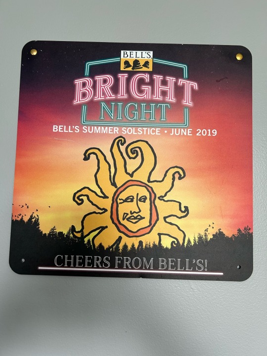

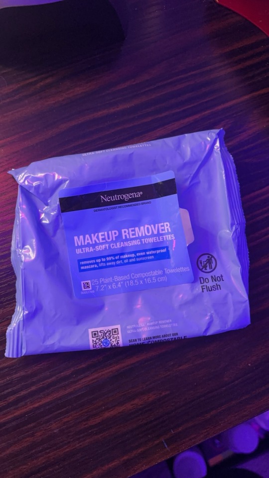
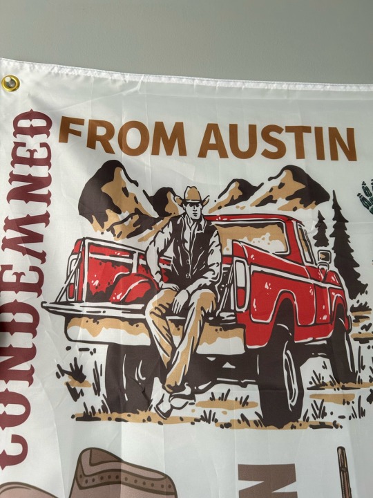
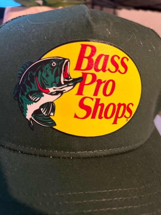

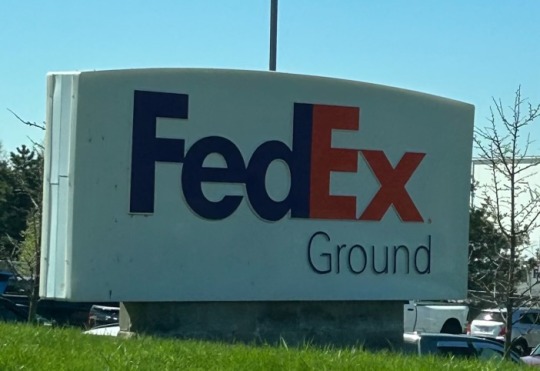

Photo 1: This design uses complementary colors. The contrast in colors on this design are making certain things within the design stand out. What I am being drawn to is the words “BRIGHT” and “NIGHT” The word “BRIGHT” is in red while the word “NIGHT” underneath it and the boarder around the two words are a greenish blue color.
Photo 2: This design uses analogous colors. The colors are being used to make certain things more subtle. For example, most of the colors used in this design are shades of red and orange. These colors are blending in with one another to put less focus on them and more focus on other areas of the design, such as the name of the snack at the top of the box.
Photo 3: This design uses mostly cool colors. This design is using cool colors in order to express the object within. Cool colors often but not always indicate something is cold or wet and i believe that this is what is happening here as well. For example, almost all brands of plastic water bottles have a shade of blue within the design and here this design is used for makeup remover where the towelettes within the packaging are both cold and damp.
Photo 4: This design uses mostly warm colors. It is using warm colors to possibly indicate the setting of the design. The light brown is being used to express certain things that may depict the location because the words “From Austin” and the mountains and ground are all a similar brown color. The red color of the truck is likely being used to indicate the object and make it flow with the rest of the design.
Photo 5: This design uses a contrast in color to communicate the relative importance of something. This design is using a contrast in color to communicate a company logo and what the company is involved with. For example, there is a contrast in hues within this design, being the logo in red and the fish next to it in green. The red is sharing the importance of the logo while the green is sharing the importance of what it stands for.
Photo 6: This design has one of the gestalt principles of grouping, being closure. It shows closure when the lines don’t fill out the trees or outline the oval around it and they are not really there but because of closure our brain is able to fill in what is missing and depict the logo.
Photo 7: This design has an active figure-ground relationship. It is using a figure ground relationship to express both the logo and what it represents. If you look closely you can see the arrow between the “E” and “x”. The arrow in the design most likely refers to the fact that the company ships things to you. If the arrow was made to be more visible, the design of the logo would be very different, fighting with the letters of the logo.
Photo 8: This design tries to look like something historical in order to communicate something related to that history. It has been printed in a grainy texture with black and white ink to replicate an actual sign that it may have been printed during the time period of which the sign is portrayed.
0 notes
Text


Photo 1: Vibe Well Açaí Bowl Cup. There is a contrast in spacing within this photo. The spacing between the writing “Vibe Well” compared to the writing “Raise Your Vibe!” is different. The reasoning behind this is to draw attention to the logo being “Vibe Well” which has larger spacing. This is what immediately stands out to me while looking at the cup.
Photo 2: Prada Bag. There is a contrast in texture within this photo. The texture of the “Prada” logo is different than the rest of the bag. Once again, the reasoning behind this is to focus attention on the logo even though it is smaller in size. The logo still stands out due to the texture contrast.
Photo 3: Xbox Controller. There is a contrast in position within this photo. The position for the “Xbox” logo is in the center at the top of the controller whereas everything else positioned on the controller is off to the side and not centered. The position of the logo is focused on but also the other buttons are placed conveniently for the user.
Photo 4: Nike Shoe Box. There is a contrast in rotation within this photo. The rotation of the “Nike” logo is different on each side. The “Nike” logo is clearly the focus here being that it is on each side of the box and faced a specific way depending on which side/direction of the box you are looking at.
Photo 5: Dove Deodorant. There is a contrast in weight within this photo. The weights between the two Dove Deodorant’s are different. The reasoning behind this is for the user’s convenience. The one which weighs less is convenient for travel or just simply moving it from place to place easier. It is also more convenient in terms of price. The bigger one is more convenient in terms of quality as well as quantity.
0 notes
Text


Image 1: Nike Air Jordan Highs. The Nike logo of these shoes is clearly printed on the front and center across the shoe. The brand and or logo may not be the most “stunning”, but this is what helps the buying and selling of the brand as well as what it stands for.
Image 2: Jeep Wrangler Logo. These vehicles nor logos are not just for viewing purposes nor are they trying to present a message. They are made to be used by others. The design of the vehicle is for client use and needs. Graphic designers aim to please their clients.
Image 3: Ford Field. You can see many different things in this photo. A Ford Field sign, the Detroit Lions logo, and the Ford logo. Each one of these things has its own purpose just like graphic designers. The variety and purposes have a large range.
Image 4: Disney World Castle: This castle’s design was not original. It was affected by another culture in which the original castle existed. Inspiration can come from all over the world and one’s culture can affect another’s ideas.
Image 5: Dior Lip Glow Color Reviver Balm. This product explains what the product is as well as having a logo of the brand on it. Both the product and brand are visually communicated, appealing to the buyer and or user.
1 note
·
View note