
Statistics
We looked inside some of the posts by mintycurry and here's what we found interesting.
Average Info
Notes Per Post
274K
Likes Per Post
162K
Reblog Per Post
112K
Reply Per Post
613
Time Between Posts
9 days
Number of Posts By Type
Text
17
Last Seen Tumblr Blogs


Fun Fact
After the announcement of the deal with Yahoo!, there were 170K signatures of unhappy Tumblr users petitioning to prevent the sale in 2013.
Text
may i present you
penguin pingu classics
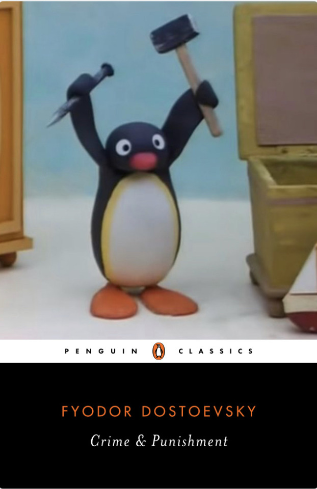
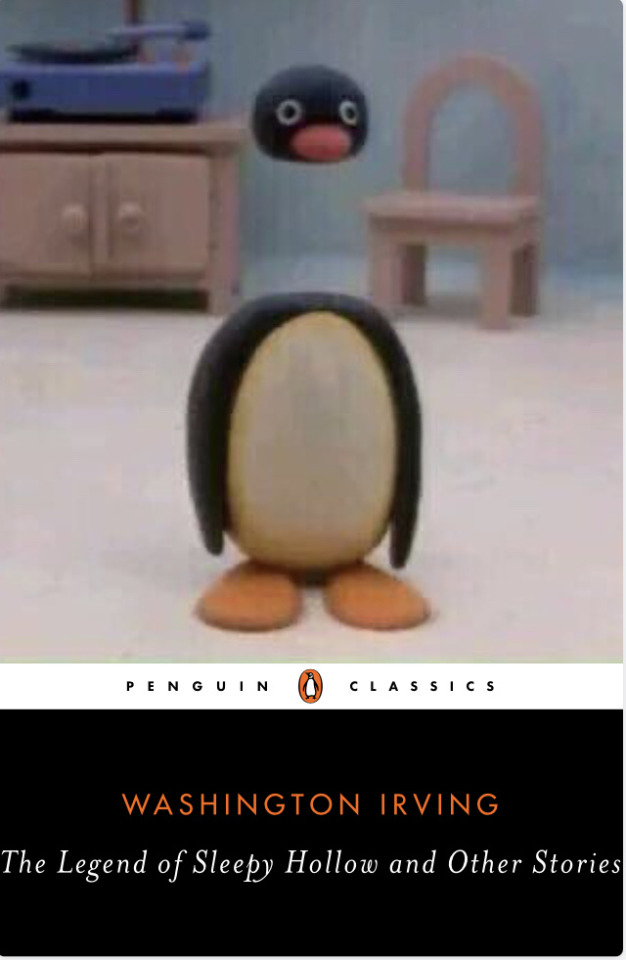

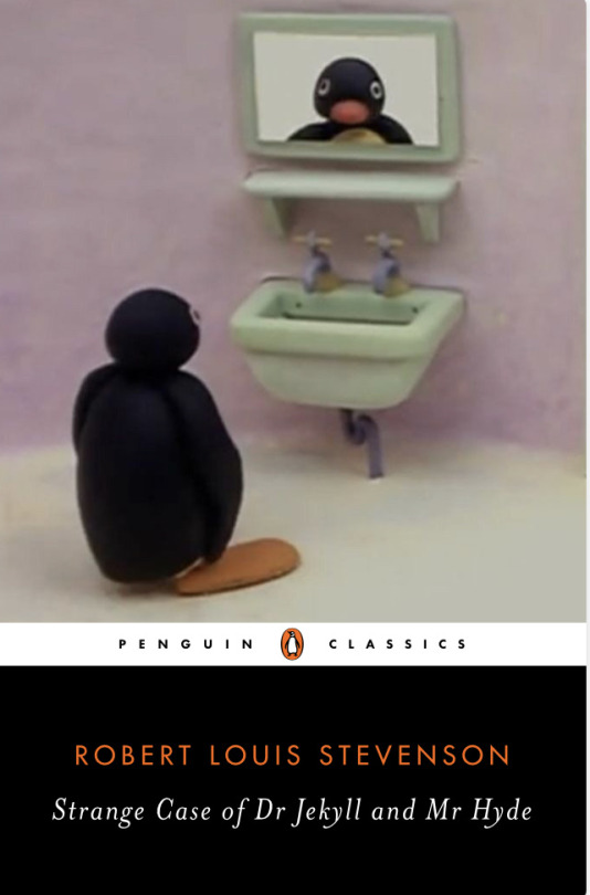
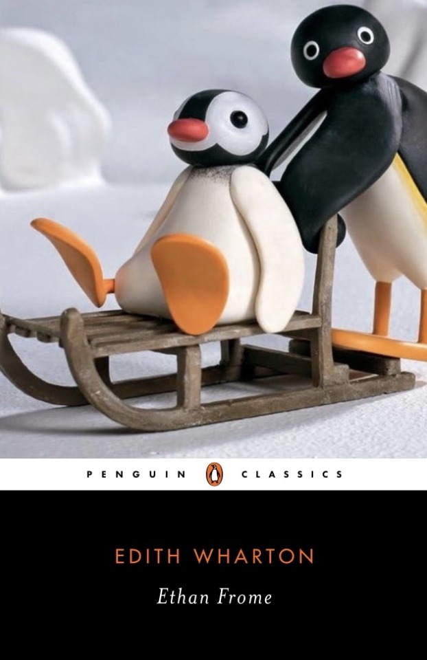
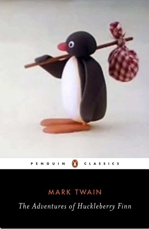

54K notes
·
View notes
Text
unusually and blonde
exceedingly peculiar
and altogether
quite impossible
to describe


579 notes
·
View notes
Text
Young Royals Faves Fest 2024
To spread a little bit of joy at a time when it's sorely needed, we're announcing our next event - Young Royals Faves Fest!

This is an event to celebrate your favorite things about the show, running next month from 21 December to 1 January.
We've posted a separate list of prompts here to inspire you to think about your favorites (scenes, characters, moments, episodes, outfits and more), and then post anything you like in response. You could create an entirely new fanwork inspired by your favorite Felice outfit, or simply gush on your blog about your favorite line of dialogue. Everything's welcome: fic, art, edits/vids, meta/analysis, gifsets, collages, poetry, playlists, embroidery, fic recs, or anything else at all you can think of. If you've posted something in the past you think fits a prompt, feel free to reblog it again!
No real rules/restrictions for this event; just pick a prompt (or several, or all of them), or you could reblog the full list and get your followers to send you asks. Then:
Post any day from Sat 21 December to Wed 1 January, in any order
Make sure to tag us - @youngroyals-events - in the body of the post so we can reblog
Use the hashtag #YRFavesFest2024, and remember to tag #nsfw if that applies, or any other appropriate warnings
We'll create an AO3 collection for anything cross-posted to AO3 and will add the link to this post once we have it
And have fun! Any questions, let us know.
80 notes
·
View notes
Text
Hello dear friends!
Thank you so much for the private messages and good wishes. If I haven't replied yet, I'll do it soon.
As I explained before, my family and I are going through a really difficult time because of our house being destroyed in a fire. Some of you asked me how to help me and suggested for me to get a gofundme. At first I thought it was impossible for me to make one since, as you know, I'm from Chile and it's not available for me here. But my lovely friend W and their partner, being the absolute best, offered to host one on behalf of me and my family.
And here it is: https://gofund.me/63519f87
My family and I will be eternally grateful for any kind of help but please do it only if you can. It's going to be a long process going back to the new normal but any help we can get will be amazing.
We tried to explain everything in a short but comprehensive way, but if you have any kind of questions about how it's the process of getting back to our feet, I'll be happy to reply.
And if you can't donate, I would really appreciate if you reblogged this post.
Thank you so much for the support, and especially my eternal love to W who's the best friend anyone could ask for 🫂
#signal boost#i guess#but omg :((#sending hugs#and lots of love#wishing you the best#with life in general#and also this gofundme#pls donate to kiti if you can 🙏
123 notes
·
View notes
Text
child stars dying young directly or indirectly as a result of fame-related trauma is just so especially sad. for me it’s the tragedy of how kids don’t really know what they’re signing up for when they ask to be famous, especially back in 2008. liam’s mistakes, addiction, and bad decisions, are all so inarguably tied into his career and the carelessness of the entertainment industry. the 31 year old man that just died is the same 16yo boy that was given drugs and alcohol to keep him quiet while he was being overworked and exploited. corey haim, river phoenix, judy garland, and so many more. you can think what you want about liam and have your own opinions, but don’t lose sight of the larger picture that he was a victim of.
5K notes
·
View notes
Text
zayn using a photo of them as kids is really getting to me. does he still see them like that? i look at some people i’ve been friends with for years and see ourselves as the age we were when we became friends. my mental image is stuck there. this is fucking awful dude
#oh.#that was me when a friend of mine passed#he just...never ages#somehow#and we weren't on the best terms either#it wasn't something negative#we just...drifted apart#i wish i made more of an effort to stay connected#a regret i believe certain people currently echoes 💔#liam payne#one direction#zayn malik
5K notes
·
View notes
Text
stuck on the different pictures louis, zayn, and harry chose for their posts…
louis’ is celebrating their bond, their friendship, the love they held for one another that got them through so many tough times. it’s saying they will never get to stand on a stage together again but let’s celebrate the good times, let’s remember the love.
zayn’s is highlighting that they were just kids at the start, they were boys thrown together into an insane, unimaginable situation and they needed each other. they found solace and comfort in each other and no one else can understand what they went through growing up together but they clung on to each other.
and harry’s… god. harry’s is just liam. liam on stage looking out on thousands of fans doing his favourite thing in the world. and that’s how harry wanted to honour him, making other people happy.
#liam payne#one direction#the goodbye messages are so well-crafted#they're all heartfelt in such different ways#and the pics are actually... fitting#saw a tweet that said it's harry's first non-him and non-promotional post#since the hiatus#im fine#im....fine.#dk if that's true#but it tracks#everyone's just feeling it
2K notes
·
View notes
Text
The worst part about Liam Payne dying is that people are posting about “the switch up is crazy”
Like no. He was an abuser and made horrible decisions, but nobody wanted him to die. He was getting hate for an INCREDIBLY valid reason, but we all recognized that he needed mental and physical help. He needed to go to rehab. He needed to get away from drugs and alcohol and improve upon himself away from the public. No one wanted him to die.
We’re not mourning the life of an abuser, we are mourning the part of him that we adored and looked up to for a massive part of our childhood/ teenage years. He was a huge part of how I was introduced to my love of music. And yes, he did horrible things and made horrible decisions and over the last few years has been anything but admirable, but none of us wanted this.
Maya didn’t want this. And everyone saying that it’s her fault can actually go burn in hell. She likely already blames herself enough. She likely already wishes she hadn’t spoken up about it out of the guilt that she likely feels. You guys commenting all over the socials about how this is her fault and “are you happy now?” Are actually horrible people.
A 7 year old boy just lost his father. A woman just lost her long term boyfriend. Two parents just lost their son. Several young children just lost their uncle. Show some fucking respect. Joking about it and hating on people who had nothing to do with what happened is not doing anything but twist the knife for the people who this has ACTUALLY effected.
14K notes
·
View notes
Text
August accusing Felice of thinking of Wilhelm during sex is so funny when you think about it because, my guy, why are YOU thinking about Wilhelm during sex?
285 notes
·
View notes
Text

🕯️🕯️🕯️
5 notes
·
View notes
Text
Me and the Bloke discussing one of my Buffy Fan Pet Peeves, which is that Angel/Angelus got his name from having "the face of an angel" and that as handsome and broody as David Boreanaz is, he does not resemble any historical ideal of an angel.
The Bloke: "Yeah, but how many people actually do have the face of an angel?"
Me: *opens mouth*
The Bloke: "That AREN'T SWEDISH?"
#well......#he's venezuelan-swedish#ergo#you can totally still mention Omar#*nods to self*#omar rudberg
13 notes
·
View notes
Text
‘bread is bad for you’ ‘rice is bad for you’ sorry im not subscribing to the idea that staple grains that have been integral to cultures for centuries are evil. i love you carbs
#me when i eat my silly little rice#my new office has MAD GOOD dishes#can i rlly be faulted for eating some delish carbs#i love u food#food never betrays us#ramble let's rumble#not so minty curry
103K notes
·
View notes
Text
had a hell of a busy week and changed my phone, but my mind chose to fixate on the 23 days of whatsapp chat it didn't back up. (I'm fine)
#not so minty curry#i also feel guilty that i gave away my baby to trade in#my beloved old phone... you will be missed honey#ramble let's rumble#i also feel guilty for being so sad about it#my new phone is dope asf#but also....#i'm gonna need awhile
1 note
·
View note
Text
me when Omar's outfit ate so bad, I need to take a walk
"i hate him" I say with a dreamy sigh
15 notes
·
View notes
Text


My suncatcher sticker was throwing lovely rainbows... I seized the moment
(art credit once again to @loren91 !!!)
70 notes
·
View notes
Text
ykw shame on me for expecting any awards after the last one... I should've known better
0 notes