
Alternative blog for fandom stuff. Just be warned, this blog may be critical since I love taking apart things I love and analyzing things. Criticism doesn’t mean hate, we just enjoy something but really dig deep to further analyze. Also just to share my fandom stuff here’s for art. This will have oc x canon content so be warned.Pronouns: She/her/They/Them
Don't wanna be here? Send us removal request.
Statistics
We looked inside some of the posts by moonlights-fandom-hell and here's what we found interesting.
Average Info
Notes Per Post
30K
Likes Per Post
20K
Reblog Per Post
10K
Reply Per Post
252
Time Between Posts
2 days
Number of Posts By Type
Text
17
Last Seen Tumblr Blogs


Fun Fact
Premium Tumblr themes are available from anywhere between $9 to $49.
Text

espio doodles i did before bed. I LOVE THIS GUY YOU DONT UNDERSTANDDDDDD
119 notes
·
View notes
Text
Not gonna lie, I like seeing the revisions here. You didn’t take away from Viv’s original vision but gave them minor tweaks.
Personally, I’m not a fan of complete redesigns since it makes the characters unrecognizable but I love how you worked with what she had but gave them different colors. I say I think Vaggie should be blue since she fake from heaven but I love the creative vision
And its not done out of spite but just for fun and care

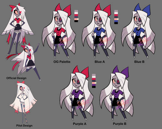

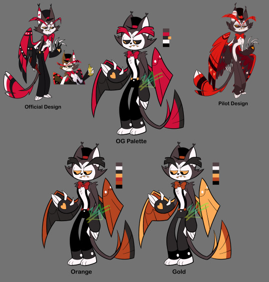

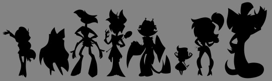
As a "fun" design exercise I decided to mess with the Hazbin characters' designs... Not really "redesigns," but more so "refined-designs"-- Keeping their overall look or "essence" while trying to simplify them and clean up their colour palettes, as well as making sure they all look distinct from one another.
I tried to stick close to the original's style but I couldn't help using thick lines, lol. Along with the simplified shapes, it gives them an early 2000s cartoon vibe I think.
For the colours I tried giving them more unique palettes, as well as making sure that they had enough contrast (the colour value of this show tends to be... not great). Also the lineup at the bottom isn't my final selection, it's just a selection to get a better idea of how they all might look together side-by-side.
Eh, tell me what you think. I could keep editing these but like, I'm tired of looking at them lol. More info on each design (plus a speedpaint) under the cut. It gets wordy, sorry.
Charlie: Not much to say besides she needs more contrast in her colours. I changed her shirt to the same colour as her corneas (yellow) so it doesn't blend in with her skin. I wish her eyes were still black (not only does it bring better attention to her face, but it works better with the idea that she's a doll-- yknow, painted on eyes? Does that make sense lol). In retrospect, maybe it would've been good to try some browns with her colours? Idk. I kept her red since she's the princess of Hell, and Hell's main colour seems to be red. Oh also, I gave her some lines on her face and hands just to make her look more like a puppet/doll. The rest of her body would have the same kind of joints/segments.
Vaggie: Ok I know her hair technically looks more moth-like in her og redesign but... it just seems like too much? Yknow? It's kind of outrageous. Idk how well my solution works but I tried simplifying it. I simplified her bow as well and made her stockings more like leggings. Her X-eye now hides behind her hair. Her gloves are shorter. Also I took away that thing around her waist that.... seems to be a different colour than everything else??? Idk what's up with that. Sorry I took away her feet. I tried out some blue and purple with her, I think it looks nice. Only thought about keeping the red bow because I thought maybe it'll match her with Charlie. Also sorry I took away her boobs 💀💀💀
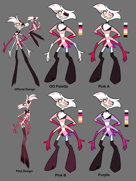
Angel Dust: So unsure about how I drew him... Specifically, his 2nd set of arms looks so floppy and tacked on, and his legs... Idk I'm not great at digitigrade legs but I'm pretty sure that's officially what kind of legs he has. His head is weird. I think I got the idea of giving him big feet from Meppity's redesign video (her redesigns are some of my faves). I took away his bowtie because... too many of these guys have bowties, and he already has a choker too. Also I had the funny idea of all the Hotel employees wearing bowties/bows of some sort, and Angel is a patron but not an employee... Anyway. Kept his gold tooth to link him to Val (who also has a gold tooth), and kept the dots under his eyes since I THINK they're supposed to be representative of his spider eyes? They can be taken away if need be, though. His gloves don't go all the way up and kind of look like dish-washing gloves again but, the way his gloves go all the way up and his sleeves go into them... it just looks so weird to me. Idk, maybe I should've just given him shorter sleeves, or even no sleeves at all 🤔 And honestly I still have no idea what's going on with his pants. Are they short-shorts? Underwear? Didn't change them anyway. For the colours, I made sure all his gloves were the same colour (still don't know WHY they decided to make his 2nd set not only a different colour, but the SAME colour as his skin/fur????). Turned down the saturation on his hot-pink, and gave his right eye the light pink instead of that almost-black colour (still kept his eyes different colours because I remember seeing a really old sketch page of Angel that insinuated that there was a reason for his eye being black). Made some of the darker parts straight-black just because I've been using that in all the other character's palettes, but this can be changed to his almost-black colour. Also tried a more purple palette to get away from all the pink, kinda really like it.
Alastor: I originally tried his coat with coattails, but wasn't sure about it and made it the original shape. Took away his monocle because fuck that it's unnecessary and clutters his face. Made his antlers bigger. Swapped out his shirt collar to be like the one Charlie's og redesign has, because the way it goes all the way up like that gets on my nerves? Idk maybe I just don't know anything about fashion design but it doesn't scream 30's-suit to me. You could probably take away the collar, though. I wanted to try a lot of darker colours for his palette since he's like... kinda the bad guy. Dark colours would work well for him. I'm worried about his arms getting lost in the black of his coat, but that's why his cuffs and hands are a different colour. Really wanted to give him more than just red so I spread out the yellow of his teeth; I like how it looks for his shirt, it also works well with his eyes to draw you towards his face. I also tried to (again) lessen the saturation of his reds and pushed them more towards orange to better match the yellow. Kept all the brighter colours to his upper body to keep your eyes there, too.
Husk: I think Husk was one of my least favorite designs when the pilot came out because he's a real mess of detail. His wings are the worst. His redesign isn't much better (like dawg why's he got these random-ass hearts everywhere). Simplified his wings to just have some circles and rounded shapes. Kept some heart shapes (like his nose, bowtie, and paws) but added a couple diamond shapes, too (mainly his suspender buttons and the shape of his white chest-fur). Really wanted to have more blatant club and spade shapes too (to add to the poker theme), but didn't want it to get crowed and decided the rest of the rounded and heart shapes worked well enough. Made his eyebrows shorter and more square-shaped. Didn't have many ideas for colours but knew that I wanted to try some oranges and yellows. Made his eyebrows a darker colour, and changed his eyes to yellow corneas with black pupils. Stands out more that way, I think.
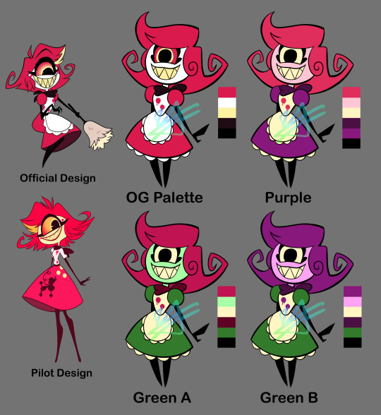
Niffty: Did you know her name is spelled with two Fs? I didn't. I don't like it... Anywayyyy. Swirled her hair a little more, and took the yellow streak out. Added some fluff under her dress just to match her apron. Kept the dots on her shirt (though there are only two now instead of three) because I'm assuming it'll make sense later (like idk maybe she was shot to death and that's what they represent), but I wonder if you can take those away for a cleaner design? Gave her more rounded shapes. I said before that all the Hotel employees would have bows/bowties of some sort for these designs: Niffty's would be her handkerchief (yknow, it's tied into a bow in the back? That works right...? Eh.) I took away her cheekmarks 1) to clear up her face and 2) to make Charlie's cheek marks seem more unique and doll-like. For Niffty's colours, I (again) turned down the saturation on her pink. I wanted to try using some green and purple on her, since her inspirations include B-movie aliens and the song One-Eyed, One-Horned, Flying Purple People Eater. Tried using different colours for her skin, since a lot of characters in Hazbin have white skin, and for Niffty specifically I think the white skin along with her white apron dries-out her look (if that makes sense?) Though I do agree her having yellow skin is NOT good if she really does end up being Japanese. I think pink skin works well for her, though. Oh! And again, it helps make Charlie's design more unique with her white skin, making her seem more porcelain. I made Niffty's eyes yellow like her teeth, and then used the same colour for her apron to unify the palette.
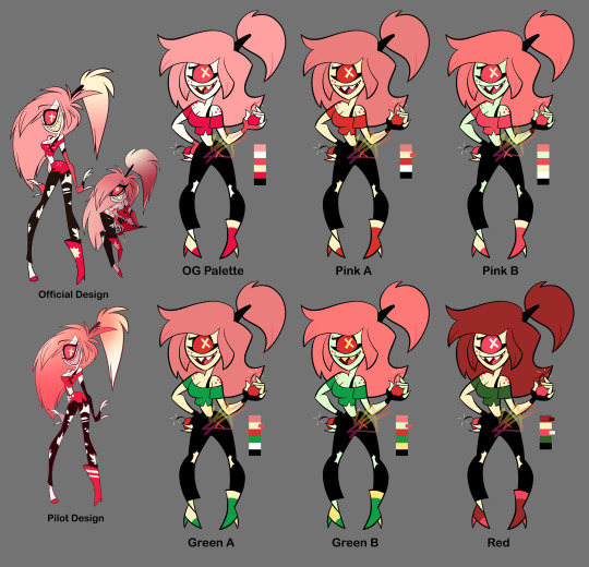
Cherri: Ok Cherri's design was my ABSOLUTE least favorite from the pilot, too many senseless details I HATE her ripped pants. So hard to look at. Idk if you noticed in the time lapse but I had to re-sketch Cherri because 1) her pose was too similar to Niffty's (I was making their poses similar to their official art) and 2) her hair was giving me trouble... I kinda hate how her hair hovers to the side like that? Tried re-shaping her hair and now it looks like she uses a TON of hairspray or something, lol. Took away her tattoo but kept her freckles. Took away the skirt thing(?) she's got on her pants. Took the symbol off her shirt, but added an X to her pants (can be taken away, though). Simplified the rips on her pants to just be ripped knees. put a heel on her left shoe so she doesn't look unbalanced/uncomfortable. Made her gloves shorter. For colours, I again took away her white skin for the same reason I took away Niffty's white skin (less "dried out" palette and makes Charlie look more unique/porcelain). Afaik Cherri's not Asian so yellow skin could work for her, though I also tried green skin. Since one of her themes is cherries I wanted to use reds, pinks, greens, and blacks. I tried some green for her clothes (and again her skin), and also turned some of her pinks more red. Made her hair darker for more contrast, and tried using some red for her hair instead of pink (I like the pink hair, but again... red like cherries). In general her colour palette was the hardest to figure out but I think I found some interesting things.
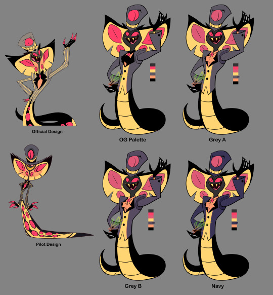
Sir Pentious: Sir Pent was my 2nd least-favorite pilot design by only a little 🤏. It's all his eyes. He's very hard to look at. I took away all the eyes on his tail, and turned down the saturation on the rest of the eyes EXCEPT the ones on his face (maybe I should have just made those reds much different colours, but it still looks a lot better with just the saturation down). Took away his stupid-ass goggles and made the face on his hat a lot simpler (combined the mouth with the hat band; it can still emote btw). Replaced his bowtie with... *quick google search* A jabot? It's supposed to be a jabot I think. I think that's what it's called. More 1700s than 1800s, but eh. Maybe I should've given him *quick google search* a cravat maybe??? Eh, eh, not a fashion expert but anyway. I thickened his mid-section so it eases into his tail better because, the way it is in the official design it always made him look like a slug to me? I looks too... squishy. Banana-slug-lookin' ass Also took away his red-tipped claws and made them straight black. For his colours, I think the grey and yellow works for him already, though I do wanna see how he'd look with more green or blue. Most of what I did colour-wise was the eyes, but also his suit; still grey, but trying both darker colours and pushing it more towards blue and purple. I wonder if I made his skin a little too dark? Is it kinda hard to see his features? Idk. Idk how I feel about these colours. Bleh.
88 notes
·
View notes
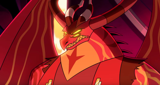
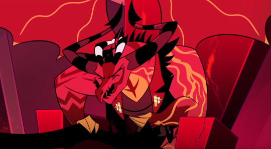
Text

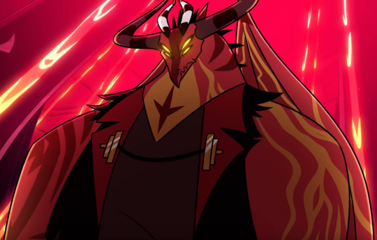
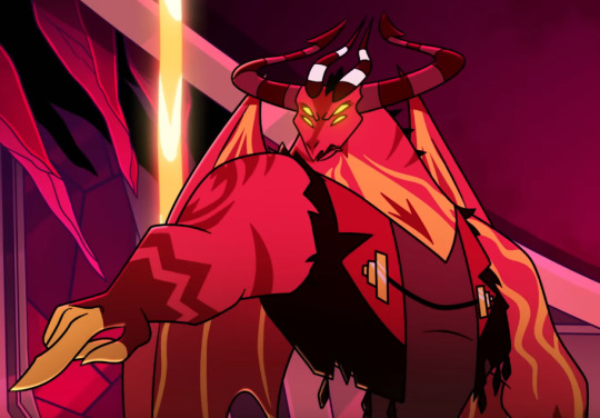
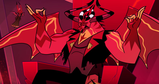
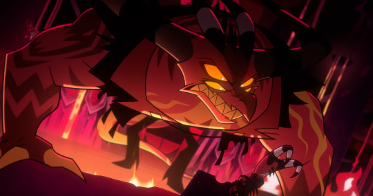
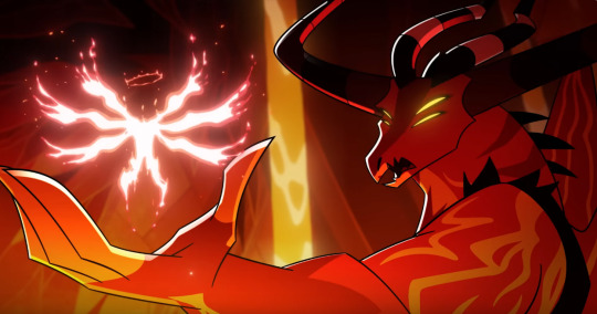
Based on a Swap AU where, instead of Charlie meeting Adam, Emily has an arranged meeting with Satan, the Sin of Wrath.
1K notes
·
View notes
Text
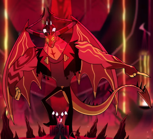
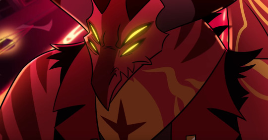
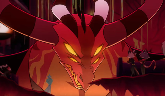
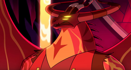
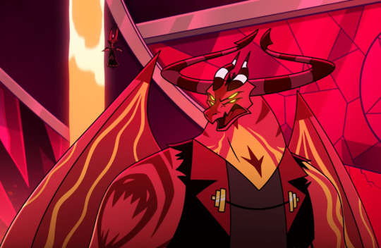
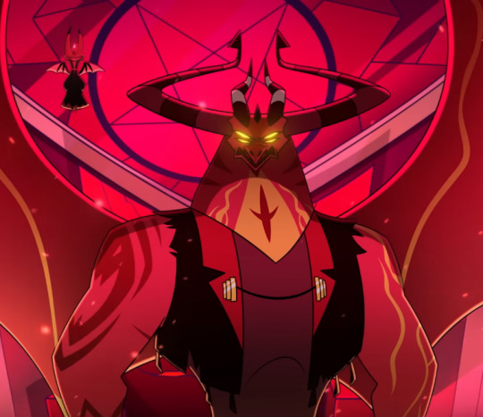
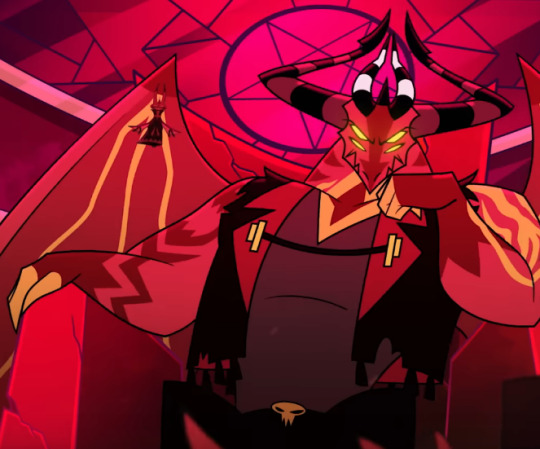
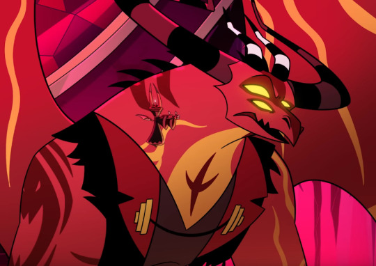
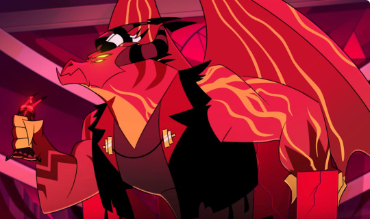
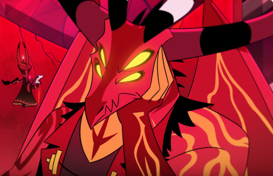
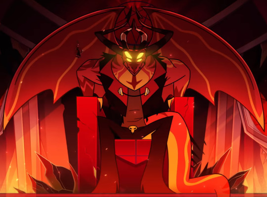
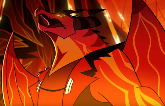
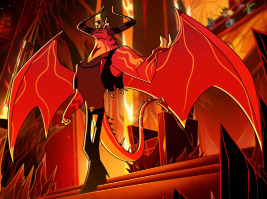
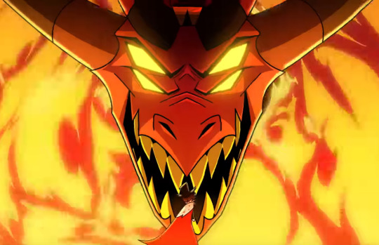
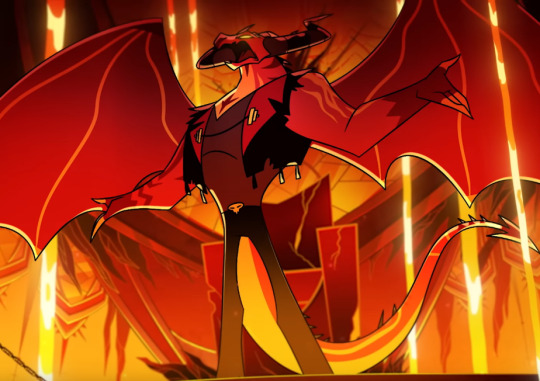
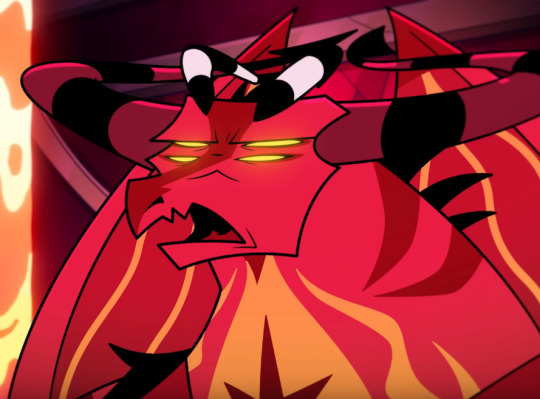
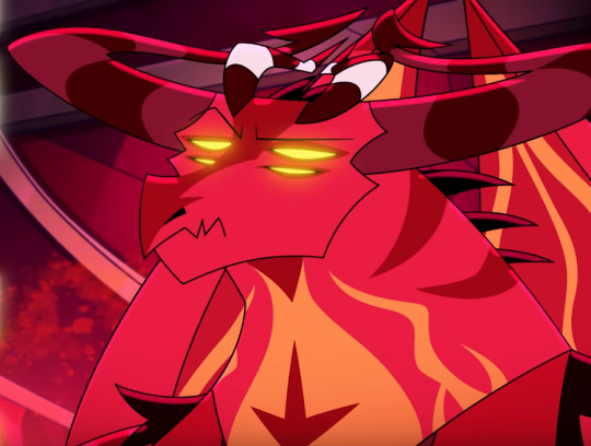

All rise for the Big Daddy of Wrath
And as a bonus:
1K notes
·
View notes
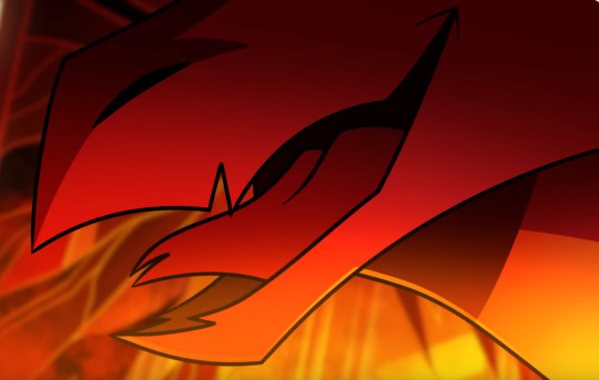
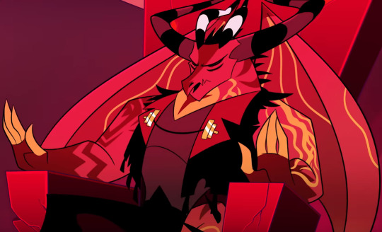
Text
OH. WHO THAT?

ITS THE BOOOY
542 notes
·
View notes
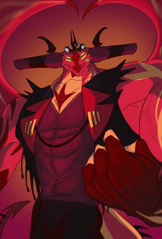
Text

I slowly losing what little ability I had to draw
126 notes
·
View notes
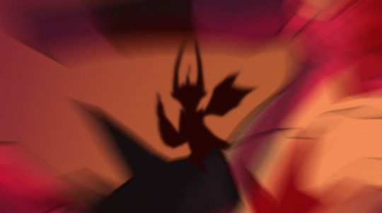
Text

the Shadow redraw but Eclipse
30 notes
·
View notes
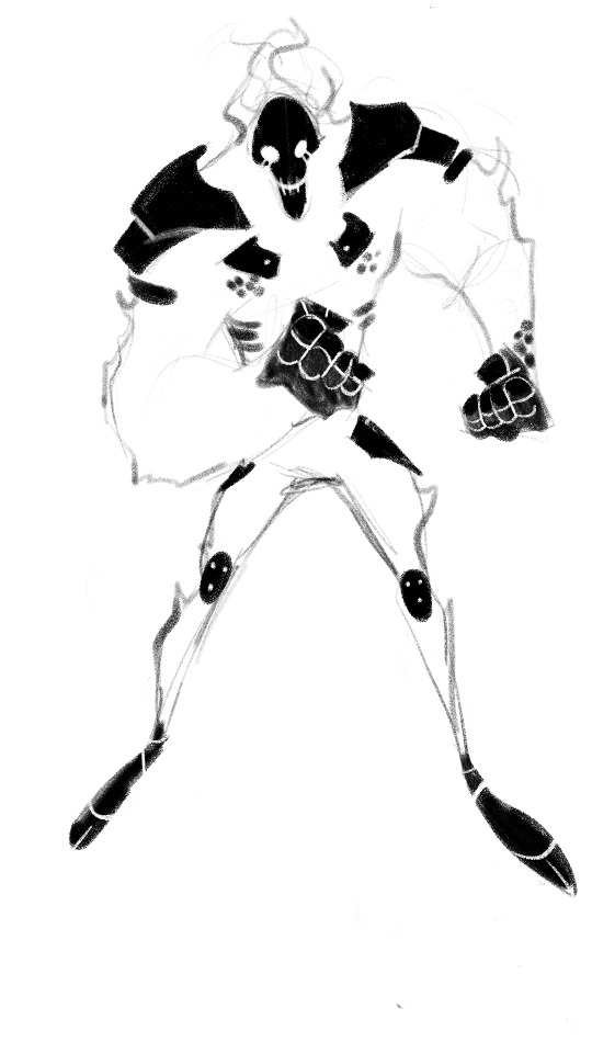
Text

Sabrewulf
23 notes
·
View notes


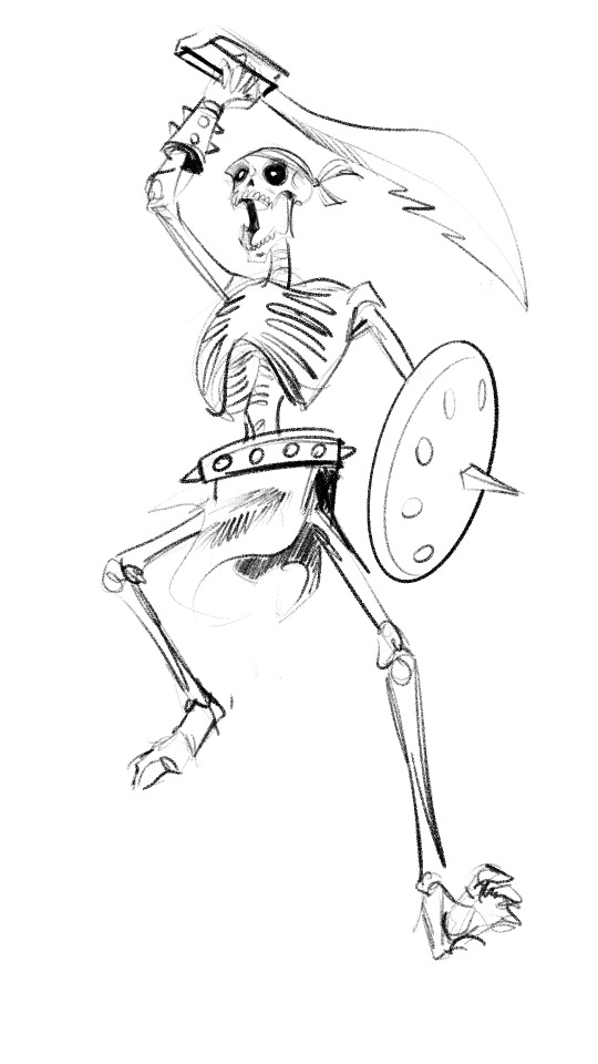
Text

Older (2010) pic I'd done of Sabrewulf from Killer Instinct; it was from before the reboot so I was working off of the 90's designs
21 notes
·
View notes
Text


And my last two prompts for @team-chaotix-week
Home and free prompt
For Home, I got inspired by that clip from Spiderman 3 with the landlord XD I wanted Vector to quote bully McGuire. Yes Charmy is high on caffeine, that I got inspired by a silly Chaotix Garry’s mod video someone made with Charmy begging Vector for Coffee. I’m gonna say that’s what happened to the broken door, and Espio steps into a chaotic mess
Second one is free prompt but I’ve been wanting to draw this for a while. I hope they don’t mind ocs, because the 3 are ocs owned by me and a friend of mine as we wanted to make a rival team for the Chaotix. But unlike Team Dark, these guys are outlaws/criminals that work for Clutch the Opossum. The Tiger girl is my OC Takara and the other two are Rush the dragonfly and Flint Locke the Komodo Dragon, who belong to a friend.
I would had colored the second sketch but something is wrong with my tablet atm. And my friend never provided me colored refs for Flint and Rush yet as he never figured out colors for them.
But those are my entries :3 I do hope I can draw the Chaotix more often than just the black arms
#sonic the hedgehog#Sonic#team Chaotix#Chaotix#vector the crocodile#espio the chameleon#charmy bee#ocs#Sonic OC#team chaotix week#my art#moonlight artworks
30 notes
·
View notes
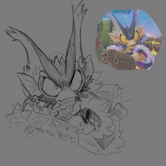
Text

tried drawing king k rool in a style like dk bananza!! not sure if i got him quite where i wanted him, but i like him (:
657 notes
·
View notes
Text
Too bad Trump raised the fucking tariffs and Nintendo literally made the games more pricey
Which sucks ive been waiting for a new main game for DK for decades and the new Mario kart and Kirby air ride look fun :c

How we feelin today
4K notes
·
View notes
Text

I'm shocked I haven't seen someone draw kong yuri yet
234 notes
·
View notes
Text

Looks like K. Rool got a some cuts during a fight. (wanted to do a little reference to the original Beauty And The Beast)
29 notes
·
View notes
Text

Ok one more Lead VoidCo monke post today, I swear. He is my new muse.
(I hope Nintendo reveals the VoidCo trio's names in the next trailer. Unless they're only referred to as "VoidCo". Either way, I'd love to know the little guy's name.)
122 notes
·
View notes
Text
i don't really want to see this retconning of neil gaiman's writing where people are re-analyzing stories like "look...you can see the message under the surface...showing how he was actually abusive IRL...it's all there..."
idk maybe we should just listen to people when they speak up and say they were abused and try to foster a culture of respecting victims and actually enforcing justice against perpetrators instead of doing this weird fucking da vinci code-esque picking apart of his stories. stories which everyone was fine with for decades!! because we understand that the content that people write and produce does not have a 1 to 1 correlation with their real world actions!!!
i fully support people who cannot engage with his work anymore and i do think that because he's a still-living person it's imperative to not give this guy another cent, but we cannot pretend that everyone was just "too dumb" to see the secret clues and turn this into another case of "what you write is what you endorse." plenty of dogshit people write good stories. plenty of good people write dark stories. that's all.
21K notes
·
View notes