
Don't wanna be here? Send us removal request.
Statistics
We looked inside some of the posts by nassedoh and here's what we found interesting.
Average Info
Notes Per Post
60
Likes Per Post
45
Reblog Per Post
15
Reply Per Post
0
Time Between Posts
3 days
Number of Posts By Type
Text
16
Last Seen Tumblr Blogs


Fun Fact
Tumblr was created by web developers David Karp and Marco Arment.
Text
8 Weeks Pregnancy Tale
So this has been a fun, stressful, and very rewarding ride that I don’t think I will ever forget... from digging deeper in common techniques like interviewing and surveys design, to swallowing whole entire new procedures related to usability and desirability testing, ideating, prototyping, and much more.
Surely, I had never experience so much learning in such small amount of time, but realizing how much more there is to learn is what excites me the most. Like I said last week, it’s been a little bittersweet to realize there’s only a week left with this amazingly talented group of people on a daily basis, but it also excites me looking forward to developing my own creative process and starting my own path to improve and grow as a Designer.
This week has been a blast working with my team on the designs for this project’s web app, and I can barely wait to present the deliverables to the client, as we think he’ll be pretty happy with the proposal for MVP.
I got a pretty good feedback on my last design report which is also a great win for this week taking into account that I had a lot to improve from my first report regarding how to differentiate my voice.
Next week’s the 9th and final one and I’ll tell you all about how the project goes with the client... stay tuned to get to know more, most likely there will be an emergency post as soon as my project’s water breaks.
Vi ses.
8 notes
·
View notes
Text
Generic much? A true story about case studies...
I’m gonna write about an article that I just read, super recommended by the way, as it portrays a trending practice for a while now but applied to a crescent number of design use cases
Undoubtedly, the market dynamics remain the same... When the offer responds to the demand and a new product/practice is suddenly common and accessible, the patterns and “spontaneous protocols” recommending a “How To” approach start to appear.
These patterns, in abundance, tend to create an impression that leads to the belief of a growing trend towards generic and unauthentic results. Design has always been a field susceptible to these practices like many others, yet diverse and ample enough for a myriad of movements and styles do stand out, leaving “generic” in the back row.
Nonetheless, -Due to the rapid evolution in the tech field, and I would assume given the pandemic effects on social restrictions and mobility- the increasing number of UX Design education programs with online bootcamp modalities, looking to rapidly feel the gap in the job markets that institutions with more structured curriculums can’t move quick enough to do, have created an impression that leads to believe that such a trend is more present than ever in this field.
The thing is contextual in my opinion, and I will try to explain... It’s been 7 weeks since we started the bootcamp, and I can see myself somehow aligned with the trend (At least in a few aspects, not all). I mean, it’s logical to follow some kind of structure or step by step when you’re learning new methods, tools, etc. The issue becomes the issue when you make a recipe of what you’ve learned and leave behind the capacity to improvise and think for yourself, and even though I consider my case studies to most likely follow the same aforementioned generic structure, I also believe that I manage to shine through in the way I write.
Knowing the process, doesn’t mean to remember the step by step, but to recognize the objective behind the task, and be able to then decide to take a different approach if more convenient or necessary.
As always, change things around, approach the story from a different angle, tell your story according to your experience, but design the experience thinking of your user, that way your seal remains your brand, and there’s no better advantage competitively speaking, than differentiation through and through... What better way to shine through the crowds than being yourself and putting your words and designs out there?
I guess what I’m trying to say is that as students learning tends to be the priority, and as the curving learn is more pronounced, creativity and the experimentation process should flow more easily without the bootcamp’s time restrictions... I can’t wait to finish the program and sit and think about creating my own ideal process , improve, and materialize my ideas into the screen aiming to get better with every time and looking forward to my results.
Let’s talk some more about this...
#UX/UIDesign#CaseStudies#AuthenticVsGeneric#Differentiation#UX/UIDesignerToBe#UX/UIDesignerInTheMaking
4 notes
·
View notes
Text
7th Week Dispatched
The week finally ended and so is the last solo assignment of Ironhack’s UX/UI Design Bootcamp, and I must say I’m pretty satisfied with what I accomplished.
The second week of the project was a challenge due to some unforeseen events that made me lose a whole day of work, but thank god for buffers and 1 all-nighter I pulled in the middle of the week.
So first than all, this presentation was done involving external juries within the UX/UI Design field, which was quite awesome to be honest, as we could get a more straight-forward evaluation from fresher perspectives in regard to our work.
I ended up developing a Web App related to the customer service industry for both outsourced service providers, and companies looking to manage their own teams aiming to personalise the customer experience. The idea was for Integration, Automation, and Design would converge in a product that would support both sides of the customer service aisle (agents & managers), and facilitate branding identity and customer service standards compliance.
Obviously, there’s a lot more going on behind what they see during the presentation, and even though I didn’t get a prefect score, having the internal knowledge and analyzing the results through the jury’s words feels like such a win, because not only confirms what you already suspect, but points you onto a path where there’s only growth.
I had good reviews in general, or whatever good you would expect from an engineer in an 2-month intensive program about Design (It was like hammering another life into my brain resulting in a constant feud for coexistence).
Predictively enough my Visual Design capabilities have a lot improving to do (Yes I have eyes, but they function better criticizing/improving than creating), I always knew this would be the most challenging part of this adventure, and to be honest I only look forward to getting better. I’m gonna have fun during the rest of the pandemic improving my projects, designing my ideas, and perfecting my technique.
Coming from engineering and having transitioned into project management and marketing before ending up here, I had enough experience in marketing that I felt confident enough about the branding part related to the bootcamp, I had my doubts about my business approach, because finding creative strategies to monetize digital products is not as easy as it seems.
Luckily, my jury’s appreciation of my research and business proposal, along the roadmap with future growth avenues for both the application and the business proved me wrong and gave me confidence on the fact that all I need is practice, practice, practice...
See you next week!
4 notes
·
View notes
Text
6th Week & 1/2 Solo Project
My 6th week went by pretty fast working on my last individual assignment, my first design for a Web App, which I think it’s pretty great if you ask me.
I started my journey by making a plan for the completion of the project, this time I had more experience, and being wiser I included some buffers so I could hace some flexibility to adapt in case of any unforeseen happenings.
I must say I feel a little intimidated about the amount of available screen space for this project... being mostly focused on mobile applications have spoiled me a little, so sizing up fonts and icons in general is going to be a challenge.
I’m also a little nervous about the scope of the problem I diagnosed being a little wider than I though at the beginning, I’ll be sure to analyze and evaluate accordingly so I can dissect it for the bootcamp’s assignment, hence limit the number of screens and the app’s navigation.
That’s it for the week, I’ll come back the next one with results.
Greetings
5 notes
·
View notes
Text
Remote Contextual Inquiries and Enterprise Software
As I was reading an article for the bootcamp and related to the project ahead, that mentions a new approach to the gap between remote usability testings and on-site contextual inquiries with users, called remote contextual inquiries, I couldn’t help but think about ERPs and other huge software platforms with interfaces full of input elements.
Understanding the complexity of enterprise software, mostly ERPs (Enterprise Resource Planning software) can be a whole universe of variations and customizations and therefore a customer service and technical support nightmare when something breaks.
The new CRI approach proposes a mix of remote control, screen recording, and therefore the advantage to observe the user’s interface so any changes in regard to appearance, hidden icons, disabled features, etc., can be identified. The new technique resumes a mix between remote usability testing and some contextual progressive inquiries.
I certainly expect to conduct CRIs to evaluate the user cases and correspondent flows to explore a few ideas I have in mind.
0 notes
Text
5 is the lucky number...
5th week is up and I finally feel like getting a grasp of things... Just in time for my last solo project of the bootcamp which is framed upon the next 2 weeks.
The week went by super fast as I spent most lunches with my partner in crime advancing on the project, and stayed most nights after class doing so as well, this actually proved to be more effective than taking the usual break and then regroup to keep working before class.
This week we managed to follow the initial plan without major rearrangements, to the point where I could actually sleep properly before the presentation.
Dani was very pro active and fast to work, it was a little hard to keep up mostly because of me being so divergent and her being the entire opposite, but we had fun talking and managed to balance each other and come up with a pretty good proposal.
We also got to meet a few guys from the web development bootcamp, and it was a hoot... they helped us a lot building the CSS for the content layout and the website’s responsiveness. We too got a chance to help them a little bit with their projects from the usability and navigation flow points of view... maybe along the coming week they’ll reach out in case they have more doubts with their projects and we’ll get the opportunity to see more of their work.
Well that’s all for my 5th week, all catched up with homework and all... I guess I’ll see you guys next week for the weekly progress post.
Vi ses.
2 notes
·
View notes
Text
Still mayhem in the 4th week...
This week was super weird as I started pretty ahead with the lo-fi wireframes iterations, business proposal and the branding statement and suddenly I crashed and burned a little on the sides, the way I like my arepas
It was in the middle of the week, right while transitioning from mid-fi wireframes to hi-fi ‘attempt’ that I got sucked in a Figma parallel universe and lost track of time. By the time I realized it, there was no way I was gonna make it to Friday alive and finishing both the Hi-Fi version of the prototype, and the presentation
I was so mad I couldn’t finished in time, I really wanted to show my concept to everyone, but my design fell short to a Hi-Fi prototype, it looked like a Mid-Fi wireframe with a splash of yellow (you would have to take a look at my design report on Medium to know)
All in all I’m pretty happy I got the chance to finish trying to portrait my idea for the app’s visual design along with its brand identity statement and business model proposal. Thanks to my own personal episode in Figmaland -or more like Wonderland- I feel more confident and experimental with Figma, which, if I am cautious enough in the future, will serve in my benefit in my eternal quest for mastering ‘Effective Time Management’
For this week and the next to come... PRIORITIZE AND CONVERGE
I’m gonna cut it short here and not jinx this week’s progress by saying anything else.
XOXO
PS: I’m having fun with Flex-Code...
2 notes
·
View notes
Text
UI Wars - Greens for Apples or Robots...??
So there’s a raging war being waged for a few years now among the grounds of UI Design that broke UX in two major sides with a few misfits scattered around the battle field.
With the goal of differentiation, distinctive styles and iconography have been applied to buttons, input controls, and even the navigation flows when developing apps... impacting significantly the experiences users have when interacting with both platforms.
A few examples to entertain for my own solo assignment for this week are included in the following comparative analysis:
In-between Screens and In-App Navigation Patterns
iOS: Tab navigation bar at the bottom of the screen, swiping to the left to go back, back button in the top left corner,
Android: Tab navigation bar at the top of the screen, standard navigation bar at the bottom, hamburger menu (drawer) for secondary flows, swiping for navigation between tabs
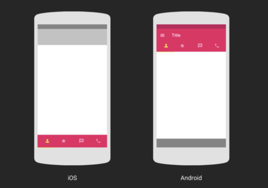
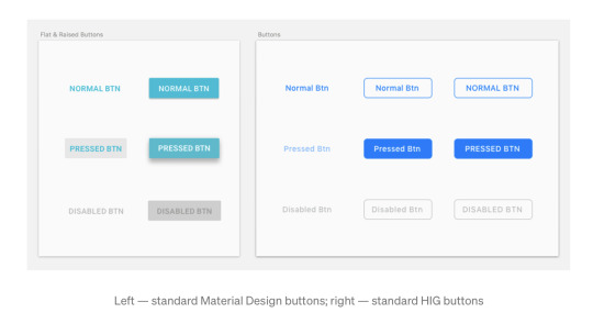
Button Styles
Both iOS and Android environments have specific standards in regard to the way they use buttons as call to action elements, applying to dimensions, colours, text labels, appearance, etc. Android in particular uses a floating button as a main call to action element.
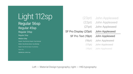
Typography
Android and iOS have both specific standards for displaying test according to hierarchy.
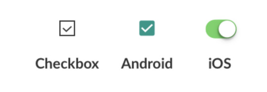
Iconography & Input Controls
iOS: Toggle switches, checked marks, tabs menu. settings button, labels under icons.
Android: Checkboxes, radio buttons,
Micro Interactions
Android: Bottom sheets with options lists
iOS: Bottom sheets with icons and apps
I’m a well discerned Apple boy, so I’m not entirely impartial... I went through an inadequate Blackberry phase and subsequently migrated to Android with my first full touch-screen smartphone before getting my first iPhone. I always felt like a stranger with Android even though I’d never had an apple mobile device of my own to compare performances, usability and visual design... but I must say that once I got adapted to the iOS flow, it was like seeing colours for the first time.
Lately, I’ve been seeing more and more similar UI’s that aim for no differentiation in the designs at all when building apps for both platforms, and it seems that Android’s progressive migration towards iOS standards clearly favor the “Rule of Thumb” as a more natural and practical approach.
My take will always stack against working double shifts... It’s just not productive, and in times where the online virtual universe gravitates towards standardization and normalization, human interaction should be the main focus and not differentiation as this is about user-centred Design, meaning it should be about performance and not branding communications.
Cheers for the sour apples lovers as I believe this waging’s victory is sour apple green, greener than Android, and certainly Dollars green friendly.
PS: I didn’t appreciate Andrew Ow’s comparison of UI standards among platforms with Martial Arts styles... That’s a very specific opportunity to, on the contrary, appreciate differentiation and recognise that a punch is not just a punch.
2 notes
·
View notes
Text
Iterative Design within the Big Apple...
So this would be my take on a 40 min long video presentation about Iterative Design by two members of Apple’s UX/UI Design team.
The very first thing that was clear to me was in regard to the roles each of the speakers had within the Design team due to the specifics of the content they were communicating, the main speaker being clearly more oriented towards UX and the secondary more visually inclined (UI).
I was very interested on the key differentiations the UX guy made about users and product owners’ goals, and business and app goals, making it easier to dissect the project’s scope to assertively answer key questions about the product and it’s contextual variables in order to impact users’ lives through quality design.
Another key insights that the UX guy highlighted during the presentation was in regard to assimilating that even though we use apps, our perspective can not be the solely considered point of view as it is obviously limited and biased because we perceive according to our wiring... but then again, the hidden treasure for me was in the very distinctive emphasis he made when mentioning that everyone can’t be your user either -Which was basically one important feedback from my first solo project-.
Sincerely writing, when the UI guy cloned the app’s screen in 3 minutes using Keynote I felt so low that I only got better when I stopped and looked at all the work I've done these past three weeks and started writing the post about my experience so far, I guess experience is obviously key, but seriously... 3 minutes?!
Progressively, they started adding variations of the original design in order to have a wider range of options to decide from, and even though this implies extra work... it was pretty clear the importance of having different iterations in order to create good and quality designs, which according to the speakers at the very beginning of the video... It’s no easy task.
See you...
#IterativeDesign#UX/UIDesign#UX/UIDesignerInTheMaking#IronhackUX/UIDesign#UX/UIDesignerToBe#AppleDesignTeam
4 notes
·
View notes
Text
Third Week’s The Charm
Hey there people...
On this occasion I’m writing about my experience during the first 3 weeks of Ironhack’s UX/UI Design Bootcamp program and it’s been an absolute pleasure to be able to learn this much in such a short time along with such a diverse group of amazing and talented people.
This week went by like a breeze, between the classes, practices, assignments, and projects, it’s crazy to stop for a minute and look back on everything that’s been accomplished in just three weeks... it all seems so surreal, even though your body might remind you otherwise.
I must say I finally feel like I’m levelling up and feeling more comfortable with my efficiency -if you can call it that just yet-, let’s just say I’m being more effective and maybe quicker in different areas.
This week we learned about User Flows, and how to evaluate them in order to enrich our competitive/comparative Benchmarking activities by mapping out existing products’ innovations and their respective introductions, evaluating competitors’ approach to the same tasks, and analyzing non-competitors apps with interesting viable features.
In regards to Figma and Coding, we learned about animations, interactions and transitions... Later in the week we dove deeper into interactive design and iterative design. We were also introduced to the concept of Proto-Personas during the briefing of our second solo project for next week, which consists in designing a mobile e-Learning app -Biting nails-.
Finally, the highlights of the week mostly reside with our results on the second team project, which if I’m not mistaken... I told you a little bit about last week, anyways... We had to add a new feature to Figma, and we went with a remote usability testing feature we named Figma Testing LAB. The teamwork was solid and fun, and I believe that our feedback and final results can attest to that.
That’s all for this post folks... Keep in tune for next week’s developments!
TA TÁ
3 notes
·
View notes
Text
To see and not to unsee...
Perception is conditioned by knowledge and experience as the article says, an undebatable fact that we can all relate to... in my opinion, perception is as conditioned by these as it is by language if not even more, due to language’s influence over knowledge and experience assimilation.
The perceptual set may be subjective from person to person, but its relationship to cognition is like the dilemma about what came first, whether the egg or the hen... and although for me the answer is always the egg, this might not be accurate to the next person in line, as we don’t see things as they are, but as we are... and we are what we speak.
I think that even though this is not mentioned in the article, this relationship is hinted at by the author through his comparative example between Picasso and Backhaus... He mentions Picasso painting things as he thinks them, while Backhaus tends to trust his eyes more than his brain in his approach to art. If we part from the fact that artists learn how to perceive light and shadow as they are before any painting techniques, we can clearly see that both artists’ perceptual sets are different, based on the fact that they speak different languages due to art being just another form of expression (abstractionism vs. realism).
In the same line, I’m not sure if I entirely agree with the “...once we know how things are made, we’re unable to enjoy them or even create them spontaneously anymore...” statement, in regards to enjoyment I agree with the author as I revel with even more admiration, marvel, and sense of curiosity once I have a more in-depth perspective of how are things done, and therefore more appreciation.
For me, this is intimately related to the dilemma around Design Vs. Taste... and clearly supports the thesis that they’re the same, but only from the ignorant’s perspective
There is personal taste, then there’s knowledge, and finally we have sophistication (fingerspitzengefühl), acquired taste or better yet explained, knowledge applied to personal taste in the pursuit of balance and self identity (craftsmanship). This... intuition (finger-tip feeling) is developed by applying knowledge through training in order to acquire experience, where theory often stands in the way of practice... until it becomes actual practice and designers stop thinking consciously about theory and achieve mastery
Thinking of design as a cartesian map... where the X axis goes from ugly to beautiful, and the Y axis ranges between broken and functional... It might not be the ideal representation for design in general, but it works best for UI design. Within this “map”, there’s a growing path for designers from the middle to the second quadrant area, meaning designers should prioritize functionality over anything else, and with experience they migrate from functional design to really amazing designs in the first quadrant (detailed attention, polishing what you have - trained taste).
Defining design as only aesthetics would make life easier for everyone, but it would be a shallow and superficial act, as functionality would be the most important factor to take into account to rate design as such... how well something works is the only obvious criteria of good design, as you just have to use a product to know if it works well. A lot of good designs are ugly, and while pretty and broken feels phony, ugly and broken is just garbage.
Again… assertive communication, meaning language conditions perception… designers need to communicate accurately through a proper use of language in order to make users see what they see, as once seen you can't unsee.
3 notes
·
View notes
Text
2nd Week of Ironhack’s UX/UI Design Bootcamp
Hello readers...
So I made it through my second week of Bootcamp, and to be honest it’s been a trip!
This week we dove into Figma’s components and variants... and trust me, when I say these features increase productivity and save time, it’s an understatement.
We learned a lot about ethnographic research and the importance of it in order to validate quantitative data from previous user research, and to ensure a proper navigation flow in the prototype’s design.
This week we were tasked with our first solo projects, and the theme was related to habits tracking applications. I’m pretty happy with the concept I came up with, and even though my prototype wasn’t as visually pleasing as some of my peers’... my approach was definitely different and it came through.
Among my learnings of the week... I must say I have some serious time management issues and I also need to dive deeper into Figma. I like working alone as well as in a team, my decision making was definitely quicker in regards to user research and managing the information, yet the design related choices were a little more difficult to make, taking into account that there’s nothing about design in my academic background.
For this project, design related work took away most of my sleep to the point I almost passed out during class... and even though tired and a little worried about Figma, I can’t wait for the 3rd week to start and tell you all about it, let’s hope I’ll be wiser and more pro active towards my time management.
4 notes
·
View notes
Text
CRITS Session # 1
Hey there,
This week I had my first CRITS session regarding my project for the week... A habits tracking app. It was really enlightening and useful to listen to my peers’ feedback in regard to my idea.
Even though I think of myself as pretty assertive, it sure was a challenge to phrase the questions and suggestions properly. I though my biggest effort would be at trying not to defend or advocate for my project and just remain attentive to people’s insights.
It was a real eye opener regarding the flow of the app and how I was intending to deliver, still not deviating much, I managed to comply with the feedback that was given and so far, just getting ready for the presentation.
Wish me luck!!
3 notes
·
View notes
Text
1st Week - Checked!
So I finished my first week of the UX/UI Design Bootcamp program, and I must say I’m fairly satisfied with how things are going... I swear I’d never learned so much in just one week after starting any program in the past.
There’s been a lot of reading, some writing, lots of ideas tumbling around and of course teamwork... We’re still limited to mobile interfaces as there are less variables to consider compared to designing or redesigning a website - This actually peaked my interest as there was a lot of analysis involved in what we’ve been doing so far.
Teamwork proved to be fun, but also challenging, along with getting a proper sleep and complying with every task assigned this week. I actually forgot to propose names for our class earlier during the week as I was concentrated on the tasks that were actually related to UX/UI Design, so I ended up including 2-3 options right before the voting process... but let’s say that I’m taking the good with “water” and the not so good as well - How’s that for building habits? -.
This week we’re supposed to deliver our first solo projects, which has me a little too excited because of the challenge that it presents, but also worried because of the amount of work we’ll be having to put down to comply with both the tasks and the deadline.
Anyways, this project put me on a path for self improvement so besides setting better working schedules you might see more water bottles around my working station instead of the usual red bull cans (I might actually keep and use one of the habits tracking apps I downloaded to check them out).
Talk more during the week...?? Can’t really wait to tell you all about what’s to come...
See ya later alligators...
4 notes
·
View notes
Text
UX/UI Design - 1st Day
So... I survived.
I know it was just the first day and we only had actual classes half of the day, actually there’s a lot more coming... but I feel confident that everything will result in peaches and plumbs (there was a lot of psycho-terror during the pre-work).
There was a very good vibe among the peers and the staff, and even though we're starting at the beginning with the Design Thinking Methodologies, and although so far mostly following the classic approach we learned during the pre-work, there were mentions of Lean and Agile UX, which are concepts of actual interest to me as they’re intimately related to my MBA Dissertation about Lean Processes and my Project Management dissertation related to Agile Methodologies.
It was definitely more challenging to take sketch-notes during classes, so I’ll try to limit it for important tips for now that really call for my attention at the moment. I’m definitely looking forward to submerging myself even more within the experience in order to find my ‘UX/UI Mojo’.
This week we’re supposed to deliver our first project... I’ll be keeping you guys posted on that as well, for now... this is it.
Toodles.
5 notes
·
View notes
Text
To be an UX/UI Design Apprentice
Hey there... So, this is a new adventure that I decided to embark on during the COVID Pandemic to diversify and jump start my career.
I’ll start with a little bit about myself... I’m an IT engineer from Venezuela and I’ve worked in many industries, ranging from Automotive, Chemical, Educational, Automation to even Insurance.
I used to work as Full-Stack developer at Siemens within the Automation Services division. I finished my masters in Project Management with the intention to put distance between me and coding and programming tasks, only to end up analyzing and checking codes from the team I was leading (Ironic).
After finishing my masters, I moved to Buenos Aires, Argentina where I lived for almost 6 years while I worked and finished my MBA Program on Strategic Marketing and Digital Communication Strategies, which is the area I have been working on since I moved to Copenhagen, Denmark.
Here, after some years within Branding Communications and Digital Marketing, I felt the need to go back to tech... See, on my last job (which I lost last year because of a mixture between Brexit and COVID) I used to manage the British market for a Danish minimalistic watch brand as I was UK Brand Manager for Nordgreen, and even though marketing can be challenging at times, digital marketing has made everything so automated and repetitive that I miss driving a stick, so to speak.
Responding to tech’s calling brings me back to my roots, and I believe this UX/UI program allows me to tie it all down as I think there are components of agile project management, systems design and analysis elements, and marketing communications and brand management intertwined within the whole discipline.
The marketing job market is flooded with prospects, and the field itself leaves very little for differentiation (ironically enough), so hopefully with this decision I’ll reposition myself in a better perspective to access better paying, less routinely, and more interesting and challenging jobs.
7 notes
·
View notes