#IronhackUX/UIDesign
Explore tagged Tumblr posts
Visit Tumblr Blog
Explore Tumblr blogs with no restrictions, modern design and the best experience.
Last Seen Tumblr Blogs


Fun Fact
Tumblr has 411 employees.
Text
Iterative Design within the Big Apple...
So this would be my take on a 40 min long video presentation about Iterative Design by two members of Apple’s UX/UI Design team.
The very first thing that was clear to me was in regard to the roles each of the speakers had within the Design team due to the specifics of the content they were communicating, the main speaker being clearly more oriented towards UX and the secondary more visually inclined (UI).
I was very interested on the key differentiations the UX guy made about users and product owners’ goals, and business and app goals, making it easier to dissect the project’s scope to assertively answer key questions about the product and it’s contextual variables in order to impact users’ lives through quality design.
Another key insights that the UX guy highlighted during the presentation was in regard to assimilating that even though we use apps, our perspective can not be the solely considered point of view as it is obviously limited and biased because we perceive according to our wiring... but then again, the hidden treasure for me was in the very distinctive emphasis he made when mentioning that everyone can’t be your user either -Which was basically one important feedback from my first solo project-.
Sincerely writing, when the UI guy cloned the app’s screen in 3 minutes using Keynote I felt so low that I only got better when I stopped and looked at all the work I've done these past three weeks and started writing the post about my experience so far, I guess experience is obviously key, but seriously... 3 minutes?!
Progressively, they started adding variations of the original design in order to have a wider range of options to decide from, and even though this implies extra work... it was pretty clear the importance of having different iterations in order to create good and quality designs, which according to the speakers at the very beginning of the video... It’s no easy task.
See you...
#IterativeDesign#UX/UIDesign#UX/UIDesignerInTheMaking#IronhackUX/UIDesign#UX/UIDesignerToBe#AppleDesignTeam
4 notes
·
View notes
Text
7th Week Dispatched
The week finally ended and so is the last solo assignment of Ironhack’s UX/UI Design Bootcamp, and I must say I’m pretty satisfied with what I accomplished.
The second week of the project was a challenge due to some unforeseen events that made me lose a whole day of work, but thank god for buffers and 1 all-nighter I pulled in the middle of the week.
So first than all, this presentation was done involving external juries within the UX/UI Design field, which was quite awesome to be honest, as we could get a more straight-forward evaluation from fresher perspectives in regard to our work.
I ended up developing a Web App related to the customer service industry for both outsourced service providers, and companies looking to manage their own teams aiming to personalise the customer experience. The idea was for Integration, Automation, and Design would converge in a product that would support both sides of the customer service aisle (agents & managers), and facilitate branding identity and customer service standards compliance.
Obviously, there’s a lot more going on behind what they see during the presentation, and even though I didn’t get a prefect score, having the internal knowledge and analyzing the results through the jury’s words feels like such a win, because not only confirms what you already suspect, but points you onto a path where there’s only growth.
I had good reviews in general, or whatever good you would expect from an engineer in an 2-month intensive program about Design (It was like hammering another life into my brain resulting in a constant feud for coexistence).
Predictively enough my Visual Design capabilities have a lot improving to do (Yes I have eyes, but they function better criticizing/improving than creating), I always knew this would be the most challenging part of this adventure, and to be honest I only look forward to getting better. I’m gonna have fun during the rest of the pandemic improving my projects, designing my ideas, and perfecting my technique.
Coming from engineering and having transitioned into project management and marketing before ending up here, I had enough experience in marketing that I felt confident enough about the branding part related to the bootcamp, I had my doubts about my business approach, because finding creative strategies to monetize digital products is not as easy as it seems.
Luckily, my jury’s appreciation of my research and business proposal, along the roadmap with future growth avenues for both the application and the business proved me wrong and gave me confidence on the fact that all I need is practice, practice, practice...
See you next week!
4 notes
·
View notes
Text
Still mayhem in the 4th week...
This week was super weird as I started pretty ahead with the lo-fi wireframes iterations, business proposal and the branding statement and suddenly I crashed and burned a little on the sides, the way I like my arepas
It was in the middle of the week, right while transitioning from mid-fi wireframes to hi-fi ‘attempt’ that I got sucked in a Figma parallel universe and lost track of time. By the time I realized it, there was no way I was gonna make it to Friday alive and finishing both the Hi-Fi version of the prototype, and the presentation
I was so mad I couldn’t finished in time, I really wanted to show my concept to everyone, but my design fell short to a Hi-Fi prototype, it looked like a Mid-Fi wireframe with a splash of yellow (you would have to take a look at my design report on Medium to know)
All in all I’m pretty happy I got the chance to finish trying to portrait my idea for the app’s visual design along with its brand identity statement and business model proposal. Thanks to my own personal episode in Figmaland -or more like Wonderland- I feel more confident and experimental with Figma, which, if I am cautious enough in the future, will serve in my benefit in my eternal quest for mastering ‘Effective Time Management’
For this week and the next to come... PRIORITIZE AND CONVERGE
I’m gonna cut it short here and not jinx this week’s progress by saying anything else.
XOXO
PS: I’m having fun with Flex-Code...
2 notes
·
View notes
Text
UI Wars - Greens for Apples or Robots...??
So there’s a raging war being waged for a few years now among the grounds of UI Design that broke UX in two major sides with a few misfits scattered around the battle field.
With the goal of differentiation, distinctive styles and iconography have been applied to buttons, input controls, and even the navigation flows when developing apps... impacting significantly the experiences users have when interacting with both platforms.
A few examples to entertain for my own solo assignment for this week are included in the following comparative analysis:
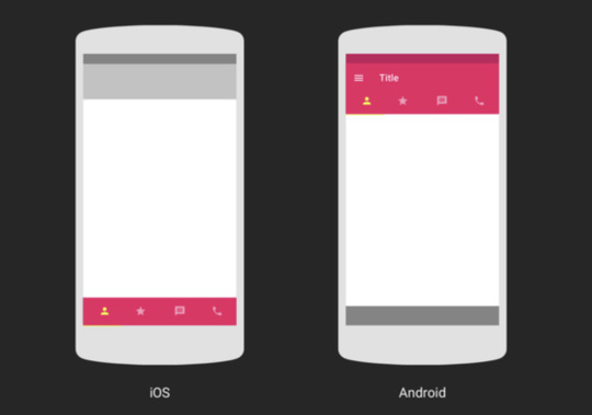
In-between Screens and In-App Navigation Patterns
iOS: Tab navigation bar at the bottom of the screen, swiping to the left to go back, back button in the top left corner,
Android: Tab navigation bar at the top of the screen, standard navigation bar at the bottom, hamburger menu (drawer) for secondary flows, swiping for navigation between tabs
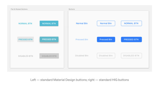
Button Styles
Both iOS and Android environments have specific standards in regard to the way they use buttons as call to action elements, applying to dimensions, colours, text labels, appearance, etc. Android in particular uses a floating button as a main call to action element.
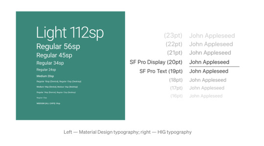
Typography
Android and iOS have both specific standards for displaying test according to hierarchy.
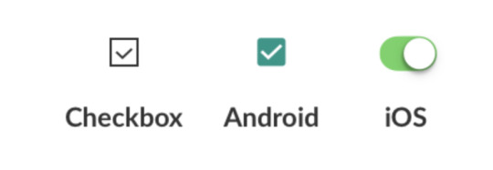
Iconography & Input Controls
iOS: Toggle switches, checked marks, tabs menu. settings button, labels under icons.
Android: Checkboxes, radio buttons,
Micro Interactions
Android: Bottom sheets with options lists
iOS: Bottom sheets with icons and apps
I’m a well discerned Apple boy, so I’m not entirely impartial... I went through an inadequate Blackberry phase and subsequently migrated to Android with my first full touch-screen smartphone before getting my first iPhone. I always felt like a stranger with Android even though I’d never had an apple mobile device of my own to compare performances, usability and visual design... but I must say that once I got adapted to the iOS flow, it was like seeing colours for the first time.
Lately, I’ve been seeing more and more similar UI’s that aim for no differentiation in the designs at all when building apps for both platforms, and it seems that Android’s progressive migration towards iOS standards clearly favor the “Rule of Thumb” as a more natural and practical approach.
My take will always stack against working double shifts... It’s just not productive, and in times where the online virtual universe gravitates towards standardization and normalization, human interaction should be the main focus and not differentiation as this is about user-centred Design, meaning it should be about performance and not branding communications.
Cheers for the sour apples lovers as I believe this waging’s victory is sour apple green, greener than Android, and certainly Dollars green friendly.
PS: I didn’t appreciate Andrew Ow’s comparison of UI standards among platforms with Martial Arts styles... That’s a very specific opportunity to, on the contrary, appreciate differentiation and recognise that a punch is not just a punch.
2 notes
·
View notes