
Seattle-based content strategist who lives for rainy days with books + good conversation over a cup of coffee/tea. Inspired by travel and technology, a minimalist by philosophy, an advocate for sustainable energy, and music addict. She is also the proud owner of a betta fish named Lord Byron.
Don't wanna be here? Send us removal request.
Statistics
We looked inside some of the posts by neon-reverie-blog and here's what we found interesting.
Average Info
Notes Per Post
26
Likes Per Post
22
Reblog Per Post
4
Reply Per Post
0
Time Between Posts
1 month
Number of Posts By Type
Photo
7
Video
2
Text
6
Audio
1
Link
1
Last Seen Tumblr Blogs


Fun Fact
70% of Tumblr users say the Dashboard is their favorite place to spend time online.

Text
8.4.3 Mastery Journal Entry
1. Recycling Bin Graphic Ad - GMT + UPI The UPI as an app hits two birds with one stone: creating a digital living document which will last after the ad placement, well-after being placed - and is appealing to LOHAS for its eco-friendly GMT approach. No waste = the best option as possible. The graphic ad could even be placed on various other spots, like bus, train, Zipcar, and Car2Go stations (lesser carbon-foot print with mass transit) and organic/natural grocery stores, such as Trader Joe’,s PCC Natural Market and Whole Foods (hot spot grocers for LOHAS). 2. Community Management + Narrative Once transmitted to the mobile device, it’ll bring up Mt. Saint Helen’s Porch profile. Porch is a great site for the remodeling and construction industries, particularly connecting convenience and transparency between company and client. This profile can also provide info such as Houzz, Reddit, Facebook, Instagram and Pinterest - all great social media spots for the LOMA audience. The more awareness Mt. Saint Helen would have on these sites, the better chances they have of being covered by Grist.org (Seattle-based green news) and Mother Nature Network, or even for sites/magazines like Dwell. 3. Radio Spot While my voice isn’t the most “motherly”, you can get an idea of how the music, along with the context of the letter from Mother Nature blends well together. It’s short, sweet, while not sacrificing creativity. 4. TV Spot The original script was a lot more specifically targeted at its audience, but I’m actually really happy with the way it turned out. The symbolism of the relationship between nature and sustainability is prevalent in the spot, while also capturing the overall neighborly feel and tone behind the narrative of Mt. Saint Helen. In closing, I did a lot of new things this month, more than I have in a while. I’ve been waiting to create a GMT since I started the program, and I think my rationale would prove right if attempted in reality, especially since I decided to connect the UPI within the blueprint of the GMT. I was a little bummed about not being able to get a few scenes for the TV spot, but I was pleasantly surprised with what I could find to creatively devise a professional spot for television.
1 note
·
View note
Text
8.1 Discussion Post | TV + Radio Spots
Narrative
“Approximately 13-19% percent of the adults in the U.S. are currently considered LOHAS Consumers. This is based on surveys of the U.S. adult population estimated at 215 million. Research shows that one in four adult Americans is part of this group—nearly 41 million people. These consumers are the future of your business and also the future of progressive social, environmental and economic change in this country. But their power as a consumer market remains virtually untapped.” (LOHAS, 2010)
As I covered from last week’s discussion post on LOHAS, the second most profitable market sector is the Green Building category, which emphasizes the importance of green housing elements such as: sustainable flooring, renewable energy systems, wood alternatives and home certification; therefore, these things will be mentioned in the dialogue for both the TV and radio scripts.
Theme, Style + Elements
Other than what is necessary to include in the dialogue, these elements will also be highlighted. This particular eco-friendly home company signifies family, nature and self-expression – a self-expression which exudes independence of one’s self-sufficiency. “The greater the “me too” factor, the lower the potential for the campaign. If your product is another of the hundreds of weight loss products or diets, then you’re likely going to have a difficult time coming up with something new to say to people. Distinctiveness applies not just to the product benefits, but also to the creative approach, the offer, and any other element of the campaign.” (StrategicMediaInc, 2008)
Mt. Saint Helen is watermarked by their geometric “watercolor-tattoo” design, accentuating their relaxed, neighborly greeting of “we’re right next door” underneath the logo, almost like a welcome mat. For both radio and TV, the tone of voice must reflect this image, so it is just as important as who the voice belongs to. Without breaking continuity, yet still being different from its TV spot counterpart, the radio script shares the “With Love, Mother Nature” letter theme which matches the GMT/UPI graphical ad. The TV ad depicts the voice of the poem read and authored by the owner of Mt. Saint Helen. I felt the imagery and the poem recited by the owner helps fulfill that needed transparency by the majority of their target audience, it also speaks to them in an artistic sense. I haven’t wrote poetry in quite a long time, but I think it managed to capture the essence of the brand nicely, while stating the important factors. Let me know what you all think of the radio and TV spots!
Radio Spot
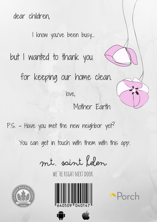
“Dear Children, (1 sec)
I just wanted to thank you for keeping our home clean and welcome our new neighbor, Mt. Saint Helen. (6 sec) I know you’re busy, but you can get a hold of them by using the Porch app on your phone. (8-9 sec) They have a variety of wood alternatives, sustainable floorplans, and they can even help you get LEED certified. (12 sec) Don’t they sound nice? I think you’d really like them. After all, mother knows best.
With love, Mother Nature.” (18-20 sec)
TV Spot (Owner of Mt. Saint Helen reading poem)
“Memory is art, it ages like wine
[Close-up of young father’s tattoos, caressing child with a smile]
{-2 sec mark}
Beautiful whether in rain or shine
[Child painting on a canvas, rain beads against the window]
{4 sec}
Always free from judgment’s glare,
[Father helps child with homework]
{5 sec}
Always welcome with love and care
[Father and child welcome mother home from work]
{7-8 sec} Free from hurt, your space, your zone
[Mother reading child a story before bed]
{10 sec} To all on earth, this is our home
[Family of three eating together at table in dining room]
{13 sec}
From dirt, to the wood and stone floor
[Hands with soil gardening, reclaimed wooden floors in an empty space]
{15-16 sec}
Mt. Saint Helen, we’re right next door"
[Shows logo, LEED certification seal, contact information, poem recited and written by Joy O'Byrne, owner of Mt. Saint Helen]
{17-20 sec} References:
About|LOHAS. (2010). Retrieved from http://www.lohas.com/about Depper, D. (2016, March 17). Wholesome 7 - Needle Drop Co. [Mp3]. Free Music Archive.
Market LOHAS. (n.d.). Retrieved from http://www.marketlohas.com/ The Top Ten Keys To Creating Great Radio Ads. (n.d.). Retrieved 2008, from https://www.strategicmediainc.com/newsroom/top-ten-keys-creating-great-radio-ads
0 notes
Audio
This is a sample radio spot created for the (fictitious) Mt. Saint Helen, an eco-friendly home company. Rough draft for Design Integration class. Notes: I made some changes to the script, and will be making a few more for the final product (something to replace 'children' maybe... any suggestions are welcome!). Please, pay no mind to my voice, as it isn't exactly "motherly"... but at least the music is a saving grace. musical track by Dave Depper, published by Noise Drop Co. via FreeMusicArchive.com.
0 notes
Photo
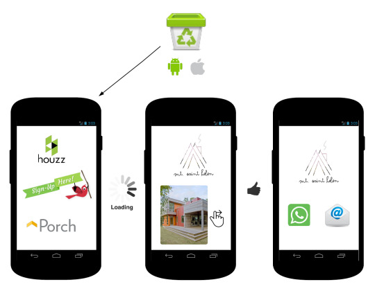
Rough draft of UX wireframe for Mt. Saint Helen GMT (guerrilla marketing tactic). A more elaborate one coming soon. 1. Audience recycles, owns iPhone or Android OS-phone. - Scans barcode (in this case we'll use Porch as an example). - Sign in, or sign up. 2. Mt. Saint Helen profile on Porch loads. - Shows recent work done, choice of materials, floorplan designs, other info... 3. Audience likes what they see, taps on the Contact icon. Brings up interactive methods of contact. Tap green-phone button to call, tap the envelope icon to e-mail through preferred e-mail.
0 notes
Text
MDM620 Design Integration | Week 1
Unique Promotional Item
“A product should offer ecological products which not only must not contaminate the environment but should protect it and even liquidate existing environmental damages. A distribution logistics is of crucial importance; main focus is on ecological packaging. Marketing local and seasonal products e.g. vegetables from regional farms is more easy to be marketed “green” than products imported.” (r. Dr. Sunmeet Banerjee, Marketing Mix, page 72)
In my style guide, I used an example of recycled pens with the brand name for marketing collateral, and I was going to go with this, but would it be effective? Even if they were passed out at some event, I couldn’t imagine them leaving that profound of an impact on attendees. Then I thought about how we view recycling bins...

We already have electronic recycling bins that are solar-powered and compact trash, but what if we personify the act of recycling, to maybe help raise brand awareness (possibly even strengthen a partnership), especially when hosting a campaign?
With green marketing, the affiliation of a company scares most of the potential audience away with disruptive advertisements – they are already numb to the idea of a company seeking for acceptance among the LOHAS. However, if the act itself piques interest while blending into daily life among their surroundings; I think it has the potential to earn praise the right way, from the right crowd.
I realize that this opinion on recycling bins varies between state to state, or even by city – but to serve as a reminder, Mt. Saint Helen was founded in Washington State, and has an Oregon and California office as well. These cities are particularly LOHAS-friendly. I know this from a personal experience, as it was one of the reasons why I relocated to Seattle.
Over 90% of Seattle’s electricity is hydro-powered, with a more recent ordinance requiring and prohibiting all businesses and residents from putting food scraps, compostable paper, yard waste, and recyclables in their garbage. This way of life is ingrained into the culture, and when a business can encourage this behavior to people when they recycle, it blends with the lifestyle of the people, it doesn't interrupt it. That's when technology has the potential to become second nature.
Some Things to Consider: Green Guerrilla Marketing Perhaps the most dreaded question a guerrilla marketing technique will face is “will it work?”, and the tricky part about this question is that there is no quantitative research that can relieve this, as each social marketing idea is custom-tailored to fit variety within a niche audience. It only makes sense, humans are complex creatures – but we are also social creatures; should the opportunity or event arise to challenge this unorthodox social design, then the real question becomes; how will we know when our aim is true? In order to make guerrilla marketing effective, you need to gain a deep understanding of the different levels of your audience spectrum – this is the case for green marketing, as it is for social marketing – although, perhaps even more. Everett Rogers (the creator of “Diffusion of Innovations” formula), he also claims following these five factors is a good way to troubleshoot whether or not your idea will be adopted, specifically speaking for eco-friendly idealism. 1. “Relative advantage: is the degree to which the new behavior is believed to accrue more beneficial outcomes than current practice.” 2. “Observability: is how easy it is to witness the outcomes of the new behavior.” 3. “Trialability: is the ease with which the new behavior can be tested by an individual without making a full commitment.” 4. “Compatibility: is the degree to which the new behavior is consistent with current practice.” 5. “Complexity: is how difficult the new behavior is to implement” Much like Everett’s Diffusion of Innovations theory, there is a tool for the measurement of this particular audience, called LOHAS (Lifestyles of Health and Sustainability, developed by the Natural Marketing Institute), which describes the four categories of varying influence of environmental awareness has on a consumer’s purchase decisions: LOHAS: “Active environmental stewards dedicated to personal and planetary health. These are the heaviest purchasers of green and socially responsible products and the early adopters who influence others heavily.” Naturalites: “Motivated primarily by personal health considerations. They tend to purchase more LOHAS consumable products vs. durable items.” Drifters: “While their intentions may be good, DRIFTERS follow trends when it is easy and affordable. They are currently quite engaged in green purchasing behaviours.” Conventionals: “Pragmatists who embrace LOHAS behaviour when they believe they can make a difference, but are primarily focused on being very careful with their resources and doing the ‘right’ thing because it will save them money.” Unconcerned: “Either unaware or unconcerned about the environment and societal issues mainly because they do not have the time or the means – these consumers are largely focused on getting by.” Defining who the audience is only one part of the solution, but what about understanding the consumer’s needs? In ecologist consultant Gil Friend’s The Truth About Green Business, he discusses how design integration benefits a team in the sustainable market, and teaching how to appeal to the standards of the LOHAS:
“Lead, don’t follow. Some companies wait and react to regulation and market shifts. Some companies define the way forward by making a strategic asset out of integrating the laws of nature into their operating systems. These leaders are creating new profit centers out of unprecedented resource efficiency. Trim your sails, be efficient, and eliminate waste – of all kinds.” Page 210, The Truth About Green Business. Additionally, social marketing strategies are encouraged, as Dr. Sunmeet Banerjee discusses what’s necessary to consider in the process, via his journal, “Environmental Marketing (Green Marketing Rudiments”:““Publics: Effective Social Marketing knows its audience, and can appeal to multiple groups of people. ‘Public’ is the external and internal groups involved in the program. External publics include the target audience, secondary audiences, policymakers, and gatekeepers, while the internal publics are those who are involved in some way with either approval or implementation of the program.Partnership: Most social change issues, including "green" initiatives, are too complex for one person or group to handle. Associating with other groups and initiatives to team up strengthens the chance of efficacy. Policy: Social marketing programs can do well in motivating individual behavior change, but that is difficult to sustain unless the environment they're in supports that change for the long run. Often, policy change is needed, and media advocacy programs can be an effective complement to a social marketing program.” Conclusion for UPI (Unique Promotional Item) + GMT (Guerrilla Marketing Tactic) So after all of this research, I decided the best course of action was to create a graphic ad for recycling bins around the Seattle, Portland and Northern Californian cities. Something that reinstated home, but intertwined with a sort of environmental marketing that would pique interest among their daily lives, not interrupt their natural surroundings - after all, no one likes random ads, but a strategically placed ad can do wonders.
The partnership with apps/web-bases like Houzz or Porch connect with individuals who identify as either remodelers for their home, or first-time homeowners. Downloading apps have become second nature to us, much like the act of recycling here in the Pacific Northwest.
I wanted to at least leave a lasting impression of what Mt. Saint Helen is about, as well as set nature at the forefront of their cause. I also wanted to understand how to spice up the recycling experience, rather than obstruct someone’s daily errands. What better than to quickly scan a QR code to passerbys or those waiting for the bus/train, rather than giving out something like a pen made of recycled materials with the brand name on it - people forget they have it, or maybe they just weren’t wearing their pants with pockets that day. Best reason of all, there is physically no waste that comes from downloading an app - but you are creating community.
#marketing research#green marketing#sustainable living#eco-friendly home design#environmental marketing
1 note
·
View note
Link
This month was an absolute blast. I thoroughly enjoyed the research and creative process for the style guide assignment, which I had loosely based off of another style guide that was catered to another eco-friendly construction company. The only issue I had this month was the fact that I couldn’t offer much advice for my peers, as an unexpected family emergency happened earlier on this week - but I think I was able to bounce back from this rather quickly, given the unfortunate timing. Anyway, onto the review of this month! I definitely grasped the most inspiration from the Lynda tutorial with Mr. French’s foundation of a style guide. I really like how free-flowing style guides can be, which vary from brand to brand, I especially had an overflow of ideas for marketing collateral for my client, Mt. Saint Helen. At first, I was going to create a logo-wrap onto an electric car, but I felt that didn’t entirely suit the company. So then I thought about what kind of products would my audience really appreciate, but can be cheaply produced, and good for the environment? A few thoughts came to mind: a style guide in the form of an interactive website that can be accessibly via mobile device (phone or tablet), and a business card which suits the mobile app’s hierarchy scrolling feature which is popular among mobile users today (and it eliminates the need of paper). To add to even more unconventional design, I’d love to see the business card printed with a LifePrint. When personable interactions do happen between consultant and potential homeowner, a pen would be an easy way to slip into a purse, and have a good conscious when it runs out of ink. When it comes to researching for textures, I took advice from a peer about looking into texturepalace.com, which seems to be a great site for good quality textures, which I have used it for the style guide. As French suggested for a section dedicated to imagery, photography and illustrations were a breeze to find via Flickr’s Creative Commons, and I believe suit the overall aesthetic of the brand. At first, I was going to use a blue-print design, but as peers and I have agreed, the blue-prints didn’t really make sense with the theme of Mt. Saint Helen. However, I was very pleased when I did manage to find a suitable illustration of a floorplan. Having another pair of eyes has always been helpful, but I never fully utilized it until now. It may be a small thing to include, but the other thing I will be doing a lot more of is asking for outside advice in the future, as I’ve had trouble consulting for trusted advice in the past. A designer can nit-pick as often as they can, making sure aesthetics align with what they have envisioned - but it isn’t until the user steps in, which humbles the designer, bringing aesthetics practicality that we often over-complicate - and if it is anything I am known for, I tend to over-complicate or over-analyze things. For instance, I had trouble with the business card’s placement of “design with nature in mind”, but until I asked a trusted friend when showing him several different placements, he pointed out something I didn’t notice. The cracks in the wood line up perfectly with some of the letters, which created a really aesthetically pleasing and natural placement, which also made sense given the context.
1 note
·
View note
Photo


A peer of mine said the logo lacked the “construction/home” part (The logo above it was the original), which made more sense the more I thought about it. At first, I started off with a geometric home (two walls, a roof), but it needed something more... then I thought about the mountain itself, and how destruction is a form of creation of itself. Instead of creating an image to ignore a rather ugly part of it's past, why not turn something ugly into something beautiful? There's no reason to condemn a natural landmark forever - while not natural, the World Trade Center in NY was able to transform the unfortunate memory into the Freedom Tower.
As far as the design goes, I used three to represent a family (mother, father, child), as well as the mountains (nature) becoming a symbol of home, with the image of a chimney and a smaller house in the last layer. I still wanted to use the unconventional color scheme, so I used the original flower with a clipping mask... it's ironic that even for this logo I recycled, but I'm very pleased with the final logo. All that’s left is to animate it! :)
1 note
·
View note
Video
tumblr
As promised, here’s the final dynamic moodboard I’ve been working the last few weeks. I have noticed a blip in the audio, and for some strange reason, I haven’t been able to really figure out how to change it, but if I do, I’ll wind up posting the update on that. Other than that, there have been some slight changes, but I feel that these changes were well done for reasons only for improvement. Let me walk you through my thought-process:
Throughout this month, I wanted to cover Mt. Saint Helen as an eco-friendly construction company who values self-expression and family. Originally, I had intended for the moodboard to cover various versions for all three offices: Oregon, California and Washington. However, since I only had such limited time, I quickly realized that I’ve bitten off more than I could chew. It was a good problem to have at the time - I simply had so much content that I felt like however I presented it, I felt like I would be confusing the client, more than zeroing-in on the main idea: the audience and their values for preserving the environment. Not how many offices there are, and how there are different logos for each office, according to their own natural beauty. To fix this, I chose a color palette that I felt described Mt. Saint Helen at their best. A pastel pink with a neutral off-white, and hues that would match this theme, but that also capture the colors of nature. The flower? Believe it or not, it’s actually a small weed I found while walking my dog back when I lived in Florida. You’ll also notice that it isn’t geometric, which was a decision I made due to the fact that if it were geometric, it could really pigeon-hole Mt. Saint Helen from expanding their audience in the future. I did go with the watercolor, though. I also went with different copy. I’m not sure whether I like it better than the original placeholder: “home for the bold-hearted”, but it certainly captures the voice of the brand: “Open doors for open minds”. Sweet and to the point, it states who they are, and who their audience is, without the pigeon-hole - yet still preserving their niche audience of youthful couples and for those beginning their family.
0 notes
Photo


This month I’ve been working on creating moodboards for Mt. Saint Helen, an eco-friendly housing company. With three offices based in the Pacific Northwest (San Fransisco, Portland and Seattle), the target audience I chose for this particular client would be of the older millennial spectrum, 23-35, young couples, newly-weds and those who are new to the world of parenting. Mt. Saint Helen’s values reflect the values of their audience, which are: nuturance, security and self-expression (or individuality).
Why this audience? The majority of eco-friendly construction companies and realty options are not focused on this particular psychographic and demographic - in fact, there is an overwhelming majority geared toward lifestyles of excessive luxury, rather than minimalist practicality, for those who really want to continue giving back to nature after spending their young professional lives working in a city. A good amount of these people are ready for the next step. Here, you’ll find some of the typefaces I’ve been thinking about using for the dynamic moodboard project, which I’ll be posting this Sunday.
1 note
·
View note
Text
Quality is a top priority at Sephora, not only for their reputation, but it depends on their customer’s expectations of the price and value to match. With almost 2,000 stores in 29 countries (r. About Sephora, Sephora), Sephora boasts an overwhelming selection of luxury, mostly exclusive brands for their diverse and niche clientele. With their active online community and self-serve in-store environment, the same treatment is distributed to all. (r. Make Up Forever Unveils Transgender Model Andreja Pejic’s New Campaign, Racked.com, June 2015) From high-class models, beauty gurus, to cosplay enthusiasts, Sephora believes everyone deserves the same professional advice and beauty secrets right from the leading, innovative professionals in the cosmetics industry, allowing any customer to walk out the door feeling beautiful and to purchase with confidence. (r. Sephora’s Market Segmentation Responsible for its Retail & Online Strengths, Tung, J., April 2013) One of Sephora’s most popular and trusted brands, Make Up Forever, launched the “BE BOLD. BE UNEXPECTED. BE YOU.” campaign in the summer of 2015, to celebrate artistry and creative expression, as well as the first transgender supermodel (Andreja Pejic) to sign a makeup contract. Narrative: I’ve always been considered a free spirit, and my mother raised me to be proud of who I am; to be different and embrace individuality. When I lost my mother to tuberculosis, I was absolutely devastated… and as I got older, I just forgot how to be myself, and every time I’d look in the mirror, I didn’t know who that person was. Years later, when I went to college in attempt to try to find myself, a friend of mine took me to my first trip to Sephora… and ever since then, the stranger that was my face became a canvas. I used makeup as a way to cope and unleash that creativity I thought I’d lost. I don’t think society can ever understand that some men want to feel beautiful in makeup too, and maybe that makeup isn’t about finding yourself, but creating yourself. Nostalgia has always been unanimous with Nintendo; the video game company’s all-ages demographic still reigns supreme, and have been successful separating itself from the life-like graphics, and more adult content of its competitors, Sony and Xbox. While some of their sales have arguably suffered in first year of releasing a new console (Nintendo Was Right About the Wii U. We Were Wrong, Endgadget, June 2015), Nintendo reaps the benefits to their innovation and distinct franchises (r. 11 Gaming Innovations We Owe to Nintendo, IGN, August 2014.) Throughout the Nintendo’s family tree, they have always been considered a late-bloomer for success, yet still dominate from family-friendly living room console to handheld platform, and possibly the mobile app industry with Nintendo Direct. (r. What Does Success Look Like to Nintendo, Games Industry, August 2013) Some years ago when the Wii was released in Italy, a campaign was launched: “Wii’ll not forget.” Street-posts displayed Nintendo’s recognizable characters in pixel art advertisements, made entirely out of brightly-colored sticky notes to catch the eyes of passer-bys. If someone were to be so inclined to take one, he or she would find a short note from Nintendo: “Wii brings the memories back to life with the Virtual Console. A wide selection of all-time best games is available to download from the Internet via the Wii Shop Channel. Whether you’re a nostalgia fan or a new player, the Virtual Console will be for you an unforgettable experience.” Narrative: Christmas of ’85 - my parents could never understand it at the time, but they went with it anyway. After so much time spent playing video games and not enough time with family, they blamed the game for time lost in my childhood. But now, their tune has changed – it took them until I was raising kids of my own to realize the joy of Mario or Pokemon, but they’re playing it all now, too. It’s become a family holiday tradition, and with so many years gone by, it’s time to pass the torch. Walking down the isle of a retro video game store, with my daughter’s hand in mine, seeing her wide-eyed and pointing at the games she will later cherish.
References: BE BOLD. BE UNEXPECTED. BE YOU. Trailer [Motion picture]. (2015). Chapin, A. (2015, June 4). Make Up For Ever Unveils Transgender Model Andreja Pejić's New Campaign. Retrieved from http://www.racked.com/2015/6/4/8729589/andreja-pejic-make-up-forever Conditt, J. (2015, July 17). Nintendo was right about the Wii U. We were wrong. Retrieved from http://www.engadget.com/2015/07/17/nintendo-wii-u-love/ Fahey, R. (2013, August 9). What Does Success Look Like to Nintendo. Retrieved from http://www.gamesindustry.biz/articles/2013-08-09-what-does-success-look-like-to-nintendo Guerrilla Marketing defined: Wii guerrilla marketing. (n.d.). Retrieved from http://blog.guerrillacomm.com/2007/07/wii-guerrilla-marketing.html Tung, J. (2013, April 21). Sephora's Market Segmentation Responsible for its Retail & Online Strengths. Retrieved from http://justintung.com/2013/04/21/sephoras-market-segmentation-responsible-for-its-retail-online-strengths/
1 note
·
View note
Text
7 Myths About User Experience Research
7 Myths About User Experience Research
User experience research—studying people and how they use a product in order to improve it—is a great career that people entering the tech field tend to overlook. I nearly overlooked it myself, largely because of a few myths I’d heard about what it’s like to work in research. After two years working as a researcher, I know the truth behind those myths and am sharing it below in the hope it’ll encourage more people to consider working in this awesome field.
1. You’ll be pigeonholed
A common worry of people who could be great researchers is that taking a job with the title “Researcher” will brand them forever as someone who can only do research. First, to set things straight: this is incorrect. I know many people who have worked as researchers and then gone on to different roles without anyone standing in their way saying, “No, thou shalt always henceforth be a researcher and thou shall be no other thing, the leopard cannot change its spots, it is against nature!!!”
But additionally, developing a research specialization isn’t a terrible curse: it’s actually one of the smartest things you can do for your career. If you do decide you want to switch specializations or become a generalist, research will be a great foundation because it gives you the whole “understands real people” cachet that’s widely acknowledged to be useful in developing software for humans.
2. You don’t get to design
Researchers design. Designing isn’t their primary task, but researchers most certainly produce deliverables that are sketches and wireframes. In fact a sketch or wireframe is often exactly what a team wants most from you, since it’s the quickest way for them to understand your insight or idea about an interface.
There’s still a major difference between you and a designer, of course, and that’s that while you amuse yourself for half an hour sketching out your great ideas, the designer gets to spend weeks grinding hers into perfection. If you really love nothing more than to spend 10 hours of your day focused on a design, then by golly, you’re a designer, go make it happen. But if you’re actually kind of lazy when it comes to execution, then the research version of “design” is your ticket.
3. It’s not creative
Just as my parents asked of me back when I was fully convinced the only thing I could do with my life as a creative person was to write fiction, I’m going to ask you to expand your definition of “creative” just a tiny little bit. I admit that’s not so easy to do from inside our “I make things”/ “I build things” tech hero culture. But creativity really just means coming up with new stuff, and that stuff does not have to be visible or tangible in order to “count.” Research requires you to come up with a ton of new stuff: new questions, new methods, new communication tactics, new product ideas. Good researchers are very creative.
4. It’s too academic
By “too academic” I’m going to assume you mean “not applied enough.” So, some large companies do employ some researchers to go off on their own and do whatever exploratory research and write a paper about it. However, all employers, and certainly small-to-medium ones, mainly would like for their researchers to help them figure out what the hell they should do with their products. That’s applied research. Rather than disappearing to write endless reports nobody will read, an applied researcher insinuates herself into the heart of the product team and gets to know everyone and everything that’s going on. She then uses that on-the-ground knowledge to design research that the team actually wants, and shares the results in brief, casual, entertaining formats that would never ever make the cut at CHI.
5. You’re stuck in a lab
A lab is a great resource and there’s no end to the gadgets you can play with in there. But if you’re doing research right, you’re running as many studies as possible out in people’s real environments: you’re intercepting people on the street, visiting them at their homes and workplaces, or videoconferencing with them wherever they may be. As a researcher, you get the hell out of the office all the time—and unlike your non-researcher coworkers, you don’t spend that time in conference rooms.
6. There’s no endgame
Compared to the scads of successful designers, engineers, and entrepreneurs out there, there are relatively few research superstars to look up to as models of success. This can be both confusing (what does success look like in research?) and discouraging (is there such a thing as success in research?).
I encourage you to look at this challenge as an opportunity. The field is still new, growing, and looking for leaders: you can be one of the people who define success, and you can do it your own way. And as you’re starting out, if you look hard, you will find there are lots of great mentors out there for you.
7. No one cares about research
Correction: Most people don’t care about research. The others do. Those others are probably the people you want to be working with anyway. In time you will find them, become best friends with them, and make beautiful music together. 12/11 - This was a great article by Jane Justice Leibrock (Research Lead at Even) for several reasons. Not only is she a professional in the industry and I am just beginning to dip my feet into the pool that is UX Research, I realize the reality: this field is just much as a newborn as I am. I’ve been feeling to not treat it as such, to give it the rigorous and strict parenting as I do to myself, when the reality is that I should be looking at it as I do with writing. Professionals from all different backgrounds, from the coders, designers or marketers did not become a UX professional overnight. I will have qualities that other UX researchers won’t have, and vise-versa. When I applied for my first internships, there was this looming idea of competition that was unhealthy and enforced by the media, as well as my peers. I felt that no matter what I did, I was never going to set myself apart from the others, even though that shouldn’t exactly be the viewpoint that I should be having. I assumed employers saw me and other potential candidates as better and worse versions of myself, not individuals of themselves. Instead, seeing that I am an individual with my own set of qualities, and not every employer will see me as the starry-eyed millennial that hasn’t had her dreams completely destroyed yet. Being humble is a good quality to have, but walking around with a blindfold will only shroud you from the truth. As a realist, and self-identified humanist, I know that not everyone will see it this way. I know I’m right in saying this, and as much as we don’t like to admit it, we judge based on appearances. Age. Gender. Weight. Hair and skin color. What we sound like when we talk, what we look like when we laugh or frown. It’s all in this subconscious mind from a negative perspective, through a negative lens. As a self-identified humanist, my philosophy is only to hope, and to witness the best in humankind, because we are all individuals who live and die under the same sky. And to be honest, would I want to work for a company that sees me and other candidates as failed and perfect clones? “But you can’t be picky in this day and age.”, as the devil’s advocate would say, and I would agree, that a life to shun out possibilities and opportunities because of close-mindedness isn’t a life living to its potential. The same close-mindedness that a potential employer has. The best advice for interviews? It is just as much of an interview for you as it is for the employer. They might be asking the questions, but the filtration system works both ways.
0 notes
Photo


DESIGN RESEARCH MASTERY JOURNAL ENTRY, 11/22 - These are film posters as a response to our chosen fake titles. I went with Moonlight Circle, and decided to go with the following genres (in order of the posters): Documentary, Sci-fi/Noir/Crime, and Horror/Comedy. I’ll go over the inspiration and explain why I went with that particular design for each one. 1. Moonlight Circle (Documentary) Since I was working with a documentary based on astrophotography and the moon, I didn’t want to explain too much in a poster, and I personally don’t care for cluttered movie posters, especially documentaries. This particular documentary that I imagined isn’t overly concerned with authenticity, as opposed to raising educational awareness of an obscure, but growing interest niche community. To prevent giving too much away, I decided to take a look some of the documentaries I’ve seen before. Luckily, my partner’s parents are quite fond of documentaries on UFOs, urban legends, etc., so I did some scouting for covers on Netflix and went from there. To be honest, I wasn’t really sure what to do for a tagline, so I left a rather silly placeholder. 2. Moonlight Circle (Sci-Fi/Noir/Crime) I’ve always been a fan of sci-fi, especially when it crosses over to the noir/crime storytelling format. The idea was simple - a special agent searches for her captured partner. The connection for the tile was with the name of a cult which held her partner captive, and “circle” being in reference to “closed circle mystery”, which is a type of convention often seen in the realm of mystery novels. Being an enormous fan of both genres, my research for posters were based on media I was familiar with, respectively. I also attempted creating an animated-feel, in reference to some anime shows like Ghost in the Shell, Alois Nebel, and Ergo Proxy to name a few. 3. Moonlight Circle (Horror/Comedy) This one was probably my favorite to create out of the three, and it’s about a supernatural crisis hotline called Moonlight Circle, where the setting takes place in the office, which is the workplace for a vegetarian werewolf, a socially-awkward zombie, and a melodramatic vampire. One of their employees leaves, and a human is employed to fill in those boots, which creates for hilarious drama in a mockumentary format. I wanted to go with something minimalistic, cheeky, but not without explaining the premise. In case you were wondering, this design idea was actually born out of making a mistake on Photoshop for the documentary example. I had plenty of idea for this, but nothing quite stuck out like this one. I didn’t want to make it seem too insensitive (nothing funny about suicide or depression), so I steered clear of making an advertisement, highway billboard, and tried to get a little creative. I wanted it to remain enigmatic, but with some cheeky humor added in the mix at the top reading: “based on real urban myth”, and added the face in the moon for light-hearted comedic effect. For inspiration, I looked at the logo for The Office television series, but created a playful horror-themed type of text and color scheme. As for an overall review of the class, I had a blast learning how to create an infographic, the history of a lot of these designers (as well as their career paths), and of course, these movie posters were also fun to create. Above all else, I very much enjoyed the previous week’s discussion post on discovering marketing campaigns. I decided to go with one cross platform campaign, and a guerilla marketing campaign, in light of the guerilla designers I chose in the beginning of this month. I thoroughly enjoyed researching on the why and how to create certain narratives for these campaigns: BE BOLD. BE UNEXPECTED. BE YOU. Trailer Quality is a top priority at Sephora, not only for their reputation, but it depends on their customer’s expectations of the price and value to match. With almost 2,000 stores in 29 countries (r. About Sephora, Sephora), Sephora boasts an overwhelming selection of luxury, mostly exclusive brands for their diverse and niche clientele. With their active online community and self-serve in-store environment, the same treatment is distributed to all. (r. Make Up Forever Unveils Transgender Model Andreja Pejic’s New Campaign, Racked.com, June 2015) From high-class models, beauty gurus, to cosplay enthusiasts, Sephora believes everyone deserves the same professional advice and beauty secrets right from the leading, innovative professionals in the cosmetics industry, allowing any customer to walk out the door feeling beautiful and to purchase with confidence. (r. Sephora’s Market Segmentation Responsible for its Retail & Online Strengths, Tung, J., April 2013)One of Sephora’s most popular and trusted brands, Make Up Forever, launched the “BE BOLD. BE UNEXPECTED. BE YOU.” campaign in the summer of 2015, to celebrate artistry and creative expression, as well as the first transgender supermodel (Andreja Pejic) to sign a makeup contract. Narrative: I’ve always been considered a free spirit, and my mother raised me to be proud of who I am; to be different and embrace individuality. When I lost my mother to tuberculosis, I was absolutely devastated… and as I got older, I just forgot how to be myself, and every time I’d look in the mirror, I didn’t know who that person was. Years later, when I went to college in attempt to try to find myself, a friend of mine took me to my first trip to Sephora… and ever since then, the stranger that was my face became a canvas. I used makeup as a way to cope and unleash that creativity I thought I’d lost. I don’t think society can ever understand that some men want to feel beautiful in makeup too, and maybe that makeup isn’t about finding yourself, but creating yourself. Nostalgia has always been unanimous with Nintendo; the video game company’s all-ages demographic still reigns supreme, and have been successful separating itself from the life-like graphics, and more adult content of its competitors, Sony and Xbox. While some of their sales have arguably suffered in first year of releasing a new console (Nintendo Was Right About the Wii U. We Were Wrong, Endgadget, June 2015), Nintendo reaps the benefits to their innovation and distinct franchises (r. 11 Gaming Innovations We Owe to Nintendo, IGN, August 2014.) Throughout the Nintendo’s family tree, they have always been considered a late-bloomer for success, yet still dominate from family-friendly living room console to handheld platform, and possibly the mobile app industry with Nintendo Direct. (r. What Does Success Look Like to Nintendo, Games Industry, August 2013)


Some years ago when the Wii was released in Italy, a campaign was launched: “Wii’ll not forget.” Street-posts displayed Nintendo’s recognizable characters in pixel art advertisements, made entirely out of brightly-colored sticky notes to catch the eyes of passer-bys. If someone were to be so inclined to take one, he or she would find a short note from Nintendo:
“Wii brings the memories back to life with the Virtual Console.
A wide selection of all-time best games is available to download from the Internet via the Wii Shop Channel.
Whether you’re a nostalgia fan or a new player, the Virtual Console will be for you an unforgettable experience.”
Narrative:
Christmas of ’85 - my parents could never understand it at the time, but they went with it anyway. After so much time spent playing video games and not enough time with family, they blamed the game for time lost in my childhood. But now, their tune has changed – it took them until I was raising kids of my own to realize the joy of Mario or Pokemon, but they’re playing it all now, too. It’s become a family holiday tradition, and with so many years gone by, it’s time to pass the torch. Walking down the isle of a retro video game store, with my daughter’s hand in mine, seeing her wide-eyed and pointing at the games she will later cherish.
0 notes
Photo

Not bad for an aspiring user experience researcher, huh? While Photoshop/Illustrator may not be my forte, I thought to renew an atypical idea for a timeline for an infographic, by implementing an active timeline by showing the dates and eras of that designer. I was also going to include Exit Through the Gift Shop in there to tie in Shepard Fairey and Banksy, but I felt that documentary was more concerned with the filmmaker, even though the documentary itself is considered an art project, controversial or not. Infographics aren't exactly about details, for example: how Lissitsky and Rodchenko being friends, or how Shepard Fairey was involved in documentary/art project with Banksy, or even how Shepard created the HOPE poster, while Eine presented a gift to President Obama. I could make those aforementioned connections, but I decided to stick with the purpose of an infographic: condensing facts ordered and projected in an image format. When I put things into perspective, the more sense it makes. I chose a designer who primarily was known for guerilla art - designs created to pose questions, to make people think, or evoke emotion. Most of my favorite designers are guerilla designers - Daan Roosegaarde, for instance. The team at Rainworks. While I may not be equipped with the team to create a full-blown design solution, I’m anticipating the process of researching design techniques, creating wireframes/sketches with Balsamiq, and interviewing audiences to measure psychographics effectively. I wonder what my design capstone will be? Either way, I have time to figure that out still, and I’m in no rush to get there... just anxious.
3 notes
·
View notes
Text
“Oohh, back to school... back to school...”
Sorry, I couldn’t resist! After a well-needed break, I’m ready to kick some butt! So keep your eyes peeled, because I’ll be posting class-related projects, as well as some work I’ve done outside of class. PAX was nuts, but totally worth it. I even started a new job the month prior. I’m working at a retro gaming store (although we carry some new titles), and host board game nights on Mondays and D&D on Tuesdays. If you’re local and interested, just let me know. For now, I got a busy night ahead of me. Happy National Coffee Day! <3
1 note
·
View note
Photo
I wrote this a long time ago for a class assignment for short stories/fables, and admittedly this isn’t a style I wasn’t used to writing in... I even made a sequel fable to this that got 383 reads. Maybe I should release a third - then edit and revise all three into hard copy books - or just one book filled with dark “adult” fables. I do have to make a book cover for one of my classes, so we’ll see... although nothing can beat the cover that Matty did. It does make me happy that this has 14 notes. :) I need to remind myself more often to celebrate even the little victories.

The stench of a burning cesspit bade us farewell from a distance as we were pulled by a wagon, only to be greeted by the sound of horse-hooves venturing off the drawbridge and onto the cobblestone path. To the left of me was a serf girl, whose mother I had witnessed trembling over bleeding words. The serf sat staring at the village soothsayer, gripping his rood with his eyes shut tight and muttering for deliverance.
An old German woman sat across from us, brooding while she grasped her tattered robes to keep herself warm from winter’s first chill. A frail thing with a thin burlap hood covering a rigid grimace, she too, sat there in mutual silence. Since solitude was our boon for strangers it was unwise to converse out of pleasantries; unless you were the perfumer, but his kind words were often disguised in persuasion, I assure you.
As betraying as my thoughts had become, there would be no comfort in a service that taxed for a distraction from what is true.
“Death is a keen blade that one cannot sheath.” the perfumer claimed in defense of his avarice. Nonetheless, I had bartered with him to replenish the musk of sage and cloves in my beak.
Less we forget our sins had bestowed a curse so fatal that God would forsake his children, and yes; I do speak of the God that promised us a cloth to wash ourselves of impurity, of whom baptized us from eternal damnation. The same God-given cloth would not promise to rid ourselves of our burdens. We heeded no warning of His fallow gift freely given, and inherited by the meek which thus brought forth the Pestilence for the faithless blind.
Alas, no pity would be taken on the doomsayer who embraced a rood of hollow wood. We had been taken to a place where coin could not hold value high enough to yield a cure, for the hopeless perfumer. The end would not be of a ripe nor gray age for the aberrant old woman. No more would the innocent serf girl see a forgiving light from this decaying sky; and I would see no reason in prayer for them. I’d lifted that forsaken veil long before I had put on the raven mask.
Their ends are preordained in my log book, and they knew this well. In these times I cannot help but wonder what number will I be when I am destined to reach mine? Has my time been of abundance or of atonement?
After we had halted to a stop on our wagon, it was custom to continue to Poveglia by water, where we would venture through fog in the Venetian lagoon. Once it was cleared, it was a sight to behold atop a blackened horizon that would shelter the dying memories of the cursed. It was a lazaretto that they would soon call home. To this day, I never knew I would be amongst them.
The days passed like the hourglass sands, and I had begun to reminisce of a time when I would sleep at night dreaming nightmares so vivid, I would beseech for God to wake me into the world again. Where is the world I once knew? Where had it gone?
A per diem from the doomsayer begged me to strike the wrongs out of him when he had shown no ill will, merely precaution. It had been done in gratitude, but what for? Departed were the days of children’s laughter emanating virtue for those that had been forgotten when I had taught the serf girl how to write her own will. Dissection was our inquisition for the contagion. ‘Twas ardent for me to sustain a nerve steady and stable, as I performed the incision on her rotting skin, once pure and anon, which would be disposed of in flame.
The old woman I regretted to the utmost had my morals not have been stripped in such depravity. If only I had abandoned my healing rites, I would have given her the most tranquil of justice. The plague doctors had accused and branded her a shroud eater from hearsay by those of tainted mind. I admit ignorance of her preexistence, but misfortune wore a cruel smile when looking upon this woman, and I was damned to smile back.
It was I, who had been given consent to suitably treat her; to remove her from this bane, by silencing her muffled screams with a thrusting stone in between her sullied lips. A pool of crimson mercy stained the leather in my shoes, as her cheeks ripped and ruptured, splitting apart as I kept pushing it farther in. Around me, a crowd of beaked monsters cheered for me to press on.
A grotesque punishment suffered by the most credulous and paramount of saints, I am burdened with sleepless nights. This is the last of my day as a plague doctor, and I oath to never see through glass eyes again. I hereby denounce my vow amongst my beaked brethren, and forfeit my life of cowardice.
“A craven death for the raven doctor… how fitting,”
a raven said while jotting a number in his log book.
#poetry#short stories#horror short stories#the black death#bubonic plague#plague doctor#raven doctor#ravens#edgar allen poe
16 notes
·
View notes