nicolemaiines
prev. malfoyswrites
victoria. thirty two. pst. jewish. she/her.
gif maker & part time roleplayer. sometimes a rph / musing blog. this blog runs mostly on a queue!
36332 posts
Don't wanna be here? Send us removal request.
Last Seen Blogs
christianity
Christianity
malaisequotes
Malaise Quotes

reqvizistor
Без названия
artemxmendacium-blog
The Art of Lying
vcraig-blog
This is a blog.
Text

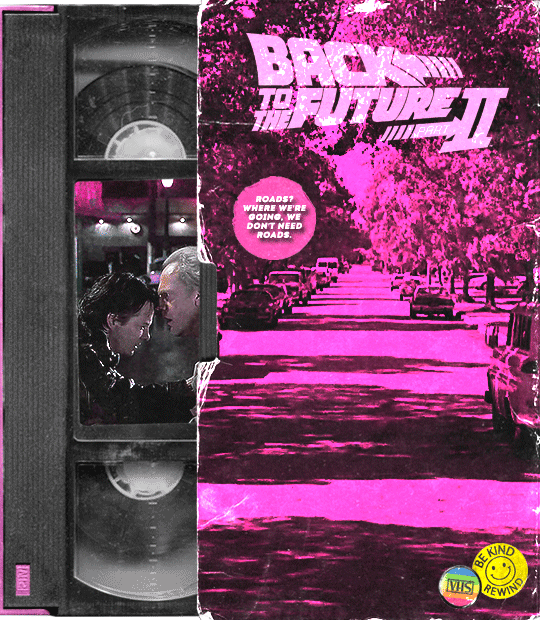

Back to the Future trilogy + VHS tapes
(insp: x, x, x, x, x, x & x)
1K notes
·
View notes


Text
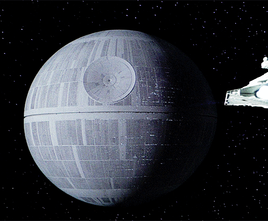

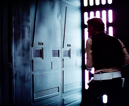


Star Wars: Episode IV – A New Hope
dir. George Lucas | 1977
1K notes
·
View notes


Text
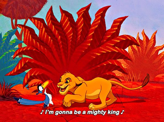


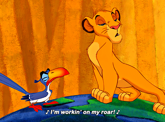
Oh, I just can't wait to be king!
THE LION KING (1994)
1K notes
·
View notes

Text
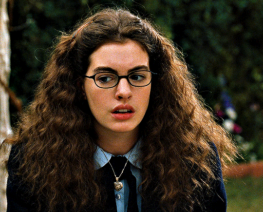
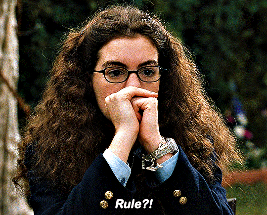
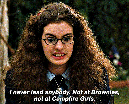
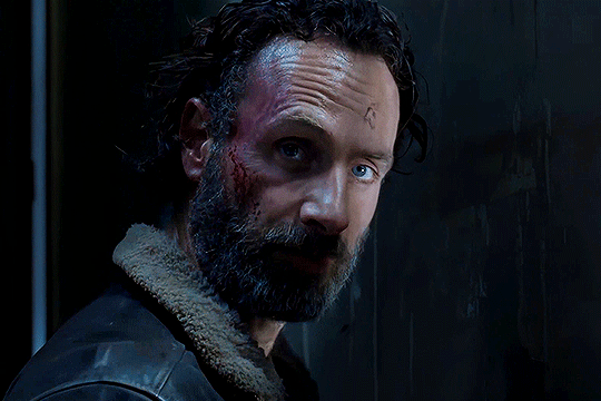
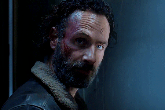
My sister says there are better ways to get someone's attention. Like that?
4K notes
·
View notes
Note
hey! your gifsets are absolutely beautiful and i'm always so impressed by them, especially your choice of fonts. so i was wondering if you might wanna share the fonts you've used in your pinned post (your green ray pakorn gifset), because they're so gorgeous!
hey there! thank you so much! 💚💚💚 always happy to share with my fellow font hoarders!
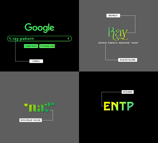
(click for larger image)
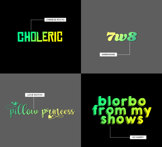
links to fonts under the cut!
karla (comes baked in with @cal-kestis' google overlay template! this is the same font used for 'chronic babygirlism')
multicolore (this is the font used for all of the white sans serif typo)
remboy
nouvelle vague
rolner
chinese rocks
shrikhand
love match
kg happy
hope this helps! happy creating!

313 notes
·
View notes
Text


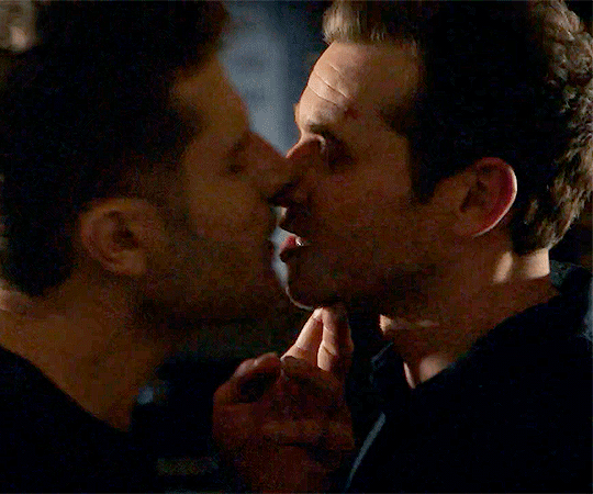
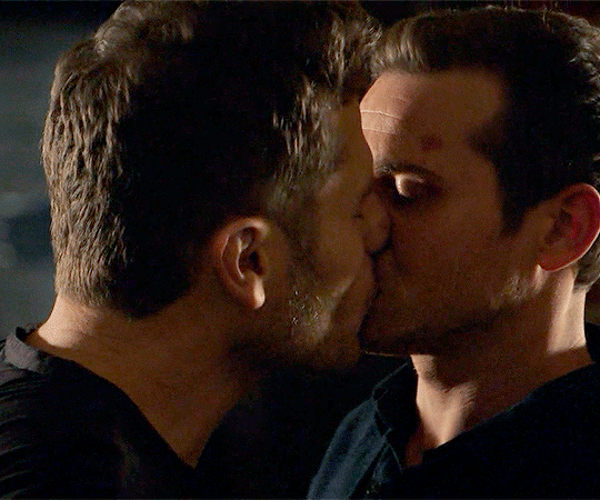
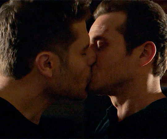
LUCIFER — 3.06: Vegas with Some Radish
THE ROOKIE — 6.05: The Vow
225 notes
·
View notes
Text
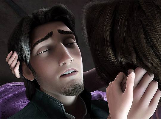


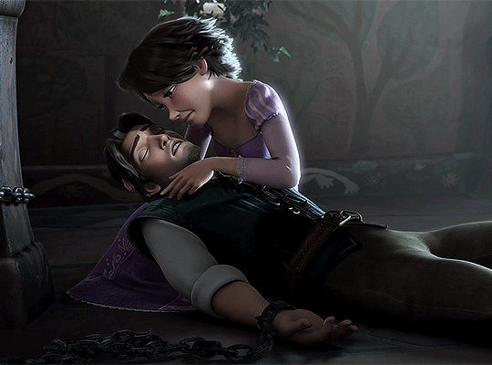
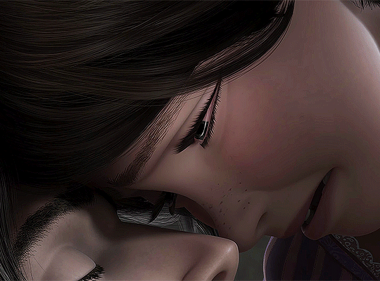
TANGLED
2010 | dir. Byron Howard & Nathan Greno
461 notes
·
View notes
Note
hi Pat, can I ask if you could share your colouring settings for your Blond Jk set? I was mesmerized by your style 🤩
hi anon! first, thank you so much! it means a lot. and i can share the psd if you want, if there is anything else you need to know, please just ask me ♥

original post | link to download
this file contains my "base" psd + the coloring i did exclusively for that video. hope it helps and that you like it 🤗
35 notes
·
View notes
Text
nothing scarier than activity on an old post.....where did u find that thang
50K notes
·
View notes
Note
about the tutorial: just one about dark scenes in general would be great :)
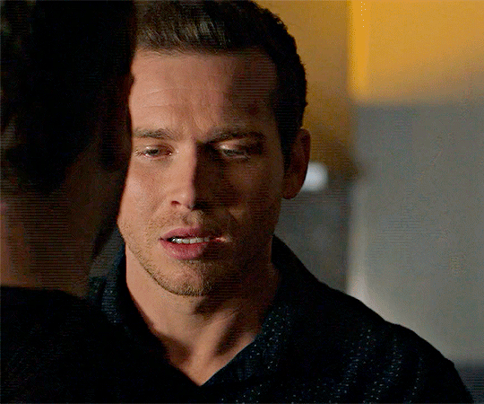
sure :) here's a tutorial on how I work with dark scenes:
before we start, it's important to mention that working with dark scenes is so much easier when your video/ screencaps are high quality. I personally refuse to gif dark scenes unless I have 4k quality footage lol.
my general coloring tutorial is here in case you want check it out!
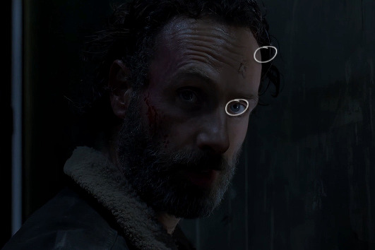
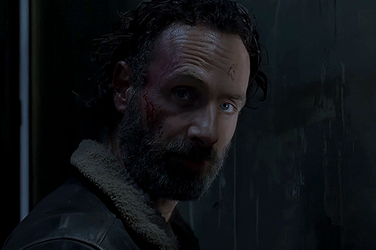
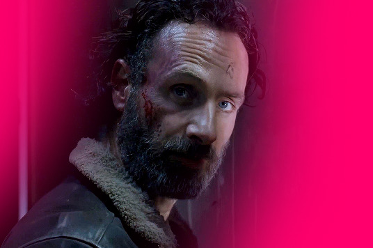
alright, let's start! after resizing and sharpening my gif, here's what we're working with:

STEP 1: levels. I use the pipette tool to select the lightest and the darkest parts of my gif, it's a great guide that helps to neutralize the overpowering color:
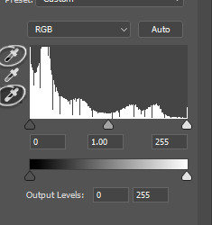
in this case, the lightest part is the little white dot in the corner of his eye and the darkest one is around his hair (if there are many dark shadows in my gif, I just click on a few darkest looking spots and see how it adjusts the coloring and lighting of the gif and just pick the one I think looks the best). basically, this layer is a good guide on how to make the overall look more natural if there is one obvious dominant color and we want to get rid of it (for example, my gif has quite a lot of blues, but it's not too crazy, so I won't need to adjust that much):
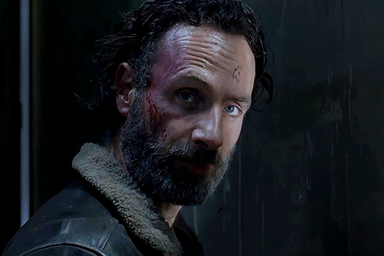
and this is what we've got just after using the levels adjustment:
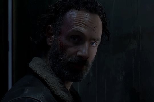
the gif is lighter and the blue was reduced a little bit, the scene now has more green and red undertones. sometimes I mess with the settings myself if I don't like the way it looks, but in this case I'm pretty happy with the automatic adjustments and I didn't even have to do that much!
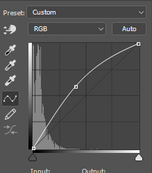
STEP 2: curves. I do the same thing that I did with the levels, using the pipette tool to select the lightest and the darkest parts and also pull the rgb curve to the middle to brighten my gif even more:
and here's the result after setting the curves layer opacity to 37%:
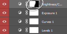
STEP 3: brightness and exposure layers. next up, I just want to brighten the character a little bit more, but not the background, so I'm adding a brightness/contrast layer and an exposure layer, here are my settings:
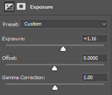
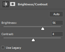
but since it adjusts the whole gif and I don't want that, I select the mask on my brightness layer and pick the eraser tool. I erase the part of my gif that I don't want to be affected by this adjustment, I colored that part bright pink so it's obvious:
and then I do the same with the exposure layer.
in my gif the character is not moving that much, so it looks pretty natural when I brighten just him. here's where we're at:
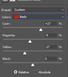
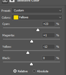
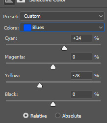
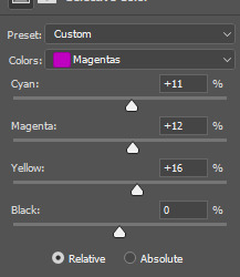
STEP 4: selective color and gradient map. I'm happy with how bright it is, but I do want to deepen the shadows here and just mess with the coloring itself, so next up I'm gonna use a couple more layers.
here are my settings for selective color layer, opacity set to around 40%:
and here are my settings for a gradient map to deepen the shadows:
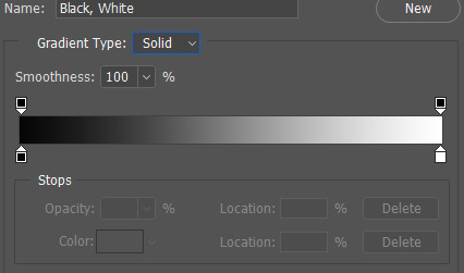
and here's the result:
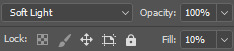
ADDITIONAL STEP: I sometimes like to add another layer and just put some soft color gradient to one side of the gif.
in this case I used a soft blue color, set to lighten, 62%:
I'm not very good at tutorials and I put this together pretty quickly, but hopefully this was somewhat helpful, let me know if you have any questions! <3
78 notes
·
View notes
Text
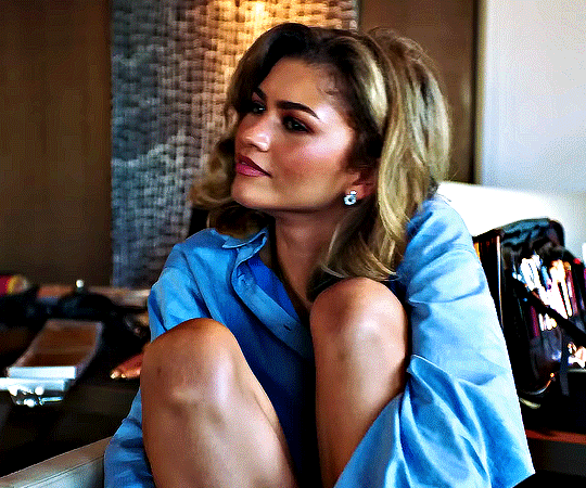
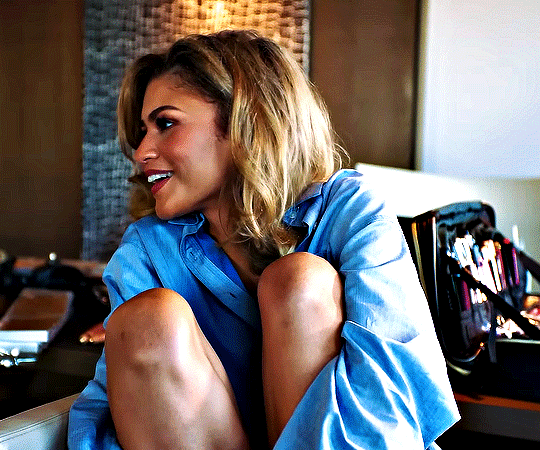
ZENDAYA
Gets Ready for the Challengers Premiere | Vogue
2K notes
·
View notes
Text
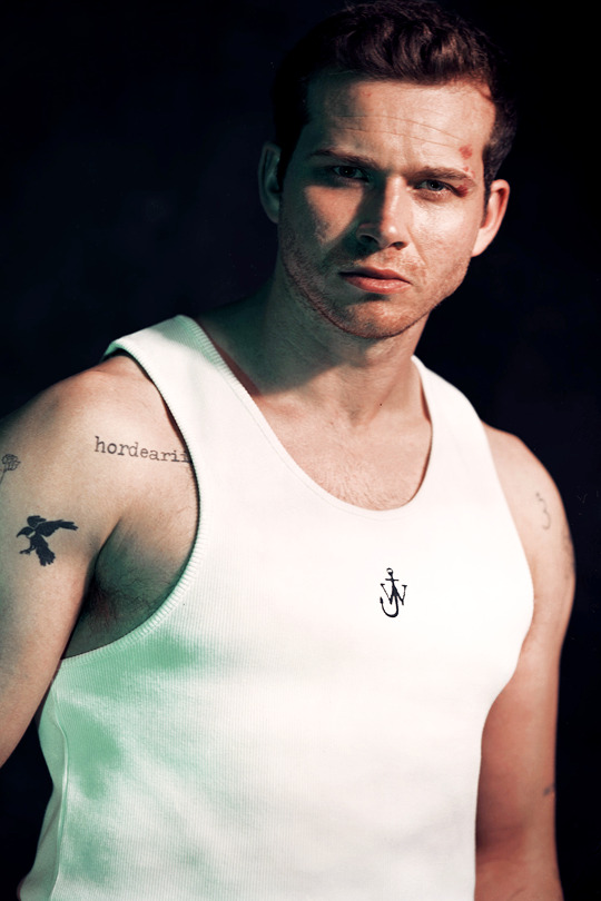
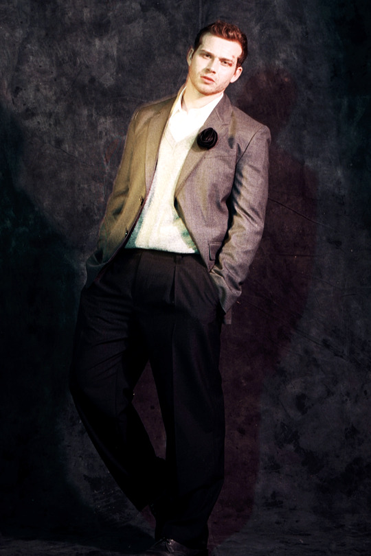
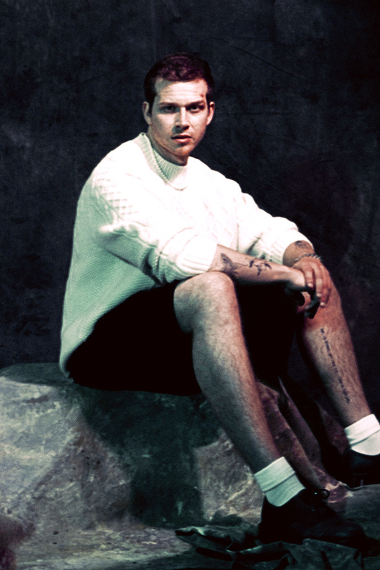
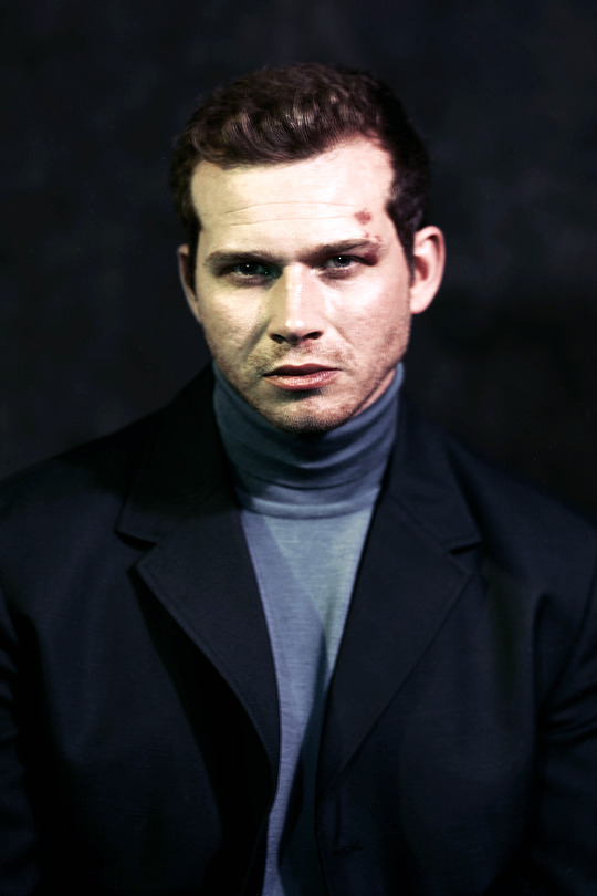
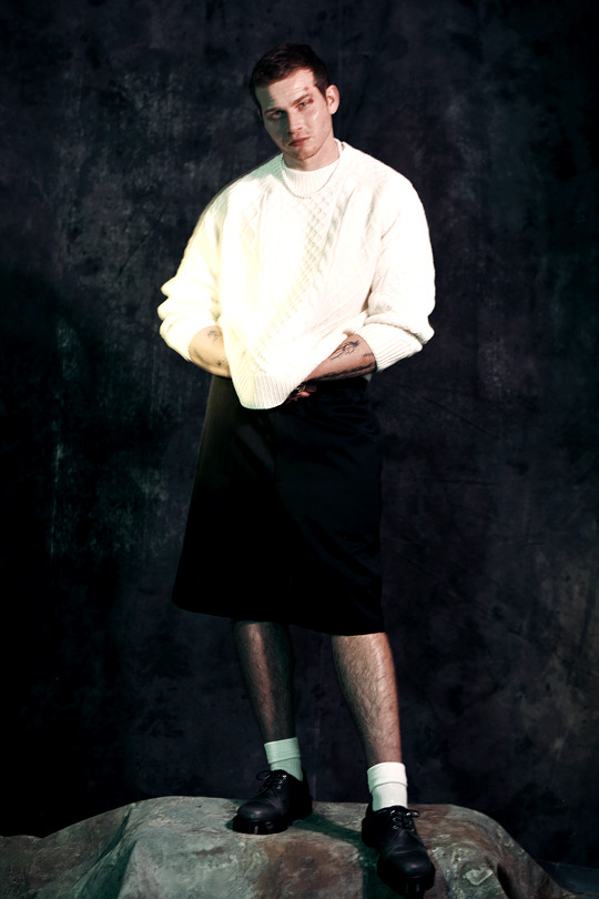
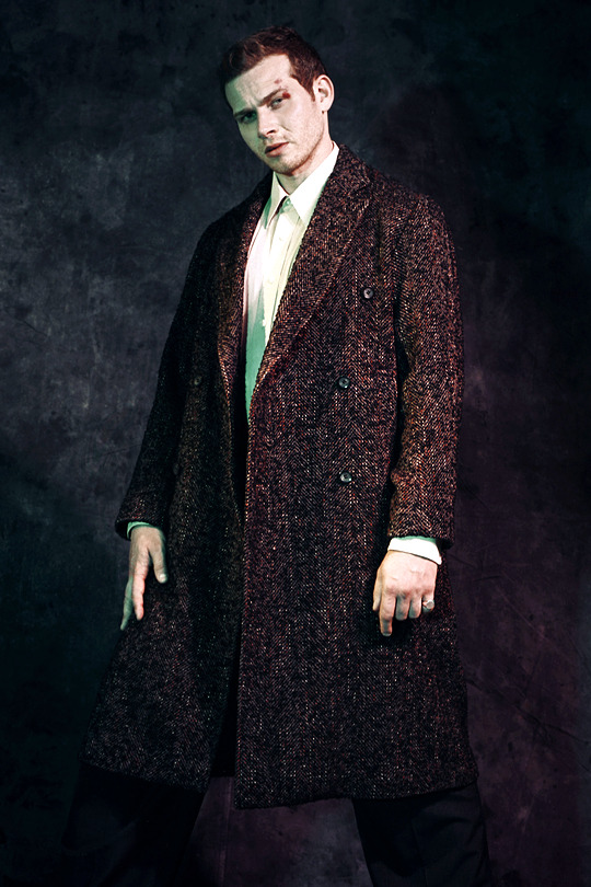

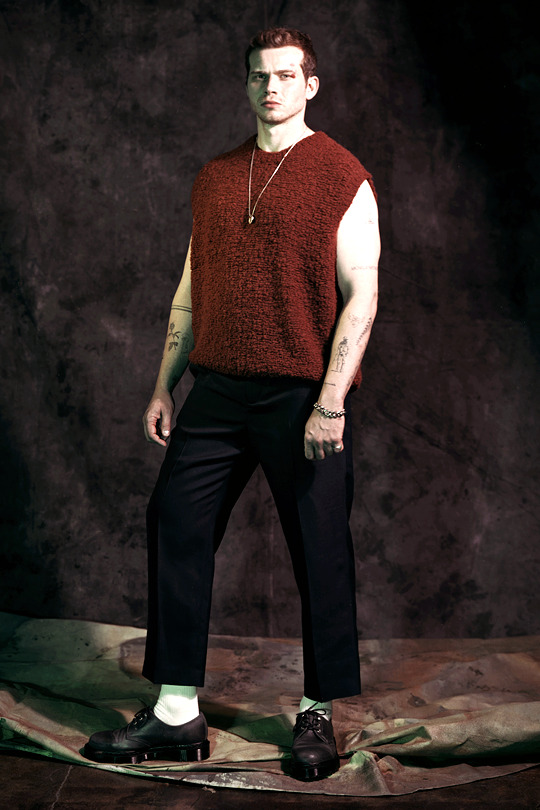
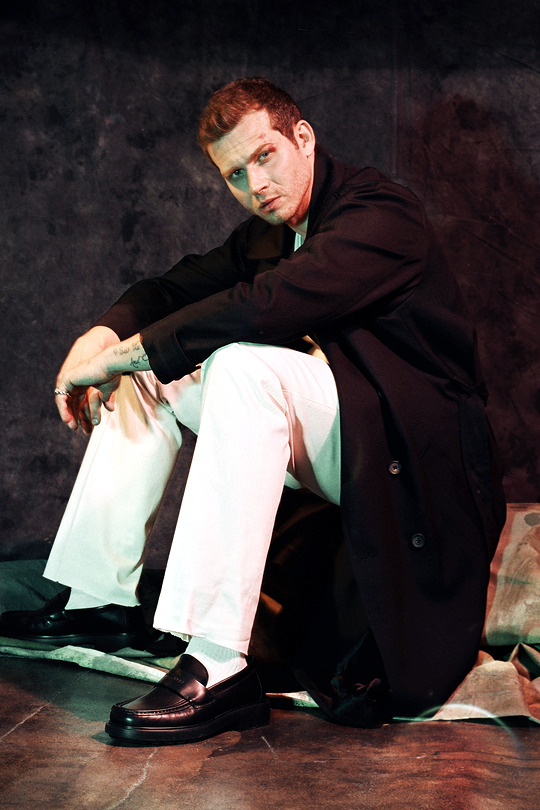

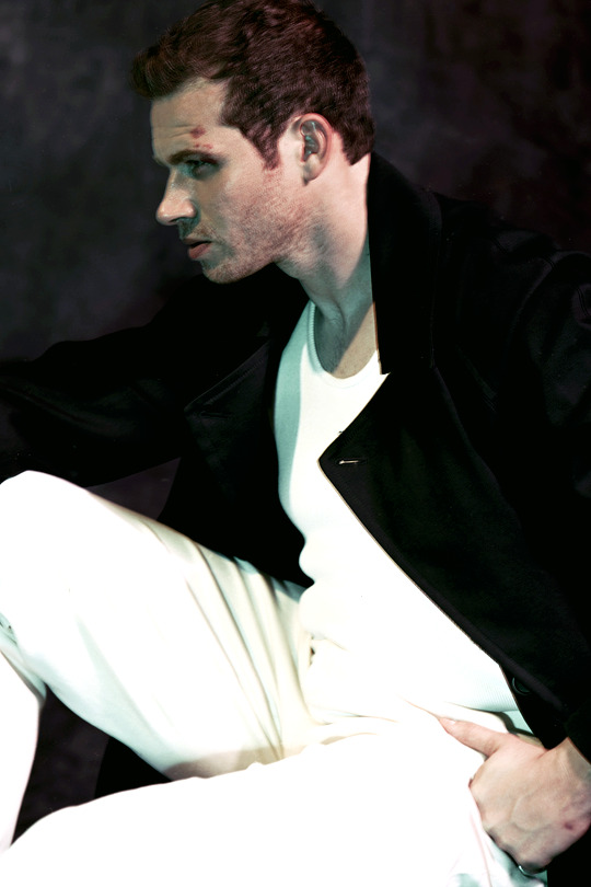

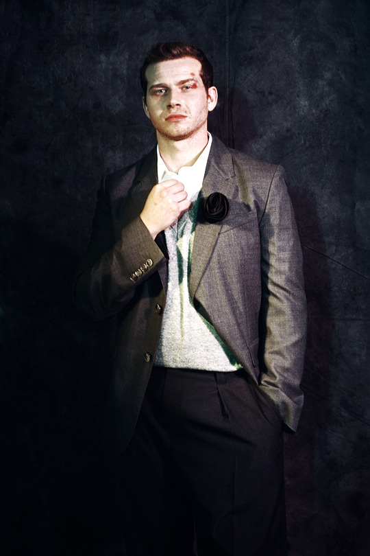
OLIVER STARK
1883 Magazine — Ben Duggan (2024)
531 notes
·
View notes