
A Norman Door is a door whose design tells the person to do the opposite of what they’re actually supposed to do. It is an example of something which is badly designed, which confuses the user. This Tumblog records them.
Don't wanna be here? Send us removal request.
Statistics
We looked inside some of the posts by normandoors and here's what we found interesting.
Average Info
Notes Per Post
1K
Likes Per Post
710
Reblog Per Post
364
Reply Per Post
2
Time Between Posts
1 month
Number of Posts By Type
Link
3
Text
6
Note
3
Photo
5
Last Seen Tumblr Blogs


Fun Fact
When “GIF” was named word of the year in 2012, Oxford Dictionaries U.S.A. credited Tumblr for pushing the word.
Link
This video clip illustrates how Norman Doors can have big impacts on their users.
2 notes
·
View notes
Text
Brazilian Norman Door
I got this door at Linkedin: https://www.linkedin.com/posts/oalexandrino_paporeto-agileleader-bb-activity-6631631707311263744-xcQU/
1 note
·
View note
Text
A PushaPull handle - Same on Both Sides
The most annoying door in Chicago... No sign, looks like a pushapull handle...
1 note
·
View note
Note
The latest photo posted of the 'Pullsh' door is photoshopped from a still the video by Vox media.
Hea Anonymous,
Are you sure? I must look back at the Vox video to check. If it is, I’ll have to blackball that photo.
Thanks!
0 notes
Text

7 notes
·
View notes
Note
Sorry for the super late reply! I didn't even realize you answered my original ask >.< I just find the post funny and wanted to show a friend because the door handle is on the outside which I find absolutely ridiculous. Just... so many steps in order to leave the train with first rolling down the window and then sticking your arm out to access the handle hahaha I can totally imagine people getting stuck in the train and riding to the next stop just because they couldn't open the door
Hi green-tea-and-go:Here is the post, enjoy!
https://normandoors.tumblr.com/post/175401690856/the-british-school-of-user-interface-design
1 note
·
View note
Text
The British School of User Interface design - train doors

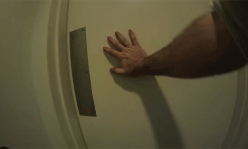
Bartosz Milewski has an excellent example of wonderfully functional but incredibly baffling design: the traditional British train carriage door.
I’ll let Mr. Milewski describe the situation that creates mild panic in the users mind:
Do you see any kind of a handle? In the obvious location, you see a steel plate. You push it, kick it–nothing! Maybe there is a button? You start searching, more and more desperately as the train gets ready to continue its ride. If you are lucky, you’ll notice a blue plaque above the window.
Here’s what it says:

Image 2: Instructions on how to open the door on a sign, above the door.
That’s right! The handle is outside. Please notice that the climate in those parts of the world is not very user-friendly. It gets cold in winter and it rains a lot. I presume they don’t have special winter railway cars. On second thought, I shouldn’t presume anything.
Dan Lockton has an interesting theory on why these doors follow this design:
I’m assuming that this design was intended to introduce an extra step into the door-opening procedure, a speed-hump, if you like, to make it less likely that a door was opened accidentally while the train was in motion (before central door locking was introduced – which makes it less necessary). From a usability point of view, we might immediately dismiss any system which has to have such detailed instructions to inform the user about performing such a simple task, but it’s certainly interesting to consider this kind of poka-yoke.
Being forced to lowering the window to get to the handle is almost like a modal ‘Are you sure you want to delete this file?’ dialogue box.
Interesting thought: the door has been designed in such a way to make it “less usable” in order to deter users from using it except when vital, i.e. getting off the train.
But, as Mr. Bartosz mentioned above:
You start searching, more and more desperately as the train gets ready to continue its ride
Mr. Lockton hits the nail into the coffin of this functional but borderline unusable door when he mentions the impact this door has on train fuel efficiency.

Image 3: Signage is now needed to persuade users to close the windows, they need to open in a hurry to get out of the train, for train fuel efficiency.
This sticker suggests keeping the window closed to cut drag and save fuel, but as I walked along the train, almost all these windows were dropped down, left in that position by the last person to close the door.
The urgency of scrabbling to lower the window, stick your hand out and use the handle, with a crowd of commuters behind you probably overwrites any intentions to close the window again engendered by the ‘Make a small change’ sticker.
An excellent example how a badly designed interface leads to extra visual noise in the form of extra signage.
7 notes
·
View notes
Photo

How to design doors to be less confusing
You’ve encountered a door like this. One that looks like you should pull on it, but really you’re supposed to push. Those doors you hate have a name: “Norman doors.”
They’re named after Don Norman, a UC San Diego cognitive scientist, who identified this phenomena in his book “The Design of Everyday Things.”
According to Norman, pushing on a door that says “pull” isn’t necessarily your fault. It is just poorly designed.

So what’s the solution to this mess?
Norman explains two principles of design that make objects, including doors, more intuitive to use.
One is discoverability — that is, just by looking at the door, you should be able to detect what you could do with it. So a door with only a flap would be more intuitively interpreted as something you push on rather than pull.
A well-designed object should also provide you feedback while using it.
Feedback involves any visible, tactile, auditory or sensible reactions that help signal whether your attempted use of the object was successful. In the case of doors, the twistable knobs would signal to you whether the door is locked or not.

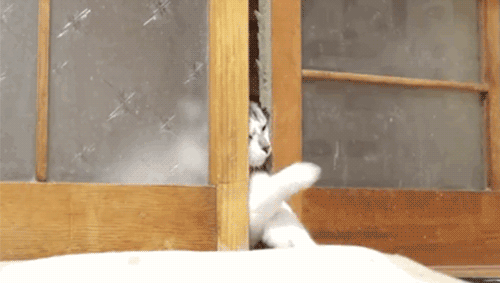
And perhaps the true test of a well-designed door may be whether your family cat can open it with ease.
Watch the full @vox video on Norman doors (and human-centered design)
1K notes
·
View notes
Note
Sorry to hear that your previous Norman doors blog got deleted! I’m trying to find a post to show my friend. It’s the one with a British train door (I think) where the handle is on the outside and you have to stick your hand out the window to access it... if you find it again, could you post it? (Not sure if you were the one who originally posted it or if it was a reblog)
Hi green-tea-and-go!Thanks for your message. Yes, it was a bit of a disaster. But thankfully someone gave me a great idea to restore it.
Yes, I remember the post. It was a post I wrote.
I’m restoring them at the moment. If you can wait for a 1 or 2 it’ll be there again.
Can I ask you why was it interesting? I’m always curious.
Thanks!
bernard
0 notes
Link

“Stop, please stop! I’m never going to read and I’m always going to pull a handle that looks like it should be pulled. #uxfail”
2 notes
·
View notes
Photo

Push! @ KPMG at South Quay in London
0 notes
Photo

Mercure Sheffield St Paul’s Hotel and Spa
0 notes
Photo

Push? Pull?
Here’s a good example of a Norman Door from a pub in London, The Florist in east London.
It’s not as bad as it looks - due to the step in front of the door, people seem to understand that it’s a push door. How odd would it be to have a door opening out, onto a step.
Looking at the doorknob it looks older (or at least less shiny). I wonder was it added for antique affect afterwards?
10 notes
·
View notes
Text
It won’t open because it’s a security door!!
youtube
(NB: Colourful language in the video!)
This is the “robbing the bookies” scene from the 2000 Guy Ritchie movie “Snatch”, where Vinny and Tyrone rob Brick Top’s bookies.
They mistakenly thought the man they followed in was their mark, “you’ve got 5 fingers!!”. So instead they’ve tried to rob the bookies and fail, miserably.
Their focus has now switched to escaping. As quickly as possible.
They are not thinking logically.
Due to Vinny and Tyrone’s heightened emotional and stress levels, they fail to see the handle on the inside of the door, they’re focusing on their end gola - self-preservation. They try to kick the door open.
Vinny shouts, “It won’t open because it’s a security door!!”.
Not quite Vinny.
They’re now even more stressed, so they start shooting at the door.
When people are in stressful or emotional situations, focusing on their end goal, they’ll often make what seem like stupid mistakes.
They misread instructions, leave out information, miss important parts.
You’ve got to understand their emotional state and try to design for it. Ideally your design does not excerbate that heightened emotional state.
Since there was a handle on the inside of the door, is this door an anti-Norman Door?
6 notes
·
View notes
Link
This is a great, old, video from Vox Media about Norman Doors. It’s also got a video interview with the Don himself.
Here’s his short blogpost about the video.
“I hate this door”. Me too Kelsey.
1 note
·
View note
Photo

Norman Door with irrelevant signboard
5 notes
·
View notes
Text
Welcome (back) to Norman Doors!
What is Norman Doors?
Norman Doors is a permanent Internet photo, video collection of examples of horrendous bad everyday design.
It is also a celebration of all that is awesome about Don Norman!
Who is Don Norman?
Don Norman is an expert in the field of design in general, human-computer interaction and user-centred design. He is the co-founder of the user-centred design consulting company Nielsen-Norman.
He has also written a number of popular books on design, The Design of everyday things, Emotional design, The Design of future things, and Living with complexity.
What is a Norman Door?
A Norman Door is an example of something which is badly designed which confuses the user.
A Norman Door is a door whose design tells the person to do the opposite of what they’re actually supposed to do.
A Norman Door is a door that gives the wrong signal and needs a sign to correct it.
Because of this bad design, the user then does not know what to do.

Image 1: an example of a badly design door - do you push or pull on this door that opens only one way?
The term was first used in Norman’s book, The Design of everyday things.
I can hear the reader saying “You have trouble opening doors?” Yes. I push doors that are meant to be pulled, pull doors that should be pushed, and walk into doors that neither pull nor push, but slide. Moreover, I see others having the same troubles-unnecessary troubles.
My problems with doors have become so well known that confusing doors are often called “Norman doors”.
How can such a simple thing as a door be so confusing? A door would seem to be as simple as device as possible. There is not much you can do with a door: you can open it or shut it. How does it open? Should you push or pull, on the left or the right? Maybe the door slides. If so, in what direction?
The design of the door should indicate how to work it without any need for signs, certainly without any need for trial and error.
Norman also wrote about the infamous doors in his blog post “When bugs become features”.
He describes a picture of a door (image 1 above) sent to him by someone in an email.
The sender explains how difficult it was to use the door - the glass door only opens in one direction, however the architect installed “pull” handles on both sides of the door in pursuit of “artistic consistency”.
Norman ends the post on a note of despair:
Confusing? Who cares? After all, now it is art, and art doesn’t have to work – it simply has to be appreciated.
I’ve found a Norman Door! What do I do?
1. Take a photo of it or make a video showing it.
2. Submit it to the Norman Doors tumblog explaining why it’s confusing!
When I receive it, I’ll post it here.
15 notes
·
View notes