
that's the two heroes reversed.... it's hard to combine names okay? not a shipping blog, I just like Batman and spider-man
Last active 60 minutes ago
Don't wanna be here? Send us removal request.
Statistics
We looked inside some of the posts by parker-wayne and here's what we found interesting.
Average Info
Notes Per Post
2K
Likes Per Post
2K
Reblog Per Post
312
Reply Per Post
12
Time Between Posts
7 days
Number of Posts By Type
Text
17
Last Seen Tumblr Blogs


Fun Fact
When “GIF” was named word of the year in 2012, Oxford Dictionaries U.S.A. credited Tumblr for pushing the word.
Text
It's so important to note that adult Peter Parker is both hot because he's funny and charming, but also because he makes the worst jokes and says random cringey shit all the time. That's part of his charm. "Well that just happened" you're already pushing that man onto the couch, ready to take him on the ride of his life. "It's bad writing" nah man, people crave a hot man whose also the biggest dork on the planet. It's why he has ultimate rizz. He's hot and a loser, it's so important.
#peter Parker#spider-man#this may be my dumbest post#hes cheesy and corny and god does it make him all the more appealing
0 notes
Text


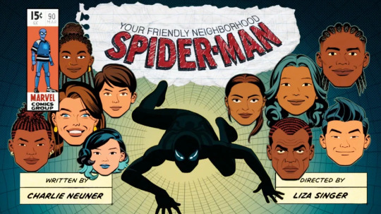
╰☆☆ 𝐘𝐨𝐮𝐫 𝐅𝐫𝐢𝐞𝐧𝐝𝐥𝐲 𝐍𝐞𝐢𝐠𝐡𝐛𝐨𝐫𝐡𝐨𝐨𝐝 𝐒𝐩𝐢𝐝𝐞𝐫-𝐌𝐚𝐧 (𝟐𝟎𝟐𝟓) 𝐋𝐚𝐩𝐭𝐨𝐩/𝐃𝐞𝐬𝐤𝐭𝐨𝐩 𝐖𝐚𝐥𝐥𝐩𝐚𝐩𝐞𝐫 ☆☆╮
89 notes
·
View notes
Text
Favorite moments from Spider-Man the new animated series:
-the solid block of stacked cash Spider-Man throws at the cops
-this GTA ass style of animation, what is the 2003 is going on here
-the fact that a cash exchange was made with an open paper bag, just such a funny concept
-how Peter Parker is fumbling Mary Jane
-calling out how some people only like to go to protests for the vibe and not the actual cause
Truly the funniest first episode I've seen so far. It actually has some interesting moments but the animation is just so .... Unique?
#spider-man the new animated series#has anyone even talked about this show on here#is this a forgotten relic#spiderman#spider-man
0 notes
Text

Spider-Man 2 (2004) | Your Friendly Neighborhood Spider-Man (2025)
523 notes
·
View notes
Text

friendly neighborhood spiderman's art style is GORGEOUS my artist brain is buzzing like SHAPES AND COLORRSSS also it's just a really fun and silly show i love it so much!!!!
trying to combine that art style and mine was interesting to say the least but i think i found a balance
125 notes
·
View notes
Text
Thinking about how Peter Parker never got to pay his aunt may back for giving him money in the game, because she got so sick so fast. Their relationship makes me so unwell.
Also thinking about the timeline of aunt may joining feast and knowing five years ago Peter Parker was 17. Do you guys think she joined feast because she saw the good her nephew was doing for the city and decided, I'm gonna do good too? Aunt May was good because Peter was good because Uncle Ben was good, wait a minute, wait a damn minute.
8 notes
·
View notes
Text
I feel the hate MJ gets in insomniac's Spider-Man is kind of underserved. I think people just love Peter Parker so much because we always get his side of the story we never see like the impact that has on MJ. So she comes across as this girl who is just playing with Peter's time. But like could you imagine dating someone and they fight crime every night. Half of the city hates him, half of the city loves him, and no one but you knows who he is. You have no one to talk to about this, no one to vent to about this. I think a lot of people miss the line "that was the first of nurse MJ moments, too many of those." Could you imagine being a teenage girl tasked with keeping your boyfriend alive because he refuses to confide in anyone else? What an emotional toll to take on as a kid.
No wonder they break up and get back together all the time. I think the reason they start to work is because MJ gives Peter Parker like valid boundaries. I think it's wild this fandom is filled with people hating a woman who spent her adolescence patching up her boyfriend, and fearing his death every night, for simply being like "I need to be your equal partner in this. Not just a girl you save, and not just your nurse." It's like a valid want and need to have in a partnership.
12 notes
·
View notes
Text
Replaying PS4 insomniac Spider-Man and the fact that otto always refers to Peter as his friend and partner even tho Pete is so much younger and inexperienced compared to him as a sign of mutual respect makes me unwell. He probably does this because of Osborn's disrespect to otto in the past. Man otto really was a truly deeply good man before those arms wrecked his brain. I'm unwell about it
42 notes
·
View notes
Text
So know that Marvel has made a pretty good Spiderman show with an artstyle inspired by the work of John Romita when the fuck is DC gonna lock in and adapt the style of Dan Mora into an animated feature film the likes of which the world has never seen


The crosshatching and gradient combo to show distance, his use of shadow, his water effects, his color palettes, DC GET UP!! Right now!! Adapting the style would not be easy but it can be done!
24 notes
·
View notes
Text
Thank you for have several Black men and giving none of them the Killmonger


#your friendly neighborhood spiderman#yfnsm#your friendly neighborhood spider man#it seems like an animation team actually learned what different black haristyles look like#which is super cool
33 notes
·
View notes
Text


First look at Gwen Stacy/Spider-Gwen/Ghost-Spider/Spider-Woman from Your Friendly Neighborhood Spider-Man Season 2.
#your friendly neighborhood spiderman#yfnsm#im curious about her delibrate shoe changes#cuz the ballet slippers were to show her grace in movement when she swang from building to building#i wonder if shes gonna have actual spider powers or be a man made copy cat#im super curious about the combat boot choice nonetheless
30 notes
·
View notes
Text
Every title cards comic references that Your Friendly Neighborhood Spider-Man picked on (and other comic references!):

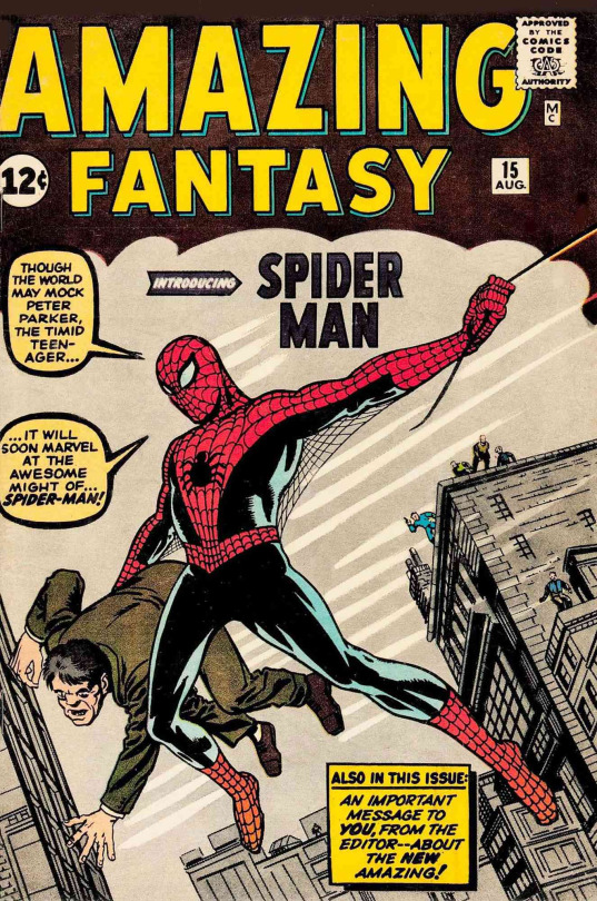
Episode 1: The first opening title card pays homage to Amazing Fantasy #15, the legendary debut of Spider-Man! That pose, that vibe… it’s a timeless classic brought to life on screen!


Episode 2: The second episode's title card is a clear nod to The Amazing Spider-Man #546, the start of Brand New Day. New beginnings, fresh twists… you can feel the parallel here!


Episode 3: No exact match here, but it gives me big Spider-Man: Shadow of the Green Goblin vibes. Spidey in the foreground with Goblin's menacing face lurking behind. On the title card in the same pose is Norman Osborn. Coincidence? I think not...
PS: We cannot forget this awesome comic reference from episode 3 as well:


Because, seriously, this shot? This shot right here? It’s straight-up ripped from The Amazing Spider-Man #70 (1963), and I’m losing my mind over how beautifully they reinterpreted it.
First off, the spotlight composition—the way it isolates Spidey, trapping him in this stark contrast of yellow against the dark background? That’s classic Romita Sr. storytelling. In the comic, it’s police flashlights pinning him to a brick wall, making him look like a fugitive. But in YFNSM, it’s an overhead searchlight casting him in that same “nowhere to run” energy. It’s such a subtle way to say, “Yeah, Peter Parker will always be hunted, always be one step ahead, but always one mistake away from getting caught.”
And THE POSE. THE POSE. The way his body is angled, mid-movement, hands splayed out in that classic spider-crawl? The way the camera looks down at him from above, mimicking the way the comic had him in full view, framed by the light? They didn’t just reference the cover—they translated it into motion.
But the REAL kicker? The thematic parallel. In ASM #70, Peter’s on the run because he’s being falsely accused of a crime (thanks to Jameson’s smear campaign, as usual). And now, in Your Friendly Neighborhood Spider-Man, we get the exact same energy. It’s visual storytelling at its finest—showing us that no matter the era, no matter the medium, Spider-Man is always one step away from being a public enemy.
This show isn’t just referencing classic Spider-Man comics. It’s understanding them. It’s living in them. And that’s why it slaps so hard.

Episode 4: Then, we have another spectacular title card comic reference. This one’s an easy catch, it mirrors the cover of The Amazing Spider-Man #100 (1971). A web of memories and legacy. Another true Spidey classic!


Episode 5: Spidey's signature crouch here is iconic, but the closest match? The Amazing Spider-Man: Renew Your Vows #3 (2015). Classic hero stance with that timeless Spidey energy!


Episode 6: Okay, Marvel fans, this one is sick. It’s a clear nod to the Marvel Knights: Daredevil cover from the early 2000s. Spidey + Daredevil? Always a win! Also, come on! I think that this reference is obvious too since this awesome episode literally stars Daredevil's special appearance here and what better to way to add Daredevil's comic reference to this outstanding title card! That's definetely genius!

Episode 7: For those who might not know, the title card for Episode 7 is a direct reference to The Amazing Spider-Man #318, an issue from Todd McFarlane’s legendary late-80s run. And let me tell you—this isn’t just a case of “oh, the poses kinda match,” this is an intentional, frame-for-frame recreation with just enough modernization to make it fit seamlessly into the show’s aesthetic. The detail, the pose, it’s like stepping right into a '90s Spidey comic.
THE VISUAL PARALLELS: IT’S ALL IN THE DYNAMICS
First off, let’s talk about the actual composition because wow, the way it mirrors the original comic cover is insane:
Spider-Man’s pose? Identical. Mid-air, twisted body, one leg bent, one stretched out, arms out in a perfect acrobatic counterbalance. It’s a classic Spidey silhouette, and the show absolutely nails it.
Scorpion? Literally the same aggressive forward charge, coiled tail framing the shot, muscles tensed as if he’s seconds away from landing a hit. They didn’t just throw Scorpion into the scene—they posed him exactly like McFarlane’s original artwork.
The background chaos? Both images have a wall of destruction, bricks and debris flying everywhere, emphasizing just how explosive this moment is. Even the curve of Scorpion’s tail is almost identical, acting as this natural framing device that guides your eye toward Spider-Man.
And it’s not just that they recreated the cover—it’s how they adapted it. The show takes McFarlane’s hyper-exaggerated, in-your-face comic book action and translates it into a sleeker, more stylized animated aesthetic, but without losing any of the energy.
AND THE BEST PART? THE EPISODE IS ABOUT SCORPION, JUST LIKE THE COMIC
Like. This isn’t just an aesthetic reference. This is an actual narrative parallel.
The Amazing Spider-Man #318 was part of Scorpion’s big return in McFarlane’s run, cementing him as a serious Spidey villain after some time in the background. And what’s Episode 7 of Your Friendly Neighborhood Spider-Man about? Introducing Scorpion to the show.
They didn’t just pull a random iconic cover to reference—they pulled this specific issue because it matches what’s happening in the episode. It’s a visual AND thematic callback, connecting the animated series to the legacy of the comics in such an intentional way.
WHY THIS REFERENCE SLAPS SO HARD
This is what makes Your Friendly Neighborhood Spider-Man feel so special—it understands Spidey’s history and respects it, but it’s not just doing a nostalgia play. It’s remixing and reinterpreting classic imagery to fit the show’s unique style while keeping that deep connection to Spider-Man’s comic roots.
It’s the kind of reference that works on multiple levels: - If you don’t know the comic, it just looks like a sick, action-packed title card. - If you do know the comic, you realize the insane level of detail that went into recreating it. - If you really know Spidey lore, you see how this isn’t just a visual reference but a full-circle moment, bringing Scorpion into the animated world just like this issue brought him back into comics.
It’s so good. It’s so smart. And it’s exactly the kind of thing that makes this show feel like it was made by people who genuinely love Spider-Man.
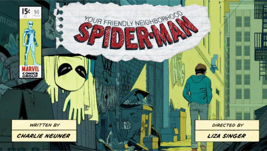

Episode 8: We need to talk about Your Friendly Neighborhood Spider-Man Episode 8’s title card because the way it references one of the most legendary panels in Spidey history is actually making me LOSE IT. This is a full-blown, screaming-into-my-pillow, rolling-on-the-floor moment.
Like. The moment I saw it??? My soul left my body. The audacity of this show to just casually drop a title card that is literally a frame-by-frame homage to The Amazing Spider-Man #50 (1963)—a.k.a. the “Spider-Man No More” issue, a.k.a. one of the most emotionally devastating, most ICONIC Spidey images EVER—was honestly just TOO MUCH for me to handle. And the fact that this comes as a jaw-dropping homage toJohn Romita Sr., the man who literally helped shape Spidey’s visual identity??? THE BEST THING EVER TO BE HONEST! Like, this wasn’t just some “Hey, look, we did a cool comic reference!” moment. No. The showrunners went all in on making this episode a modernized, emotionally gut-punching reimagining of the exact struggles that made that comic arc so unforgettable. And I NEED to talk about it.
The Reference
Romita Sr.’s original panel is so deeply ingrained in Spidey’s history that even people who don’t read comics probably know it. Peter walking away, head down, shoulders slumped, while his Spidey suit—crumpled, abandoned—hangs limply in the foreground. The composition. The colors. The gut-wrenching loneliness of it all. It’s a moment that SCREAMS "I can't do this anymore." And when it dropped in The Amazing Spider-Man #50? It defined what it means to be Peter Parker: this constant, heartbreaking cycle of sacrifice, of choosing between himself and the world, of trying to walk away even when he knows he never truly can.
AND THEN THIS SHOW COMES ALONG AND HITS ME WITH THIS???
The exact same framing. The exact same walk of defeat. The exact same abandoned mask in the foreground, except here it’s Peter’s hoodie (because let’s be real, that’s his version of the Spidey suit at this stage in his life). The warm yellows and greens replacing the original’s cold blues make it feel different but just as heavy. The graffiti, the dumpsters, the messy urban sprawl—it’s a perfect modernization of that same iconic moment.
Like, at its core, The Amazing Spider-Man #50 was about Peter Parker’s exhaustion. He’s broke. He’s stretched thin. He’s losing himself to the weight of responsibility, and he genuinely wonders if it’s all worth it. He’s sick of sacrificing his own happiness, sick of constantly choosing duty over self. So he makes a decision: he walks away.
But as we all know, being Spider-Man isn’t just something Peter does. It’s something he is. And no matter how much he tries to let go, the city still needs him. The people still need him. And ultimately… he still needs to be Spider-Man.
AND THIS SHOW SAID, “OKAY, BUT WHAT IF WE PUNCH YOU IN THE HEART EVEN HARDER?”
Because in Episode 8, we see this Peter—this younger, still-learning, still-growing Peter—go through that same internal war, but in his own way.
He’s questioning if he’s doing the right thing.
He’s weighed down by guilt and self-doubt.
He’s struggling to balance his normal life with the impossible expectations of being a hero.
And just like in ASM #50, we see him consider walking away.
We don’t get a dramatic "I QUIT" moment, but the entire episode oozes that same “Spider-Man No More” energy. We see Peter feeling like he’s failing—like maybe being Spider-Man isn’t making things better. Like maybe he should just… stop.
Why This Hurts More Than It Should
I think what really destroys me about this is that Your Friendly Neighborhood Spider-Man didn’t just reference a comic panel for the sake of being cool. They GET it. They understand that being Spider-Man is about the struggle, about the burden, about those moments where Peter just wants to let go but knows, deep down, that he never can.
I just CANNOT get over how perfect this homage is. It’s not just about recreating an iconic image. It’s about recreating its emotional impact in a way that fits this version of Peter.
The episode lives and breathes Romita Sr.'s legacy, even outside the title card.
It perfectly captures the weight of what it means to be Spider-Man.
It delivers one of the most heartfelt, jaw-dropping tributes to one of the greatest Spidey artists of all time.
John Romita Sr. helped define who Spider-Man is. His work showed us that Peter Parker isn’t just a hero because of his powers—he’s a hero because he never stops trying. And Your Friendly Neighborhood Spider-Man Episode 8 understands that completely.
I just know that somewhere, he’d be so proud to see his work honored like this. His art shaped Spider-Man as we know him. His legacy is woven into the DNA of this character, and this title card feels like a love letter to everything he built.
Romita Sr. gave us some of the most stunning, emotionally charged, timeless Spider-Man imagery ever. And this show—this wonderful, heartfelt, perfectly crafted show—just immortalized his influence for a whole new generation of fans.
John Romita Sr., you will be so deeply missed. But your art will always live on. This show is making sure your legacy lives on!


Episode 9: THEN, we move straight into Episode 9, which brings the momentum full circle. The previous episode was about Peter struggling with his identity, contemplating stepping away from being Spider-Man. But now? He doesn’t have a choice. He’s prey. The title card is once again a perfect recreation of a classic comic cover, this time from The Spectacular Spider-Man #215 (1976), where Scorpion is in full beast mode, literally holding Spider-Man’s torn mask in his claws. The show’s version is just as ominous—Scorpion crouched, mask in hand, the alley dripping with danger. The flow between these episodes is so well done. We go from Peter’s internal struggle (Episode 8) to his external nightmare (Episode 9).
The Comic: The Spectacular Spider-Man #215
This issue is not messing around. The cover immediately establishes a sense of dread—Scorpion is front and center, hulking over the remains of Spider-Man’s torn mask, claws dripping with webbing and possibly blood. The composition is chaotic yet deliberate; the jagged edges of the mask, the rain-streaked background, the intensity in Scorpion’s pose—this is the moment where you realize just how dangerous he is. It’s Predator and Prey for a reason. The contrast between Spidey’s usual agility and Scorpion’s brute force is at its most terrifying when Peter is cornered, and this cover captures that fear perfectly.
The Title Card: A Perfect Modern Reinvention
Now, look at the title card for Episode 9. It’s the same energy—but distilled through the show’s unique visual style.
The pose is nearly identical: Scorpion crouching low, ready to strike, completely dominant in the frame.
The mask, torn and held in his grip, is the most striking similarity. In the comic, it’s shredded almost beyond recognition, a brutal symbol of Spider-Man’s vulnerability. In the title card, we get a slightly more intact mask, but the meaning remains: Spider-Man has lost this fight.
Even the color palette mirrors the comic. The deep blues and greens of the comic’s murky background are translated into a darker, shadowy alley, making it clear that Peter is trapped. This isn’t his home turf—it’s a hunting ground.
The Episode’s Thematic Flow
Now, what really makes this title card hit so hard is how it follows the Spider-Man No More homage from Episode 8. In that episode, Peter was choosing to walk away, wrestling with his own identity and whether or not he could carry the weight of being Spider-Man. It was an internal struggle.
But in Episode 9? That choice is stripped away.
If Episode 8 was about Peter contemplating giving up the mask, Episode 9 is about someone ripping it from him.
Scorpion is the perfect villain to represent this shift. He’s a physical embodiment of what happens when Peter hesitates—when his doubt allows a predator to get too close.
The fact that this title card directly echoes a Spectacular Spider-Man cover also reinforces that we’re in the middle of a downward spiral for Peter. Things aren’t just bad; they’re getting worse [SPOILERS: For the first time in the show, we get to see what happens when Spider-Man stops pulling his punches—and it is downright feral.
The showrunners didn’t just adapt the Predator and Prey theme from the comic in its visuals. They adapted the entire energy of it. In the comic, Scorpion is portrayed as this absolute menace, a brutal tank of a villain that Spider-Man can’t just dance around—he has to put him down. And the show? The show does that concept justice.
Because Peter doesn’t just win. He almost demolishes Scorpion.
THE BRUTALITY—THE SHOW DOESN’T HOLD BACK
Let’s talk about that fight.
The rage in Peter’s attacks is visceral. You feel every punch. The animation, the sound design, the choreography—everything sells just how terrifying Peter is when he finally stops holding back.
The moment Scorpion realizes he’s not in control anymore? Chills. The second Peter stops dodging and just takes his attacks like they’re nothing—you know it’s over.
And then Peter goes in. No quips, no banter—just raw, unforgiving violence. He’s grabbing Scorpion's tail, ready to tear through him like he’s nothing until Lonnie stops him.
The sheer force of his punches is insane—there’s one hit that literally makes the air crack.
When Peter finally stands over Scorpion down on the ground, ready to kill him, I thnk it’s just framed just like the title card—only now, he’s the predator.
Like, this is not the kind of fight we would really expect to get in Your Friendly Neighborhood Spider-Man. Usually, Peter fights defensively, dodging, outsmarting, making sure to keep things under control. But in this episode?
Control is gone.
The showrunners make a deliberate choice to show that Peter Parker has limits. You can only push him so far before something in him snaps.
And the best part? This isn’t just violence for the sake of violence. It’s storytelling.
Peter isn’t just fighting Scorpion—he’s fighting his own guilt, his own doubts, his own pent-up frustration from everything that’s been building up over the past few episodes, especially from what Norman Osborn expects him to be.
The way it ties into Episode 8’s Spider-Man No More reference? Brilliant. Peter was walking away in Episode 8, questioning whether he could handle the burden of being Spider-Man. And in Episode 9? He answers that question—with violence.
This episode is a turning point. Spider-Man isn’t the same after this. And that’s what makes it so groundbreaking—it dares to ask the question: What happens when Peter Parker actually fights like the strongest person in the room?
Coming back to the title card, this isn’t just a reference for the sake of reference. The creative team behind Your Friendly Neighborhood Spider-Man is deeply engaged with Spider-Man’s visual storytelling history. They’re using these iconic images not just as callbacks, but as narrative devices. Each title card prepares you for the emotional and thematic core of the episode before it even starts.
And the fact that this is Scorpion’s episode? Oh, it’s perfect. This is a villain who has always been about overpowering Spider-Man in a way that few others can. Where Peter is quick, agile, and clever, Scorpion is relentless, savage, and built for destruction. And just like in the comic, this title card tells you everything you need to know—Peter is in real danger, and there’s no easy way out.
This is how you honor Spider-Man’s history. Not just with nods and winks, but by understanding what made these moments iconic and integrating them into new, powerful storytelling. The way these episodes flow from one to the next—from internal struggle to external nightmare—is just chef’s kiss.
Your Friendly Neighborhood Spider-Man isn’t just referencing Spidey’s past. It’s becoming part of it.


Episode 10: There’s something incredibly poetic about the way Your Friendly Neighborhood Spider-Man wraps up its first season, and the final episode’s title card is a masterful visual homage that encapsulates the essence of Spider-Man’s journey.
At first glance, it’s an obvious tribute to The Amazing Spider-Man (2014) #1, the issue that saw Peter Parker reclaiming his identity and responsibilities after the dark, morally complex era of Superior Spider-Man. But on a deeper level, this visual choice is an intentional statement about Peter’s growth across the season—how far he’s come, how much he’s suffered, and where he stands by the end of it all.
The pose, colors, and composition of the title card aren’t just nostalgic for nostalgia’s sake—they're deeply symbolic of Peter’s restoration and reaffirmation as Spider-Man after a season of emotional and physical trials.
The pose: The way Peter swings freely through the city, arms open, fully embracing his role, is a deliberate contrast to the heavier, more burdened energy of previous episodes. This is Spider-Man at peace with himself, despite the darkness he’s endured.
The webbing’s movement: Unlike previous title cards, where there’s often an ominous, static, or intense energy (like Episode 9’s gritty Scorpion homage), the webs here move smoothly, forming large, elegant arcs—this sense of motion symbolizes forward momentum. Peter isn’t stuck in guilt, anger, or uncertainty anymore.
The bright, open sky: A notable shift from the darker, more confined settings in earlier episodes. The city below him is vibrant and golden—a visual metaphor for hope, a new beginning.
This mirrors the context of The Amazing Spider-Man #1 (2014), where Peter returns to his life after being displaced by Otto Octavius (Superior Spider-Man). The comic cover was all about Peter swinging back into action, reclaiming what was his. The title card does the exact same thing for the animated series—Peter has wrestled with his darker impulses, faced his greatest threats, and now? He is, simply, Spider-Man again.
Also, I need to talk about how the final episode's title card completely introduces Spider-Man's red and blue suit FULLY detached from Norman's white suit dessign. Like, the white suit—both aesthetically and narratively—carries major implications:
A Nod to the Future Foundation Suit (obviously!)
In the comics, the Future Foundation suit (worn by Spider-Man when he joined the Fantastic Four’s successor team) was a symbol of change and new alliances, but it also represented a departure from Peter’s usual solo, street-level identity.
The show uses the white suit to evoke this same idea—it’s Spider-Man working under the influence of someone else’s system (Osborn in this case, rather than Reed Richards).
Norman Osborn’s Influence Over Peter
In the show, the white suit isn’t just a new look—it represents Norman Osborn’s grip on Peter.
It’s a physical manifestation of Peter being molded, shaped, and subtly manipulated into something Osborn envisions for him—a Spider-Man that fits his world.
This plays into Norman’s ongoing attempts to control Peter, not just physically but mentally and ideologically.
The Shift Back to Red & Blue: A Defiant Reclamation of Identity
Peter abandons the white suit and returns to his classic red and blue suit in Episode 9—and this timing is perfect.
Rejecting Osborn’s Vision
By donning the red and blue once more, Peter is essentially rejecting Norman’s ideology and control.
He is no longer Osborn’s “perfected” version of Spider-Man—he is his own Spider-Man.
This choice visually signals Peter choosing his own path, free from Osborn’s influence.
A Return to His Core Values
The red and blue suit represents Peter at his most authentic—his true, classic self.
While the white suit aligned with a more methodical, calculated, and potentially ruthless version of Peter (especially under Osborn’s mentorship), the red and blue signifies a return to his roots—a hero who fights not for power, but for responsibility and justice.
A Precursor to the Emotional Climax
The fact that Peter changes back in Episode 9, before the brutal fight with Scorpion, is crucial.
It sets the stage for what comes next: Peter proving that even in his classic form, he is not weak—he can still be terrifyingly powerful, dangerous, and ferocious when pushed to the edge.
Episode 10’s Title Card – The Final Step Out of Osborn’s Shadow
By the time we reach Episode 10’s title card, the transformation is complete.
Peter is fully and unapologetically himself—there’s no trace of Osborn’s influence left.
The bright colors, open sky, and confident pose in the title card visually contrast the earlier episodes, where Peter was more conflicted, burdened, and trapped in other people’s expectations.
This moment cements that Peter has broken free and fully embraced who he is meant to be.
The journey from Osborn’s white suit to Peter’s red and blue classic is a powerful metaphor for his growth across Season 1.
He starts the season under Osborn’s expectations, unsure of himself.
He experiments with power, anger, and control, seeing the cost of holding back vs. letting loose.
He chooses his own identity, stepping back into the red and blue suit in Episode 9.
He fully embraces it in Episode 10, swinging into the city on his own terms—free, strong, and completely Spider-Man.
The show brilliantly uses costume design to visually tell a story, making Peter’s rejection of Osborn’s influence one of the most satisfying and symbolic transformations of the season.
I think that the title cards in Your Friendly Neighborhood Spider-Man are nothing short of spellbinding, serving as both vibrant introductions and powerful reflections of Peter Parker’s journey. The showrunners have masterfully woven in homages to Spider-Man’s rich comic book history, from classic Marvel cover aesthetics to deep-cut references like the Future Foundation suit’s influence on Peter’s temporary white attire. Each title card isn’t just a visual treat—it’s a storytelling device, evolving alongside Peter as he grapples with responsibility, loss, and identity. By the time we reach the final episode’s stunning tribute to The Amazing Spider-Man #1 (2014), the show makes it clear: this is a love letter to Spider-Man’s legacy, honoring his past while confidently swinging into the future.
36 notes
·
View notes
Text

They fucked
#yfnsm#your friendly neighborhood spider man#oh yeah for sure#a funny head canon is that norman osborn bottomed and he's an ass to otto octavius because bottoming would ruin his business tycon persona#they definitely give bitter divorced exes vibes
331 notes
·
View notes
Text

I just think he's neat
27 notes
·
View notes
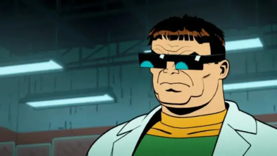
Text

What kind of dork wears sunglasses indoors?
211 notes
·
View notes
Text
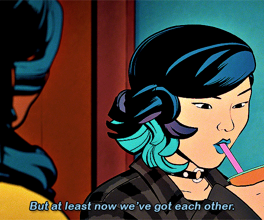


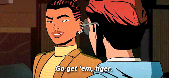
Nico & Pearl
YOUR FRIENDLY NEIGHBORHOOD SPIDER-MAN | 1.09: HERO OR MENACE
#your friendly neighborhood spiderman#your friendly neighborhood spider man#yfnsm#theyre lesbians your honor
374 notes
·
View notes
Text
Did anyone else catch that RDR2 reference?

31 notes
·
View notes