
Raised on Octavia Butler, Nichelle Nichols, and Jack Kirby, I drew my first picture at 10, wrote my first story at 16, and got the first rejection letter at 18, welcome to the blathering blatherskyte of a UX designer and illustrator, with more snark than brains—Philip Jean-Pierre
Don't wanna be here? Send us removal request.
Statistics
We looked inside some of the posts by philipjeanpierre and here's what we found interesting.
Average Info
Notes Per Post
85K
Likes Per Post
53K
Reblog Per Post
32K
Reply Per Post
38
Time Between Posts
5 months
Number of Posts By Type
Text
10
Photo
6
Note
1
Last Seen Tumblr Blogs


Fun Fact
Tumblr is used by 21% of adults online aged 18-29 years.
Text
Artwork of Ninja Scroll by Yoshiaki Kawajiri


1 note
·
View note
Text
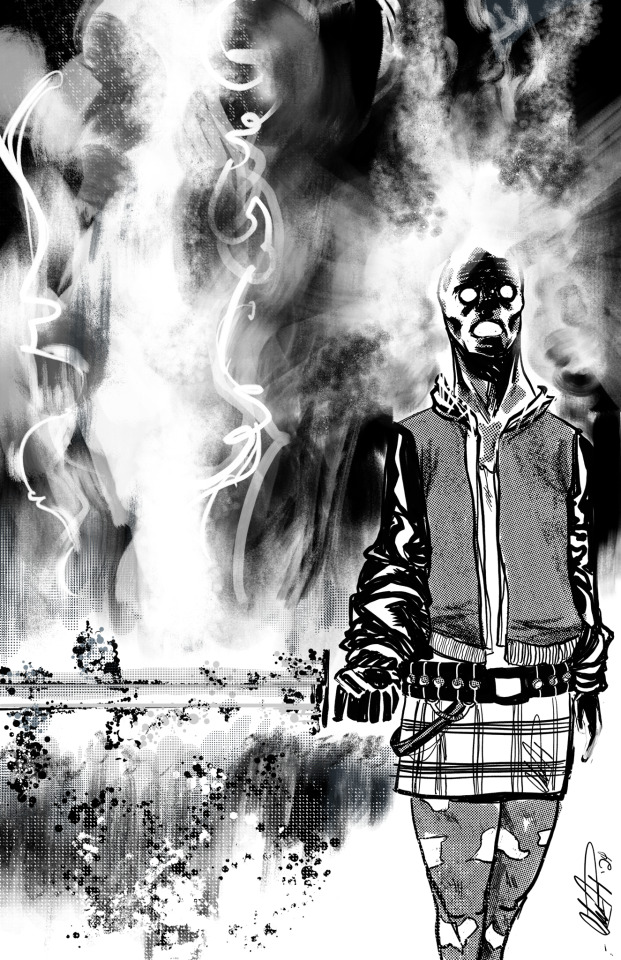
Concept art for a project i’m working on. See me, this and others at #Blerdcon on July 12-14 at #HyattRegencyCrystalCity and visit our table A-114 this year.

#howdoyougrind#apple pencil#blerdcon2024#comicartwork#cyberpunk#Arlington Virginia#procreate#grind2greatness#concept art#Hyatt Regency Crystal City#black artists
9 notes
·
View notes
Text
See us at #BlerdCon at Table A-114

0 notes
Text
A piece inspired by the sailor scout archetype famous in Anime, manga and also inspired from one of my fave 90s anime back in the day, Ogre Slayer. I’m sure it’s been done before but this is my own personal occult take on it. I enjoy the juxtaposition of darkness and implied innocence. I had no direction for this piece originally but I like where I ended up, this go around. As always sketched it traditionally imported it into Procreate and did the finishes and effects using an Apple Pencil.
#sailor scouts#procreate#occult#horror#apple pencil#traditional art#ogre slayer#paranormal#comicartwork#blerdcon2024#grind2greatness#howdoyougrind
2 notes
·
View notes
Text
Working on some test pages for a comic anthology I’m hoping to have ready for #Blerdcon2024. I’m #still not sure of the look I want. I’m being reminded that the language of illustrations vs the mechanics of comic pages are vastly different and trying to find the balance is always the struggle but fun when a plan comes together. My Mac crashed so instead of using traditional and #ClipStudioPaint, I used traditional and #Procreate and #ApplePencil.


0 notes
Text
Something I’m working on for #Blerdcon2024. This started off as a rough ink sketch/drawing, I imported it into #Procreate and futz around until I was happy, not sure if it’s the final but this is my stopping point, for now. Might become a print or a part of this year’s artbook. Either way, I’m calling this one The Dark Knight. #NotAI #applepencil #penandink #digitalart #occult #MonsterHunter #forsaken #desertus

#not ai art#Forsaken#grind2greatness#Blerdcon2024#procreate#digitalart#occult#monsterhunter#howdoyougrind#Apple Pencil#comicartwork#comic art
1 note
·
View note
Text
Here is a recent commission I did for a client’s project. Think of a mash-up of #TreasureIsland meets #lovecraft horror meets #ArthurianLegends. It’s a lot but was fun to come up with a concept. We went through many iterations before landing on this during the inking stage. I thought it worked and like the story of the image. Please don’t ask me tomorrow if I’m happy with it. #neversatisfied This was a fast one and I was still recovering from #blerdcon and some family issues, so I took a shot and did this piece exclusively with #applepencil #ipad and #Procreate using @claytonhenry_artist’s brush. #wouldhighlyrecommend Overall it was an ok experience to work that way and faster but it reminded me that I will never give up working traditional. #AnotherToolInTheBox For you #processjunkies swipe to see the development work.
#illustration #DigitalArt #ComicArt #ArtCommission


#treasure island#lovecraft#arthurian legend#apple pencil#ipad art#procreate#illustration#digital aritst#comicart#art commisions#howdoyougrind#grind2greatness
3 notes
·
View notes
Text

And so it begins…
1 note
·
View note
Text
Just heads up this coming weekend you can find us at Blerdcon “Fae’d To BLACK” July 7-9, 2023!! Focused on inclusive culture of our geek family! A 3 day, 24 hour con based in ANIME, GAMING, COSPLAY, COMICS & SCIFI with panels, celebrity guests, presentations, workshops, gaming tournaments, cosplay contests music,dance and artists. Being held at the Hyatt Regency Crystal City at National Airport in Virginia
0 notes
Photo


I meant to post this sooner, like a lot sooner, but life got in the way as it does.
Thankfully my trusty assistant was there to poke me with a very..ahem… very sharp stick to post this. The following piece was part of the ‘Things Are Getting Sketchy’ live drawing event. I had the honor to share the night with ultra talents @seandamienhill and @nathanphillips_art (Check them out), and the night was hosted by the host with the most @nathan.duncan.75. The theme was X-Men villains. I went with the SeleneBlack Queen of the Hellfire Club. I have thoughts on this piece and the final look, but for now, let’s just say I learned a lot doing it.
Process photos are also included.
4 notes
·
View notes
Text
The problem with the Internet is that it gives you everything - reliable material and crazy material. And now you get to decide what in the world I am giving you. Yes, Like most of the whorebaggers of the internet, I finally got around to setting up a Linktree on the various places you can find me and my stuff. This is prime stalking material if your flavor of the internet is the weird and the unhinged-ish.
Enjoy: https://linktr.ee/blackgorbachev

2 notes
·
View notes
Photo


After some of the personal stuff I have had to deal with, I got mentally “unblocked” and decided to do some practice stuff and throw the cobweb stuff; here are today’s morning exercises; there was a whole lot of ring rust spent a lot more time this morning on stuff like this than I anticipated until I felt comfortable again--these warm-ups. I have many, many more terrible ones than good ones, but for this post, I picked the pieces I thought were less shameful to my father, my mother, my sisters, my brothers, and our line of people back to the beginning. Have some things in the works in the coming weeks, and I’ll show what I can when I can. Special shout-out to my assistant @bubblyboiarts aggressively and mayhap violently encouraging me to get back to posting. While it's not a 100% chance they can kick my ass—it’s also not a 0% chance.
#illustrations#artstudies#ComicArtWork#characterstudies#drawing#artwork#sketching#sketchbook#inkdrawing#crayon#lighting#FigureDrawing#roughtsketch#dancing#dancingwomen#lightingreference#ballet
1 note
·
View note
Photo


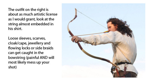


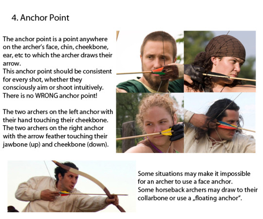

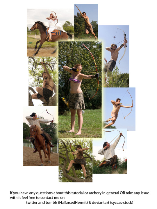
Spent the last two days working on this little archery guide in art and writing. Considering the rise in popularity of archers in pop culture this hopefully comes in handy for a bunch of fandoms.
75K notes
·
View notes


Note
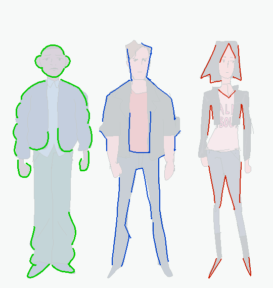
Oh almighty napkin arm with googly eyes, I humble peregrin dare come forth with a request... could you make some character design breakdowns for some more realistic characters? Like your power ranger fanart? I tried to break them down on my own, but I'm not sure I did it that well... it's incredibly useful and interesting... Keep being awesome, and thanks for how you already helped me anyway!
Thanks for the patience, had to mull this one over. The more complex a design gets, the more difficult it is to break down. Basic character design tips may not be enough…so let’s delve into:
Character Design Tips Part 2!
Before we start, it’ll help to read my last character design post, where I laid out four concepts: shapes, silhouettes, colors, and inspiration. In this post, I aim to build on and rephrase these in a way that hopefully makes it easier to apply them. I’ll be drawing examples from my Power Rangers (2017) fanart to illustrate my points.
(Disclaimers:)
(Ideally, you should already be comfortable with drawing people. If not, look into figure drawing, gesture drawing, etc.)
(Whereas my previous tips were more tried and true, the tips here are more my own thoughts, so they may be half-formed.)
(Again, these are not rules. They’re just tips to add to your toolbox; the more tools you have, the more versatile you’ll become.)
Without further ado, let’s start!
Based off what we know about shapes, silhouettes, colors and inspiration, I want to cover: lines and angles, external and internal silhouettes, values, and references.
1. Shapes => Lines and Angles
Last time, I laid out three basic shapes:round, box, and triangle.
Problem: limiting yourself to these 3 shapes can be useful and fun for simpler designs, but they may be too simple or look out of place on more complex designs.
Solution: let’s go to the next level! Instead of shapes, shift your thinking to lines and angles!
Lines can be curved, straight, or diagonal.Angles can range from obtuse to acute angles.Follow your intuition: what feeling do you get from each line or angle?If I follow my own intuition, I see that:
curved lines = natural, soft
straight lines = balanced, grounded
diagonal lines = off-balance, in motion
obtuse angles = broad, relaxed
right angles = rigid, unnatural
acute angles = slim, dynamic
If this sounds familiar, you’re right! It’s just the shapes all over again:
curved lines make round shapes
straight lines with obtuse/right angles make boxy shapes
diagonal lines with acute angles make triangular shapes
But lo! Since we broke the shapes into their smaller components, it’s much more flexible! Now we can use lines and angles for more complex designs:

2. Silhouette => External and Internal Silhouettes
Last time, I explained the silhouette test: if you black out the figure, it should still be readable.
Problem: blacking out the figure only tests the outline of the design, i.e. the external silhouette. But what about the inside of the design?
Solution: block in the figure and test for the internal silhouette!
If you want not just an interesting outline, but an interesting costume, block in the major components of your design to see if it has a readable internal silhouette. This test can help you avoid boring or cluttered costumes and makes your design stand out. If your internal silhouette is too empty, try adding props or designs. If it’s too busy, simplify it.

3. Colors => Values
Last time, I talked about the 60-30-10 and 70-30 rules for color.
Problem: those rules work on the assumption that you’re only using 2 to 3 colors. But what if I want to use more colors?
Solution: good news! The same idea applies if you split your palette into 3 major values: shadows, midtones, and highlights.
Balance your palette by converting your colors to grayscale and applying the 60-30-10 rule to the values. This is related to the idea of silhouettes; if you get a nice internal silhouette, you’ll probably end up with a nicely balanced set of palette values, and vice versa.

(Fun fact! You can split your palette in different ways. In a watercolor tutorial, Miyazaki splits the palette into bright, dark, black, green 1, green 2, blue 1, and blue 2.)
4. Inspiration => References
“Good artists copy, great artists steal!” -Picasso
Problem: Coming up with something 100% original is tedious and doesn’t always give great results. It saps the inspiration right out of you!
Solution: It’s a lot easier to steal ideas from references!
Note: don’t just copy, steal! Cherry-pick/massage the aspects of the reference you find the most appealing and work them into your design. Ditch anything that you don’t care about. Make it your own! Make it something you can put your own name on! Below is the reference image I used for my designs:

And below is my fanart:


That’s it for now! Thanks for reading! If you guys want to see any other topics, feel free to ask and I can try my hand at it.
If you want to see my previous character design tips, click here.If you want to see the full-size Power Rangers fanart lineup, click here.If you want to see other character designs I’ve done, click here.
9K notes
·
View notes
Photo

Lunchtime sessions. Something I will have to clean up and ink at some point. #harleyquinn #dccomics #suicidesquad #poisonivy
2 notes
·
View notes
Photo

Cosmic Odyssey John Stewart Green Lantern. Have always loved this storyline. #cosmicodyssey #kuretakefountainbrushpen #deleterneopikoline3 #GreenLantern #dccomics #GreenLanternCorps #sector2814 #inblackestnight
#dccomics#greenlanterncorps#deleterneopikoline3#kuretakefountainbrushpen#sector2814#greenlantern#inblackestnight#cosmicodyssey
0 notes