
Statistics
We looked inside some of the posts by portiarook and here's what we found interesting.
Average Info
Notes Per Post
1
Likes Per Post
1
Reblog Per Post
0
Reply Per Post
0
Time Between Posts
5 days
Number of Posts By Type
Photo
17
Last Seen Tumblr Blogs


Fun Fact
Hackers stole 65M passwords from Tumblr in 2013.
Photo

TASK 10
I did this in 2hrs ok! God knows I’d love to iron out the letters but it’s not worth putting so much time into when I have so many things to do! I really like how the letters fit in with each other though and the idea of using a wax seal of a logo. I probably wouldn’t use either of these though lol
0 notes
Photo

Pin Up Day!
Yeah so the errors never showed up on the printed version so it was a lot of fuss over nothing! I’m glad it’s ok now though! Overall I think we did really well. I’m super happy with out colour choices and experimental layout, it really separates us from the rest of the mags! And somehow we managed to make everyones art style work together which is really good
1 note
·
View note
Photo

I have no clue how the eyes on the bottom right hand corner ended up on the wrong layer and now it’s going to be in the final print. You can see in previous posts that it’s even got an effect to make it partly transparent and I since didn’t change it, only moved it. And now it’s my responsibility and fault that it’s covering the text since it was my job to manage the base file. I feel so bad :( it would’ve been such an easy mistake to fix had I caught it
I also contributed 3 articles under the persona of “Shiva Shallows”
0 notes
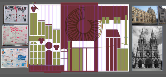
Photo


Flat Mag - Fixed!
Ok so i can definitely shrink the text and shock and horror that solved most if not all of my problems. The layout is definitely better than before and now all of the illustrations are in place. I just realised I never talked about the circular design in the background. I intended that to look like both a Victorian window and an eye. We’re going to meet up to dicuss the final version so I’ll post that next.
0 notes
Photo

Flat Mag - Now with Articles!
I can’t believe we got them all done in a week but jesus Christ do I not like the layout now, I had to do a bunch of shuffling around that frankly took me way too long and I’m still not happy so! Tomorrow! I’m going to do a test print and if there’s enough legibility that I can reduce the font size I will to create more space.
0 notes
Photo

Layout Update!
Ok so this is what I have so far with 0 idea on what the articles are going to look like or where they’re all going so I’m not going to fiddle with it more than this. But I’m really happy with the boxes and they’re different enough for me to be satisfied that I've done enough work on the project, we’ll see how it looks when I put the articles in
0 notes
Photo


As a side project I decided to take what we learnt from Semester 1 and try my hand at making some floral wallpaper but out of dangerous and weird looking plants. That way it gives a store of time appropriate feel to the background of the mag.
0 notes
Photo
Flat Mag Progress - Layout
I’ve been put in charge of the master file and I also put my hand up to do the layout. So since it’s Victorian era themed I decided to draw inspiration from gothic architecture to make the layout interesting. It’s going to be really hard to balance between fun and different, but readable and easy to follow. But we’ll get there.
0 notes
Photo

Task 9
Just when I thought I was running out of creativity I make this. Don't want to toot my own horn as they say but I am all for self praise and I love this. I was asked to make something horror related which was uncomfortable and honestly that description is so far out of my comfort zone. So I decided to draw on things which make me scared, specifically things like teeth in places they shouldn’t be. Again I would spend more time on it if it weren’t just a weekly task but the extra effort of editing the text to fit a bottle shape was definitely a good decision.
0 notes
Photo

Task 8
Went and saw IT: Chapter Two on the weekend, Gold Class babey!!! And it was honestly a pretty solid movie, and I never usually like horror. But the good thing about horror is the iconography which makes it v easy to do this sort of task with. I might do more of these by hand for some fun in the future :D
0 notes
Photo


Task 6!
God do I love crossing genres. This was based off an anime I watched when I was a kid called Ouran Highschool Host Club, and the main title song has a line, “Kiss! Kiss! Fall in love!”. So naturally I was like oh why no draw KISS in a bunch of girly anime poses. I didn’t spend too long on the illustration since it was just a class task after all but I’m still happy with how it turned out, might make it into an actual shirt!
0 notes
Photo

TASK 5
I honestly don’t know what I was doing here but I love it. I’ve always loved overlapping text and I’m embarrassed to say how long I spent gently nudging the text this way and that until I was satisfied with how it looked. I then added the line to direct the eye down and the title text to be intercepting that line. Then the graphic at the bottom was just an auto cut out of a stock photo image of a man walking across a crossing, layered like the text. That bar was just added to break up the negative space.
0 notes
Photo


WE’RE DONE! (Click on each image for a bigger version)
It was a real crunch to get everything printed and cut on time but I’m really glad I had all of the months done ahead of time so I just had to make the adjustments from the presentation.
I’m really proud of the colours and overall concept, I think it turned out great. Though looking at everyone else’s made me think maybe my design was too big, but since I was designing for my mum who loves keeping a calendar I wanted to make sure there was enough room to write events as well as a big enough feature space for the paintings.
All in all I’m happy with the end product. Bring on the next assignment!
0 notes
Photo


QUICK DEMONSTRATION OF CHANGES
I also changed the title from “In Orbit” to “In Rotation” because I didn’t want to imply space so heavily since that wasn’t the theme. Though I did pick the painting with the most texture and make it black and white to kind of suggest the texture of the moon... The greys are all tinted to match each theme and the tags are now circular :D
0 notes
Photo


PRESENTATION
I’d like to say I’m getting better at this and I’m glad the concept came across effectively.
Feedback
Change the cover: It bares no relation to the theme aesthetically - find a way to reference the paintings.
Neutral grey should be tinted to fit the colour palette of each page.
Holiday tags could be circular to match the theme more closely.
Due to my own timetable I’m going to have to make these changes immediately and send a print request so I can bind on time so... wish me luck! (quick suggestion, considering we have to make adjustments after the presentations it’s not really fair that ours are so late in the week whoops)
0 notes
Photo

REVISED MONTH DESIGN
This time with the text curving around the outside of the circle design. This was the only aesthetically nice way I figure out to fix the white text problem and it took me a while to warm up to it - BUT I like how the paintings are completely unobstructed now so you can see all the individual brush strokes.
This is how all the months look now but for each painting!
0 notes
Photo


DESIGNING THE LAYOUT FOR THE CALENDAR
Initial Problems:
In this example the colours were too soft to match the painting
The week day texts were too hard to read and uneven
I like the second version a lot better and I like the idea of having the text more prominent and maybe even wrapping around the circle to make it look more like a sphere but unfortunately some of the paintings have a lot of white space which makes the text invisible. So I’ll have to figure out a new way to display the months :(
0 notes