
For Practice 1: Developing Skills class. Recording any thoughts and exploration about assignments.
Don't wanna be here? Send us removal request.
Statistics
We looked inside some of the posts by practice1developingskills and here's what we found interesting.
Average Info
Notes Per Post
1
Likes Per Post
1
Reblog Per Post
0
Reply Per Post
0
Time Between Posts
6 days
Number of Posts By Type
Text
13
Last Seen Tumblr Blogs


Fun Fact
There are dozens of funny blogs to kill time on Tumblr.
Text
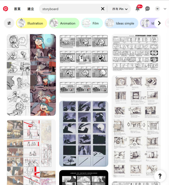
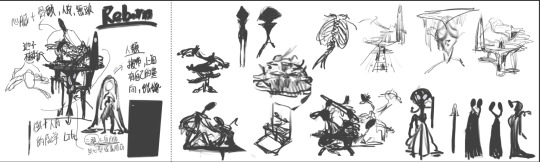
Assignment6- storyboard
This time, the theme is storyboards. I know what a storyboard is, but I don't have much experience drawing them. So, I first went to Pinterest to see how storyboards are done in different works. So, I went to Pinterest to check how storyboards are done in different works.
After getting a handle on storyboards, I started thinking about what kind of storyboard I wanted to create.
After some thought, I decided to use the theme and characters of Assignment 2 - Rebirth to create a storyboard for the beginning of the game. I originally wanted to continue the worldview of Assignment 2 - Rebirth since I have many more ideas for this theme that I want to express.
After picking a theme and figuring out the storyboard, I checked out some game openings on YouTube to get ideas. After watching a bunch, I noticed that the more impressive game openings share a few key elements:
High interactivity: Players can take control of the game character right from the beginning, becoming part of the game-opening experience.
Complete transitions in a short time: The game opening balances telling a story and keeping things concise.
A game opening needs to consider the player's time and should not be too long. Players usually look forward to starting the game quickly, so a lengthy opening might cause them to lose patience and concentration.
The challenge is How you quickly immerse the player into the game world while telling a story with a complete sequence of events? That’s one of the most important objectives to achieve at the start of a game.
youtube
youtube
youtube
youtube
When I started working on the storyboard for Rebirth, I used the simplest way to quickly sketch out the story and images I wanted to convey. Then, I drew the final version based on that draft.


This is a storyboard about a dead person who wakes up in the world between the dead and the reborn. He's unsure where he is, but white lines spread out on the ground as the protagonist takes his first step. The protagonist follows the lead of the white lines and keeps running forward.
On the way, he keeps seeing his look-alike shouting at him: "Why don't you choose me?" "Are you sure this is good enough?"
The monsters chase the main character to a cliff, and he falls onto a platform in the air. When the main character wakes up, the white line is gone, but the main character is still guided by the only path before him.
At the end of this journey, the main character encounters the god of rebirth in this world. The main character remembers everything he's done during their interaction—good and evil. As these memories overwhelm him and he begins to pass out, the god of rebirth pulls him into the pool of rebirth and helps him to be reborn.


Honestly, I made this work mainly because I've always been self-critical and not confident in my personal growth., much like the monsters the main character faces as he evolves. I didn't become a different version of myself in a different time and space; I think they're all better versions of me. They're always telling me:
"Why don't you try harder?"
"Why can't you do anything right?"
"That's why I didn't show up in that reality!"
The white line the main character encounters on the ground represents the timeline. The timeline that becomes reality is the thickest, while the timelines that don't are tiny and faint.
The god of rebirth that the main character encounters at the end serves as an entity that forces him to confront his past mistakes. At the brink of mental collapse, this being grants the main character a chance to become human again, offering him a fresh start.
0 notes
Text
Assignment5- 3D-2
Because I didn't have enough time, I took a break from the Blender exercise to focus on the goal of this assignment.
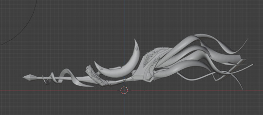
It's that magic flying machine I drew before. I've been itching to build it in 3D to see what it looks like in Blender!

The heart of this magical flying machine is the perfect blend of technology and magic. It's divided into several parts: the moon seat in the center core, the jewels and name tags on the top of the flyer, and the magic ribbon on the tail! (My favorite part, but also the hardest part of the painting process)

In the modeling process, the most challenging part is the details of the fuselage and the overall modeling mastery and restoration. In the 2D drawing process, I can cover up some of the design's less desirable or unique parts more opportunistically, but in 3D, there is no dead space at all. So, in the actual modeling, I had to adjust the proportions of the overall shape for a while.
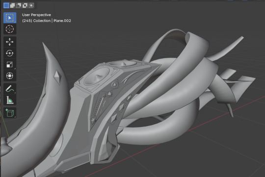

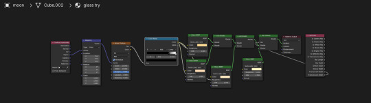
The second issue is the texture. It's hard to draw textures by hand and even harder to create textures in Blender that match your style. It's tough to make a texture in Blender that matches your own style of hand drawing.
At a very late stage, I realized that creating a unique texture is very difficult, and it's not something that can be done quickly. However, I looked at the online teaching resources and tried to make something close to my ideal. The glass moon and the magic ribbon were the most difficult parts.


0 notes
Text
Assignment5- 3D-1
This assignment was all about using 3D software, and honestly, it made me a bit nervous. I don't have much experience with 3D software, but I'm also excited because mastering 3D skills is a massive part of being a concept artist. I'm a beginner in 3D but eager to find as many resources as possible to practice and learn more.
youtube
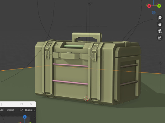
First, I'm looking for Chinese resources to learn. I found a YouTuber who teaches how to use Blender, starting with building an essential toolbox to learn how to operate it. Since I'm pretty new to Blender, this tutorial is still challenging. I managed to build a toolbox using the tutorial, but there are still many things I don't understand or did wrong during the process.
youtube
So, I decided to look for a new Blender tutorial. This one is perfect for me, haha! I followed this YouTuber and built a simple pearl girl. While doing that, I practiced the basic Blender operations, like interface, basic object deformation, and setting up the material creation.

After practicing the Pearl Girl, we will start practicing more complicated models.
For example, the fox, leaves, trees, and so on. While building this basic model, I became more familiar with the operation of Blender and learned the most important function of the Blender modifier.
Honestly, this function is really quite complicated! But after actually using it, I will be shocked by Blender software!


Lastly, practice the important connection node in the blender texture function.

Attached are my notes haha

0 notes
Text
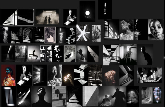
Assignment4- Light and Shadows-2
After looking at Journey and Little Nightmares, I started thinking about what theme I wanted to use for this assignment.
While thinking about it, I read the information the teacher gave us about this light and shadow assignment.
It hit me that I have a thing for black-and-white and intense light. So, I decided to go with that as the theme for this project.
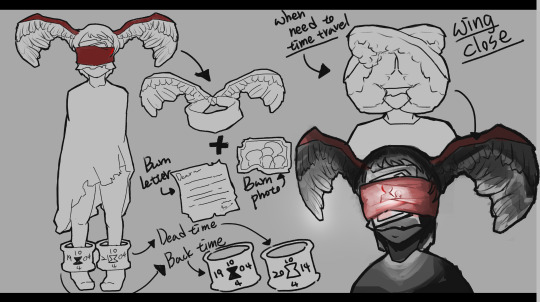
I usually start by creating a general worldview and characters before I can visualize the related images and story. So, first, I made a dead character.
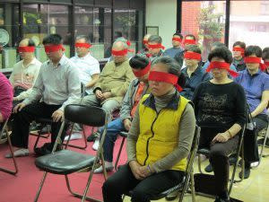
The most distinctive feature of this character is the red strip of cloth on his face. I got the idea from an Asian psychic ritual called "Guan Lu Yin." The main idea of this ritual is that an experienced cleric can lead the person tied with the red cloth to find the person he wants to see in the underworld.
I thought about it in reverse and came up with a dead person who can return to the human world as a ghost to see his family and friends still alive through the ritual.
This character has some interesting details:
The red cloth is a living creature.
The wings on his back allow him to fly around the afterlife.
To activate the red cloth, letters and photos burned by relatives and friends are necessary.
Finally, the ankle ring on the character is another intriguing feature. It represents:
An obsession with staying in the afterlife, meaning the character cannot truly "die."
A tool to help the character return to the human world.
The ankle rings have a unique function:
The right ankle shows the time of the character's death.
The left ankle displays the time the character can return to.
However, there's a catch: the character can only return to a world where he is still alive. He cannot visit the world where he died.
So, based on this character and worldview, I wanted to create a world in this gray area between the human and afterlife worlds.
It's a zone with no rules, so you might see strange buildings that don't make sense physically, water flowing down from the sky, and plates floating in the sky.
But really, this space is a world made up of the dead's memories and experiences, all amplified by the moment's emotions.
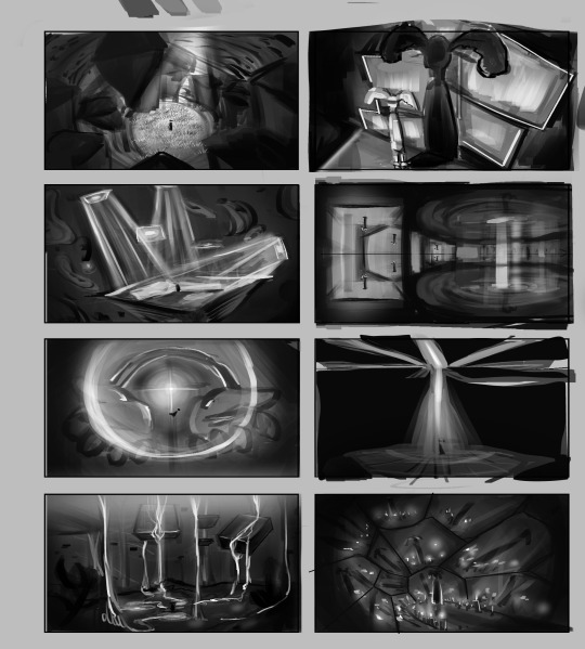
Ultimately, I decided to go with this image as the one I want to keep working on. It may look messy, but it's packed with ideas I want to get out there. First, there's the square plate floating in the air with intense light.
That's a photo of a deceased person's life, and the image is projected onto the floor. I imagined the effect to be like that of Teamlab, a famous light and shadow exhibition in Tokyo. It has photos of the deceased floating in space, and there's also a clock in the air to show the passing of time. I wanted to use this image to convey the feeling of running lights in one's head at certain moments.
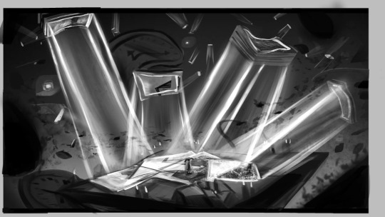

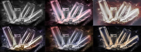
I found the last part of the assignment interesting, but it was also the worst. I had to use different colors in the same image to create different emotions in the scene.
I think it's a fascinating experiment to figure out the best color for the scene, but since I don't know much about color and the structure of the scene, I'm not that happy with the final result.
There are a few reasons for this. First, I'm not familiar with drawing spotlight-like lighting effects. Second, in the beginning, I only had black-and-white images in my mind, so I didn't know how to add colors to the light and shadow.
This assignment opened my eyes to the power of light and shadow and showed me how far I have to go in mastering them. I plan to improve by drawing more photos with intense light and shadow.
Reference
Yahoo News (n.d.) 還願:觀落陰到底是什麼?危險嗎? Available at: https://tw.news.yahoo.com/還願-觀落陰到底是什麼-危險嗎-060053705.html (Accessed: [4 January 2025]).
teamLab (n.d.) Impermanent Life: People Create Space and Time, at the Confluence of Their Spacetime New, Reversible Rotation – Continuous. Available at: https://www.teamlab.art/w/impermanent-life-people/#modal-1 (Accessed: [4 January 2025]).
Pinterest (n.d.) Pin on Art and Culture. Available at: https://ch.pinterest.com/pin/187884615681828295/ (Accessed: [4 January 2025]).
0 notes
Text
Assignment4- Light and Shadows-1
When I saw this assignment, two games came to my mind. The first one is Journey, and the second one is Little Nightmares.
I thought of these two games because the lighting and shadows of these two games have left a deep impression on my mind, so I wanted to take the opportunity of this assignment to re-examine these two games.
The first one is Journey.
Here's a quick rundown of the game.
The Journey was released in 2013 by that game company. Journey is a game that Thatgamecompany published in 2013. Players loved it for its unique gameplay and artwork. You take on the role of a red-robed character and embark on a journey through the desert. What I find most impressive about Journey is how it captures the beauty of nature's light and shadow in a very natural and beautiful way, which is pretty rare.
It's like you can feel the same emotions you'd have if you were actually seeing the beauty of nature in real life.
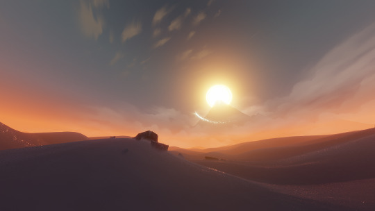

This is my favorite pic from the game.

I was gliding on the sand while messing around with the game character during this golden hour.
Then, I saw the strong sunset sunlight shining on the sand, and the shadows of the buildings hitting the sand made this beautiful, mysterious atmosphere. It was like nature was showing me the most beautiful picture, telling me to cherish the moment and let go of all the anxiety in my heart.
The reason I love this image so much is because of how it uses light and shadow in nature. When the weather's nice, golden hour is always my favorite time of day. The sun's light and the sky's color mix together, making the sky and clouds look fantastic, and the color of the setting sun can make everything feel nostalgic and warm.
The angle of the sun's light also makes the ground look like it has interesting shadows. It's honestly the best time of the year.

(The photo is from my cell phone)
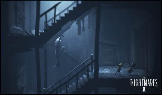
Next up, I'd like to talk about Little Nightmares. If the beauty of Journey is that it brings back the beauty of nature's light and shadow in the game, I think the power of Little Nightmares is that it uses indoor light and shadow to really make the spooky atmosphere pop.
It's a 2017 horror puzzle game made by Tarsier Studios.
Using various props, you take on the role of a skinny kid trying to escape from a scary place.
There are two main lighting techniques in Little Nightmares.
Strong Light Source in a Closed Space One prominent technique involves placing a strong light source in a confined area, similar to the effect of a spotlight.
This approach creates an immersive atmosphere, enhancing the visual depth by casting shadows on walls or floors, enriching the overall visual experience.
Additionally, it helps players easily locate their character amidst the game's busy and cramped environments, ensuring seamless gameplay.
Below is an example illustrating this technique:

2. Natural Light Through Openings As shown in the picture below, another lighting technique involves introducing natural light into the closed spaces through openings.
This method contrasts the first by being softer and subtler, aligning with the nighttime setting of Little Nightmares.
Natural light sources such as moonlight or street lamps are often used. These light sources are intentionally not overpowering.
For example, moonlight streams in from the top in the image below, casting a cold and stressful tone across the screen.
This not only reduces the emotional intensity brought by stronger light sources but also allows players to momentarily catch their breath.
Despite the softer light, the eerie and mysterious atmosphere remains intact, preserving the game's signature creepy vibe.
To sum it up, the lighting and shadows in these two games made me feel like I was right in the middle of the action and got me feeling all the charm of each game.
Reference
Matt Nava's Journey: Nava, M. (n.d.) Journey. Available at: https://mattnava.com/Journey-1 (Accessed: [10 January 2025]).
The Art of Little Nightmares II: IAMAG (n.d.) The Art of Little Nightmares II: 60 Concept Art. Available at: https://www.iamag.co/the-art-of-little-nightmares-ii-60-concept-art/#jp-carousel-343728 (Accessed: [10 January 2025]).
Cut Content in Little Nightmares: Fandom (n.d.) Cut Content in Little Nightmares. Available at: https://littlenightmares.fandom.com/wiki/Cut_content_in_Little_Nightmares (Accessed: [10 January 2025]).
0 notes
Text
Assignment3-Nostalgia and Memory-3
After picking the characters, I started thinking of all kinds of things that happened to me when I was a kid. I made a list of the four things I remembered most and wanted to put them into a Keyframe.
When I was little, I wanted to perm my hair, but my hairdresser made me look like a poodle.
When I was little, I couldn't win an argument with my sister, so I bit him on the arm.
It was very hot in Taiwan, so I would sit in front of an electric fan and open my mouth when I was little.
When I was young, I hated a specific cartoon character, so I used a red crayon to draw a fork on the TV.


My biggest challenge in drawing these keyframes was recalling scenes from my memories, much like how Turning Red resonated with its audience.
One reason why Turning Red connects so well is that viewers can easily recognize objects or scenes from the characters’ lives that mirror their own childhoods. I aimed to achieve a similar effect by collecting photos resembling my memories. However, I feel the results still leave plenty of room for improvement.
For the drawings, I aimed for a more comic book-style approach. This included making sound effects larger to better convey the characters' emotions. Additionally, I thickened the character outlines to enhance the comic book aesthetic.
Despite these efforts, I’m unsatisfied with how these keyframes turned out. I plan to revisit and refine them in the future.
0 notes
Text
Assignment3-Nostalgia and Memory-2
After checking out all kinds of artwork, I'm taking on the challenge of cartoonizing my childhood self again! First, I had to find pictures of myself when I was little. Luckily, I was able to find some pictures of my childhood after asking my grandma!
After looking at my childhood photos, I came up with a few features that I wanted to express:
single eyelid and small eyes
small eyes with single eyelids
wearing glasses
short hair
chubby
big feet
After that, I tried to draw according to these five characteristics, but maybe because I already had a cartoonized image of me as a child in my mind, I didn't try too much at the silhouette stage and just started drawing the details!


I was initially puzzled by how to depict single eyelids and small eyes, which are defining features of my youth. I wanted to reflect the lively and mischievous personality I had back then, avoiding a look that felt cold or introverted. So, I experimented with various approaches to drawing single eyelids and small eyes, aiming to capture that playful energy.
After focusing on the shape of the eyes, I discussed the design with my teacher. The teacher pointed out that the overall character shape looked confusing and suggested a valuable method to improve consistency: organizing the silhouettes of the character's parts.
The suggestion involved tracing the outline of large character parts and rearranging them to check how well they fit together. I decided to try it out, and it worked like a charm!
I particularly liked this method because:
It allowed me to quickly identify which body parts affected the character's overall look.
I could pinpoint proportions that needed adjustment to create a more cohesive design.
This approach has been a game-changer in ensuring the character feels visually consistent and expressive.


This is the final version of the character after incorporating the teacher's feedback.
By adjusting the shapes of the large blocks, the character now looks more coordinated and has a better sense of rhythm in the lines of the frame.
Once the character's appearance was finalized, I began working on emotional expressions that I remembered from my childhood. Drawing emotional expressions for a character was particularly challenging because it required maintaining the character's appearance while capturing the essence of each specific emotion.
After studying various reference images and doing plenty of practice, I finally got the hang of drawing those childhood emotional expressions!
Reference
Inkcross (2014) 034: A Mexican Story. Available at: https://inkcross.com/2014/08/25/034-a-mexican-story/ (Accessed: [4 January 2025]).
Pinterest (n.d.) Image reference. Available at: https://www.pinterest.com/pin/12384967717643330/ (Accessed: [4 January 2025]).
Behance (n.d.) Short animation film: A Jeju Story - Sohyun Childhood. Available at: https://www.behance.net/gallery/200210341/Short-animation-film-A-Jeju-Story-sohyun-childhood (Accessed: [4 January 2025]).
Pinterest (n.d.) Image reference. Available at: https://uk.pinterest.com/pin/969540626024592179/ (Accessed: [4 January 2025]).
Ninjago Wiki (n.d.) User comment and reference. Available at: https://ninjago.fandom.com/f/p/4400000000000052278/r/4400000000000167381 (Accessed: [4 January 2025]).
Tumblr (n.d.) Image reference. Available at: https://66.media.tumblr.com/4225a7a94c9ef2e9c248a4f4faf1e605/tumblr_o60t3zLNi61qhdiu5o5_1280.jpg (Accessed: [4 January 2025]).
Pinterest (n.d.) Image reference. Available at: https://uk.pinterest.com/pin/766949011567053107/ (Accessed: [4 January 2025]).
0 notes
Text
Assignment3-Nostalgia and Memory-1
After hearing the teacher's announcement about this topic, I had a light bulb moment: I should cartoonize my childhood self!
I think it’s because, as a kid, I loved watching cartoons, but my parents limited how much time I could spend watching TV. As a result, I could never finish watching a cartoon properly.
Naturally, when I grew up, I binge-watched all my favorite cartoons again! I got really into the style of American animation characters. I think every character in American animation has a distinctive design that’s memorable at a glance. You can instantly feel the character’s personality just by looking at them!
So, with this theme, I was totally on board! I decided to take on the challenge of drawing myself as a cartoon character in the American animation style.
Since it was my first time trying to draw in this style, I wasn’t sure where to start. I looked up my favorite cartoon concept art and studied it closely for inspiration!
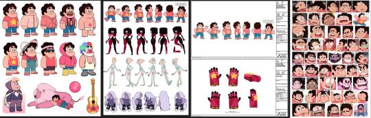
My favorite from the first one is Steven Universe. I'm a big fan of this show. I love how the story is interesting without being overly complex, and I really appreciate the diversity of the characters.
Every character in Steven Universe is designed to be instantly recognizable, and you can guess their personality just by looking at them.
Take Steven, the main character. He’s outgoing and naive, but also incredibly kind. His design is full of rounded lines, making him look friendly, and his pink color scheme adds to the positive and lively vibe he gives off.
Then there’s Garnet (the one with the square head and red and black color). Garnet is a reliable and strong leader who always knows the right thing to do. The square head and broad shoulders make him look dependable, and the dark red and black tones emphasize his strength and reliability.
Another thing I love is the exaggerated expressions the characters use to show their emotions. For example, Steven’s exaggerated facial features make it easy to read his emotions, while also adding depth to his character.
Studying Steven Universe's character design has made me appreciate the work even more. It’s taught me how silhouettes and colors can define a character. A strong silhouette and a well-thought-out color scheme highlight the characters’ personalities and make their actions in the story feel more believable.
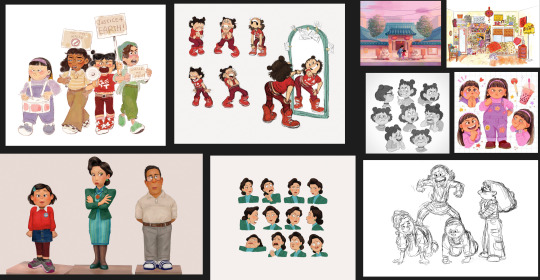
I added Turning Red to my list of works to research because I really like it. Honestly, the heroine, MeiMei, looked a lot like me when I was a kid, so I wanted to understand how the character was designed.
One of the things I admire most is how Turning Red cartoonizes real people while keeping an appearance that the audience can relate to. I also love the proportions of the characters.
Take MeiMei's family, for example:
MeiMei: Her proportions are modest, and details like the oval glasses, the hair under the ears, the collared shirt, and the knit jacket give the impression of a well-behaved, smart, and lively girl.
Mama: Her proportions are more exaggerated. Her outfit—a jacket with high padded shoulders and a narrow skirt—creates a wider top and narrower bottom, making her appear severe and sharp.
Papa: In contrast, his proportions are moderate. Details like his sloping shoulders, straight body, and a rectangular face with no pronounced neck contribute to his rounded and laid-back personality.
The color schemes further highlight the family dynamic:
MeiMei and Mama feature red and green, a contrasting color scheme that emphasizes their differing personalities.
Papa uses white and grey, symbolizing his role as a central and balanced figure in the family.
This thoughtful use of proportions and colors makes MeiMei's family of three a perfect representation of a classic Asian family.
As I mentioned before, I think Turning Red excels at transforming real people into cartoon characters while striking a balance between realism and stylization. This approach allows viewers with similar cultural backgrounds to instantly feel empathy for the characters, while still maintaining the cute and fun vibe of the cartoonized designs.

The last one I wanted to work on was Splatoon! I really like the body proportions of their characters.
I love how they made the shoes bigger. The body's proportions are great, and the head is big, so it's memorable. That's why I want to incorporate it into my character design!


Reference
Nintendo (n.d.) Splatoon Gallery. Available at: https://www.nintendo.com/jp/character/splatoon/en/gallery/index.html (Accessed: [4 January 2025]).
D23 (n.d.) Unbearably Cute Turning Red Concept Art. Available at: https://d23.com/unbearably-cute-turning-red-concept-art/ (Accessed: [4 January 2025]).
Steven Universe Wiki (n.d.) Steven Universe (character)/Gallery/Official Artwork. Available at: https://steven-universe.fandom.com/wiki/Steven_Universe_(character)/Gallery/Official_Artwork#Model_Sheets (Accessed: [4 January 2025])
1 note
·
View note
Text
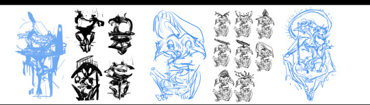
Assignment2-Human and Inhuman-2
After deciding on the general appearance, I was torn between two versions:
The Blue Version: This design featured winged hands and a veil.
The Black Version: This design had no visible hands and no veil.
Ultimately, I chose the black version on the left because I felt the blue version was too complicated, and the winged hands and veil didn't add much to the character's overall impact.
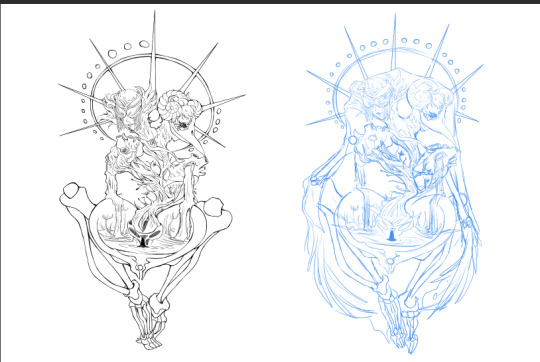
This character is a god of rebirth. Players will encounter this character in the afterlife, where they will be interrogated with various questions. The answers provided will determine what form the player will be reborn into.
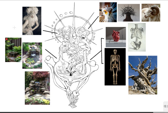
Design Concept
Since this character represents rebirth, the design removes most of the human structure, keeping only key elements like bones and a heart to symbolize the human aspect. To convey life force, additional elements such as plants and water are incorporated.
Key Structural Features
The Pelvis:
Enlarged to resemble a pond or womb, emphasizing its role as the origin of rebirth.
This is where the player’s rebirth occurs.
The Heart and Energy Source:
Comprised of a deconstructed heart and tree sweat, representing the energy fueling the rebirth pond.
The Head:
Designed to embody both good and evil, leading to two distinct appearances:
Good: Features an eyepatch, symbolizing wisdom and impartiality.
Evil: Includes a beak and goat horns, representing a darker, more ominous side.

After discussing the revision with the instructor, we concluded that the foot part of the lower half of the body appeared too large. Additionally, the structure of the ankle bone created an unintended effect, making the character look like it was wearing socks.
To address these issues, we will continue revising to ensure the proportions of the lower half of the body's foot are accurate and aligned with the character's design.

0 notes
Text
Assignment2-Human and Inhuman-1
youtube
When I saw the theme and assignment description, I thought, "Does Inhumane have to be something scary? Does Inhumane have to represent monsters?"
With these questions in mind, I watched the movie Annihilation, which my teacher recommended. The movie presented many great and intriguing concepts, but one moment stood out to me. The main character described her memories of the shimmer, saying:
"Corruptions of form, Duplicates of form. It was dreamlike… Nightmarish? Not always. Sometimes it was beautiful."
This quote shifted my perspective and made me rethink the theme of inhumanity in a new and more nuanced way.
I'm a big fan of Peter Mohrbacher. I like how he changes up the human body, making it look like a regular person, but then adds different shapes and elements to make the character seem human or not human. It gives off a weird and strange vibe.
I'm also a big fan of Zeen Chin's Dream Paradiso series. It's not too scary, but it has a spooky vibe that masterfully captures the feeling of being both human and inhuman.
I particularly admire Zeen Chin's simple yet detailed design. For instance, the exaggerated proportions and positions of the human bodies are carefully adjusted to create a spooky atmosphere.
These reference images have been a huge source of inspiration for me. From these images, I've learned that altering the human form doesn't always have to evoke negative emotions. By experimenting with different shapes and forms, we can create a wide range of atmospheres.
Based on these ideas, I'm thinking I want to design my theme with "weird but beautiful" as the core concept.
To bring this to life, I decided to start with something that embodies both weirdness and beauty. I aimed to reconstruct the structure of human beings. With the theme of "rebirth," I chose the bones and heart of a human being as the core elements and added natural elements to complement them.
After finalizing the theme and elements, I began sketching out my ideas. From these sketches, I selected the most compelling silhouettes and explored them further.
Reference Flickr (2015) Image by Faceme. Available at: https://www.flickr.com/photos/faceme/17027369817 (Accessed: [Insert date of access]).
Pinterest (n.d.) Pin on Animation. Available at: https://www.pinterest.com/pin/10766486603342236/ (Accessed: [Insert date of access]).
Pinterest (n.d.) Pin on Concept Art. Available at: https://in.pinterest.com/pin/143974519315763353/ (Accessed: [Insert date of access]).
MyAnimeShelf (n.d.) Devilman Lady The Extreme Devil. Available at: https://myanimeshelf.com/figures/1900841_Devilman_Lady_~The_Extreme_Devil~ (Accessed: [Insert date of access]).
Artwork Archive (n.d.) Butterfly Princess by Erica Berkowitz. Available at: https://www.artworkarchive.com/profile/erica-berkowitz/artwork/butterfly-princess (Accessed: [Insert date of access]).
0 notes
Text
Assignment1-Environment-3
After completing the character design, I created two scene concept illustrations to help clarify how the character functions.
This first illustration mainly demonstrates the character’s presence deep within the forest. She acts as a sanctuary in the woods, providing a safe and warm place for adventurers passing through. Most adventurers will follow signs hanging on the trees to seek her out. Additionally, the character is typically surrounded by glowing forest spirits, making her a striking and comforting figure in the forest.

This illustration demonstrates that when people need shelter, they can sit in the center of the flower and pray. At that moment, a transparent protective shield will appear around them, and forest spirits will also gather around to protect them.
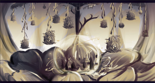
The next step—
To better align with the keywords "Homely" and "Protect," the environment could feature more symbols of danger to contrast with the character. Additionally, more illustrations could show how this character heals people and the process of blooming and withering.
0 notes
Text
Assignment1-Exploration-2
After finalizing my keywords and the direction I wanted to pursue, I began collecting various reference images on Pinterest alongside some of my own photos. After reviewing the different references, I started by sketching the pictures that came to mind and ensured I clarified the features and functionality I wanted for the character. For example, its head is a flower, and its body is composed of a tree, with the lower part protecting and healing others.


After confirming the character’s features and functions, I experimented with various silhouettes. During the brainstorming process, I hesitated between designs based on curved lines and those focused on straight lines. However, after discussing with my tutor, I decided to make curves the core element of the character’s appearance, as curves better convey a sense of warmth and elegance.

After deciding to focus on curves, I began thinking about how to achieve the desired functionality while maintaining the character's unique features. Initially, I sketched the middle character, but based on feedback from my instructor and classmates, I realized that most people preferred the silhouette with a large hat-like design. As a result, I created three different head silhouettes for comparison.
After comparing them, I still wanted to keep the rounded shape for the head, as I felt it better resembled the contour of a blossoming flower. At the same time, the branches extending from both sides of the lower body could help the character's lower part resemble the shape of a house.

Once I finalized the basic silhouette of my character, I started adding some simple details to it and reassessing how to incorporate the intended functionality into the design. Ultimately, I designed the character with a core feature: the lower half of the body is a large flower bud. People can enter the bud to heal and receive protection when it blooms.

Afterward, I began fine-tuning the proportions of the character’s details. For example, I adjusted the ratio between the head and the flower bud in the lower body and the size and width of the branches extending from both sides.

After finalizing the character’s proportions, I began considering the materials for different parts of the character and how I wanted to present the details. For instance, I envisioned the head’s flower resembling a rose while the flower at the base would resemble a lotus. As for the sides, I also thought about what elements I wanted to hang there.

This is the final character illustration and a scale comparison to an average human.
First, the character wears a mask on their head, as I wanted to give the character a sense of mystery. The headpiece is composed of stamens and pistils. The upper body is entirely made of tree elements, with a key feature being the character’s elbows, which are formed from multiple thin branches, allowing the arms to bend and extend freely. The lower body is a large flower, which not only heals adventurers who enter but can also serve as a large shelter in times of emergency. Additionally, the branches on both sides are filled with objects resembling bird nests, which are homes to forest spirits and play a crucial role in helping the character with pollination.

CITATIONS AND REFERENCES
References. Available at: https://www.pinterest.com (Accessed: 17 October 2024).
0 notes
Text
Assignment1-3 Keywords-Floral, Protect, Homely-1
Regarding this assignment, I initially struggled with selecting the most appropriate keywords. I ultimately chose Floral, Protect, and Homely.
The reason I selected these three keywords is that when I first arrived in the UK, I really enjoyed taking walks and noticed that the scenery here is quite different from Taiwan. Most houses are standalone buildings, and they usually have beautiful gardens in front of them.
While walking, I not only observed that almost every house has a garden, but I also saw many unfamiliar and beautiful plants, trees, and flowers along the streets. Being surrounded by nature made these walks feel very relaxing and enjoyable.
Therefore, I chose these three keywords to capture the core concept of my work: the sense of being mentally and physically soothed by nature.


(the pictures from my iPhone)
After selecting key concepts, I started considering words related to these three keywords to convey the atmosphere I wanted to express. Through this association process, I aimed to determine the direction for my character design.
For instance, "Protect " associates me with a big, stable figure shielding others from harm. " Floral " envisions a vast field of vividly blooming flowers, and finally, "Homely" brings to mind a warm, personal space where one can feel safe and at ease.

0 notes