
Don't wanna be here? Send us removal request.
Statistics
We looked inside some of the posts by priyadarshinipanda and here's what we found interesting.
Average Info
Notes Per Post
3
Likes Per Post
3
Reblog Per Post
0
Reply Per Post
0
Time Between Posts
11 days
Number of Posts By Type
Text
4
Last Seen Tumblr Blogs


Fun Fact
Total funding amounts to $125.3M.
Text
Assignment 4: Creating Graphs for Your Data
PREVIOUS CONTENT
Assignment 1.
Assignment 2.
Assignment 3.
Link to download the dataset here.
Link to download the codebook here.
WHAT TO SUBMIT:
Once you have written a successful program that creates univariate and bivariate graphs, create a blog entry where you post your program and the graphs that you have created. Write a few sentences describing what your graphs reveal in terms of your individual variables and the relationship between them.
Download the graph program here.
In the last assignment (3), I had made the data management that I thought necessary. Now is time to create the graphics that represent this data.
I did that in two ways, in the first one I made the Quantitative->Quantitave method generating a scatterplot and the second one was a Qualitative->Quantitative method that creates a bar graph. Before I present the result of the relationship between the two variables in the graph, let’s see the histogram and the metrics extracted in each attribute separated.
Univariate graphs
Incidence of breast cancer
The first attribute was the incidence of breast cancer in 100,000 female residents during the 2002 year. As it is a quantitative attribute, was generated the histogram of the data. #Univariate histogram of the incidence of breast cancer in 100,000 female residents during the 2002 year.seaborn.distplot(sub1["breastCancer100th"].dropna(), kde=False);plt.xlabel('Incidence of breast cancer in 100,000 female residents during the 2002 year.')plt.ylabel('Number of counties.')plt.title('Histogram of the Incidence of Breast Cancer.')plt.show()
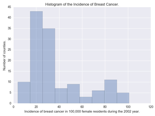
We can observe in the histogram that most of the countries have an incidence of cancer around 30 and 40 cases per 100,000 females. The extracted metrics of this attribute were: desc1 = sub1["breastCancer100th"].describe()print(desc1) count 129.000000mean 37.987597std 24.323873min 3.90000025% 20.60000050% 29.70000075% 50.300000max 101.100000Name: breastCancer100th, dtype: float64
With this, we can see that 75% of the countries have an incidence of breast cancer under 50.30 per 100,000 females.
Sugar consumption
The second attribute is the sugar consumption. For this attribute, I have made two graphs: one that shows the histogram of the original data and the other one that shows the bar graph of this attribute relocated into categories.
Histogram
#Univariate histogram of the Mean of the sugar consumption (grams per person and day) between 1961 and 2002.seaborn.distplot(sub1["meanSugarPerson"].dropna(), kde=False);plt.xlabel('Mean of the sugar consumption (grams per person and day) between 1961 and 2002.')plt.ylabel('Number of counties.')plt.title('Histogram of the Sugar Consumption.')plt.show()
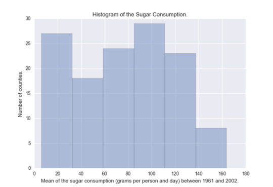
This histogram is almost evenly distributed, we can see that the countries that have the most sugar consumption are in the 20 and the 110 grams per person. desc2 = sub1["meanSugarPerson"].describe()print(desc2) count 129.000000mean 76.238394std 42.488004min 6.13238125% 42.20642950% 79.71452475% 110.307619max 163.861429Name: meanSugarPerson, dtype: float64
The mean of sugar consumption is 76.24 and we can see that 75% of the countries have a consumption of sugar under 110.31 grams per day.
Bar graph
#Univariate bar graph of the Mean of the sugar consumption (grams per person and day) between 1961 and 2002.seaborn.countplot(x="sugar_consumption", data=sub1)plt.xlabel('Mean of the sugar consumption (grams per person and day) between 1961 and 2002.')plt.ylabel('Number of counties.')plt.title('Histogram of the Sugar Consumption.')plt.show()

Where the consumption is:
(0) Desirable between 0 and 30 g.
(1) Raised between 30 and 60 g.
(2) Borderline high between 60 and 90 g.
(3) High between 90 and 120 g.
(4) Very high under 120g.
The bar graph behaved very similarly to the histogram.
Bivariate graphs
The two bivariate graphics are presented below: #Bivariate Scatterplot Q->Q - Incidence of breast cancer versus sugar consumptionscat1 = seaborn.regplot(x="meanSugarPerson", y="breastCancer100th", fit_reg=True, data=sub1)plt.xlabel('Mean of the sugar consumption between 1961 and 2002.')plt.ylabel('Incidence of breast cancer in 100,000 female residents during the 2002 year.')plt.title('Scatterplot for the association between the incidence of breast cancer and the sugar consumption.')plt.show() #Bivariate bar graph C->Q - Incidence of breast cancer versus sugar consumptionseaborn.factorplot(x='sugar_consumption', y='breastCancer100th', data=sub1, kind="bar", ci=None)plt.xlabel('Mean of the sugar consumption between 1961 and 2002.')plt.ylabel('Incidence of breast cancer in 100,000 female residents during the 2002 year.')plt.title('Bar graph for the Association between the incidence of breast cancer and the sugar consumption.')plt.show()
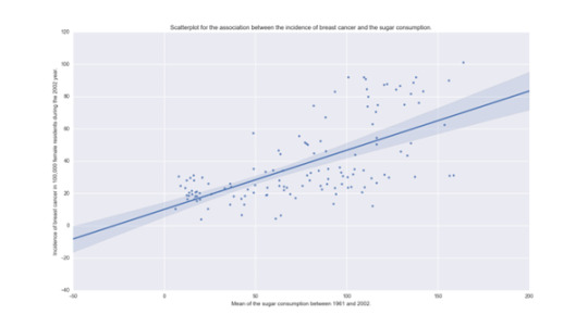
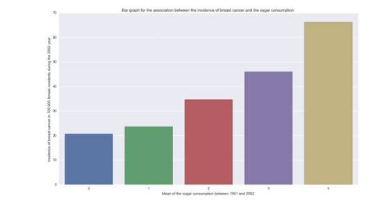
In both graphics, we can see that there is a relation with the incidence of breast cancer and the consumption of sugar. While sugar consumption is increased the incidence of new breast cancer cases is increased too.
Review criteria
Your assessment will be based on the evidence you provide that you have completed all the steps. When relevant, gradients in the scoring will be available to reward clarity (for example, you will get one point for submitting graphs that do not accurately represent your data, but two points if the data is accurately represented). In all cases, consider that the peer assessing your work is likely not an expert in the field you are analyzing. You will be assessed equally in your description of your frequency distributions.
Specific rubric items, and their point values, are as follows:
Was a univariate graph created for each of the selected variables? (2 points)
Was a bivariate graph created for the selected variables? (2 points)
Did the summary describe what the graphs revealed in terms of the individual variables and the relationship between them? (2 points)
2 notes
·
View notes
Text
Assignment 3: Making Data Management Decisions
WHAT TO SUBMIT:
Once you have written a successful program that manages your data, create a blog entry where you post your program and the results/output that displays at least 3 of your data managed variables as frequency distributions. Write a few sentences describing these frequency distributions in terms of the values the variables take, how often they take them, the presence of missing data, etc.
Download the program here and the dataset here;
In the last assignment, I had already made the data management that I thought necessary, but I made it in the excel with formulas.
Now, I remade the data management directly in python, and the program output can be seen down in the post.
The results were still the same. The sample used was the incidence of new breast cancer cases in 129 different countries. After running the program, it was possible to observe that the consumption of sugar is considered desirable only in 20.9% of the countries of the dataset. Taking into account that this metric is based on the average of the desirable sugar ingest in grams per day of the woman (25g) and the man (36g) [1] and [2].
To the food consumption data, I made the average of all countries consumption and compared each country consumption to this mean. 55% of the countries stay under the average.
At last, to range the total cholesterol in the blood of the countries I used as a base the metric of Mayo Clinic [3]. In the dataset, none of the values exceeded to a high level of total cholesterol and almost 73% of the countries presented to be in the desirable level.
Reference
[1] Life by Daily Burn Are You Exceeding Your Daily Sugar Intake in Just One Meal INFOGRAPHIC. Visited 05 Jul 2016. URL: http://dailyburn.com/life/health/daily-sugar-intake-infographic/.
[2] MD-Health How Many Grams of Sugar Per Day. Visited 06/07/2016. URL: http://www.md-health.com/How-Many-Grams-Of-Sugar-Per-Day.html.
[3] Cholesterol Test - Procedure details. Visited 05 Jul 2016. URL: http://www.mayoclinic.org/tests-procedures/cholesterol-test/details/results/rsc-20169555.
Output of the program: Importing the packages and the data set (csv)
import pandasimport numpyimport statistics # Import the data set to memorydata = pandas.read_csv("separatedData.csv", low_memory = False) # Change data type among variables to numericdata["breastCancer100th"] = data["breastCancer100th"].convert_objects(convert_numeric=True)data["meanSugarPerson"] = data["meanSugarPerson"].convert_objects(convert_numeric=True)data["meanFoodPerson"] = data["meanFoodPerson"].convert_objects(convert_numeric=True)data["meanCholesterol"] = data["meanCholesterol"].convert_objects(convert_numeric=True) # Create a subData with only the variables breastCancer100th, meanSugarPerson, meanFoodPerson, meanCholesterolsub1=data[['breastCancer100th','meanSugarPerson', 'meanFoodPerson', 'meanCholesterol']]
Making the new variable sugar_consumption
# Create the conditions to a new variable named sugar_consumption that will categorize the meanSugarPerson answersdef sugar_consumption (row): if 0 < row['meanSugarPerson'] <= 30 : return 0 # Desirable between 0 and 30 g. if 30 < row['meanSugarPerson'] <= 60 : return 1 # Raised between 30 and 60 g. if 60 < row['meanSugarPerson'] <= 90 : return 2 # Borderline high between 60 and 90 g. if 90 < row['meanSugarPerson'] <= 120 : return 3 # High between 90 and 120 g. if row['meanSugarPerson'] > 120 : return 4 # Very high under 120g. # Add the new variable sugar_consumption to subDatasub1['sugar_consumption'] = sub1.apply (lambda row: sugar_consumption (row),axis=1) # Count of sugar_consumptionprint("Count of sugar_consumption - Range of sugar consumption based on the mean of the quantity (grams per person and day) of sugar and sweeters between 1961 and 2002")c1 = sub1["sugar_consumption"].value_counts(sort=False)print(c1) # Percentage of sugar_consumptionprint("Percentage of sugar_consumption - Range of sugar consumption based on the mean of the quantity (grams per person and day) of sugar and sweeters between 1961 and 2002")p1 = sub1["sugar_consumption"].value_counts(sort=False,normalize=True)print(p1)
1.1.1.2 Count and Percentage of the new variable sugar_consumption
Count of sugar_consumption - Range of sugar consumption based on the mean of the quantity (grams per person and day) of sugar and sweeters between 1961 and 20020 271 192 313 314 21Name: sugar_consumption, dtype: int64 Percentage of sugar_consumption - Range of sugar consumption based on the mean of the quantity (grams per person and day) of sugar and sweeters between 1961 and 20020 0.2093021 0.1472872 0.2403103 0.2403104 0.162791Name: sugar_consumption, dtype: float64
Making the new variable food_consumption
#Make the average of meanFoodPerson values.food_mean = statistics.mean(data["meanFoodPerson"]) # Create the conditions to a new variable named food_consumption that will categorize the meanFoodPerson answersdef food_consumption (row): if row['meanFoodPerson'] <= food_mean : return 0 # Food consumption below the world average. if row['meanFoodPerson'] > food_mean : return 1 # Food consumption under the world average. # Add the new variable food_consumption to subDatasub1['food_consumption'] = sub1.apply (lambda row: food_consumption (row),axis=1) # Count of food_consumptionprint("Count of food_consumption - Mean of the food consumption of countries based on the mean of the total supply of food (kilocalories / person & day) between 1961 and 2002")c2 = sub1["food_consumption"].value_counts(sort=False)print(c2) # Percentage of food_consumptionprint("Percentage of food_consumption - Mean of the food consumption of countries based on the mean of the total supply of food (kilocalories / person & day) between 1961 and 2002")p2 = sub1["food_consumption"].value_counts(sort=False, normalize=True)print(p2)
Count and Percentage of the new variable food_consumption
Count of food_consumption - Mean of the food consumption of countries based on the mean of the total supply of food (kilocalories / person & day) between 1961 and 20020 711 58Name: food_consumption, dtype: int64 Percentage of food_consumption - Mean of the food consumption of countries based on the mean of the total supply of food (kilocalories / person & day) between 1961 and 20020 0.5503881 0.449612Name: food_consumption, dtype: float64
Making the new variable cholesterol_blood
# Create the conditions to a new variable named cholesterol_blood that will categorize the meanCholesterol answersdef cholesterol_blood (row): if row['meanCholesterol'] <= 5.2 : return 0 # Desirable below 5.2 mmol/L if 5.2 < row['meanCholesterol'] <= 6.2 : return 1 # Borerline high between 5.2 and 6.2 mmol/L if row['meanCholesterol'] > 6.2 : return 2 # High above 6.2 mmol/L # Add the new variable cholesterol_blood to subDatasub1['cholesterol_blood'] = sub1.apply (lambda row: cholesterol_blood (row),axis=1) # Count of cholesterol_bloodprint("Count of cholesterol_blood - Range of the average of the mean TC (Total Cholesterol) of the female population counted in mmol per L between 1980 and 2002")c3 = sub1["cholesterol_blood"].value_counts(sort=False)print(c3) # Percentage of cholesterol_bloodprint("Percentage of cholesterol_blood - Range of the average of the mean TC (Total Cholesterol) of the female population counted in mmol per L between 1980 and 2002")p3 = sub1["cholesterol_blood"].value_counts(sort=False, normalize=True)print(p3)
Count and Percentage of the new variable cholesterol_blood
Count of cholesterol_blood - Range of the average of the mean TC (Total Cholesterol) of the female population counted in mmol per L between 1980 and 20020 941 35Name: cholesterol_blood, dtype: int64 Percentage of cholesterol_blood - Range of the average of the mean TC (Total Cholesterol) of the female population counted in mmol per L between 1980 and 20020 0.7286821 0.271318Name: cholesterol_blood, dtype: float64
Review criteria
Your assessment will be based on the evidence you provide that you have completed all the steps. When relevant, gradients in the scoring will be available to reward clarity (for example, you will get one point for submitting output that is not understandable, but two points if it is understandable). In all cases, consider that the peer assessing your work is likely not an expert in the field you are analyzing. You will be assessed equally in your description of your frequency distributions.
Specific rubric items, and their point values, are as follows:
Was the program output interpretable (i.e., organized and labelled)? (1 point)
Does the program output display three data managed variables as frequency tables? (1 point)
Did the summary describe the frequency distributions in terms of the values the variables take, how often they take them, the presence of missing data, etc.? (2 points)
0 notes
Text
Assignment 2: Running Your First Program
WHAT TO SUBMIT:
Following completion of your first program, create a blog entry where you post:
Your program: Download the program here and the dataset here;
The output that displays three of your variables as frequency tables: Present at the end of this post.
A many rulings describing your frequency distributions in terms of the values the variables take, how frequently they take them, the presence of missing data, etc. After the first week assignment and the alternate week assignments, I realized that my codebook could be bettered. All my variables have a different response for each entry, so I decided to develop response categories. You can download the new full codebook and dataset in this xlsx file. The attributes of codebook that I will use in this work stayed in that way:
Variable Name
Description of Indicator
Main Source
breastCancer100th
Number of new cases of breast cancer in 100,000 female residents during the 2002 year.
IARC (International Agency for Research on Cancer)
sugarConsumption
Consumption of sugar based in the meanSugarPerson (0) Desirable between 0 and 30 g. (1) Raised between 30 and 60 g. (2) Borderline high between 60 and 90 g. (3) High between 90 and 120 g. (4) Very high under 120g.
FAO modified
foodCountryMean
Consumption of food based in the meanFoodPerson (0) food consumption below the world average. (1) food consumption under the world average.
FAO modified
cholesterolInBlood
Total Cholesterol in blood based in the meanCholesterol (0) Desirable below 5.2 mmol/L (1) Borerline high between 5.2 and 6.2 mmol/L (2) High above 6.2 mmol/L
MRC-HPA Centre for Environment and Health
The new attributes were made based on the old ones presented in the assignment 1. With this, I joined the three questions made in assignment 1 to:
Does the sugar intake, the food consumption or the total cholesterol in blood have some relation with the incidence of new breast cancer cases?
The sample used was the incidence of new breast cancer cases in 129 different countries. After running the program, it was possible to observe that the consumption of sugar is considered desirable only in 20.9% of the countries of the dataset. Taking into account that this metric is based on the average of the desirable sugar ingest in grams per day of the woman (25g) and the man (36g) [1] and [2].
To the food consumption data, I made the average of all countries consumption and compared each country consumption to this mean. 55% of the countries stay under the average.
At last, to range the total cholesterol in the blood of the countries I used as a base the metric of Mayo Clinic [3]. In the dataset, none of the values exceeded a high level of total cholesterol and almost 73% of the countries presented to be in the desirable level.
Reference
[1] Life by Daily Burn Are You Exceeding Your Daily Sugar Intake in Just One Meal INFOGRAPHIC. Visited 05 Jul 2016. URL: http://dailyburn.com/life/health/daily-sugar-intake-infographic/.
[2] MD-Health How Many Grams of Sugar Per Day. Visited 06/07/2016. URL: http://www.md-health.com/How-Many-Grams-Of-Sugar-Per-Day.html.
[3] Cholesterol Test - Procedure details. Visited 05 Jul 2016. URL: http://www.mayoclinic.org/tests-procedures/cholesterol-test/details/results/rsc-20169555.
The results of the first program that demonstrates the frequency distributions were:
Importing the packages and the data set (csv)
import pandas
import numpy
data = pandas.read_csv("separatedData.csv", low_memory = False)
Print data set dimension
print(len(data))
print(len(data.columns))
129
9
Change data type among variables to numeric
data["breastCancer100th"] = data["breastCancer100th"].convert_objects(convert_numeric=True)
data["sugarConsumption"] = data["sugarConsumption"].convert_objects(convert_numeric=True)
data["foodCountryMean"] = data["foodCountryMean"].convert_objects(convert_numeric=True)
data["cholesterolInBlood"] = data["cholesterolInBlood"].convert_objects(convert_numeric=True)
Count of breastCancerAll - Number of new breast cancer cases in 2002
print("Count of breastCancer100th - Number of new breast cancer cases per 100,000 female in 2002")
c1 = data["breastCancer100th"].value_counts(sort=False)
print(c1)
Count of breastCancer100th - Number of new breast cancer cases per 100,000 female in 2002
31.6 1
46.6 1
3.9 1
30.9 1
6.4 1
29.7 1
10.3 1
31.8 1
12.3 1
13.6 1
15.3 1
16.5 2
30.3 1
18.7 1
19.5 3
20.6 2
21.5 1
22.5 2
23.5 2
24.7 4
25.9 2
26.0 1
28.1 4
29.8 2
30.6 1
31.2 3
32.7 1
33.4 1
34.2 2
35.1 2
..
16.6 1
16.2 1
17.1 1
24.1 1
46.2 1
18.2 2
10.5 1
19.1 1
19.0 1
20.4 2
87.2 1
23.3 1
26.4 1
50.3 1
18.4 1
23.1 1
24.2 1
29.0 1
13.0 1
25.2 1
83.1 1
24.0 1
30.0 1
26.1 1
29.5 1
55.5 1
30.8 1
74.4 1
20.2 1
84.7 1
Name: breastCancer100th, dtype: int64
Percentage of breastCancer100th - Number of new breast cancer cases in per 100,000 female 2002
print("Percentage of breastCancer100th - Number of new breast cancer cases in per 100,000 female 2002")
p1 = data["breastCancer100th"].value_counts(sort=False,normalize=True)
print(p1)
Percentage of breastCancer100th - Number of new breast cancer cases in per 100,000 female 2002
31.6 0.007752
46.6 0.007752
3.9 0.007752
30.9 0.007752
6.4 0.007752
29.7 0.007752
10.3 0.007752
31.8 0.007752
12.3 0.007752
13.6 0.007752
15.3 0.007752
16.5 0.015504
30.3 0.007752
18.7 0.007752
19.5 0.023256
20.6 0.015504
21.5 0.007752
22.5 0.015504
23.5 0.015504
24.7 0.031008
25.9 0.015504
26.0 0.007752
28.1 0.031008
29.8 0.015504
30.6 0.007752
31.2 0.023256
32.7 0.007752
33.4 0.007752
34.2 0.015504
35.1 0.015504
...
16.6 0.007752
16.2 0.007752
17.1 0.007752
24.1 0.007752
46.2 0.007752
18.2 0.015504
10.5 0.007752
19.1 0.007752
19.0 0.007752
20.4 0.015504
87.2 0.007752
23.3 0.007752
26.4 0.007752
50.3 0.007752
18.4 0.007752
23.1 0.007752
24.2 0.007752
29.0 0.007752
13.0 0.007752
25.2 0.007752
83.1 0.007752
24.0 0.007752
30.0 0.007752
26.1 0.007752
29.5 0.007752
55.5 0.007752
30.8 0.007752
74.4 0.007752
20.2 0.007752
84.7 0.007752
Name: breastCancer100th, dtype: float64
Count of sugarConsumption - Range of sugar consumption based on the mean of the quantity (grams per person and day) of sugar and sweeters between 1961 and 2002.
print("Count of sugarConsumption - Range of sugar consumption based on the mean of the quantity (grams per person and day) of sugar and sweeters between 1961 and 2002")
c2 = data["sugarConsumption"].value_counts(sort=False)
print(c2)
Count of sugarConsumption - Range of sugar consumption based on the mean of the quantity (grams per person and day) of sugar and sweeters between 1961 and 2002
0 27
1 19
2 31
3 31
4 21
Name: sugarConsumption, dtype: int64
Percentage of sugarConsumption - Range of sugar consumption based on the mean of the quantity (grams per person and day) of sugar and sweeters between 1961 and 2002.
print("Percentage of sugarConsumption - Range of sugar consumption based on the mean of the quantity (grams per person and day) of sugar and sweeters between 1961 and 2002")
p2 = data["sugarConsumption"].value_counts(sort=False,normalize=True)
print(p2)
Percentage of sugarConsumption - Range of sugar consumption based on the mean of the quantity (grams per person and day) of sugar and sweeters between 1961 and 2002
0 0.209302
1 0.147287
2 0.240310
3 0.240310
4 0.162791
Name: sugarConsumption, dtype: float64
Count of foodCountryMean - Mean of the food consumption of countries based on the mean of the total supply of food (kilocalories / person & day) between 1961 and 2002.
print("Count of foodCountryMean - Mean of the food consumption of countries based on the mean of the total supply of food (kilocalories / person & day) between 1961 and 2002")
c3 = data["foodCountryMean"].value_counts(sort=False)
print(c3)
Count of foodCountryMean - Mean of the food consumption of countries based on the mean of the total supply of food (kilocalories / person & day) between 1961 and 2002
0 71
1 58
Name: foodCountryMean, dtype: int64
Percentage of foodCountryMean - Mean of the food consumption of countries based on the mean of the total supply of food (kilocalories / person & day) between 1961 and 2002.
print("Percentage of foodCountryMean - Mean of the food consumption of countries based on the mean of the total supply of food (kilocalories / person & day) between 1961 and 2002")
p3 = data["foodCountryMean"].value_counts(sort=False, normalize=True)
print(p3)
Percentage of foodCountryMean - Mean of the food consumption of countries based on the mean of the total supply of food (kilocalories / person & day) between 1961 and 2002
0 0.550388
1 0.449612
Name: foodCountryMean, dtype: float64
Count of cholesterolInBlood - Range of the average of the mean TC (Total Cholesterol) of the female population counted in mmol per L between 1980 and 2002.
print("Count of cholesterolInBlood - Range of the average of the mean TC (Total Cholesterol) of the female population counted in mmol per L between 1980 and 2002")
c4 = data["cholesterolInBlood"].value_counts(sort=False)
print(c4)
Count of cholesterolInBlood - Range of the average of the mean TC (Total Cholesterol) of the female population counted in mmol per L between 1980 and 2002
0 94
1 35
Name: cholesterolInBlood, dtype: int64
Percentage of cholesterolInBlood - Range of the average of the mean TC (Total Cholesterol) of the female population counted in mmol per L between 1980 and 2002.
print("Percentage of cholesterolInBlood - Range of the average of the mean TC (Total Cholesterol) of the female population counted in mmol per L between 1980 and 2002")
p4 = data["cholesterolInBlood"].value_counts(sort=False,normalize=True)
print(p4)
Percentage of cholesterolInBlood - Range of the average of the mean TC (Total Cholesterol) of the female population counted in mmol per L between 1980 and 2002
0 0.728682
1 0.271318
Name: cholesterolInBlood, dtype: float64
Review criteria
Your assessment will be based on the evidence you provide that you have completed all the steps. When relevant, gradients in the scoring will be available to reward clarity (for example, you will get one point for submitting output that is not understandable, but two points if it is understandable). In all cases, consider that the peer assessing your work is likely not an expert in the field you are analyzing. You will be assessed equally in your description of your frequency distributions.
Specific rubric items, and their point values, are as follows:
Was the program output interpretable (i.e., organized and labeled)? (1 point)
Does the program output display three data managed variables as frequency tables? (1 point)
Did the summary describe the frequency distributions in terms of the values the variables take, how often they take them, the presence of missing data, etc.? (2 points)
0 notes
Text
Data Management and Visualization Assignment 1
My name is Priyadarshini Panda and this blog is a part of Data Management and Visualization course on coursera. The submission of the assignments will be in the form of blogs. So I choose medium as my medium of assignment.
Assignment 1
In assignment 1, we've to choose dataset on which we've to work for the whole course. The five law books are given through which we've to elect a subcategory and two motifs/ variable on which we want to work.
STEP 1 Choose a data set that you would like to work with.
After reviewing five codebooks, I've decide to go with “ portion of the GapMinder ”. This data includes one time of multitudinous country- position pointers of health, wealth and development. I want work on health issue is the main reason to choose this text. In moment’s world, the average life expectation is increased. But some intoxication cause early death.
STEP 2. Identify a specific content of interest
As I want to explore the average life expectation including some intoxication, I would like to go with alcohol consumption and life expectation. As the alcohol consumption is so pernicious to health I would like to aim this issue to how important it’s dangerous. So I ’m considering how the alcohol consumption will prompt to health and other parameters or which parameters are related to to alcohol consumption.
STEP 3. Prepare a codebook of your own
As, GapMinder includes variables piecemeal from health( wealth, development). So then I ’m considering only incomeperperson, alcconsumption and lifeexpectancy as variables.

STEP 4. Identify a alternate content that you would like to explore in terms of its association with your original content.
The alternate content which I would like to explore is urbanrate. While looking at the codebook, I allowed that there might be possibility that civic rate is connected to alcohol consumption. We can see in civic area, people are less apprehensive of their health and consume further toxic.
STEP 5. Add questions particulars variables establishing this alternate content to your particular codebook.
Is there any relation between civic rate and alcohol consumption?
Is there any relation between life expectation and alcohol consumption?
Is there any relation between Income and alcohol consumption?
The final Codebook

STEP 6. Perform a literature review to see what exploration has been preliminarily done on this content
For the relation between urbanrate and alcohol consumption, I search so much on google scholar but there isn't a single paper on it. When I had hunt on google itself, I got to know that there's nor direct relation between this two. The relation as in terms of stress and culture. Those can be in megacity and civic are also. So I do n’t have to consider this term( urbanrate). For the relation between life expectation and alcohol consumption, I got lots of papers on it so do with income and alcohol consumption. Then are many papers and overview of their content.
1. Continuance income patterns and alcohol consumption probing the association between long- and short- term income circles and drinking( 1)
Overview In this paper, authors estimated the relationship between long- term and short- term measures of income. They used the data of US Panel Study on Income Dynamics. They also gave conclusion like the low income associated with heavy consumption. “ Continuance income patterns may have an circular association with alcohol use, intermediated through current socioeconomic position. ”( 1)
A Review of Expectancy Theory and Alcohol Consumption( 2)
According to their study, “ expectation manipulations and alcohol consumption three studies in the laboratory have shown that adding positive contemplations through word priming increases posterior consumption and two studies have shown that adding negative contemplations decreases it ”( 2)
2. Alcohol- related mortality by age and coitus and its impact on life expectation Estimates grounded on the Finnish death register( 3)
In this composition, the author studied presumptive results on the connection between alcohol- related mortality and age and coitus. Then are many statistics, “ According to the results, 6 of all deaths were alcohol related. These deaths were responsible for a 2 time loss in life expectation at age 15 times among men and0.4 times among women, which explains at least one- fifth of the difference in life contemplations between the relations. In the age group of 15 – 49 times, over 40 of all deaths among men and 15 among women were alcohol related. In this age group, over 50 of the mortality difference between the relations results from alcohol- related deaths ”( 3)
STEP 7. Grounded on your literature review, develop a thesis about what you believe the association might be between these motifs. Be sure to integrate the specific variables you named into the thesis.
After exploring similar papers, they're enough to establish the correlation between alcohol consumption and life expectation and also with Income( piecemeal from these three). After certain observation, following are my thesis
• The alcohol consumption is largely identified with life expectation.
• The social culture, group of people associated with person, stress and Income have direct correlation with alcohol consumption.
• Civic rate isn't directly connected to alcohol consumption.
Final Codebook
Reference
Cerdá, Magdalena, etal. “ Continuance Income Patterns and Alcohol Consumption probing the Association between Long- and Short- Term Income Circles and Drinking. ” Social Science & Medicine,vol. 73,no. 8, 2011,pp. 1178 – 1185., doi10.1016/j.socscimed.2011.07.025.
2) Jones, BarryT., etal. “ A Review of Expectancy Theory and Alcohol Consumption. ” Dependence,vol. 96,no. 1, 2001,pp. 57 – 72., doi10.1046/j. 1360 –0443.2001.961575.x.
3) Makela,P. “ Alcohol- Related Mortality by Age and Sex and Its Impact on Life Expectancy. ” The European Journal of Public Health,vol. 8,no. 1, 1998,pp. 43 – 51., doi10.1093/ eurpub/8.1.43.
1 note
·
View note