
Need to know more about Analytics.. Let's learn together !!
Don't wanna be here? Send us removal request.
Statistics
We looked inside some of the posts by rohanms and here's what we found interesting.
Average Info
Notes Per Post
2
Likes Per Post
2
Reblog Per Post
0
Reply Per Post
0
Time Between Posts
29 days
Number of Posts By Type
Text
2
Last Seen Tumblr Blogs


Fun Fact
China blocked Tumblr because of pornography and censorship problems in 2013.
Text
Performing Time Series Analysis and Forecasting using an R language
Data points indexed in chronological order are collected into time series and analyzed to determine trends and characteristics. However, time series forecasting involves analyzing a series of recorded data and making predictions about the future based on the analysis.
Practical Implementation can be done using R studio and it helps us to forecast the output based on the past and present values.
Now, using the consumer price index (CPI) data in Indonesia from Dec 2002 to April 2020, we will now do from exploration to forecasting and predict the future CPI outcomes of how it is being shifted. There are many ways to measure time-series data, including measuring it daily, monthly, annually, etc. Finance and weather forecasting are two fields where time series can be used. The purpose of this article is to introduce you to the analysis and prediction of time series data using R. Let me demonstrate this by using the Bank Indonesia consumer price index (CPI) data from December 2002 through April 2020.
Step-wise attack:
I will give you an overview of the steps we need to take before beginning the analysis. They are as follows:
To begin, we need to collect and pre-process the data, as well as understand the domain knowledge of the data we use.
Then we visually and statistically analyze the time series,
Our next step is to identify the best model based on its autocorrelation,
In addition, we test the model to see if it meets the assumption of independence, and finally, we describe the results.
Forecasting can be done with the model
Pre-process data:
As the Indonesian CPI data will be analyzed in time series starting in December 2002 and ending in April 2020. We may obtain the data from the Bank Indonesia. Our only option is to copy the data from the website onto a spreadsheet, then create a .csv file from it. We get a similar result after we import the data.
library(tidyverse)
data <- read.csv("data.csv")
colnames(data) <- c("Time", "InflationRate")
head(data)
A pre-processing step is necessary before making an analysis. Especially on the “inflation rate” column where we have to remove the ‘%’ symbol and convert it to a numeric type like this,
# Pre-process the data
data$InflationRate <- gsub(" %$", "", data$InflationRate)
data$InflationRate <- as.numeric(data$InflationRate)
data <- data[order(nrow(data):1), ]
tail(data)
Then, the data that we have will look like this,

With that, we can make a time-series object from the “InflationRate” column using ts function
cpi <- ts(data$InflationRate, frequency = 12, start = c(2002, 12))
With the cpi variable, we can conduct the time series analysis.
Analysis:
First, let’s introduce the consumer price index (CPI). CPI is an index that measures the price change of consumer goods at a certain time from its base year. The formula looks like this,

Each CPI values is measured every month. Here is the code and also the plot as the results from this code,
library(ggplot2)
# Make the DataFrame
tidy_data <- data.frame(
date = seq(as.Date("2002-12-01"), as.Date("2020-04-01"), by = "month"),
cpi = cpi
)
tidy_data
# Make the plot
p <- ggplot(tidy_data, aes(x=date, y=cpi)) +
geom_line(color="red", size=1.1) +
theme_minimal() +
xlab("") +
ylab("Consumer Price Index") +
ggtitle("Indonesia's Consumer Price Index", subtitle = "From December 2002 Until April 2020")
p
# Get the statistical summary
# Returns data frame and sort based on the CPI
tidy_data %>%
arrange(desc(cpi))
tidy_data %>%
arrange(cpi)
Output:
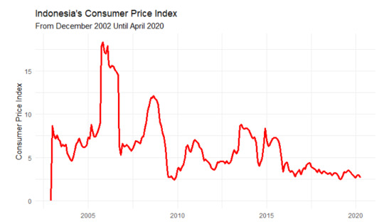
Based on the graph, We cannot see any trend or seasonal pattern. Despite it looking seasonal, the peak of each year is not in the same month, so it’s not seasonal. Then, this graph also doesn’t have an increasing or decreasing trend on it. Therefore, this graph is stationary because the statistical properties of the data, such as mean and variance, don’t have any effect because of the time.
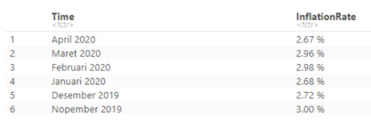
Besides the graph, we can measure statistical summary from the data. We can see that the maximum inflation occurs in November 2005 with the rate of CPI being 18.38. Then, the minimum inflation occurs in November 2009 with the rate of CPI being 2.41. With that information, we can conclude that the data doesn’t have a seasonal pattern on it.
Model Identification:
After we analyze the data, then we can do modeling based on the data. There are 2 models that we will consider for this case, there Auto Regression (AR) model and also the Moving Average (MA) model. Before we use the model, we have to identify which model perfectly fits the data based on its autocorrelation and which lag suits the model. To identify this, we will make the Auto Correlation Function (ACF) plot and also Partial Auto Correlation Function (PACF) plot like the one below, and here is the code,
acf(cpi, plot = T, main = "ACF Plot of CPI", xaxt="n")
pacf(cpi, plot = T, main = "ACF Plot of CPI", xaxt="n")

Based on the plot above, how we can choose the perfect model for this data. To choose between AR and MA models, we can see this summary below,
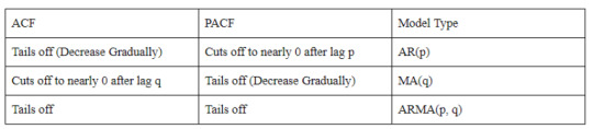
The summary says that AR(p) will fit the model if the ACF plot tails off and the PACF plot cuts off to nearly 0 after lag p. Then, the MA(q) model will fit if the ACF plot cuts off to nearly 0 after lag Q and the PACF plot tails off. If both plots are tailing off, then we can use the ARMA(p, q) model for it. For those who are still confused about tail off and cut off, tail off means that the value is decreasing gradually and has not dropped to nearly 0. Then cut-off means that the autocorrelation decrease to nearly 0 after the previous lag.
Based on that information, we can see that the ACF plot decreases gradually (tail off) and the PACF plot decreases to nearly 0 after lag-1. Therefore, for this model, we will use the AR(1) model for the next step.
Model Diagnosis:
To make sure that the model can be used for forecasting and the other measurement, we have to test the model using Ljung Box Test. Here is the code to do that,
library(FitAR)
acf(ar1$residuals)
res <- LjungBoxTest(ar1$residuals, k=2, StartLag=1)
plot(res[,3],main= "Ljung-Box Q Test", ylab= "P-values", xlab= "Lag")
qqnorm(ar1$residuals)
qqline(ar1$residuals)

Based on these plots, we can see that the Q-test plot has p-values above 0.05, then the ACF plot shows no significance between another lag, and finally, we can see that the QQ-Plot is almost fit into the line, so we can assume that is already normal. Therefore, we can use the model to do the forecast.
Forecasting:
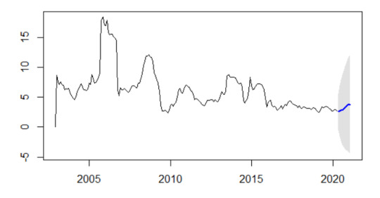
After we make the model and take the test, now we can do the forecasting by using the code below,
library(forecast)
futurVal <- forecast(ar1, h=10, level=c(99.5))
plot(futurVal)
And here is the result,
Conclusion:
Forecasting is the last work that I can show you. I hope, with this study case on time series analysis, you can make a time series analysis based on your problem. This article is just showing the fundamentals of how to do the analysis and not tackling a problem that is using the ARIMA model and the data that I used is still stationary data.
1 note
·
View note
Text
Multiple Regression using Marketing Field
Multiple linear regression:
A multiple linear regression is an extension of a simple linear regression and uses separate predictor variables (x) to predict the outcome variable (y). With 3 predictor variables (x), the prediction of y is expressed as:
y = b0 + b1*x1 + b2*x2 + b3*x3
The b is called the beta coefficients. We will now build, interpret a multiple linear regression model in R & check the overall quality of the model.
install.packages('tidyverse')

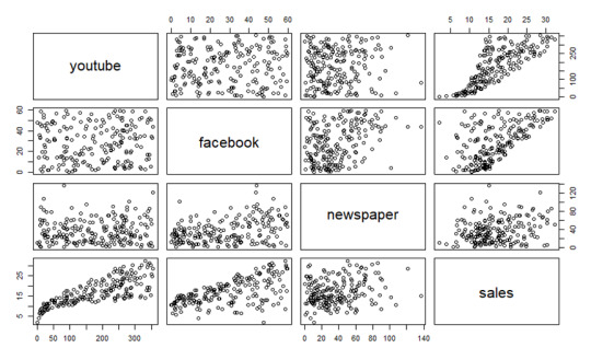
We will use the marketing data set [datarium package] to determine which advertising mediums (youtube, facebook, and newspaper) are associated with sales.
data("marketing", package = "datarium")
head(marketing, 4)

My dataset consists of 3 independent variables:
1. YouTube
2. Facebook
3. Newspaper
The dependent variable is the Sales variable. This study was designed to investigate what effect ads from different platforms have on sales.
BUILDING MODEL
Using the advertising budget invested in youtube, facebook, and newspapers, we want to estimate sales as follows:
sales = b0 + b1*youtube + b2*facebook + b3*newspaper
In R, the model coefficients can be computed as follows:
model <- lm(sales ~ youtube + facebook + newspaper, data = marketing)
summary(model)

plot(marketing)
INTERPRETATION
Taking a look at the F-statistic and the associated p-value, which are provided on the model summary, is the first step in interpreting the multiple regression analysis.
We see that the F-statistic has a significant p-value of 2.2e-16 in our example. A significant relationship exists between one of the predictor variables and the outcome variable, at least.
The coefficients table shows the estimated beta coefficients and the associated t-statistic p-values, so you can determine which predictor variables are significant:
summary(model)$coefficient
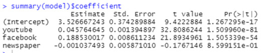
By looking at the t-statistic for a given predictor, we can determine whether there is a significant difference between the beta coefficient of the predictor and the outcome variable. Changing advertising budgets for YouTube and Facebook are significantly correlated with changes in sales, while changing newspaper budgets are not significantly correlated with sales.
The coefficient (b) can be interpreted as the overall effect of an increase in a predictor variable of one unit held constant, when all other predictors are held constant.
A YouTube and newspaper advertising budget of $1000 each result in an increase of 189 units of sales, on average, when you spend an additional $1,000 on facebook advertising. According to the YouTube coefficient, for every $1000 increase in YouTube advertising budget, all other factors being equal, 45 sales units will increase on average for each $1000 increase.
In our multiple regression analysis, newspaper was not significant. Accordingly, a change in the newspaper advertising budget will not have a significant impact on sales units when YouTube and newspaper advertising budgets are both fixed.
In this case, we may remove the newspaper variable since it is not significant:
model <- lm(sales ~ youtube + facebook, data = marketing)
summary(model)
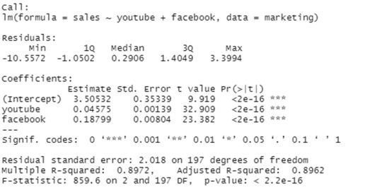
Finally, our model equation can be written as follow:
sales = 3.5 + 0.045*youtube + 0.187*facebook
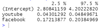
The confidence interval of the model coefficient can be extracted as follow:
confint(model)
The R-squared (R2) and Residual Standard Error (RSE) can be used to assess the overall quality of a model, as we have already seen in simple linear regression.
R-squared:
The correlation coefficient R2 in multiple linear regression reflects the relationship between the observed (or actual) values of the outcome variable (y) and the predicted (or fitted) values of y. In this case, R will always have a positive value and will range from zero to one. Based on the x variables, R2 represents the proportion of variance that can be predicted in the outcome variable y. The value of R2 close to 1 indicates that the model can explain a large proportion of the variance in the outcome variable. When more variables are added to the model, the R2 will always increase, even if those variables are only weakly associated with the response. By taking the number of predictor variables into account, the R2 can be adjusted.
In the summary output, the adjustment in the "Adjusted R Square" value corresponds to the number of x variables in the prediction model.
The adjusted R2 in our example, with YouTube and Facebook as predictor variables, is 0.89, meaning that youtube and Facebook advertising budgets are capable of predicting 89% of the variance in sales.
The adjusted R2 of 0.61 is better than the simple linear model with only YouTube.
Residual Standard Error (RSE):
It is also called as the sigma. The RSE estimate gives a measure of error of prediction. In general, a model with a lower RSE is more accurate (on the data in hand).
By dividing the RSE by the mean outcome variable, the error rate can be estimated:
sigma(model)/mean(marketing$sales)

The RSE for our multiple regression example is 2.023, which translates to a 12% error rate.
As a result, the RSE is 3.9 (*23% error rate) for the simple model, with only the youtube variable.
This work is done by
Rohan M
MBA (2020-2022)
Amrita School of Business
Coimbatore
NOTE: “This blog is a part of the assignments done in the course Data Analysis using R and Python".
1 note
·
View note