
Statistics
We looked inside some of the posts by roseatedesire and here's what we found interesting.
Average Info
Notes Per Post
841
Likes Per Post
612
Reblog Per Post
227
Reply Per Post
0
Time Between Posts
3 days
Number of Posts By Type
Text
13
Note
4
Last Seen Tumblr Blogs


Fun Fact
Kazakhstan’s Minister of Communications and Informatics has blocked the Tumblr site because it contained 60 sites of terrorism, extremism, and pornography in 2015.
Text


cater stimboard. [★|☆|★] [☆| ♡ |☆] [★|☆|★]
40 notes
·
View notes
Text

hello. its me. radio. yes. i was actually the first editor to go to mars, did you know. <- thats a joke!!!!!!!!!
but hi. this is my new blog. despite being around for like 4 years i never actually made a promo post, this is scary. but anyways i edit and stuff, isn't that fun.

please let me know if you want to be removed >-< @loveseeking @kurodel @roseatedesire @myuumei @cobaltpegasi @maitsunakas @lovesick-level-up @l4verdoe
37 notes
·
View notes
Text
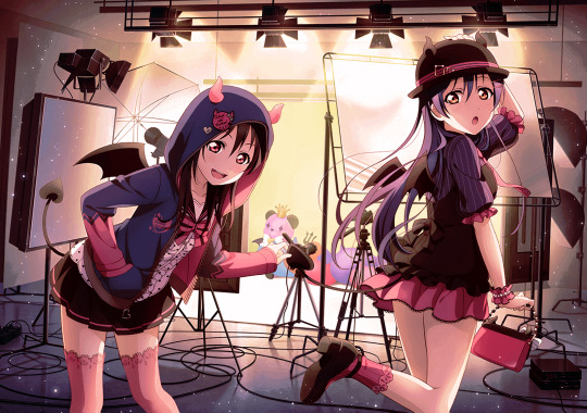
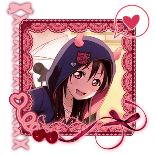

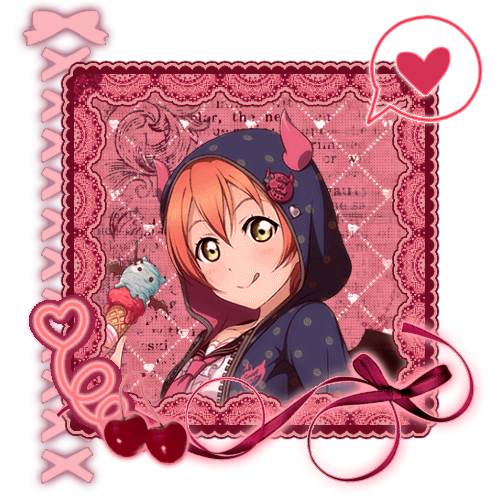
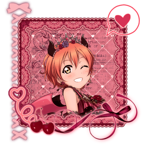
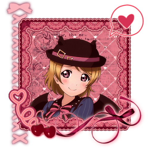
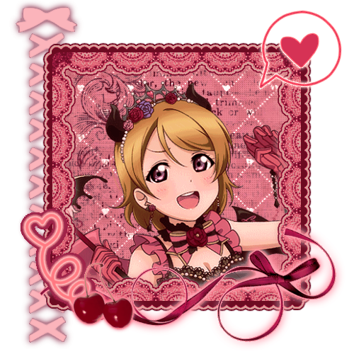


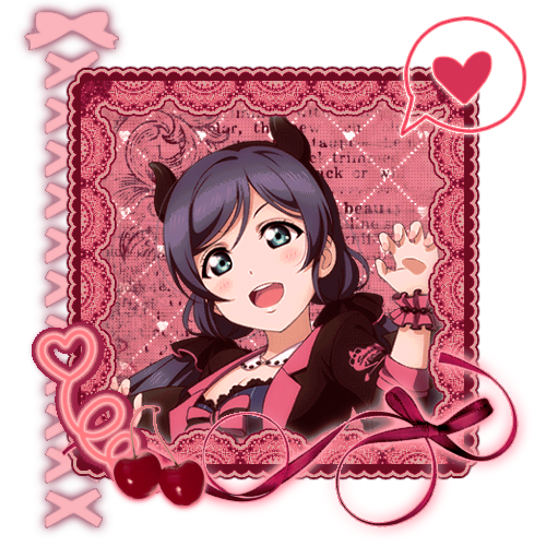
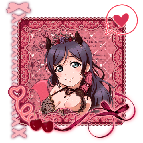
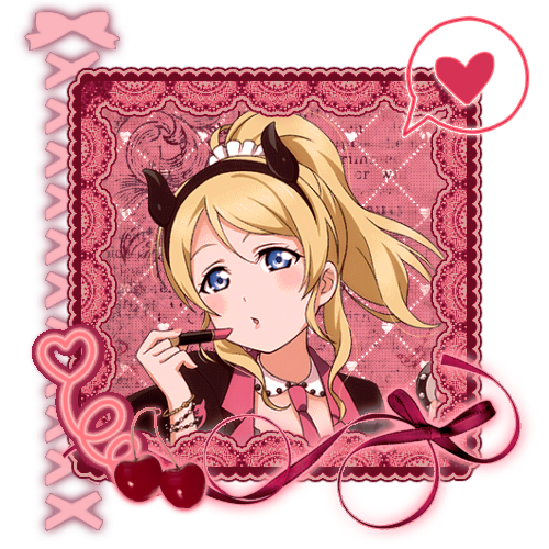

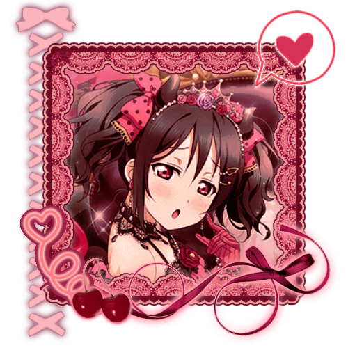
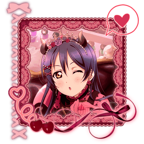


💕 — Muse's Little Demon Set
like/rb + credit if using !
#hi everyone i made a psd specifically for love live so ill prob post some set icon edits. just for fun#love live#love live school idol project#love live muse#nico yazawa#umi sonoda#rin hoshizora#hanayo koizumi#maki nishikino#honoka kousaka#kotori minami#nozomi tojo#eli ayase#♡ — edits#♡ — icons#♡ — sets#im probably going to post the aqours version tomorrow lalala
62 notes
·
View notes
Note
hello! do you have any tips for creating your own psds? right now I'm just sort of throwing things at the wall and hoping it sticks!

Hi hi nonnie! I am NOT the best person for you to ask this (not in a miiile) BUT I tried making this in the most concise way I could and prayed to god it didn't get too confusing since a lot of the times I too just throw things at a wall and call it a day. I'll teach my usual psd making style and a more general one just in case that's what you were looking for! They're under the cut since it probably will get a tiny bit long but I hope it's helpful to you! <3 as always reminder that there is no correct way to make a psd this is just how i do etc etc
This has a lot of text and images so beware of the big scary maica


First of all: While you certainly *can* make a psd based solely out of one image or a compilation of your own edits (as i have done on the past), I'd say in general it's more useful and easier to make something when you have more than a singular image to check and a color spread to use. I made this little template in 5 minutes (which is a lie because my photopea crashed at first and so I had to re-do it) and I'll link it here alongside the psd itself so you can poke around and check how I do things! If you want to do your own template or anything, though, here's the color spread I use! :]

It has a spectrum, a bar line and some skin tones so it should be helpful! You can also use Travi3sapsd swatches if you'd like, since I know some people would prefer having a view of the colors before and after the psd to check!
Talking about skin tones, Amemcth also has a nice collage with characters of varying skin tones so you can check how your psd look on different skin tones. I don't think it's obligatory for all psds to look fine with every skin tone, however, I think if you're not doing it for a singular character and are indeed posting that psd for public use, making it work with darker skin tones is something good and that I encourage. If it doesn't work, remember to always indicate it by adding a "Works fine on most skin tones" or "Doesn't work on poc characters". Those warnings can also be useful for other things, like not indicating the usage of the psd on irl pictures, cartoon pictures etc.
So, final thing before we get into psd making itself (if you are using a image mask template to check colors) is adding the images! I always recommend adding characters from different sources and irl images to be sure, and with either varying colors across the spectrum so you can be certain the psd is working nicely OR images that feel similar enough in vibes so you can be certain the vibes of the psd are going towards where you'd like them to. However, it's also important to consider which colors you will be working with to make the psd, since I think it's easier to make a psd for a character when you have something in mind. For my own psds, I usually limit myself to a maximum of three colors + black and white (which I'll mess with to change their tones), so for this tutorial I'll be using yellow, purple and pink! This is the where we start. (I won't be trying to keep skintones working for this since it's all pale characters, but please have the common sense to make psds that work if you're editing a black character. don't make them white and for the love of god don't make them grayish)
Also reminder before anything that if you're editing a card and that card works weirdly with the psd you can always add adjustment layers to the card itself and mess up with the hues on it hashtag editing some characters just are a pain in the ass to edit because of colors being too similar etc so don't be afraid to fight them

First: Make A Folder for your psd to be built on. It makes things a lot easier to drag around once you have it done and arranged. Name it after the psd name, name it psd folder, whatever, just put your layers under that folder. Onto the layers.
My autistic ass mostly does psds only following one single pattern, but in case you want to mess around and play, feel free to have fun and mess around. A lot of psd making really is just messing around. In my case, these are the main adjustment layers i use: Threshold, Selective Color, Hue/Saturation, Photo Filter, Color Balance, Vibrance and, on occasion, Gradient Map and Curves. You can use others but I am >not< the best person to tell you what they do and how to work with them.
So, you now have your pretty little image layout down and the colors you want to work with in mind (pink purple yellow + bw), so what now? Well, I usually like to think on which direction I want to take this psd towards. People will always have different methods and directions on psd making. Some of them like to make some of the most eyestraining things I've ever seen which somehow work, some of them like to make a pastel so bright I can feel my eyes burning, some of them prefer to make desaturated tones, some of them like to lower the vibrancy of the image so much I almost can't see shit. Everyone has their own preferences and I work w pretty much anything, but for this I'll try to keep a standard bright view, if a little pastel and desaturated, for this.
So now, we have our colors, our images, our color swatches and a direction in mind.
First thing I like to do whenever I'm making psds is to add a threshold layer. However, not in the way I usually see around editblr. When you add a threshold layer, it should look like this

Don't just do that. Go there on that little normal bar and click it. I know people who use others, but I usually settle with either Multiply or Soft Light for it, then lower the opacity down until it's somewhere I'm satisfied with.


So this is where we end up at. I don't let my threshold opacity go any higher than a 30%. threshold basically serves to bring out the shadows on your images and bring out the shapes on them. it helps make the focus on the image clearer yadda yadda yadda. Be careful when using it on darker images, but for brighter ones it sure helps w making everything easier to see.
After adding a threshold, I add my Selective Color layer. With this you'll basically be playing around with the sliders until your colors look the way you want them to. This messes *slightly* with the hue without fully changing them (we'll get there soon), so it gives you some chance to balance out the initial shades of the psd. For the current method i'm teaching (focused colors), i usually recommend you to make the colors you >dont< want on your psd brighter or in a shade that still feels coherent with the colors you dont want in it. we'll be dealing with them soon.

So we get there. HOWEVER! don't think we're done once you mess with the main colors. the 1st selective color white is, what i'd say, one of the most important parts of psd making. you know how most anime characters in gacha games these days look pale white? Yeah. this can change it. What i usually do is bring the black slider on the white layer to the right and then increase a bit of the magenta and yellow. Boom.

It's quite tricky to use on images with heavier shadows, but for the standard pale white anime gacha character? it helps give some life to them. its quite subtle, but can help a lot to make the image get more lively. A counter thing to this is that yeahhh this can mess a lot if you want to make, you know, a >white< psd since it will also mess with the white tones themselves, so there's no 100% settled need to mess with it, just keep it in mind in case you wanna make the character a bit more tan or, you know, have a normal skintone. It also helps a lot with defining shadows, so keep it in mind :]
I usually don't mess with the neutral since it can fuck around a lot w skintones and, if i do, i always make sure to keep them on less than 20% for all levels. be careful when playing w it.
Black is a tricky one. I know a lot of you pastel girlies across editblr and psd making communities like turning it all the way down so theres no black but honestly, contrast is important. I usually make sure to bring the black scale to the right and then mess around w the other three so the black is still visible and bringing contrast to the image, but w the help of the other three, make it so the black looks softer and matches the psd itself. So, here we are!

After the selective color in my psd process, that's where we erase any unwanted color and shift the hues to where we'd like them to be. Make a hue/saturation layer and go to the colors you dont want (in our case, green and cyan) and move that hue slider to a color you want babyyy. I encourage to mess around with the color scale on the specific color so you have more power over what colors change or don't, in case it's messing with colors close to it on the scale (cyan messing with greens, greens messing with yellows etc). Be aware that doing this will fuck uppp certain images with those colors, cry about it for a bit, and go back to making your psd

If you're a picky mf just like me, you WILL add 1 or 2 more hue/saturation layers to fully clean that bar of any color you do not want. If you're normal, you'll be chill with how this looks and call it a day, so onto the next step.

After arranging your colors and possibly finding out how green is an absolute shit color to try and erase traces of, we get to color balance which is, well, where you balance the colors. go around and mess w the scale until your colors lean more towards what you want them to look like. I personally don't mess much here and the difference will be suuubtle subtle, this is more if you're just picky with colors like me and want them to look perfect in the idealized version of the psd you hold in your head.

Photo filter will basically bring the whole thing together. It serves as a filter to bring eeevery tone you have going on into a cohesive line. Always remember to lower down the density of it so the other colors are still noticeable. a lot of the time i will add more than one photo filter and play with it until I'm satisfied with how it looks <3

Then this is the time where I'll usually add ANOTHER selective color layer just to mess more with the tones and finally get them down to where I usually stop playing around.

A few more touches and you should be done! I really don't know how to even explain curves and gradient maps so play around with them for a bit and you should at least understand how they work. One thing I do a lot with my psds is make toggles to make colors darker/bring more focuses etc etc, so if you're someone who struggles to make decisions, toggles might be a good thing to add to your psds!
Now... If you don't want to limit yourself to a set number of colors? Quite simple! Simply skip the hue/saturation layer steps or delete them altogether once you're done with your psd and there, a psd that plays with the tones of the image to make them more harmonious while keeping everything cohesive! You can mess around a bit more on the two selective color layers you have if you do this by deleting the huesat layers, but it should generally look pretty nice still!

This should be it! So, to summarize everything Ive been yapping about so far...
Before diving head in, decide if you want to limit your colors or not. Also decide on a set type of psd (bright, pastel, desaturated, dark...) you want to go towards
Use multiple images to make your psd, either with similar vibes so you can ensure it's becoming something you wanted or with varying colors so you can cover your ground
Use a threshold layer with lowered opacity before anything else so the shadows on your images have more contrast
You can use a selective color layer on the white part to darken pale characters skintone and bring some more life to them, but be careful when doing this because of cards with heavier shadows, if you want to keep white as a color on the psd etc
Don't lighten the black part on the selective layer as that messes with contrast and might make your psd harder to comprehend when looking from afar
Try to still make your colors distinct enough so you're able to tell apart shapes if from afar, it can be a difficult thing to do but it helps a lot with readability
Don't be afraid to go back and forth between layers! If you're on a photo filter layer, you can always go back to make a specific color more prominent if you miss it overall
Use hue/sat as a way to change colors you don't want instead of replace color. It's tricky, but it covers more ground
Use photo filter to bring all colors more cohesion and make it so they look more harmonious
Have a headache trying to work around cards with harsher shadows
DO NOT make poc characters gray or straight up orange/red for the love of god
Feel free to make different toggles for your psds if you can't decide on which path to go towards, you can always duplicate layers and make different paths depending on what you want!
If a specific image you're using has difficult shadows or different tones to work around with the overall set, you can always just mess with that image alone and make adjustments to make it work out with the rest of the set
Remember that psds work differently on photopea and photoshop, so make sure to check that out if making them/using them/posting them anywhere and make it clear for which app they were made for!
Good luck with psd making and have fun overall! <3
Here's my psd test yet again if you'd like to mess around with it! Just don't repost and it should be fine ^^
47 notes
·
View notes
Note
i see limcom on ur blog this is a good blog (semi-serious talk ur edits r really cool, im eating them all)

weheh tyty anon <333 my stupid winrate (i promise i can play this semi decently i dont just click p+enter) game who i love dearly..... i should get to theme around hong lu once his canto card is out argh. holds your hand <3

4 notes
·
View notes
Text
hi i'm en (or other names) formerly theatrepuppet which i deleted due to it being killed by tumblr and now i'm here as maitsunakas because i love editing forever. read rentry here. may i ask for a promo. explodes and dies.
@3dlove @kurodel @lovesick-level-up @myuumei @radioexe + anyone else. crumples to the ground.
26 notes
·
View notes
Text

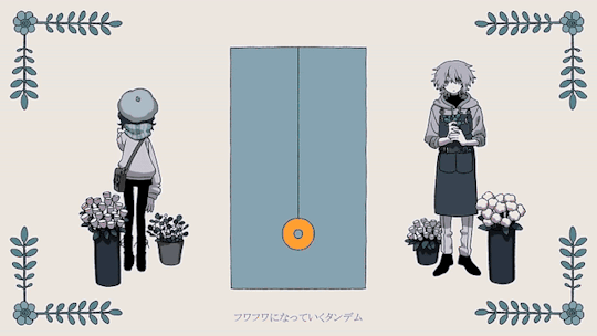


🐕 — Mass' Gradually Turning into a Dog ;;
43 notes
·
View notes
Text


"I always end up looking for the safest, most certain route. I'm a boring person who can't dream. So, Aya-chan… just how am I supposed to go about getting one?" "A-Anyone can dream! Even you, Chisato-chan!!"
#oh the colors on this are so soft and nice... the editing is also so so cutie. holds it#♡ — others edits
30 notes
·
View notes
Text


TENMA SIBLINGS WALLPAPERS! for anon
95 notes
·
View notes
Text


🤖 — Kinari Azekawa Stimboard ;;
( ⓵ ⓶ ⓷ • ⓸ 🌐 ⓺ • ⓻ ⓼ ⓽ )
#one more for the series... ill eventually get to everyone ^_^#18trip#kinari azekawa#stimboard#visual stim#gif#♡ — stimboard
46 notes
·
View notes
Text


credit and rb to use
#uwah the muted colors on this are so so nice... theyre still vibrant even if muted its great#i also looove the pinks on the 4 images. so good. uwah#♡ — others edits
41 notes
·
View notes
Text

hii, odel here! you may know me from past blogs like mrsh0wtime, heartsymphonia or io-kun, and i'm back to editing stronger than ever yesss (or not. idk). may i please have a promo? feel free to reblog even if you aren't tagged!
@myuumei @radioexe @maitsunakas @3dlove @rookmeo @nemuurin @pomettes + anyone else who would like to promo!
49 notes
·
View notes
Text


🪽 — PASWG Season 2 Preview ;;
#panty and stocking#paswg#paswg season two#paswg polyester#paswg polyurethane#anime gif#♡ — edits#♡ — gifsets#first time messing around w sharpening. not sure what i think.hm
273 notes
·
View notes
Text


for @roseatedesire.
#♡ — for me :3#wehhh these are so so nice... the sharpening helps to make him stand out a lot and the paint splatter gif effect w the color inverse is so#cool to add some dynamics onto it... the subtle psd is also sooo good and yummy... eating it...#thank you for it!!! <333#♡ — others edits
35 notes
·
View notes
Text


🍷 — AdamLilith's Himegoto ;;
#what do i tag this one uh. ik it isnt my usual stuff but hope you all like vampire yuri gang#♡ — gifsets#adamlilith#himegoto#jpop#vampire
8 notes
·
View notes
Note
Bedsibs Guilty Gear you're so based for that

thank you i love my stupid bedsiblings... and their bed of course

2 notes
·
View notes
Note
i think you are so cool and want to edit you something. tell me your fave characters

hello??? yeah sure ^_^ uhh anyone within ev3ns 18trip, specifically chihiro are probably my current faves rn. yuki and azuma a3, iori charisma house, lillia and epel twst. hong lu and ryoshu limbus, anri hello charlotte (both the irl one and the created one), aba+paracelsus jack'o ramlethal and bedsibs guilty gear ^_^ hope this is a wide enough list you can get something youre familiar with within there nonnie o7
3 notes
·
View notes