#editblr tutorial
Explore tagged Tumblr posts
Visit Tumblr Blog
Explore Tumblr blogs with no restrictions, modern design and the best experience.
Last Seen Tumblr Blogs


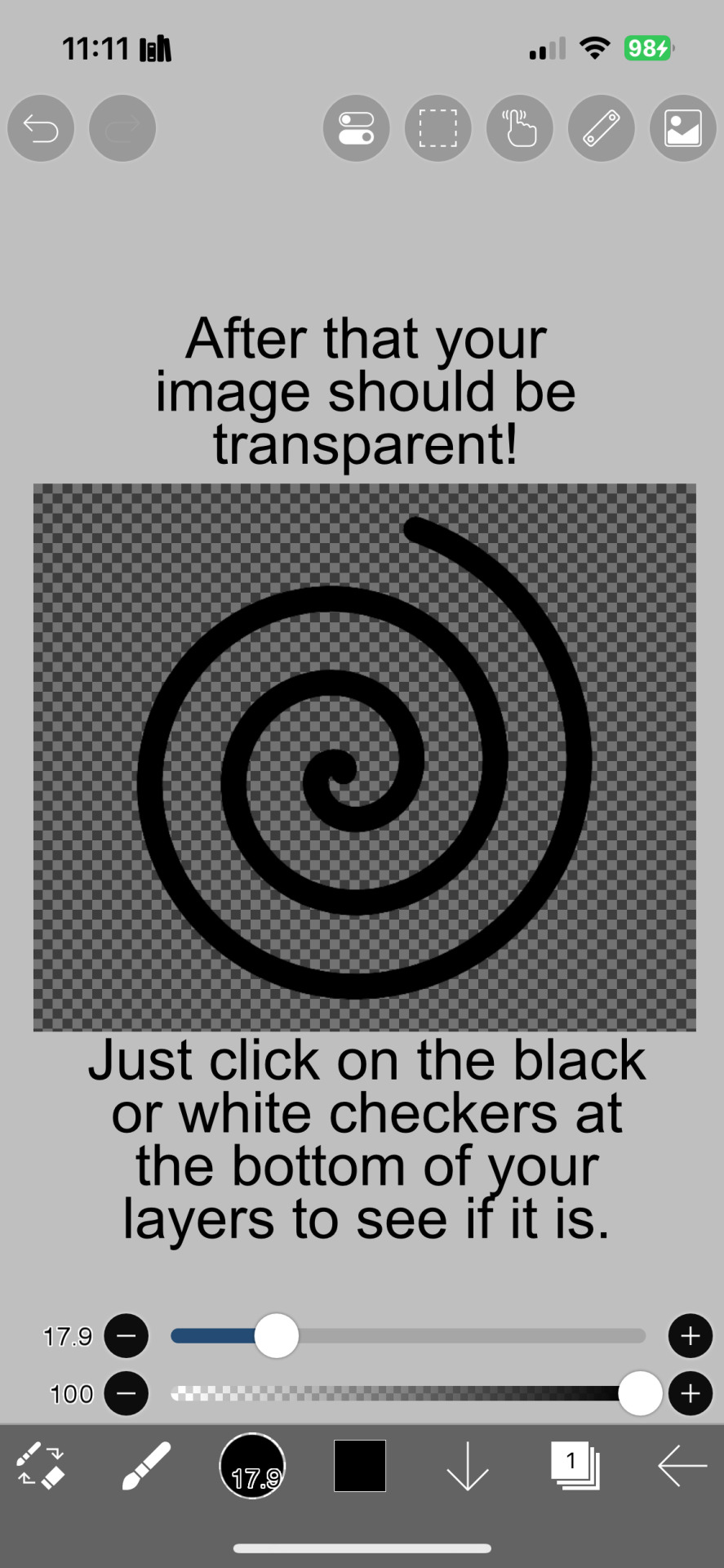
Fun Fact
The Tumblr app for Google Glass was released on May 16, 2013.
Note
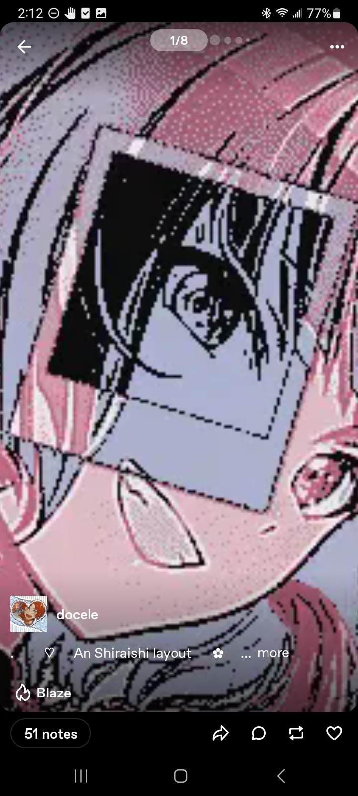
how does one make graphics (i need to . improve)

Well, the Princess' methods are very simple! She would be glad to teach you.
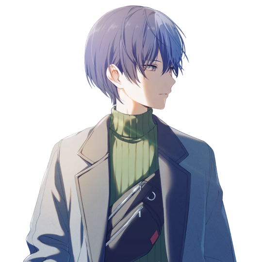
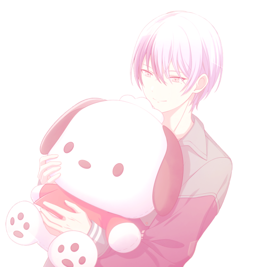
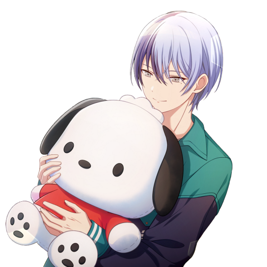
A bit long graphic tutorial under cut ^_^ (all art by Iinquint on twitter)

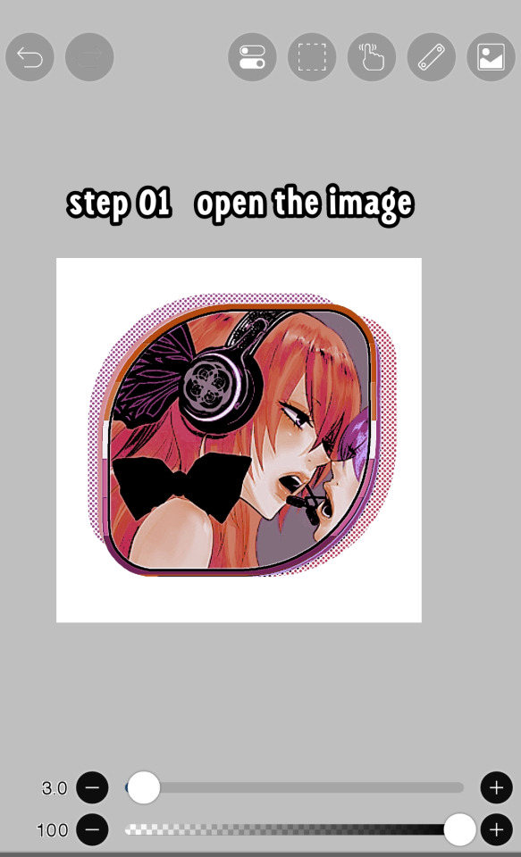
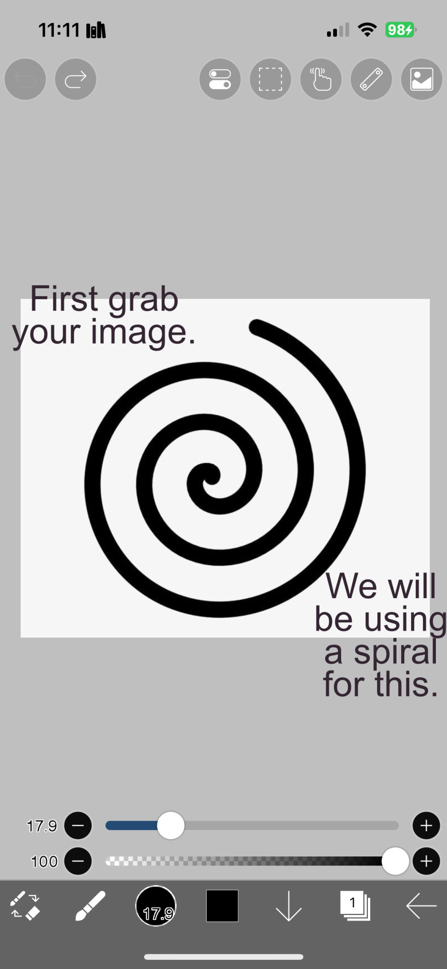
First, we import the frame or mask you will use. You can find these by searching "rentry frame".

Then, we will import our picture and erase any excess outside of the frame.

Then we usually add a chibi, You can do this by finding chibi art and erasing the background.

And now we will add any PNGs to the graphic. We chose circle laces for this.

Now we will duplicate the layer of our chibi.

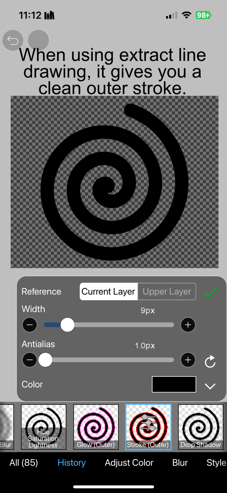
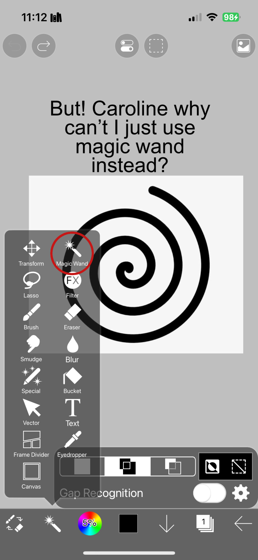
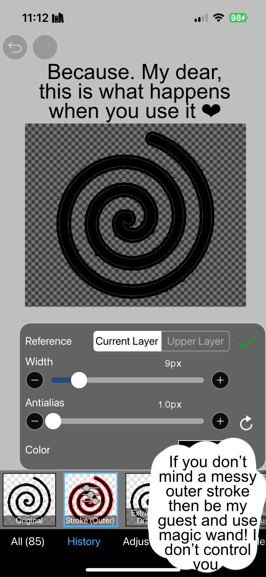
We then use the Stroke Outer filter to find dots that weren't erased, we will go to the top original later and erase where all the exposed dots are.

After that, we delete the layer & reduplicate it. Then we use stroke outer for a white outline, and then a black one. If the chibi or whatever you are using is white or very light already, feel free to reverse the white & black.

Then we add glow outer (usually around 1-2px)

Continue this process for everything

Save it

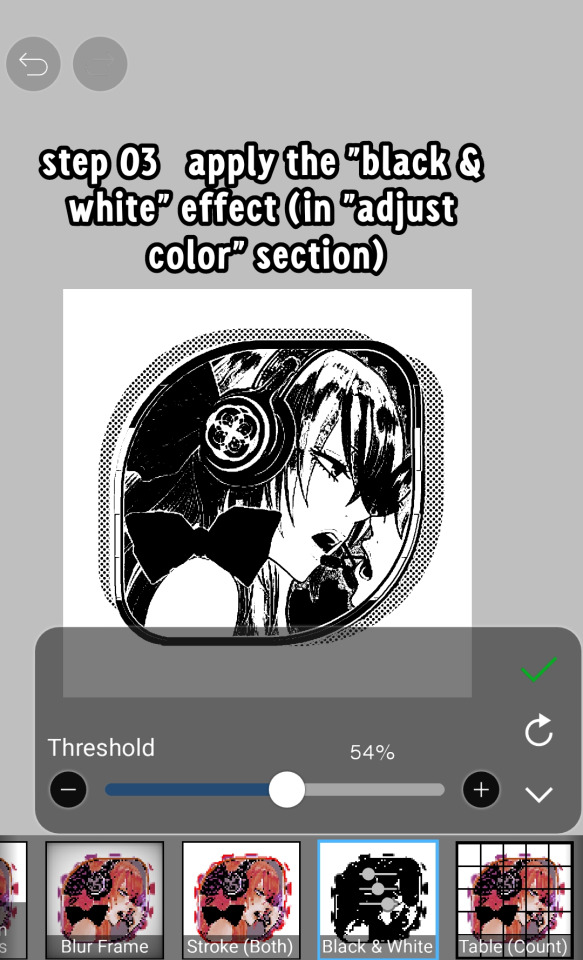
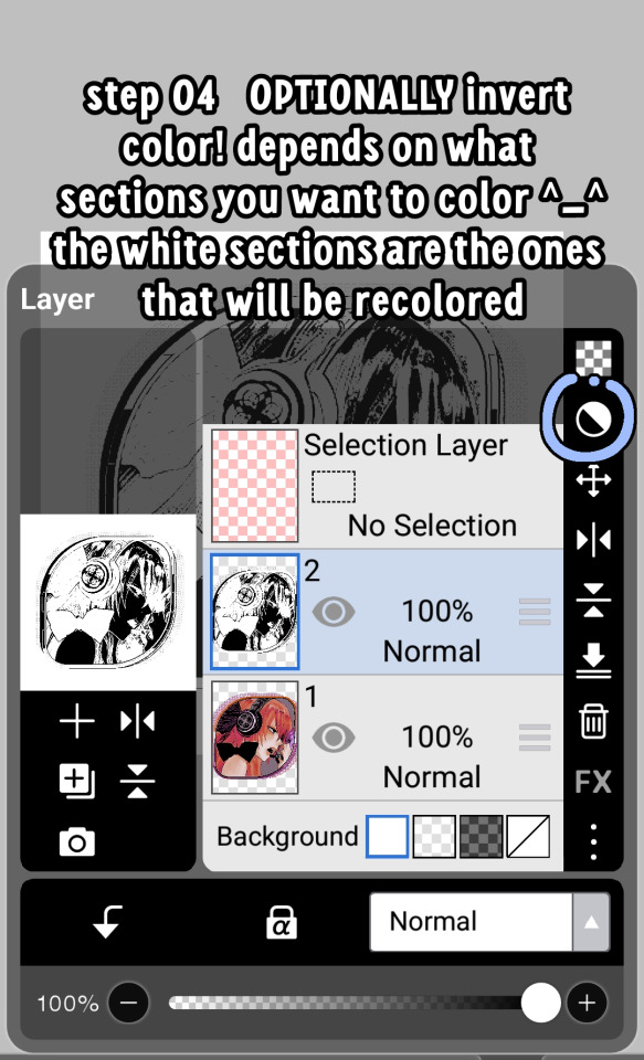
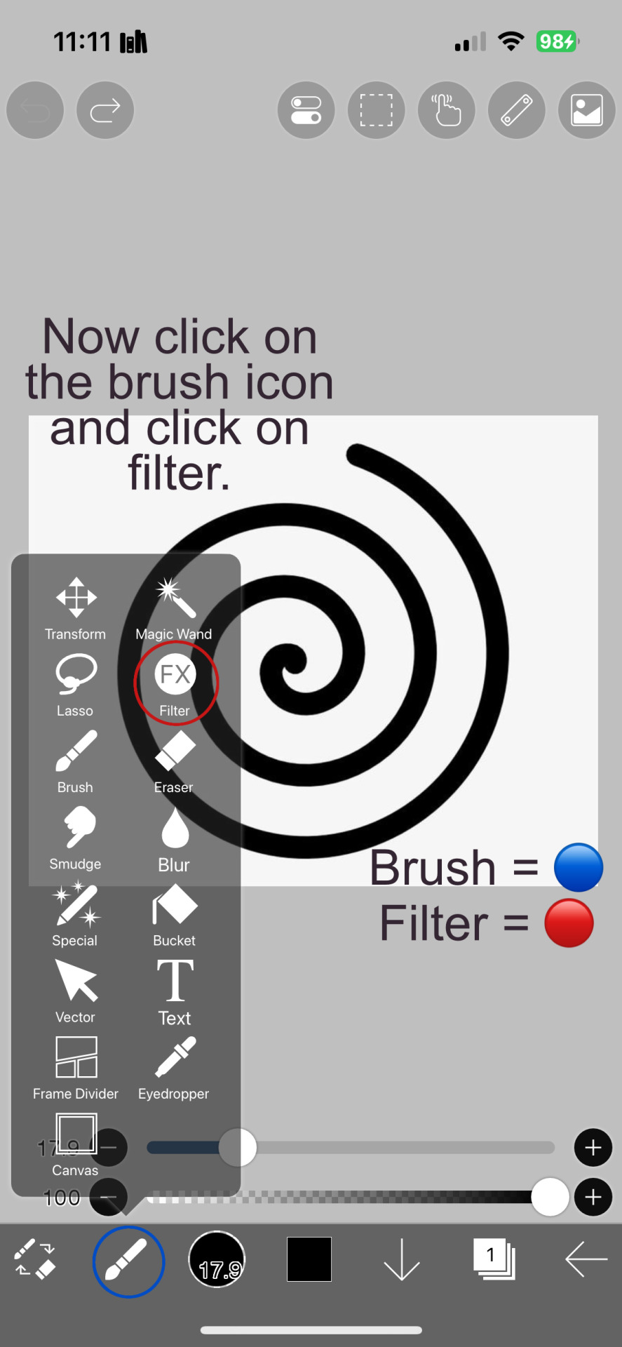
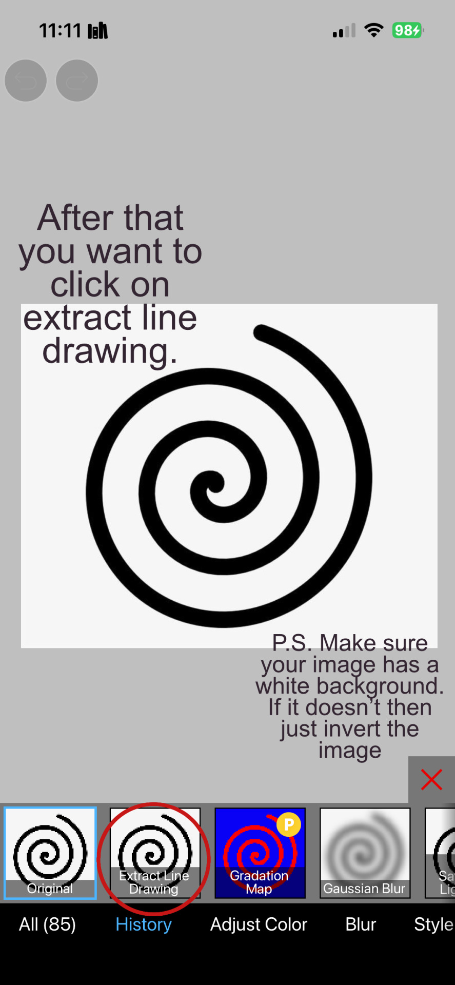
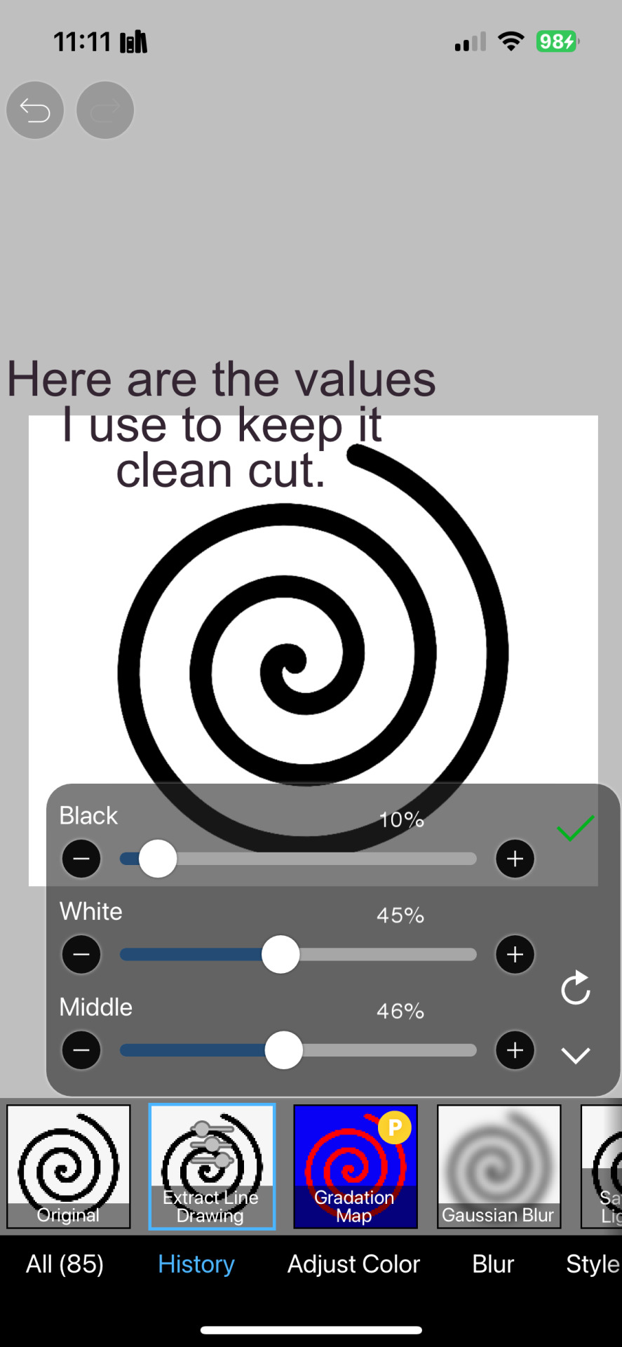
And then we will import it into a new canvas through 'import picture' & then use the grayscale.

Now, We do not always use a gradient map. But feel free to try out gradients to see if it looks nice on the graphic. Either of the 2 top sites work.

Find a gradient that looks nice. If none fit your vision, feel free to skip it.


Now, import the new image and then add textures. Play around with blending modes & opacity until it looks right.

Boom! You've made your very own graphic.
Now for animated graphics...
(No visuals) If you'd like one where the small chibi moves, move it to be angle -5, save it, and then angle 5 and save it. (Also adjust angles if the 5 looks weird.)
Import the images into ezgif gif maker and turn on "Don't stack frames" and adjust delay time. (I usually use 80ish)
--
Animated graphics 2

Import your graphic into capcut. Add a green background or whatever color is not present on your graphic at all. Add the gif you want on the graphic. Adjust for all the images to go on for equal times so it works.


Ezgif > Mp4 to gif > Remove Background > Select hex code of background > "Replace hex with transparency" > Adjust Fuzz > Optimize

And voila, your graphic is completed! Feel free to adjust in ezgif effects if needed.

#ᛝ a chat with the lady spawn .ᐟ#rentry decor#rentry inspo#rentry resources#rentry#rentry stuff#rentry graphics#rentry banner#rentry coloring#ibis paint colorings#graphic tutorial#rentry tutorial#editblr#pr3typriincess#pr3ttypriincess forsaken#pretty princess forsaken#forsaken roblox#roblox forsaken#roblox#forsaken rentry
380 notes
·
View notes
Text
A Tutorial Requested by @castcine

#✸ ⁀➷ the sage is typing。。。#/ castor posts#/ other#tutorial#photopea tutorial#editblr help#rentry help#helping out#editblr tutorial#editblr#rentry#rentryblr#rentry resources#editblr resources
38 notes
·
View notes
Note
https://www.tumblr.com/pupsec/777071487795478528/messing-around-with-layouts-and-shit?source=share HOW DID U DO THE COLORINGGGGGG I LOVE ITTT CAN U SHARE PLEASE AND TYY
[EDIT 235 GODDAMN NOTES WHAT THE SHIT.]
hi! i am happy you liked it 💗💗😭😭
unfortunately it's something i cannot share because, well, it's something i worked a lot for.
it's not that i dont encourage inspo/asking for help, it's just that with experience you find a style that's unique to you and expresses you!
however, here are some really good overlays i reccomend using for a similar style!
remember to grayscale all of them before you apply a blending mode! that's what i mostly do, no pressure.


example:

if you want a tutorial for how to use blending modes and stuff, and how to mess around with filters, do let me know!
#♡̵ ⠀⠀・ ⠀⠀pupsec ⠀⠀ᜑ⠀⠀💗꣒#♡̵ ⠀⠀・ ⠀⠀edits ⠀⠀ᜑ⠀⠀💗꣒#♡̵ ⠀⠀・ ⠀⠀requests ⠀⠀ᜑ⠀⠀💗꣒#♡̵ ⠀⠀・ ⠀⠀resources ⠀⠀ᜑ⠀⠀꣒#rentry#rentryblr#rentry resources#rentry stuff#rentry icons#rentry overlays#rentry overlay#overlay#overlays#editblr#editblr resources#editblr help#editblr stuff#editblr tutorial#tutorial#rentry tutorial#editing tutorial#hyacine#hsr#hsr hyacine
284 notes
·
View notes
Note
You've probably answered something like this before but could I ask how u do this... (the recoloring skin thingy ISK HOW TO EXPLAIN)
NO WORRIES im shit at explaining but ermmmm i tried!! i probably made this longer than it should be but WHATEVER!!! i promise its really easy.so.tutorial ujder cut

70 notes
·
View notes
Note
hello! do you have any tips for creating your own psds? right now I'm just sort of throwing things at the wall and hoping it sticks!

Hi hi nonnie! I am NOT the best person for you to ask this (not in a miiile) BUT I tried making this in the most concise way I could and prayed to god it didn't get too confusing since a lot of the times I too just throw things at a wall and call it a day. I'll teach my usual psd making style and a more general one just in case that's what you were looking for! They're under the cut since it probably will get a tiny bit long but I hope it's helpful to you! <3 as always reminder that there is no correct way to make a psd this is just how i do etc etc
This has a lot of text and images so beware of the big scary maica


First of all: While you certainly *can* make a psd based solely out of one image or a compilation of your own edits (as i have done on the past), I'd say in general it's more useful and easier to make something when you have more than a singular image to check and a color spread to use. I made this little template in 5 minutes (which is a lie because my photopea crashed at first and so I had to re-do it) and I'll link it here alongside the psd itself so you can poke around and check how I do things! If you want to do your own template or anything, though, here's the color spread I use! :]

It has a spectrum, a bar line and some skin tones so it should be helpful! You can also use Travi3sapsd swatches if you'd like, since I know some people would prefer having a view of the colors before and after the psd to check!
Talking about skin tones, Amemcth also has a nice collage with characters of varying skin tones so you can check how your psd look on different skin tones. I don't think it's obligatory for all psds to look fine with every skin tone, however, I think if you're not doing it for a singular character and are indeed posting that psd for public use, making it work with darker skin tones is something good and that I encourage. If it doesn't work, remember to always indicate it by adding a "Works fine on most skin tones" or "Doesn't work on poc characters". Those warnings can also be useful for other things, like not indicating the usage of the psd on irl pictures, cartoon pictures etc.
So, final thing before we get into psd making itself (if you are using a image mask template to check colors) is adding the images! I always recommend adding characters from different sources and irl images to be sure, and with either varying colors across the spectrum so you can be certain the psd is working nicely OR images that feel similar enough in vibes so you can be certain the vibes of the psd are going towards where you'd like them to. However, it's also important to consider which colors you will be working with to make the psd, since I think it's easier to make a psd for a character when you have something in mind. For my own psds, I usually limit myself to a maximum of three colors + black and white (which I'll mess with to change their tones), so for this tutorial I'll be using yellow, purple and pink! This is the where we start. (I won't be trying to keep skintones working for this since it's all pale characters, but please have the common sense to make psds that work if you're editing a black character. don't make them white and for the love of god don't make them grayish)
Also reminder before anything that if you're editing a card and that card works weirdly with the psd you can always add adjustment layers to the card itself and mess up with the hues on it hashtag editing some characters just are a pain in the ass to edit because of colors being too similar etc so don't be afraid to fight them

First: Make A Folder for your psd to be built on. It makes things a lot easier to drag around once you have it done and arranged. Name it after the psd name, name it psd folder, whatever, just put your layers under that folder. Onto the layers.
My autistic ass mostly does psds only following one single pattern, but in case you want to mess around and play, feel free to have fun and mess around. A lot of psd making really is just messing around. In my case, these are the main adjustment layers i use: Threshold, Selective Color, Hue/Saturation, Photo Filter, Color Balance, Vibrance and, on occasion, Gradient Map and Curves. You can use others but I am >not< the best person to tell you what they do and how to work with them.
So, you now have your pretty little image layout down and the colors you want to work with in mind (pink purple yellow + bw), so what now? Well, I usually like to think on which direction I want to take this psd towards. People will always have different methods and directions on psd making. Some of them like to make some of the most eyestraining things I've ever seen which somehow work, some of them like to make a pastel so bright I can feel my eyes burning, some of them prefer to make desaturated tones, some of them like to lower the vibrancy of the image so much I almost can't see shit. Everyone has their own preferences and I work w pretty much anything, but for this I'll try to keep a standard bright view, if a little pastel and desaturated, for this.
So now, we have our colors, our images, our color swatches and a direction in mind.
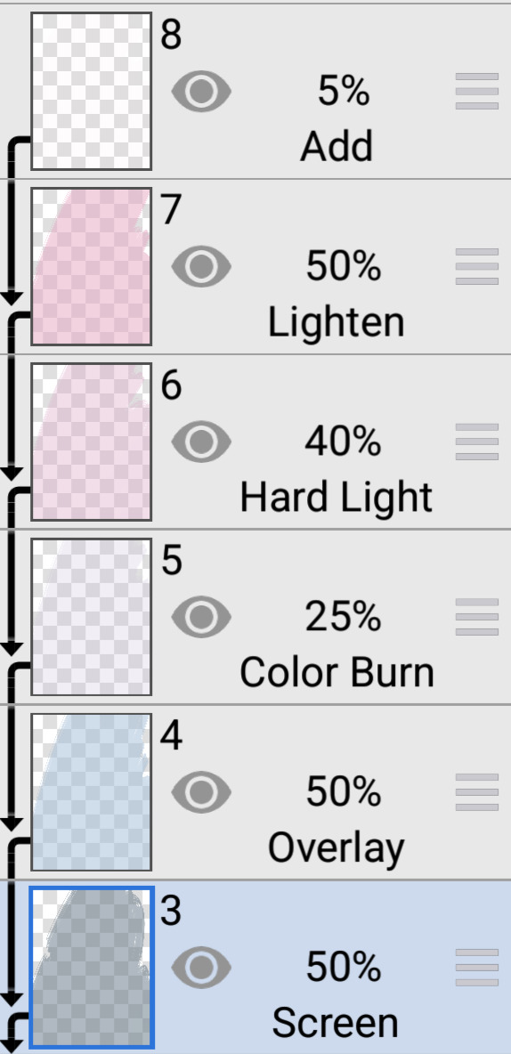
First thing I like to do whenever I'm making psds is to add a threshold layer. However, not in the way I usually see around editblr. When you add a threshold layer, it should look like this

Don't just do that. Go there on that little normal bar and click it. I know people who use others, but I usually settle with either Multiply or Soft Light for it, then lower the opacity down until it's somewhere I'm satisfied with.


So this is where we end up at. I don't let my threshold opacity go any higher than a 30%. threshold basically serves to bring out the shadows on your images and bring out the shapes on them. it helps make the focus on the image clearer yadda yadda yadda. Be careful when using it on darker images, but for brighter ones it sure helps w making everything easier to see.
After adding a threshold, I add my Selective Color layer. With this you'll basically be playing around with the sliders until your colors look the way you want them to. This messes *slightly* with the hue without fully changing them (we'll get there soon), so it gives you some chance to balance out the initial shades of the psd. For the current method i'm teaching (focused colors), i usually recommend you to make the colors you >dont< want on your psd brighter or in a shade that still feels coherent with the colors you dont want in it. we'll be dealing with them soon.

So we get there. HOWEVER! don't think we're done once you mess with the main colors. the 1st selective color white is, what i'd say, one of the most important parts of psd making. you know how most anime characters in gacha games these days look pale white? Yeah. this can change it. What i usually do is bring the black slider on the white layer to the right and then increase a bit of the magenta and yellow. Boom.

It's quite tricky to use on images with heavier shadows, but for the standard pale white anime gacha character? it helps give some life to them. its quite subtle, but can help a lot to make the image get more lively. A counter thing to this is that yeahhh this can mess a lot if you want to make, you know, a >white< psd since it will also mess with the white tones themselves, so there's no 100% settled need to mess with it, just keep it in mind in case you wanna make the character a bit more tan or, you know, have a normal skintone. It also helps a lot with defining shadows, so keep it in mind :]
I usually don't mess with the neutral since it can fuck around a lot w skintones and, if i do, i always make sure to keep them on less than 20% for all levels. be careful when playing w it.
Black is a tricky one. I know a lot of you pastel girlies across editblr and psd making communities like turning it all the way down so theres no black but honestly, contrast is important. I usually make sure to bring the black scale to the right and then mess around w the other three so the black is still visible and bringing contrast to the image, but w the help of the other three, make it so the black looks softer and matches the psd itself. So, here we are!

After the selective color in my psd process, that's where we erase any unwanted color and shift the hues to where we'd like them to be. Make a hue/saturation layer and go to the colors you dont want (in our case, green and cyan) and move that hue slider to a color you want babyyy. I encourage to mess around with the color scale on the specific color so you have more power over what colors change or don't, in case it's messing with colors close to it on the scale (cyan messing with greens, greens messing with yellows etc). Be aware that doing this will fuck uppp certain images with those colors, cry about it for a bit, and go back to making your psd

If you're a picky mf just like me, you WILL add 1 or 2 more hue/saturation layers to fully clean that bar of any color you do not want. If you're normal, you'll be chill with how this looks and call it a day, so onto the next step.

After arranging your colors and possibly finding out how green is an absolute shit color to try and erase traces of, we get to color balance which is, well, where you balance the colors. go around and mess w the scale until your colors lean more towards what you want them to look like. I personally don't mess much here and the difference will be suuubtle subtle, this is more if you're just picky with colors like me and want them to look perfect in the idealized version of the psd you hold in your head.

Photo filter will basically bring the whole thing together. It serves as a filter to bring eeevery tone you have going on into a cohesive line. Always remember to lower down the density of it so the other colors are still noticeable. a lot of the time i will add more than one photo filter and play with it until I'm satisfied with how it looks <3

Then this is the time where I'll usually add ANOTHER selective color layer just to mess more with the tones and finally get them down to where I usually stop playing around.

A few more touches and you should be done! I really don't know how to even explain curves and gradient maps so play around with them for a bit and you should at least understand how they work. One thing I do a lot with my psds is make toggles to make colors darker/bring more focuses etc etc, so if you're someone who struggles to make decisions, toggles might be a good thing to add to your psds!
Now... If you don't want to limit yourself to a set number of colors? Quite simple! Simply skip the hue/saturation layer steps or delete them altogether once you're done with your psd and there, a psd that plays with the tones of the image to make them more harmonious while keeping everything cohesive! You can mess around a bit more on the two selective color layers you have if you do this by deleting the huesat layers, but it should generally look pretty nice still!

This should be it! So, to summarize everything Ive been yapping about so far...
Before diving head in, decide if you want to limit your colors or not. Also decide on a set type of psd (bright, pastel, desaturated, dark...) you want to go towards
Use multiple images to make your psd, either with similar vibes so you can ensure it's becoming something you wanted or with varying colors so you can cover your ground
Use a threshold layer with lowered opacity before anything else so the shadows on your images have more contrast
You can use a selective color layer on the white part to darken pale characters skintone and bring some more life to them, but be careful when doing this because of cards with heavier shadows, if you want to keep white as a color on the psd etc
Don't lighten the black part on the selective layer as that messes with contrast and might make your psd harder to comprehend when looking from afar
Try to still make your colors distinct enough so you're able to tell apart shapes if from afar, it can be a difficult thing to do but it helps a lot with readability
Don't be afraid to go back and forth between layers! If you're on a photo filter layer, you can always go back to make a specific color more prominent if you miss it overall
Use hue/sat as a way to change colors you don't want instead of replace color. It's tricky, but it covers more ground
Use photo filter to bring all colors more cohesion and make it so they look more harmonious
Have a headache trying to work around cards with harsher shadows
DO NOT make poc characters gray or straight up orange/red for the love of god
Feel free to make different toggles for your psds if you can't decide on which path to go towards, you can always duplicate layers and make different paths depending on what you want!
If a specific image you're using has difficult shadows or different tones to work around with the overall set, you can always just mess with that image alone and make adjustments to make it work out with the rest of the set
Remember that psds work differently on photopea and photoshop, so make sure to check that out if making them/using them/posting them anywhere and make it clear for which app they were made for!
Good luck with psd making and have fun overall! <3
Here's my psd test yet again if you'd like to mess around with it! Just don't repost and it should be fine ^^
47 notes
·
View notes
Note
not a request id jst like to know how you color your graphics :3

‧₊˚౨ৎ good day to you, patron. indeed you may know how I color my graphics. I should share a fair warning beforehand, I do not claim my method of coloring images as the best or only method- there are many viable methods, though, I have found this one works best for my needs.

chapter I ⠀⠀✧ ⠀⠀image choice + program

‧₊˚౨ৎ for this tutorial, I will be using argenti's lightcone, 'an instant before a gaze.' such a beautiful lightcone will do wonderfully for a profile picture in my next edit, which you may want to keep an eye out for. the program I use is firealpaca, it is a free and easy to use drawing app that I have also found suitable for editing. however, this tutorial should apply to all programs usable for edits, so long as it has filters.

chapter II ⠀⠀✧ ⠀⠀color choice

‧₊˚౨ৎ the next step is to choose your colors. I typically only need two to begin recoloring my images, and if needed, I will change throughout the process. however, for simplicity's sake, I've chosen two colors for this edit. I quite like argenti in red, so I will be keeping him in red for this edit. I tend to memorize the general placement of my colors upon the color chart, but if you hold concerns for memorizing your colors, do not fret. I suggest placing your colors on a different layer so you may color pick them as needed. now that we have our colors, we may continue.

chapter III ⠀⠀✧ ⠀⠀beginning the recoloring

‧₊˚౨ৎ to begin coloring, create a new layer, and make sure it is above the image. I start off by using the gradient tool provided by firealpaca to place both colors in a nice gradient, in either order, and then change the blending filter to 'color.' you will see the image change into your desired colors in a natural way; if it does not look like how you imagined, attempt to adjust the opacity or the colors you are using before continuing. as you can see, the image is extremely red, so I will be turning the opacity down for a more natural recoloring.

‧₊˚౨ৎ that is a much better recoloring. it is less bright, and more akin to ambient lighting. this satisfies my needs, so I will continue onto the next step. to continue, you may either create a new layer with the gradient of colors again, or you may simply duplicate the layer from before and adjust as needed. I have chosen to do the latter. after you have the new gradient layer, combine the original gradient layer down to the image after you are certain it suits your tastes.
chapter IV ⠀⠀✧ ⠀⠀continuing to edit

‧₊˚౨ৎ now that you know the basics on how I personally choose to edit, it makes continuing the recoloring much easier. after this, you can duplicate the gradient as many times as needed, or create new gradients and adjust the opacity and the blending filters. I typically tend to use the following filters during my editing, though I may not use all of them if not needed- multiply, overlay, screen, lighten, darken, soft light, hard light, and then color. these are simply my most used filters, and I may branch out into hue or saturation change as needed, though rarely do. feel free to play around with your blending filters, it's important to find which filters suit your preferences and needs most, patron. for this edit, I used mostly multiply, overlay, and screen, and adjusted filters opacity as needed.
chapter V ⠀⠀✧ ⠀⠀returning to old roots

‧₊˚౨ৎ this step is entirely optional, but I enjoy doing this. I like to add a touch of different colors during my recoloring, and in this case, I would like to bring back argenti's green eyes. fetch an image of the character once more, and use it to color pick the color you wish to bring into the edit. in this case, I've used argenti's chibi sticker in order to return his original eye color. you may create a new layer with these colors as well, if you wish to, but I am usually fine to just remember it. this method is the same one I used to bring back the green hues in my personal graphics when editing them.

‧₊˚౨ৎ using your brush tool and on a new layer, color over and fill in the area you wish to recolor. since the area is small, this step is fairly easy, and I simply recolor over the pupil. then, set the blending filter to color, and adjust opacity as needed. you may also attempt to set the filter to overlay or multiply, the blending filter which works best to you is to be discovered by you, but I personally find the color filter to be enough. after this step, I tend to add another layer; in this case, I added an extra screen layer, to add more into it. be sure to add as much as you feel is needed.

chapter VI ⠀⠀✧ ⠀⠀finale
‧₊˚౨ৎ and this is the completed product. though it may not be the best recolor I've done to this day, it certainly befits a good tutorial and sample of how I tend to do my projects. I do hope this helps you color your graphics and images as well, patron. thank you for the question, it was a very fun experience writing up a small tutorial such as this one. do have a good day, now, and until we meet again, patron.


#༒ ꒰ daphne ┊ small talk . ꒱ ⚰︎#༒ ꒰ myrica ┊ questions . ꒱ ⚰︎#tutorial#graphics#graphics tutorial#editblr#editblr tutorial#༒ ꒰ flos ┊ misc . ꒱ ⚰︎
39 notes
·
View notes
Note
¿oodrías hacer un tutorial de cómo difuminar el marco de las fotos tipo así, por favor?

holii, ahí te grabe uno. no se si me explique bien, pero de esa manera es muy fácil para mi. solo le pones filtros a una foto de color, los que le puse son para difuminarlos (depende del gusto de cada uno de como ajustarlos) luego le pones la foto arriba y con la flechita de al lado del candado la superpones y ya esta.
(ignoren lo de capcut 💔💔)
si no quieres que la foto quede tan visible, por así decirlo, le bajas la opacidad (lo marcado en rojo)

espero que te sea de ayuda. cualquier duda que tengas, puedes escribirme por aquí o por mi ig 👊🏻!!
#fakeland#rp moodboard#tropical moodboard#kpop moodboard#tropical#kpop#moodboard#random moodboard#argentina#brasil#my edit#photo edit#editblr#edit#short bios#kpop bios#messy bios#messy icons#messy layouts#messy moodboard#instagram#tutorial
295 notes
·
View notes
Text
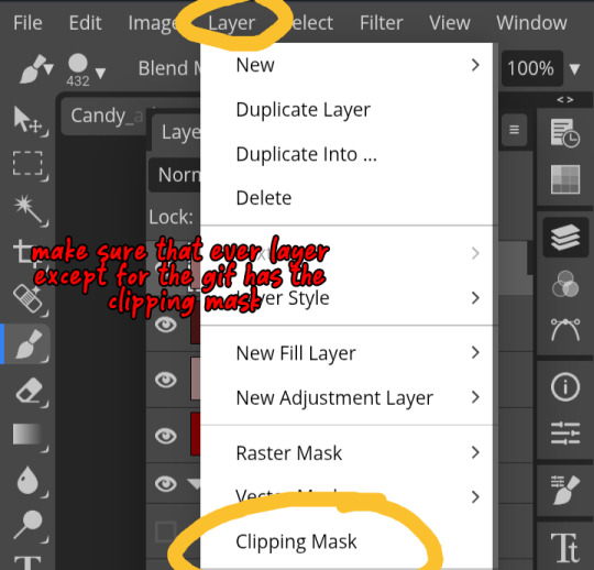
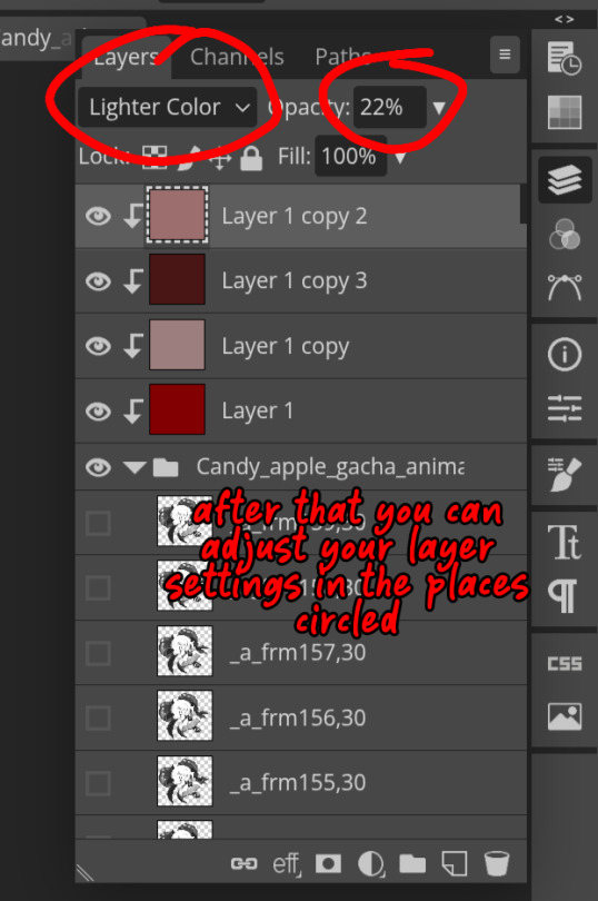
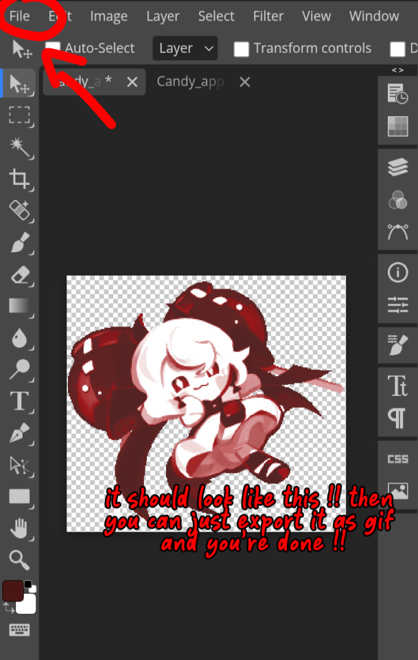
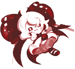
How do you clip GIFs onto masks?
[PT: How do you clip GIFs onto masks? /END PT]
Right click on your mask layer, click Select Pixels.
Click the Folder icon and then the Raster Mask icon on the bottom right. This should create a new folder.
Duplicate your gif into your project, either by clicking and dragging it into it or by right clicking and duplicating it into your project.
Simply put your gif into the folder that you made earlier and adjust it as needed. (make sure you have the WHOLE GIF FOLDER selected and have AUTO-SELECT OFF! otherwise it'll only edit one frame)
Export it as a gif and you're done.
You CAN do this with images that have faded borders, but it is important to note that gifs will make masks with any fading solid if you export it as a gif. Exporting it as a webp will keep the fading, though.
#𐐪 tutorials and help.#𐐪 from praysia.#𐐪 by praysia.#photopea#photopea tutorial#edit help#editing help#rentry resources#masks#rentry masks#how to#how-to#photopeablr#photopea resources#editblr
437 notes
·
View notes
Text

Tutorial on how I cutout my PNGs!!
I use Ibis paint X for this entire process and get all of my images off of Pinterest.

And hopefully this helps! Sorry if I didn't explain certain things well enough or the image ID text is confusing. I don't include it all too often.
#png#answers#rentry decor#rentry#puerileds#transparents#tutorials#talking#my stuff#decor#carrd decor#carrd resources#rentry resources#carrd png#rentry png#gfx#vector#vectors#graphic design#design#pinterest png#ibis paint#carrd stuff#rentry stuff#editblr#Is this enough tags
226 notes
·
View notes
Text


Hello guys! Today ill make a tutorial on how to use psds! Dont be scared, its really easy and very fun too!

First, open photopea with the image you wanna use. click “File” and press open, after that, you open your files and select your psd!


Great! Now we have the psd! But what do we do with it…?
well, first you need to check that youre on the right layer: Make sure youre selecting your psd folder before doing anything here!

great! Now click “layer” and after that, “duplicate into”

Now make sure you change it to the name of the project you wanna apply the psd to!


Enjoy your edits!
Feel free to send in an ask if you have any questions or something wasnt clear enough! Im always happy to help. See ya!

#⌗ 🍦 ⊹⁺ Marking what is mine#rentry decor#photopea psd#psd#psd tutorial#editing resources#edit tutorial#rentry inspo#editblr#rentry resources
532 notes
·
View notes
Text
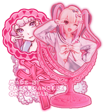
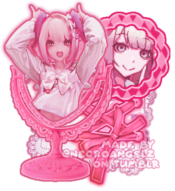
☆ ❛ STREAM ALERT !! ❜ NECROANGELZ is streaming ♡ ⁓⁓ Come watch ?
❛ i'm a mess in distress but we're still the best dressed. fearless, say yes, we don't dress to impress. ❜ —- EVE, PSYCHE & THE BLUEBEARD'S WIFE.
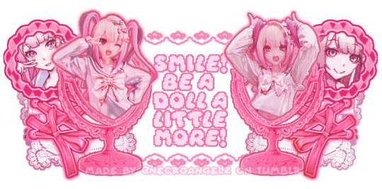
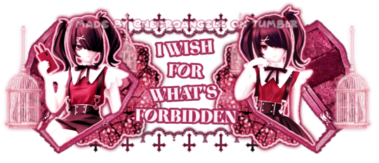
♡ NOW WATCHING : Needy Streamer Overload Graphics ☆ ⁓⁓ Enjoy the stream !!
—- semi-requested by @lavendergalactic
—- OH MY GOD. IF ANYONE WERE TO ASK ME WHAT GRAPHICS I HAD THE HARDEST TIME EDITING I WOULD SAY THESE GRAPHICS. THESE WERE IN THE MAKING SINCE A MONTH AGO AND I PROBABLY SPENT 10+ HOURS TOTAL ON THEM. THESE WERE SO HARD TO MAKE BUT THEY'RE NOT THAT BAD I THINK. ANYWAY I'M GOING TO CRY NOW.
—- alts under the cut.
—- "angel why is one of the graphics a different color-" we don't talk about that. (i had a hard time making it with the color palette i decided, ok. i toiled for four hours, ok. i had to change the colors or else i would die, ok.)
—- likes and reblogs are always appreciated. thank you for supporting the angelic streamer.
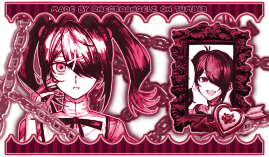
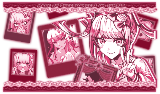
#🌠﹕ a wishing star 𝜗𝜚 ︵#👁️🗨️﹕ from the archives 𝜗𝜚 ︵#needy streamer overload#needy girl overdose#kangel#omgkawaiiangel#kangel nso#ame chan#ame nso#ame needy girl overdose#ame needy streamer overload#kangel needy girl overdose#kangel needy streamer overload#needy streamer overdose#needy girl overload#rentry graphics#editblr#rentry resources#rentry edit#rentry tutorial#rentry guide#rentry divider#tumblr layouts#nso icons#kangel icons#ame icons
690 notes
·
View notes
Note
hi! I wanted to ask how you got the outline around the moving creme a la mode cookie in your blog's banner!

haii ^_^ ofc !! i'll make a mini tutorial here :3
i'll use shadow milk as an example:

my photopea's in spanish so i'll try to translate !!
here, you have to click 'layer'

and a window'll pop up !!

click 'layer style' and another window'll pop up:

click 'stroke' .

here you can change the width, color and opacity of the outline !! then , click 'OK' .

^ if youve done everything correctly, it will look like this
finally, click 'file' > 'export as' > 'gif' . yayay ur done !!

finished result :3 feel free to send another ask if you still have doubts !!

#i love helping yeysyes#editblr#rentry resources#rentry decor#rentry dividers#rentry graphic#rentry graphics#tutorial#editorial#my edit#shadow milk cookie#shadow milk crk
117 notes
·
View notes
Text
COMMON TERMS IN EDITBLR & THEIR MEANINGS. — guide by Aria.
* this post includes long texts.

KIN / ME TAGS
usually used by fictionkins who dont like doubles. "No Kin/Me tags" means you cant tag the character in the post as your kin, nor as "you", "irl you", or similar, usually due to the OP being uncomfortable with it. just respect it.
F/O TAGS
f/o (standing for fictional other; a character one selfships with, often romantic but can also be platonic, familial, or more) tags are essentially the same as the previous; OP probably is a self-shipper (also known as Yume, but could also be a Riako) of such character, and does not want other Yumes to tag the character as "their partner/wife/husband/love", or otherwise similar terms reflecting the user having a relationship with the character.
F2U or FTU
F2U, or FTU (standing for free to use) means... exactly what you think; usage of the creation posted is allowed to the public.
NF2U or NFTU
...the opposite. usage of the work is not allowed. the OP can sometimes also add "unless [user/name] afterwards, meaning only the one mentioned can use it.
CREDIT
pretty basic in every community. leave the OP's user somewhere visible; some have preferences of how they like to be given credit, such as; Linking, (linking their post or profile to a text, usually pinned post or your bio,) @'ing them, or just Adding their user somewhere visible (again, such as a bio or pinned post.)
REPOST & REBLOG
these two have a big difference. reblog is when you click the button on the app that looks like this -> 🔁, and repost is when you save the work and post it somewhere else. never repost someone's work unless they allow it, but reblogs are always nice.
PLAIN TEXT / TRANSLATION
tons of people here use typing quirks and/or fonts that some cant read, find difficult to read, or break screenreaders, which obviously bothers them a lot. plain texts/translations are versions of the same texts that are easier to read, having no typing quirks, fonts, symbols, or whatever was making it difficult/impossible to read and such.
PSD
stands for photoshop document. can be used on photopea or photoshop. when using these, it saves the project file and when opened has each layer, instead of the flat image. the term PSD is often used for colorings that alter the colors of your picture to custom ones with settings made by the creator, but it can be used for anything.
^^ NOTE: read this please ^__^ my wording came out wrong but this kind person explained. it better
USING AS BASE
commonly used for psds. this means you cannot grab the psd, and... use it as a base, adding your own layers to it and making it your own.
if any of these are incorrect shoot me an ask and i'l change it asap. thanks.

#tutorial.pdf#sorry for long text oops#i always feel the need to overexplain myself even if im bad at it#rentry resources#rentry help#rentry tutorial#rentryblr#editblr#editblr help#editblr terms#editblr guide
60 notes
·
View notes
Note
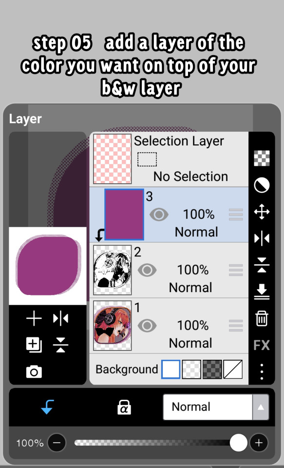
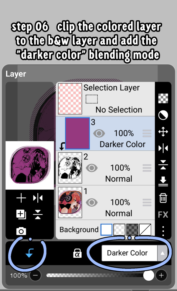
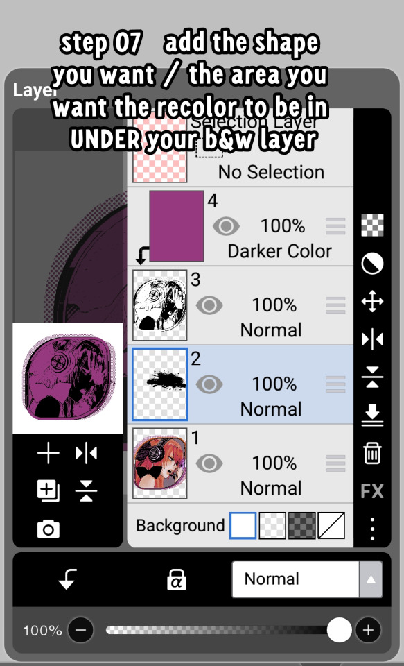
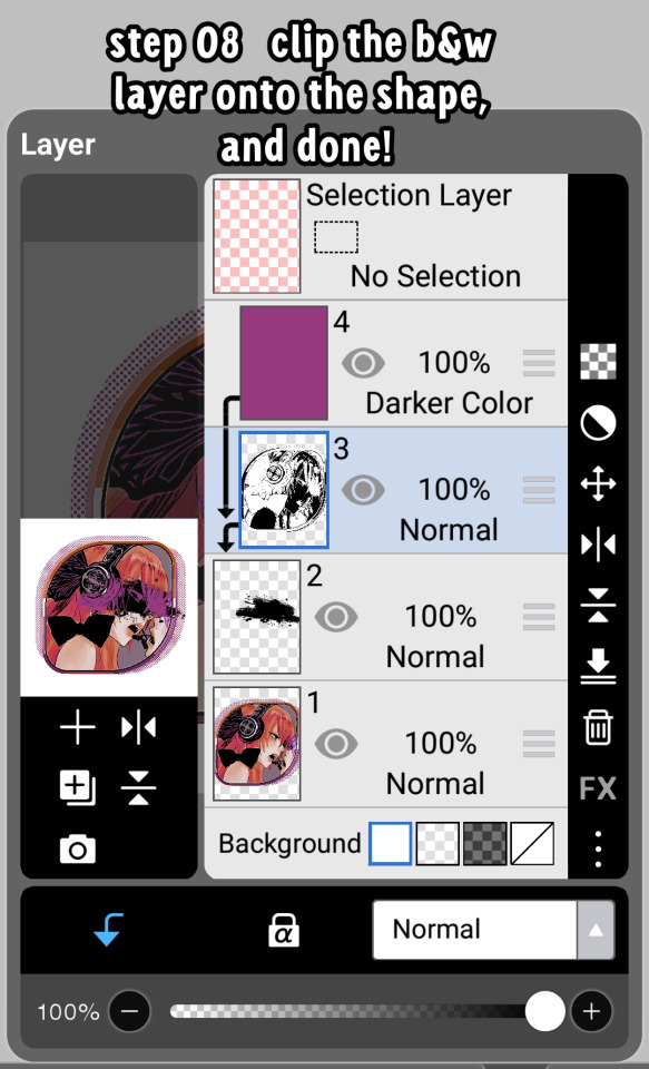
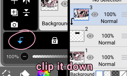
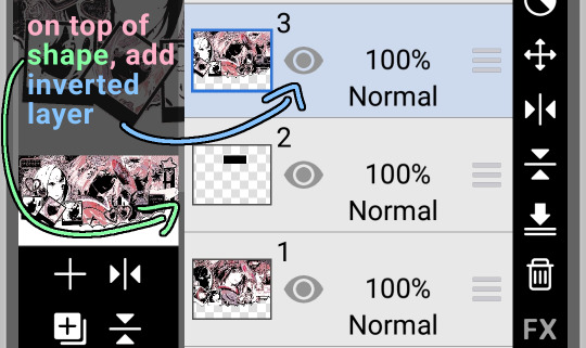
hrhfhfh i was wondering how you achieved these effects on some of your edits ?? i hope you're okay with me asking
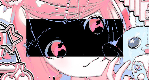
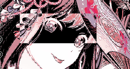
of course, of course! i just use the invert effect on photopea (although i suppose the ibis one also works), then i put the psd layer on top so the colors match
after that, i get a shape (in this case a rectangle), put it where i want the invert effect, then clip the inverted layer!
pictures / tutorial below cut
( psd is by nemuurin !!!! )


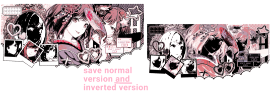
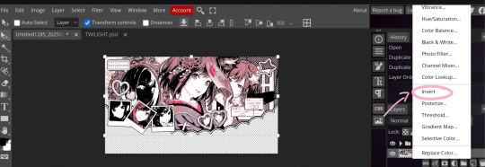
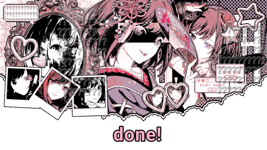
hope this clears it up :) feel free to ask any more questions, or ask me to explain in other way if you didnt understand
55 notes
·
View notes
Text

❥⠀⠀random colorings
f2u⠀𓈒⠀no creds needed⠀|⠀no id tags for toya
color palettes and tutorial below cut
transparent credits ; 01 02


#˚ ୨୧ ⋆ 。 ˚ ⋆⠀𓂃⠀𝓐⠀𝓑lessed⠀𝓖ift⠀⠀︵ ︵ ིྀ#rentry decor#rentry graphics#rentry inspo#rentry resources#rentry stuff#sntry decor#sntry frames#sntry graphics#sntry inspo#sntry resources#coloring#ibis paint x#ibis paint coloring#psd#rentry help#rentry#rentryblr#editblr#editing#colors#coloring tutorial#free coloring psd
92 notes
·
View notes
Note
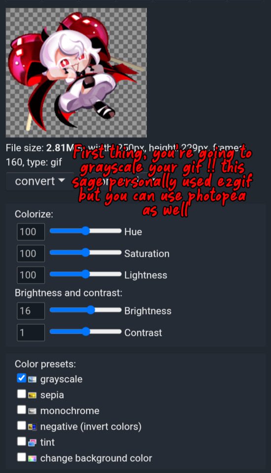
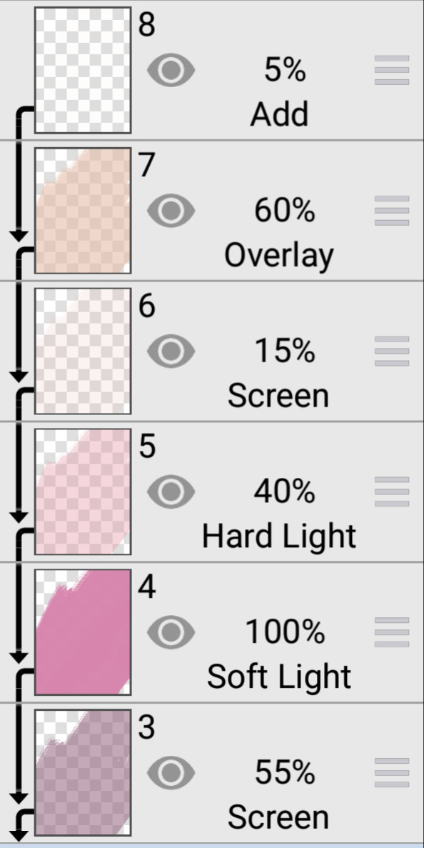
Gif colouring tips! Or what apps do you use!
Hi there! Personally, I use Photopea for all of my coloring.. But I understand it can be hard for beginners, so here’s a tutorial! Hope this helps.
#🧩 𝓓avid’s 𝓡esources ᛪ༙#rentry inspo#rentryblr#editblr#rentry decor#rentry graphics#rentry resources#rentry stuff#rentry gif#rentry coloring#rentry tutorial#rentry tuts
126 notes
·
View notes