#editing tutorial
Explore tagged Tumblr posts
Visit Tumblr Blog
Explore Tumblr blogs with no restrictions, modern design and the best experience.
Last Seen Tumblr Blogs


Fun Fact
Tumblr has a low social media market share in South America.
Text

jelly text tutorial! (works with shapes as well)
what you need: ibis paint x, premium or free version doesnt matter
step 1: color
yes we're starting with color! I highly suggest using multiple colors for a prettier finish. I prefer parallel gradiation but as long as its blurry anything should look nice. pick analogous colors for the best result.

step 2: write the text or draw/import the shape.
as it says! if youre drawing it, make sure its on a new layer above the gradient! I suggest using rounder, bubblier fonts/shapes, one of my favorites to use is starborn on all uppercase. the color you use does not matter as it will be the background color in a short bit
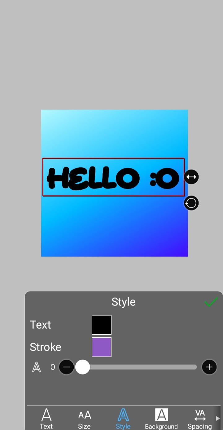
step 3, the jellificationing
this little friend called "water drop (rounded)" in effects under style is your best pal. its here to help you and make the process so much easier.
so just press it and fiddle around with it until you're happy with the result.
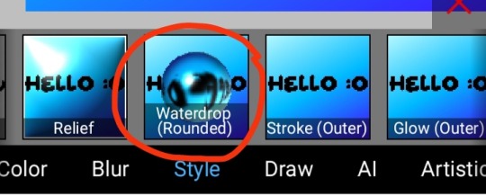
step 4 (optional): refracting
to help it make look more 'realistic' I tend to add another layer of the water drop. to do this I simply copy the previous one and go do the same effect on the top layer
step 4.5: tips
you need to make sure the refractive index for the second one is turned down all the way, or itll look weird, streaky, etc. make sure the highlight and highlight size settings are lower than the previous time you used this effect. and make sure the little sun symbol (the light source) is on the edge of the opposite direction of the previous time you used the effect. so if the first layer of jelliness had the light source coming from the top right, the second layer should br on the very edge of the bottom left.

step 5: begone, background
yeah, we're done with that, this will also be the big reveal of the final image

and then you just crop to fit and then save as a transparent
bam! heres the final thing!

I dont know how good I am at explaining but I hope this helped! if youre confused dont be afraid to ask!
#🌫️ i know what you dread | creations#rentry#rentry inspo#rentry resources#editing resources#editing#editing tutorial#edit tutorial#edit resources#rentry decor#rentry graphics#carrd resources#web graphics
602 notes
·
View notes
Note
https://www.tumblr.com/pupsec/777071487795478528/messing-around-with-layouts-and-shit?source=share HOW DID U DO THE COLORINGGGGGG I LOVE ITTT CAN U SHARE PLEASE AND TYY
[EDIT 235 GODDAMN NOTES WHAT THE SHIT.]
hi! i am happy you liked it 💗💗😭😭
unfortunately it's something i cannot share because, well, it's something i worked a lot for.
it's not that i dont encourage inspo/asking for help, it's just that with experience you find a style that's unique to you and expresses you!
however, here are some really good overlays i reccomend using for a similar style!
remember to grayscale all of them before you apply a blending mode! that's what i mostly do, no pressure.


example:

if you want a tutorial for how to use blending modes and stuff, and how to mess around with filters, do let me know!
#♡̵ ⠀⠀・ ⠀⠀pupsec ⠀⠀ᜑ⠀⠀💗꣒#♡̵ ⠀⠀・ ⠀⠀edits ⠀⠀ᜑ⠀⠀💗꣒#♡̵ ⠀⠀・ ⠀⠀requests ⠀⠀ᜑ⠀⠀💗꣒#♡̵ ⠀⠀・ ⠀⠀resources ⠀⠀ᜑ⠀⠀꣒#rentry#rentryblr#rentry resources#rentry stuff#rentry icons#rentry overlays#rentry overlay#overlay#overlays#editblr#editblr resources#editblr help#editblr stuff#editblr tutorial#tutorial#rentry tutorial#editing tutorial#hyacine#hsr#hsr hyacine
282 notes
·
View notes
Text
MY GO-TO'S FOR EDITING.
I’ve decided to put together a masterlist of the resources I use, since I get asked about them pretty often. If you're somebody who can’t commission resource makers or you’re just wanting to get into editing or creating commissions yourself, I hope this helps.
pinterest. IMPORTANT NOTICE IF YOU UTILIZE THIS: avoid usings people's art; if you can get permission from an artist to use a piece, that's another discussion. Be warned there may also be ai mixed in, which I've personally got a good eye for spotting; i prefer to go by images i've seen long before the ai craze, since i've been on there for a while. your best bet is looking through miscellenous character boards. From there, you can choose images to blend or even make pngs out of, to give unique flare to your edits.
remove.bg + photokit. if you're looking to save time or don't have a way to cutout images manually ( i sometimes like to use my art tablet if I want to be really precise ), these are good ways to make pngs out of images you find, as opposed to png sites. i prefer this because ive caught adware on png sites before, plus there's also a lot of ai on those as well.
for screencaps, i use google images or youtube, since the quality is higher than anything on pinterest...though, psds are what normally cover up quality issues, from what i've learned. then again, it might depend on the psd. IMPORTANT NOTE IF YOU UTILIZE THIS: If you’re using google Images, searching for actual screencaps might lead you to blogs or websites dedicated to capping—many of which ask for credit if you use their content. Also, avoid reposting people's edits or gifs, since those will inevitably show up when searching faceclaim names and similar tags. on the off chance you find free-to-use faceclaim content, be sure to credit if/when asked !
photopea. it's a great alternative for those of us who can't be assed to learn adope, nor can afford it .
I know it doesn't look like much, but this is genuinely my go-to formula. I don't think there's any need for anything over the top. That said, if you guys have better alternatives or anything to add, feel free—this is just based on my own experience.
ADDITIONAL EDITING TIPS: If you find yourself stumped creatively or unsure how to approach using these, I’d recommend breaking down the character or setting you’re working with in terms of aesthetic. What are some keywords or imagery you associate with that muse ? Take a character like h/arry p/otter, for example—focus on individual visuals, important symbols, and signature colors. For him, I’d think of round glasses, lightning bolts, owls, candles, spell books, brooms, etc. Then, take each of those elements and explore them individually. I’d maybe start by looking up “owls” on Pinterest; from there, I might find images that can be turned into pngs. Repeat that process with every vibe or detail that comes to mind. You don’t have to limit yourself to making pngs either—feel free to experiment by blending different images together and building a look from there.
ADDITIONAL UPDATES/RECOMMENDATIONS:
Screencapped ( * will need an account )
VLC Media Player ( * good for screencaps / things you've downloaded from youtube )
#re: editing resources#free to reblog!#for the other anon i got#roleplay help#roleplay resources#roleplay community#rp graphics#rp resources#editing resources#editing tutorial#ish
75 notes
·
View notes
Text
Photoshop Tutorial #2 -
Paint Tears


This is the easiest thing in the world! You can do it in a minute. This is for anyone new to editing in Photoshop
Okay! Starting off by opening my pic in Photoshop - I'm choosing this one of a sadboy

I'll simply create 3 layers

grab a brush, set it to white,

and on the first layer, I paint some tear shaped blobs in the characters eyes - I'm just doing whatever, as long as the shapes are round and bubbly in some way, it's okay.

now, I'll set the opacity of that layer to around 25%

on the layer above, I want to draw some simple, round highlights with the same white brush

and set the opacity to around 30%
Finally, on the last (top) layer, I'm grabbing that same, white brush and making it really small - like, 2px.
Shortcut to increase & decrease brush size is [ and ]
and I'm going to paint some lines around the tears. Not all the way around, just kinda, artistically around some of the edges, and leaving other edges open.

now, I'll set the opacity to around 50%
I'm happy, so I'll flatten the image and save!
and that's it!
Here are the three layers isolated, just so that you can see.

2.

3.

and combined

Hope this was helpful!
Good luck!
#sims 4 tutorial#editing tutorial#sims editing tutorial#sims 4 edit#photoshop editing#photoshop tutorial#sims 4 community#simblr#sims 4 photoshop tutorial
144 notes
·
View notes
Text


hiii i’ve been seeing these really cute edits ↑↑↑ all over my pinterest and i really wanna start making them too but i have no clue how to do it (。•́︿•̀。) i don’t know where to get the pngs or what app to even use and how to do everything on there, there’s literally no tutorials anywhere,,, can anyone help me please (ᵕ̣̣̣̣̣﹏ᵕ̣̣̣̣̣) i’m not the best with written instructions so if anyone is willing to help, is it okay if you could send videos doing a step by step tutorial or something? i’d really really appreciate it (˶ᵔ ᵕ ᵔ˶) ♡ please dm me if you can help, i have discord and everything !! i think the style is called fakeland or something like that, i’m really new and wanna understand it ༎ຶ‿༎ຶ i’m super interested and i really wanna learn more about what it is and how I could be apart of the community ♡ if you know any spaces or communities where people share or make edits like these (cuz I have no idea what it is) , please please share them with me
꒰。•ᴗ•。꒱ thank uu sm!! ♡
creds:
@eunpuertoamor on pinterest
@igaridoll on pinterest
@tiernocafe on pinterest
@besitosweb on pinterest
#editing help#pinterest#kpop#pngs#aesthetic edit#editing tutorial#png pack#dollcore#kawaii#pink#soft edit#ibispaint#coquette core#couqette#soft aesthetic#le sserafim#njz#triples#miss tada#kpop moodboard#kpop icons#soft moodboard#kpop layouts#kpop roleplay#fakeland
38 notes
·
View notes
Note
hello! do you have any tips for creating your own psds? right now I'm just sort of throwing things at the wall and hoping it sticks!

Hi hi nonnie! I am NOT the best person for you to ask this (not in a miiile) BUT I tried making this in the most concise way I could and prayed to god it didn't get too confusing since a lot of the times I too just throw things at a wall and call it a day. I'll teach my usual psd making style and a more general one just in case that's what you were looking for! They're under the cut since it probably will get a tiny bit long but I hope it's helpful to you! <3 as always reminder that there is no correct way to make a psd this is just how i do etc etc
This has a lot of text and images so beware of the big scary maica


First of all: While you certainly *can* make a psd based solely out of one image or a compilation of your own edits (as i have done on the past), I'd say in general it's more useful and easier to make something when you have more than a singular image to check and a color spread to use. I made this little template in 5 minutes (which is a lie because my photopea crashed at first and so I had to re-do it) and I'll link it here alongside the psd itself so you can poke around and check how I do things! If you want to do your own template or anything, though, here's the color spread I use! :]

It has a spectrum, a bar line and some skin tones so it should be helpful! You can also use Travi3sapsd swatches if you'd like, since I know some people would prefer having a view of the colors before and after the psd to check!
Talking about skin tones, Amemcth also has a nice collage with characters of varying skin tones so you can check how your psd look on different skin tones. I don't think it's obligatory for all psds to look fine with every skin tone, however, I think if you're not doing it for a singular character and are indeed posting that psd for public use, making it work with darker skin tones is something good and that I encourage. If it doesn't work, remember to always indicate it by adding a "Works fine on most skin tones" or "Doesn't work on poc characters". Those warnings can also be useful for other things, like not indicating the usage of the psd on irl pictures, cartoon pictures etc.
So, final thing before we get into psd making itself (if you are using a image mask template to check colors) is adding the images! I always recommend adding characters from different sources and irl images to be sure, and with either varying colors across the spectrum so you can be certain the psd is working nicely OR images that feel similar enough in vibes so you can be certain the vibes of the psd are going towards where you'd like them to. However, it's also important to consider which colors you will be working with to make the psd, since I think it's easier to make a psd for a character when you have something in mind. For my own psds, I usually limit myself to a maximum of three colors + black and white (which I'll mess with to change their tones), so for this tutorial I'll be using yellow, purple and pink! This is the where we start. (I won't be trying to keep skintones working for this since it's all pale characters, but please have the common sense to make psds that work if you're editing a black character. don't make them white and for the love of god don't make them grayish)
Also reminder before anything that if you're editing a card and that card works weirdly with the psd you can always add adjustment layers to the card itself and mess up with the hues on it hashtag editing some characters just are a pain in the ass to edit because of colors being too similar etc so don't be afraid to fight them

First: Make A Folder for your psd to be built on. It makes things a lot easier to drag around once you have it done and arranged. Name it after the psd name, name it psd folder, whatever, just put your layers under that folder. Onto the layers.
My autistic ass mostly does psds only following one single pattern, but in case you want to mess around and play, feel free to have fun and mess around. A lot of psd making really is just messing around. In my case, these are the main adjustment layers i use: Threshold, Selective Color, Hue/Saturation, Photo Filter, Color Balance, Vibrance and, on occasion, Gradient Map and Curves. You can use others but I am >not< the best person to tell you what they do and how to work with them.
So, you now have your pretty little image layout down and the colors you want to work with in mind (pink purple yellow + bw), so what now? Well, I usually like to think on which direction I want to take this psd towards. People will always have different methods and directions on psd making. Some of them like to make some of the most eyestraining things I've ever seen which somehow work, some of them like to make a pastel so bright I can feel my eyes burning, some of them prefer to make desaturated tones, some of them like to lower the vibrancy of the image so much I almost can't see shit. Everyone has their own preferences and I work w pretty much anything, but for this I'll try to keep a standard bright view, if a little pastel and desaturated, for this.
So now, we have our colors, our images, our color swatches and a direction in mind.
First thing I like to do whenever I'm making psds is to add a threshold layer. However, not in the way I usually see around editblr. When you add a threshold layer, it should look like this

Don't just do that. Go there on that little normal bar and click it. I know people who use others, but I usually settle with either Multiply or Soft Light for it, then lower the opacity down until it's somewhere I'm satisfied with.


So this is where we end up at. I don't let my threshold opacity go any higher than a 30%. threshold basically serves to bring out the shadows on your images and bring out the shapes on them. it helps make the focus on the image clearer yadda yadda yadda. Be careful when using it on darker images, but for brighter ones it sure helps w making everything easier to see.
After adding a threshold, I add my Selective Color layer. With this you'll basically be playing around with the sliders until your colors look the way you want them to. This messes *slightly* with the hue without fully changing them (we'll get there soon), so it gives you some chance to balance out the initial shades of the psd. For the current method i'm teaching (focused colors), i usually recommend you to make the colors you >dont< want on your psd brighter or in a shade that still feels coherent with the colors you dont want in it. we'll be dealing with them soon.

So we get there. HOWEVER! don't think we're done once you mess with the main colors. the 1st selective color white is, what i'd say, one of the most important parts of psd making. you know how most anime characters in gacha games these days look pale white? Yeah. this can change it. What i usually do is bring the black slider on the white layer to the right and then increase a bit of the magenta and yellow. Boom.

It's quite tricky to use on images with heavier shadows, but for the standard pale white anime gacha character? it helps give some life to them. its quite subtle, but can help a lot to make the image get more lively. A counter thing to this is that yeahhh this can mess a lot if you want to make, you know, a >white< psd since it will also mess with the white tones themselves, so there's no 100% settled need to mess with it, just keep it in mind in case you wanna make the character a bit more tan or, you know, have a normal skintone. It also helps a lot with defining shadows, so keep it in mind :]
I usually don't mess with the neutral since it can fuck around a lot w skintones and, if i do, i always make sure to keep them on less than 20% for all levels. be careful when playing w it.
Black is a tricky one. I know a lot of you pastel girlies across editblr and psd making communities like turning it all the way down so theres no black but honestly, contrast is important. I usually make sure to bring the black scale to the right and then mess around w the other three so the black is still visible and bringing contrast to the image, but w the help of the other three, make it so the black looks softer and matches the psd itself. So, here we are!

After the selective color in my psd process, that's where we erase any unwanted color and shift the hues to where we'd like them to be. Make a hue/saturation layer and go to the colors you dont want (in our case, green and cyan) and move that hue slider to a color you want babyyy. I encourage to mess around with the color scale on the specific color so you have more power over what colors change or don't, in case it's messing with colors close to it on the scale (cyan messing with greens, greens messing with yellows etc). Be aware that doing this will fuck uppp certain images with those colors, cry about it for a bit, and go back to making your psd

If you're a picky mf just like me, you WILL add 1 or 2 more hue/saturation layers to fully clean that bar of any color you do not want. If you're normal, you'll be chill with how this looks and call it a day, so onto the next step.

After arranging your colors and possibly finding out how green is an absolute shit color to try and erase traces of, we get to color balance which is, well, where you balance the colors. go around and mess w the scale until your colors lean more towards what you want them to look like. I personally don't mess much here and the difference will be suuubtle subtle, this is more if you're just picky with colors like me and want them to look perfect in the idealized version of the psd you hold in your head.

Photo filter will basically bring the whole thing together. It serves as a filter to bring eeevery tone you have going on into a cohesive line. Always remember to lower down the density of it so the other colors are still noticeable. a lot of the time i will add more than one photo filter and play with it until I'm satisfied with how it looks <3

Then this is the time where I'll usually add ANOTHER selective color layer just to mess more with the tones and finally get them down to where I usually stop playing around.

A few more touches and you should be done! I really don't know how to even explain curves and gradient maps so play around with them for a bit and you should at least understand how they work. One thing I do a lot with my psds is make toggles to make colors darker/bring more focuses etc etc, so if you're someone who struggles to make decisions, toggles might be a good thing to add to your psds!
Now... If you don't want to limit yourself to a set number of colors? Quite simple! Simply skip the hue/saturation layer steps or delete them altogether once you're done with your psd and there, a psd that plays with the tones of the image to make them more harmonious while keeping everything cohesive! You can mess around a bit more on the two selective color layers you have if you do this by deleting the huesat layers, but it should generally look pretty nice still!

This should be it! So, to summarize everything Ive been yapping about so far...
Before diving head in, decide if you want to limit your colors or not. Also decide on a set type of psd (bright, pastel, desaturated, dark...) you want to go towards
Use multiple images to make your psd, either with similar vibes so you can ensure it's becoming something you wanted or with varying colors so you can cover your ground
Use a threshold layer with lowered opacity before anything else so the shadows on your images have more contrast
You can use a selective color layer on the white part to darken pale characters skintone and bring some more life to them, but be careful when doing this because of cards with heavier shadows, if you want to keep white as a color on the psd etc
Don't lighten the black part on the selective layer as that messes with contrast and might make your psd harder to comprehend when looking from afar
Try to still make your colors distinct enough so you're able to tell apart shapes if from afar, it can be a difficult thing to do but it helps a lot with readability
Don't be afraid to go back and forth between layers! If you're on a photo filter layer, you can always go back to make a specific color more prominent if you miss it overall
Use hue/sat as a way to change colors you don't want instead of replace color. It's tricky, but it covers more ground
Use photo filter to bring all colors more cohesion and make it so they look more harmonious
Have a headache trying to work around cards with harsher shadows
DO NOT make poc characters gray or straight up orange/red for the love of god
Feel free to make different toggles for your psds if you can't decide on which path to go towards, you can always duplicate layers and make different paths depending on what you want!
If a specific image you're using has difficult shadows or different tones to work around with the overall set, you can always just mess with that image alone and make adjustments to make it work out with the rest of the set
Remember that psds work differently on photopea and photoshop, so make sure to check that out if making them/using them/posting them anywhere and make it clear for which app they were made for!
Good luck with psd making and have fun overall! <3
Here's my psd test yet again if you'd like to mess around with it! Just don't repost and it should be fine ^^
47 notes
·
View notes
Note
Where do you get pictures for your edits?


Hi there! For my edits (Be it lockscreens, Moodboards or even the occasional Profile Picture) I tend to get them from Pinterest, and have been getting them from there since I was a teenager and first started getting into editing.
However I do admit, that it it has become a bit more difficult in the past year as Pinterest has started to add more and more AI generated slob to their site. So I have also started following some aesthetic pages on Instagram or I occassionally browse through google images to find pictures that would fit the theme I am going for.
Hope this helps. If you have any more questions or wish to get into editing yourself, feel free to ask!
#ask#asks#editing#editing tutorial#edit#moodboards#transformers#maccadam#maccadams#fairy tale au#fairytale au#megop#pinterest
23 notes
·
View notes
Text

𓆩♡𓆪 transparent png tutorial ˖˚
꒰ step one ꒱ ↳ first, find an image or two on a search engine or pinterest/something like it. if doing images from real life (not art), try to use images that don't have noticeable lighting. for example, product images with white backgrounds are best rather than product images in a real life setting with strange lighting.
꒰ step two ꒱ ↳ either copy and paste the image or download and upload the image into remove.bg. use erase/restore as needed.
꒰ step three ꒱ ↳ you're done! pretty simple, huh? good work \(^_^)/

#carrd graphics#rentry graphics#rentry decor#rentry resources#carrd resources#png#transparent png#pngs#transparent#tutorial#rentry tutorial#graphic tutorial#editing tutorial#transparent png tutorial#transparent tutorial
38 notes
·
View notes
Text
How to make icons like these:
Flags: Idol system, Bubblegender, Musicstar
Warning: This tutorial relies on the idea that you have some understanding of how to use photoediting software like photoshop, however if something that doesn't make sense then feel free to ask and I will explain it as best as I can.
All the icons we made for this can be found here! Thank you for reading, please consider reblogging this post and the icons because this took forever to write up and the icons take a LONG time to make.
In this tutorial I will make DID/OSDD Aoi Miyake icons.
Anyway let's get into it!
Step one, choose what you're going to make (and gathering resources)
This may seem obvious, but going in with a plan makes these so much easier.
In this stage we consider three things:
The flag and/or colors we want to use in the icon, this is important as it can affect the images used or even the character depending on how similar their colors are
Character and the general colors associated with them, this is important as it can makes the filtering stage easier (or harder) and can make an icon look 'wrong' or 'right' sadly
The border of the icon and how that will affect the icon itself, sometimes they're easy to work with, others not so much. Our method differs from a lot of other peoples so we take more time with them than most others
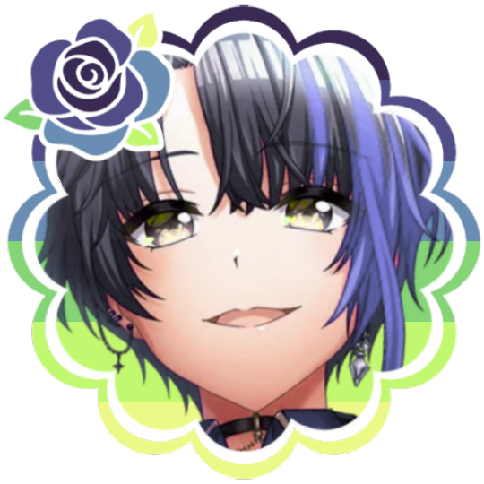
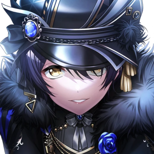
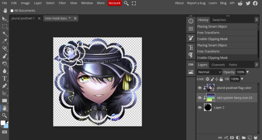
In this case I will be making DID icons of Aoi Miyake from D4DJ, however due to how most of her cards have a blue tint I will be using the plural peafowl flag by m0dem0n than the original DID flag- This is to save time and make th icons look more harmonious.
We will also be using this mask by i'mjustchillinghere as the icon base


Step two, coloring the middle image (optional step)
This is a lot of guess work and everyone has a different process for this. Essentially we're going to make a PSD that makes the image look better with the colors of the flag.
As shown above we have the flag and the character image, but they don't match completely. The rose and other blue accents are too saturated compared to the flag and the black is too black and the wrong blue hue, the eye could also be a bit greener and saturated imo.
What I like to do is open the image with the flag behind or infront, so I can see the colors I'm working with.
Then I open the hue editor layer (Layer > New Adjustment Layer > Hue and Saturation). It's very important to clip the hue layer to the image so it doesn't start messing with the colors of the flag (we've had this happen many times before it's very awkward trying to match a color that keeps changing) to clip right click 'Clipping Mask'.
Your screen should then look like this:
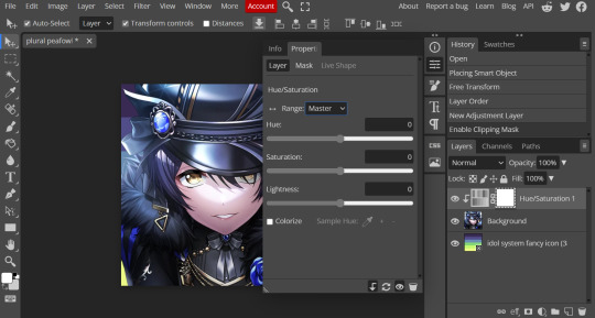
Okay so if you need to adjust the screen to get the icon in the center so you can see everything do this now.
Next where the box with the hue options says master, click it.
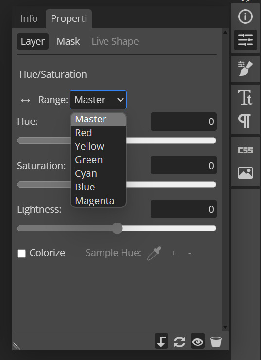
These are all the color options you can change, in this we'll mostly be using, yellow, green and blue. For other projects blue and cyan sometimes get 'mixed up' and can control both shades so be careful with that.
Other color settings we personally use are: Vibrance and Selective Color (both are located under the Layer option), but in this case I'm happy to just use Hue and Vibrance.
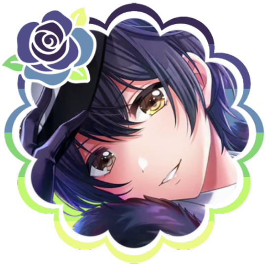
This is what the icons look like:
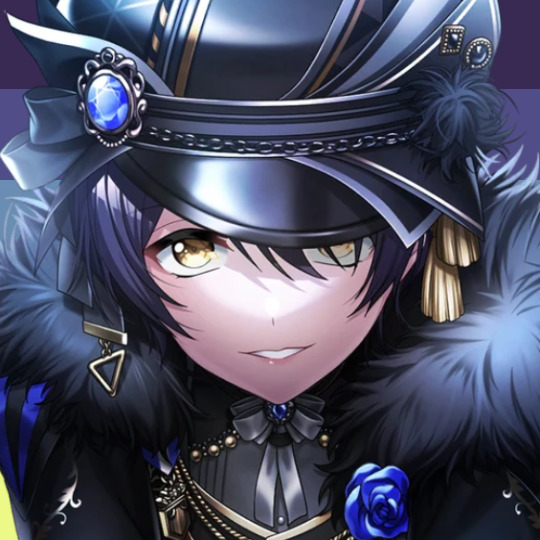

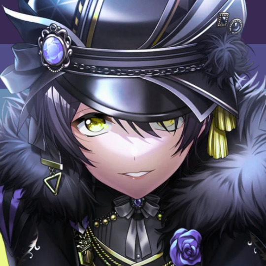
No color editing | Just Hue and Saturation | Hue and Saturation + Vibrance
Now your middle icon is ready turn off the background layer and save the image as a transparent png!
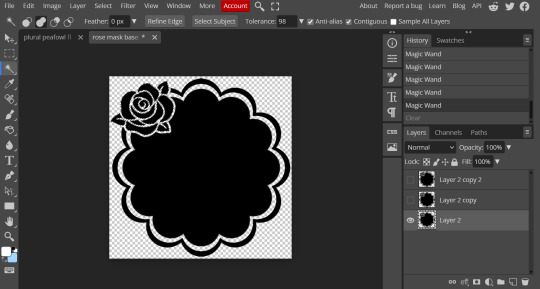
Step three, preparing the mask for use
So the mask is the base of your icon, however if you clip all aspects of your icon to the mask it looks like this and you can't see the flag.
So what you need to do is layer the mask. This will vary in difficulty, it can depend on how far apart the pieces of the mask are and how they interlink. You could erase the border parts but that takes a lot of time.
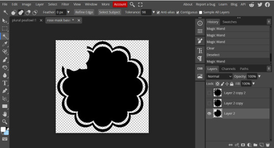
This icon is simple because to me there's three clear sections, the middle part, the border and the rose. What you need to do is copy the layer three times and get the wand- I would reccomend having the wand strengh over 100 or else black lines may remain, but this will depend on how close the black parts are.
Hide the top two layers and work from the bottom up. Select all the areas you want to delete, in this case I can only delete the rose (the border is too close to the middle part and would delete that as well) and then hit delete.
In this case, I will just erase the border by hand, and then BOOM, you have a base!
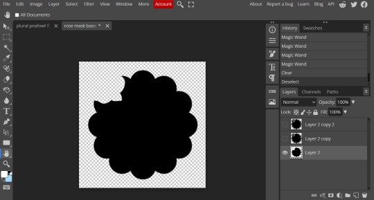
Hide this layer and move to the next, for this one I'm removing the middle and the rose.
For the next layer you can select what's in the layer below and delete it without it impacting the border, which makes the icon process easier, however in this case I'm going to give out the border layers for you here!


Step four, using the mask
NOW you can clip the flag to the layers! We always clip it to the base and border layer.
As for the rose... We make a seperate layer and clip it to those rose. Then (using the eye dropper tool) pick colors from the flag to use to color it in! As shown:
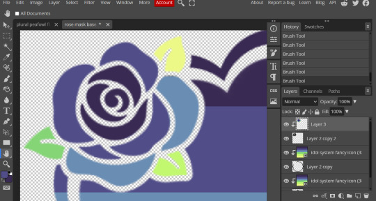
Next step is to add the image you colored!
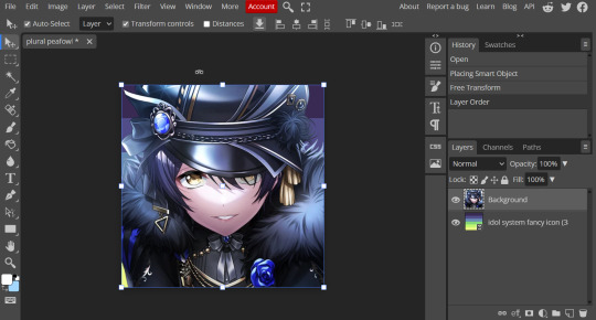
Go to File > Open and Place and then choose the PNG from your gallery and place it in the icon. Once it's there fiddle around with it until you get the image you want and then BOOM!

Now you have a singlar icon!
Feel free to repeat this as many times as you want and make as many icons as you want.
-
All the icons we made for this can be found here! Thank you for reading, once again please consider reblogging this post and the icons because this took forever to write up and the icons take a LONG time to make.
98 notes
·
View notes
Text

Updated Fanlore Editing Tutorial
We’ve just introduced a shiny new editing tutorial to the Fanlore wiki!
If you’ve noticed that the wiki is missing a page for a fandom you’re in, or if you’ve looked at a Fanlore article before and wondered how to add something to it, now’s your chance to learn how you can contribute to documenting fandom history!
This new tutorial covers the basics of editing pages on Fanlore using both wiki markdown and the new visual editor, including formatting text, adding links and new sections, as well as an introduction to discussing edits, asking for help and suggestions for places to get started with editing articles.
Check out the tutorial at Help:Tutorial on Fanlore!
----
We value every contribution to our shared fandom history. If you’re new to editing Fanlore or wikis in general, visit our New Visitor Portal to get started or ask us questions here!
41 notes
·
View notes
Text
HOW TO MAKE FADING GIFS. — tutorial by Aria.

like this ⬇️

STEP 01: have your frames—your frames are the images that will fade into each other. in this case i'll only use 2, but feel free to use as many as you'd like. ( note, do not save them like i did here ⬇️ lol, thats just to show my frames. )

STEP 02: open ezgif (linked to text). specifically the section labeled as "gif maker".
then, click choose files and pick your frames from your gallery.

STEP 03: after picking your files, it'll appear as [amount of files] files. scroll down and click on "Upload Files!".

STEP 04: wait a moment for your files to load. then, you'll get this screen. in the image i explained the basic stuff, but i'll explain it here too.;
Delay Time: how long each frame will last.
Crossfade frames: whether the frames fade into each other or just turn from one to another without transition. check the box if you want them to fade.
Don't stack frames: check this box if your frames have transparent background(s). if not checked, when frame 1 turns into frame 2, frame 1 will stay in the background—stacking the frames.
you can drag the files / frames to your desired order.

STEP 05: click "Make a GIF!". it may take a while to load, but then this will appear under. just click "Save" and wait for it to save to your device.

and finally, you're done!!! go fuck around with your gif sure orrrr something. anyways follow me i like notifications
#tutorial.pdf#rentry resources#rentry tutorial#rentry help#editing help#editing resources#editing tutorial#gif tutorial#tutorial#rentryblr#editblr#rentry
11 notes
·
View notes
Note
WAIT OKAY last annoyinf ask SORRY T T .. can I ask how you got like the dot / comicky effect ??? If that makes sense I can explain it more if it's confusing T T
IT’S ALR I DON’T FIND THESE ANNOYING!! I love answering questions ❤️
TUTORIAL UNDER CUT
OK SO IMPORT A DOT OVERLAY SIMILAR TO THESE (I assume you use ibis)


Next, go to ‘layers’ and click the three dots. Select any option that says ’clear white’! This only works if the dots are black. If they’re white instead, then invert them! If your overlay is transparent, skip this step!

Now, clip it onto your desired image

Click ‘normal’ and then select the ‘overlay’ option!

And now you have your finished image! Feel free to play with opacity or erase dots in some areas, your choice!

#──୨ৎ sichuan master#──୨ৎ the conversing heir#──୨ৎ a wistful smile#Tutorial#editing tutorial#edit help#editing help#edit tutorial#editblr
9 notes
·
View notes
Text

tada! as requested by anon & since this is one my frequently asked questions i thought i'd finally make it a proper post! ദ്ദി(˵ •̀ ᴗ - ˵ ) ✧

first things first, i use photoshop cc 2018 to edit & with just a keyboard n mouse. my editing is HEAVILY inspired by the amazing stellarfalls !! i'm also still experimenting with things so i'll try to keep this up to date ♡


first i use smooth sharp (no topaz) then i will sometimes mess with curves if my photo is too dark to begin with. then i add my lighting which is just drawing on an overlay layer with a round soft brush :3

(sorry for the weird cropping i was recording the wrong window</3) i'm not a pro at lighting LMAO but i'll put it roughly where light would hit from the surroundings so here would be the fireplace, there's also a lamp behind them. i change the opacity so its not as drastic! for this step & the next i usually lean towards very light yellow, orange & pink for my brush colour!
next is the fun yet most tedious part, specific highlights! the most important part here when you're not using a tablet is shape dynamics > fade under brush settings (smoothing is also your friend as well!) this entire part is trial & error, you basically just outline the sim where light would be hitting them! when i'm done i use the blur brush, make it fit the entire image & click twice. i know that's like super specific it's just what i've found looks best so far •ᴗ•

hair strand time hair strand time!! i'm still not really satisfied with them yet (think i'm just being overly picky tbh LMAO) but this is how i do them now. basically following literalite's old hair strands tutorial, fade is once again your friend! i use a clipping mask to change the colours (˶ᵔ ᵕ ᵔ˶) i just use an edited photoshop brush & you can find the settings in literalite's video! but here are some nice hair brushes if you want more variety! x

finishing touches baby! time for some dust & noise ( ˶ˆᗜˆ˵ ) this gif shows a whole lotta nothing but i like consistency! anyways, what i'm doing is just sizing the image to fit then changing the blending mode to screen, i usually change the opacity to about 60% or 80% ++ i add 1% noise to the image!

and tada! we're done~ ദ്ദി(˵ •̀ ᴗ - ˵ ) ✧

but what about my older posts? all i used to do was add the butter action along with smooth sharp still + dust overlays! up until very recently i also added crinkled paper overlays to my photos

for overlays (things like moodlets, pop ups & text) the most common things i use are bunnithechubs' moodlet psd's! & buglaur's tutorial for text, i used this tutorial for pop ups in my older posts as well! other editing things i may use can be found at my resources page ♡
and now we're completely done, i hope that answers everyone's questions but if you still wanna know something or you're confused please feel free to send me an ask! ヾ(˶ᵔ ᗜ ᵔ˶)
#resources#editing tutorial#please forgive the cropping</3#also sorry for any grammar mistakes or anything like that (˶ᵔ ᵕ ᵔ˶)
36 notes
·
View notes
Text
PHOTOPEA TUTORIAL / PHOTO FILTER FOR SKIN TONES:
a tutorial on HOW TO BRING OUT SKIN TONES if an image is 'too gray' (faded) or has too much of one (likely over saturated) color! this technique can easily be applied to icons that already have a border ! just put your focus on the base image / icon ! this works on relatively anything, including poc and non-poc. WHAT YOU WILL NEED: photopea...and your desired your base image(for example, i'll be showcasing inconsistent or otherwise dark/faded scene lighting, like twilight and saw). DISCLAIMER: not all lighting/images are the same, nor are psd colorings. while some colorings may be designed to bring out reds/yellows(which is the filters we'll be using in this specific example), others may mute them and you may have to improvise with whatever color the psd you're using is designed to focus on. this is just a general idea, you will have to explore as you see fit. it's all going to depend on your personal taste !
by the end of this, you should be able to manage results like this !

cool, huh?....anyway, on with the mechanics !
EXAMPLES:

[ BEFORE PSD ] [ SYNOPSIS ]
#01 / LEFT IMAGE ABOVE: too much green, becomes muted with psd and doesn't show variety. #02 / RIGHT IMAGE ABOVE: the colors are very faded in this scene, and the pink focused psd in question made the image seem gray. we will start with EXAMPLE #01. i will be using the same PSD on both, a custom psd i made and focuses on reds/pinks.

as you'll see above the PSD has now been applied...but now it's kinda boring :// (there's nothing wrong if you don't mind how it is above, everyone's got their aesthetic choice—HOWEVER, we're aiming to add skin tone...)
once you have your image open, you'll want to go to image>adjustments>photo filter; i went ahead highlighted it in yellow for easy finding !

since this psd DOESN'T mute reds/yellows, (and those are usually the base of most/general skin tone combinations) i applied both a yellow and red filter. now, these colors i'll be using in this example, because they're in my default colors on the photo filter option—you can totally choose lighter or darker variants of these colors, or like i said, a different color altogether based on how the PSD you're using works. the toggle setting doesn't have to be exact to this example either—this is just what worked best on this image combined with the chosen PSD ! // RIGHT IMAGE IS THE FINAL RESULT AFTER APPLYING THE RED FILTER AFTER THE YELLOW.


repetition on a different example . . .


this scene in particular is very faded, and the red feels a little blotchy/over saturated here...so i'll show you an EXTRA STEP you can use ! in saying this, you don't have to do exactly this; you can even choose to go ahead with selective color to fix your image, without doing the filters, if you find that suitable. but i'll be showing you the magic of selective color to balance out the red toned overlay.

same concept as before, just a different selection: image>adjustments>selective color. think of selective colors as "balancing" the colors. it does have a toggle selection for each color, which is super helpful, including diminishing or adding white highlights. given the PSD colors, naturally, i'll be focusing on yellow and red.


it's now got a general skin tone and red is not as blotchy !
[ FINAL RESULTS / CONSISTENCY WITH PSD APPLIED ]

this is a great hack i use quite a bit, it's great for maintaining consistency in your icons when the lighting is working against you...hope this was comprehensible and helpful, happy editing !
#* RE - RELEASE#* MY TUTORIALS.#sorry i didnt realize i forgot to reupload this one!#long post /#FREE TO REBLOG !#rp community#icon tutorial#rp icon tutorial#psd tutorial#roleplay coloring#roleplay help#roleplay resources#roleplay community#roleplay graphics#coloring psd#psds#icon psd#psd#roleplay psd#rp graphics#rp psd#rp resources#tutorial#editing tutorial#rpc tutorial#editing resources#psd coloring
254 notes
·
View notes
Text
Photoshop Tutorial #1 - Change Background & Add Reflections
Before & After


You will need
Photoshop
Internet Access
I was inspired to make this tutorial after facing a dilemma in my game. I wanted my sims to swim in Brindleton Bay, but, shock horror, the water there is not swimmable. Luckily, I know how to change the background of my screenshots to make it appear as though it is - and I'm going to bring you through the process of how!
Starting off, in game, I brought my sims to Tartosa and got my desired shot. Then, heading over to Brindleton Bay, I got some shots of the horizon that I wanted as a backdrop.
Here's a picture I took:

Okay! Let's open up Photoshop!
For reference, I have Photoshop 2024, but most if not all of the features I've used should be included in older versions too.

Here's our image! Now I'm selecting the Background layer in the layers panel and press CTRL J twice to create two duplicates.
I'll turn off the bottom two layers for now, (by clicking the eye button, for newbies) and go to the properties panel. this should be on the right hand side, above the layers panel, but if it isn't, simply go into window > properties to switch it on.
With the layer selected, I click remove background and voila! Photoshop has... er... done her best to remove the background (she sometimes gets it wrong, but at least it's a help)
You'll see that a layer mask has been created. (circled in image).

If you haven't used layer masks before, the only important thing to know is that black will erase and white will add.
So with my brush tool (shortcut B) selected and set to black, I can go around the image and erase all of the parts I don't want.
If you have a steady hand and a tablet/cintiq you can do the same job a little quicker with the lasso tool (shortcut L) by selecting any unwanted area and simply pressing delete
Once I've removed all that needs to be removed, I see that there's a little slice of her hair that needs to be added. I can change the brush colour to white and paint it in.
Done! Easy!

Okay, let's switch off this layer for now, and switch on the one beneath it.
This is the layer I want to make look like the Brindleton Bay sea. So I'll make sure to pull an image of the water up as reference for colour.
This time I'm going to create a layer mask using the polygonal lasso tool
It's easy.
Find the lasso tool in the tool panel on the left of screen (the third icon from the top - or by pressing L on your keyboard)
Left click & hold, and a menu will pop up. Select the polygonal lasso tool.
Click around the area you'd like to mask, in my case, the sea. Tip: if you hold down the shift key while clicking, you will be able to create perfectly straight lines.
Click on the layer mask button at the bottom of the layers panel (pictured)
Everything except the selected area should disappear!

A small thing here, but I don't want the reflection of the rock in the water in my picture. I'll select the layer (not mask), take the eyedropper tool (shortcut i) with the sample set to all layers, and use a soft brush (B) to paint it away.

Next I'm using adjustment layers to edit the colour of the water, to try and make the blue turquoise paradise look more like the horrible green bog water of the bay.
You'll find these next to the mask button in the layers panel.
For my picture, I'm using hue/saturation for the colour and levels for the light. you can fiddle around with any of the adjustment layers to find what works for you.
I've shown the adjustments I've made for my specific scene below, just for reference.
When I'm happy with the colours/lighting, I select all adjustment layers (shift + L click to select multiple), then right click and choose create clipping mask. This is to ensure that the adj layers don't affect any other parts of the image, just the area I want it to.
And there! My water is looking sludgy, just like I wanted.

Okay! I've decided that I'd like some texture in the water. It always annoys me that sims water looks so flat. So here's where Pinterest enters the story.
I like Pinterest because unlike Google, the majority of the images are not watermarked. You're also slightly less likely to find AI slop.
I wanted some water ripples, so I searched for something like Water Texture, found one I liked, and dragged and dropped it into my photoshop file.
From here, I transformed it (CTRL + T) by resizing & rotating the bounding box, then grabbing the corners while holding CTRL to create some kind of perspective that works for the image.
I didn't bother bringing it all the way to the horizon, because I intend to fade that out with a gradient anyway. I had to sacrifice the bottom of the image for the sake of correct perspective, but that's fine. I will crop that out later.
With the texture layer selected, set the blending mode to soft light. It blends nicely!

Now! Another layer mask! These are our friends
With the texture layer still selected, I create a layer mask.
This time, because I had nothing in the image selected first, the layer mask will appear white. That just means nothing has been masked yet.
With it selected, I find the gradient tool (shortcut G) if you press G and the paint bucket tool is activated, simply navigate to the tool panel on the left of the file, hold the paint bucket tool down and select gradient.
I'll change the colour to black, and make sure I have the foreground to transparent gradient selected.
Other settings are pictured.

I'll drag the gradient over the area I want to mask. In this case, the top of the water texture to make it appear as though it's fading away towards the horizon.
(Doubly make sure you've selected the mask, not the layer while performing this action.)
Looking good!
Time to drag the layer above your adjustment layers and create a clipping mask again.

Alright! Let's do the background.
I'll drag that image of Brindleton Bay that I took earlier into the file.
I want to place it below my sea layer, and above that original background layer (I am going to leave that untouched for insurance reasons)
Then, using the move tool (shortcut V) I'm simply going to move it to the correct place. Basically I just want the horizon lines to match up.
Tip: hold the shift key to drag an image in a straight line.
Enter to confirm.
You can see that the sky is now unfinished, but it's such an easy fix. I'll just select the sky colour with the eyedropper tool, then use the paint bucket tool & brush tool to fill in the sky.
Done!

Now - note that the sea doesn't quite blend in with the background. To fix this, I'm going to take my eyedropper tool (shortcut i) and select some of that dark green colour beneath the mountains.
I will create a layer (+ button on the base of the layer panel) and drag it above that sea texture layer I created earlier.
Then I'll create a layer mask to clip it to the sea.
I'm grabbing that gradient tool again (G) and creating a nice gradient on the horizon.
The horizon line is a little sharp, in my opinion, I want it more faded. So, using a soft brush (B) and that same green colour, I'm going to create a new layer & place it above that green gradient, this time I'm not clipping it.
Holding down the shift key, I'm going to draw a straight line right across the horizon. This helps to blend it all together a bit better.

Now! for Reflections!
Firstly, I'm going back to that sky layer with the Brindleton Bay mountains, and I'm going to duplicated by pressing CTRL + J
I'm dragging it above the sea layer, but below all of the other clipping masks. This will automatically create a clipping mask for the new layer.
Next, I'm going to edit > transform > flip vertical
With the move tool (V) I'm moving the image upwards so that the horizon lines meet and it looks like the lighthouse and mountains are reflecting in the sea.
Note: make sure auto select is off while using the move tool on a layer that lies beneath several others.

This leaves a little bit of a mess on the bottom on the canvas, which can be fixed by creating a layer mask & the gradient tool set to black, and dragging a gradient over the bottom of the image until it blends nicely into the sea.

With the mountains reflection done, I'm going to move onto the people.
I'll turn that top layer that I worked on earlier back on.
Then I'll duplicate it (CTRL + J)
Right click on the layer mask of the duplicate and select Apply Layer Mask from the dropdown. This simply bakes the layer mask into the image. Usually I try to edit non-destructively as much as possible, but in this case it's fine to destroy.
I'm going to rename this layer Reflection
With that new, reflection layer selected, I'll go to Edit > Transform > Flip Vertical, just like before.

I want to add a little water/shimmer effect to their faces, so I'm going to Filter > Distort > ZigZag
I'll just mess around with the settings here until I find something I like.
This is optional, obviously, I've done reflections in edits without doing any of this, but it just adds something a little extra to water scenes, I think.
Here's a time I didn't do that.

anyway, my sims are looking a bit crazy now, but it's fine, because I'm going to, you guessed it, add a layer mask and gradient.
But first, using the lasso tool (L) I'm going to draw around one of the characters and drag her into place. I can move the bounding box around a bit to make her shoulders meet in the right place.
Then I'll do the same for the other character.
Tip: Hold CTRL while moving, warping or resizing something for a smoother, more precise experience.

Now, I'm doing what I said I would, and I'm creating that layer mask. We know how to do it by now, right?
Make sure everything is deselected first by pressing CTRL + D
Create layer mask
Select Gradient (G) set to black
Drag gradient over bottom of reflection (If you ever need more precise gradients, you can select the round gradient at the top of the file. I needed it to blend the reflection on the right more, because the characters are not at an even height.)
In the Layer panel, change opacity to 20% (or whatever you like) and hit Enter to confirm

Using Crop (shortcut C) I'm going to crop my image, cut off that pesky strip at the bottom and just basically make the framing of the picture a little bit nicer.
And viola!

I could edit this image more, throw in bounced light, splashes etc etc but I'll leave it like this.
The only thing I will add in is a little lens flare to indicate sun, so again, I'm taking to Pinterest and searching for one that works.
Tip: make sure the background of a lens flare image is completely black. Otherwise it will be harder to use.
Below is the one I have chosen.
I'm simply changing the blending mode to screen, moving it and resizing it with the transform tool (T), and fiddling with the opacity until I'm happy.

That's it!
I made a video running through this whole process, with all of my shortcuts in the bottom right hand corner so that you can see exactly what is happening.
youtube
If there are other tutorials you'd like to see in future, please let me know!
And I'm more than happy to answer any questions!
Good luck <3
#sims 4 tutorial#editing tutorial#sims editing tutorial#sims 4 edit#photoshop editing#photoshop tutorial#sims 4 community#simblr#Youtube#sims 4 photoshop tutorial
191 notes
·
View notes
Note
hello! i've been watching sfth edits all day (including yours! big fan!), and i just wanted to ask what your editing process is like? what program do you use, how long do they usually take, how do you get all the footage, etc? i really want to try making edits, but it's all new to me and i don't really know where to start
Hello!! That’s definitely a great way to spend the day :D (and thank you <3)
I’ve only been editing for a year so I’m honestly still learning, too :)
I don’t really know how I do it, I generally only edit when ideas actually come to me otherwise I won’t be motivated enough to finish it. Most of the time it’s just hearing a song and going “that’s exactly like this character/ship/moment” and then I put them together. Making them can take anywhere from an hour or two to a week, depends on how motivated I am. (A week from beginning to end- not of actually doing it)
I’m making an edit now so I’m gonna basically just say what I’m doing :) this will be long and I’m sorry if I’m bad at explaining things 😅
Find song and get the audio


I save tiktoks with potentially good audios into a folder and used one of those today. I also just use songs I know or hear. I generally go to youtube and screen record it, then I can “upload audio from video” when editing.
2. Screen record clips and then upload them to the editing software of your choice.
I use inshot but have also used capcut, recommend inshot more. (Only used the free versions, which is the reason I don’t use capcut- the free version is very limited in my opinion and I’ve found inshot to be better in this aspect)
(I edit on my phone, this “tutorial” is in the context of using inshot on a phone :))


I choose moments that I find fit with the lyrics. Usually I kinda see the moments in my mind?? when I listen to the song and am thinking of how the edit will go, so I then find those moments in the video.
3. Add the audio and mute the clips
(I generally mute the actual clips, sometimes I play with having lines of the dialogue in the edit, but for starting to edit I’d say it’s simpler to mute the clip audio and focus on the music)


The “extract audio from video” will allow you to import to screen recording of the song.
you’ll probably want to also cut the audio, you do this with the “split” tool when you have the audio open (so click on the lil “audio” button) you can also fade in or out the audio with the “edit” tool (the pencil)

Dragging whatever you have open (like the image or the audio or the captions) will let you put that little white line on wherever you want to make a cut.
4. Cut the clips to fit the audio and adjust them where needed. You can also change the aspect ratio of the edit to be whatever, I like to make it 1:1 (square)

You can see here that I split the clip using the “split” tool, then deleted the part I didn’t want (marked with the star) by clicking on it and then pressing the “delete” button.


Above is how to make it cropped 1:1 or cropped to be whatever aspect ratio you want. You can also do this manually (which I did for AGES before realising this was possible and way easier.)
5. Add text, filters, overlays, text ect.


Have a play around and try to make it look good, is my honest advice. I don’t really have my rhyme or reason for what I do with filters/adjustments, just try and make it look harmonious.
You can use the “duplicate” tool for text to keep any changes you make to it (like colour and size) consistent.
6. Adding transitions
I don’t actually do this all the time because I kinda like how it looks without any transitions. I’m not going to do it for this edit, but if I were to do it, I’d probably use the “animation” tool. You can also click on the white square with the “\”symbol to add a transition, but that can mess up with the timing of your clips because it merges them.


7. Make it all clean and smooth
You’ll probably have to do this a lot, at least I do. Just pretty much watching it over and over looking out for any jumps or bits that don’t look right and then lining them up.
In inshot, you can drag the thing you’re working on to line up with another aspect and it should “snap” into place which is a very handy feature.
8. Export
I usually end up exporting an edit at least four times because I’ll watch the final product and go “oh that looks bad” so I just kinda keep going until I’m happy with it. Inshot allows you to remove the watermark by watching ads, which I do. I then export it in 4K (because who needs storage right?) and voilà :)
Hopefully this is a helpful guide for you, anon!
#I’m not the best at explaining things but hopefully this is good#Editing#editing tutorial#inshot#sfth edits#emu edits#thank you for the ask!#I tried to format the images to be neater but tumblr wasn’t having it
15 notes
·
View notes