
roshellecoghlan
Roshelle
DESN1021 course journal
18 posts
Don't wanna be here? Send us removal request.
Last Seen Blogs
kotgd-blog
Spawn of Stan
ossielv
Ossiel V

statemitten0-blog
Untitled

symmetry-balance
Symmetry | Balance

stuckysnugglebutt
You've reached my tagline... make your tag a line.
Text
Flat mag group project; the wandering eye

Concept

Option 1

Option 2

First attempt

WIP


Another option


Final design
0 notes
Photo

Classmate brief activity:
BRIEF
Business name: Andalucia
Details: Emma Lauren 0400000001. [email protected]
Overview/audience: early 20s/30s. Statement rings. Handmade. Flat gold. Mediterranean/spanish/coastal. Gems. delicate.
Vision/objectives: be known. Consignment. Exclusive clients. Abstract + simple text(neat and simple)
Tone of voice: sophisticated but not stuffy, not too fancy. Accessible. Effortless.
Scope: Logo/name/packaging(box)
Budget: unlimited
Timeline: 3 weeks
QUOTE
Logo/name/packaging
Online presence/packaging
PDF
0 notes
Text

This is my working page for my own business logo. The final is below.

0 notes
Photo
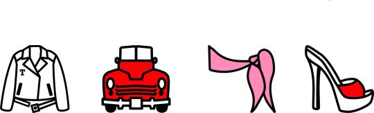
Four Icon Challenge
0 notes
Photo

Not a very original concept
0 notes
Photo
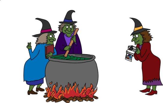
T-shirt design. Combined both options (analog/I put a spell on you) into one illustration. There is an option to put a slogan on the front of the cauldron, can’t currently think of a witchy pun.
0 notes
Photo

This is all the pages as they are in the final calendar. I arranged them sort of fading from one colour to the next. I arranged them around June being purple for Pride month (the photo is some pride flags I spotted on a drive home and pulled over to grab a quick photo of in peak hour traffic). All the photos are mine, some are old some are new taken specifically for the calendar.
0 notes
Photo

Once I finished the calendar I decided to bring back the camera outline for the front cover, I thought it worked better for the cover and I really wanted to use it somehow. I’m really pleased with how it turned out.
0 notes
Photo


This is where I ended up with the grid. Instead of using a table I just made a rounded rectangle and repeated it to make the grid.
Second image is my page of icons in progress. I didn’t use all of them and some I used for multiple holidays of the same theme or denomination. (some of the icons didn’t survive the size scale down but they look fine on the actual calendar pages).
0 notes
Photo

I decided to go with the film border and after trying and failing for days to make the camera outline design work, I decided to go with a simple grid. This is where I thought I was done but I soon realised I needed 6 rows instead of 5 for the months of May and August. I also discovered that there is no easy way to make the inside of the grid square rounded because that function doesn’t exist, you can only make the outside edges rounded, so I decided to just start the grid again and use shapes instead of a table.
0 notes
Photo


After showing my initial design to Brett, he suggested I try a film border instead of the digital camera icons. This is my first try of that.
The second image is my slide from the week 4 presentations. I created some icons to represent the public holidays on the calendar and showed both ideas for the photo to get opinions.
0 notes
Photo

This is my first mock up of my calendar design. I used an image of an actual digital camera to get the outline of the camera shape and made the screen section bigger to fit the calendar grid in. For the image up top I overlaid the camera setting icons to make it look like a camera screen.
0 notes
Photo


Activity 2 - grids in indesign
0 notes
Photo

License plate task
Outlined the skyline of Sydney city and used it for the background of the license plate. I decided to go with a rainbow gradient for a Pride themed plate but I couldn’t decide if I liked it better with the rainbow as the background or as the skyline.
0 notes
Photo

My original calendar concept. I wanted to make the functional calendar part of the calendar look like it was on the screen of an actual digital camera, with the controls and buttons. Then making the image on top my own photos of various nature themed landscapes/subjects with the overlay of the settings/controls that would be on the screen on a digital camera.
0 notes
Photo

Activity 1
Watched and followed along with a few tutorials on lynda and I’m starting to sort of get the hang of it(very basic hang of it). I decided to make the figure in colour and add a background of one of the artist’s major themes (perfume, album art etc). I’m happy how this one turned out. (it’s Ariana Grande if you hadn’t guessed yet).
0 notes
Photo

Activity 1 WIP
Still wrapping my head around using illustrator, finding it very difficult and unintuitive. This is the basic silhouette of the face with shapes, I went with a full body design because the person is more recognisable by her style and hair rather than her face.
0 notes