
Don't wanna be here? Send us removal request.
Statistics
We looked inside some of the posts by rossbowkerdigitalart and here's what we found interesting.
Average Info
Notes Per Post
40
Likes Per Post
39
Reblog Per Post
1
Reply Per Post
0
Time Between Posts
3 days
Number of Posts By Type
Text
8
Photo
8
Video
1
Last Seen Tumblr Blogs


Fun Fact
After the announcement of the deal with Yahoo!, there were 170K signatures of unhappy Tumblr users petitioning to prevent the sale in 2013.
Text

I wanted to take a look at a few logos that have been used or are being used for game franchises as this heavily affected the design for my own logo which I have used in my final Major project.
First of all, there are a few attributes that all of these logos share and every effective logo also shares these attributes. I will of course go into more detail for the individual logos, but all of these designs are rather simple and have a close link to what they are representing.
First of all, the Witcher 3 Wild Hunt logo is deceptively simple, firstly all of the entire within the witcher franchise have shared the "Witcher" title with the same font, this is clearly to create consistency within the franchise as well as make the title itself more recognisable as the font itself is rather distinct. The more eye catching part of the logo is the three that is designed to look like claw marks, this small section has quite a few details that tie into the game; the claw mark is meant to represent that character you're playing considering you play a monster hunter, the claw marks are also subtly designed to resemble the helmet worn by antagonist of the game, which is the leader of the titular wild hunt and finally, the claw mark is coloured red to make sure it stands out from the black and white of the rest of the title. All of these small details help link the title and logo to the product while being very simplistic and recognisable.
Secondly, we have the assassins creed logo; this logo in fact changes quite often with each new installment of the franchise whilst keeping the overall shape, this is done in yet another effort to make sure the logo links in with what it represents. The game shares its logo with the emblem of the titular creed of assassins that each installment of the franchise focuses on. Finding a concrete answer as to why this specific logo was chosen for the franchise is very difficult, I've read that it was create from the lower part of a bird skull (the assassins are heavily associated with eagles.) with some influence from the freemasons emblem, while other believe it is designed to look like the hoods that are worn by the in game assassins and other think it is just designed to look like an A. Despite all of this, the Assassins creed logo is undeniably recognisable and eye catching.
Thirdly, we have the Dungeons and Dragons logo, this example is actually so simplistic that there isn't much yo actually talk about. The logo in its entirety is a stylised ampersand that is designed to look like a dragon breathing fire, this is clearly taken from the games title as well as it abrievation as the game is commonly referred to as D&D.
Finally we have The Elder Scrolls V: Skyrim's logo, this example holds a couple of in depth meanings. To a person who didn't know much about the in game world of the Elser Scrolls, the logo would simply represent the returning if the dragons which takes place with the game's story. However, this logo is in fact the insignia of the Septim Empire and the logo in its entirety represents the civil war that is taking place throughout the story. At first glance the logo seems pretty solid, being made out of metal and all, but look closer and you see that the logo is in fact scratched and chipped; this is supposed allude to the condition of the empire, it shows a strong face, but this is just to hide the fact that it is slowly starting to fall apart as all of the countries that are apart of the Empire start to remove themselves.
My favourite part of a logo isn't being able to instantly recognise the image (even though that is its purpose,) my favourite part is figuring out just how it connects to the franchise that owns it; of course you get simple designs like the D&D example, but then you get those like Skyrim and the Witcher, it simply shows how much thought has been put into its design and its intent, sometimes a logo is just created so you'll remember it and sometimes they're designed to tell a story.
2 notes
·
View notes
Photo
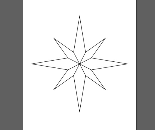
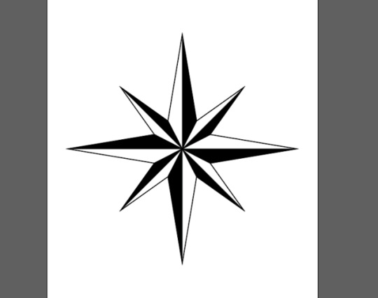
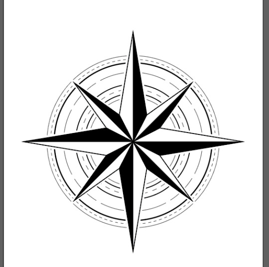
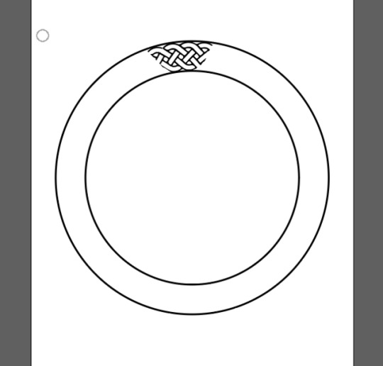
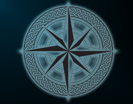

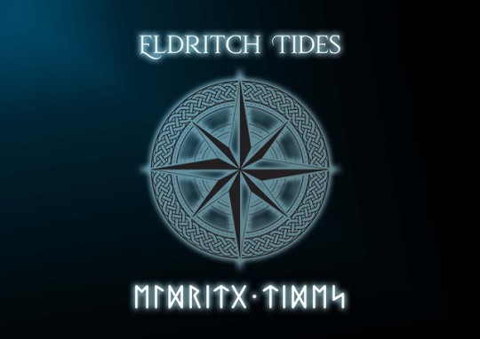
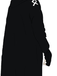
This is the logo that I had created for my Final Major Project and, ignoring the Celtic knot, it was quite easy to make. The logo itself is created almost entirely within Adobe Illustrator with a few tweaks that I added in Adobe Photoshop. To begin with, I used a combination of the shape tool and path tool to create a small guideline for the compass rose, this was so I could make sure the proportions were right as well making sure that the branches of the compass rose were centralised. I next drew the main four point star section of the compass rose over the guidelines and then drew the four smaller segments over the star. Once I had the basic outlines of the segments drawn, I used the path tool to then draw over the shading; there are a few different ways to draw compass roses, but they usually always have the shading drawn in such a way where the shaded sections always have a non shaded section in between them. After finishing the compass rose, I used circle tool to create the segmented lines that you see in the final design, this was quite easy to do as illustrator has an inbuilt tool to turn lines into segments and dots. I did this to mimic the design that you find on compasses which allow you to determine what degrees the compass’s arrow is pointing. The final part of the design itself was the hardest and that was the circular Celtic knot, to achieve this I drew a small section of the knot’s outline with a path tool using two circles as a guide which allowed me to give the section the right curve. I then copied the design until it made a full circle and this is what created the largest issue; it took many attempt of trial and error to get the design to the point where it connected together seamlessly, but once I got to that point, I grouped all of the paths together. It was at this point that I realised all of the detail confused the image to a point that it took a moment to distinguish the compass rose from the rest of the design, so I copied the outline layers of the compass rose and turned them completely white and used the fill tool to make the inside white as well before making them slightly larger than the compass rose; this new buffer of white that was placed behind the compass rose lifted it from the image and made it much easier to distinguish. Once the design was done, I wanted to turn it into a poster for the Fianl Major Project as well as the end of year show, so I imported the logo into photoshop and the first thing I did was remove the white from the compass rose, so I was left with a version of the design with a transparent background. I next used the gradient tool to add a dark cyan to black gradient to the background. Then I gave the design a blue glow effect, this was to imitate the logo portion of the trailer as well as a glowing runes idea I had early in the project which I had to scrap. Finally, I added the text to the poster, turned the letters white and gave them the same glow effect. I chose the compass rose for my logo because it is a very identifiable symbol and is often associated with discovery, exploration and finding one's way, this fit rather well with the video game idea I had for my concept, which would contain many aspects of exploration. The Celtic knot was chosen because of the nordic roots of the concept and while it is the wrong culture, Celtic knots are very similar to many nordic designs and can still bring about the same feelings. The title was chosen for two reasons, because Eldritch is a word closely linked to the works of H.P. Lovecraft, meaning weird and sinister, or ghostly, which practically describes all of his works. I also chose tides to allude to the story of the game which takes the main character from his home city of London to the Scandinavian countries. All together, the title is meant to convey the main character's journey to a country that is foreign to him and his interaction with the wierd, strange and unexplainable throughout the story. And finally, I chose the nordic text, which is simply Eldritch tides translated into runes, to show the nordic connection of the game concept.
2 notes
·
View notes
Video
tumblr
Above is the trailer video that I developed for the Final Major Project along side the conceptual art of the characters and items. I created this video in Adobe Premier Pro, each scene is made up of individual frames as I rendered the animations in PNGs, this is because rendering them out as actual video allowed the opportunity for the footage to be corrupted if it was accidentally stopped or interrupted. There isn’t much to say about how I put the footage together, I had already rendered out the footage to the length I’d wanted, so I simply imported the frames into premier as an image sequence then set it so the frames would play at 24 fps. The outro to the trailer was slightly more complicated, as I had to create it within after affects. To start off I imported the compass rose and celtic knot logo I had created in illustrator, along with the title and nordic text; I made sure to keep these all on separate layers so I could edit them separately. For the compass rose, I key framed it to rotate into place and had the scale fall slightly whilst it rotated; this was to add to the focus affect that I wanted on the logo, to achieve that I used a radial blur affect that was key framed to gradually sharpen as the rotation stopped. Another affect I wanted to take place during the rotation, was the outline slowly appearing, for this I used the Vegas affect and set it only to have one segment so when the outline was fully formed, it would only be made of one outline. Finally, I added a to the compass rose. Next I copied this compass rose layer and changes the colours so I had a dark blue layer, light blue layer, purple layer and a pink layer and then I moved the key frames so they were just out of sync, this further added to the focusing effect. I followed this same process for the Celtic knot, though the design was far too complicated for the Vegas outline affect, so I need to find a way to disguise when it appeared on screen, so I added the flash affect, though this didn’t quite hide the knot and text pop in, so I added a quick fade in, so it wasn’t so abrupt. Now that everything was set up, I finally added a glow affect to all the layers and I made sure that the glow's colour matched the object it was put on, though the colour was much more pale. Finally, I went through the video and began to add some music and sound effects, granted these were not the best in the world, but the video just seemed rather odd in a silent state. So I went through the internet and found some music that matched the tone of the trailer as well as a small nordic-esque melody that would play over the logo; I made sure that the music faded in and out during the dark period between the 3D animations and the logo. I also looked for some rain and lightning sound effects for the hallway, a subtle wind noise for the dungeon corridor, a low hum for the cave and a wind effect for mountains. So the sounds did not seem to abruptly appear from nowhere, I creates a quick fade transition between each of the sound clips. Thankfully, none of the sound had to be perfect due to the fact I'm not being graded on it, but I did make an attempt to mix the audio as best I could. Whilst creating this trailer, I kept in mind the retro theme, so I wanted the graphics of the trailer to look like it was from a game from about fifteen to twenty years ago. I think I achieved this goal as I could have made the final product much closer to photoreaslism than I did. I feel the final outcome is representative of the technical limitations of game developers in the past. Granted, the trailer is rather simplistic and I wish I could have done more with it, but the goal from the outset was to create a teaser trailer that showed off some of the environments from the game, something like Elder Scrolls 6's trailer. Unfortunately, I did have to remove quite a bit of content because the render times would just take too long and would mean I wasn't able to meet the timeline. As a closing statement, I am really happy with how the trailer came out, especially with the fact that it links to the retro theme as I feared it would not. I would have preferred if I was about to keep the footage that I had to cut, but I don't think the short and sweet nature of the trailer doesn't hurt it.
2 notes
·
View notes
Photo
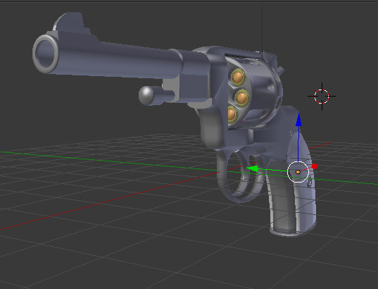
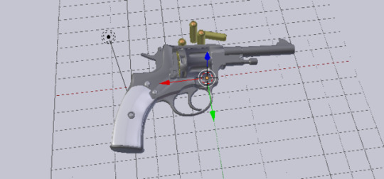
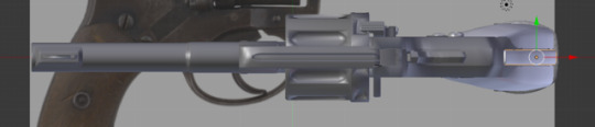

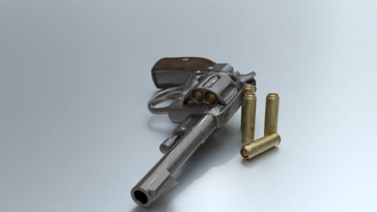
Here are some screenshots of the 3D outcome of the 2D concept art which I have posted about on the blog already. Originally I wanted to show a timelapse video of its creation, but the effort of editing it as well as the upload was taking focus away from my actual outcomes for the product.
To start, with the reference image in the background, I placed a cylinder into the scene and began building the barrel of the gun; this was quite simple thanks to blender already having a default cylinder, so I extended that cylinder to match the image background, for the iron sights of the barrel, I added in a cube and placed it in the appropriate place and shrank the top, I then added in another cube and modelled it to match the top part of the Nagant M1895’s iron sight. With the basic shape of the barrel complete, I wanted to hollow it out, so I selected the end face of the barrel and extruded then scaled it down before extruding it back down through the barrel. Finally for the barrel and iron sights, I added a subdivision modifier to the barrel to soften the sharp edges of the object.
I then next created the section which connects the barrel to the main body of the gun, I did this by extruding one side of the barrel and scaled it slightly before extruding it again, this creates a small diagonal transition between the barrel and that new section. I then placed a cube into the scene and uses that to model the more square area of the new section. Next I modeled that extruding rod, which points in the same direction as the barrel, out of a cylinder. After all of this, I then used a few loop cuts to clean up the edges created by the subdivision modifier.
Now I had to work on the main body, so I hid the barrel and added a cube to the scene. I began extruding areas of the cube to match the reference image until it looked like a blocky imitation, I then began to adjust the shape and gave it curves so it would completely match the reference, I did this with several loop cuts and using the proportional editing, which adjusted the shape according to changes I made to specific sections. I generally followed this process of extruding and scaling a cube to make a curved shape while creating the hammer, as well as the trigger guard and the trigger itself. I then attempted to use the subdivision modifier on these objects, but due to their complex nature, the subdivision didn’t work so I had to settle with the smooth shader.
To create the grip of the gun, I used a cylinder and curved it to follow the shape of the handle, next I flattened it slightly so it looked like it would actually be comfortable to hold. I did some tweaks to the shape of the grip that I can’t quite explain, but I essentially made the grip on the back of the handle flat, as well as make it somewhat wider at the back.
The last major thing I had to do modelling wise was create the cylinder of the revolver, I did this by adding two cylinders into the scene, one I left as it was, the other I modelling into the basic shape of a bullet, this is what I used to create channels in the cylinder where bullets would be placed. I placed this button in the cylinder before using the boolean modifier to cut the bullet’s shape out of the cylinder, I did this seven times to match the Nagant’s seven bullet capacity. I used a similar technique to create the grooves on the outside of the cylinder; I turned a sphere into a cylinder with round edges and then used that shaped to create the grooves with the boolean modifier.
For the screws and bolts that decorate the revolver’s surface, I simply cut sphere’s in half and pushed an X into the top to simulate a screw.
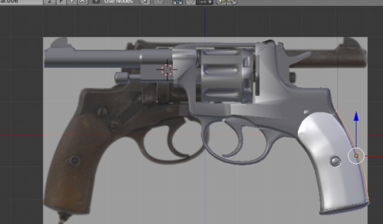
The texturing work for this one was rather simple as I used a metal material very similar to the one that I used in the creation of the ice blade, though this one did have a few tweaks; the colours on this material have been changed to match the darker gun steel that the Nagant M1895 has, I also wanted there to be visible rust on the weapon, so I increased the strength of the dirt effect as well as the strength of the scratches to give it a more worn look. This same metal material was also used on the bullets with adjusted settings to turn them a more brass colour as well as making them look more new than the gun.
For the handle, I had to create a wood material because that was the most common material that gun grips were made of at the time. Thankfully, this was rather easy; first I started with creating a displacement to create the bump of the wood grain, I achieved this with a wave texture with I then distorted with a noise texture to make sure that waves weren’t uniform. After the bump, I needed to create the colour, I did this with a glossy shader which I mixed with a diffuse shaded to give the brown colour and I also used a noise texture as the factor for this mix, this was to achieve the effect that the gloss was not uniform across the surface. I then repeated this mix three more times, minus the gloss shader, to add different colours to the grip because wood is very rarely one block colour.
Looking at this model in its final render, I’m extremely happy with how it ended and I can’t think of many improvements. To me, it looks rather photo realistic and I think it shows an interesting contrast between the reference model, the concept art I drew and the actual 3D outcome itself
2 notes
·
View notes
Photo
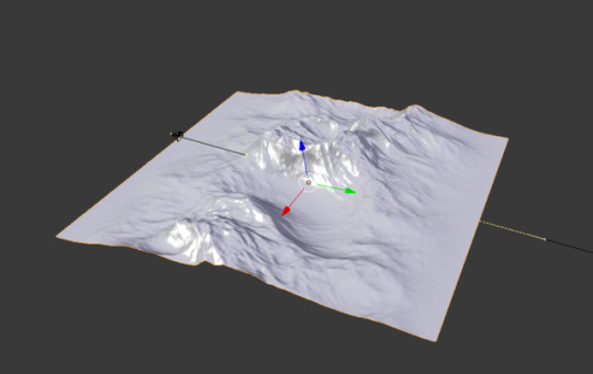
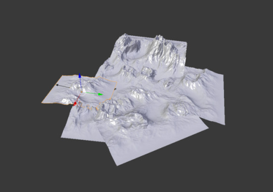
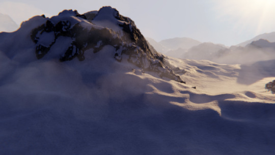
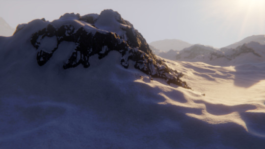
Here are a few screenshots of the aspects that make up this mountain scene that I’ve created for my trailer outcome for the Final Major Project. As confusing as this set up looks, it’s one of the easier creations that I have made for th project, at least it is the easiest until you try to make it as realistically as possible which has caused a few hiccups throughout the development. Starting off I needed to create the mountains themselves, so I used a tool in blender which is wholly used to create landscapes; this tool is designed to turn a texture into a landscape, this could be a canyon, mountains, or any type of landscape you could want and even though it works like a displacement modifier, the landscape tool is much more in depth and is focused on landscapes as I said previously. I had an idea of what I wanted for the mountains, so I chose the slick rock preset and and the default noise tester before beginning to tweak the settings until I had a ravine with two mountains flanking it. Even though the mountains looked great straight after using the landscape tool, they weren’t detailed enough to withstand a close up shot like I wanted in the trailer, so I needed to use some micro displacements to add more detail. So within the node editor, I used a normal map of rocks that I found on the internet, but with the origin node set up, the bumps were placed all over the mountain mesh and it just didn’t look right; if you look at a photo of a mountain, the bumpy, jagged parts are usually contained to the more vertical inclines. So to fix this, I created a small system controlled with a colour ramp to confine that rock micro displacement to the inclines. The next parts of texturing were quite simple thanks to blender’s inbuilt principled shader and a variety of textures I was able to acquire. First off, I started with the snow texture, which is simply a snow texture’s diffuse, speculative, roughness and normal plugged onto the proncipled shader. I simply repeated this process for the rock and used the previously created node system which I used for the micro displacement to make sure the rock texture was only on the bumpy rocks. However, I wanted at least some snow on the rocks, so I added in another colour ramp to control where the snow and rock textures meet and allowed some of the snow texture to leak onto the rock. I also wanted the snow to be a little rougher snow around the rocks, like perhaps there some small pebbles and whatnot underneath the snow, so I copied the texture system I created for the snow and rock and changed out all the textures for a rougher snow, I then adjusted some settings to confine that new texture to the near edges of the rocks as well as a few patches throughout the mountain. Once texturing was complete, I needed to fill out the scene a little more, so the camera wouldn’t be able to see that the mountain was in fact just floating in the air, so what I did was I copied the mountain I had been working on and began to create this small landscape. I made sure to change the rotation and scale of the mountains so you wouldn’t be able to tell they were all technically the same model. I also specifically made one of the mountains taller than the rest so the camera could focus on it once the camera turned the corner. Near the end of the process of creating these mountains, I decided to play around with the possibility of using volumetric clouds as part of the trailer, however though they made the final product look great, they were far too taxing when it came to rendering, so I had to remove them. In an ironic way, this emulates one of the limitations with retro video games, considering they had to work around severe hardware limitations and I've had to do the same during this project. Overall, despite the lack of clouds, I love the outcome for this part of the project. It looks amazing and way better than I thought it would when I was starting out.
2 notes
·
View notes
Text
So I can keep within the limits of the retro theme of the Final Major Project, I wanted to do some research on the development of video game graphics since the inception of video games themselves, this is because I wanted the graphics within the trailer I'm developing for my outcome to look retro themselves, like of they were from a videogame from fifteen to twenty years ago.
Video games are a visual medium, from the printed ads, to the trailers, meaning one of the big things you have to sell them based on how they look and this is heavily impacted by computing power, because of this early video games look nothing like what we have today.
In the early 70's video game development would only take months with just one or two people writing the code, this is due to the fact the classic video games of that era were so simplistic, with the graphics only being simple blocks on a two dimensional plain. A good example of this is pong, the entire game was controlling a rectangle that could only move up or down and your only goal was to block a square "ball." Other example are Indy 500, where you had to drive a car made of blocks around a 2D track and asteroid, where you play an arrow shooting outlines of geometric shapes so they don't hit you.
Throughout the 80's with games like Super Mario bros and OutRun, the appearance of video games began to improve with the implementation of more detailed polygons, allowing for the games themselves to have more variety and visuals, though at this point game's developers still only had sixteen colours to work with.
During the early 90's is when video game graphics truly began to evolve and became ever more details, you could now explore dungeons, fly spaceships and race sports cars against your friends. This time period is when the trend to explore the idea of 3D in video games began by creating the illusion of a 3D space. Titles like Wing Commander, Doom and Duke Nukam 3D would use sprites and 2D textures to create a faux 3D effect for the player which would later be dubbed 2.5D. The true use of 3D space could not be achieved at the time due technical limitations. However, true 3D was achieved when Quake was released in 1996. Quake was the first ever title to be released that featured 3D worlds and enemies. Thanks to Id Software's Quale Engine realtime 3D rendering has supported OpenGL. This was a huge step for the industry and 3D graphics quickly evolved as shaders, Skeletal-based character models, and ragdoll physics were thrown into the mix.
By the mid 2000's developers were taking full advantage of all three dimensions, where it be on PC or console and the creation of two dimensional games became a style choice instead of a technological constraint.
At this stage game creators had started to experiment more with visuals. Cel-shading had started to become more prevalent as games like Borderlands, Crackdown, and No More Heroes came into the mainstream. Instead of the shade gradient that’s commonly used in photorealistic graphics, the cel-shading technique uses less colour, tints, and shades to give more of an animated look and feel. This resulted in cel-shading becoming particularly popular with the anime and comic book markets as the visual style gives that extra layer of authenticity.
Cartoonish graphics have become even more popular in recent years. Instead of using cel-shading titles including Fortnite, Overwatch, and Street Fighter Vexaggerate aspects of their characters and environments, and use a brighter colour palette. This animated style appeals to a wide audience and gives further escapism from the real world, giving birth to a new generation of video games with the likes of Overwatch and Fortnite selling in their millions and played by people of all ages.
With 3D graphics coming into fruition developers started to seek out new tools to help them with modeling, texturing, and animating. Maya and 3ds Maxhave been providing those tools to game creators for years. Both Max and Maya work seamlessly with engines like Unity, Unreal, and Id Tech, which are essential for game development. Here are just some of the titles that you may have played which have used Maya and 3ds Max to create their outstanding visuals
Graphics continue to evolve as the technology behind them grows. Developers are now able to create cutscenes in-engine without pre-rendering or filming full motion videos. Recent blockbusters including God Of War, Detroit: Become Human, and 2016’s DOOM are able to tell their story seamlessly without the use of live-action video. Technology has evolved so much that loading screens will soon become a thing of the past - Mass Effect and Fallout have already taken steps to make loading transitions shorter and more fluid.
All of this is important if I want my trailer to keep to the retro theme as I want the trailer to be of footage related to the game and that footage would have to be subjected to similar constraints as older games were.
2 notes
·
View notes
Photo
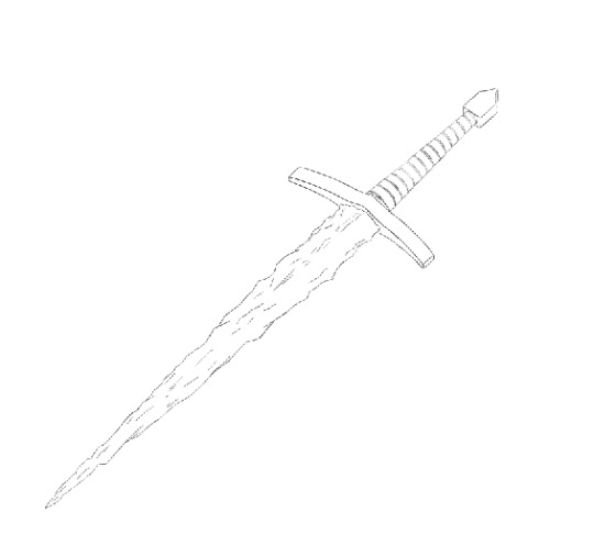
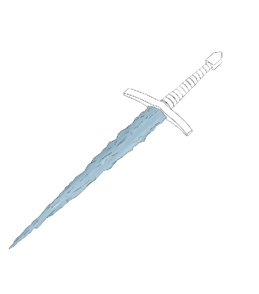
Above are a few screenshot of the conceptual art I created for the Ice dagger, I wanted to combine thos 2D art with my 3D outcome to show the affect that concept art had in the final product. Granted, this concept art I've created is kind of cheating due to the fact I developed it along side the 3D model outcome. Despite this, I also think that this method also reflects the way concept art evolves and changes alongside the creation of the final outcome. To begin, I started off with the frwwing if the whole blade. First I drew a cross with one of the lines being shorter than the other and slightly curved. This cross helped me plan out how different parts of the object would compare, such as the length of the blade and the width of the hilt, this was important because proportions are the main determining factor of whether it would be a sword, shortsword or a dagger. After having the proportions planned out, I drew basic shapes over those guide lines so I would know where to place details later. Next I began to refine the shapes and outlines, give the blade a more jagged shape and began to draw the string that wrapped around the dagger's grip. Once I had the whole of the blade design drawn, I wanted to draw a close up of the dagger below the hilt, mostly because I wanted to show off the glowing runes that I wanted to decorate the weapon. To create this closer view, I followed the same process as before, drawing a cross, then basic shapes over that and finally, refined all of the details. Now the outlines were finished, I created a few empty layers which I would use for the colour; starting off I used the polygonal marquee tool to block out the colours if the dagger. Next I decided to try my hand at digital painting as I thought it would lend itself well to creating a genuine look of ice, so in the layer above the base colour, I began painting in the shadow and highlights, choosing to use darker and light variants of the basic colour respectively. I continued this method shading throughout the poster. Once everything was shaded, I placed the nordic runes that I wanted onto the blades hilt. I decided to colour these runes a light blue to match the centre piece of the dagger which was the blade made of ice. I then wanted to convey the fact that they were glowing, since blue runes seemed rather flat and out of place against the shaded metal, so then placed an outer glow affect on the runes which was a very pale blue. Finally I imported an image of the rendered 3D outcome and used a textured brush to erase the edges so it would fit the painted look of the concept pieces. I really liked the idea of seeing the 2D outcome next to the 3D one and I'm glad that it contrasts well. Even though this was one of my first attempts at digital painting, I couldn't be happier with how these two pieces of art came out and I can't find anything to complain about them other than the fact that I wish I had more practice with digital painting so I could do these more justice.
2 notes
·
View notes
Photo
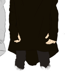
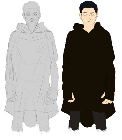
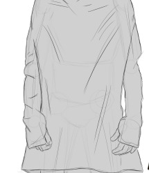
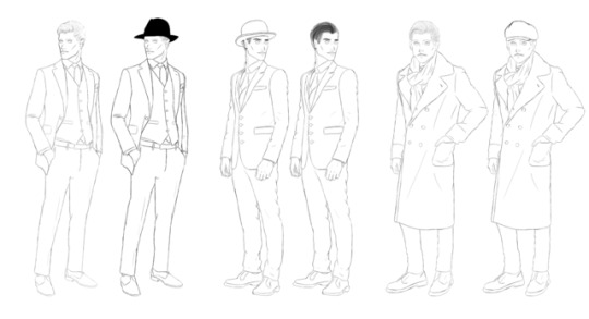
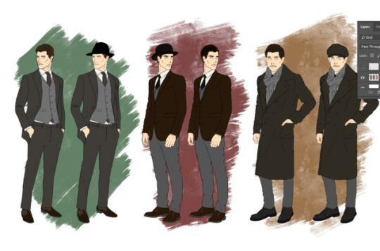
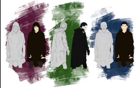
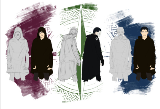
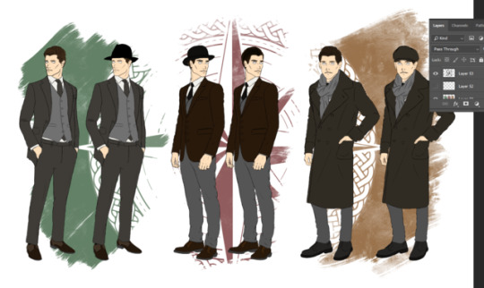
Above are a few screenshots of the two character concept posters that I designed for the Final Major Project. In the beginning stages of these designs, I began to research the fashion of my chosen time period, the 1910s. I’ve made a rather extensive post on the subject which acts as most of the research I’ve done, though of course I made use of the male portion of that research instead of the female part. To begin the actual drawing stage, I used several research of models in suits to help with the creation of the the poses and to help visualise the way said poses and gravity affected the clothing. Naturally I first began to plan out my posses with simple circles and lines, many of these were thrown out due to being out of proportion, stiff, or just having a poor appearance. One I had five or six poses, I developed them by giving them an actual body, which made me throw out the sixth pose because it just didn’t look right. On a small note, the poses were inspired by the kinds of poses you see on things like movie posters, or posters for video games. Using those previously mentioned models, I began to draw on the suits onto the “mannequins” I had previously drawn on a different layer. The reference images helped tremendously, as I’ve had difficulty drawing clothing in the past due to the intricacy of how the fabrics folds and falls onto itself. Thankfully, suits haven’t changed to an extreme degree, so it was easy for me to modify what I was drawing, the main difference I found while drawing were that suits from the past had a lot less folds in the fabric as well as the much longer nature of the suit jackets. Once the basic outlines were finished and refined, I created a series of empty layers for the individual characters where I used the polygon marquee took to add the colour to the concept while keeping the outline layer above the colour layers. I layered the colours like they would be layered in real life, with the skin layer at the very bottom and the suit jacket at the top. Once the colour was finished, I copied the outlines and the colour then moved them so the were standing next to the originals, I then proceeded to draw and colour the hats onto the second character. Finally I used a layer mask to hid the hair that was clipping from underneath the hat. To create the cultist concept art, I pretty much followed the same steps as I did the with the main characters concept, though it was next to impossible to make the cultists robes look as if they were from 1910s as robes are so nebulous in appearance that they could be from any time frame. The other challenge for these drawings were finding a decent reference as I found most images containing a cultist robes were either another artist’s work or rather low resolution. I also chose to show off the rather sketchy nature of the character’s creation in the cultist poster, so I simply merged all of my guide layers and lowered the opacity whilst giving the drawing a grey background to make to stand out. Creating the background was rather easy, all I did was create some scribbles on the background behind the characters with a brush that had a metal texture, I then placed the logo I created in illustrator, in a separate layer, over those colours and then gave that layer a layer modifier. Originally, I decided that I wanted to simulate an early concept piece with these drawing by avoiding in depth detail because in the early stages of concept art, there is no need for that detail. In the pursuit of this effect I decided to omit shadows, this also had the added benefit of not accidentally ruining the drawings with poor shadows, but in hindsight I do regret not adding shading, even if it was simple cell shading. Aside from shadows, there are a few mistakes I’ve made that I can see now that I look at the concept pieces, mainly some items of fashion, such as the fedora on the furthest left detective concept; fedoras in the 1910 did not slope back over the head, that feature isn’t something that was completely popularised until the 1940s. Despite the few small mistakes I made whilst drawing these concepts and the few things I would change, I'm genuinely really happy with how these two posters ended up and I feel they're representative of my skill and ability to draw.
2 notes
·
View notes
Text
Geralt rejoins his long-lost lover, Yennefer, in the town of White Orchard. Yennefer tells him that Emperor Emhyr has summoned him to the city of Vizima. Emhyr tasks Geralt with finding Ciri, who has recently been seen in several places. Ciri is a Child of the Elder Blood, the daughter of the emperor and the last heir to an ancient elfish bloodline with the power to manipulate space and time. Geralt first hears that Ciri was in Velen at Crow's Perch, the Bloody Baron's fort. The baron refuses to help, but Geralt's acquaintance, the sorceress Keira Metz, tells him that an elfish mage was looking for Ciri. Keira directs Geralt to the Crones of Crookback Bog: malicious, ancient spirits living near Velen. The Crones say that they captured Ciri for the Wild Hunt before she escaped and have enslaved Anna, the baron's missing wife. Geralt returns to the baron, who tells him that Ciri went to Novigrad.
He discovers that the Church of the Eternal Fire, a militant religious organization, is purging mages in Novigrad. Meeting his former lover, Triss Merigold, Geralt learns that Ciri had contacted his friend Dandelion. Geralt navigates Novigrad's criminal underworld to rescue Dandelion, and learns that Ciri teleported to the Skellige archipelago. In Novigrad, Geralt may help Triss to free fugitive mages. He sails to Skellige and rejoins Yennefer, who has been investigating a magical explosion linked to Ciri. They track Ciri to the island of Lofoten, which has been attacked by the Wild Hunt. Geralt and Yennefer realise that Uma, a deformed, cursed creature at Crow's Perch, was present after Ciri's escape. Before leaving Skellige, Geralt can help determine who will rule Skellige after the king's death. Yennefer severs the magical bond between her and Geralt, giving him the option of affirming his love for her or ending their relationship.
They bring Uma to the witcher school of Kaer Morhen, where Yennefer removes his curse and transforms him into Avallac'h. He reveals that he teleported Ciri to the Isle of Mists to save her from the Lofoten attack. Geralt travels to the island and finds Ciri in a deathlike state, until she is awakened by Avallac'h's magic. She says that Eredin's (the King of the Wild Hunt) homeworld is being destroyed by the White Frost, and he wants Ciri's power to conquer the Continent. Ciri and Geralt teleport to Kaer Morhen, pursued by the Wild Hunt. After a brief reunion with Yennefer, Triss and Vesemir (their witcher mentor), the Hunt attacks. Vesemir is killed protecting Ciri; her distress unleashes her Elder power, and Eredin and the Hunt retreat. Geralt, Yennefer, Triss, Ciri, and their allies conduct a funeral for Vesemir. Ciri and Geralt travel to Novigrad and help Triss and Yennefer reform the Lodge of Sorceresses to aid their fight.
They learn about the Sunstone, a relic which can lure Eredin out and bind him to a location. On the Skelligan island of Undvik, Avallac'h uses the Sunstone to draw out the Hunt and their fleet. Geralt, Ciri, their allies and the Nilfgaardian fleet battle the Hunt, and Geralt defeats Eredin in combat. As the White Frost descends on Skellige, Ciri insists that she must confront it with her Elder Blood before it consumes all life on every world. She enters a portal and defeats the White Frost, ending the threat. The game ending varies, depending on previous choices. If Ciri is alive, Geralt can retire with Yennefer or Triss or remain a lone witcher. If Geralt helps Nilfgaard win the war and brings Ciri to meet the emperor, she will become empress; if Ciri does not meet the emperor, Geralt fakes her death and she becomes a witcher. If Ciri dies fighting the White Frost, Geralt hunts down her stolen medallion as a keepsake; surrounded by monsters when he finds it, his fate is unknown.
The Witcher 3 is my second major influence for a video game concept, though unlike L.A. Noire, this may just be because it is my favourite video game. Again, just like with L.A. Noire, there are a few mechanics I would adopt if given the opportunity to bring my video game concept to life. Firstly, I would want to have the story driven conversation and dialogue choices that you find in this game; as I said in the explanation of the plot, the game's narrative has several different endings and this is determined by players actions and choices, the ending wasnt just affected my choices main within the main story either, it was also affected by the side stories and the choices within them, even deciding to skip some stories could affect the ending. The witcher also had an investigation mechanic, where Geralt would "focus his senses" and key pieces of evidence, like blood or footprints would glow to help the player, you could then usually interact with these things to get a dialogue line from Geralt. While not as in depth as L.A. Noire's investigation mechanic, the Witcher's own mechanic got a lot of use due to the fact you were playing a monster hunter and often had to go hunting monsters or look for missing people.
Another thing I would want in my own game is the quality of world that the Witcher has, the world is huge and is designed to be explored by the player, with every location, no matter how far off the beaten track, been lovingly crafted and filled with detail, from the biggest city to the deepest cave. To give another incentive for players to explore, the game is filled with small stories that you can progress through that take you to different locations, on top of that some of these locations that you can explore contain some of the best equipment in the game.
The final thing I'd want to adopt would be importance that CD projekt red placed on the side content of the game, because in open world games such as these, usually all of the effort is placed into the main narrative which leaves all of the side stories feelings rather two dimensional, but in this particular game they all have depth and emotion, it feels like what you're doing matters.
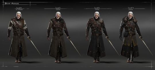
I also wanted to take a look at the concept art for the witcher, especially the art for the main characters, because it is designed in such a way to make it easier to show off the different clothing and armour options that are available for the player. This was achieved by using the same pose with the same face and same sword while using different armours over it, this method cuts a significant amount of time out of the process. I chose the two images above to show the differences in detail that you can have while creating concept art, one is photo realistic and the other looks like a sketch, this is because detail in an initial concept art isn't extremely important as the objective of concept art is to convey the idea of the concept. Despite that, both examples of concept art above are particularly amazing.
3 notes
·
View notes
Text
I wanted to flesh out the context of my Final Major Project a bit more, so I began to research the origins of detective fiction and how its evolved and progressed. I specifically chose to take a look at detective fiction because the context for my Final Major Project revolves around a private investigator, I chose this because stories revolving around mystery and detectives were very popular in my chosen time period of the 1910's.
Detective and mystery-related stories are and have always been one of the most popular genres of fiction of fiction. In literary form, detective novels are so various that publishing companies devote entire labels to the genre and release hundreds of entries per year. Detective/mystery-related narratives have also become a major part of television programming, so much so that some channels devote their entire primetime programming to the genre.
Despite the growing popularity of Arthur Conan Doyle's Sherlock Holmes, Doyle did not invent the genre of detective fiction. The creation for this genre must go to Edger Allan Poe. Along with being a major to the literary traditions of Gothic Horror and romanticism, Poe also originated detective fiction with his character C. Augustus Dupin. When this character first appeared in The Murders in the Rue Morgue in 1841, the English word "detective" did not even exist; the characters name "Dupin" suggests the English word dupe, or deception, which Dupin utilises in order to obtain the information he requires to solve a case.
Many of Dupins characteristics heavily influenced character portrayals of detectives throughout the 19th and early 20th centuries. His cold, logical method or problem solving, upper class background, and emphasis on intense reading for clues remained consistent throughout the only other two stories released within Poe's life time.
If Poe was the inventor of the detective fiction genre, Arthur Conan Doyle was the one that who truly cemented it as a popular literary genre. The first obvious difference between the two writers is the sheer volume of works that were released; while Poe only wrote three stories featuring Jo's detective Dupin, Doyle created fifty six short stories and four novels featuring sherlock Holmes. The first series of short stories appeared on the Strand Magazine in 1891 and was responsible for the characters dramatic rise in popularity.
One major difference between Poe's and Doyle's detective tales was the inclusion of a sidekick character to aid Sherlock Holmes. While doctor remains steadfastly loyal to Holmes, he stands in sharp contrast to him. His approach to problem solving is populist and simplistic, while Sherlock's is complex and sophisticated. Watson sees the surface of crime, while Holmes strives to delve into the psychology of the criminal. Despite this contrast, it is overwhelmingly Watson who gives the Holmes's stories their point of view, providing narration for fifty three of the short stories and all four novels. The interaction between Watson and Holmes and their differening methods of problem-solving are just as enjoyable for the reader as the actual mystery to solve.
While Poe invented the genre and Doyle made it popular, detective fiction only left it's short story for in the early 20th century, this change in form which gave the story telling another level of complexity and depth. Due to the similarity in time period in which my Final Major Project is set and the increased popularity of detective fiction, I chose to focus the story of game concept around a private detective as I believe it would be very appropriate for the time.
2 notes
·
View notes
Text
Following the end of World War 2, Cole Phelps, a decorated USMC veteran of the Pacific campaign, returns home to Los Angeles, California, to live with his family while taking on work as a patrol officer for the LAPD. After solving a major murder case in 1947, Phelps is promoted to detective and ovee the next six months earns a reputation for solving challenging cases for Traffic and Homicide.
Upon being promoted into Vice, he becomes involved in the investigation into morphine syrettes being sold on the street, stolen from the ship that brought home his former marine unit. During this time he falls for German lounge singer Elsa Lichtmann, and soon has an affair with her. Phelps eventually learned that several members of his former unit stole and distributed the stolen morphine, only to be assassinated on the orders of Mickey Cohen, who had controlled the drug trade and had resented the competition.
Phelps' partner in vice and corrupt cop Roy Earle, helps several prominent figures in the city cover up a major scandal by exposing Phelps' adultery before he can further question Courtney Sheldon, a member of Phelps' former unit, over his involvement of the stolen morphine. In exchange, Earle is given a place in a syndicate called the Suburb redevelopment fund (SRF)- a development program that supplies housing for veterans, financially supported by the same people.
Phelps' marriage ends, he is disgraced within the LAPD and is demoted to Arson, where he tasked with investigating a number of suspicious house fires. Despite noting a string connection between them and a housing development that the SRF operates, Phelps is warned off by Earle from pursuing the syndicate and its founder, tycoon developer Leland Monroe. Seeking help to investigate the development, Phelps prompts an old comrade, Jack Kelso, now an investigator for California Fire and Life insurance company, to look into the matter
Kelso quickly discovers that the development is using unsatisfactory building materials, and that his boss Curtis Benson, a member of the SRF, is insuring them dispite this fact. After nearly being killed by Monroe's thugs, Kelso agrees to be an investigator for Leonard Petersen, the Assistant District Attorney, advising him to pursue the SRF. Following a shootout at Monroe's mansion, Kelso learned that the syndicate used a mental patient of Dr. Harlan Fontaine, a member of the SRF, to burn down the homes of holdouts who would not sell to them. Eventually, his patient accidentally killed innocent people in a fire and lost his mind.
After the Patient murders Fontaine and kidnaps Elsa, Phelps discovers that Sheldon stole the morphine to unwittingly find the SRF, only to be then murdered by Fontaine, who had misled Sheldon about his intentions for the stolen morphine. Through a newspaper cutting, Phelps discovers the syndicate was merely a front to defraud the US Federal Government—Monroe acquired land with money invested by the syndicate, building matchstick houses on them to increase their value, knowing the government would later purchase the plots for a new freeway.
Kelso later discovers Fontaine's patient was IRA Hogeboom, a flamethrower operator from Phelps' unit who was traumatised after burning out a cave in Phelps' orders, only to find that the cave was a makeshift hospital full on civilians; Hogeboom took Elsa into the Los Angeles river Tunnels. Phelps and Kelso pursue Hogeboom, fighting through corrupt police officers and thugs, as a heavy rainfall begins. The pair rescue Elsa, and Kelso kill Hogeboom to end his suffering. As the water rises, Phelps sacrifices his life to save the group.
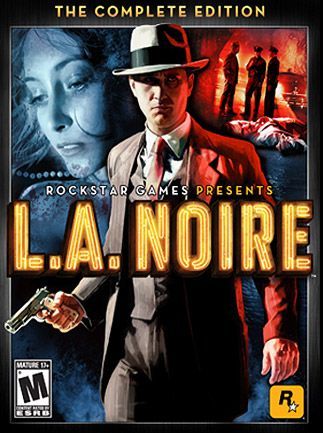
L.A. Noire was actually my main inspiration, besides the Witcher 3: Wild Hunt, to do a video game concept. Granted, lots of the things that inspired me, such as gameplay mechanics, environments and story telling, I won't be able to recreate or use due to the limited amount of time of the project and my developmental skills, but it doesn't stop me from using them as part of the context I'm using for my actual outcomes.
So, talking about the aspects of L.A Noire that I would adopt into my own game if I were able to actually create it, the first thing I would impliment would be the mechanics that revolve around solving crimes, such as the interrogations as well as the collection and handling of evidence. In the game itself, when you enter a crime scene, you are able to handle and example key pieces of evidence that drive the case forward and whilst examining the evidence you can find hidden details that will further aid you in solving the case. Whilst interviewing and interrogating witnesses and suspects, you must question them about the evidence you have found and by looking at their facial expressions, you must decide whether they are lying and you must give them the appropriate conversational response.
I think these mechanics would be rather interesting in the context of a private investigator looking for a evidence about a hidden cult and then being able to interrogate their members about the cults actions. Granted, it wouldn't be the first open world game to have this ability examine objects in the environment, but in most games it is used it's a rather hollow and 2D feature which doesn't do much other than to act as a way to view a collectable, in my game I'd want it to be a way of progressing the story, make the objects and the mechanic itself have meaning, not unlike L.A Noire, but maybe with aa bit more deptj. This video game mechanic is such a great tool for story telling and I'd really want to take advantage of it given the chance.
To make this post more relative to my actual final outcome, I want to take a quick look at the weapons used within the game, because I've created a couple of weapon models that would be within the conceptual game of my Final Major Project.
First off, all of the firearms within the game were chosen and designed from real life weapons that would exist and be in used at the time the game is based in. They were also chosen because of their accessibility to the LAPD police officers, so most of the weapons are either semi-automatic rifles, low calibre automatic firearms, and the majority of the weapons are simple handguns, which are still commonly used by American police officers today.
Due to the clearly deliberate choice of the weapons in the game, the concept designers must have done extensive research on what police officers of the time would have, this is proven by aforementioned type of firearms, as well as where they were made, because of the fire arm models within the game are/were produced in the United states.
Attention of detail isn't exclusive to the firearms, its within every aspect of the video games visuals to make sure the player is immersed in the time period, everything is designed within the style of that period. In L.A. Noire specifically, everything is designed to look like the 40's, from the buildings, to the cars, to clothing the characters wear.
4 notes
·
View notes
Text
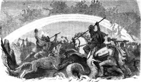
To me, one of the more important parts of my video game concept is the story, without it the planned trailer and the concept art doesn't mean much, to that end I wanted to do some research on the event in Norse mythology known as ragnarok, this is because the antagonists ofthe story are a cult that wish to bring on ragnarok, believing it will transform the world into a paradise. Of course I'd be taking liberties with the actual mythology so it would fit the mold of my story, but having a good grasp of the source material would help make my own story make sense.
Within the real world mythology of the Vikings, ragnarok was the cataclysmic destruction of everything in the universe, even the gods themselves. If you were to look at the tales from viking mythology as a linear timeline, ragnarok would naturally come at the end. To the Vikings, ragnarok was prophecy of an event that was to come at an unspecified and unknown time in the future, this had profound ramifications on how the Vikings understood the world in their time.
The word Ragnarok itself actually came from the old Norse word of ragnarök, meaning "fate of the gods." The event itself was referred to by a host of different names, such as in an apparent play on words, in some old Norse literature it was referred to as ragnarøøkr, meaning "twilight of the gods," as well as occasionally aldar rök, "fate of mankind," along with a host of other phrases and names.
The first sign of ragnarok the fimbulvetr, sometimes anglicised as Fimbulwinter, a great winter unlike anything the earth has seen. The winds would blow snow from all directions and the sun's warmth would disappear, plunging the world into unbelievable cold. This winter would last for three years without respite, mankind would be so desperate for food and other necessities of life that law and all morals would fall away, only leaving the struggle for survival. It would be the age of war, the string would survive.
Skoll and Hati, the wolves who had chanced the sun and moon across the skies since the beginning of time, will at last catch their prey. The sun, the moon, even the stars would disappear, leaving a dark void in the sky. The great tree Yggdrasil that hold the cosmos amongst its branches would tremble and all the trees, and even the mountains would fall to the earth. The chain that holds the monstrous wolf Fenrir would snap and the beast would run free. Jormungand, the might serpent that who dwells at the bottom of the ocean and encircles the earth, will rise from its depths, spilling the oceans across the land.
These convulsions would shake the ship Naglfar free from its moorings. This ship, which is made from the nails of dead men and women, would easily sail over the flooded earth. The crew of this ship would be an army of giants, creatures of destruction and chaos. And its captain will be none other than Loki, the traitor to the gods, who would have broken from the binds in which the gods had placed him.
Fenrir would run across the earth, his lower jaw against the ground and his upper jaw against the top of the sky, devouring everything in his path. Jormungand would spit his venom across the world, poisoning the air, land and water alike.
Sky would split and from the crack would emerge the fire-giants from Muspelheim. Their leader would be Surt, with a flaming sword brighter than the sun in his hand. As they March across the Bifrost, the rainbow bridge to asgard, the home of the gods, the bridge would fall and break down behind them. Heimdall, the divine sentry, would blow his horn to announce the time the gods fear most. Odin would then got to the head of Mimir for counsel.
Despite what the prophecies have said about the outcome of the fight, the gods would decide to go to battle. After arming themselves, they would got to Vígriðr, meaning "Plain where battle surges" to meet their enemies.
Odin would face Fenrir along with the einherjar, the host if his chosen human warriors that he had kept in Valhalla for that very event. Odin and his champions of men would fight with more courage than any others who have fought before. But this bravely would not be enough, Fenrir would swallow Odin and his men. Then one of Odin's sons, Vidar, would avenge him. On one of his feet would be the shoe that has been crafted for this very purpose; it has been made from the scraps of leather discarded by human shoemakers, and with it Vidar will hold open Fenrir's mouth. Then he will stab the wolf through the throat, killing him.
Garm, another wolf and the God Tyr would slay each other. Heimdall and Loki would do the same, putting an end to the gods treachery, but to great cost to the gods as it meant losing one of their best. The giant Surt and Freyr would also be the end of each other. Thor and Jormungand, the age old foes, would finally have a chance to kill the other. Thor would be successful in destroying the great serpent with blows from his legendary hammer, but the snake would have covered him in so much venom that he would not be able to stand much longer and he would take nine steps before falling dead himself.
After the mighty battle, the remains of the earth would sink below the waves and there would be nothing left but the void, making as though creation had never existed.
After this point in the tale, there are two outcomes that I could find; ragnarok is the end of all tales and the whole cosmos itself, but the other is a new, beautiful green world will rise from the water. Vidar, and 5 other gods: Vali, Baldur, Hodr and Thor's sons Modi and Magni would have survived the death of the old world and will live happily in the new one. A man and a woman, Lif and Lifthrasir, meaning life and striving after life, would have survived the cataclysm by hiding in a place known as the "Wood of Hoddmimir." These two would emerge from their hiding place and populate the land they find themselves in. This new land would be over looked by a new sun, the daughter of the previous one. And all of this would be presided over by a new, almighty ruler.
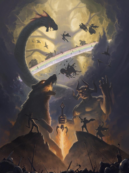
The latter opinion of how ragnarok would be resolved is the goal of the antagonists of my concept. They are what I'm referring to as the Cult of Permafrost and this cult wish to bring about the events of ragnarok so they can shelter themselves and emerge in the new world which would be a veritable paradise. They aim to accomplish this feat by following the instructions found within ancient tombs that were in turn found within ancient Norse burial sites.
The events of ragnarok would differ from the mythology though, the most drastic difference would be the gods themselves; the gods arent as the Norse mythology describes them, they're in fact a lot more livecraftian in nature. The gods are in fact completely alien, unknowable creatures which vastly go beyond our own comprehension, the very concept of dimensions do not apply to them, even visualising them for long enough, either by seeing or thinking about them would drive you mad. These creatures would be the basis of human religion, whether it be Norse, Aztec, Egyptian; it would all be derived from the existence of these beings.
The Cult of Permafrost in fact worship these beings, learning about them from the previously mentioned ancient tomes and the members known as the "high priests" would be the few that actually came into contact with these beings which often left them deeply scarred, though the cult sees this as a blessing instead of a curse.
Ragnarok wouldn't in fact be a battle like the viking's tales foretold, the entire event would actually be a lot more bizarre. Instead of a winter, Fibulwinter would be an instant freeze that would turn the oceans water to ice, people outside would also turn to ice and would shatter at the smallest impact, this would happen so quickly that everything would be normal and in a blink of an eye, everything would be converted in ice and snow. The initial freeze would quickly die and the world would be placed into a three year ice age, but more severe than any ice age ever seen, fire would refuse to burn and the sun would no longer provide heat until the sun would eventually disappear, along with the stars. It would not leave a void however, the black sky would instead have a dark purple hue and a subtle glow.
Earthquakes would follow as the cult's patrons, the unknowable beings, appeared in sky; their appearance would be so strange, so aberrant that the human minds failed to comprehend it. Their maddening affect would worsen the already violent conflict for resources as people began to destroy each other in their mad delusions. These earthquakes wouldn't make mountains collapse like the Viking tales prophesied, instead great, jagged monoliths would shoot through the ground towardd the sky in sharp angles.
These earthquakes would also break the ices that covered the seas and the oceans would convulce as the water spread across the land, leaving only the hills, mountains and the tall monoliths caused by the earthquake.
Ships that have previously sailed the ocean would sail it again in a ghostly form and anything they touched would turn to dust, be it animal or earth. The same would happen on the men and women that lived on the land as they began to walk the earth again, resuming their lives as if they had never been ended.
Space and time itself would begin to warp, took would slow and speed up. Visable ripples in the air would begin to float across the surface of the ocean and land. Items, people, buildings, even mountain would suddenly in random places before disappearing again. Black holes that warped space around them would begin to appear in the glowing purple sky as the cosmos began to deteriorate. From ripples in the air, unimaginable monsters would appear, killing anything in their wake.
The immosibaly large creatures that the cult so willingly worshipped would descend from their place in the sky and begin to wander the earth, paying no mind to the chaos below them.
The oceans, the land and whatever was left living would then experience the weather changing so rapidly that it could be captured with a blink an eye; the seas would begin to freeze once again before immediately boiling, then freezing, then boiling and on and on as meteors began to crash from the sky. As the large space rocks land into the seas, they would send title waves across what was left of the land, drowning it below the waves.
When only water is left on the planet, the ghostly figures from every point in time would continue their lives as the Cult's gods and the monsters lingered until the black holes in the sky expanded to encompass everything, leaving only those aberrant creatures, allowing them to recreate what they did to this world in whatever reality they would choose.
5 notes
·
View notes
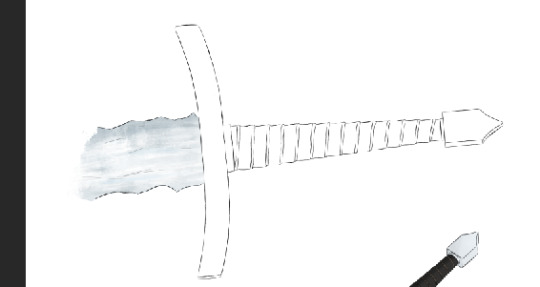
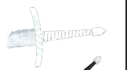
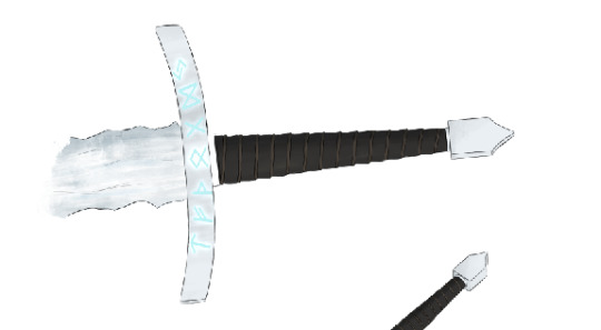
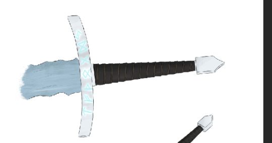
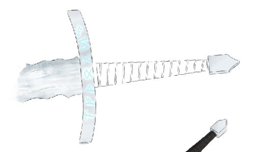
Photo
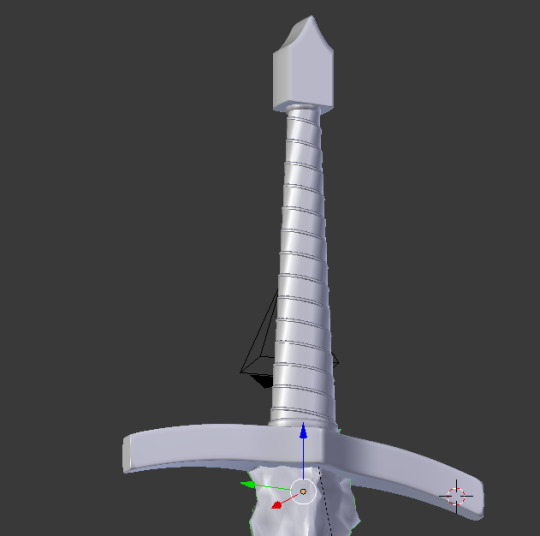
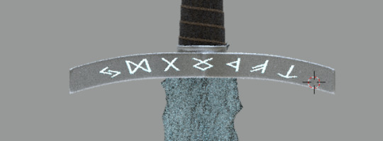
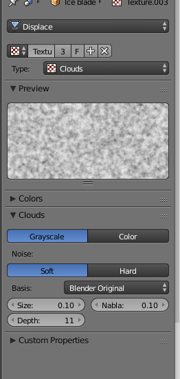
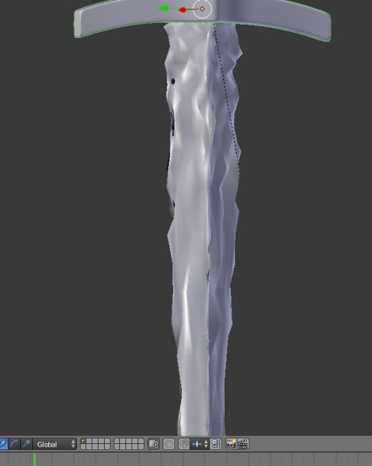
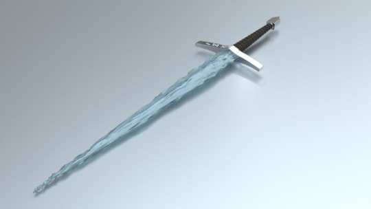
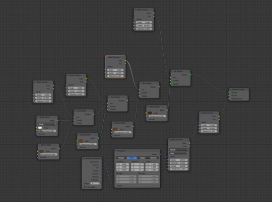
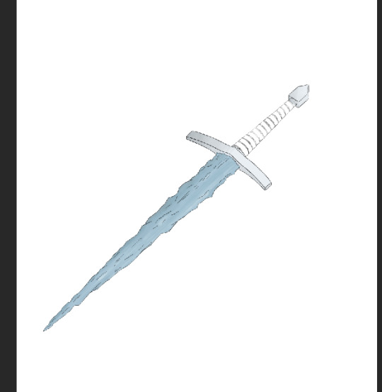
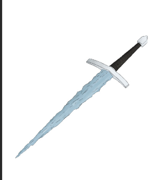
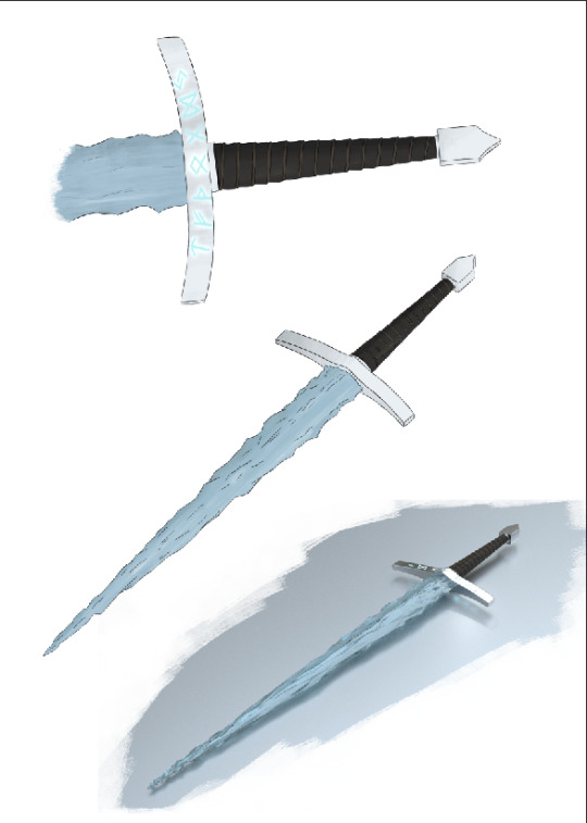
Above are a few screenshots of the process that I went through to create this dagger with a blade of ice, which I’m using as part of video game concept. I first began with the cross guard of the blade, using a cube with a mirror modifier, so it would reflect the work I did on one side to the opposite side. I then elongated the cube into a thin rectangle and then gave it an inward curve so it would curve from the sharp, wider angle in the centre to the thinner outer face. I then added the subdivide modifier to curve the object and used loop cuts to push the curve to the edges, because items in real life rarely have completely sharp edges. I next created the basis of the blade by using another cube and turning it by 45 degrees so two of vertical edges were at the same angle as the cross guard. I then flattened the cube so it was of an approximate depth of a regular dagger blade. I then shrank the width of the blade so it would be in proportion with the blades guard. Afterward, I entered the blades length to be appropriate for a dagger or short sword. Next I moved onto the grip of the blade, and this was done by using a curve spiral which I gave 15 loops, this would then turn into the leather strips that would be wrapped around the handle. I then gave the spiral weight; giving it an actual shape instead of being a line in the hair. I then increased the width of this weight until the edges met, like they would if they were wrapped around a cylindrical object. I repeated this process, but did not widen the width, I just left the spiral with a tubular shape to represent the string or twine which would be keeping the leather in place. Next I two cylindrical caps to the grip, one where it meets the guard and another where it meets the pommel The pommel was extremely easy to make, it simply consisted of a cube, which I then gave the sides of a rather small curve outward and then created a triangular shape at the top which I then gave inward curves. To create the blade’s final shape that more resembles ice, I used a deform modifier with a cloud texture as the deformation type; this means the blade would be deformed depending on the texture’s colour, with more deformation in the darker areas of the texture. I made sure to make the texture was rather small, so the deformation on the blade was rather large, giving it bumps and curves like ice. I then placed a subdivision modifier to remove the extremely sharp edges created by the deformation modifier. The texturing process of this object is rather complex and confusing, so I won’t doing a step by step of the process. For the base of the metal texture and giving it a glossy look, I used the principles shade which allows you to completely control the basis of a material, (this worked by essentially affecting how light interacted with an object) and to create something resembling metal, I only had to increase the metal slider to full (The metal slidee controls how metallic an object is,) then I lowered the roughness slightly (this slider controls the object’s glossiness and how reflective it is,) these settings made an objects that looks like metal, but it didn’t look real because it had no imperfections. To create the imperfections I used a number of different nodes to create the appearance of dirt and scratches on the metals surface. To create the dirt affect on the metal, I started out using a musgrave texture and changed its size and distortion so it would look like a random stain. I then attached this node to a colour ramp node so I could further edit the texture, I then added the colour ramp node to a bump node through an RGB to BW converter. I lowered the strength of the bump, so the stain would only have a very slightly difference in height to the surface of the metal. After creating the bump for the dirt, I attached a colour ramp to the colour connector on the principled shader, I then attached this to the RGB to BW node through a multiply node. This new colour ramp allowed me to give the dirt a colour, I chose a gray with a yellow hue; this created a rather nice affect that was subtle, making it seem like the material had been in use, but was still maintained. Creating the scratched was a bit more of a complicated affair, so for the sake of brevity, I wont go into huge detail as to how did it. The basis of the scratch appearance is two vorornoi texture nodes, these are connected to each other through a subtract node, this means the textures subtract from each other, but since the textures have the same settings, there will be no texture. The obvious answer to this would be to change the settings of one if the texture nodes, but this would make the scratches stretched and disproportionate. To get around this issue, I created a system where you could control the X, Y, and Z of the scratches. This was accomplished by using a texture coordinator and a series of Math nodes. To start off, I attached the texture coordinator’s object connector to a separate X,Y,Z node’s connector, I then added a combine X,Y,Z node, I connected these nodes X and Y connectors together through add nodes (this allowed me to change the add nodes value to affect the X and Y) and I connected the Z connectors directly because the Z axis was irrelevant in this case. To stop the scratches from being straight lines, I added two noise texture nodes, these both had different values and one was connected to the Y’s add node and the other to the X’s through a multiply node; this added curved to the scratched. I then added this system I had created to control the scratched to the two voronoi textures, one directly and one through a mapping node. I edited the mapping mode ever so slightly so it was the two voronoi textures were slightly different, this meant some of the texture was left after the subtract node and what was left would become the scratches. Finally the subtract node was attached to a colour ramp, which allowed me to control the amount of scratches, this was in turn attached to a RGB to BW node which was then attached to a bump mode; I again turned this bump node down so it was only slight and then attached this bump node to the dirt’s bump node. After some small tweaks to the details, the metal was complete. I then used this metal material for the pommel and the grip caps. To create the glowing text, I used an image texture connected to a texture coordinator and a mapping node, in combination these allowed me to place the text where I wanted on the guard. I then attached this to a bump node to make it looked like the text was engrave and I also attached it to an emission node which gave it the glow. I did this through a series of mix nodes. I then finally added the glowing text to the rest of the texture with a mix shader mode. Starting off with the leather, I used a geometry node, with three different math nodes attached in a string attached to the geometry node's pointiness connector. This node string was then mixed with a diffuse node set to a white colour as well as a principled shader set with a dark brown colour. These nodes come together to make the grip turn white where the light hits it directly while keeping the edges brown, like how light interacts with actual leather and the pointiness noee string makes the leather strips look creased and folded at the edges. Because leather isn't a uniform material and light will be absorbed differently across the material, I added in a noise texture and a musgrave texture to break up the rather flat white defuse that was present, these two new textures were connected to the middle math node within the pointiness node string. I then changed the diffuse colour to a light greyish brown, this made the material seem worn. It was here I decided to move away from the leather material and more to a general fabric, I did this with a wave texture and a bump map, this created an affect that looked like threads of a fabric. To add to the worn look, I added a texture coordinator, noise texture and a colour ramp and plugged it into the principled node's colour; I used this to add discolour areas to the material, I also did a similar thing for the diffuse node as well as giving it a bump. To create the string of the grip, I essentially used the same material, though I did tweak settings, such as the colour so it would fit. For the Ice, I started with the colour of the ice. This was done with a combination of wave textures all mixed together and plugged into a colour ramp which was then plugged into a bump node, which was then plugged into a glass node along with athe original colour ramp, the glass node is what gave the object its colour at this point, due to the node being given blue colour, this left the object being a translucent blue with many lines of different shades of blue running down the blade. I then mixed this node group with a fresnol node and colour ramp, this allowed me to control the refraction of the object. The blade was looking good, but it was far too translucent for what I wanted, so I mixed in a few more node groups. First off I created a group for absorbing light as it entered the object, this was done by combining a pointiness node, an RGB to BW node, a colour ramp, diffuse node and finally an volume absorption, I used the colour ramp node to invert the pointiness node so the texture would be affecting everything but the sharpest ("pointiest") areas of the mesh, the diffuse node spread out the light and was set to a very light blue and the volume absorption actually absorbed the light when it hit areas that weren't thin or sharp, like how ice works in real life. I further mixed this with one node group dedicated to subsurface scattering, meaning they controlled how light acted once entering the object and the other dedicated to the glossiness of the blade. First I combined to subsurface scattering nodes, both with two different shades of light blue and as the factor for this combination I used a fresnol node, this affected refractive the subsurface would be. Secondly I created a node group which made it so some parts of the ice seemed denser and light had a harder time passing through it, this was done with a noise texture along with a mapping node to control the positioning and scale of the noise, I then mixed this with a gradient node, which allowed me to make it so their were less dense areas of ice the higher up the blade to went, this was then combines with a gloss node to give those dense areas a bit more shine and then this node group was mixed with the sub surface scattering group. To add some final detail to the blade, I created a small group consisting of a texture coordinator, a mapping mode and three texturing nodes. These texturing nodes were a voronoi texture, wave texture and a noise texture; these textures were then plugged into the displacement output, created some small bumps and ridges on the models surface to make sure no part of the surface was too smooth.
2 notes
·
View notes
Text
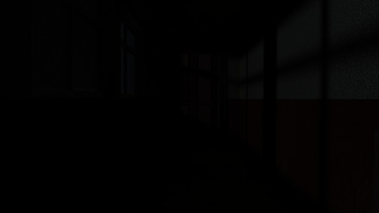
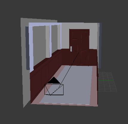
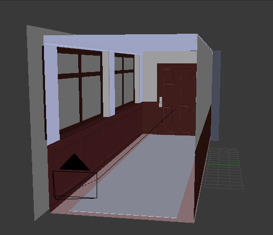
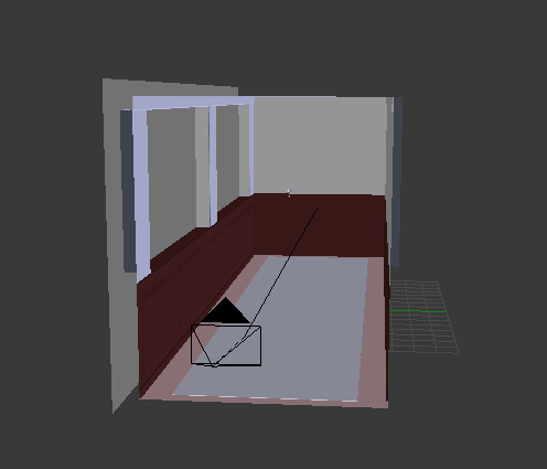
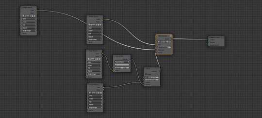
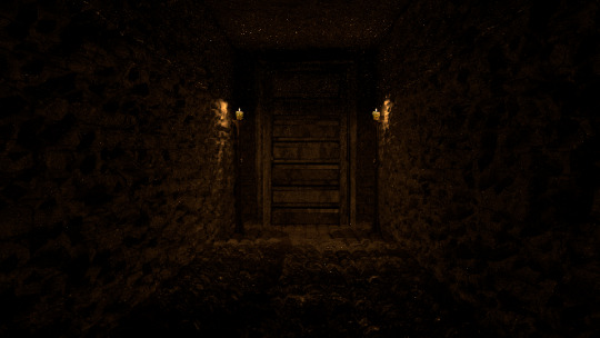
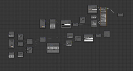
Despite the very clear problem that has presented itself in the way of lighting, the images above show the process I used to make a couple of corridors that will feature in trailer I've made as a part of my Final Major Project. Unfortunately, tumblr doesn't allow enough screenshots to show the whole process of the creation, so I'll try to describe the whole process as much as I can.
A quick disclaimer before I continue, I'm only showing the process of making one of the corridors as I used essentially the same techniques to make the other.
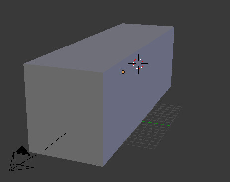
I first started with the default cube that belnder gives you and I scaled it up and elongated it is so it was much larger and in the shape of a rectangle. I hollowed out the rectangle to create the basic shape of the corridor's interior. To create the wall panels and windows, I used a large number of loop cuts to essentially cut the shapes into the walls; after using the loop cuts, the panels and windows had their own faces, which allowed me to extruded them, I extruded the windows inwards to make sure the glass was thin along with creating a windowsill and I extruded the wall panels outwards. To create the rug, I extruded the floor and scaled it down before extending it once again along the Z axis. I then added another cube to the scene which I scaled up to be the shape of a door, I then again used loop cuts to extrude different parts of the rectangular shape to add detail and actually make it look like a door. To finish off the modelling, I beveled all of the edges in the hallway, I did this because straight, perfect 90 degree edges dont really exist in the real world and having them in the seven was rather distracting.
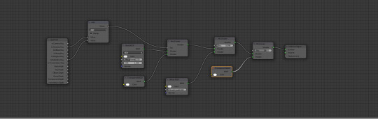
Thankfully, the modelling of the hallway was far easier than I expected, the real challenge for me was texturing; during this part of the project, I decided to proper image textures instead of creating my own materials with nodes. There is a wide selection of different textures on the internet and I've found a few sites that are designed for people who create CG art, so their textures also come along with things like normal and bump maps, as well as roughness and distortion images. For things like architecture models, you need image textures and creating your own takes a lot of time and I unfortunately didn't have the time to do it, so I made sure to use royalty free textures.
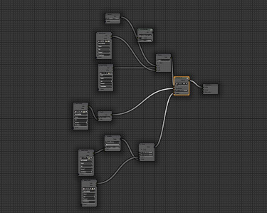
Having the texture is only half the work though, you can't simply slap one on a model and expect it too look good, so I created a node system for the textures to make them look as realistic as possible.
The wooden panels on the lower half of the wall as well as the wooden floors use a rather simple set up. It centers around a node that combines all of the image texture inputs. I first added the basic colour texture which I plugged into the colour segment of the Dielectric node, I then added the normal and bump maps into the node group; these two textures affect the appearance of the objects surface; in the case of the floor, it makes it appear that there are bumps on the surface and creates the illusion of depth, specifically around the edges of the planks as well as the ridges on the wood. I connected the bump map into the bump node and the normal map into a normal map node, which I then connected to the bump node's normal, these two connected nodes then connected to the Dieletric node's normal. The combination of these nodes made the material look more real and 3D, but it looked too perfect and clean, so in order to make it look more worn and like it wasnt completely untouched, I added a roughness texture which I connected to the Dieletric's roughness value; this means the roughness changes to that texture, darker sections of that texture will be less glossy the lighter areas. Finally, I added a similar in a similar texture as to the last one and combined it with the colour node, this added a dust like layer to the texture. This process was used for anything with wood in the scene, like the door, panels and floor as well as the stone walls in the second corridor.
To create the actual shape of the bricks in the stone corridor, I used a displace modifier along with a displace texture, this displaced the mesh wherever the texture is darker than pure white.
The glass in the windows is essentially the same as I used for the bottle and drinking glass that I posted about before.
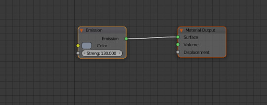
The last texturing I did was creating the pale green paint, it was rather easy. It is made up of two RGB nodes which control colour, along with a gloss node and a diffuse node that are mixed, the RGB nodes control the colour of the gloss and diffuse. I lastly added a noise texture which I plugged into the displacement as scaled it up to the point where the bumps it created were so small that they just seemed like bumps on paint on the wall
2 notes
·
View notes
Photo
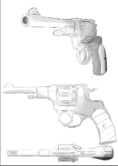
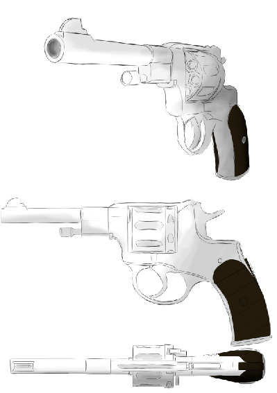
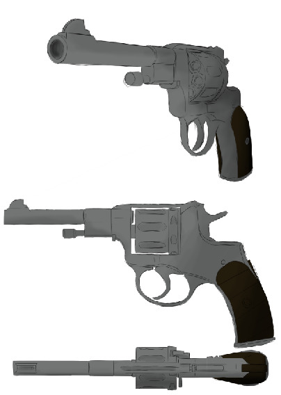
After researching time period appropriate revolvers and having a look at other people’s concept art, I decided to draw some of my own. My Final Major Project originally started out with concept art in mind before it began to veer into the world of 3D CGI art and so previous research isn’t wasted, I thought it would be best if I were to return to that original goal. I wrote about the Nagant M1895 in a previous post, unfortunately it was rather brief due to most aspects of a gun not being very relative to an art project, though there were a few key things I forgot to mention in that post. Firstly is the materials that the gun is made of, which is most likely steel, though I can't find a concrete answer to that question. The grip of the revolver is made from wood, at least in the original models. Drawing a concept for the revolver that I wanted to create was fairly simple considering I had real world references to work with. It's a pretty basic rule of drawing from a reference that you should look for shapes within the thing you're trying to draw and that's where the simple geometry of this particular revolver comes in handy. I unfortunately deteled the sketch layer before taking a screenshot, but it was essentially a series of rudimentary squares that made up the general shape of the revolver, though it wasnt perfect first try and I had to modify it a few times before refining the general shape. I used this method to first draw the side profile and the overhead view which was fairly easy as their was no need to account for distortions created by perspective and the perspective drawing was much more difficult to draw in the beginning considering I'm not the best when it comes to drawing quarter views. I next used the polygonal lasso tool to on a new layer and painted in the grey steel like colour onto the gun along with the pistol grip which I gave a simple brown to represent the wood. After the colour was placed into the image, I selected the colour layer's pixels and began to paint on the shadow with the a brush that has a rather low opacity. Then finally, I simply used a oval brush to paint the blue in the background. I will be the first to admit that these are not the best drawings in the world and could definitely use improvement, especially in the departments of the outlines and shading, but I'm happy with them when seen in the context of concept art. Concept art isn't meant to be the prettiest and most detailed piece of art in the world, it simply has to convey an idea for the final product and I think this does that. There are a few details I've left out that you would find on the actual gun, such as the serial number and the year of creation, this is because I wouldn't be able to put this in the final model because the geometry would make it difficult to render and perhaps make the file unstable.
2 notes
·
View notes
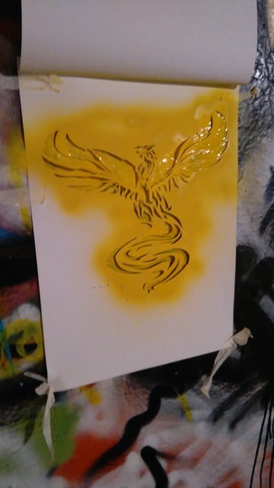
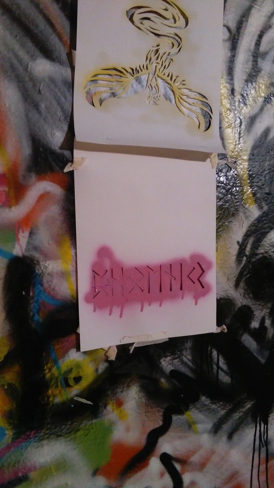
Photo
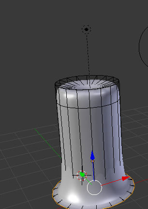
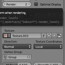
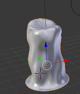
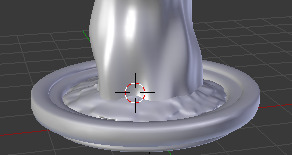
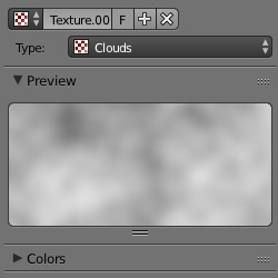
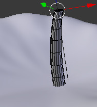
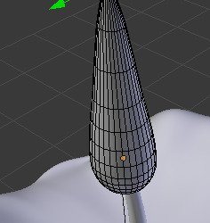
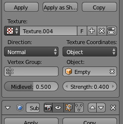
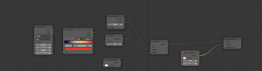
Above are screenshots of the process I used to create the candle which will be featuring in the opening scene of the animation which will be used as part of my Final Major Project. The images above contain the node structure that creates the flame’s colour, distortion affects that control the movement of the flame and the shape of the candle. Animating the flame and actually texturing it too look like a flame was much easier than I originally anticipated assuring my research I found out that fire is notoriously difficult to animate and model, though it seems candle flame is relatively easy due to the fact that they’re relatively stable and you don’t have to simulate smoke. First I started off by creating the body of the candle, this was done with cylinder with two loop cuts near the top and bottom edges with a concave top. Next I placed a subdivision modifier onto the object and then a displace modifier, the displace modifier changes an objects shape depending on a black and white texture; in this case, I used a cloud texture which distorted the shape into something similar to an old candle. I then placed yet another subdivision modifier along with a smooth shader to make sure to remove any rigid edges. After having the body of the candle, I created the wick by using another cylinder which I had shrunk to a relative side to the candle body then I stretched it along the z axis and added around 10 loop cuts, then using the “connected - smooth” manipulation mode, I scaled down the tip of the wick so it looked like it had been burning, I then curved it slightly and finally added the smooth shader. For the flame I added a sphere to the scene and again scaled it down to be within a relative size of the wick and candle body, I then selected the highest point on the Z axis with “connected - smooth” and extended it upwards, turning it into a tear drop shape which somewhat resembled a flame, but the tip was too round so I switched “smooth” to “sharp” and extended the tear drop slightly, which sharpened it. Once the basic modelling was done, I needed a way to control the flame’s movement, the way I went about this was by adding an empty axis into the scene and made it follow a circular path. Then I added a low strength distortion modifier to the flame and parented it to the empty axis, this means that when the axis moves, the distortion effect changes causing the flame to the move. After modelling, I added a lamp to the scene to mimic the light of the candle because if I made the flame too bright, it would wash out what little colour was already there. I added a Blackbody node to the light emission, this node allows you to control the temperature of the light, soi set it to around 2500, creating a warm orange colour. Next I textured the candle body, which was rather simple; I added a glossy node, a subsurface node and added them together with a mix shader. The subsurface node affects how light passes through a solid object, like how you can see light through paper, this created the affect some light being able to get through the wax closest to the flame. For the wick, I simply used a diffuse node set to a dark brown colour. While texturing the flame, I started off with the wave texture and a colour ramp, the combination of the two shaders allowed me to create the gradient that you can see on a candle flame. I then added an emission node to make that gradient glow, I also mixed this emission mode with a transparent node and a layer weight node. The transparent does what it sounds like and makes the object transparent while the layer weight node is used for layering and mixing shaders, this is why the flame isn’t completely see through. And finally, I added a volume scatter node, this causes light to scatter as it passes through an object. Lastly, I copied all the surface nodes, changed the colour ramp to a blue hue in stead of an orange one and mixed them with the previously existing nodes. I then key frames the node groups to quickly switch from orange to blue near the end of the animation. Blender has an inbuilt editor for edit post render, so to put the final touches on the animation, I added a glare affect that would mimic the halo that surrounds flames when they're in a dark place.
2 notes
·
View notes