
Statistics
We looked inside some of the posts by sallyunit10 and here's what we found interesting.
Average Info
Notes Per Post
0
Likes Per Post
0
Reblog Per Post
0
Reply Per Post
0
Time Between Posts
1 day
Number of Posts By Type
Link
2
Text
15
Last Seen Tumblr Blogs


Fun Fact
Tumblr has a low social media market share in South America.
Link
0 notes
Text
For this GIF I have decided to work with a green, black and white colour scheme. This is to showcased the variety of colours used in my collection. To create this I used Canva in the social media animation section. This is an advertisement piece explaining that my new exhibition prieces are ready to view today.
0 notes
Text
For this GIF I have showcased one of my most detailed designs, with my collection name down the side. This is a clear promotion piece that would indicate to the viewers the style of my new collection.
0 notes
Text
For this last design, I wanted a lay out that would encapsulate the main themes and abstract illustrations of my collection. I love the layout and direct advertising.
0 notes
Link
The content in my commercial has been collated since the start of this project. I began by filming my development, which displayed my initial research ideas inspired by my primary images. I then continued to document; my initial sketches, textile samples, media experimentation and final illustration work. I planned and created this commercial over about three days when I was coming to the end of the unit. I used the programme Premiere Pro and chose music from Epidemic Sound. Overall, I am really pleased with the outcome but will continue to practise using this software so that I’m able to create more promotional content faster in future projects.
0 notes
Text
Commercial Plan
I began creating my commercial by making a story board layout plan to make sure I didn’t miss out any key collection information. For example, I needed to include: my collection name; video content; key adjectives describing the collection; appropriate music and my logo.

This working document allowed me to keep the commercial time at a good length, whilst editing the content to keep it fast paced and interesting.
0 notes
Text
Collection Press Release -THE AGORA COLLECTION
Agora - A Latin Architectural word to describe a place of Assembly. This has been interpreted by using inspiration based on a towns architecture such as the Town Hall, places of work and open park spaces and their buildings.
Inspired by the historic and contemporary beauty of her home town, Sally Mitchell explores the combination of Victorian and modern architecture in Barnsley. Commissioned by Barnsley Civic to create a six piece collection, the designer has taken influence from the delicate details, angular silhouettes and traditional objects to create these innovative pieces. Experimenting with the idea of merging the town’s past and present infrastructure, the collection encapsulates the diverse but treasured sense of the town and symbolic features.
0 notes
Text
Press Release Paragraph Plan

Making a press realease allowed me to collate all of my ideas and adjectives for the collection onto one page. I then selected the ones that I believed were the most descriptive and that would best portray my home town collection in a paragraph.
0 notes
Text
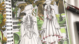
6 Illustration Boards
After designing each of my six design boards I started to lay them out with my spec drawings. In the end I’ve decided to do sepearer design boards and spec drawing boards that will go along dude each other in my portfolio.
This is because I felt that I wouldn’t be able to show the detail of both if I was to shrink them down. Therefore, I will display them on different A3 boards beside each other. Also, the details of a spec drawing need to be bigger in order for them to be manufactured correctly.

This first deisgn is one that stands out to me in the collection because of the voluminous sleeves. I wanted to focus this design, which is inspired by my primary images taken from Locke Park, in the detail of these sleeves.
I love how this illustration had turned out, in particular the colour scheme I have chosen. To improve, this furthe I could have created a more quirky pose for this illustration as I feel that it would lend itself well to this.

This second design was definitely the most complicated to illustrate. This is because of the obscure pose, as well as the intricate layering details to the garment. However, due to its complexity, I love how this illustration appears. It was difficult to create the transparent layered top effect using pro-markers, but I love how the blend of the pens turned out in the end.
This deisgn is very much inspired by the angular and symmetrical elements to classic and Victorian architecture, which I photographed around Barnsley.

My third design is the most elegant look from the collection and is the only jumpsuit style piece. I decided to include this to show a variety within my collection and I feel it would show different techniques had I needed to construct my pieces.
This look was inspired by the silhouettes of the lamps outside of the Digital Media Cente in Barnsley. I tried to focus on the detail of these elements of designs, as well as the colour scheme from my primary images.

For my fourth illustration, I have focussed on creating an abstract exhibition piece. Also, I feel that this design is quite delicate and pretty compared to some others in the collection.
The spiral pattern that creates of the garment was inspired by the smaller details within the architecture of the Town Hall in Barnsley. I wanted to focus on the intricate details of the Victorian architectural work. Overall, I am really pleased with how this illustration appears.

Once again I have designed a very detailed garment, much like my previous illustration. This deisgn was one of the most time-consuming to draw, but I’m very happy with how the final piece turned out.
This piece is again inspired by the lamppost silhouettes outside of the DMC. My aim was to really accentuate the curves and rounded shapes from the objects, as well as create a detailed and volumised skirt.
Overall, I love how the pro-markers have complimented the design, therefore this is one of my personal favourites.

Finally, my sixth design was inspired by the spikes which can be seen on the top of the previous Queen’s Hotel building on Regents Street, Barnsley. This is the most unusual and eccentric deisgn out of the collection, but I wanted to show a variety of looks so felt it was important to include. This deisgn gives a bold sense of Victorian architecture.
My aim was to portray how these juxtaposing architectural styles can stand beside each other in one town and somehow still create a homely, historic but welcoming town.
0 notes
Text
Collection Moodboard

Wikimedia Commons. (2020). History of Architecture: Ancient Greece.Available: https://www.pinterest.co.uk/pin/849421179711139157/. Last accessed 2nd Nov 2020.
world4.eu. (2020). The Roman Ornament. Corinthian and Composite Capitals. The Acanthus.. Available: https://www.pinterest.co.uk/pin/698128379728230216/. Last accessed 2nd Nov 2020.
archdaily.com. (2020). Gallery of Does Form Follow Fashion? Viktoria Lytra's Montages Keep Iconic Architecture In Vogue - 7. Available: https://www.pinterest.co.uk/pin/21744010689724204/. Last accessed 2nd Nov 2020.
Sweeney, R. (2011). Experimental pleat (Bird in Flight). Available: https://www.flickr.com/photos/richardsweeney/8689502395/. Last accessed 2nd Nov 2020.
Iris Van Herpen. (2018). Iris Van Herpen at Couture Fall 2018. Available: https://www.pinterest.co.uk/pin/584623595355160084/. Last accessed 2nd Nov 2020.
Vail, H. (2016). ASYLUM. Available: https://www.pinterest.co.uk/pin/27303141480098467/. Last accessed 2nd Nov 2020.
Arocena, M & Benitez, L. (2020). Nintai: Origami-Inspired Geometric Dresses. Available: https://www.pinterest.co.uk/pin/555702041492176445/. Last accessed 2nd Nov 2020.
Hardinge, G. (2013). Georgia Hardinge. Available: https://www.pinterest.co.uk/pin/2040762316187054/. Last accessed 2nd Nov 2020.
0 notes
Text
Design Boards Development
I have used my deisgn develpment ideas to create three different deisgn board ideas. I have shown a range of colour schemes throughout the collection, hence why many of my deisgn board ideas are bright and bold. However, in the end I decided that my final illustrations looked better diplayed on a white background with a strip of colour and my collection name.
This is because I felt that the detail on the designs gets lost with with the busy backgrounds. Also, by incorporating the collection name I am able to tie all of the illustrations together.
0 notes
Text
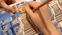
Spec Drawings
For each of my six spec drawings I have had to confided the manufacturing details including; the darts, fastenings and patterns. However, the most important part of a spec drawing is to indicate the specific details of the garment and how practical it is going to be to take on and off, as well as showing an indication of the deisgn features.
After moving my deisgn boards around, I have decided that I will lay my final illustrations and spec drawings out on different A3 pages. This is so that the details on each are still clear, but will be payed out side by side in my portfolio.


0 notes
Text
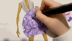
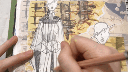
Adding media to illustrations
I have decided to illustrate my final six designs using promarker pens. This is because I love how I am am able to create tone by building and blending the pen inks. Also, I have a variety resources available to me, such as a number of skin tones and blender pens.

In addition, I love how bold the colours apprear when using promarkers. This allows me to portray a strong colour palette in my design work.

The promarkers have a thick and a thin nib, meaning I am able to add this media to smaller, more intricate areas areas of my design.

For this illustration above, in particular, I had to decide how to create a transparent effect using the promarkers. To do this, I used a light grey pen and blended this area. I am happy with how it turned out as it creates the effect that I hoped for.

This is one of my favourite designs because of the bold colour choice and tones of blue. I was able to blend these tones using this media, which creates depth and texture.

At first I wondered how I would add media to the sleeves of this design, however I found that just adding slight marks of colour would create the best visual effect. I also love the tones of green added to the bottom of the garment, which I was able to blend using the promarkers.

I was also also to photocopy my illustrations onto more of my bleed-proof promaker paper to experiment with different colours for the designs. However, luckily I was happy with my first selection of colours as I had searched them before hand.

In some cases, I only added a slight bit of colour to the design in order to add texture, tone or to create a three dimensional effect. For this deisgn above, I have added grey tones into the corners of my design to lift it out of the page and create tone.
Overall, I’m pleased with how my final Illustrations turned out having used the promarkers. Whilst continuing to experiment with different media, I think I will always refer back to this as my favourite.
0 notes
Text
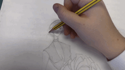
Illustration Development
After looking though all of my deisgn development from my initial fourteen sketches, I managed to decide on my final six.
This was a difficult process as I was trying to get a balance of having my favourite deisgn ideas, whilst having a variety of style and and silhouettes. However, after editing myself and getting the opinion of my peers and tutor, I am happy with my final six selected designs.
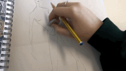
Once I have chosen all six deisgns, I then had to create and change different poses for these designs. Over my time on this course, my pose development is something that I’ve struggled to perfect. For this reason I really wanted to challenge myself to use a style of pose that I haven’t yet tried.

This is why I have decided upon a more quirky style that will display my abstract designs well. These are stances that I found through research and then developed to make them my own.
Specially, I experimented with a number of different ideas for the heads of these illustrations.

At fist, I went for a more detailed face and hair with a harsh drawing across the face. However, I then realised that these were conflicting ideas to decided to strip it back to no hair or detailed facial features, with an abstract scribble design across half of each of the faces.

This is my favourite style of illustration that I have worked on so far and I will continue to develop my style for future projects.

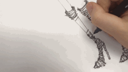
Once I sketched all of my deisgns onto the six poses, I then outlined all of them using black fineliner.

At this stage, I was in a position to start adding my chosen media.
0 notes
Text
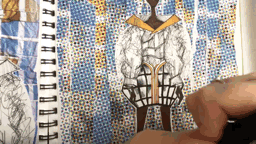
Textile Samples
To create texture and give an indication to some textile techniques I would use on my garments I have created some fabric samples.
I have included: pin tucks, wave tucks, pleats, batik, embroidery and stitching into paper. Using my primary images I have depveloped ideas which I could then carry forward into my design illustrations.

When creating this batik sample, I wanted to be able to portray the deisgn of the clock face from the Town Hall. Whilst, I liked the final outcome, the process is quite messy, which doesn’t allow for a lot of detail. Therefore, batik isn’t my favourite technique to use.


0 notes
Text
Media Experimentation
For my experimentation I have used mixed media over all of my 14 deisgn ideas. The media that I have used: pencils, water colour, berol pen and promarkers.
In my sketchbook, I displayed my initial design ideas, along with a copy of this and an enlarged version. I did this so that I could experiment with each drawing a few times to get an idea of what media would work the best.

In many ways the media used to add colour to a design can accentuate all of the best elements or detract from the key features.
For some of the design, I realised that I didn’t like the use of media after having completed the design, which allowed me to see what will be best to use for my final collection.
A lot of the time it was the colours I’d chosen which had put me off the design, however some didn’t create a striking enough effect for this collection in particular. For example, with the coloured pencil I was able to shade, but the overall effect wasn’t as eye-catching as I wanted.

For some of the design, I chose to use a mixture of media as I thought this would be highlight some parts of the design and create texture for others. However, when looking at all of my deisgns, I have decided that using only one form of media will look the most effective.
0 notes
Text
Media Experimentation
Experimentation is a huge part of developing a collection. In order to decide what media best displayes different materials and textures, I had to test these out on my deisgns.
Using berol pen and water creates a great blend of colour and is one of my favourite forms to use. I love the effect that it had on some of these designs, however is isn’t something I want to use to illustrate all of my deisgns for the collection. This is because it wouldn’t compliment all of my ideas because the water causes the ink to run which can make it look messy.
Watercolour is another form of media that I experimented with. The water colour pencils that I used for this design created a nice wash of colour. However, I find that the colour wasn’t bold enough for how I invisioned my illustrations. Therefore, I probably won’t choose this media to finalise my deisgns.

Collaging is also a decorative form of media which I have used for previous designs and one which I was considering using for this collection. However, looking at all of my designs together, I decided that this wasn’t that right technique to use due to the intricate details of some of my work.

Also, I feel that collaging pulls the visual aesthetic of a collection together so would need to appear in each illustration. In the end I decided that this wouldn’t be the most effective use of media for my collection.

Another form of media that I experimented with was promarker pens. These are one of my favourite forms to use because I love how bold the colour appears and how I am able to blend them to create tone and texture.

I used promarkers to experiment on a number of my designs and whilst I struggled to decide on the colour combinations at first, I am really happy with how they all look.

Therefore, I have decided use promarker for my final illustration. I believe that this will allow me to showcase the details of my design and create a collection of vibrant colour.
0 notes