
sew-lolita
Sew Lolita
I'm Cat/Rin, she/her.
I'm just a tall AF, bisexual, neurodivergent, disabled white girl.
I've been interested in lolita fashion since 2010. But haven't tried to be involved since 2012, when I was bullied at a meetup.
From building tables to sewing ball gowns, I've a menagerie of skills that I learned so I could create things.
Feminism appropriating terfs NEVER welcomed.
Same with misogynists, racists, pedos, thinspo/fatspo, or trumpers, DNI/DNF.
I WILL block you immediately.
SFW blog.
(Kink friendly, but no kink posts will be happening.)
77 posts
Don't wanna be here? Send us removal request.
Last Seen Blogs

pawelmarek61
Pawelmarek the Great

dingabra
Terbaik

tranquil-slaughterhouse
Angel Dust worship/simpin'/appreciation blog

expurplepotato1
Purple potato makes edible art
ily-like-a-banana
smile flowers will bloom
Text
Hey all! Still breathing!
We've been working on The Move still and prepping, so everything hobby wise that's not at my computer has been put on the back burner for the time being.
That is to say, this blog was also back burnered for a while. I may be back soon, or this may just be another failed attempt at social media-ing. Hopefully it's the former. 😊☺️

1 note
·
View note
Text
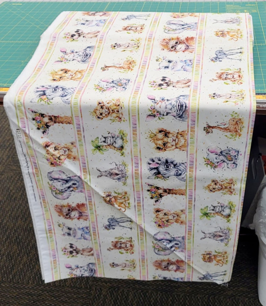
Picking quilt prints to use in lolita fashion
You're going to find different opinions on if you can use quilt fabric for handmade lolita fashion. Some say that it's fine, and some say it'll never work. The actual answer is really simple: you can definitely absolutely sometimes in some applications use some quilt prints, maybe.
Aren't we glad we've cleared things up?
One of the difficult things about using quilting fabrics in lolita fashion is that prints that read really well in a quilt do not always read very well in a garment. Quilts are made up of small squares of fabric, usually somewhere between 12" (30cm) and 2" (5cm) on a side. This means that a lot of quilt prints are meant to have the majority of the print contained within that small space.
Garments, on the other hand, especially lolita skirts, have very large amounts of fabric in them. I cut a lot of skirts at about 88", or twice the full width of the fabric. When some patterns repeat every 7" or so, it starts looking boring or muddy when it's gathered up into a big lolita skirt.
Quilts also are generally viewed from up close. The backing of a quilt is a large expanse of fabric. However, it's also usually only viewed from a couple of feet away, the distance between a person and their bed or their lap. If someone is viewing my skirt at the same distance that they're viewing a quilt, they are much too close to me.
This is about prints, but I'm going to include a couple of fast tips about quilt fabric. 1) If you're making a garment with quilt fabric, lining is not optional, even in skirts. 2) If at all possible, when you're still learning how to spot good lolita quilt prints, go to a physical store. Ideally, see if you can go to a quilt store with a lot of prints and a lot of collections. Just like how we need certain scales of print for our garments, quilters need different scales of prints for different applications in the quilt. Quilt collections have coordinated fabrics with several different scales, so if you find a fabric that you love and that just plain won't work, you have other options of related fabrics. For what it's worth, most quilt stores can get you higher quality prints for less than you pay for them at Green Craft Store and other similar fabric places. Your local quilt store can't necessarily match Green Store's $5/yard thingies but they'll have pieces comparable to Green Store's $18.99 prints, but for $12.99. If you find the perfect
So, let's break into the main thing about working with quilt prints for lolita fashion: how well does any given fabric look when a large chunk of it is viewed at a distance. Shopping in a physical store is great for this, because you can see the scale close up.
We're going to talk about motif prints (prints with things on them, like animals or food or plants) instead of geometric things like polka-dots or stripes. There's plenty of existing images for how to work those things into a dress, so I'm going to jump in to the more complex element of picking detailed prints.
If a fabric can work largely depends on four components: how large the motif is, how far away the motifs are from each other, how the motifs are laid out on the fabric, and color palette/contrast.
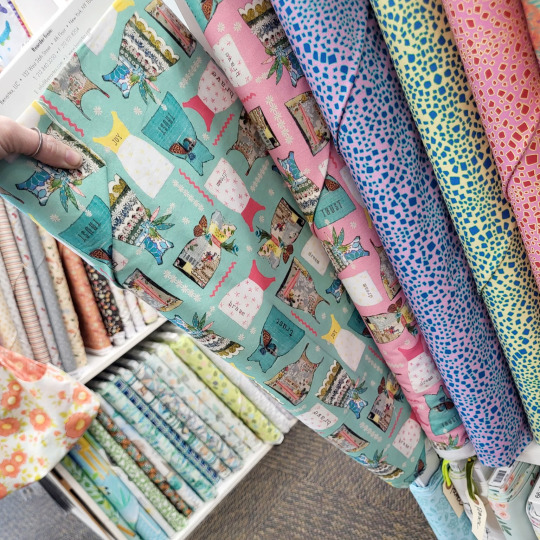
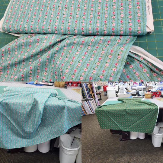
This print, while cute, is something that I won't use. It does fine in one of the categories, and not fine in three of them.
Motif size in this case is how big the dresses on the print are. Here, you can compare them to my thumb. What size of motif you have is going to depend on your garment. A headbow, which is much smaller than a skirt, might need a small motif, so that you can see all of it in the finished piece. A skirt can use a much bigger motif, since it's a very large space, and the whole motif will be visible. These dress motifs on that pattern are large enough to show on a skirt, but small enough to be visible on a bodice. This is a motif of a usable size.
Motif spacing is the one that's going to kill most print spaces. Let's look at how much space there is between the dresses. There's pretty much none. There's a few filler patterns in between, which clutter up the space a little bit. However, look at just the dresses in the print. While this condensed space works really well in a quilt block, they don't have any breathing room.
On a lolita print, we often have more space between the motifs than we have motif. This is very hard to find in a quilt print, but remember that it's the look we're going for.
Another element of motif spacing is how much fabric you go through before the motif repeats. If we use the dress with the yellow bodice as our reference point, we can see that it repeats twice in the 22" of fabric that we can see. This isn't too close together, but keep in mind that a fabric that repeats the print every 10" is going to have the same print motif a lot when it's on a skirt.
Motif alignment is just taking into account that garments are inherently directional. Your dress has a distinct top and bottom. You can't put on your socks upside-down or wear your blouse with the collar around your waist. Because clothes have a top and a bottom, prints that are intended to be viewed from any angle often look like part of them is upside-down when you use them in a garment. If we make a dress out of this dress fabric, half the dresses will be flipped.
Color palette is how many different colors there are in the fabric, as well as how close they are to each other on the color wheel, how much contrast there is between the lightest and darkest shades of each color, and the colors in general. For this print, we have a lot of colors: teal, yellow, pink, white, and a little bit of green and brown.
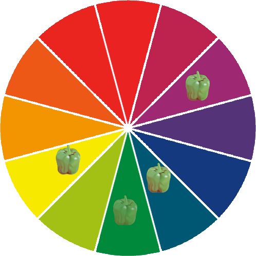
When we plot those colors on a color wheel, we see that the colors aren't particularly close. We have two of the most dominant colors being directly opposite on the color wheel. While it's totally okay to have complementary colors in your print, when both of them are dominant colors, the print can start to read as muddy when you look at it from far away. You don't need to plot every print on the color wheel, but it's a good way to show where the colors fit.
So, let's just look at a bunch of fabrics, and how I feel they do and don't work for lolita fashion. Some of this is just kind of my opinion. Some of these would look okay with good styling, and some wouldn't look okay unless there's good styling. But let's jump in.
Here's some small prints with geometric repeats. I like the teal one for lolita. Even though you can't really see the details from a distance, you can see the geometric stripe pattern. When you get a little closer, you can see the pattern, and the motif there is a nice lolita-applicable concept. I grabbed the one on the right because I thought it reminded me of a skirt by The Black Ribbon, but when I looked it up, it didn't look at all like that. That said, it still looks okay from a distance. The color reads as green, and isn't muddy or ugly. You get a little bit of geometric texture from a distance, and you can see the motif when you're a little closer.

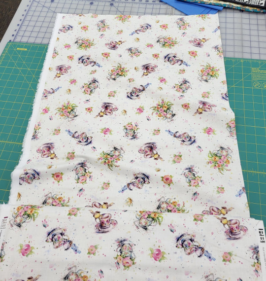
Here's some that don't work. While the cupcakes and the teapots are both nice ideas, and we love cupcakes and teapots in lolita prints, they're not in a good presentation here. The teapot fabric has the teapots so close together that you can't actually tell what they are from a distance. The cupcakes are also very tightly packed together, making it hard to tell what the image is. Look at the cupcakes with the light brown swirl on the top, and look at how many times you can see it in this one image. The fruit is another example of the repeat being too close together, as well as having a bad color palette. You can see how many times the red fruit repeats, as well as how the red and green right next to each other doesn't read well from a distance.
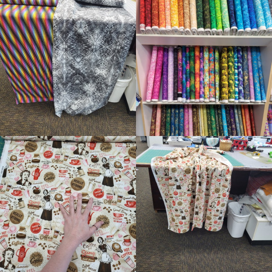
Not sure why I stuck these four in the same collage, but let's go. Up top, we have some fabrics that don't work due to color palette and texture. Some of these are actual rainbows, and the way they're arranged gives them the feeling of movement. When this is on a garment, it starts making your eyes tired. In lolita fashion, we don't want people to be exhausted just looking at us. The gray one would just read as kind of messy and dirty, since the print is a more grunge print. The ones on the shelf also have the same problem of either having too many colors that are too far apart on the color wheel, or having really irregular patterns that would read as dirty or messy.
This coffee one is something that I really want to work, but the print spacing kills it. On the left, we can see that the standing coffee lady three times in a single 11" square. Also, between every large motif is a lot of filler text. Sadly, this just reads as a mess from a distance. This would be a lot more usable if we could delete all the "it's coffee time!" text. As far as fabrics go, it's not the worst on this list, but it's not ideal.
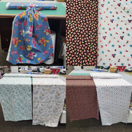
The blue fabric at top left is a good choice! You can see how much space is between each flower. It's a nice, empty space, and it reads well when you gather the top up. I'd wish that it'd have more detail in the print, so the flowers could look better up close, but I went through so much fabric here and it was nice to find one that felt good.
Top right, we have two small motif fabrics, with very different spacing. When you look at both of them from a distance (bottom right), you can see how the one on the black background reads more yellow than black, and the one on the white background reads as dots on a white background. This is just something to keep in mind when you're looking at motifs.
On the bottom left, we have two prints that have some color palette issues. The green one has some lovely leaves that could work in some more classical applications, but it doesn't look good from a distance. All of the green shades are very close together, without a really dark shade to make the shapes distinct from a distance. The butterfly one also doesn't have enough dark colors to look good from a distance.
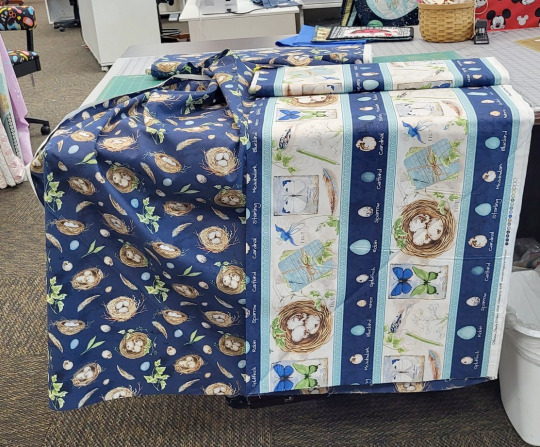
Here's a nice example of why shopping at places that have collections is a nice idea. This line has an all-over pattern with bird's nests, and a border fabric with a much larger print. If we stacked these two, we'd have a nice print on our hem, without the large print being too big for a bodice. The bird nest fabric has a more wide print spacing than some other prints. While I wouldn't use it as a standalone fabric, it works well when paired with the print. The extra-large scale of the border fabric helps the all-over fabric look more spaced out.
These terrifying baby animals with too long of eyelashes would feel like it wouldn't do too well as a dress. The print is nice for a skirt, but kind of big for a bodice. There's a lot of colors here: orange, gray, green, yellow, pink.

However, there ARE dresses that use horizontal stripes all over, which have mostly this color scheme. The pop of green is unusual, but not unheard of. This is one of those ones that is going to need some really careful styling. This is also why it pays off to window shop and make lists of things you do and don't like in lolita fashion.
This one is pretty damn adorable, and it's got a wider spacing than most prints, but you would have to figure out how to come to terms with the fact that no matter how you cut it, some teacups will be upside-down.

If you can find some border prints, definitely consider them! Most premade lolita print dresses and skirts are made of a border print fabric. This geometric metallic print isn't an ideal example of a border print for lolita fashion, but it does demonstrate the different ways that motif spacing can work. If you look at the very center of the fabric, you'll see that the little motifs have a huge amount of space between them. This is more the spacing that we want for many of our pieces. At the bottom, they're all packed together, and in the middle, they're spaced out like most quilt prints are. It's okay to have a lot of detail on the hem of your skirt. The petticoat holds the print out and makes it more visible. If the print is just at the hem, it doesn't overwhelm the whole piece, even if is much closer spaced than you'd want in the area around your waist.
So, let's get some basic guidelines for buying quilt prints for lolita fashion:
a) How much of the background color of the fabric can you see? To make sure you're getting good spacing, you want to see a lot of background.
b) How many times does a part of a print show up in a 10" square? Is there a big, notable piece that shows up multiple times in your sample space? Watch out.
c) Can you determine what's right-side-up and what's upside-down on this fabric? If there's highly directional motifs, you don't want your garment to always look like it's on wrong.
d) how much does this look like fabric used in extant lolita pieces? If you get this fabric, are there references available for how to style it? It never hurts to have some references for what you're trying to make!
And now, a quick reminder about buying fabric: quilt fabric shrink, maybe a lot. It often comes with a sizing on it, which makes it easier to quilt with, but harder to determine what the fabric will really look like. Having worked in Green Store for almost five years, I can assure you that I've never personally seen their quilt fabric shrink more than 10" in width when it was first washed. I'll leave a significant pause after that statement and let you fill in some blanks. Some cheaper quilt fabric will shrink a whole lot, or lose pigment, or really change feel when you wash them. Some expensive fabrics will do the same. I really recommend doing a prewash with liquid fabric softener on the first wash. I know a lot of people hate fabric softener, but you only need to do it once per project. If you don't mind smelling like pickles and reducing the longevity of your garment, you can use white vinegar instead of fabric softener. Just get that sizing out and pre-shrink your fabric so that you know what you're working with.
As a final note: the more you actually transform some fabric into a garment, the more you're going to learn about how to do it. We all have things we look back on and wish we changed. Don't let your fear of it being imperfect stop you from making the thing you want to make. It will be imperfect. It will always be imperfect. Everything is imperfect. We learn when we make decisions that weren't ideal. You will learn when you try.
Some old posts from this blog that are related: Print Scale from 2018, and A Quick Guide to Prints from 2015 (Which, yes, was actually photographed with a potato. I believe that camera was 2.1 megapixels).
111 notes
·
View notes
Text
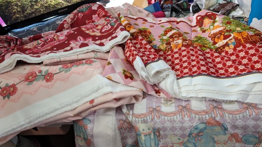
My taobao order arrived on my birthday!!
The picture isn't great at showing everything, due to not having enough room, but lookit all my fabrics! I got 21.5m of fabric that came out to 12lb/5kg (and expensive AF shipping!).
The purple cat and teacup/pot print is not on the selvage, which is extremely frustrating as it's only about 20in/50cm in length, and I am toll. So some splicing or tiers will be done so as to have a skirt that goes past mid thigh.
Everything is lovely and a nice texture, I'm excited AF to start sewing...except that I still need to do patterns, as well as finish my first two pieces that I've already gathered everything for, before I start buying even moar trimmings and lace.
#homemade lolita#lolita sewing#lolitafashion#lolita sewing blog#plus size lolita#pattern drafting#sewing#lolita fashion#sweet lolita#lolita pattern#taobao order#taobao fabric#fabric stash#handmade lolita#lolita fabric
12 notes
·
View notes
Text
3 days left, thought I'd reblog
Haven't posted in a bit. Hii! Updates on sewing:
So we found out that we're going to be moving downstairs (finally!!), but not until maybe after March. We're in the process of packing things that aren't used often, to be moved to storage. (Never to be seen again.) When my body is actually working, that is.
Which led to me sorting my fabric stash to eliminate what I can't see myself making anything from, which is a good number of yards of random fabric from when I worked in the green fabric store (and a lot of Doctor Who prints).
We're going to wash all the fabric and then I plan on listing a good amount of it for sale. Likely on mercari or another similar site. I'll share a link when it comes time though.
In the meantime I'd like to keep working on drafting the bodice blocks. I may take a break from it to make a skirt to test the size of my hoops (which are literally as wide as my doorframes, so mayhaps a bit too big?)
That all being said, I've been working of getting some MH heads ready to print, once I'm able to get some flexible resin, that is. I did already pack 90% of my repainting supplies and almost all of the dolls I'm keeping, so it won't be for a while that I'd be posting anything except the 3D prints.
I'll probably post the finished results here or make a doll repainting side blog. Which would you all rather see?
1 note
·
View note
Text
Haven't posted in a bit. Hii! Updates on sewing:
So we found out that we're going to be moving downstairs (finally!!), but not until maybe after March. We're in the process of packing things that aren't used often, to be moved to storage. (Never to be seen again.) When my body is actually working, that is.
Which led to me sorting my fabric stash to eliminate what I can't see myself making anything from, which is a good number of yards of random fabric from when I worked in the green fabric store (and a lot of Doctor Who prints).
We're going to wash all the fabric and then I plan on listing a good amount of it for sale. Likely on mercari or another similar site. I'll share a link when it comes time though.
In the meantime I'd like to keep working on drafting the bodice blocks. I may take a break from it to make a skirt to test the size of my hoops (which are literally as wide as my doorframes, so mayhaps a bit too big?)
That all being said, I've been working of getting some MH heads ready to print, once I'm able to get some flexible resin, that is. I did already pack 90% of my repainting supplies and almost all of the dolls I'm keeping, so it won't be for a while that I'd be posting anything except the 3D prints.
I'll probably post the finished results here or make a doll repainting side blog. Which would you all rather see?
#homemade lolita#lolita sewing#lolitafashion#lolita sewing blog#sweet lolita#Monster High repaints#Monster high 3D prints#3D printing#doll repainting
1 note
·
View note
Text


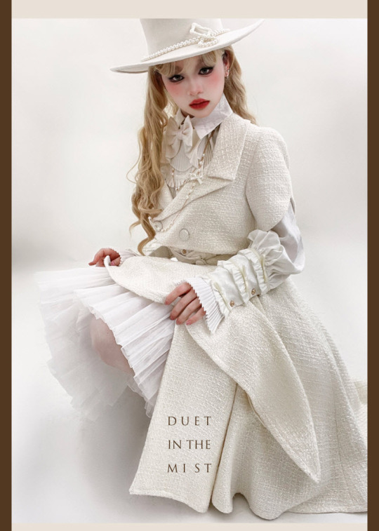
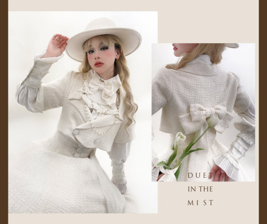
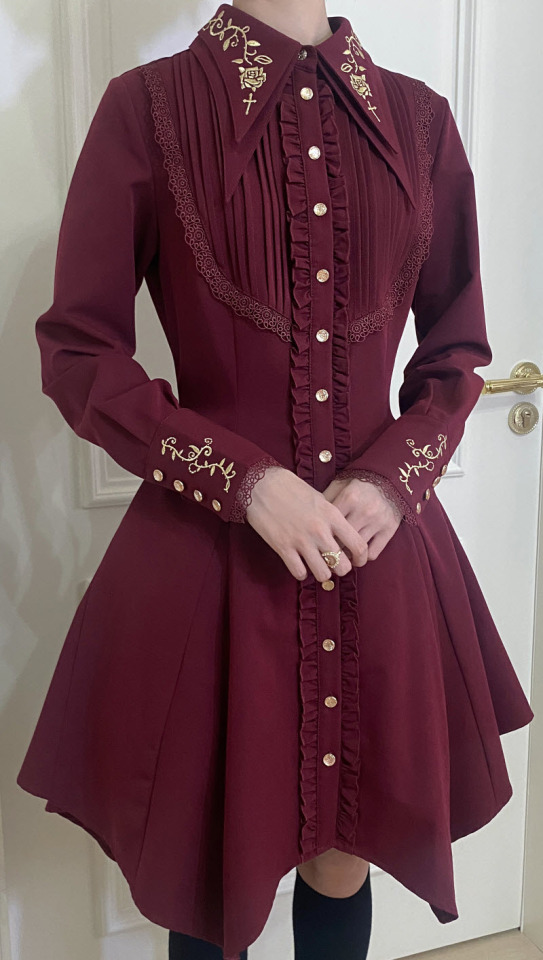
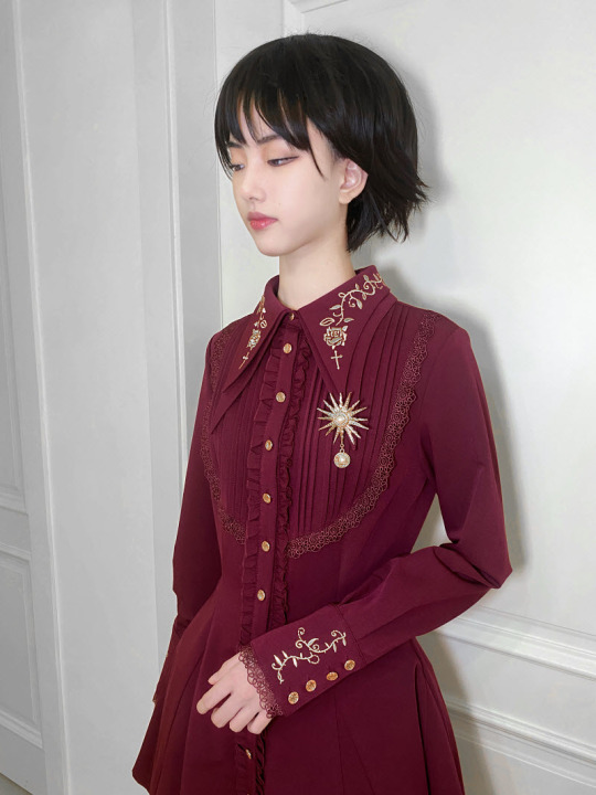
New Release: Time Temple 【-Duet in the Mist-】 Lolita Blouse, Jacket and Skirt
◆ Shopping Link >>> https://lolitawardrobe.com/time-temple-duet-in-the-mist-vintage-classic-lolita-blouse-jacket-and-skirt_p8123.html
480 notes
·
View notes
Text


Preorder Deadline Reminder: Little Dipper 【-Rose and Cross-】 Embroidery #Ouji Lolita Blouses
◆ Don't Miss These Blouses: https://lolitawardrobe.com/c/deadline-reminder_0420
◆ The Preorder Will Be Closed After Tomorrow (September 24th, 2023)!!!
885 notes
·
View notes
Text

To all lolitas of tumblr, I wish you a happy international lolita day aka loliday 🎀
#Lolita#I don't have anything to wear yet#but am looking forward to when I can join in on#international lolita day#lolita sewing blog#lolitafashion#plus size lolita#lolita fashion#sweet lolita
29 notes
·
View notes
Text
You are meant to be here.
#I mean#my mother told me she wished she aborted me when I was 11#but I'm still here about 20 years later#and she's not in my life anymore#for which I am lucky af#terrible mom#I was also born a month after her and my dad's divorce was finalized#and I literally TORE her open to get out#This is sweet though#still here out of pure stubbornness#and my found family & in laws
32K notes
·
View notes
Text
REMINDER THAT ANTISEMITES AREN’T WELCOME HERE AND WON'T BE TOLERATED
73K notes
·
View notes
Text
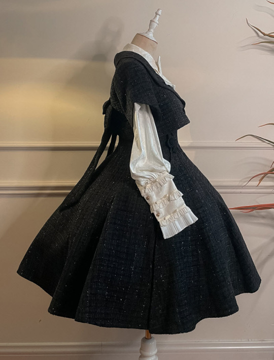
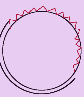
Scallop Hems
Scalloped hems look like this:

They’re a fabulous way to avoid using lace on your dresses. They’re also a nice option if you don’t have enough fabric to do a rolled hem. They’re especially useful if you’re sewing on calico.
From now on, “quilting calico” is what I’m going to call the non-premium quilting cotton collections (lowest price, but best selection of lolitable prints). This is because I don’t like using “cotton” to describe a kind of fabric, when cotton is a very versatile fiber that makes many different kinds of fabrics. “Calico” is technically a kind of fabric that refers to a low thread count, minimally processed fabric, but it’s the closest I could get without delving into a 30 word description.
Many people who make statements beginning with “handmade lolita only works if–” talk about the way that calico behaves as a garment fabric. It’s often said to drape poorly, which means that it’s stiff and doesn’t mold to a form very well. It makes larger, sharper creases when made into a shirt of bodice and worn by a human.
Handily, there’s a lot of ways around this.
One of the ways to get a calico to drape better on a skirt is to make sure some weight ends up at the hem. This can be done with lace, which also stiffens the hem somewhat and forces the fabric to behave like a more expensive fabric. Another way to get some more weight at the hem is to use a faced hem.
Faced hems are cool because they allow you to smoothly hem any shape of hem. For a scalloped hem, like my dress, facings are the only way to get a nice hem. They aren’t necessary on every kind of hem, but they’re a great tool to have in your skillset. This is especially true on flared hems, where turning up for a hem can lead to puckers on the inside. Faced hems are also great in any case where your skirt might be visible on the inside, because they look very neat. (Showing off your skirt inside doesn’t happen in lolita a lot, but if you get into theatre or cosplay or dance and have an onstage costume change or a very dynamic choreography with swishy skirts, they’re a good thing to consider)
You might also want to add a faced hem onto any lightweight, opaque fabric that you would like a little more weight on the edge of. The phrase “added weight” doesn’t sound like it’d jive with petticoats, but a little more weight on the hem can keep a dress’ silhouette in “lolita” territory, when too little hem weight can make the bottom edge flare out and send it into “square dance” or “rockabilly.”
Making lolita out of calico is basically the art of making calico behave like a more expensive fabirc. In many cases, that’s very easy. It’s mostly a matter of adding more fabric, more thickness, or more weight. Faced hems are one of the more involved ways of pulling that off, but they’re not difficult, they’re extremely useful, and look very professional.
Step zero of all calico projects is to prewash (they shrink, sometimes big time) with a good soap and a liquid fabric softener. If you’re confident in the print’s ability to not run, hot water’s a very good idea. When your fabric shrinks, it closes up the holes in the weave a little bit, which makes the fabric tighter-woven. A lot of fabrics meant for quilting have a sizing put in them to make them stiff. This is good for quilting, but for garments, we want it OUT. Liquid fabric softener can make a huge difference, and I don’t consider it optional. Liquid fabric softener actually penetrates the fabric and disperses through it, which dryer sheets and dryer balls don’t do. You can use fabric softener AND a dryer ball, but don’t skip the fabric softener part.
EDIT: Don’t skip the fabric softener the first time you prewash it! After that, it’s only necessary if that’s your preference. Fabric softeners can shorten the life of your fabric, so it’s up to you if you use it every time, but it really makes a difference in the initial wash. Thanks to Anon who pointed that out!
Edit: more info about fabric softener, how it works, and if you need it here: x
While your fabric is washing, let’s have our geometry lesson: shaped, faced hems like scalloped hems require two techniques: turning curved seams, and facing hems. They’re both simple and look nice.
The only thing that makes scalloped hems tricky is that they require you to use curved seams. We’re going to have a 20dollarlolita geometry lesson for a second:

Part 1: The inside of a circle is smaller/shorter than the outside of a circle (image on the left). The outside of a circle is bigger/longer than the inside of the circle. This is really the only fundamental lesson here.
Part 2: When you draw your seam allowance on a curved seam, that seam allowance isn’t an exact copy of your stitching line. The curve in the middle shows what happens when your seam allowance tries to be an exact copy of the stitching line. The lines overlap or are different distances from each other, and you can’t sew a seam where your seam allowance overlaps your stitching line and stops existing. The image on the right is a better approximation of a realistic seam allowance. Just pretend that it doesn’t change thicknesses. Photoshop is hard sometimes.
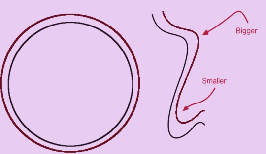
Part 3: When you have your pieces with the wrong sides together, they lie flat. However, when you’re sewing, you turn the piece inside-out and put the seam allowance on the inside. Here’s where your problem starts. The outside of a circle is bigger than the inside of a circle. When you turn our circle right-side-out, you make the outside of the circle become the inside of the circle. However, the actual amount of fabric that you have in your formerly outside circle doesn’t change. There’s too much fabric for it to lie flat, and it will become lumpy. We don’t like lumpy lolita hems.
a+ photoshop
To fix this, you have to remove some of the fabric in the outside circle. When you cut little notches out of the seam allowance, you can turn them into an inside circle that doesn’t have too much fabric in it.
Geometry lesson done! Sorry to be boring, but too many tutorials go “just cut this and it goes flat” without explaining why it smooths out, and that bothers me.

So, step 1 is to look at your hem, and cut your hem facing:
Terminology: facing is fabric that you put in your garment, that shows with the right side pointing at the inside. It’s often used to finish a hem or cover a seam.
Face or face fabric is the fabric that will show on the outside or the right side of the fabric.
Face of your fabric or fabric’s face is the side of the fabric you want pointing to the outside. In my case, it’s the side with the print. Technically speaking, whatever side you decide is the front is the face of your fabric, even if it’s not what the manufacturer intended. You are the master of your own destiny in this case. Double-faced is fabric that looks the same on both sides.
Interfacing is what you put between the backside of the face, and the facing, for stability or reinforcement. Any questions? Confused yet? Moving on!
To save on the confusion, I generally try to say say “facing,” “front fabric,” or “fashion fabric,” and “interfacing,” when I’m writing for this blog.
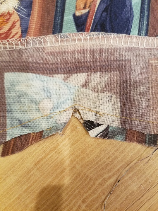
As you can see, my hem facing is cut out of the same fabric as my skirt. You can also use a coordinating, but less expensive fabric. In this case, the cats on my facing are going sideways, because I ran out of fabric to make them go the proper direction.
The hem of the skirt and the hem of the facing need to match exactly, and the hem facing needs to be about three or four inches above the hem. My hem facing’s other edge is shaped sort of like my hem, but it would have been much easier to just make it a straight line above the scallops.
You’re going to need to finish your non-hem edge. I used an overlock because I have a serger. You can use a zigzag, or just press it down on the wrong side about 5/8". You don’t need to double-press, because the skirt will cover the raw edge when you’re done. This is why it saves you a lot of trouble to just cut the back edge of the facing in a straight line.
Step 2, sew the facing to the hem, just along the hem edge. If your hem has any corners, like mine does at the edge of the scallops, make sure your turns at the points are sharp. Whatever your hem allowance in your patterns was (mine was 3/8"), sew that distance as your seam allowance.

Step 3, grade your seam allowance. Grading is a really great precision sewing technique. Here, it means cut off half of the seam allowance on the facing side only.
The purpose of grading is to prevent the seam allowances from showing a bump. When you cut the edges of your seam allowance in layers, you make the whole seam smoother from the outside. In general, you want the seam allowance closest to the outside fabric to be the longest, and the seam allowance on the inside to be the shortest. This is why we cut the facing seam allowance shorter, not the outside fabric.
Step 4: If you’ve got inside corners at the edges of your scallop, notch them all the way up to your stitching line. Here, you can see that my original stitching line didn’t have a sharp enough point, so I sewed an extra line of stitching before I notched it.
If you skip this step, you won’t be able to fully turn the scallop to the front. You want to go all the way to the stitching line, but not through it!

Now, clip your seam allowances so you can turn them inside. Remember our geometry lesson up there.
The graded seam allowance is two different lengths, but you can clip them like they’re one piece.
Grading and then clipping saves you a lot of time, instead of doing it the other way.

Step 5, press and turn. Start by pressing them from the right side, like this. Take some time to prevent any lip-like folds at the seam line. Use the very tip of your iron and work it into the fold to flatten it out.

Then flip over your facing to the wrong side and press it flat with your iron.
You want none of the facing to show on the right side, and a little tiny bit of the front fabric to show on the back.
If your facing doesn’t sit 100% flat at this point, troubleshoot it until it does. You don’t get a better chance to fix it than this.
Step 6 is understitching, AKA the best secret trick ever. When you understitch, you sew your seam allowances to your facing, about 1/8″ from your seam line. The purpose of understitching is to keep your facing on the inside and your outside on the outside. Right now, our facing is all hidden in the backside, and not showing at all on the front. With time, facings like to shift so that the seam creeps forward, and makes the facing visible. It’s not a good look. Understitching stops that, and it’s necessary for any garment you want to wash more than once.
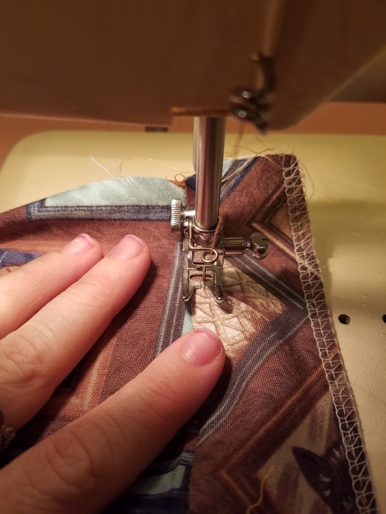
The best way to understitch is from the outside, because you can really see where you’re sewing line is going. You can’t actually see the seam allowances, but you don’t need to, because you can feel them through the fabric. On the left is my front side of my dress, and on the right is my facing. All of the seam allowances are pressed towards my facing. With my index finger, I can feel that there is no seam allowance on the left side. If I feel a little bump, I know to stop and move it to the right before I sew over it.
You really don’t want any stitching to touch your front fabric here, which is why you want to do this from the outsides.
When you flip it over to the wrong side, you can see your seam allowance sewn up all nice and neat. The top line of stitching is my seam. The bottom is the understitching.
Go slow, stop often, and keep one finger monitoring your front fabric and feeling for any pieces of seam allowance that might have gotten shifted to the improper side. The facing side should feel chunky and the face fabric should feel thin and smooth. And don’t worry, as long as your finger stays touching the fabric, even lightly, you can’t sew over your finger because your presser foot will stop you. It’s actually incredibly difficult to sew over your finger (despite what Project Runway tells you).

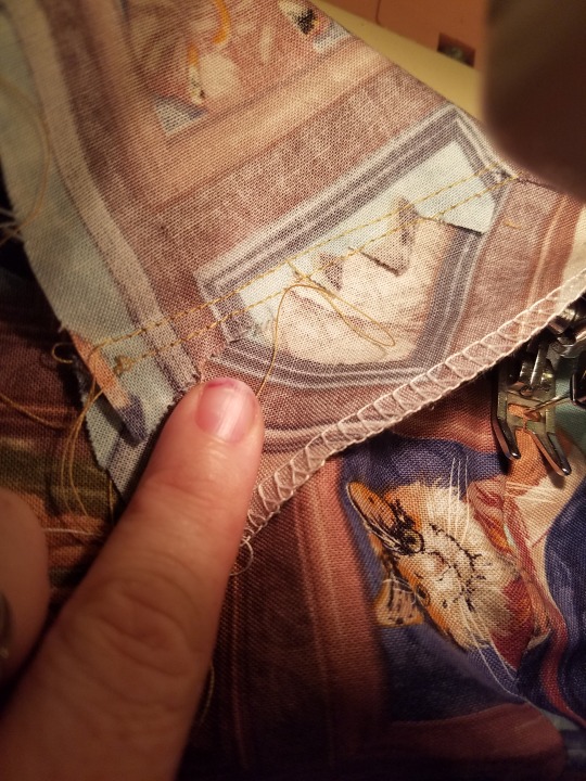
Step 7, press it again. Get it all arranged so it looks good, press it from the back, and then the front. Get your facing smooth all the way to the other edge. You want to get it so it looks perfect, because you’re about to fix it like that forever. Pin the top edge of the facing so that it’s smooth and not going anywhere.
You can see my little line of understitching here.

Step 8, using an invisible stitch of your choice, sew that facing down by hand.
Doing 7 other steps of sewing and pinning and then still having to hem it by hand has always felt like the punch line to a joke I didn’t get to hear, but you’ve done so much work that you don’t want to wreck it with a line of machine stitching visible on the outside.
(unless your facing edge is perfectly even and straight, and you decide to hide that stitching line with some lace, but that’s Technically Not The Right Way To Do These Things)
I use the flat catchstitch/cross hem stitch, because I’m really fast at it and it’s very easy to regulate my thread tension. Any stitch that looks invisible from the outside will work. You can use a blind machine hem, if you’re confident in your machine’s ability to do it (but I’m not confident in mine).
If you need a refresher on the flat catchstitch and/or want to go down 20dollarlolita memory lane back to 2014, here’s a post on hemming stitches.

And there you go! Shaped hems are a great way to add detail and interest to an otherwise plain dress or skirt, without having to buy 5 yards of lace. You can stick a ruffle behind it for some extra cuteness.
You can use this faced hem technique on any hem you want, no matter what shape.
860 notes
·
View notes
Text

me in my final form
825 notes
·
View notes
Text


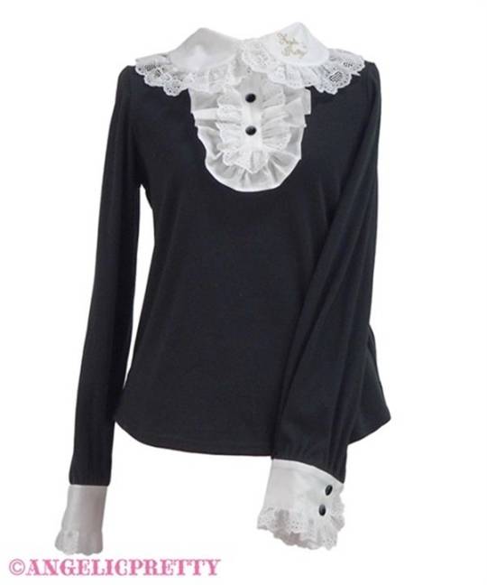
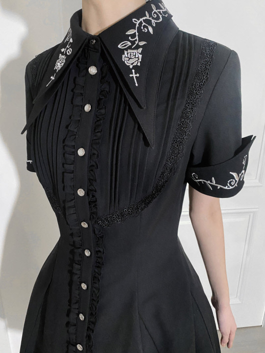
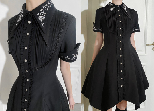
Angelic Pretty collar logo embroidery jabot cutsew in white, pink and black
47 notes
·
View notes
Text

Baby boy reunited with his Mama.
Long live the Resistance ❤️❤️❤️❤️❤️
8K notes
·
View notes
Text
Someone on a sewing discord I follow that was created by @20dollarlolita asked if anyone had the dimensions of a BtSSB headbow so they could make their own and I drew up a schematic. Decided to also include my AP headbow as well for comparison. Enjoy!

The bow itself is extra long because of internal wire. To create the double bow effect you just fold in the edges of the loop.
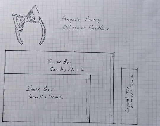
The AP bow is really good to scale up or down because the finished product is very precise.
Both of these are the finished dimensions. If you want to use it to make your own- don't forget seam allowance! ❤️🧡💛💚🩵💙
205 notes
·
View notes
Text
I feel like something that doesnt get talked about enough is how fast fashion is coming to hobbies as well. Sure, you can sew, knit, and crochet something better than youd buy in store, but good luck finding quality materials
Want a fabric that doesnt fray from being gently caressed? Want yarn thats not 100% plastic and splits if you touch it wrong? Good luck finding that if you dont have a genuinely good crafts store near you.
Go on any thread where people are trying to figure out where to buy fabric. 50% of it is people saying big stores are servicable, online stores work, or the like, and the other 50% are talking about how bad the quality is or how the quality of a website dropped because it was bought out
Were running into a problem where fast fashiob is so integrated into society that even the ability to make your own, comfortable and long lasting, clothes is being threatened by capitalism
33K notes
·
View notes