
Statistics
We looked inside some of the posts by sinistermaximalism and here's what we found interesting.
Average Info
Notes Per Post
97
Likes Per Post
76
Reblog Per Post
21
Reply Per Post
0
Time Between Posts
1 month
Number of Posts By Type
Text
10
Last Seen Tumblr Blogs


Fun Fact
The KCSC sent more than 20K requests to delete posts related to prostitution and porn to Tumblr from January to June 2017.
Text
oh no guess what happened again
I forgot my password and the idea of resetting it was too much but I'm back!!
2 notes
·
View notes
Text
why, this is hell - Get Out (2017)
you don't need me to tell you what Get Out is about. you know what Get Out is about. it's one of the best horror movies of the 2010s! and part of the reason it's so brilliant is because it's so meticulous. nothing about it is left to chance, every word and every angle is serving the story.
so OF COURSE the production design is all very deliberate and intentional, and of course we should take a look at what it's telling us.

so this is the Armitages' house, in upstate New York. as a Brit, I basically know nothing about the significance of different states or different districts in the US, but everything about this house screams money. it's huge. it's got tons of rooms. and it's all incredibly ""tasteful"". by which I mean it looks like the house of old rich white people.
just have a look at this shot, for starters. the bookcases frame the shot, and the books on them look well-thumbed (and expensive). there are at least three different types of wood, from the shelves to the floor to the door to the cabinet to the chair legs, and you just know that's all solid wood. no IKEA laminates here. also, it's so shiny! you just know it's all kept well polished. you can almost smell the wood polish just looking at the still.
right in the middle of the shot, like a spooky eye, there's one of very few curved objects in this room. it's a portrait, right? some old-timey-looking thing like you'd find in a museum or art gallery. these people have ancestors worth painting pictures of. we're talking old moneyyyyyy baby.

here's some more of the house, and again we're seeing straight lines, neutral colours (so much goddamn beige) and framed art that suggests wealth, significance, history. (it looks like a map - does it have something to do with former colonies? I would not be surprised.)
there's no colour here, no joy, no life. remember the beginning of the film when we get to see some of Chris's photography? yeah you're not gonna find anything that looks like that here.
though... maybe not for lack of trying.

speaking of things in this house being kept shiny, look at that kitchen island! it's huge! and like a mirror! the copper pots, too, are spotless and beautiful. the green of the plants and the yellow of Georgina's gloves are almost shockingly bright compared with everything else. beige, beige, beige, everywhere you look. but clean, no traces of debris, no food, nothing that looks lived in.
this is rich people shit. they've got enough cabinets to hide anything that might look messy. they've got enough employees to keep everything neat and tidy.
the cracks don't show.
it's interesting how creepy that all feels. aren't we all supposed to aspire to this aesthetic? it's what you see on those reality shows, all those empty kitchens that you know no-one ever cooks in, all those spotless living rooms with their stiff-cushioned sofas, all those perfectly selected pieces of art sitting on those empty shelves. there's nothing welcoming about any of it. it's not warm, not safe, not comfortable. it's like the decor has been set up specifically to make you sit up straight, watch your manners, and worry about spilling your coffee.
you're supposed to want to live like that.
who wants to live like that??
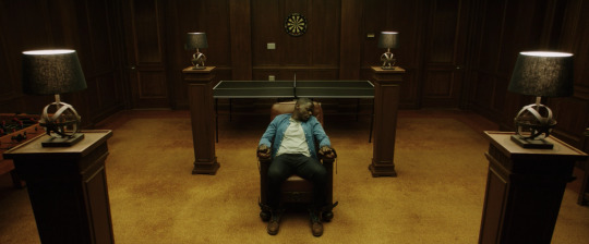
ooh look at this. it's the torture basement, or, well, it's probably the "den", isn't it, but it's where the brainwashing happens. there are definite echoes of the first still I included here, with all those straight lines framing the shot and directing you to a round image at the back - this time, it's a dartboard, a target - but it's darker down here. the brown wood has become oppressive. there's no daylight. you're not meant to get out.
maybe the one worn object in the house is that chair Chris is sitting in, because I guess the Armitages don't care about the people who sit in it, but that's a big mistake on their part. that chair is an ally. it's been around long enough to see some shit.
this room really makes me think of secret societies, the kind created by bored rich guys who like to chat about the supernatural while getting drunk and abusing sex workers.
if you have a room that looks like this in your house, I'm scared of you.
#sinister maximalism#get out#jordan peele#interior design#interior decor#production design#set design#horror movies#things they do to scare you#scary movies
15 notes
·
View notes
Text
I forgot my password and the idea of resetting it was too much but I'm back!!
2 notes
·
View notes
Text
a matter of taste - A Wounded Fawn (2022)
a thing I definitely thought would be much easier, when I started this blog, was finding stills that showed off exactly the bits of films I wanted to talk about. yeah, joke's on me, innit.
anyway, this might be my favourite film of 2022, you guys. A Wounded Fawn is a surrealist - or maybe I should say Surrealist, with a capital S - nightmare of a horror film in which Greek mythology is brought bang up to date. a trio of Furies bring retribution to an evil man, and everything looks incredibly perfect and beautiful. it's shot on 16mm, the effects are practical, and honestly there are more striking shots to be found in this movie than in, like, every other movie of the 2020s combined. I love it.
that said, a lot of the interior decor on show here is deliberately bland.

what does that kitchen tell you about anyone, or anything? well, it's massive and shiny and incorporates a giant wine fridge, so I guess it says it's the home of a rich dude with more money than sense.
the plants on the windowsill are a nice touch, in their basic terracotta pots. are they herbs? that would probably make sense, in a kitchen of a man who likes to cut down living things.
maybe this says more about me than it does about anything else, but the fact that there's just no character in this kitchen, no brightly coloured tea towel or quirky little ornament on the windowsill, is giving me them bad vibes. it's like it's one of the homes on Selling Sunset, the kind of place you suspect no-one actually lives.
and in this case, you'd be right - in more ways than one.

there's a bit more going on in some of the other rooms, as we take a peek at some of Bruce's (Josh Ruben) art collection, but here too there's a lack of personality. again it's a rich person house: everything is perfectly curated, the shelves have more negative space than clutter, and everything matches. it looks like a professional put the collection together, buying it in bulk, all in one go.
(do I aspire to be a person who "curates" their shelves rather than having so much stuff to put on them it's a miracle if nothing's actively falling off? hmmmm nah.)
the thing is, too, part of the reason this home isn't telling us much about Bruce is that it's not really Bruce's house. look at that art again - doesn't some of it look a little feminine to you?
there's some nice subtle colour-coding going on here, too. the use of colour and light in this movie is never accidental: as things get scarier, the colour palette slowly shifts, from safe beige to hints of orange to a bright, screaming orange that's impossible to ignore.

when we get to red, that's when shit gets really real. I want to show you the red, I do, but I can't find a great shot of it, and also, uh, spoilers? I don't know if I care about spoilers on this blog. do you care about spoilers? lmk.
maybe let's just stick to interior design, for now. and here, we've got some lovely warm coloured walls, which in other circumstances might seem cosy, but here - partly due to all the negative space, especially that huge dark glass wall in the background - just seems foreboding.
earlier in the movie, when Bruce and Meredith were driving up to the cabin, they passed a literal row of red flags, which she paid no attention to. now, it almost feels like the cabin itself is trying to warn her that she's in danger.
unfortunately, it's almost too late for that.

the final thing to talk about is the statue that starts all the trouble. it's called The Wrath of the Erinyes, by an unknown artist from the Hellenistic period. three goddesses of vengeance - Megaera, Tisiphone, and Alecto - stand around the screaming fallen figure of a man, probably Orestes. it's a tableau that's been represented a lot in art.
(have a google of "Orestes Pursued by the Furies" to see some more - I particularly enjoy the John Singer Sargent version, and now I've got a tab open to buy a print of it, argh)
annoyingly, I couldn't find a good shot of the film's version, but you get the idea from this great close-up. this thing is supposedly so beautiful that collectors are willing to spend hundreds of thousands of dollars on it, but it's actually pretty unsettling. clearly cursed.
it's an interesting piece of art for Bruce to choose, all things considered, but then perhaps fate has a sense of humour.
#sinister maximalism#a wounded fawn#the furies#orestes#horror movies#horror films#travis stevens#interior design#horror decor#production design#horror production design#horror interiors#horror houses
1 note
·
View note
Text
bigger than before - Barbarian (2022)
they say if you dream about discovering your house has hidden rooms in it, it means that you should explore hidden parts of yourself - that you should be open to new experiences.
technically, that is kind of what happens in Barbarian, when Tess (Georgina Campbell) discovers that the AirBnB she's booked is far, far bigger than advertised. Barbarian is a nightmare.
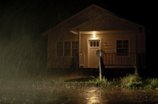
at first sight, yeah, it's an AirBnB. the only house in the derelict neighbourhood that still seems inhabitable (like, probably the only one with an intact roof), it's clean and uncluttered and pretty much anonymous inside. what makes it more interesting - and scarier, at first - is that it's double booked, so there's someone else's stuff there, and, well, someone else there.
and isn't that what part of the appeal, and the horror, of AirBnBs is anyway? you're staying in someone's home, sometimes. it's not a hotel, it doesn't have that comforting anonymousness. it's a place owned by someone else, probably decorated to their taste, and depending on what you've booked, they might even be there, too.
the Barbarian house has got a lot more going on than just that, though. there's something in the basement.
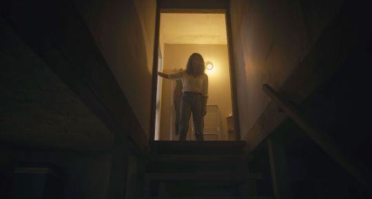
that shot, of someone standing at the top of the stairs to the basement, silhouetted in the light, is such a classic. it's also a cliche. it appears in so, so many horror movies, reminding us that basements are scary places. they're dark, unfinished, full of junk, and god knows what could be lurking down there.
psychologically, basements represent a part of our subconscious in horror films. it's where we put the stuff we don't want to think about, the stuff we want to hide, to forget about. going down into the basement means confronting something you don't want to look at.
Barbarian's basement, though, is only the beginning. in amongst the junk, sitting conspicuously on one of the shelves down there, is a rope, and when you pull the rope, a secret door opens. beyond the door? well.
first, there's a long passageway. if you knew you were in a horror movie, you wouldn't walk down that passageway. Tess doesn't know she's in a horror movie, but she does know that she's a woman and her safety can never be taken for granted. still, she needs to know what's down there. and the first horrifying thing she sees is this secret room.

look at that room. that is some perfectly set-designed grime. what colour is it, even? it's sort of greeny-yellow, the colour of rot, the colour of pus, the colour of rooms where nothing good could ever happen. the floor is cracked, the plaster streaked with who knows what. that little wooden support beam is an inspired touch: nothing here is secure, nothing here can be trusted.
and then there's the bed, and the camera. even before we find out what happened in there, you already know. your brain fills in the blanks. why would you point a camera at a bed? why would you point a camera at a bed that looks like that, in a secret room no-one knows exists, far away from the eyes of the world? it's not something you want to think about.
and Tess knows that this room means this is a bad place, and she needs to get the hell out. if it weren't for Keith (Bill Skarsgård) she'd have been in her car and miles away, safe, immediately.

but he is a man and he doesn't have her instincts. he needs to see the room for himself, his inherent misogyny finally rearing its head, because he can't just believe her that something is terribly wrong. he needs to look, but he can't see. there's so much here that should tell you a story about horror and fear and pain, but he can't see it, he can't read the cues.
maybe he can't see the difference between buttercup yellow and torture basement yellow. it's definitely something to be careful of, when you're choosing paint colours.
I won't spoil anything else, but there's another room that's full of even more horrors, and once again, they're horrors a man fails to see. something something about that cliche about how men just don't notice that housework needs doing? hmm.
#barbarian#sinister maximalism#basement#horror#horror film#horror movie#interior decor#horror decor#production design#scary basement
2 notes
·
View notes
Text
a voyage to the moon - Lords of Salem (2012)
now. look. I'm not a fan of Rob Zombie's filmography, at all. but I've seen Lords of Salem six times, and I think part of the reason it's even slightly bearable is that Heidi's apartment (and the rest of the building) is so cool looking.

the first thing that comes to mind when I think of this film, then, is that enormous mural behind her bed. it's an image of the moon, from Georges Méliès's 18-minute 1902 silent film Le Voyage dans la Lune, it's an absolutely unhinged to put above your bed if you ever plan not to have nightmares, and yet there's a really big part of me that wants to do the same thing in my bedroom.
(this isn't a great shot of it, I'm sorry, but she also has a brilliant black and white chevron duvet cover on her bed, and I actually did have a matching one for a while.)
other things I dig in this bedroom: her glowing bedside tables - so handy! - and that terrifying lamp. honestly, she's really made this room the least relaxing place in the world. no wonder she doesn't sleep well.

somehow, that's not even the scariest piece of art in the flat. the blood is, I think, Satan-related, but that horrifying print was there already. (anyone know what it is? I'm coming up empty).
the bathroom is otherwise quite nice. I enjoy the black subway tiles and the contrast between those and her floor tiles, and, of course, that magnificent clawfoot bathtub! the room does rather cry out for some colour, but the red and pink towels would've done perfectly well. no need for all the blood, lads.

beyond Heidi's front door, between her and that spooky apartment where the devil-thing lives, there's some pretty incredible damask wallpaper. that pattern! it kind of looks like a standard repeating fleur-de-lys, in opulent black and gold, of the kind you might find in any Gothic revival, sinister maximalist (heyoooooo) home, except doesn't it also look particularly yonic?
I'm willing to bet that's deliberate, and that it was created especially for the film, rather than being off the rack. I mean, if not, point me at it, Rob?
#lords of salem#sinister maximalism#interior design#horror movies#horror#horror film#production design#interiors#decor#horror decor
4 notes
·
View notes
Text
that house is a bitch - Girl On The Third Floor (2015)

recently I rewatched Girl On The Third Floor, a horror film that's at least 30% about how grim renovating a house is. (it's also 60% about misogyny, and 10% about CM Punk doing acting.)
this is another film in which the house is a character - one of the ghosts has basically merged with the house - and you've never seen a film that's quite as gooey as this one.

the house, as we eventually find out over the course of the film, used to be a brothel, where women and children were violently mistreated (and ultimately murdered). now, it's a trap for misogynists. or, as the local bartender says, it's "bad news for straight men", which is much the same thing amirite?
throughout the film, parallels are drawn between the house and female bodies, and male mistreatment of both. our horrible protagonist, Don (CM Punk), knows absolutely nothing about renovating houses but reckons, as a man, he can just figure it out.
he fucks up a lot.

almost every scene involves some kind of sexual imagery, as Don's tools (lol) penetrate every part of the house, finding all of its soft spots and destroying them.
the director, Travis Stevens, wrote an essay about the real house his fictional creation was based on, and it's worth a read.
mark me down as "hiring a goddamn professional" whenever anything needs doing in my home.
#Girl On The Third Floor#CM Punk#Travis Stevens#horror movies#horror interiors#horror houses#production design#haunted houses#sinister maximalism
3 notes
·
View notes
Text
a beautiful monster part II - Crimson Peak (2015)
"at home we have only black moths. formidable creatures, to be sure, but they lack beauty. they thrive on the dark and cold." - Lucille Sharpe
an addendum to my previous post, because this wasn't really visible in those pictures: the floor of the entrance to Allerdale Hall has a moth motif in its tiles. there are real moths everywhere in the house, symbolising destruction and ruin, and Lucille herself tells Edith that nothing beautiful survives at Crimson Peak - just the dark, cold, creepy things.
#Crimson Peak#sinister maximalism#allerdale hall#gothic#interior design#horror decor#production design#horror interiors
7 notes
·
View notes
Text
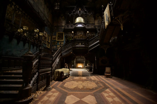
a beautiful monster - Crimson Peak (2015)
shall we have the argument about whether or not Crimson Peak is a horror movie? Guillermo del Toro says it's not, that it's a Gothic romance, and yes okay maybe he knows best, but also all movies are horror movies, QED.
right, now we've got that sorted, let's talk about Allerdale Hall. The titular Crimson Peak, named for the blood-red clay of the ground the house sits on (and which made the family their fortune), is a beautiful nightmare. by design. as well as, you know, all the ghosts, del Toro intended for the house itself to be a monster. it's a character in its own right; it shifts, it screams, it bleeds.
the actual set was fully constructed, for real, save the hole in the roof that light (and snow) falls through, which means someone had to physically create all of those details you're looking at. go on, open up the photo and take a proper look. the shot up at the top of the post, a low angle on the entrance hall, makes Allerdale Hall a hulking monster; as a viewer, you're dwarfed by it.
partly that's the angle, looking up, but partly it's the triple (quadruple?) height ceiling. each floor has a high ceiling, but here, in the hall, you're looking all the way up, up the staircases that line the walls, all the way to the roof. for a house with secrets, that entrance hall feels wide open. like a mouth. or a maw.

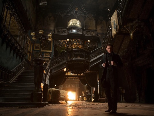
you can get a better look at some of the details here. what a difference lighting makes, eh? here, you can see that the house is full of colour, glowing gold and jade, reflecting the colours of the then-happy couple. (Edith's always in gold, she always glows.) colour is deeply significant in this film, as del Toro basically colour-codes everything, and it doesn't take a lot of analysis to see the difference between how grand and beautiful the house looks here vs how it looks in the dark.
considering the height of this room, there are very few windows. actually, that hole in the roof might be serving a useful purpose - otherwise, the only natural light is coming from that one window at the top, which really only serves to enhance the feeling that you're being engulfed by something. even when you can see the gold, you're still in the belly of the beast.
architecture-wise, we're talking Gothic Gothic Gothic. all those arches! all those sharp points! this house has teeth. it's incredibly ornate, and incredibly sinister. (was this house the inspiration for my blog name? you got me.)
it's opulent, Victorian, even fussy, but crucially, it's also ruined. you don't notice it so much in the light like this, but as Edith explores, she finds out just how much of a mess everything really is. and I mean, imagine how much dust would build up in all of those nooks and crannies. everything in this house looks like it's designed to keep an army of servants busy, except that the Sharpes, by the time we meet them, have run out of money, and everything's falling apart.

here's another look, from a slightly different angle, of how those staircases wind around and around one another. you'd get lost in this house, wouldn't you? Crimson Peak deliberately draws on Gothic literature, and in those stories, unsuspecting women were often imprisoned and undone by big houses. this one has devoured more than its fair share. but then, it's a big beast. imagine the second Mrs de Winter trying to take charge of a house like this! brrrr.
so, features worth taking another look at: the carved bannisters; the twisted columns; the uncanny angles of the staircase; the grandfather clock that almost disappears into the wall; that tapestry, gold and green again, a signal about where the story's going. steps, steps, and more steps. this is a house designed on the scale of a cathedral (check out the painted saints on the walls of the second floor!) except that in those spaces, the Gothic arches and huge stained glass windows are designed to direct your eyes and your mind upwards to heaven. Crimson Peak is sinking into the ground, and it'll take you down with it if you give it a chance.
fwiw I would definitely use that gold and green colour scheme in my own home. it's something I've been genuinely considering - rich jade green walls with antique gold highlights - for a little while, and only when pulling together pictures for this post did I consider the subconscious inspiration.
probably gonna skip all the spiky bits, though.
#Crimson Peak#Guillermo del Toro#interior design#horror interiors#gothic#gothic romance#sinister maximalism
31 notes
·
View notes
Text
Hello!

this is a blog dedicated to exploring the interior design choices made by horror filmmakers, because I’ve written “lovely production design, though” in reviews way too many times and I want to dig into that a bit more.
so before we get properly stuck in, here’s a quick post to break me out of blank page syndrome. and where else would I start but with Dario Argento’s finest interior design work, Suspiria (1977)?
there’s so much to love about the decor in this movie, particularly the wallpaper, so I’ll be coming back to it in much more detail.
for now though? that pink panelling is so beautiful, just the perfect welcome to the world’s witchiest school.
#Suspiria#Dario Argento#giallo#sinister maximalism#Horror movies#interior design#production design#decor#horror decor#horror houses
30 notes
·
View notes