sirielle
Sirielle's Corner
Karolina Węgrzyn 'Sirielle'
One page portfolio at Sirielle.Art
Portfolio & archive Sirielle.com
::: Prints :::
Instagram :: Twitter :: Facebook
793 posts
Don't wanna be here? Send us removal request.
Last Seen Blogs

siennakeys
Hi, I'm Sienna

redheaded-vulcan-inthetardis
Life. Love. Geekery.

melmendeesss
Mércia Mendes

oodlesofowls
☆ Everyone is Aro ☆

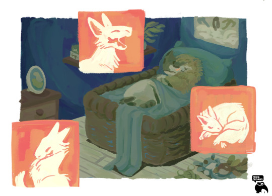
eraserdead
HAHAHA

Note
I love the colors you use! Do you use an undertone/overtone layer? How do you pick your color palette?
Thank you! My style is pretty simple so I don't use any effect layers for color unless I'm doing lighting, which I usually don't. A lot of the time I color pick naturally from a start/base color. If you set a background color before you pick the rest of the colors, you'd be surprised how the rest will follow that tone.
Here's some additional notes on one of my best pieces color-wise!
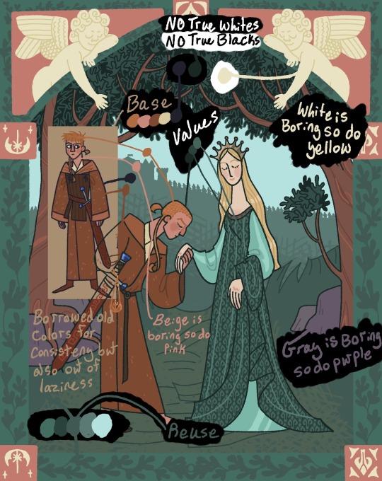
You can also implement a little Stealing-Like-An-Artist and make a pallet from another work.
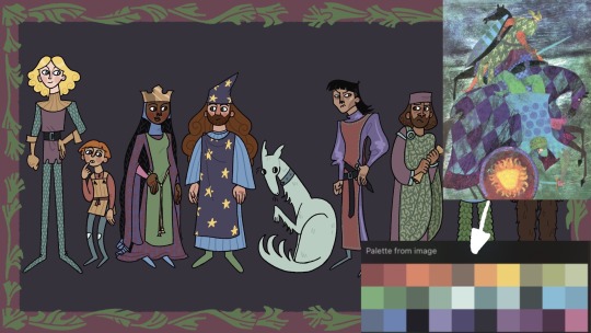
Also color theory! Complimentary, triadic, analogous, and all that.
211 notes
·
View notes


Text
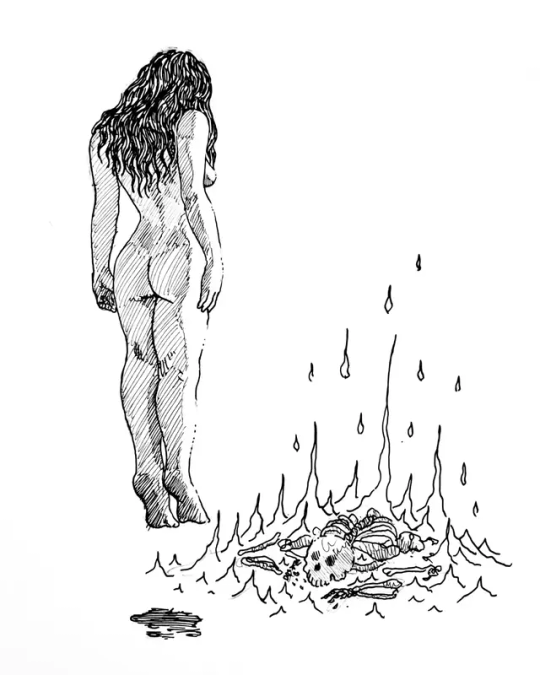
The silent light of God's Mercy
(in the radiance of Your presence
my heart was filled with ardour)
9K notes
·
View notes

Text
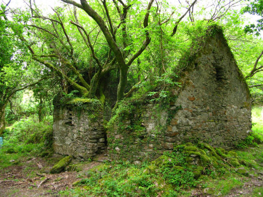
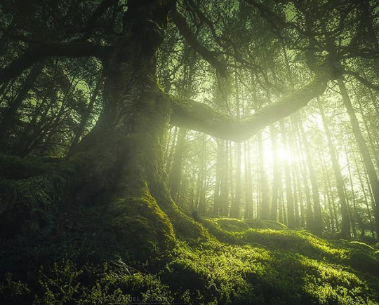
Beautiful abandoned house on the Kerry way (walking route) between Sneem and Kenmare
'There's still life there...' by LeiraEnkai
2K notes
·
View notes


Photo
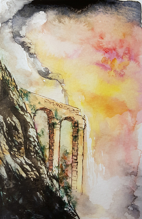
“Ioreth of Gondor”
Companion piece to “Éowyn of Rohan”, and another reworking of an earlier (2014) ink drawing in watercolour:

143 notes
·
View notes
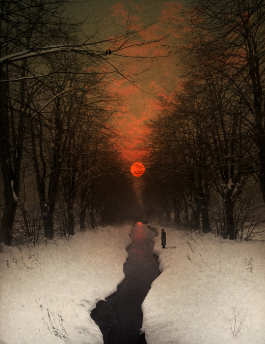
Text
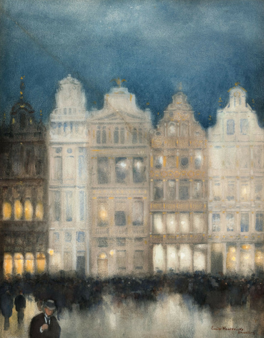
Evening lights, Grand Place, Brussels by Emile Hoeterickx (Belgium, 1853--1923)
5K notes
·
View notes
Text
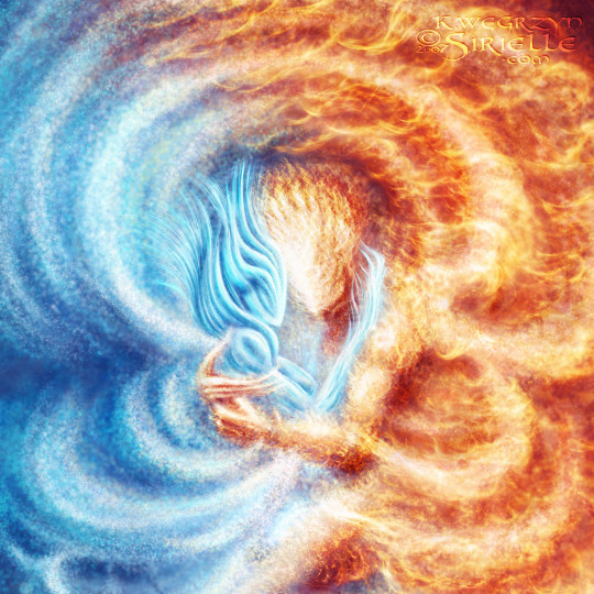
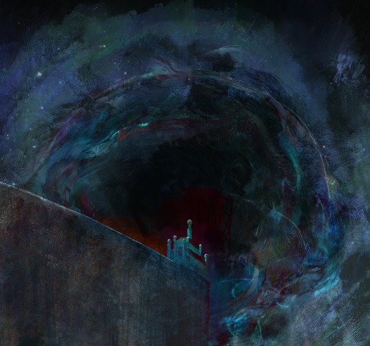
Fire and Ice
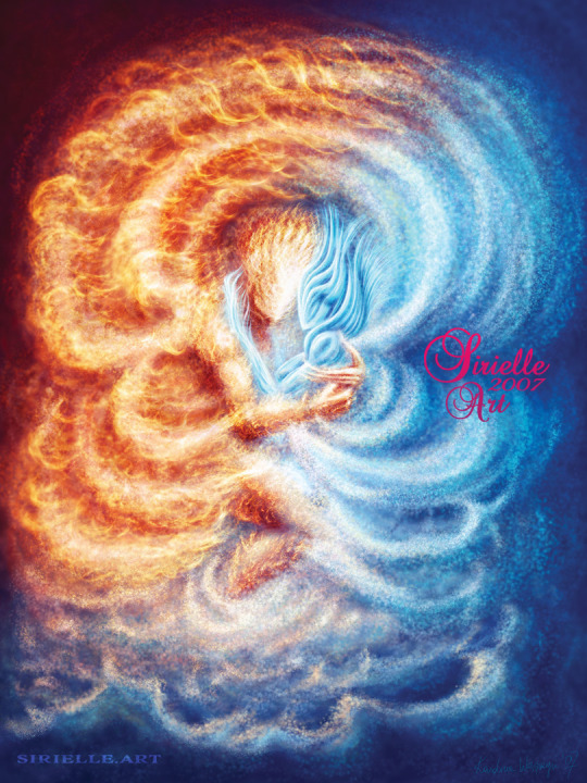
Opposites in Eternal Dance. Prints available at Redbubble. Choose gallery quality Kodak Endura Metallic photographic paper for more depth, better cyans and pearl-like feel of silvery hues. The effect is visible even better without a glass cover.
Available also at INPRNT, which offers more archival variants, including posters. Choose glossy finish for brighter colors or art print for a more classical feel.
Homepage & Portfolio: sirielle.com & sirielle.art
54 notes
·
View notes
Photo
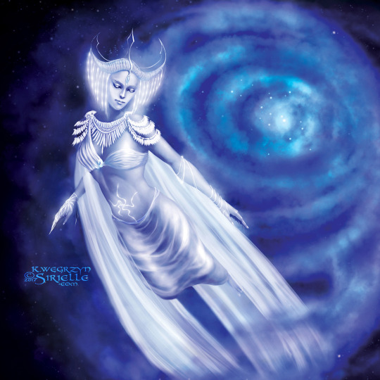

Cosmic Goddess travelling through time and space.
Get prints and what not at Redbubble. Choose gallery quality Kodak Endura Metallic photographic paper for more depth, better cyans and pearl-like feel of silvery hues <3 Effect visible better without a glass cover.
Available also at INPRNT, which offers more archival variants. Choose glossy finish for brighter colors or art print for a more classical feel.
7 notes
·
View notes