
End-to-end Product Designer with a focus on UX, Interaction and Rapid Prototyping
Don't wanna be here? Send us removal request.
Statistics
We looked inside some of the posts by sophiakc and here's what we found interesting.
Average Info
Notes Per Post
0
Likes Per Post
0
Reblog Per Post
0
Reply Per Post
0
Time Between Posts
2 months
Number of Posts By Type
Photo
4
Last Seen Tumblr Blogs


Fun Fact
Women make up for the other 50% of Tumblr’s audience.
Photo

D E S I G N I N G F O R
T H E N E X T W I K I P E D I A
O F E D I B L E P L A N T S
Lead Designer
— UX, UI, User Research, Interaction Design, Wireframes, User Flow, Sitemap
〰️ C o n t e x t 〰️
About
Openfarm is an open source online encyclopedia, created and edited by farmers, gardeners and green thumbers around the world. It functions like a marketplace, with on one side people sharing their knowledge, and on the other side people looking for specific information.
Openfarm is also the smart database behind Farmbot, a CNC personal farming machine:
youtube


〰️ C h a l l e n g e 〰️
Redesign the overall experience of accessing gardening knowledge and empowering gardeners to contribute.
〰️ P r o c e s s 〰️
Discovery & Research
✔︎ Questioned the team and analyzed existing materials
Goal: get an understanding of the past design decisions
✔︎ Audited the website user flow based on user scenarios
Goal: identify roadblocks and UX inconsistencies
✔︎ Conducted an online survey
Goal: get a sense of what gardeners, fromand especially beginners, struggle with
✔︎ Went to a collective farm - Goal: see how people interact and transmit knowledge
User scenarios
Level of engagement on the website: new visitor, recurring visitor, author
Level of expertise in gardening: newbie, intermediate, advanced
Job to be done
👩🏼🌾 🌾👨🏻🌾
As a newbie in gardening, I want to easily find answers to get started with planting crops on my balcony.
As an intermediate in gardening, I want to take a step further in my gardening journey, e.g. picking specific methods.
As an expert in gardening, I want to quickly share my knowledge, in an accurate way for other people to reproduce it.
Analogies, Patterns, Mental Models
Other platforms, identified as marketplaces, clearly have 1. A homepage with a search bar as the primary access point 2. A dedicated search page with criteria and results 3. The detailed page of a given result

Design patterns of a Search Page from Airbnb, Craigslist, and Linkedin:

Roadblocks identification
Existing state
✗ Search results can equally showcase guides and crop information. This is also how the back-end side is structured. The user mental model and taxonomy should be made more straight to the point.
✗ Color and UI guidelines lack consistency throughout the user flow
✗ As provided by the survey results, Gardeners need a holistic understanding, from soil prep, watering, garden type specificities. Not only how to grow a certain crop:

Suggested principles
✔︎ Guides are the added value of Openfarm, not crops. Therefore, the Search should only provide Guide results. Crops are to be linked and only accessible through Guides.
✔︎ Guides explains how to grow certain crops. There should also be dedicated to other peripheral knowledge: how to prepare the soil, how to start as a newbie.
✔︎ Material Design guidelines: consistent, coherent, and minimalist visual language across the platform

〰️ D e l i v e r a b l e s 〰️
Sitemap & User flow
In an attempt to answer the following triggers:
- what are the access points for a gardener willing to find a guide vs. willing to write a guide?
- is it metrics-friendly?
- are there loops to other relevant actions?
- what are the main vs. secondary actions, allocated space and visual focus?
See more directly on Artboard
Existing state:


Ideation of future state:

Search Page
Existing state
✗ The Search page equivalent is currently the Crop page, composed of theoretical info about the crop (half left side) and related growing guides (half right side):

✗ The Search feature is currently limited to guides explaining how to grow a crop. No guide for other peripheral topics.
Suggested Sketch & Wireframe
✔︎ Enhanced Search with 1. crop 2. current location and month (auto-incremented). Use case: as a gardener, what can I do now (here in February) in my garden, that corresponds to my climate zone (here San Francisco), for any given stage (by default the first one being “prepare”).
✔︎ Mental model of a dedicated Search page
✔︎ Only display guide related to the searched crop. Crops are linked to guides.
✔︎ Receive alert based on search criteria
See more directly on Artboard

Wireframe - skeleton

Wireframe - live

Wireframe - empty state

Homepage
UI existing state
✗ Call to action to be clarified
✗ No access points for author, two unclear access points for readers
✗ Background picture isn’t engaging
✗ Primary green lacks dynamism

Suggested Wireframe
✔︎ Call-to-actions with primary and secondary hierarchy
✔︎ Two access points for authors and 2 access points for readers. Also more metrics-friendly
✔︎ Engaging background pictures
✔︎ Primary green changed to fruitful #339933
✔︎ Updated the search bar from the new Search page
✔︎ Footer restructure

Lead Design
Existing state
✗ Distributed Open Source (OS) Developers who contribute to maintaining the website as contributors pick their task in the unordered Github issues’ list (tickets)
✗ OS Developers don’t have the big picture of the user flow
✗ Decision-making process through Github and Slack, often lacks focus and efficient result
Implemented changes
✔︎ Github projects (Agile tickets management board) for front-end and back-end related tickets. Clear state of each ticket, whether still under discussion or need implementation
✔︎ Share my Design process and questions through Figma


Growing guide creation workflow
Sitemap audit & questioning

Sketching ideation

Ongoing questioning: should we radically change the existing UI towards more freedom for the guide author?
Next step: Wireframe
〰️ T a k e a w a y s 〰️
Still thinking about it :-)
〰️ B e h i n d t h e s c e n e 〰️
Working with a distributed team as the Lead and sole Designer:
Simon Vansintjan, lead software engineer
Rory Aronson, CEO & founder
Open Source Contributors
Note: The graphic design of icons had been made prior to my collaboration with Openfarm
Figma, Github Project, Github Issue, Slack
📌 Remote + San Francisco Bay Area
0 notes
Photo

D E S I G N I N G T O R E D U C E
C O G N I T I V E O V E R L O A D
Product Design and iOS development
— Sketches, Wireframes, User Interview, Interaction Design, Onboarding, iOS (Swift) animation and Development
〰️ C o n t e x t 〰️
About
Memoir is an app that enables you to unload your thoughts, whenever you want throughout your day. You just had a delicious meal with a loved one? Write how delighted you feel. You just finished a meeting and you are upset about the outcomes? Throw few notes.
All you have to do is: open the app, write down few words, go back to your journey! All your notes are securely saved within your calendar, findable anytime through keywords and the calendar timeline.
Use scenarios
Feeling upset when going
〰️ C h a l l e n g e 〰️


Back-end
Memoir has been programmatically animated with Swift (iOS) as a team project for CodePath iOS for Designers. Memoir uses iCal SDK to send text entries.
UX/UI Design
Mental model as a user: What’s the UI components of the existing experience of writing a diary, on a physical notebook?
When I want to write a new note, I go to the next blank page on the right.
When I want to read my previous notes, I go to the left pages. The more I turn pages, the further it goes backward in time.
The bookmark enables to go straight to the last page I’ve written.

UI Gesture based-only
Inspired by the UI of other apps and for the sake of implementing fun and advanced iOS features, we considered the following challenge: how to navigate without any call to actions and relying entirely on gestures?
This implies a coherent mental model based on actual use of the app.
User Interviews
Why do you hold a diary? How does it help you in your life?
Why don’t you hold a diary? What do you do instead?

Demo day team presentation

SEE VIDEO OF THE DEMO
SEE GITHUB REPOSITORY
0 notes
Photo

D E S I G N I N G T O W A R D S A C C E S S I B I L I T Y
I N R E A L - T I M E C O N V E R S A T I O N S
UI Design Audit
— Onboarding, User Flow, User Testing, Sketches, Mockups, Interaction Design
〰️ C o n t e x t 〰️
About
Ava is a speech-to-text iOS app (voice recognition), enabling deaf and hard of hearing people access and be included in real-time oral conversations.
Use scenarios
This app could be used during a meeting with colleagues, a drink with friends, a family dinner at home.

〰️ C h a l l e n g e 〰️
Revamp the overall experience of the app, and especially when 1. Interacting with the speech-to-text feature for the first time and when 2. Inviting guests to join a conversation
〰️ P r o c e s s 〰️

Putting myself in the shoes of the user
— What's the experience of not having full (to none) hearing capacities, in my everyday life and when interacting with others?
From my own experience, as I have 100% hearing loss myself on one side, I know there is a variety of hearing loss profiles. The spectrum could range from having one fully capable ear out of two, 30% on both side, or 0%.
— What’s and when it’s particularly challenging?
Particularly challenging when singing under the shower in the morning? No. When attending a fast-paced and stressful professional meeting? Yes. The stress and stakes involved would turn the experience into an urgent need.
— What are the possible stigma and frustration about it?
Hearing loss is an invisible disability.
Real-time information are commonly provided orally. E.g. Airport flight announcements.
People aren’t often likely to repeat, slow down or articulate their wording better. Organizations aren’t often inclined to change the acoustic of a conference room, the ambient noise of a bar, or the rules of taking in real time notes during a meeting.
Overall the environment and behavior towards hearing accessibility are at stake.
User flow
— Existing state
Detailed the journey of a new user downloading the iOS mobile app for the first time
1. Onboarding process

2. Solo use

3. Multiple users

—Analysis
Below, I identified in RED What are the possible roadblocks/ frustrations, in ORANGE What needs to be improved soon, in GREEN What’s particularly well executed.

1. Get the app - invite-only beta access
2. Open app, create account
[3. Test the app with myself - solo use] missing - lack of clear visual feedbacks: call to actions, microphone activation, and empty states 😫
[3bis. Test the app with a friend - solo device] nothing encourage that 😫
4. Invite a friend the guest invitation process requires a lot of determination 😫
5. Friend circle back to 1.
6. Friend does 2.
[7. Test the app with a friend - multiple devices and users] works great! 👏
Onboarding for both users and guests: long, complex, not data-friendly 😫
As a person with a hearing disability you want to be sure an app like Ava is working accurately before advocating about it to your coworker.
User scenarios
Engagement on the website: new visitor, recurring user, invited user
Hearing loss: can handle an oral conversation with few weaknesses (comfort), can barely handle an oral conversation (must-have), can’t handle an oral conversation at all (basic need)
Job to be done
🗣 👤👥
As a person who can handle an oral conversation with few weaknesses, I want to be more comfortable during meetings with my teammates, so that I won’t miss any important information.
As a person who can barely handle an oral conversation, I want to be able to catch up what is said during a meeting and understand who’s talking about what.
As a person who can’t handle an oral conversation at all, I would like to interact with my teammates.
Analogies, Patterns, Mental Models
How other apps, dealing with voice recognition, represent their main call-to-action?
Short answer: rounded, centered, obvious

What're their visual feedbacks to express that the microphone is active?
Short answer: interactive animation!

Interactive animation:

〰️ D e l i v e r a b l e s 〰️
Homepage + Solo use
✔︎ Clear call-to-actions,
✔︎ Visual feedbacks
✔︎ Empty states
✔︎ Activity indicator: microphone activated
Sketches

Wireframes

Prototype in action

Usability testing
Feedbacks and observations emphasized additional use cases:
- pause, resume and stop a conversation
- ease the understanding of write-to-text vs. voice-to-text only
Sketches for new iteration
Note: This was beyond the scope of my analysis
New UI element: the floating button to wrap core actions into one call-to-action
#materaldesign

〰️ T a k e a w a y s 〰️
This app definitely implies a minimalist, yet interactive, user interface. It was a lot of fun to look at the design patterns that could apply for the basic and more advanced use cases.
〰️ B e h i n d t h e s c e n e 〰️
This analysis was part of a short-term collaboration with the Ava team, including Pieter Doevendans, Co-founder & COO.
Trello, Sketch, Photoshop
📌 Remote + San Francisco Bay Area
0 notes
Photo
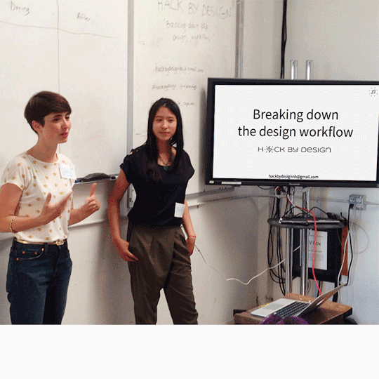

Hackbydesign Workshop
Content Creation, Prototyping, Co-speaker
Status
Workshop given in July 2016 at Noisebridge hackerspace in San Francisco.
What
UX Design workshop, with hints of Design Thinking, rapid prototyping and lean methodologies.
Hat
Workshop co-builder and animator.
Team mate
Co-built with Frances Soong.
Purpose
Demystify the Design process from understanding a problem all the way to prototyping a job to be done.


SEE ALL TWEETS
How else was I involved at Noisebridge?
Contributing to Reboot 2016 (next one is soon), building a Rails user interface to interact with Flaschen Taschen at Makerfaire 2016, attending Circuit Hacking Mondays and other awesome hacking events.
0 notes