Statistics
We looked inside some of the posts by sorrellab and here's what we found interesting.
Average Info
Notes Per Post
7
Likes Per Post
7
Reblog Per Post
0
Reply Per Post
0
Time Between Posts
9 days
Number of Posts By Type
Text
12
Photo
5
Last Seen Tumblr Blogs


Fun Fact
Tumblr was acquired by Yahoo for $1.1B in 2013.
Text
Art Analysis Essay
Identifying which printmaking process works for me is pretty hard due to not having much experience in each different process, so I’d have to base this essay and my decision on which technique I’ve enjoyed the most this past year. I evaluated each process and my outcomes, and I feel the best would be Screen-printing. I also, came to this decision due to the speed and efficiency of this process. My art style can be quite graphical, and I feel this process captures that in print form the most, by using digital applications like Adobe Draw initially then exposing them onto a screen to produce a print. Using the specific colours in the initial design or being able to experiment freely without changing the integrity of the initial outcome.
After conducting initial research, I discovered that screen-printing started as early as the 17th Century progressing through the decades ever evolving as the technique, we know it as today. Artists like Andy Warhol, David Hockney and Roy Lichtenstein really giving it the platform of popularity. The process makes up of a exposing a stencil onto a silk screen, then pushing the ink or paint through the screen so it transfers onto the material you’re wanting to print on. The stencil is exposed onto the screen in a similar way to a photograph, using light to burn the image into the reactive emulsion paint which hardens it. Any areas that weren’t covered by the design stencil remain a liquid which can be washed off to reveal the image you’re wanting to print, then allowing the ink to flow the screen to your desired layout or design.
Kate Gibb
Kate Gibbs is artist I’ve researched as part of another project and is printmaking artist from London, England. I loved her work previously, as I find it to be very expressive with her use of colour, lines, shapes and texture. The obvious use of mark making within her work can be visualised in different works. Utilising the chance of happy accidents that can occur during the creative process.

kategibb.co.uk. (n.d.). Kate Gibb. [online] Available at: http://kategibb.co.uk [Accessed 1 Mar. 2021].
My analysis of Kate Gibbs ‘Pleasure Garden’ starts with my initial feelings on the overall, composition, colours, textures and shapes she has used to create this piece. When looking at this design I get cultural references of Japanese printworks though her use on colour and their tonal ranges, after conducting further research I noticed that this design in particular references Kyoto, Japan for a magazine publication. This explains why she worked in this way to portray a more abstract outcome in relation to her way of working. As similar to her other prints works, I’ve researched Kate Gibb prefers the use simple shapes, colours and lines combined with layering. These marks on top of one another make her prints more cohesive to me, I think she does this, so her style is fluent and easily recognizable predominately, in her album cover works. My eyes are more drawn to the circle which looks like sun on the bottom layer, then flow around the composition following the brush strokes down the page into a pool of different mark marking processes. I find this design very relaxing compared to her other designs, the colours are more complementary of each other already mentioning their tones but, also different shades blue ranging to green and aqua. I think she might have done this to relate back to Japanese culture, as I also find the ‘The Great Wave off Kanagawa’ by Japanese artist Hokusai, very harmonious and calming. I like her use on paintbrush strokes to add texture especially in the larger areas where you can see the background peaking through. The little areas of detail filling negative spaces with repeated patterns and the shadowing of the background adds dimension also, contributing to the flow of direction when looking at the design. I like that there are some elements more subtle than others I think she would have done this to keep eyes on the piece for longer a the more I look and analyse different shapes and lines appear.

Google Arts & Culture. (n.d.). The Great Wave off the Coast of Kanagawa - Katsushika Hokusai. [online] Available at: https://artsandculture.google.com/asset/the-great-wave-off-the-coast-of-kanagawa/fAFp7yddSAtcTQ?hl=en-GB [Accessed 10 Mar. 2021].
Laurie Hastings
Laurie Hastings is a printmaking artist I’ve discovered recently on Instagram; her simple illustrative style of screen printing really caught my eye. Her background as an illustrator shows through into her silk-screen works, with the cartoon influenced figures and use of block colours. She is a commission-based artist with displaying works on her online portfolio but, also international exhibits.
Laurie Hastings. (n.d.). Portfolio | LAURIE HASTINGS Illustrator and Printmaker. [online] Available at: https://www.lauriehastings.com/ [Accessed 1 Mar. 2021].
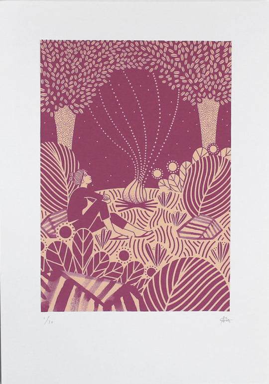
My analysis of Laurie Hastings ‘The Adventurers - Campfire’ starts with my initial feelings on the overall, composition, block colours and line work she has used to create this piece. My initial reaction was to the process of how this piece was made, as at an initial glance I thought it was a Lino Print, very similar to another artist I’ve researched called Michelle Hughes in terms of line work and block colours. I feel the simplification of only two blocked colours, one darker, one lighter which have no tonal range, shadows or highlights to them, then to be applied in layers create this effect. I get a real homely, warming feel from this, warmth relating the fire and her use of organic lines and shapes in waves. I can feel movement within the design to how it has been illustrated this way with fewer straight lines and the trees being more suggestive than realistic shapes. The figure in the print is of a woman looking out at the sky looking comfortable in her overall position. My own relation to camping and a sitting in front of a fire is that I’ve always found it very peaceful which also, strengthens the warmth intuition as I have a personal relation to it. The ground has also, been flipped in colour to create extra dimension of shape, grounding and stability. Highlighting this area to be different to the sky and other elements of the print. After looking deeper, I discovered this piece being part of a series of 3, with the other designs having similarities within their illustrative forms. Making all 3 designs a cohesive collection together. Looking at the bottom of the print your eyes automatically are drawn upwards due to all the different marks/lines facing vertically then interconnecting with different elements then drawing focus back looking at the print and its entirety.
michellehughesdesign. (n.d.). Yorkshire Dales III, original linocut print. [online] Available at: https://www.michellehughesdesign.com/yorkshire-dales-3-linocut-print?lightbox=dataItem-j97a2han [Accessed 10 Mar. 2021].
Chuck Sperry
Chuck Sperry is another screen-printing artist I’ve come across recently. He’s an American printmaker based in San Francisco also, working from his studio there. He exhibits his work internationally propelling his American rock poster style into fine arts using a silk-screen process. His use of text, patterns and various materials to print on caught my eye as I’d not seen this before.
Chuck Sperry. (n.d.). Original Art Archives. [online] Available at: https://chucksperry.net/category/original-art/.
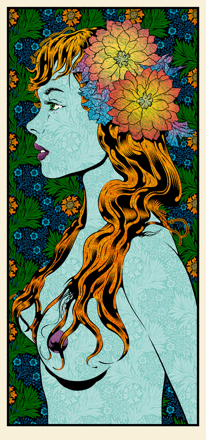
My analysis of Chuck Sperry ‘Vivien 2016’ starts with my initial feelings on the overall, composition, colours, patterns and influences that have gone into creating this print. My eyes are drawn to the initial profile of a woman as the title suggests is Vivien. Vivien reminds my highly of Marvels villain Mystique in the X-men series due to her being topless, the colours used for her hair and body along with the watermarked style texture of the background pattern showing through. I also researched his influences and among them was the era of pop art which I can see this print is heavily inspired by. Roy Lichtenstein portrayed women in many of his designs and the facial features and hair of ‘Vivien’ here compared to his ‘M-Mm Maybe’ print look very similar to me regarding there cartoon comic style. Although I do see the differences, I see I that Roy used dots to add definition in specific areas strengthening comic references whereas Chuck Sperry uses florals it his work. The floral head piece which looks as if it’s glowing from radial illusion created is the most eye-catching part of this design dividing the figure away from the busy background. Highlighting aspects of the background, the style of how the leaves have been drawn remind me of Celtic symbolism, and a traditional illustration of a Scottish thistle, the repeated pattern and the colours used a similar to a tapestry. Chuck Sperry has created a series of these designs uses the description of ‘muses’ and female names to title them, each design has similarities to the hair, florals and beauty creating a series print. Although his more recent work in this style looks less like a comic and more like a realistic portrait of a woman. The title of Muse to me highlights the feeling of confidence, strength and beauty which I feel is portrayed along with sensuality.
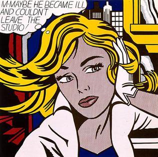
Wikimedia.org. (2021). [online] Available at: https://upload.wikimedia.org/wikipedia/en/2/23/M-Maybe.jpg.
All of the prints I’ve chosen have some form of an organic natural feel I find I am most inspired by these elements in terms relating to my own work. Different aspects of each artist drew me in for the analysis of their work. I find Kate Gibbs expressive abstract style very freeing with the use of her bold colours and layering. Whereas both Laurie Hastings and Chuck Sperry although using the same printmaking process have more of a graphical, planned technical feel. While writing up my analysis I wanted to include both styles of working as depending on my mood I like to work either way.
Word Count- 1,532
3 notes
·
View notes
Text
Alasdair Gray Analysis

Image - Photo Relief Re-print 2017
shop.glasgowprintstudio.co.uk. (n.d.). Alasdair Gray, Saint Jerome, 2017. [online] Available at: https://shop.glasgowprintstudio.co.uk/artists/38-alasdair-gray/works/28875-alasdair-gray-saint-jerome/ [Accessed 22 Feb. 2021].
Saint Jerome, 1955.
My initial thoughts on this piece were that it was very cultural.
I get these thoughts due to the positioning of the subject, his writing tools and the animal placed behind him in the print. How man is positioned in the foreground and the burning fire with candles behind him I get spiritual references as crossed legs and lit candles/fire are linked progressively with meditation and/or prayer. The subject in the centre reminds me of the emperor in Mulan with regards to his moustache, hair and overall appearance although is this piece he appears to naked with his abstract writing materials covering his genital region. I’d say his writing material is abstract due to it just being a four sided shape, which is more suggestive than an actual scroll or paper material. In his hands he appears to be holding an old fashioned feather which is why I believe him to be writing also.
Supporting my initial thoughts and channelling cultural references are the animals depicted in the print which look quite mythical. The animal lying behind the man looks to be part lion/dog also, reminds me of Mulan looking at the end ceremony in particular with the celebration and elaborate costumes. The birds are a mixture to me of cranes, vultures and dragons. I like the placement of them in the overall composition, I felt the artist placed them strategically to remove any areas of negative/blank space. I fell he’s also achieved this with the placement of the drape, building structure, branches and sky but, instead of them all being separate they intertwine in some way either over lapping or extending out of something, doing this made the print cohesive which is the intention of an artist.
I’d say the print is very minimalistic with use of solid black and white, using negative space as highlights to add in extra details rather than adding tones and shading. I think adding tones would have complicated the print, also would not have been as fitting along with the use of simplistic figures, symbols and blocked shapes that I’ve explained make it merge together and appear more appealing to the eye.
After conducting further research into St Jerome, I believe this is his own adaptation referencing the saint using his own style in which his works. I used the word Alternative and artist style due to my first initial thoughts of the mans appearance or setting not matching any other artists reference I researched. I definitely see the linking of this to “St Jerome in his Study’’ depicted by other artists below but, I like the way Alistair Gray has took this reference an truly made it his own sticking to the original symbols of relation like the tiled floor, the lion figure, skulls and candles. Its like his has took references from other artists and merged them together in his own style.

Metmuseum.org. (2021). [online] Available at: https://www.metmuseum.org/art/collection/search/387569 [Accessed 22 Feb. 2021].
Wikipedia. (2020). St Jerome in His Study (Antonello da Messina). [online] Available at: https://en.wikipedia.org/wiki/St_Jerome_in_His_Study_(Antonello_da_Messina) [Accessed 22 Feb. 2021].
Wikipedia Contributors (2020). Saint Jerome in His Study (Dürer). [online] Wikipedia. Available at: https://en.wikipedia.org/wiki/Saint_Jerome_in_His_Study_(D%C3%BCrer) [Accessed 22 Feb. 2021].
1 note
·
View note
Text
Inspired Artists
Michelle Hughes


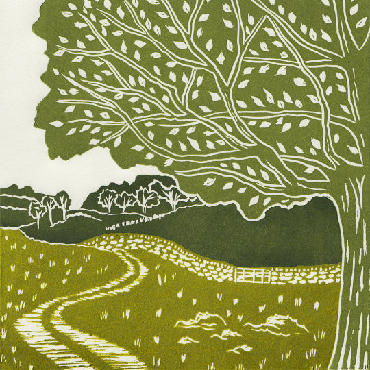
A printmaking artist specialising in Lino cut relief prints and is based in North Yorkshire. Her designs feature trees, pathways, wildlife and of the UK countryside that she captures herself and uses the photographic images as a reference back in her studio. Some locations easily recognisable, the top two researched images above are depicted from the Yorkshire countryside and coastline, Fridaythrope and Staithes to be exact. Each design created with multiple blocks, using oil based relief paints and a etching press to hand print each of her editions. Using colour schemes with variating tones and simple silhouettes creating effortless print works.
Gustave Baumann


Born in Magdeburg Germany in 1881, Gustave Baumann is a well-known for his colourful woodblock prints. Creating his first set of colour woodcuts in 1910 to be exhibited in The Art Institute of Chicago shortly after moving there in 1891. Using a layering technique he depicted scenes of New Mexico and the Californian coastline. Gustave had many great achievements and cut all of his own woodblocks that created over four hundred prints during his career until his death In 1971.
Paul Catherall


Currently based in London, Paul Catherall specialises in Linocut relief prints. He came into printmaking in 1998 after a successful career in illustration, drawn to its step by step process. Using bright bold colours complementary off each other with the design main focal points blocked and bulky easy to distinguish. His prints of famous London landmarks are immaculately clean, sharp and bold with a graphic/illustrative edge easily recognisable to each reference.
Gerry Baptist


Gerry Baptist studied Painting and Graphics at Walthamstow School of Art and the London College of Printing. Attracted too many different reference points to abstract designs then landscapes using multiple mixed medias such watercolour, acrylics and woodblock printing as an example shown in the larger images above. He has developed a wide range skills in different medias but painting has always remained his main passion, with life colour and excitement pour out of his work in a cheerful brilliance.
~
I choose these four artists as my main inspiration due to the subject of their prints. I love nature and landscapes as a reference, this was my main focal point when I conducted my initial research. It was the effortless style of these artists and the colours they use that inspired me to do further research looking at exhibitions, print works and their websites online. Even though the subject reference is similar each artist is different in their own way. Michelle Hughes uses a combination of tonal colours in her Yorkshire landscapes. Whereas Paul Catherall focuses on Urban landscapes focusing on a bolder colour scheme with more variety. Gustave Baumann using multiple layers in woodblocks similar too Lino but, his works have a more fine art feel with little textures added on to floral prints. Finally Gerry Baptist with his abstract woodblock landscapes with a small pop of colour showing from the background pre washed with watercolours.
1 note
·
View note
Text
𝙴𝚟𝚊𝚕𝚞𝚊𝚝𝚒𝚘𝚗
My initial thoughts when starting this project were to research designed album covers to gather inspiration and thoughts on what my final album cover could look like. I looked at online images using a combination of Pinterest, Tumblr and Google images taking inspiration from graphical design and fine art ones. When looking through these designs I chose my favourites and added them to a mood board that I could refer back to at a later date as I progressed further through this course. I feel the selection of album covers I have shown different styles and techniques used to create them for example the fine art styles of Billie Ellish and Lorde covers compared against the type design of Ariana Grande and Doja Cat. Once happy with my research and mood board design I continued to do further research into Artists that have designed album covers of their own.
My first artist Kate Gibb has designed album artwork for various artists but has a longstanding relationship with The Chemical Brothers, her designs are very colourful, and I love the composition of the designs. My second artist Matt Maitland worked with artists such as Michael Jackson and Galantis, his designs very fantasy/space inspired using layering and collage is very eye catching and inspiring. Third artist is Roy Lichtenstein using an iconic pop art style of design which is very recognisable, I love his cover for The Fratellis it suits the genre and the band as a whole. Fourth artist is Jimmy Turrel a famous graphic artist and video director. His style of work using a combination collage, screen print and sketching. The bold bright colours really stand out and the tears in the paper from the layering of materials and often repurposes found images and graphics from different eras.
My fifth and final artist I chose to research is Banksy. I chose to look into Banksy because, I like his overall style in his prints and his message in the current climate. He uses his platform to send messages and promote certain subjects his most recent design being in support of the NHS. His use on stencils and spray paint create a eye catching combination, I like his technique used to create the album cover for Blur and his design worn by Stormzy to wear at Glastonbury.
After researching my five artists I decided to uncover more information about The Recycled Orchestra of Cateura a Paraguayan musical group, which my final outcome from this project is intended for. I looked onto their website to learn that the group use instruments entirely made out of garbage and that Cateura is built on top of a landfill site. Favio Chavez the groups creator began using the rubbish to create instruments for the children in the nearby neighbourhoods. I found this very inspiring and due to the current climate with Global Warming I think it’s a great idea not only to recycle but, doing it in such a creative way. Looking into the band this way I can get a feel of the kind of print I’d like to create that would suit the targeted audience and The Recycled Orchestra as a whole.
Reviewing all my gathered research for this project I was confident enough to start working on some experimental designs and tasks set by my tutor. The first task to create collage design ideas in reference to Jimmy Turrel and his work. Selecting my favourite Stevie Nicks I gathered images from Pinterest to digitality manipulate then print to add to a collage design. Using materials from my home such as train tickets, receipts, newspapers etc I collected and ripped them to create raw edges. I created 3 A3 style pieces using various images and materials combined, my favourite design is the second collage I made just due to the overall composition and images used. I was more confident heading into collaging this piece due to my first design being more trial and error but overall, I liked how the 3 designs turned out. Although using the same techniques as Jimmy Turrel wasn’t enough and I didn’t feel like my designs referenced his enough which is why I did some further development and digitally edited images using Photoshop Camera, my favourite collage to intensify colours and to create similar compositions. Following on from the collage I created some type designs inspired by Jimmy Turrel using the same effect I did on the collage piece.
Looking at logos and type design I researched an artist called Alan Kitching who is one old the world’s most foremost practitioners of letterpress and typographic design and printmaking. I like how bold his designs are and the use of capital lettering in most of his designs, I also like how the type is printed and the background is white. It creates a crisp letter shape which is also eye-catching. I designed three different type design using stamps, ripped paper and washy tape and red acrylic paint which is my favourite print. I spent the most time on my last design and how it references Alan Kitching really well although my design is inverted with the background having colour and my text being white.
My third artist experimentation were logo designs inspired by my chosen artist Banksy. Initially I wanted to reference this artist by using real spray paints and stencil designs then upload what I’d created and then edit further digitally like I have done in previous experiments. Although I would have loved to have done this, the cost and also the space I currently have at home wouldn’t have allowed it. So instead, I used the initial digital logo I designed with spray paint lettering and an application called Painter to add more spray paint and watercolour effect brushes to create my desired effect and I’m happy with the outcome I created. If I had longer on this project, I would’ve love to use spray paint and stencils in real life.
My final experimentation task was to research and reference the artist Andy Welland. A visual artist using bright colours and experimental compositions. To reference his work, I used an app called Adobe Draw to create 3 separate designs. This was definitely my favourite experimentation task I had a lot of fun using this app and the use of colours and a sporadic composition. My favourite design is my second once I created, I feel this because, I became more confident using the app making use of layers, in app shapes and colour themes. If I were to create another design, I’d definitely incorporate image layers to add texture and depth. I enjoyed using the app so much I further developed my Alan Kitching research creating digital designs referencing him.
Looking into different artist styles benefited me within this project as applied some of these experimentations and references into my final outcome the Album Cover. Before creating final, my design dabbled with Canva creating 2 initial designs using my imagery taken at The Kelvingrove Bandstand. My tutor set us a task to gather images throughout the project initially I took photos of items you see every day to reference ‘The beauty in the Mundane’. These initial photos were taken on my daily walks and commutes. Whereas with the Kelvingrove Bandstand I felt related almost too well with the next task referencing words set by my tutor which were chorus, orchestra, piano, music, note, conductor, concert, jazz and loud. Although I took these words to literally, I like how my images turned out with the composition, depth of field and viewpoints from where they were taken.
Having my images, experimentations and experience with Canva I felt confident enough to create my final outcome my Album Cover. Already using my first hand images in 4 initial design already with my final cover, I wanted to create something different but, still use elements from these designs I liked with my final outcome. I liked my images facing the bandstand and of the seating area but, didn’t want to incorporate them as images having done this prior. I decided to print the image and draw over details using fine liner pen then uploaded it into Photoshop Camera to apply the yellow artist effect. Using letter frames on Canva to reference Alan Kitching I added the image to each individual letter to create the type for The Recycled Orchestra. I then added different paper elements and ripped effects to elevate the recycled/rubbish aspect to keep in reference to my intended audience.
Overall, I like both my front and back covers for my album covers. Throughout this project I’ve become more confident in both my analogue and digital designing. My chosen artist was Banksy but, I felt when using his using logo style which my imagery they weren’t very complimentary of each other whereas the type design referencing Alan Kitching I much preferred. I’m glad I looked at my different options and experimentations first as my initial album designs look very different to my final outcome. The overall composition to the design I’m very happy with I feel a little more shadowing around the title would help it stand out more but other than that the colours and different textures applied make all together an eye catching design.
0 notes
Text
𝙵𝚒𝚗𝚊𝚕 𝙰𝚕𝚋𝚞𝚖 𝙲𝚘𝚟𝚎𝚛 𝙳𝚎𝚜𝚒𝚐𝚗


My Final Album Cover Design created using the Canva app on my iPad.
~
To create the design I sketched my images of the Kelvingrove Bandstand using pencil and black fine liner. I wanted my design to be messy so I used a combination of mark making techniques to create my desired effect. Once I was happy with sketch I took images so I could digitally manipulate them using Photoshop camera, applying filters and presets until I got my desired effect. I chose this yellow hued effect because, I found it quite eye catching/bright and after experimenting in the style of Jimmy Turrel I thought it referenced him quite well.
~
Happy with my images and imported them into Canva to start exploring different compositions, texture and type styles. I produced 3 different covers before finalising on this one. I incorporated different paper textures and patterns to referenced the recycled aspect of the band, then the type font showcasing my initial edited sketch. I feel the capitalised text also, references my experimentation into Alan Kitching.
~
Overall, I’m happy with my finalised design. I feel the different elements have come together really well to create an interesting piece. I’m glad I decided to sketch my images instead of adding my photos directly to the design like I have done prior in my experimentation stages, I prefer the drawn style and also fits my brief and The Recycled Orchestra ethos better.
1 note
·
View note


Text
𝙰𝚍𝚘𝚋𝚎 𝙳𝚛𝚊𝚠 𝙰𝚕𝚋𝚞𝚖 𝙲𝚘𝚟𝚎𝚛𝚜.

My favourite experimental piece from working with adobe draw I like the overall composition with the bandstand in the background, the placement of the stickers which are piano keys and a saxophone printed twice in different colours to create definition. The type used reminds me of the opening credits of a Quentin Tarantino Film.


~
After experimenting with Album cover designs in Canva and creating my inspired pieces from Andy Welland, I wanted to explore using a different platform like adobe draw for creating album cover designs. These are the 4 experimental pieces I designed using my images took from Kelvingrove Bandstand and stickers I created using Adobe Capture.
0 notes
Text
𝙵𝚞𝚛𝚝𝚑𝚎𝚛 𝙻𝚘𝚐𝚘 𝙴𝚡𝚙𝚎𝚛𝚒𝚖𝚎𝚗𝚝𝚊𝚝𝚒𝚘𝚗
After using Adobe Draw I wanted to use it more to experiment creating more Logo designs inspired by the artists Alan Kitching and Banksy.


Alan Kitchen Inspired
The designs above are inspired by Alan Kitchen with the repeat of typo and bold colours in the background. The Saxophone shape I created in Adobe capture then imported it into Adobe Draw as a sticker that can be easily added and removed easily to designs.


BanksyInspired Sticker
Using the same technique as did for the saxophone sticker I decided to do the same for the initial logo I created for my Banksy experimentation. So I could easily add and remove the sticker when creating the final album cover for the recycled orchestra.
0 notes
Text
𝙰𝚗𝚍𝚢 𝚆𝚎𝚕𝚕𝚊𝚗𝚍 𝙳𝚎𝚜𝚒𝚐𝚗𝚜


~
The first design is inspired directly from the first piece, I created a similar composition using Abode draw. I used the pre-made shapes available within the app and also painted my own I also used the eraser tool to remove areas on certain layers to show the colour underneath. The colours selected I chose from palette available to select on Adobe Draw, selecting these colours instead of choosing my own was a guarantee that they’d compliment each other.

~
My second design i had freedom to explore and chose my own composition and colours compared to my initial design, looking at it literally in terms of composition and colours used. With this design I experimented using different shapes using just the outline of some and filling some in. Again using different layers initially to explore and to be able to make easy changes if I didn't like to outcome rather having to start from scratch. I like the colours I used I feel they complement each other well how the black brings out the brightness in the other colours.

~
My final design inspired by Andy Welland. Using the same techniques as in my first 2 experimentations I was able to create this design. With this one I also explored the opacity of the paint choosing higher and lower density for some shapes (mainly rectangles). I used another colour scheme available to me within adobe draw that complement each other really well I like the off tone background and the deep blues it’s muted but, eye catching.
~
Overall, I really enjoyed creating these designs and exploring digitally designing via Adobe Draw. I became more confident in my creations after a while using different layers, shapes and colours then with my general compositions. I feel I have developed pieces that you can see have been inspired by Andy Welland.
1 note
·
View note
Photo

Andy Welland Research
I like Andy’s choice of bold colours and simple shapes in his prints. Very simple pieces but yet very eye catching and fun to look at. It’s very expressive way to work, just adding blocks of colours and lines freely without having to stick to a plan like you would have to when creating a portrait or landscape design.
0 notes
Photo


CHORUS. ORCHESTRA. PIANO. MUSIC.NOTE. CONDUCTOR. CONCERT. JAZZ. LOUD.
~
These images were taken at the Kelvingrove Bandstand in Glasgow.
I captured the images to relate to the words above given for this experimentation task. I took a literal approach to the words feeling that using this location would reference the words the best.
The Bandstand can be filled for concerts and orchestras throughout the year normally but, due to COVID-19 events have had to be cancelled and the bandstand has laid empty. Taking this photos with with it empty gives a eery feel and is kinda spooky also due to the time of year its covered in leaves which gives it a littered feel relating back to the aesthetic of The Recycled Orchestra.
0 notes
Text
𝙲𝚊𝚗𝚟𝚊 𝙴𝚡𝚙𝚎𝚛𝚒𝚖𝚎𝚗𝚝𝚊𝚝𝚒𝚘𝚗
Digital experimentation of my images using Canva app to create initial album cover designs.
Images show the process of me uploading images to my app, searching the apps stock images and editing that, applying block colour backgrounds to artistic ones, separate effects to use and individual images, applying stickers, different typo styles and overall composition for a album cover design.


Experimenting with the app in this has allowed me to get feel of the basics ready for when I create my final outcome design.


~
0 notes
Text
𝙱𝚊𝚗𝚔𝚜𝚢 𝙻𝚘𝚐𝚘


~
Bansky inspired logo design using the app infinite painter.
I created this logo using the initial template I designed for my Jimmy Turrel experimentation and imported it into infinite painter. From there I selected only spray paint paintbrushes to apply the graffiti effect to my design. I like the combination of the the bright colours against the blacks and smoky greys. I like how the type is highlighted just enough so the logo is still readable but, still has a smeared effect.
0 notes
Text
𝙰𝚕𝚊𝚗 𝙺𝚒𝚝𝚌𝚑𝚒𝚗𝚐 𝙴𝚡𝚙𝚎𝚛𝚒𝚖𝚎𝚗𝚝𝚊𝚝𝚒𝚘𝚗


~
Logo design inspired by Alan Kitchen.
Created this logo using masking tape shaped into type then with red acrylic paint pressed and folded into the paper. Once dried I peeled off the tape to reveal bold white type of The Recycled Orchestra.
Once I was happy, I then cropped and loaded the design into the painter app adding more paint splatters and shadows digitally to test how they would look ready for my Banksy experimentation.
0 notes
Photo

Alan Kitching Research
My research into Alan Kitching. I like his use of bright colours with the typography used. Eye catching prints that draw your attention.
0 notes
Photo


Logo style experimentation
~
I created this using different font text off of google images then crop them down to spell my desired title and layout using Microsoft powerpoint saved as a group image and imported into my iPhone so I could add the effects you can see above. I chose to use a graffiti style text to link back into my chosen artist banksy the style of font is very similar to the cover art for Blur. I find Graffiti very interesting but understand there’s a lot of shroud around the style of art to whether its vandalism or art work but, I love graffiti and enjoy seeing it in everyday life. The bright yellow background on the 3rd edit of the logo reminds me of Jimmy Turrels album covers, a small pop of colour by is very eye catching.
0 notes
Photo


𝙸𝚗𝚒𝚝𝚒𝚊𝚕 𝚕𝚘𝚐𝚘 𝚎𝚡𝚙𝚎𝚛𝚒𝚖𝚎𝚗𝚝𝚊𝚝𝚒𝚘𝚗 𝚍𝚎𝚜𝚒𝚐𝚗𝚜 𝚏𝚘𝚛 𝚃𝚑𝚎 𝚁𝚎𝚌𝚢𝚌𝚕𝚎𝚍 𝙾𝚛𝚌𝚑𝚎𝚜𝚝𝚛𝚊.
0 notes