
Main blog: http://whatclemson.tumblr.com | Otome Obsession Blog: https://resuri-likes-otome-games.tumblr.com/ | Leslie | 25 | Female | AroAce | I'm sorry my blog is a fucking mess | I like drawing various things, but I usually draw my OCs. I don't post as much as I'd like, so don't expect art like every day. I don't accept constructive criticism unless I ask for it; I want to feel good about my art for once. | dA: ResuriMaikeruzu (not really posting anymore tbh) | Instagram: strawberry.cream846 |
Don't wanna be here? Send us removal request.
Statistics
We looked inside some of the posts by strawberry--cream and here's what we found interesting.
Average Info
Notes Per Post
482K
Likes Per Post
273K
Reblog Per Post
209K
Reply Per Post
757
Time Between Posts
5 days
Number of Posts By Type
Text
11
Note
1
Photo
5
Last Seen Tumblr Blogs


Fun Fact
The “We are the 99%” Tumblr blog became the slogan for the Occupy Wall Street movement.
Text
Hey everyone, I know it's going to be a busy day for a lot of people, but Google enrolled everyone over 18 into their AI program automatically.
If you have a google account, first go to gemini.google.com/extensions and turn everything off.
Then you need to go to myactivity.google.com/product/gemini and turn off all Gemini activity tracking. You do have to do them in that order to make sure it works.
Honestly, I'm not sure how long this will last, but this should keep Gemini off your projects for a bit.
I saw this over on bluesky and figured it would be good to spread on here. It only takes a few minutes to do.
149K notes
·
View notes
Note
hi there, i love your themes but i was wondering if you had any tips for choosing the right colours and fonts for themes?
Hello, please bear in mind that this is merely how I approach color + font choices; other people may go about it differently, but here’s how I do it!
Colors:
Pick your theme. By this I mean the theme of your blog content and what you want it to look like. E.g.: a personal blog vs. a fandom blog. The reason for this is if you’re a fandom blog, you may choose to have it as eye-striking, bold, etc.
Obtain colors from an image. Of course, this step only works if your theme comes with image options(e.g.: header or sidebar). By obtaining colors from an image that’s included, the whole site will appear to be more harmonizing, as the colors are from the same color scheme. (x) (x) (x)
Pick an accent color. This will be the main color of your blog, and all other color choices will correspond to/around this color. If your theme comes with image options, make sure your accent color stands out the most in those images. Remember that the purpose of an accent color is to make certain elements more eyecatching than the rest.
Choose from monochromatic colors & related colors. Monochromatic colors adjust the brightness of that color, whilst related colors are colors that are close together of the same hue. I advise against color shades, as they desaturate colors by mixing black into it (the same goes for color tints, which mix white into it). (x)
Here are a few more resources regarding color: (x) (x) (x)
Fonts:
Pick a body font. This is basically the main font for your entire blog. I recommend choosing a neat & simple font; the categories “Serif” and “Sans Serif” from Google Fonts are my go-tos.Body fonts should be clear and easily legible; I recommend font sizes 0.875rem–1.063rem (you can convert rem to px here).
Pick an accent font. This is the font for special text, e.g.: header text, title text, etc. You can go as wild and/or fancy as you want; the “Handwriting” category from Google Fonts is my favorite. Accent/title fonts should be large and eyecatching (much like the accent color); I recommend font sizes 0.938rem–1.25rem depending on your font choice. Letter spacing may also come in handy for fancier fonts for improved
Fonts’ height discrepancies: Some fonts’ displayed font size may be different from the font size you assigned it as. For example, when the font Manjari is set to 16px, it shows up as a shorter height with excess space under the characters.
Here are some resources for fonts & font pairings: (x) (x) (x)
54 notes
·
View notes
Text
writing is 10% storytelling and 90% rearranging three sentences for an hour like you're trying to solve an ancient curse
25K notes
·
View notes
Photo

People just love to play, haven’t you heard? - Submitted by: fastman27
#7F6D9F #C29CD6 #D8B2C0 #F2CAC5 #FFE1DA
3K notes
·
View notes
Text
HOLY SHIT THERES SO MUCH AWESOME IRISU SYNDROME FANART ON HERE WHERE HAVE I BEEN!!!
0 notes
Text

Maestro
Make a playlist out of your audio posts
This is a project I've been writing and rewriting on and off for a while now. After starting over completely from scratch last weekend, I think I've gotten far enough to share it.
It's still early, but so far it supports:
NPF and Legacy audio posts
Spotify posts
Keyboard navigation
There's a few more variations of audio post that I need to finish, but feel free to test out what is currently ready!
161 notes
·
View notes

Text
call me a dirty communist radical but I think everyone should know if they live near toxic waste
33K notes
·
View notes
Text
☁ beryl (collection page).
Links: preview | install
Beryl is a grid-based page that neatly displays your collection — of fics, books, movies, muses, portfolio works, or anything you'd like to show the world. Sticky section titles and graphics remain in view so you never lose track of your progress.
Features: no javascript, neat sections, sticky section titles, sticky navigation, header, item quote blocks, item ratings with custom symbols
Credits: preview header image by yamasa-n (unsplash)
468 notes
·
View notes
Photo

watch yo jet - Submitted by: fastman27
#E2EBF4 #B0C8FF #8791ED #7D5CDF #4C3C9D
3K notes
·
View notes
Photo
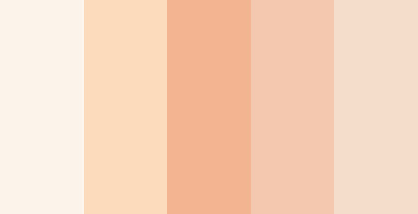
A More Naive World - Submitted by Synoicus
#FCF4EB #FCDABC #F3B491 #F4C8AF #F5DDCB
1K notes
·
View notes
Text
genuinely wild to me when I go to someone's house and we watch TV or listen to music or something and there are ads. I haven't seen an ad in my home since 2005. what do you mean you haven't set up multiple layers of digital infrastructure to banish corporate messaging to oblivion before it manifests? listen, this is important. this is the 21st century version of carving sigils on the wall to deny entry to demons or wearing bells to ward off the Unseelie. come on give me your router admin password and I'll show you how to cast a protective spell of Get Thee Tae Fuck, Capital
67K notes
·
View notes
Text

Theme [40]: Web Zero by glenthemes
💾 ── preview / code / guide / credits 。
APRIL FOOLS’ 〜 you've fallen through a wormhole into the early 2010s! 👹 “my child is fine” your child is still running their tumblr blog from middle school!
💾 ── theme features ‣
top bar: css striped pattern (diagonal 1, diagonal 2, vertical, or horizontal) ✦ repeating lace pattern (image)
blinkies wall: up to 20 blinkies! auto arranged in a grid! draggable!
posts: 300px–700px ✦ vintage stamp-style borders ✦ optional black-and-white filter ✦ choose between old blockquote captions or modern dashboard captions ✦ legacy & NPF compatible
sidebar: 200px–350px ✦ customizable tape image! optional texture! ✦ stencil-style spray paints on corners ✦ shadow/offset frame ✦ custom title & description ✦ up to 6 custom links
corner image: 100px–400px ✦ choose whichever corner of your screen ✦ options to move it up/down/left/right!
music player: up to 10 songs ✦ inspired by Wikplayer and SCMPlayer ✦ fully functional: play/pause, previous/next, shuffle, interactive bar, toggle view full playlist
💾 ── how to edit this theme ‣
Please read the guide I put together! ᕙ(ಠ∀ಠ)ᕗ
💾 ── terms of use / ask a question / tip jar ☕
1K notes
·
View notes
Photo

Maria Clara — Submitted by gkdeamon
#B39259 #EDD28C #FFFAD0 #FFEEB8 #C7C495 #8C8661 #5C4F3D
918 notes
·
View notes
Photo

Just Straight Up Word Salad - Submitted by: fastman27
#FCDEDE #FBC7D7 #E8AFD8 #CF9EDF #A493E4
4K notes
·
View notes
Text
not all ships are For wanting them to be in a happy healthy relationship together. sometimes shipping two characters means you want them to be erotically obsessed with each other and become entwined in a mutually toxic love affair for a few months and then horrifically break each other's hearts and never speak again. sometimes you want them to be codependent best friends with enough repression to explode a submarine who only make out/have sex when they're at their worst. sometimes you want them to pine after each other for years, never say anything, and then die. sometimes you want them to kill each other. this, too, is shipping
38K notes
·
View notes
Text
Tidbit: The "Threshold" Effect of Desaturated Objects Due to Increased Contrast
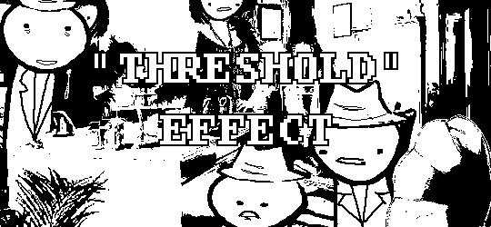
If you've ever asked how to replicate an effect like this...
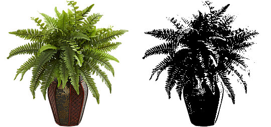
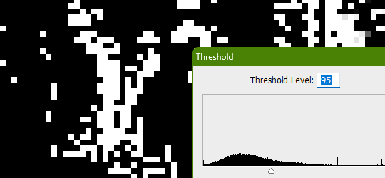
...it's likely someone told you to apply the threshold filter, which converts any light colors to pure white, and any dark colors to pure black. And it's perfectly fine to do so. It's simple, straightforward, efficient. But I take issue with the assertion that it's definitively the only conceivable way Hussie did it when the evidence points to the contrary. Scrutinize the following examples under a microscope:
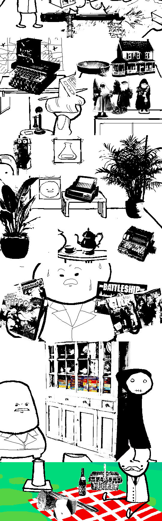
Did you see it? The singular detail that distinguishes these images from ones that have been thresholded? Congratulations if you noticed that these contain not only black and white pixels, but GRAY pixels as well! A threshold filter's conversion is binary; a pixel is either black, or it is white. No in-between. The presence of these gray values rules out its use, then.
One thing is clear, at least: these images are black and white in the traditional sense of the term, i.e. "grayscale", even if it's in drastic form. They've been stripped of any color, hue, chroma. Completely desaturated, in other words.
So from this observation, we can reason that they were converted to be grayscale at some point in the process of editing.
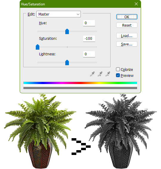
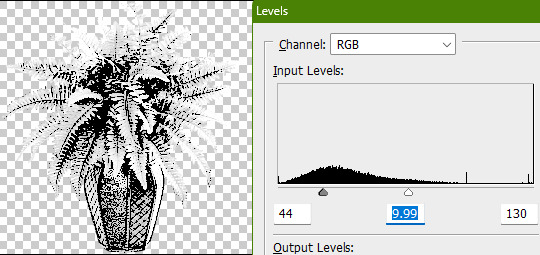
Of course, this is still lacking in the pure black and pure white departments. If only there was a way to adjust the intensity levels and push them both to their extremes... oh wait, THERE IS! Using the Levels adjustment tool!
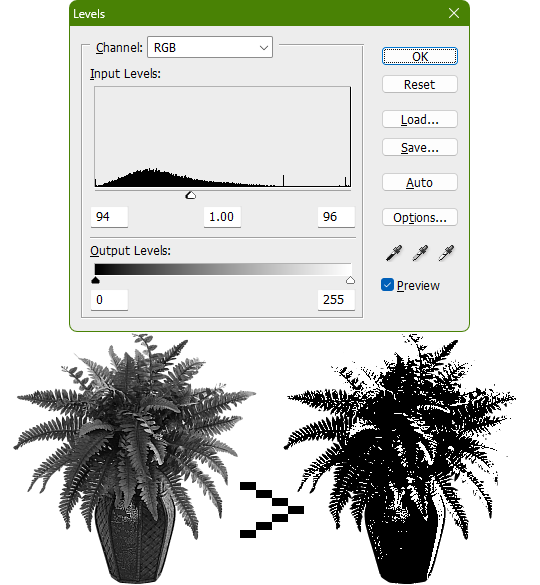
Pushing the black input levels slider to the right makes all dark colors turn darker, and conversely, pushing the white input levels slider to the left makes any light colors turn lighter. This is a great way of increasing the contrast and adjusting the brightness. Speaking of which, the Brightness/Contrast adjustment tool in Photoshop with "Use Legacy" enabled also accomplishes a nearly identical effect.
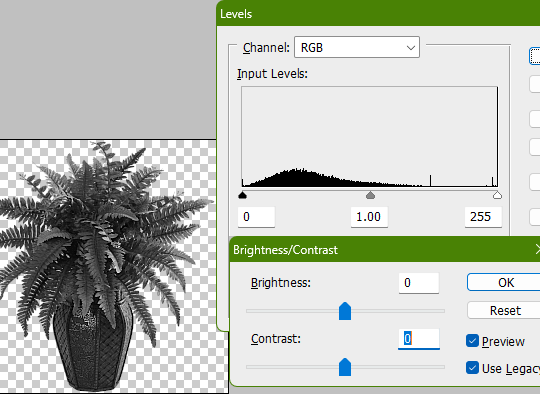
This timelapse demonstrates how the Brightness/Contrast adjustment is basically equivalent to using the Levels one when used this way
I say nearly identical because raising the contrast all the way to 100% with Brightness/Contrast makes it actually identical with the Threshold adjustment tool. The black and white input levels sliders can't fully join in the middle because of the gray input level slider occupying the space, hence why there are some stray gray pixels even when pushing them to their limits.
Well, there could be several reasons explaining why there could be gray pixels other than the contrast not being high enough to clip them, but I'll spare you another needlessly complicated and overly technical rambling on how I can tell it's most definitely the Levels adjustment tool always.
This post is getting a little long, so I'll stop here and elaborate a little more on pertinent things under the read more link, like semi-opaque pixels, scaling down, sharpening, and the gamma slider. Also here's the potted plant PSD if you wanna check it out I guess.
ADDENDUM
Semi-opaque pixels
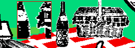
When separating objects from a background, it's usually easiest to do so with a magic wand selection tool, which selects regions of similar colors. There's an option to make the selection anti-aliased, smoothing the edges of whatever you've cropped. Unchecking it will make the pixels hard and jagged. The wine bottle and picnic basket are a good example of each, respectively.
If you've already cropped out something with anti-aliasing enabled, there's still a way to sharpen the edges after the fact. Duplicating the layer multiple times will increase the semi-transparent pixels' opacity. Do it enough times and they'll eventually become completely opaque. An analogy would be stacking multiple panes of tinted glass on top of each other. Stack enough of them and you wouldn't be able to see through anymore.
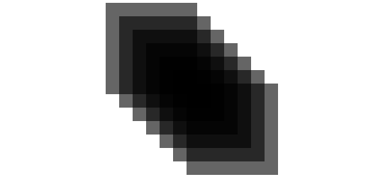
These semi-opaque black pixels would appear gray on a white background, and so would semi-opaque white pixels on a black one. That's the reason for the gray pixels around the edges on some of these examples.

Scaling down/Sharpening
Suppose you've already gone ahead and went through the whole rigamarole of editing the object to be black and white before deciding firmly on the size of it in your composition, and now you think it could be a little smaller. You could always resize it and scale it down, but with the interpolation method set to none/nearest-neighbor, it's going to look kind of shit, and with it set to something else like bilinear or bicubic, the anti-aliasing is going to make it a bit blurry (introducing these gray values). You could increase the contrast again, or you could use the Sharpen filter to do it.
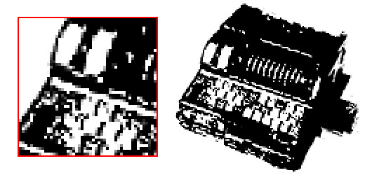
Not to suggest that this particular example was scaled down after editing, it's just the one that looks closest to it since I'm too lazy to make one.

Sharpening repeatedly will bump up the contrast, plus Photoshop's Sharpen filter has the added benefit of hardening any semi-opaque pixels as well, making the edges sharper.
GIMP's Sharpen filter doesn't do that latter part, unfortunately, but if the layer has an opaque white background, it'll do the same.
Gamma slider
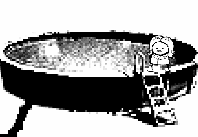
This effect might not be so obvious, but really take a good look at these board games:

Actually, maybe this Problem Sleuth bonus panel shows what I mean better:

The dark values are cranked up very high, and so are the light values a bit, but there's an inordinate amount of midrange values that are on the lighter side than what would be normal. That's because of the midtones input levels slider, the gray slider, the gamma slider, whatever.
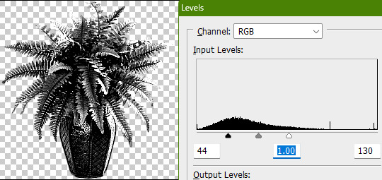
I'm toot tired to explain any more than that, so make of that what you will. The end.
481 notes
·
View notes