
Don't wanna be here? Send us removal request.
Statistics
We looked inside some of the posts by surfacelaneauckland-blog and here's what we found interesting.
Average Info
Notes Per Post
0
Likes Per Post
0
Reblog Per Post
0
Reply Per Post
0
Time Between Posts
4 days
Number of Posts By Type
Text
2
Photo
15
Last Seen Tumblr Blogs


Fun Fact
China blocked Tumblr because of pornography and censorship problems in 2013.
Text
Surface Lane Abstract
‘Surface Lane’ is a project that responds to Fort Lane through the cinematic lens. The Lane is a multi-leveled vertical space that aims to create a working environment that is aimed towards (but not only) students and office workers, as an alternate place to work/study. The walls are of made up of a series of vertical glass fins that run throughout ‘Surface lane’ with a series of horizontal platforms.
The building will be illuminated by a series of light boxes that will be placed behind the fins and create a range of atmospheres that promote different types of productive work. Designing my own surface design was the main influence and drive behind the development of the design. Using the original surface design to and create different surfaces for different types of group and individual work.
Through this, I wanted to create a space within Auckland scene that is opposite to the normal chaotic scene and provides a more relaxing space, where occupants will be able to use the different areas in a range of ways and not be limited to the furniture within. I wanted to create a unique entrance that creates a transition between the chaotic city and into Surface Lane.
0 notes
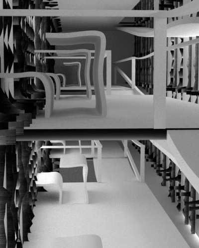
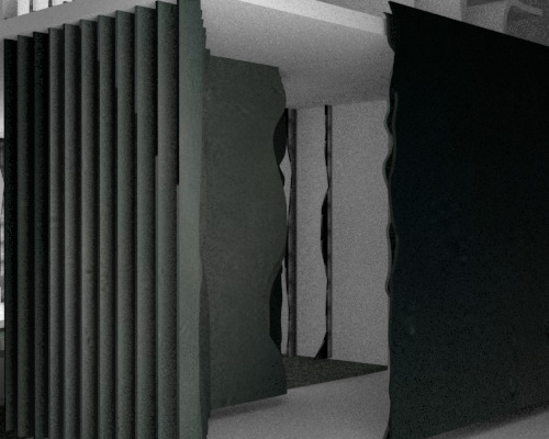
Photo

Working rhino model showing the shapes and lines of each fin in detail.
shows the shapes of the furniture, the curves and how they are made from the surface itself.
Arrows showing the direction of the lightboxes
0 notes
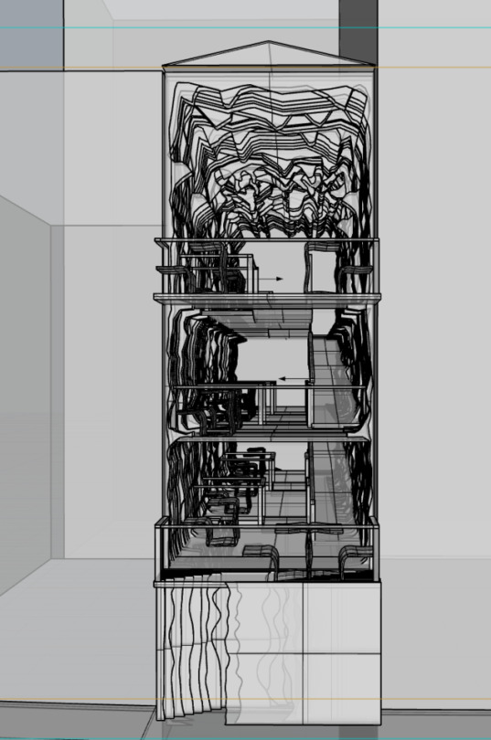
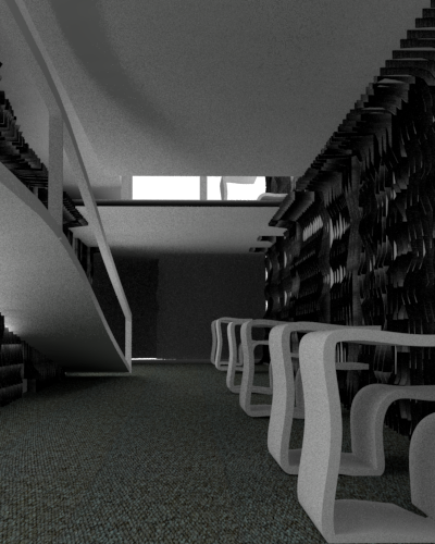
Photo
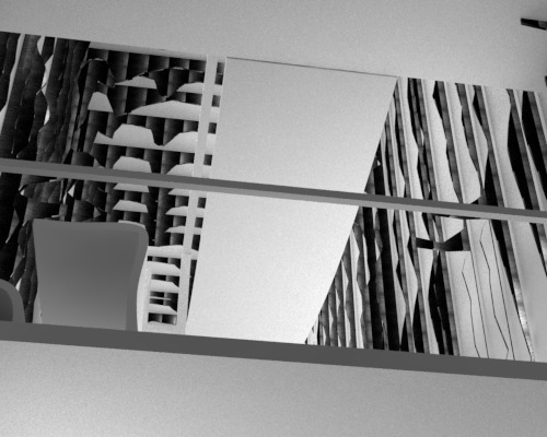
Perspectives from the top floor.
First image is a perspective looking down towards the floor below.
Second image image is exploring the surface with a dark material. This material created an interesting effect but did not show the surfaces shapes and lines as other materials would.
Third image is looking up towards the third level. With the spaces between platforms enables the visitors to be able to see others within the space and enable shadows to form from different angles
0 notes
Photo

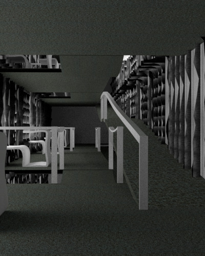
Different perspectives from the second floor.
Looking through the space and and up and down the ramps.
Started experimenting with materials and lighting. Adding the small details to enhance the experience and understanding of the space.
0 notes
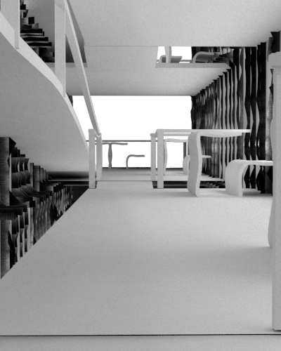
Photo
Some perspectives from the first area on the ground floor.
Top images is looking up the ramp
left images looking up towards the entrance. Also includes a slight view into the space above.
third image is looking from Fort Lane into the entrance space.
These are the 3 main views that most visitors to the space will experience.
0 notes
Photo
Exploring how different coloured lights create different atmospheres and bring out the details from the surface.
The top surface is very detailed and shows all the different layers.
0 notes
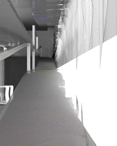
Photo
One of the final renders exploring how the space can be interacted with and ho light and shadows play within each space.
For this render I needed to change the furniture and make there be less in certain areas.
Also needed to show the surface more as my whole design is surrounded by it.
I also wanted the lightboxes to be less noticeable and not as bright
0 notes
Photo
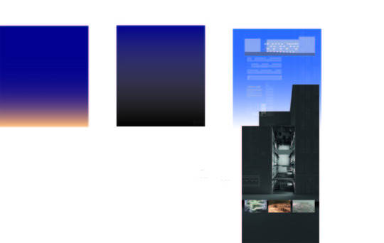
Starting to place the drawings for the final layout.
Looking into having a large render in the middle with the drawings above to describe the building. Adding building details to the render as site context. Surface images from the beginning of the semester are at the bottom due to being an important part of the design and bringing the most inspiration to the design.
0 notes
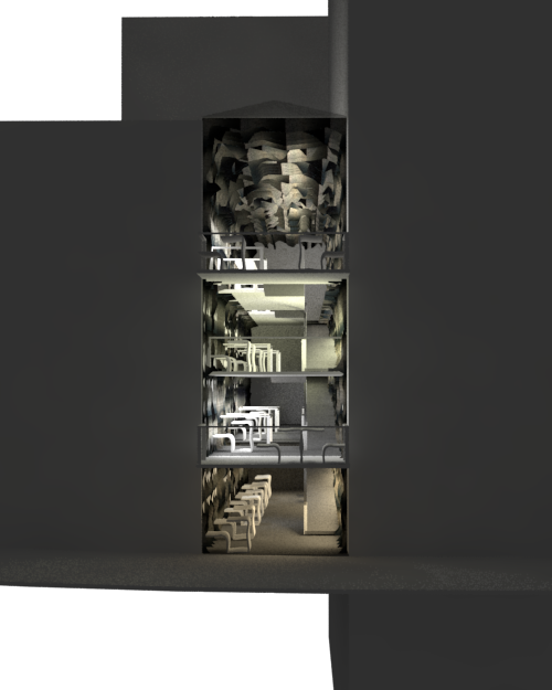
Photo
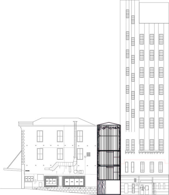
Elevation
Showing the location of my building in relation to the two buildings beside it. I used this elevation to look into how the different floors levels and how they are different. Site also looks at the the slope and how the slope ends at the opening.
0 notes
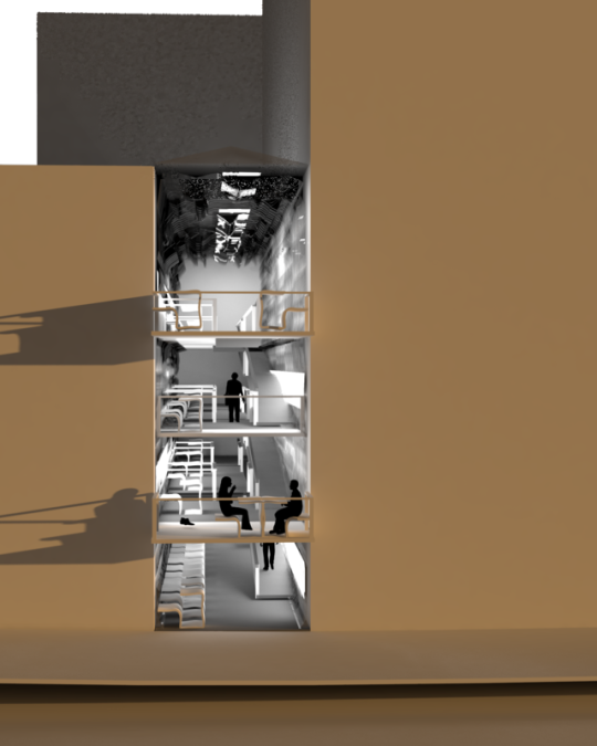
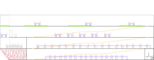
Photo
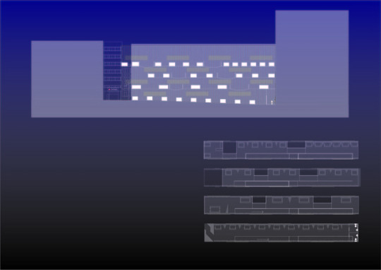
Plan and Section of the space
Individual lines on each drawing showing how the location of the fins. Used a light yellow lines and shapes to show the lightboxes locations within the spaces. The furniture itself is only seen as a box due to the shapes of them and the way they are seen.
Part of the space is over the lane and enables views into the lane as well as the surrounding environments.
0 notes
Photo
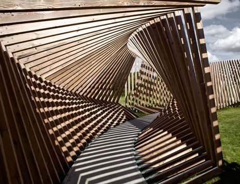
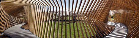
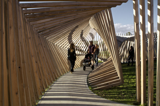
Ekko by Thilo Frank
Thilo Frank is a designer from Berlin that creates works that encourage the visitor to question ones relation to space. I liked the way that he uses the space to amplify the visitors perception of the space
Are looking into Ekko I was able to take inspiration from the meaning behind the design as well as the light and shadows that occur within the site.
The walkway is made out of timber, it has speakers and sensors which record sound that gets played back to you after being warped with a computer program.
0 notes
Photo
inspiration: Presentation layouts found on Pinterest
I was looking into how to layout my project and show the right amount of information to show my idea clearly.
As my building is 12m high having a large portrait render would show my space well. I chose to place my render at the bottom and show the different drawings above it. I want to make sure that the drawings to not take away and distract viewing the render.
0 notes
Photo

Some simple renders exploring shapes, materials and size of the space.
Materials: I added different surface images over the walls and entrance which experimented with lighting and colour. Using these materials I wanted to create a light soft feeling that does not feel heavy and claustrophobic.
Size: as the location is a small alleyway between the backpackers and kebab and food places I wanted to experiment with what could be placed within the space. Size 4m x 32m
0 notes
Photo
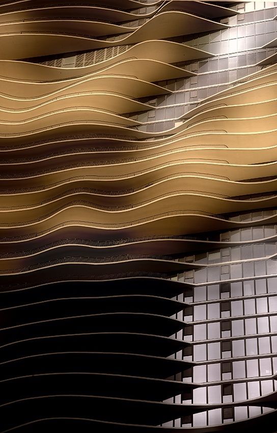
Aqua Tower designed by studio gang architects
The design was inspired by the striated limestone outcroppings.
I was inspired by the way that the groves are placed and creates a unique facade.
https://www.archdaily.com/42694/aqua-tower-studio-gang-architects
0 notes
Text
Thinking about program for the space
Program for the space.
Designed as a working space. areas for individual workers as well as pair and group work.
Designed as an alternate space for those who feel that they wish to work somewhere different
Surrounding environment: backpackers, food places, car park, bars, cafes, businesses. Within the surround buildings there is nowhere for the public to be able to go where it is just a place for working, apart from the library and their own work spaces.
Aimed towards people who need a space to:
- study
- read
- draw
- research
- design
- meet up as a group
- discussion space
0 notes
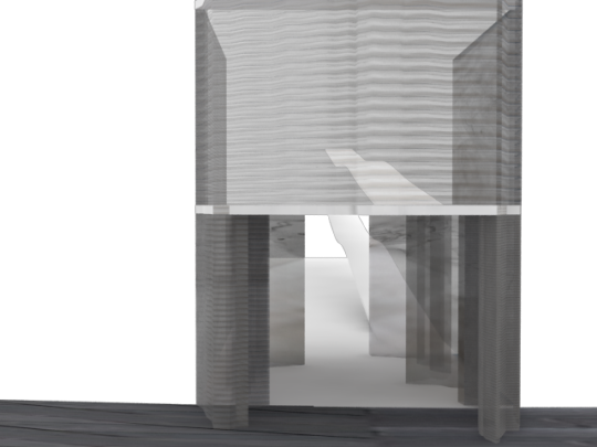
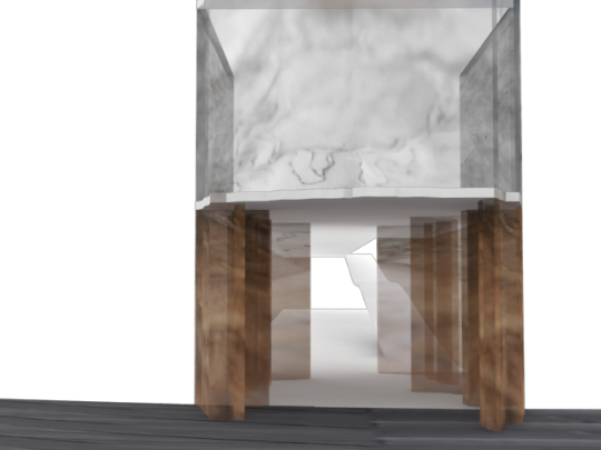
Photo
Concept section looking at the different levels and multiple fins.
Looking at the layout of the space including the ramp shape.
From this I changed the idea of a rooftop garden as the space itself would not get any light and also would not work with the overall idea of a working space.
0 notes
Photo

Old plan looking into how the floor could possibly be laid out. The different platforms and location of the bridges. This plan shows the threshold are being dark and quite intense. This will be changed for the future plan and become more like the fins
0 notes