
Don't wanna be here? Send us removal request.
Statistics
We looked inside some of the posts by swalkerwebdesign-blog and here's what we found interesting.
Average Info
Notes Per Post
5
Likes Per Post
5
Reblog Per Post
0
Reply Per Post
0
Time Between Posts
13 days
Number of Posts By Type
Text
5
Last Seen Tumblr Blogs


Fun Fact
The Tumblr app for Google Glass was released on May 16, 2013.
Text
Asset Curation Process for P3
Project 1: VCD1
There were many sketches that ended up not influencing my final deliverable in this project, so I chose to not include these sketches in my process documentation on my portfolio site. I curated my sketch development in order to create the most compelling story or flow of this project. I started with my pencil and paper sketches, which I then developed digitally on photoshop, and then warped the phrases to create my final design of a white space created mute symbol using the type as a form.


Project 2: ITRC
This was a very long project with many deliverables, so it was important for me to determine which aspects of the process to showcase on my portfolio site, keeping in mind that the user does not need to see all content. The app, physical space renderings and sketches, branding and the curriculum overview were most important to the final solution for this project. However, I felt it was necessary to include the protocol interviews/card sorts, data documentation image and tags, and the insights/implications to allow the user to visualize and follow me through the process to the end solution that we offered to the City of South Bend.


Project 3: Letterform Analysis
I selectively chose research inspiration posters from my first Tumblr post about this project and chose process images of the development of my bubble button, the final wave, and the two different letter analyses that were included in my earlier post as well.
1 note
·
View note
Text
Project 3: Responsive Portfolio Site
I began this project by learning about responsive web design and looking at responsive websites. After an initial understanding from our lecture, I began to research specific responsive portfolio sites created by designers. Many of the designers who had portfolios online had more visual communication projects, like logos, typography, etc. Some of these designers included, Jessica Hische, Shanti Sparrow, Poster Posse, Devon Stank and Mike Campau. These all had similar structures, however the Campau site did not have any padding between project images, which I did not prefer. So my site leaned more towards inspiration from Jessica Hische and Devon Stank.

There were also more interactive, colorful sites, like Meat Agency, which played with a:hover and three dimensions. I really liked the possibilities shown through Meat Agency’s site, however, I preferred the clean, simpler aesthetic because my projects are not as cohesive as a professional designer.

Also, through the Collaborative Innovation minor at Notre Dame, most of my projects have been semester long, design research driven projects. So when I began to search UX/design research designers, I found Gregor Kalfas.

While I liked Gregor Kalfas similar structure to Jessica Hische, Kalfas had way too much color and interactions that I did not want to include in my site. I used Adobe XD to create wireframe sketches based on Jessica Hische’s site. I created the wireframes for my Home page and Project pages for three breakpoints (phone, tablet, desktop). I then used the sketches to create a digital wireframe in html and css using the XD sketches as a guide and posted my site to GitHub.

I really like Devon Stank’s simple color scheme of shades of white, black and gray. It allowed the projects to take control rather than the site itself. However, I wanted to include some personal, color preferences like cool tones (i.e. blues, purples and grays). I had created a black and white style tile and a more feminine pink and brown style tile. These style tiles did not represent my personality or design aesthetic, so my third style tile used the cool blue and purple tones, which I felt represented me and would allow the projects to speak for themselves. My style tiles also included the fonts I was originally considering. I am drawn to Lato, Raleway, and Montserrat. However, after peer critiques, I realized I needed a better display font for my H1. So in my final design, I used the Domine font family from Google Fonts. (see the three style tiles below).

Using my wireframes and chosen style tile, I created static digital mockups in Adobe XD for both the home page and project pages. These mockups were extremely helpful in visualizing the div boxes in html and determining the positioning of my content. They mockups acted as guides to my html and css.

I copied my digital interactive wireframe folder and began to insert my portfolio content and styles. I ran into some issues with positioning and responsive web design with regard to a menu bar that switched from hamburger style to a regular menu bar on the desktop. I ultimately settled on using the hamburger menu in all three versions because I like that it allowed me to use more color in my site, which had become more white than I was expecting based on my mockups. I used color changes to indicate that my project boxes were clickable and would take the user to the respective project page. My contact/about page includes icons that takes the user to my social media and professional sites, and to a drafted email addressed to me. The social media/professional icons are also located at the bottom of the home page because I wanted the user to be able to access ways to get to know me as conveniently as possible, in case they are looking at my portfolio for a business request or other professional inquiries. My final fully functional site is posted under project 3 on my GitHub site: swalker97.github.io

My portfolio includes the following three projects, which are discussed in further detail on the project pages. Please enjoy my fully functional portfolio: swalker97.github.io :)
Project1:
I had to consider which projects to include in my final site. I do not feel as strong of a visual communication or graphic designer. I did not want to emphasize my VCD1 projects because their purpose was more to help me learn the Adobe Creative Suite. However, I do feel passionate about one of my VCD1 projects, which used type as form, and was more provocative in opinion or message than my other work. This piece went through many iterations and used the three phrases “Racism Divides, DIvisions Cause Fractures, Fractures Destroy Societies” as the only content or forms allowed. As I was sketching, I realized I wasn’t believing what I was designing. I felt it was extremely superficial and predictable. After speaking with my professor, I paused and allowed myself to feel the affect these three statements had on me. I feel passionate about freedom of speech and fear the lack thereof. We live in a very exciting time of change and no tolerance for people who live to hate or judge. However, when opinions become so bold they can become a majority that takes over social media and becomes too loud to allow other opinions to be expressed. This is detrimental. If society no longer feels safe to express a new perspective, then we will never progress. So I focused my designs on cutting off speech or preventing voices from being heard. I then took my pencil sketches into photoshop.
Project 2:
The minor, as I mentioned, focused heavily on design research. I chose the project that was an interdisciplinary approach to a client’s request. The client was the City of South Bend who had recently been granted a sum of money to be used for technology and reemployment. The class split into focus areas and conducted ethnographic interviews, card sorts, and other protocols to gain insights. My focus was on local businesses and their specific needs when hiring. We presented our initial insights to the client halfway through the projects with relative implications.
The class re-divided into solution focus areas to create a wholistic approach that would allow the client to offer the best resources for the community. My focus area stemmed from my business research to develop a curriculum that would best prepare community members for the current workplace needs. Other teams focused on the general structure of the resource center and the branding.
This was my first client focused design project and it was very exciting to see a design consulting project through from start to finish, so I wanted to include this in my website.
Project 3:
My last project I chose because I wanted to showcase my basic html and css coding skills that I developed towards the end of the minor. This was a letterform analysis of the font family “Righteous”. As mentioned in my first Tumblr post, this was a fun project to learn about coding and to create a whimsical design based on the shape created from the letter “a”. I had explored whether I wanted to design based on whimsy or based on the inspiration of the font, which I researched and found was from the Art Moderne movement. Ultimately, I chose the whimsy because of the experience a user can have with this project using the bubbles as buttons and the waves to scroll. While I still have more to learn on coding platforms, I was proud of this project and wanted my portfolio to show my basic understanding of the tools.
0 notes
Text
Project 2: additional images
Interactive paper prototype:


Static digital wireframe:

Illustrations:


1 note
·
View note
Text
Project 2: Game/Learning Tool
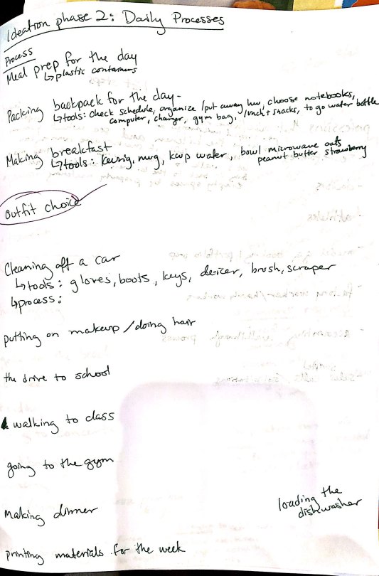
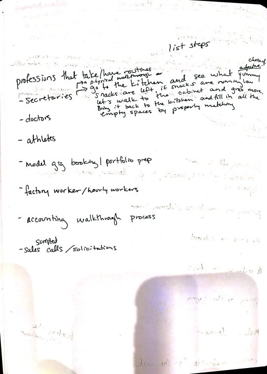
We began this project by brainstorming a variety of simple things. First, we brainstormed around things we learned in elementary school. Next, we thought of daily processes, followed by different professions, and lastly, our hobbies and interests. Below are the lists I had formed.
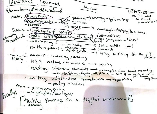
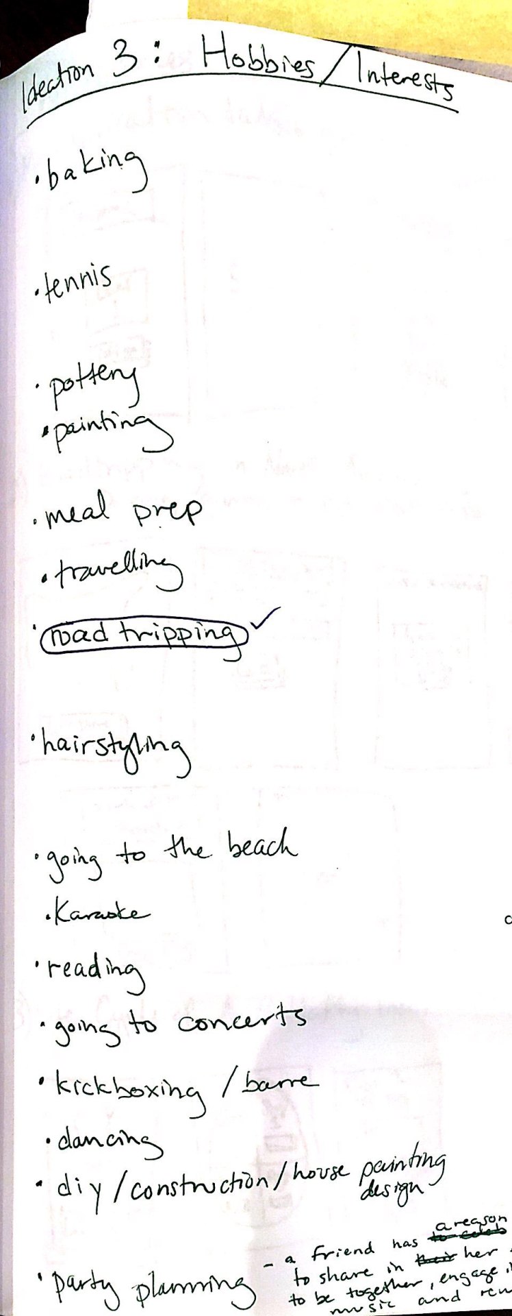
I selected my top 6 concepts to use to develop simple wireframe sketches. The concepts were a multiplication table game (inspired by the speed quizzes we would do in elementary school), a roadtripping/map of America game (inspired by my interest/roadtripping hobby - I love the idea of getting in a car and going anywhere - it was a large part of my life even if it was just traveling with my family or friends to the beach or my lacrosse tournaments), the life cycle of a butterfly informative site (inspired by my second grade project of documenting the life cycle of the butterflies we kept in our classroom), a DNA code matching game, an outfit choice game (inspired by my passion for biology and my memory of how cool it was learning about how code matching can completely change your physical appearance and other aspects of your body/personality/health etc.), and a fraction game using fruit (inspired by how we learned fractions drawing fruits or coins on paper). These sketches helped to convey the goal of the game, the interactions with the game, and the visual placements. We split into small groups to discuss our ideas and narrow down the three most enjoyable and feasible ideas.
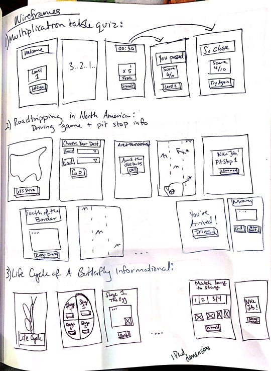
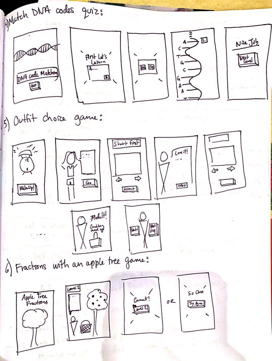
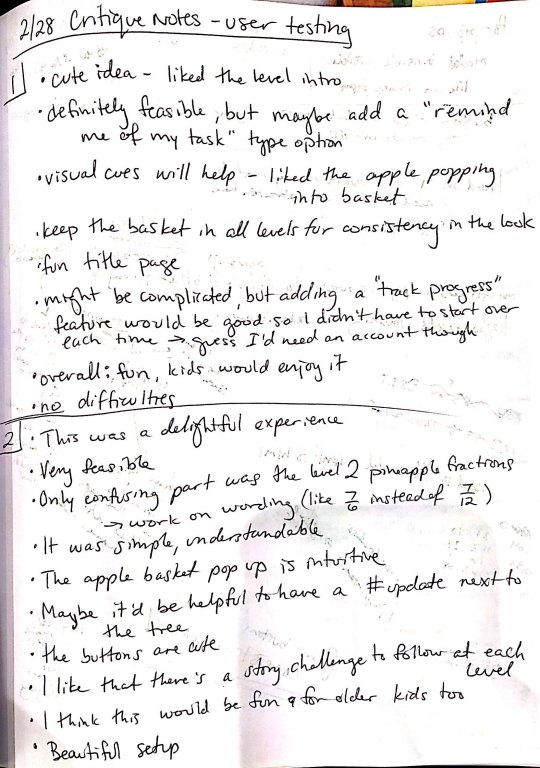
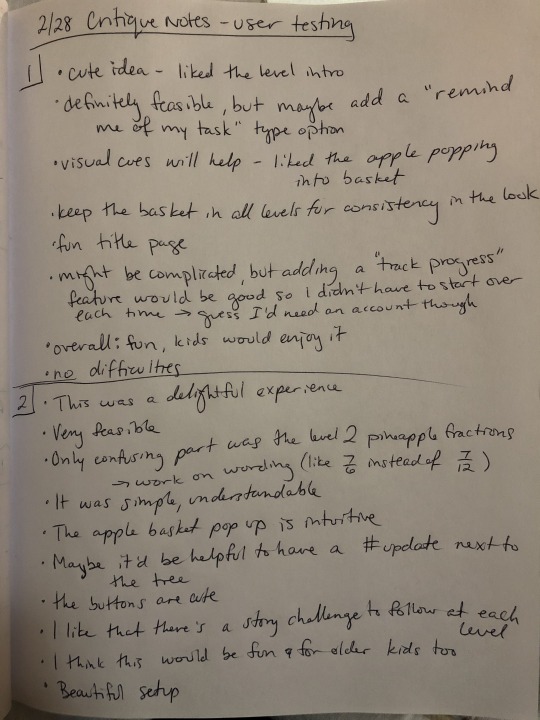
I decided the one concept I wanted to use was the Fraction game. I felt I had the most developed concept for it and it would be most feasible to create for my first interactive multi page website. Using this idea, I created a lo-fi paper prototype of the website (see below).

I used this prototype and a task list I created to conduct user testing with two of my classmates. My goal was to observe and document their process to see if they were able to accomplish my task list. The main questions to consider while they were interacting with the prototype were what was the overall experience like, is it a good idea, is it feasible, did you have any difficulties? The following are my two critique notes.
Next, I used Adobe XD to create a static digital wireframe of my site. Then I went on Pinterest and explored Google fonts to create two mood boards that would help me decide which visual experience I wanted my users to have.

After my critique, I used the feedback and static wireframes as a guide to help me code an interactive wireframe using HTML, CSS and jQuery that my content could later be added into. This part was extremely helpful in the final coding of my site because it helped me visually see where the divs would be and how my content should be included and positioned. Also, any interactions I had not thought of or missed in my static wireframe became evident here and I was able to include them now rather than realizing this later.

(The interactive wireframe can be found under Project 2: Interactive Wireframe at http://swalker97.github.io).
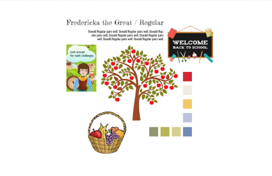
I used the mood boards from earlier to create two style tiles/static digital mockups on Adobe XD. These mockups included most of the content that was used in the final site, so it gave a better idea of what the game would look like and how it would function. For both versions, I tried to find header fonts that were playful and childish and pairing that with a simple body copy typeface that would be easier for a child to read. The first version included Fredericka the Great for the header and Raleway for the body copy. The second version included Luckiest Guy for the header and Oswald for the body copy. The first version was more clean cut lines and pastel colors with 2D images. The second version was inspired by a felt board because I remember learning with felt pieces in my childhood, we would be able to move the pieces to accomplish the task. I felt this memory of my interaction with fractions would work well with the movement of the game pieces. However, after critiques, I decided the 2D cleaner version was more visually appealing for the user, so I chose this design when I began coding. I also decided against both pairs of typefaces. My final version uses Short Stack for the header and Open Sans for the body copy.


Using my digital mockup, I catalogued all of the illustrations I would need to create for my site. I used Adobe Illustrator and Photoshop to create these illustrations and learned to save the files as svg’s so that they appeared most clear when on my site. One difficulty I ran into when coding was that my image files had too much transparent background padding and it was interfering with the jquery clicks. Once I discovered this issue, I re-saved all my illustrations with less background and once the images were updated in the code, my issue was resolved!
I made a copy of my interactive wireframes folder, and began to recode it using my actual content and assets (my illustrations). It was really exciting to see my static concept come to life with jQuery. My favorite parts of the site is the fruit appearing into the basket and the popup modals. The modals were a new challenge for me, so when they worked with the opaque black overlay hiding the main page I felt extremely accomplished. This project allowed me to add to my coding skillset and feel more confident in creating future usable sites. My least favorite part of the coding was the frustrations of the illustrations as I explained above. I could not understand at first why my jQuery was not working because the code appeared right to me, but the behaviors were not occurring on the hide/reveal clicks and manipulating the visibility. However, using inspect on Chrome and changing the z-index helped me find the issue, which was the unnecessary background in the images that began to overlap other images inhibiting their click-ability. Now my game is fully functional and is a good representation of what I had intended when designing the concept in the early stages of this project!

My entire site can be found under Project 2: Fully Functional Site at http://swalker97.github.io.
1 note
·
View note
Text
Project 1: Letterform
I was initially struck by the vintage style of Righteous when I was exploring fonts on Google Fonts. The description on Google Fonts mentioned the font was inspired by the deco posters of Hungarian artist Robert Bereny, specifically a piece entitled “Modiano”.

I began to research this period in art history to better understand the font development. Art Deco and Art Moderne represented a period between 1920 and 1945 and derived from the 1925 an art exposition held in Paris. The style incorporated cubism and avant-garde painting styles, along with smooth lines used in Arte Nouveau styles. The style was also incorporated into architecture. The first building to represent Art Deco in America was the Nebraska State Capitol Building in 1919. Other identifying features of the style included intense colors, smooth stones, metal casements, monumentality, vertical lines, ornamentation, mosaics, and relief carvings. As fairs and exhibitions, like the Chicago World Fair, began to pop up in America, the style of Art Moderne began to gain popularity. The smooth finished, line emphasis, and metal frames included only subtle differentiating features that made the style hard to isolate from Art Deco.


These styles can be seen in work from Leonetto Cappiello in “Pates Baroni”, Theophile Steinlen’s “Le Chat Noir”, and Vogue’s 1926 cover.


An emergence of graphic design occurred in the late 19th into early 20th century and had led to the modern “poster” design. Post industrial revolution and World Wars caused a demand for campaigns, which brought advertisements and graphic design to every day life. These posters are seen in Bereny’s work along with US Army Recruitment posters, like “Wake Up America” by James Montgomery Flag. The Great Depression in the 1930s also influenced posters and campaigns. The Franklin D. Roosevelt administration created the Works Project Administration to help stimulate the economy, especially for artists. This initiative led to a series of graphic art pieces promoting national parks within the United States, like Alexander Dux’s “See America”.


I consolidated my research choosing keep points from the Righteous font family history to be used as the body copy for my letterform analysis:
“Righteous was designed by the Astigmatic One Eye Typographic Institute. It was initially inspired by the all capitals letterforms in the 1932 poster by Hungarian artist Robert Berény, “Modiano”. The Art Deco style transitioned into the 1930s style of Art Moderne, which is reflected in the grid based, geometric forms of this font family. Block colors featuring shades of red, gold, and black and smooth lines are representative of this movement. I chose Righteous because of its vintage inspiration and whimsy features.”
To draw attention to distinguishing features of the font family, I noticed asymmetric features and differing widths. I used lines to highlight the individual widths and circles to emphasize the angled ends on the vertical line in an “a” form.

I used the history to inspire my wireframe sketches. For the Art Deco designs, I focused on ornamenting the letter with artifacts indicative of the era. Some of these artifacts included cigarette holders, hats, gloves, pearls, mustaches and canes.


I chose to focus one of my designs on Art Moderne’s influence on architecture.

The font in itself has a whimsical nature, so I explored this as well. The lowercase “a” in Righteous reminded me of a childish drawing of a fish, so my sketches became influenced by a fun, nostalgic feeling.

I began to transfer wireframe sketches to digital style tiles using Adobe XD. I used gilded and bold colors along with more sultry black, grey, and red shades seen in many posters of the time. For the fish, I began to explore indicative colors of sea-life and settled on a classic goldfish orange. To contrast the bright orange, I used the blue of the ocean and referred to a color wheel to choose the shade of blue I felt would be best for the page.

I settled on a darker toned navy-violet. However, I wanted to maintain an emphasis on the “a” form, so I did not use the orange color for the rest of the content on my page. I chose a contrasting sea foam color that would stand out against the navy background while remaining within the range of blue shades.


While I was initially drawn to the vintage, flapper society style characterized in Righteous, I decided to focus on the more whimsical nature of the font after comparing the style tiles.
Adding to the whimsy and extending the oceanic design of my page, I incorporated more features that would indicate to the viewer that the “a” is representing a fish in water. I added waves and bubbles to bring the page to life. Since the bubbles were placed closer to the letterform, I wanted to use one of the bubbles as the button for my letter analysis.


After critiques, I felt the need to make the button clearer, so I added a white speck on the bubble and a subtle drop shadow to create a 3D effect that would differentiate the button from the rest of the bubbles. The purpose of this detail was to influence a viewer’s interaction with my page.


Other interactions include the underline that appears when viewer’s mouse over hyperlinks, and the ability to scroll through the font family “showcase” at the top of the page.
To aid in my understanding of how to layout my html, I created a box wireframe on my final XD style tile to separate the content.

Doing so helped make the transfer from static design to live code more comprehensible and easier to manipulate. After coding a box html skeleton, I began to include my content and various assets I created in Photoshop and Illustrator. I added jquery to allow my button analysis to have a behavior.


The page was uploaded to Github desktop and is now live at https://swalker97.github.io/Walker_project1-jquery/index.html.
References
https://fonts.google.com/specimen/Righteous
https://99designs.com/blog/design-history-movements/historys-most-famous-posters/
https://circaoldhouses.com/art-deco-art-moderne/
2 notes
·
View notes