
Last Seen Blogs

3teki
生き恥

reflections-of-a-believer
Fun-Loving, Bible-Believing,
Word-Speaking

sticksbakes
Sticks Bakes!

kleptonancydrew
Nancy Drew, Kleptomaniac
koyuca
Özge
Text
R Sweathha Final Project Commentary
Our final project for this module was a branding project – either rebranding the CNM department or creating a personal branding. I was immediately drawn to the option of creating a brand from scratch based on my self-identity. I thought it would be a fun challenge for me to break myself down to analyze what made me ‘me’ and designing a brand for myself.
The first step was brainstorming. I decided to jot down any words that came to my mind when I thought of myself. They were any words that portrayed my personality, my values, my likes, my passion and hobbies and even aesthetic. Drawing inspiration from the way I decorated my room and the type of designs I gravitate towards online/on Pinterest, I also briefly wrote some words to describe the style and colours I preferred.

Jotting everything down helped to make the process so much easier as I was able to see the ideas and concepts that I was more drawn to. Soon, I decided on the main concept that I wanted to portray.
I have an extremely sweet tooth and I love anything chocolate, cookies, cupcakes, muffins, and the list can go on. Something I enjoyed just as much sweet treats, is to bake for my loved ones. Not only does it give me so much joy to put in my time to make something with love for the people I care about, but baking has also been a great stress-reliever for me these past 8 years. Hence, I wanted to portray this in my design in order to highlight my love for sweet things, my inner child as well as my creative side. I wanted to incorporate this concept with a design style that would portray my calm, soft and friendly side as well.
Logo
I knew I wanted to try playing around with my initials, S and R, as my name is a bit too long for a logo. With that in mind, I began by sketching out some ideas.

For the cupcake sketches, I found that the focus was entirely too much on the food and the logo looked like a bakery’s logo rather than a personal branding. Finally, the winner was the fusion of the letters S and R vertically with the two legs of the R forming a part of a cookie, as seen below.

To make the logo, I used Illustrator. I used the Text function to create 2 separate text boxes with the letters S and R respectively to use them as a guide. I then lined them such that they overlapped vertically first. In order to customize the letters as much as possible, I first used the Glyph function to find a variation of the S with a little hook on the top. Then, I used the Eraser Tool to erase parts of the letters that did not fit well and that I wished to manually adjust. Following this, I used the Paintbrush Tool (Calligraphy Tool) and Pen Tool to manually redraw these areas. I was still not satisfied with the way the R was turning out. Thus, using the lines I had drawn using the Pen Tool as a mere guide, I used the Paintbrush Tool (Calligraphy brush) to once again manually redraw the strokes of the R as well.
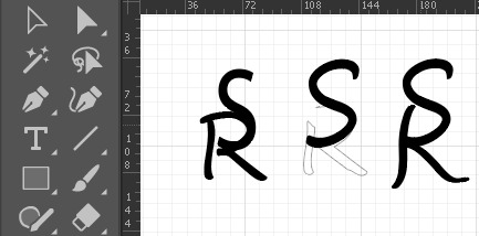
To jazz up the S a little more and add some elegance, I chose a Glyph of the letter S from the font ‘Vladimir Script’. I grabbed the Eraser Tool to erase off almost 90% of the letter and was left with just the tail end. I then joined the tail end to the S and used the Width Tool to adjust the thickness in different parts accordingly until I was satisfied with all the widths in the various parts of the letters.
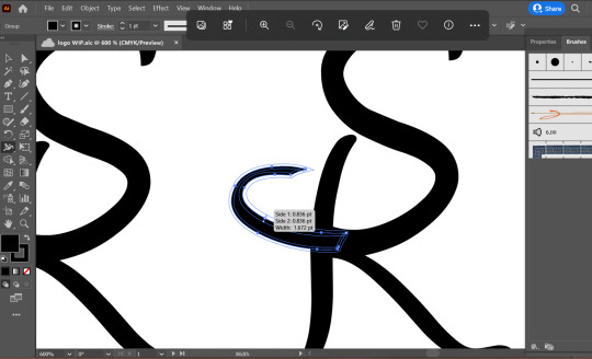
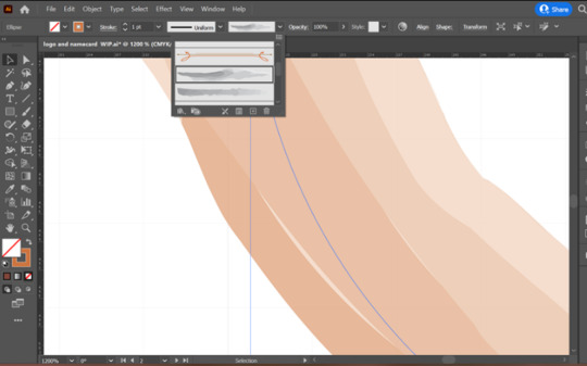
After this, all that was left was the circle encapsulating the initials and the cookie bit. For this bit, it was just a lot of exploring. I learnt that it was really just a process of trial-and-error as a lot of times doing up the design helps me see what works and what does not. I mainly used the Ellipse Tool to form the circle in some of the designs, and the Paintbrush Tool to manually draw out the cookie portion. As seen below, I came up with many variations, each working from the previous design. I also explored some designs using the Paintbrush Tool in the Watercolour paint stroke.
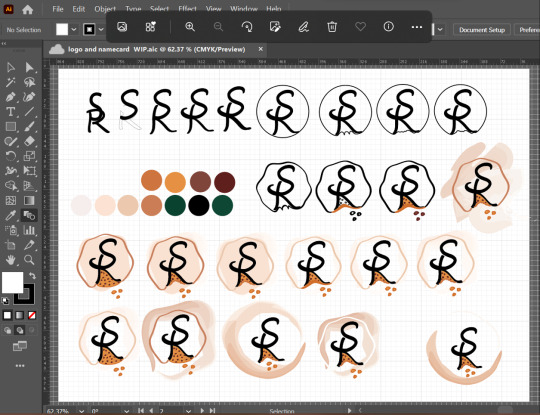
After much trial-and-error, the image below is the final logo that I settled on as I felt it best presented the concept I wanted to. Based on some feedback from Week 11’s tutorial, for the cookie, I drew it with a bite taken out of it as some peers said that without a bite, the cookie might look like a pizza slice. I also ended up going for a watercolour brush stroke for the circle as I felt that I portrayed the soft and minimal look I was going for very nicely.

Colour Palette
I knew I did not want bright, loud colours. The colours should also match the theme of sweet treats – in this case the cookie. In addition, I wanted the colours to also be friendly and give a down-to-earth feeling.
The primary colour palette are colours that are predominantly used in all the designs, collaterals and assets.
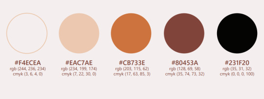
I also included a secondary colour palette so that these colours can be used for any additional or alternative collaterals, or to make any assets to be included in collaterals.

The off white, beige and baby pink shades convey peace, simplicity and softness respectively, which is aligned with my branding. The various shades of brown not only are appropriate to represent cookies and chocolate, but also portray earthiness which can be tied to portraying a down-to-earth personality. The pure black acts as a nice contrast colour that is appropriate to be used for any important or lengthy texts in collaterals, for simplicity, elegance and easier readability.
Typography
Deciding on the typography was an arduous task as it was necessary to pick typefaces that complement each other well whilst portraying the brand identity well. I learnt just how important choice of typeface is in any design. I went with the Segoe Script as the primary typeface for headers. This script font looks very elegant, yet not dramatic hence looking friendly and approachable. For the subtitles, sub headers and body text, I wanted to go with a San-serif typeface to complement the script typeface. Thus, I chose the Segoe UI – its four variations of Regular, Semi light, Semi bold and Italics in accordance to the needs of the collaterals.
Name card and Resume Sketches
I sketched out a few sketches of what I envisioned. I knew that I wanted to include cookie designs to add some creativity to my name card and resume.
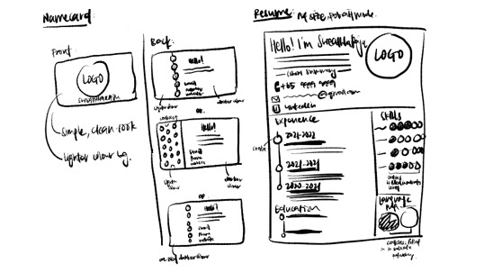
Name card
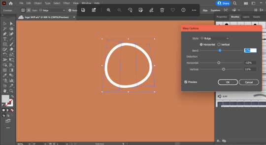
For the cookie, I started with the Ellipse Tool to draw out a circle for the shape. Then, I used the Warp Effect to get a cookie shape that was more realistic looking – an irregular circle that has a bulge.
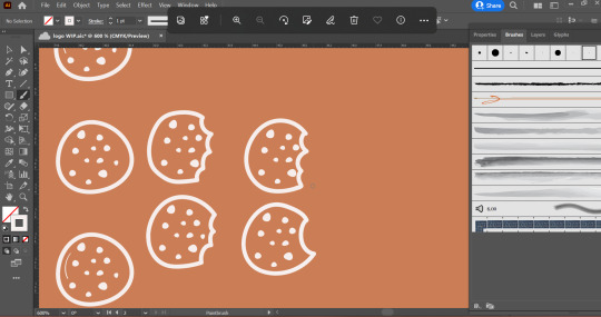
I followed similar steps to achieve the chocolate chips on the cookie. For cookies with a bite taken out of it, I used the full cookie I had created as a guide, while using the Paintbrush Tool to draw a few variations for me to choose from.
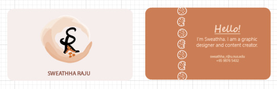
Following this, I arranged a full cookie and a bitten cookie in an alternating order on a vertical line, around the 1/3rd mark of the name card. Then I used the Text function to add in the textual information I wanted to add in the name card and in the image below you can see the front and back of the name card.
Resume
I first made the different assets I needed – different cookie designs to act as the bullet points and to display skills level, as well as the phone and mail icon. For the cookies in the various sizes and styles, I followed the same method that I had used to create the cookie design for my name card. For the phone and mail icon, I used the Shape Tool, Pathfinder Tool and Curvature Tool to form the shapes, combine them and adjust the curvature points for smoother gradients and connecting lines.

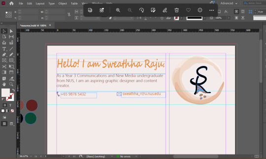
Then I placed the phone and mail icons I made on Illustrator in my InDesign Resume file under the header section.
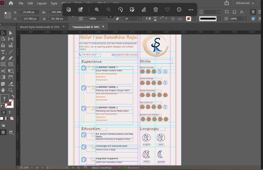
Following this, it was pretty much just arranging the information neatly in the way I had planned. To showcase the skills, I was inspired the ‘5-star rating’ concept and translated that in the form of cookies. Therefore, if 3/5 cookies were filled with colour, it meant I was rating myself 3/5 for that particular skill.

Through making the resume (and the final Brand Style Guide), I was really able to explore the functions of InDesign and I especially found the ruler guides extremely useful in ensuring neatness. By the end my file pretty much looked like this with guidelines everywhere but it also ensured alignment.
Brand Style Guide
Finally with all my assets and collaterals done, the final step was putting it all together in the form of a Brand Style guide. This process was mostly a trial-and-error process of trying different variations of presenting the information to figure out which was satisfactory.
Critique and Feedback
After the Week 13 Final Pitch, I had received some valuable feedback from my peers and tutor.
Firstly, Merlin had pointed out a small “white” gap in the watercolour brush stroke around my logo. I zoomed in as much as I could to double check on this and found that the “gap” was in fact not a hollow white gap but it was merely a lighter shade of brown/beige (as seen in contrast with the white background) as the brush stroke is imitating how a real watercolour paint stroke would look like.
Therefore, I did not feel that there was a need to go over that area to purposefully fill it in with colour and hence left it as it was.
For the name card, the first feedback I had received from a peer was that the logo and name on the front was a bit disproportionate. Taking this into consideration, I played around with making the logo smaller in the name card. I did find that it looked better now and hence finalised this. The second feedback was that the excess design of the cookie was hanging outside of my name card. As it was such a small part, it was a mishap on my part and I went I correct that as well for my final name card.
For the resume, I had received feedback that it was looking a bit too cluttered. To address this concern to make it more comfortable on the eyes, I first removed skills that were not high. For instance, initially I had included Premier Pro with a 2/5 cookie rating. Realistically in a resume we will not add skills that are not as good as we do not want to highlight them. Hence, I removed this skill entirely from the resume and this gave more room in that section as I redid the spacing between the different lines. Following this I also reduced some of the font sizes that were initially at 15 or 16 points as they did look too big. After reducing some of the sizes and moving around to better adjust the spacings, I feel that the final prototype looks significantly less cluttered and more comfortable. I had also received feedback that the headers (“Experience”, “Education”, etc) did not stand out enough. Hence, I changed the font from Regular to Bold for the headers and went with the darker brown colour from my colour palette.
Overall, all the feedback I had received were very valuable in pointing out certain things that I may not have considered or may have even missed out. Using the feedback to play around and figure out what works for me also allows me to go through another round of self-critique. These processes allow for the valuable refinement of work to produce the best version as the final prototype.
Final Thoughts
Through this project I was also able to experience what it would be like to go through the process of branding from start to the end prototype, and this is especially useful and insightful to me as a marketing student. This will definitely come in handy when I work in marketing/publicity/public relations role for future internships or full-time job. Various companies go through rebranding processes and I am now better equipped with the knowledge and I am confident in my ability to contribute.
While this project was extremely intimidating and pretty exhausting due to the amount of assets and collaterals that were required, it was truly a rewarding and fun experience. As this final project was also a lot more extensive than our Assignments 1-3, this really allowed me to dive deep into the Adobe applications and the various features/tools as I explored them while designing my assets. This has only piqued my interest even more as in the process of exploring, I have had questions that emerged that are still unanswered. Designing takes times and a lot of practice, and I know that through this module I have only scratched the surface. I look forward to exploring and self-learning more about these applications in the near future!
0 notes
Text
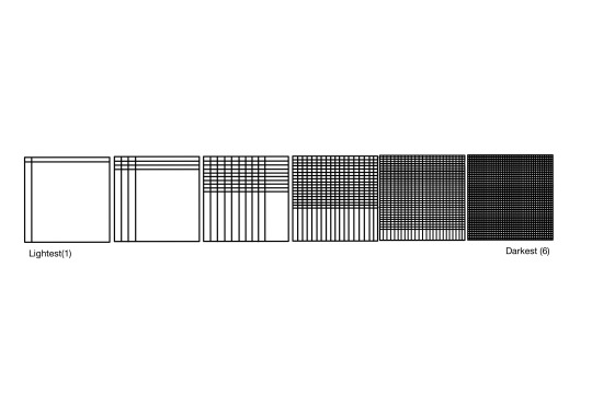
R Sweathha In-Lecture Ex G: Creating a pattern
For this week’s lecture exercise, I used simple line elements to create a pattern. Starting out with simply one horizontal line that intersect with one vertical line, I duplicated this as the repeating pattern in the next few stages to make it increasingly densely packed and darker.
0 notes
Text
R Sweathha In-Lecture Ex F: Hues and its moods
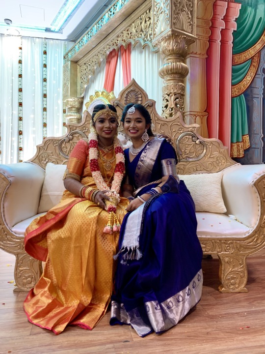
For this in-lecture exercise on hues, I chose this image, seen above, taken on my phone recently at my elder sister’s traditional Hindu wedding ceremony. The 5 hues I have picked out from this photograph are orange, pink, red, blue and gold.
The orange hue seen in the photograph mainly comes from the main part of my sister’s wedding saree. This bright orange instantly attracts viewers’ attention to the saree and the person wearing the saree. This is appropriate as the bride of the wedding; this bright orange saree helps to easily draw attention to the bride. In addition, this orange hue radiates optimism, enthusiasm and a cheerful mood which is in line with the happy wedding as it is able to accentuate the bride’s happiness.
This orange hue is complemented by the pink borders on the saree as well as the pink blouse worn by the bride. This pink hue is able to add some feminity, love and compassion. This works well as it is appropriate for the wedding theme and it is also works well with the orange saree as the feminity and tenderness that the pink gives out helps to balance out the orange from giving off over-enthusiasm and adventurousness.
The red hue can be seen on the flower garland around my sister’s neck. This red hue is also able to draw attention while portraying passion, love, energy and excitement. This red works well as only certain parts of the garland is red which prevents it from being a strain on the eye from having too much red, and too many strong colours in the same area.
The blue hue can be seen on my saree which conveys loyalty, trustworthiness, sincerity. It is also rather calming on the eye. This works well as it signifies me as a maid-of-honor to my sister who is loyal and sincere in aiding in leading the wedding plans and assisting the bride with any needs on the day of the wedding.
Lastly, the golden hue seen from the sofa and decorative pillars in the background effectively accentuates the grandeur of the wedding event as the gold looks expensive, premium and classy.
0 notes
Text
R Sweathha Assignment 3 Commentary
For Assignment 3, to design an infographic, I started by listing out possible themes wherein my interests laid. Then I narrowed it down to 4 themes (as highlighted below) as I was easily able to brainstorm specific topics for each of these 4 themes.

After listing out the topics for these 4 themes, I narrowed it down further to 2 topics, Makeup Basics and Skincare Basics, as I was able to generate more ideas for these. I proceeded to roughly sketch out how I could envision the infographic for both of these topics. After the brief sketch, I found myself gravitating more towards the ‘skincare basics’ topic as I was able to better envision the step-by-step process to achieve the end prototype.
Inspired by fashion magazines, I used this as an inspiration for the typeface of my infographic and searched up the typeface used by the most popular fashion magazine, Vogue. I tried out different variations of this serif typeface, Bodoni, to be used as the header for the infographic.

From my own personal experience of reading skincare articles, blog posts and YouTube videos, I have always noticed skincare being associated with a calming, clean, fresh and minimalist characteristics. Upon reading a few articles, I was also able to find that most skincare brands like to use shades of soft blues, greens and browns. Drawing from these, I decided to go with a colour palette that was relatively neutral without any bright colours, hence choosing pastel and muted tones of pink, lilac, and green.


Through this planning process, I was able to learn the importance of drafting out the overall structure, suitable typefaces and the colour palettes for any design work I do as putting it down on the workspace allows for better comparison. I am also better able to tell if what I had envisioned translates well in practice and hence allowing me to make further adjustments from there before I even begin putting it all together as the final prototype.
Next, after scouring the Internet for the content I wanted to include in my infographic, I finally had all the information I required, which was a 5-step skincare routine suitable for beginners. To start of the design process, I extracted images of skincare products that represented each of these 5 steps. I ensured that the products had a generic shape of a cleanser, toner, serum, moisturizer and sunscreen so that when translated as vector images, they will effectively signify the products being referred to.

I went on to use the pen tool to trace over these products. Following which, I added additional features to make it more obvious what these products were. For instance, I used the Ellipse shape tool to add two cotton pads beside the toner bottle and used the line segment tool followed by curvature tool to add details on the cotton pad. This is because toners are often applied with cotton pads. Another example was moving the serum bottle’s dropper outside the bottle as displaying the entire dropper is more effective at signifying that it is a serum due to its distinct shape. Finally, I used the eyedropper tool to fill these images with the colour palette I had created in my previous step.

As mentioned earlier, since I was inspired by fashion magazines, I envisioned having a picture of a “model”. Thus, I found an image of a girl who best represented a skincare model as seen by her makeup-free skin and towel-clad hair which indicated cleanliness and freshness. I used the pen tool on illustrator to recreate it as a vector image.

After placing this image at the centre of the page, I went ahead to choose the Bodoni MT typeface in the Poster Compressed font and played around with the tracking and horizontal scale such that the header fit snugly at the top of the infographic.
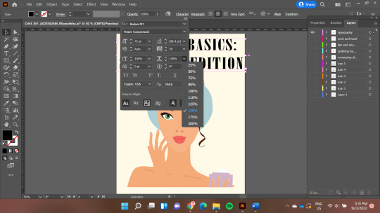
Following this, all I had to do was arrange the 5-step icons around the girl and typed in my content. For the sub headers which indicates the step, I decided to still use the Bodoni MT typeface but in the Condensed Bold Italic font. Once again, I adjusted the tracking and horizontal scale until the letters looked readable and filled the space well.

For the body text, to choose a typeface that complimented the serif typeface of the header and sub header, I went with the san-serif typeface, Gill Sans MT. This was another important learning point on the importance of choosing complementary typefaces to ensure all the text are easy on the eyes for readers.

Although initially in my drafting process, I had planned to include a section at the bottom of the infographic on common skin concerns and good-for-the-skin ingredients, at this stage I realised that the infographic was already looking pretty filled and adding further content was only making the infographic over-crowded. As a result, I decided to do away with this section. This taught me to be alright with letting go of my creative and ambitious ideas that I may have envisioned at the start, especially if during the design process they may not practically play out well.
Critiques and Improvements
From the critique session, I was given a couple of valuable feedback which I used to improve on my prototype.
The textboxes and images were spread out too close to the edges of the infographic which looked ‘claustrophobic’.
Since there is an odd number of steps which leads to the 2 patches of empty spaces at the bottom right and left of the infographic, it is possible to explore pushing down the image of the girl all the way to the base of the infographic.
The order of the steps was confusing to read.
The font could be made smaller to make the infographic look less crowded.
Since the infographic looks like a magazine, it is possible to explore textures.
Based on feedback 1 to 4, I realized I needed to find a way to better fit all my information in without making it look crammed. After some exploring, I decided to change my infographic from a portrait mode to a landscape mode. While I had initially envisioned the infographic to be in portrait mode to better represent a magazine, I learnt to adapt on-the-go as I was clearly unable to fit my information, despite cutting it down, in neat and spacious manner.
Upon doing this, I reduced the horizontal scale of the header to add a little more space around the edges of the infographic. Then as suggested by my peer, I did find that moving the image of the girl to the base of the infographic gave me more room to arrange my 5-step content in a more orderly manner. I did this by positioning the 5 steps around the girl in a semi-circle, going from step 1 to 5 in a clockwise direction. I also reduced the font size of the body text to 12pnt from 14pnt to create further contrast between the sub header and body.

Taking feedback 5 into consideration, I attempted playing with the gradient tool to add some gradient effect, to add depth, even attempted adding some textures to emulate paper. I also attempted to add patterns and shapes. However, I found that it did not fit the infographic well and did not give the clean, minimalist and soft look that this skincare advice magazine-inspired infographic was attempting to give. Alternatively, I then attempted to give it more dynamism by rotating the 5 steps to face inwards and flow in a semi-circle more naturally as seen below.

However, I was once again not satisfied with this as I found the infographic to be too messy looking at this point. Hence, I had to do away with this one feedback after all the exploring and decided on the final prototype I had after making the improvements from the first 4 feedback.
0 notes
Text
R Sweathha Assignment 2 Commentary
Once all the images were taken, I used Adobe Illustrator for the layout. I made use of the Clipping Mask tool to create a uniformed crop of all the images as I felt that this allowed the photographs to be sequenced in the neatest and easiest-to-follow manner. Assignment 2 was on visual storytelling through images. Upon reading the assignment brief, I was brainstorming for possible storylines and soon realized that I was faced with 2 main challenges.
1) Being able to tell a story within just 6-9 frames while still having a narrative that flows well from start to end with a main character, setting and time.
2) Being able to portray the story through merely still images.
These challenges proved to be harder than anticipated. After spending a considerable amount of time to consider possible themes for the plot, I managed to roughly pen down 2 themes and their respective plots.
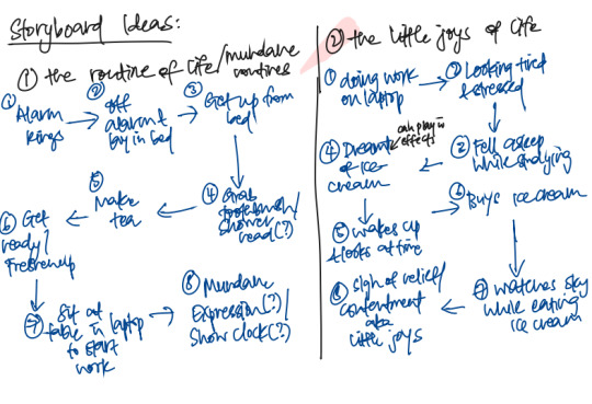
Then I analyzed the two themes I had written and was not sure if the first one had a meaningful sequence and ending. The storyline was merely showing the main character’s morning routine and throughout the plot, there was no change in the emotions or mood as it was portraying mundanity throughout. Hence, doubtful of its effectiveness as a plot, I decided to work on my second them which I had titled “Little Joys in Life”.
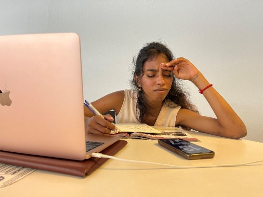
The story starts with the main character, a girl, working hard studying on her laptop. She is feeling very stressed and exhausted from studying away and eventually she knocks off in the midst of doing her work. She ends up dreaming about ice cream which seems like such a precious and prized reward in her dream. She eventually wakes up from her accidental nap feeling disoriented. She then realizes that she in fact can and will treat herself to the precious and prized ice cream that she dreamt of, to reward herself. She heads over to the store to get her ice cream, sits outdoors to watch the clouds while eating her ice cream, to experience the little joys in the midst of a stressful life.
The inspiration behind this theme was reflective of my own life where I personally find solace and happiness in taking a break from the stress of life by watching the clouds roll by in the sky while eating ice cream. Hence, this helped me to easily develop the sequence of the frames for my visual story as I moved on to storyboard this plot.
I was initially very intimidated by the idea of storyboarding for 2 reasons. I do not consider myself an artist or someone who can even draw which made storyboarding seem like an impossible task for me. I was also concerned about what if I mess up the storyboard drawing. However, once I started on it, I soon realized the effectiveness of storyboarding. I learnt that storyboarding is an essential step as it allows us to:
1) Visualize how we want each scene of the story to look like which is made very easy when the previous frame is already sketched out
2) It is the best place to make mistakes as we can identify how we can improve and work on it
Hence, I eventually ended up enjoying the process of storyboarding, especially as a visual learner. After some time, I had managed to come up with a storyboard and I was satisfied with it.

Next, I planned out how I would want to go about taking the photographs by planning out the photographic compositions and camera angles. I gave myself a few options for the composition and angle which I thought might be suitable for each of the frames.

This allowed me to stay prepared and make the process of taking the photographs efficient while still giving me some room for experimentation when taking the photographs.
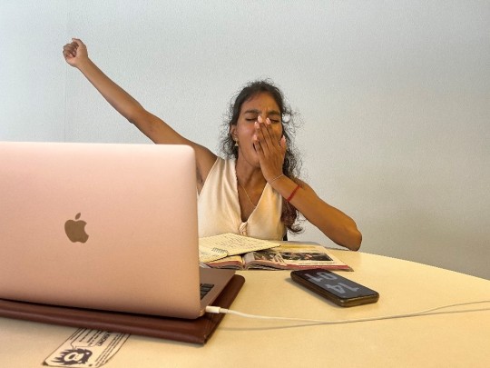
So, the next step was to take the photographs. As per my plan, I took the shots and played around with the composition and angles to find one that I felt best suited that particular frame and I felt satisfied with. Another learning point was being ok with the actual shot not turning out exactly the way I had planned in my storyboard process. One instance was frame 5 of my storyboard where the main character wakes up from her nap. I initially took a shot like what I had planned out during my storyboard but realized it may not effective in showing that the character was just waking up from her nap. This challenge came with having to tell a story through still images.
Hence, I had to experiment and try different ways to portray the idea of waking up effectively. After a few tries, I was finally satisfied with the following image which I used in my final prototype.
Once all the images were taken, I used Adobe Illustrator for the layout. I made use of the Clipping Mask tool to create a uniformed crop of all the images as I felt that this allowed the photographs to be sequenced in the neatest and easiest-to-follow manner.

I also added a thin, black stroke for all the images to act as a frame as I felt like it made it look clean and neat as well.

I was given 2 main critiques during the tutorial session.
1) My tutor mentioned that he got quite confused with the sequencing of the story as he followed the frames in a flipped “C” order. Hence, to avoid such a confusion, I decided to number my frames to improve my final prototype.
2) The fourth frame which showed the ice cream during the dream was potentially not clear enough that it was a dream due to the background being similar to frames 7 and 8. Hence, a classmate suggested using a dark background and shining light on the ice cream to emphasize that it was precious and prized. I decided to heed this advice and went onto retake this picture by attempting to find a black background and shining a phone torch from above while taking the picture from a low angle to emphasize how the ice cream was seen as a “trophy” or “reward” that held the power. I also then went on to use Photoshop to adjust the brightness and contrast of the image to highlight the lightning on the ice cream a little more.

0 notes
Text
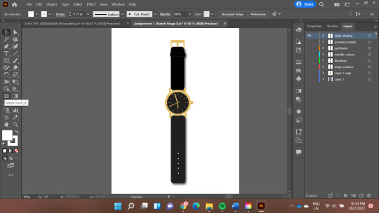
R Sweathha: Assignment 1 Commentary
For Assignment 1, choosing what subject I wanted to work on was harder than I had imagined it to be. After thinking hard and scrolling through my phone’s photo library to find inspiration for a possible subject, I initially picked a picture of my friend’s dog as seen below. I chose this photo because my initial impression was that having fewer intricated details in the photo might make the abstraction process a lot less complex.
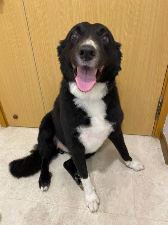
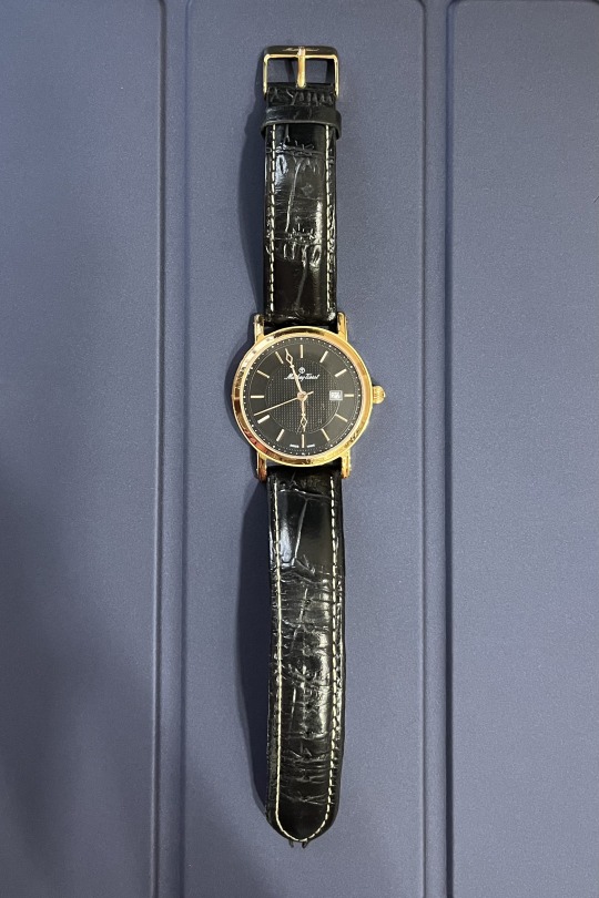
However, as I opened the image on my Adobe Illustrator, I realized that I was having a hard time planning how I would do a 5-step abstraction process on this photo. Hence, I decided to change my subject and eventually decided on taking a photo of my watch that I wear every day. I deemed it to have sufficient fine details for me to abstract across a few stages. This emphasized to me the importance of planning when it comes to designing as early planning allowed me to make my decision to change my design idea before it was too late.
Stage 1
For the first stage, my main focus was on creating a digital illustration that looked as similar to the original photo as possible. Hence, I used the Pen tool to trace out as much details as possible. As the background did not value-add to the photo, I eliminated the background at this stage itself.

Thereafter, I filled in the colours of the watch which was black and gold. To be as detailed as possible, I first emulated the leather texture on the straps by using the Craquelure Texture under the Effects dropdown menu and adjusting the crack patterns, depth and brightness according to my preference. To add dimension, I made use of both the Gradient tool and the Drop Shadow effect under the Stylize menu. This was the end result of my stage 1 as seen in the image below.

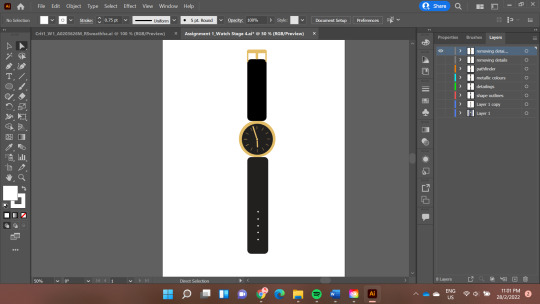
Stage 2
At this stage, to cut down on some details, the main thing I did was to switch from using the Pen tool (as I did in stage 1) and instead used the various Shape tools such as Rectangle tool, Rounded Rectangle tool, and Ellipse tool to map out the watch. To add dimension, in addition to the Drop Shadow effect and Gradient tool as mentioned earlier, I also made use of the Warp Effect > Arc on the leather loop on the upper strap. I also explored the Pathfinder function to merge the shapes that formed the metallic structures of the watch.

Stage 3
For step 3, I first focused on removing additional colours and sticking to black, white and only one gold colour for the metallic parts of the watch. I also further simplified the design by removing the 3-dimensional aspect. For example, for the leather loop on the strap, I removed the Warp Arc effect and made it a flat rectangle shape. I also removed the Gradient tool effect.
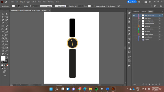
Stage 4
In this stage, I removed the Drop Shadow effect to make the image completely 2-dimensional. I also removed further details such as simplifying the metal structure surrounding the dial, the details on the dial of the watch itself as well as the number of buckle holes on the strap.
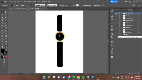
Stage 5
For the final stage of abstraction, the main focus was simplifying the design as much as possible by removing details that were not necessary. Hence, the buckle holes and the metal clasp on the strap was removed. The details on the dial of the watch were also removed such that only the hour hand and minutes hand remained. This allowed the final stage to be extremely minimalistic while still being able to show that the design was portraying a watch as seen below.
Critiques
During the critique session, the feedback I received from my peers was that while the final abstraction did clearly look like a watch, they suggested I could still keep the buckle holes on the watch strap as it would make the image more realistic. I decided to try out this adjustment and added the buckle holes on the bottom strap. I did find that the image did resemble a watch more with the holes in place. However, in order to not take away the purpose of the abstraction process, instead of adding all the buckle holes, I kept only 3 holes for the final stage and spaced them out so that the overall image still looked simplistic and minimalist.
Another feedback I had received was that the shade of black was not uniformed as the dial and lower strap appeared to be a lighter shade of black as compared to the upper strap. This was a learning point for me too as I realized that due to the brightness of my own laptop screen, I had overlooked the slight difference in the shade of black I had used for the different parts of the watch.
Upon receiving this feedback, I increased my screen brightness and did indeed find that there was a slight difference. Through this I have learnt to ensure that my screen brightness and resolution are at an optimal level when working on digital designs in order to see the colours better. I also learnt to use the Eyedropper Tool as a way to check and ensure that the colours used are uniformed and the intended shade. Thus finally, I made the final adjustments such that the dial and lower strap were also a true black shade which gave me the final end product as seen below.
0 notes
Text
R Sweathha In-Lecture Ex E: Analysis of Typographic Representation

Upon analysis of the text shown above, there are 3 main areas in which this typographic representation can be improved upon.
Firstly, it can be noticed that all the text, including both the header title and body text, are in the same typeface which is Slab Serif. This typeface is actually indeed extremely suitable for the header title as this typeface has strong, square finishing strokes which is able to effectively capture readers’ attention. However, the body text is also in the same Slab Serif typeface with all the characters being block outlined characters in caps lock. While effective as the header title, it brings about the opposite effect as the body text. The whole chunk of words now looks messy and lacks a smooth flow which makes it hard to read. To improve upon this, the typeface of the body text can be changed to a complementary typeface such that the header title and body text are able to complement and enhance each other. Therefore, for instance, the San-Serif typeface can be used for the body text as in contrast to the Slab Serif, the San-Serif is more rounded. In addition, the body text will be easier to read if it was not in all caps lock and not in outlined block letters. This is to create a hierarchy in this chunk of text between the header title and body text. Making these changes to the typeface of the body text will be more effective at capturing and sustaining the readers’ attention.
Secondly, there is an issue of legibility with the body text as each characters in the words seem to be a little too close to each other, making it hard to decipher each character apart distinctly with ease. Therefore, to improve the legibility of the text, increasing the kerning will in essence increase the space between each character, making the text more legible.
Thirdly, the centre alignment of the body text also causes the issue of readability. Centre aligned texts are harder on the eyes to read due to the lack of a hard edge where the first words of each line in the paragraph starts. Therefore, to improve upon this, switching the alignment of the text to left aligned will help to improve the readability as there will now be a hard edge on the left which easily serves as the starting point. This will then allow readers to read with much more ease.
0 notes
Text
R Sweathha In-Lecture Ex D: Visual Composition
I used my 4-inch by 4-inch mini canvas painting of an orange slice sitting on an equally small easel to take photographs from different angles and at different sizes.
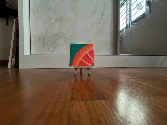
For the first picture (as seen above), I took a long shot of the canvas on the easel at an eye-level. By taking the shot at eye-level to the subject of the photograph, this gives a neutral and familiar shot. In addition, it captures the viewers’ eyes to look at the painting on the canvas with much ease. Through the use of the long shot, not only does the photograph manage to encapsulate the idea of vast space surrounding the painting, but it also situates the painting in this clean empty space. This further helps to draw the viewers’ eyes towards the painting the small size of the painting is accentuated due to the contrast against the vastness of the space surrounding the painting itself.
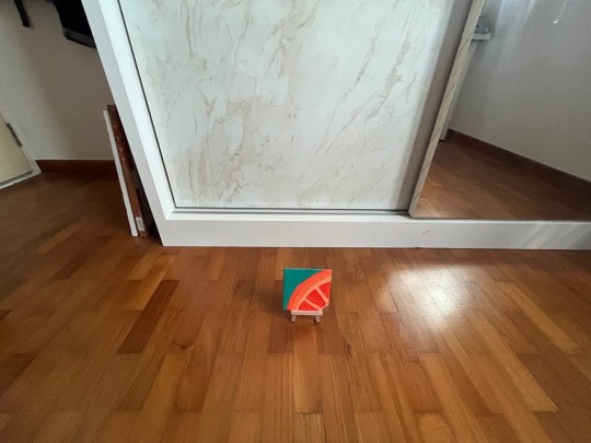
For the second shot, similar to the first one, it is a long shot of the painting but this time it is photographed from a high angle. Taking the photograph from a high angle aids in exaggerating and emphasizing the difference in the size of the painting in contrast to its background. More attention is brought to the vastness of the space surrounding the painting and the main focus of the photograph from the viewers’ perspective is now on how small the painting, canvas and easel are.
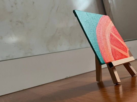
For the third photograph, it is a medium close up and Dutch shot. The medium close up shot zooms a lot closer to the subject of the photograph as compared to the previous two shots. This allows the viewers to be able to see the painting more up and close with more details. The photograph is also a Dutch shot wherein it is taken at a canted angle, adding an increase layer of dimension to the image. It aids in adding an emotional dimension to the image as there is some sort of eerie or strange vibes from the image. This dimension is exacerbated by the shadow of the painting and easel which takes up two-thirds of the image on the foreground.
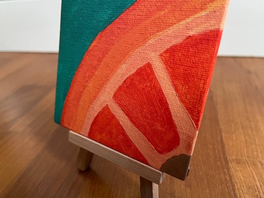
The last on is an extreme closeup shot at an eye level. This allows the audience to view the painting from a neutral perspective, focusing entirely on just the painting as it is on eye level. The extreme close up in addition also allows the viewers to view every detail on the painting including the various streaks of the paintbrush on the canvas, any uneven patches and even the texture of the canvas itself. This allows for a very raw and honest portrayal of the painting. The photograph is also taken from the side of the painting which is the inner portion of the orange slice. This can allow viewers to feel more included and “inside” the painting then feeling like they are external.
0 notes
Text
R Sweathha In-Lecture Ex C: Heinz Ketchup Ad
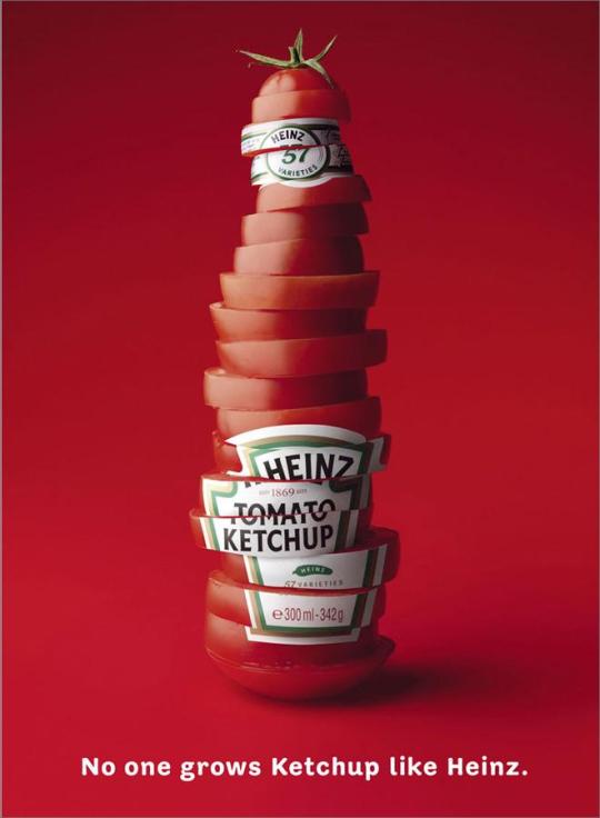
This image is an advertisement by Heinz, an American food processing company that is well renowned for their sauces and condiments.
The main signifier in this advertisement can be easily identified by the central image of fresh tomato slices that are stacked on top of each other to form the shape of a ketchup bottle. We can also see the “Heinz Tomato Ketchup” sticker label on the stack of the tomatoes as though this really is a bottle of Heinz Tomato Ketchup. Through this, the signified is that Heinz’s tomato ketchup is fresh and authentic, making use of real tomato produce that is fresh and juicy. The tomato slices depicted in the advertisement are all a very juicy, plump and red indicating its freshness and the rich flavour that Heinz’s tomato ketchup as a result has. This could also portray that Heinz’s ketchup is rather healthy as they use fresh produce rather than any artificial flavourings or preservatives to make their sauce, which could possibly reach out to consumers even more to purchase their brand’s sauce as compared to other ketchup brands out there.
There is also a text that reads “No one grows ketchup like Heinz” which can be another signifier in the advertisement. The signified meaning is then also in line with the meaning of image which portrays their ketchup to be made freshly and authentically from fresh produce tomatoes. The words “No one” and “like Heinz” also indicates Heinz’s attempt at differentiating themselves from other similar brands to confidently declare that Heinz is different from other condiments and processed food companies.
We can also notice the use of syntactics through the use of colour depth in the monochromatic advertisement. The centre of the advertisement where the slices of tomatoes are stacked up, we can see that background colour has a ‘light’ on it or looks a little brighter whereas the top and bottom of the advertisement has more depth and shadow. This helps to bring attention to the centre of the advertisement to the image first as well.
Overall, this is an effective advertisement which simplistically used two main signifiers to convey that Heinz uses real, fresh tomatoes to produce their ketchups so that they taste fresh and authentic without artificial flavourings or much preservatives. It also conveys the message that they are a brand like no other, standing out from their competitors.
0 notes
Text
R Sweathha In-Lecture Ex B: Constructive Criticism Model on Graphic
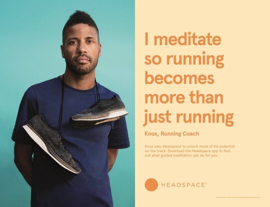
This is a graphic advertisement made by Mother New York for Headspace, which is a guided mediation mobile application. This is just one of the few graphic advertisements that Mother New York has designed as part of the ‘I Meditate’ campaign. However, all the advertisements under this campaign follow the same design structure. The simplicity of this design was what caught my eye and hence I decided to apply the constructive criticism model to evaluate its design.
In this graphic advertisement, on the left we can see a photograph of a young, athletic looking man who has his running shoes hanging over his neck, leaving the shoes dangling against his chest. His photograph is against a turquoise blue backdrop. On the right of the graphic, there is a text in solid dark orange colour against a solid light orange background. The text which are in larger font reads “I meditate so running becomes more than just running” and right below this text we see his name and occupation which is a running coach. The text in smaller font below that reads that he “uses Headspace to unlock more of his potential on the track. Download the Headspace app to find out what guided meditation can do for you”. At the bottom of the graphic, we can see Headspace’s logo.
One thing that can be noticed immediately is how the colours that have been chosen are rather calming and pleasing to the eyes even though they are colours such as orange and turquoise blue. This is because the designer chose muted tones which has created this calm feeling, aligning with the brand as a medidation app. The choice of showing a photograph of an athletic looking man with his running shoes and a serious expression portrays an image of someone who is very sporty and strong. This side of the graphic portrays almost a very masculine energy. On the right side, the choice of colours itself lean more towards a feminine energy with peach. The design used on this side is very minimal, simplistic and monochromatic. The contrast in the different sizes of the text draws attention to the biggest font which explains why he uses the meditation app, followed by who he is and then finally the call-to-action for the audience which is to install the application to find out more about guided meditation.
This graphic advertisement aims to break away the stereotype and prejudices that people may hold regarding the types of people who typically meditate to show that meditation can be for everyone and anyone, as it can value-add to individuals’ lives in a variety of ways. This is because stereotypically people would not expect someone who is a running coach and looks like him to meditate. Hence seeing that he does and how it value-adds to what he does may change the pre-conceived notions some may have about meditating and encourage them to give it a try as well.
This is a generally well-thought-out graphic which is able to successfully portray its message clearly to the viewers of the advertisement. The approach to use a photograph of individuals who are athletic and may not fit the stereotype of someone who meditates, allows audience to feel more connected to the graphic as they are seeing a very real person in the advertisement, which may break the stereotypes they may have held. The use of a simple sentence in the largest font, starting with “I meditate” as it goes on to explain why the photographed individual meditates also allows the audience to quickly get the message that the meditation value-adds to what these athletes do.
Although overall, the graphic is successful in achieving the advertisement’s objectives, one of the possible shortcomings could be that for people who may have no idea what exactly meditation actually helps to achieve, they may still be confused after seeing the advertisement. They may not be able to understand how meditating would have helped the individuals in the photograph and hence how meditating could possible value add to their own lives. As a result, there is a possibility that some people may still not be inclined to install the application as the they may still not be convinced about what benefits meditation can bring about.
0 notes
Text
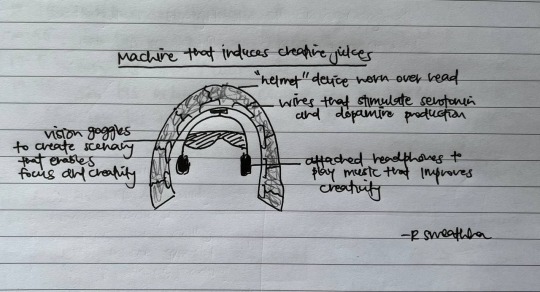
R Sweathha In-Lecture Ex A: Creativity Boosting Machine
There are some days when my creative juices flow in abundance and I am able to create to my heart’s content. However, there are some days when my creative juices just do not seem to flow, and I am stuck with a mind block unable to create. When I am faced with such a situation as well as an impending deadline to create something, I try to induce my creativity ‘artificially’ by making changes to my immediate environment.
Often, I find that I am unable to create when I am in a negative mood, such as being extremely stressed or anxious. Hence, making changes such as playing calming or a slightly cheerful music usually helps to uplift my mood. Other times, I will change my physical environment by for instance, going outdoors to look at some greenery and the sky as it allows me to feel calmer and more focused.
After having done some research, it was easy to find that several research studies suggest how listening to music has scientifically proven to directly impact individuals’ emotions and hence cognitive thinking abilities as well (Emily Frith, 2018). Research also seems to prove that being in the nature or outdoor environment does indeed boost creativity levels, allowing individuals to come up with more and diverse types of ideas (Adam Palancia, 2019).
Therefore, this led me to come up with this imaginary machine, as seen in the image below, that I think would help to increase my creativity. It is a helmet-shaped machine to be worn on the head. This structure can be seen to have wires inside, which when worn over the head, would be able to induce the serotonin and dopamine levels to increase. Research has shown that improved moods will also improve creative thinking (Rachel L.C. Mitchell, 2007), and serotonin and dopamine are hormones which are known to regulate individual’s mood. Hence firing up these hormone levels in my body will be a sure way of boosting creativity. In addition to directly affecting the hormone levels, the device will also come with an attached headphones and vision goggles in-built. This will allow me to also listen to calming or cheerful music, as well as have a vision of something calming like the cloud or stars or greenery. This machine targets all three aspects – hormone levels, auditory sense and sense of sight, which I believe will create the most optimal conditions to get the creative juices flowing!
Bibliography
Adam Palancia, A. L. (2019). A comparison of nature and urban environments on creative thinking across different levels of reality. Journal of Environmental Pyschology Volume 63, 44-51.
Emily Frith, P. D. (2018). Experimental effects of acute exercise and music listening on cognitive creativity. Physciology & Behaviour Volume 191, 21-28.
Rachel L.C. Mitchell, L. H. (2007). The psychological, neurochemical and functional neuroanatomical mediators of the effects of positive and negative mood on executive functions. Neuropsychologia Volume 45, 617-629.
1 note
·
View note