#1960ssewingpatterns
Text

Betwixt and Between: Sub-Teens & Slacks: Simplicity 4540
Separates were an idea that had been around for a while, at least to the days of the shirtwaist around 1900, and were made even more popular by Claire McCardell in the 1950s. McCardell liked to have separates made in the same fabric to look like dresses as you see in the print and the plaid skirts and blouses here in the top row. McCardell like a covered-up top and a bare top which went with the same skirt, while many others realized harmonizing coordinates simply made it easier to get dressed.
This patterns dates to the early 1960s and shows us how a moment in time and in the life cycle could get dressed. Slacks on women were for informal occasions, like resort wear or dirty work, although women began wearing fancy silk slacks around the house for informal entertaining during the 1950s. On girls--and these patterns were for 8-14 sub-teen sizes--slacks were for play time or at-home time. By the late 1960s, pants on women were for every occasion, despite the protests of conservative dresses. But here you can see there was still a level of formality, or perhaps we should say of a level of harmony expected, as these coordinates were made of the same fabrics as the skirts or the vest. The days of a pair of jeans with any kind of top were still in the future.
The skirt is a simple rectangle with pleats at the waistline and both the skirt and the pants close with a zipper. The vest is lined to the edge, and buttons closed. Notice the collared blouse has cuffs as well. Cottons are recommended, but so are linens, silks, and even lightweight woolens for cooler months. These garments took a fair amount of sewing effort and ability. Maybe possessed by the sub-teen herself, but more likely by her mother or some older relative.
Notice this isn't really all that different from the capsule wardrobe that got invented in the 1940s and keeps getting rediscovered as something new about every 15 years or so. There is something persistently appealing about an easy, but polished way to get dressed.
#sewing#vintage#making#dressmaking#vintagedressmaking#vintagedaywear#vintageseparates#clairemccardell#1960sfashions#1950sfashions#1960ssewingpatterns#vintagesewingpatterns#vintagesewing#Simplicitypatterns#simplicity4540#teenclothing#teenfashion#vintageteens#costumehistory#dresshistory#fashionhistory
13 notes
·
View notes
Photo


The Big Blooms Print Dress: Choosing the Pattern(s)
Where does an idea start? Sometimes it starts with a fabric. You see the polyester satin fabric which I bought for no reason particular project. I simply loved the exuberance of the print. True, it is poly, not my favorite fiber, but the colors charmed me.
Then, I got word of a family wedding coming up for this spring, so I took a look at the fabrics I had on hand. Big Blooms, as I have dubbed it, seemed perfect. It is a happy print that says celebration and springtime. What pattern? I settled on Butterick 6582, with the wide, flared skirt, perfect for dancing at a wedding.
Now, what to wear with it? A wrap of some kind? And then it hit me, use one of the embroidered silk organzas that I had also bought with no project in mind. I have two of them. One is a deep red. The other pale orange with peach embroidery; originally it was all peach, but was too close to my skin color to look anything but weird. So I popped it into the washing machine with some Rit Dye and the fabric became orange while the polyester thread stayed the peach.
I put the 3 fabrics up against each other and it was clear the pale orange was the wrong color. Then I layered the red organza over the print as you see. An intriguing, swirling floral resulted. I was thinking of a sheer over-dress, a look from the 1950s that has fallen out of our style vocabulary, but which offers limitless color combinations. The re-issued Simplicity 8252 shows you one.
And so the idea grew for a dress in the print worn with the overdress for a quieter look for the wedding ceremony. Without the overdress, I will have a brighter dress for the reception and dancing afterward.
Neither of these patterns is still in print, but check the web and you should find plenty of them.
Stay tuned for how it is turning out.
#Butterickpatterns#butterick6582#1960sfashions#1960ssewingpatterns#vintagesewingpatterns#vintagefashions#vintagesewing#sewing#dressmaking#fabrics#sewingfabrics#choosingfabrics#bigbloomsprint#makers#making#simplicitypatterns#simplicity8252#1950sfashions#over-dress#springfashions#sewingforspring
10 notes
·
View notes
Photo

Big Blooms Print Dress: The Layout, or How Did I Do?
I must confess that I was so focused on getting the front bodice lay out just right that I really did not think enough about the skirt. For the front bodice, I wanted to feature a motif, but one in a softer color, have enough background white in the middle, make sure the motifs and colors harmonized where the two bodices pieces created the illusion of surplice, or wrap. I laid the pattern pieces in several places to see the results. I think it worked out very with the motif spreading across the center, getting paler as it goes as the whole idea was to make sure that it did not overwhelm the wearer--me!
I was so focused on the bodice that I thought far less about the skirt layout. I an a little worried at having the pale but large leaf in peach hitting in the middle right below the waist. On the other hand, it is part of a larger motif, so maybe it does not make anyone else think of a fig-leaf?
In any case, I decided then that a sash--not a belt--should accompany the dress with enough of the peach-colored leaf to blur the location of that color and that leaf. Stay tuned to see how it worked out.
This is Butterick 6582, a re-issued pattern from 1960. It comes in both a slim sheath and in this wide-skirted version which created the hour-glass figure that was so popular in the 1950s.
#bigbloomsprint#1960sfashions#1960ssewingpatterns#butterick6582#Butterickpatterns#butterick#making#makers#sewing#dressmaking#vintagesewing#vintagedressmaking#costumehistory#dresshistory#fashionhistory
8 notes
·
View notes
Photo
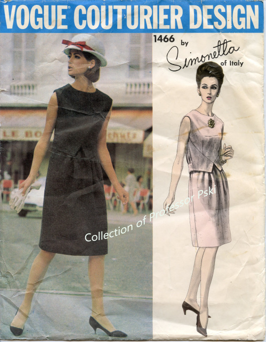

The Two-Piece Look of the Dress in the 1960s: Vogue 1466 by Simonetta
Why would a designer go to so much trouble to create the look of two-pieces in a dress? This is the second such effort I have spotted recently among 1960s patterns, see Vogue 1522 by Patou which I blogged earlier, so there must have been some reason. It could be mere novelty, it could be the satisfaction of fooling the eyes of the onlooker, the borrowing of an idea, or it could be separates were considered a bit less informal than a dress and thus easier to choose for day-time wear. It also could make it easier to wear as one didn’t have to worry about the two pieces parting company at the waistline if one should stretch or lean. What it did not do in this case was make it easier to get into.
This dress pattern by the Italian designer Sinonetta featured what she called a “bias-cut loose waistcoat effect” created with a center bodice pattern piece and then two side pieces which are then lined after they are attached. Then an underbodice which looks like a darted sloper but cut in lining fabric front and back is attached to the fashion fabric bodice, and shuts with tiny hooks in the back under the zippered back, making it extremely difficult to get on by one’s self. The underbodice exists in order to attach the gathered skirt front to it, thus creating the two-piece look and then the whole underbodice has an attached inner ribbon belt to hold it close to the body by closing with hooks and eyes. The back belt pieces then button in place, one through the other. And did I mention the entire garment is first underlined to give it some stiffiness and keep the A-line shape?
Yes, a lot of work for this two-piece look, and one that tends to draw attention down towards the waistline. Notice how the sketch of the pink version has a large brooch and an up-do to draw attention back up towards the face. And notice how the photograph of the black makes it hard to discern any of the details which seems a waste of all that effort.
Simonetta started her career in the 1940s, had salons in Paris and in Rome, and was active through the 1970s when she retired. I suspect this pattern dates to the early to mid-1960s as the hemline is right below the knee, and the woman photographed in public wears a hat and carries gloves, indicating a time when more effort was expected when a woman was on the street.
#1960sfashions#vintagefashions#vintagesewing#vintagedressmaking#vintagesewingpatterns#1960ssewingpatterns#simonetta#italianfashion#garmentdesign#historyofgarmentdesign#making#makers#costumehistory#dresshistory#fashionhistory#vintagedress#daywear#vintagedaywear#hautecouture#couturedesign#couture#couturetechnique
11 notes
·
View notes
Photo
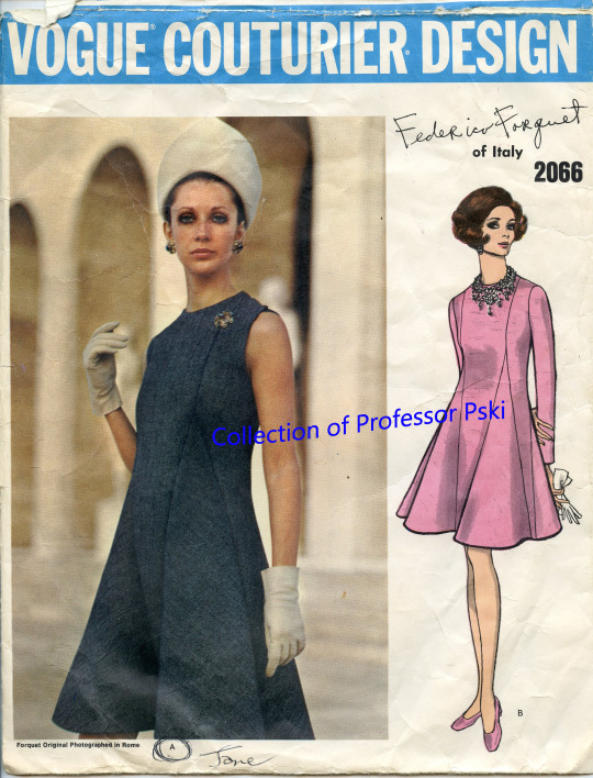
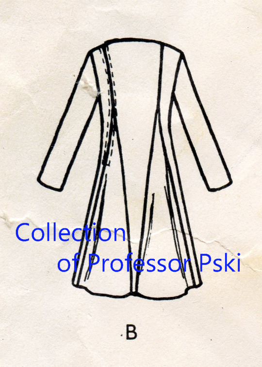
Godets a Go Go: Vogue 2066 by Federico Forquet
This Vogue pattern boasts that “FREDERICO FORQUET (For-Kay)--talented young Italian designer creates clothes with simple elegance.....” You may not have heard of him because he moved out of fashion and into interior design, but Forquet began by working for Cristobal Balenciaga and then opened his own salon in Rome in 1962. Despite much success through the 1960s, he shut the salon in 1972 and turned his hobby of decorating friends’ homes into a business.
You see here on this dress a remarkable set of bias-cut godets playing with proportion. Godets are a slice of fabric, shaped much like a wedge of pie, which are usually found at along the hemline of a skirt in order to create flare for easy movement. These too are at the hemline, but they are lengthened considerably and shoot almost to the bustline.The result is a dress that is almost all godets which are further emphasized by the 2-inch horsehair which stiffens the hemline. In addition, the entire dress is underlined, again to give it greater body, and he recommended “crisp heavyweight fabrics” for the fashion fabric. Seam binding stabilizes all the seam allowances of the dress before the godets are inserted.
Notice too how he refused to compromise the emphasis on the swooping lines of these giant godets, by setting the zipper into the side seam instead of creating a center back seam. All of which would have taken considerable skill as befits a couture garment.
Both the photography and the fashion sketch indicate that he felt the need to move some of the attention up from this interesting hemline towards the face. The photography has the model wearing a tall white hat and a large brooch near the shoulder, and the sketch has the model wearing a tiered, elaborate necklace. Notice too that both have white gloves, an indication that this pattern came out at a time when formality was still required for public clothing for all occasions, but sports or country life.
#voguepatterns#vintagevoguepatterns#vintagesewingpatterns#vintagesewing#dressmaking#sewing#vintagedressmaking#federicoforquet#italianfashion#1960sfashions#1960ssewingpatterns#sewingpatterns#godets#garmentconstruction#garmentdesign#historyofgarmentdesign#historyofsewing#costumehistory#dresshistory#fashionhistory#making#makinghistory
11 notes
·
View notes
Photo
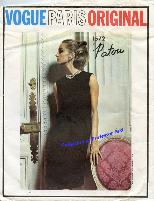
Shifting Emphasis Downward: Vogue 1572 from the 1960s
You can’t really see what is happening in the photograph of this A-line dress by the House of Patou (Jean Patou himself died in 1936) because it is all in black. In fact, the emphasis of the black version is near the face because of the large sparkly necklace and earrings worn by the model. But take a look at the sketches done up in pink and in white and you realize that the designer had abandoned the Dress Doctors’ art principlr which said keep the emphasis of garment design on the face.
Despite the big brooches on the pink and white versions, the lines of the garment on the front of this dress are all down at the lower hip. Welt pockets, a bow, piecing and gathers are all down there and except for the skirt overlay which creates a flap from the center low hip down to the hem. Although the look implies a two-piece garment because of the piecing from the bodice to the skirt, it is actually one piece. It is an awful lot of effort to bring attention down to the lower hip line.
The whole garment is an awful lot of effort as all couture garments would be. The entire dress has an underlining, probably in order to stiffen it to keep the A-line shape. The center front of the bodice has a stay which echoes its shape and which then is sewn to the gathers of the skirt at center, all in order to allow the fashion fabric bodice piece to move freely unattached above the gathers. Yes, a lot of effort to make the dress look like two pieces. In fact, I suspect when this dress was in motion, onlookers’ eyes would be puzzled enough-- two pieces? --one piece?-- to dwell on that area of the dress while trying to figure out what was going on. Then, bound buttonholes button up the back where the two-piece illusion is discarded. There is an inner belt at the waistline which is attached to the seam allowance and then closes with a hook and eye inside the dress at the back.
Which brings me to the effort of getting this dress on. You would have to close the waistline belt behind your back, and then button up the dress behind your back. Only wearers of the original, who would have a maid to ask for help, or dressmaker with a spouse at hand, could get this dress on easily.
How fancy would it be? For day time or nighttime? Hard to say as the fabric suggestions run from satin and silk to cottons, linens, and woolens, but notice that the two sketches also have these women wearing gloves, a sign of a dressier occasion. The 1960s saw a number of experiments moving the emphasis in garments far down from the face, but I can’t say I am a big fan of the effort.
#patou#jeanpatou#Vogueparisoriginal#voguepatterns#vogue1572#vintagesewingpatterns#vintagesewing#vintagedressmaking#couture#hautecouture#1960sfashions#1960ssewingpatterns#costumehistory#dresshistory#fashionhistory#sewing#dressmaking#designer#fashiondesigners#artprinciples#emphasis#garmentdesign#historyofgarmentdesign
6 notes
·
View notes
Last Seen Blogs