#AbstractLogo
Explore tagged Tumblr posts
Visit Tumblr Blog
Explore Tumblr blogs with no restrictions, modern design and the best experience.
Last Seen Tumblr Blogs


Fun Fact
Tumblr posted its first advertisements in May 2012 and subsequently earned $13M in revenue.
Video
youtube
Design Tutorial: Creating an Innovative Abstract Logo for Your Business in Adobe illustrator.
2 notes
·
View notes
Text

What do you see in this icon? Is it just the letter S, or do you spot something more? Let me know your thoughts—your feedback is always welcome! 🚀✨
📩 Contact me at: [email protected] to discuss your branding needs or to purchase this exclusive design.
#logo#logodesign#logomaker#Slogo#Rlogo#monogram#branding#graphicdesign#creativelogo#minimalistlogo#modernlogo#businesslogo#abstractlogo#designinspiration#startupbranding#typographylogo
0 notes
Text

Begin by creating your own Abstract Flame Logo brand with our simple AI logo generator tool.
There is no need to join up; simply begin customizing for free. Instantly download it and use it for all of your marketing and advertising purposes. It is not necessary to be a competent graphic designer to create a unique, flowing logo with wave lines.

#FlameLogo #logomaker #LogoGenerator
0 notes
Text
Adobe Illustrator tutorial on creating a 3D drop abstract logo design using the Corner Tool, Shape Builder Tool, and Knife Tool! Learn this easy and innovative technique to create smoother drop shapes in just a minute.
#LogoDesign #AdobeIllustrator #3DDesign #AbstractLogo #CornerTool #ShapeBuilderTool #KnifeTool #GraphicDesign #DesignTutorial #CreativeProcess #SmoothDesign #DigitalArt #LearnDesign #VectorArt #DesignSkills #ArtCommunity
5 notes
·
View notes
Text

Creative Agency Logo Images - Free Download Fiverr Link https://www.fiverr.com/s/vv71X1z Abujmah Link https://abujmah.com/listing/creative-agency-logo-images-free-download/ "Design and Web site Development is my passion and profession, I have more than 7+ years of experience in Website Development and I build many kinds of Responsive Word Press website design with positive feedback." #SikandarTrailer #GalxeID #SnowWhite #Nithiin #AEWCollision #UFCLondon#agencylogo #creativelogo #logo #logodesign #branding #design #modernlogo #brandlogo #companylogo #elegantlogo #luxurylogo #modern #marklogo #logointernational #inspirationlogo #logocreator #mindlogo #logofashion #logomarketing #brandinglogo #bussines #drawlogo #logographic #servicelogo #abstractlogo #fonelogo #storelogo #shoplogo #gplogos #websitelogo #WestBengal #BRATCHELLA #UxlinkIsKing #ENCHELLA #COACHELLA2025 #UFC314
0 notes
Photo
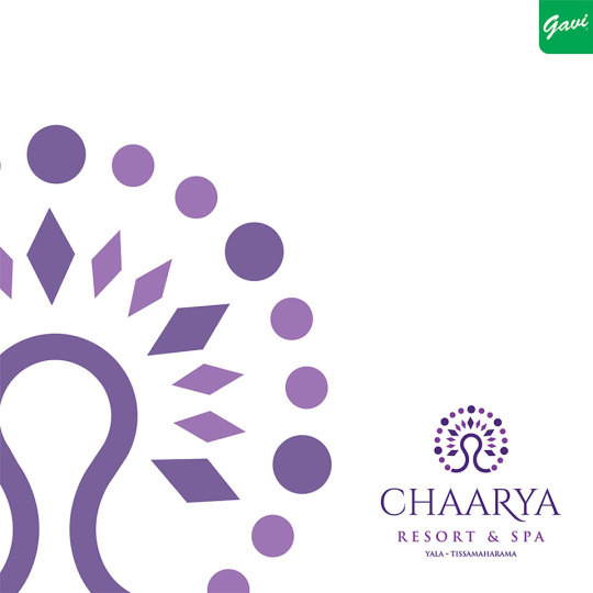
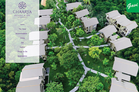
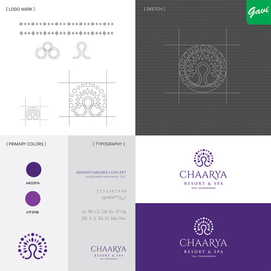


Introducing the new logo for Chaarya Resort - a symbol of luxury and tranquility.
Client: Chaarya Resort
Logotype: Abstract Icon
Industry: Hotel & Resort
https://www.gavi.lk/logo-design-sri-lanka/
#CreativeLogoDesign#LogoDesignSriLanka#LogoDesigns#logodesigner#GaviDigital#logo#GaviAds#LogoDesignServices#Gavi#BrandIdentity#Ideas#AbstractLogo#Branding#Advertising#BusinessLogoDesign#BrandDesign#LogodesignChallenge#HotelLogo#resortlogo
8 notes
·
View notes
Text
#abstractlogo#abstractlogodesign#illustration#famousabstractlogo#creative logo#logo design#logotype#brand design#graphic designer#minimalist logo#product design#branding#brand new#designed#designing
2 notes
·
View notes
Text
Stratler Logo design.
Flat 'S' logo for Stratler.
Completed project (By: NUR - via 99designs)
PROFESSIONAL EXTENDED DESIGNER. (Graphic Design, UI/ UX Design, Motion Graphics, Web Design & Digital Marketing)
⭐ +88 017 47 96 36 43 (WhatsApp) 👉 [email protected]
✨ https://linktr.ee/NUR_expert
Linkedin Behance Dribbble Instagram Pinterest Twitter Facebook Tumblr Medium Youtube
#Logo#Logos#LogoDesign#SLogo#ConsultingSLogo#LogoDesigner#LogoMaker#ITconsultingLogo#SColorfulLogo#Stratlerlogo#SflatLogo#SLogoDesign#Sicon#SLetterLogo#SAppLogo#FlatLogo#BusinessLogo#ProfessionalLogo#AbstractLogo
4 notes
·
View notes
Photo


Thoughts will teach you a lots. you have to be familiar with a lot of things when you empower yourself. Whatever the output, I hope it will be useful at some point. LOVE TO CREATE SAY HALLO: [email protected]
ORDER YOUR LOGO - https://bit.ly/3zWhXpw
#modern logo#logo#logomark#graphic design#branding#business#fiverr#fiver gigs#freelearning#digital artist#corporate#customlogo#flatlogo#Abstract#abstractlogo#minimalistlogo#typographylogo#signaturelogo#letteringlogo#amazing concept#high resolution#social media kit#stationery designs
2 notes
·
View notes
Video
youtube
Abstract in Minutes: Quick Logo Design Template with Adobe Illustrator | KavuCreative
Embark on a creative journey with our latest tutorial, 'Abstract in Minutes: Quick Logo Design Template with Adobe Illustrator.' 🎨✨ Join us as we delve into the world of rapid design, demonstrating how to craft a visually stunning abstract logo in just a few short minutes. This step-by-step guide in Adobe Illustrator unveils essential techniques, allowing you to effortlessly infuse elegance and modernity into your branding. Elevate your design game and unlock the potential of rapid logo creation. Watch, learn, and let your creativity flow! 🚀 #AdobeIllustrator #LogoDesign #AbstractInMinutes #DesignTutorial #creativejourney
1 note
·
View note
Text


Fluora - Vibrant Abstract Gradient Symbol by Artology https://dribbble.com/shots/25573821-Fluora-Vibrant-Abstract-Gradient-Symbol
📩 Contact me at: [email protected] to discuss your branding needs or to purchase this exclusive design.
#LogoDesign#BrandIdentity#MinimalistDesign#TechLogo#AILogo#CreativeDesign#Branding#LogoInspiration#DesignStudio#CustomLogo#BusinessBranding#ModernLogo#UniqueLogo#LogoConcepts#VisualBranding#DesignExpert#LogoDesigner#GraphicDesign#BrandingExpert#TechBranding#IdentityDesign#CreativeBranding#LogoMark#AbstractLogo#BrandDesign#ProfessionalLogo#LogoDesigns#BrandLogo#UniqueDesign#LogoTrends
1 note
·
View note
Photo
Comenzando con mis primeras series de monogramas #madewithcolourscafe #colour495 @colours.cafe #designinspiration #branddesigner #abstractlogo #logofreelancer #logotips #logovoice #logolearn #logo_lesson #logoprofessionals #logoimport #logohexa #logosketch #logoplace #flatlogodesign #logolemon #logoprocess #logoidentity #greatlogo #logoideas #logoconcept #logobrand #logogrid #logonew #logomark #logoinspire #brandingdesign #minimalism #logotype https://www.instagram.com/p/CJT-yStgrC8/?igshid=1dpxrritgk5zs
#madewithcolourscafe#colour495#designinspiration#branddesigner#abstractlogo#logofreelancer#logotips#logovoice#logolearn#logo_lesson#logoprofessionals#logoimport#logohexa#logosketch#logoplace#flatlogodesign#logolemon#logoprocess#logoidentity#greatlogo#logoideas#logoconcept#logobrand#logogrid#logonew#logomark#logoinspire#brandingdesign#minimalism#logotype
1 note
·
View note
Text
Iterations of the logo:
The complimentary research conducted off my Research Practicum paper “My project undertakes the challenge of participatory design for social innovation including thorough personal research to understand about the area, peoples, culture, behaviour, language and lifestyle for designing an environment for the need of people in the area in Duki, district in the Balochistan, province of Pakistan where they experience low quality of life.
This requires collaboration with a large scale of people (multiple generations) to experience the personal research, taking forwards into the world of visual assessment and agreement between myself and the stakeholders, helping vision develop into tangible design that meets functional requirements and reflects local identity, creating a base for cultural reclamation and growth. The decision made over this participatory design is because there is a cultural disconnection between myself and the stakeholders. This technique might be the best way for myself to observe and learn from the user as the focus is on the idea of ‘infrastructure’ as a way to approach social innovation that differs from project-based design. According to the research (per-Anders Hilgren, 2011), this technique raises concerns regarding the cultural imitations of applying designs in the working field.”
Click here to understand the logo given below:

Using this formula, 10+ people were given a pen and a paper to design their ‘needs and wants’ according to the concept ‘low quality of living’. We later truncated people down to 7 then to 3. These design collections were randomly selected and given to another people to develop on those design and ‘somehow’ those 3 end designs were given titles on each. (Minimal, modern and cultral)…
How did this happen?
One of the girls had a ‘minimal’ design because she describe herself as a student with not many needs but wanting a spatial home to feel present.
One of the guys drew a family house basing off the ‘cultural’ aspect of him having his temple away from the kitchen where the meat and other inappropriate food stays that isn't suitable for his religion during occasions while the kitchen is placed on the right as he feels his body motion towards the right as walking into the kitchen feels right then having another left turn then right towards the sink. (as he explains…)
Another boy drew a ‘modern’ house with structures placed very openly but flash.
Click here for background work:
Allocating ideas into two different range…
These three ideas in my context towards my own contribution and portfolio were put into one design/house focusing on all three concepts while the titles were taken and used for the logo.
I personally feel that these titles/concepts given generally builds a simple yet meaningful structure. Likewise, we were trying to integrate ¼ = 1’ meaning one quarter equals to one foot on an Architectural scale as we are working on this scale for this chosen area in Pakistan which is a fairly complex scale to work on for minimal, modern and cultural where the point of privacy is also noted. An aspect of ‘Ethnography’ is also studied during this project, complimentary topic off my research paper.
Image given below shows how we started off with logo designing for our business card.

The iterations given below slowly minimized into a very short logo yet people were still reading all of them as “Marchitecture” even though we tried isolating M and A by putting 1/4 scale in the middle of those two.

User Experience for the final design iteration 01:
Why Marchitecture
1/4 shade is not fully covered
Why is the moon fading away and that is not the colour of the moon we perceive. We perceive a warm colour.

User Experience for the final design iteration 02:
*confused* 1/4 scale isn’t complete
*Note*: A pictorial mark alone can be tricky. It’s effective if you already have an established brand but that’s not a hard and strict rule. You can use brandmarks to your advantage to convey what your business does graphically if your name is too long, and they can also be used effectively to convey a desired idea or emotion.

User Experience for the final design iteration 03:
Black, white and grey isn’t appealing.Apply a little colour somewhere or maybe on 1/4 but 1/4 is read from the top to bottom but I argued quarter is usually on the bottom while reading the fraction from top to bottom but whatever one is coloured, it still portrays 1/4 but keeping a hot colour close to another pitch colour throws the abstracts of the design.
This is where the use of colour palette came in place.

*Note*: A pictorial mark alone can be tricky. It’s effective if you already have an established brand but that’s not a hard and strict rule. You can use brandmarks to your advantage to convey what your business does graphically if your name is too long, and they can also be used effectively to convey a desired idea or emotion.
These logos are formed as an abstract logo but had a touch of pictorial mark.
1 note
·
View note
Text

Creative Agency Logo Images - Free Download Fiverr Link https://www.fiverr.com/s/vv71X1z Abujmah Link https://abujmah.com/listing/creative-agency-logo-images-free-download/ "Design and Web site Development is my passion and profession, I have more than 7+ years of experience in Website Development and I build many kinds of Responsive Word Press website design with positive feedback." #SikandarTrailer #GalxeID #SnowWhite #Nithiin #AEWCollision #UFCLondon#agencylogo #creativelogo #logo #logodesign #branding #design #modernlogo #brandlogo #companylogo #elegantlogo #luxurylogo #modern #marklogo #logointernational #inspirationlogo #logocreator #mindlogo #logofashion #logomarketing #brandinglogo #bussines #drawlogo #logographic #servicelogo #abstractlogo #fonelogo #storelogo #shoplogo #gplogos #websitelogo
#zelena #indvsban #happybirthdayshaheer #IndependenceDay #DMAIL #TalroshKiShaadi
0 notes
Photo


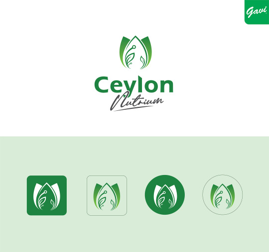
A new chapter begins! Feast your eyes on the stunning new logo of Ceylon Nutrium, where nature's goodness meets modern elegance. Get ready to embark on a journey of health and wellness like never before!Discover how Ceylon Nutrium logo was born.
----------------
Client: Ceylon Nutrium
Logotype: Abstract Icon
Industry: Organic Food & Farming
-----------------
https://www.gavi.lk/logo-design-sri-lanka/
https://www.gavi.lk/custom-logo-design/
https://www.gavi.lk/packaging-design-sri-lanka/
-----------------
Instagram: @gavidigital_digital
WhatsApp: +94 71 897 5976
E-mail: [email protected]
-----------------
#logo design#logo#BusinessLogoDesign#creativelogodesign#logo design services#logo design ideas#Logo Designers#creativegraphicdesigner#LK#Gavi#gavi digital#gavi ads#nature logo#abstractlogo#ceylon#Brand design#brand identity design
2 notes
·
View notes