#And in that that creates the basis for their dynamic and how evenly matched they are
Explore tagged Tumblr posts
Visit Tumblr Blog
Explore Tumblr blogs with no restrictions, modern design and the best experience.
Last Seen Tumblr Blogs


Fun Fact
The KCSC sent more than 20K requests to delete posts related to prostitution and porn to Tumblr from January to June 2017.
Text
No One:
Me: Anyone ever think about how because Tyler was tricking her, he accidentally ended up as the one person who was seeing Wednesday for who she is and not who everyone wanted her to be? Specifically not who he wanted her to be, because he didn’t even have another image of her to fall back upon? Weems saw her as trouble/her Mother, Gates underestimated her, Sheriff Galpin only saw her Father, Xavier as his childhood hero, Enid blatantly assigned her a social mask but Tyler looked her full in the face and took her as she was? From their first meeting to their last, seeing Wednesday as she is, as she comes, all her dark edges and bright ideas and meeting her as an Equal Opponent, never underestimating her, never covering her up…. Just her. Only her. (And that in turn blinds her to who he is, until she pulls his mask off by accident).
Me: Anyone else ever think about that?
#weyler#wyler#wednesday addams#tyler galpin#Grey’s meta#I’ve been rewatching recently and like Tyler really pays attention to who she is and that is a really big factor as to why he does manage t#trick her#Tyler trusts Wednesday as much as she trusts him#Which is implicitly#And in that that creates the basis for their dynamic and how evenly matched they are#As people as enemies as rivals as competitors with one another#And that affords some really interesting insight into both of them#Wednesday trusts Tyler because he meets her where she is#Whereas Xavier projects ideas onto her and gets mad when she doesn’t meet them#And Enid’s whole tangent at the end of Ep 6 exposes the mask she made for Wednesday to talk about her to other people instead of letting#Wednesday set who she is#Tyler doesn’t actively meddle or try to tell her who she is#Weems and the Sheriff only see her parents#Gates only sees the family legacy#But Tyler looks at her and sees Wednesday#His enemy who he happens to trust implicitly because oh he’s never met anyone like her#Can be tagged as ship and non ship#In that I know there’s a romantic angle here but it can also be viewed as a strict character analysis#I LOVE COMPLICATED DYNAMICS#SO MUCH
96 notes
·
View notes
Text
Color Theory for Designers: Creating Harmony and Contrast
Introduction
Color theory is an essential aspect of graphic design, allowing designers to create visually appealing and effective designs. Understanding the principles of color theory helps in making informed decisions about color combinations, ensuring harmony and contrast in designs. In this article, we'll explore the fundamentals of color theory, how to achieve harmony and contrast, and practical tips for designers.

Understanding Color Theory
Color theory encompasses a set of guidelines and principles used by designers to communicate through color. It is based on the color wheel, which visually represents the relationships between colors.
The Color Wheel
The color wheel is a circular diagram of colors arranged by their chromatic relationship. It consists of primary, secondary, and tertiary colors, providing a visual representation of how colors relate to one another.
Primary Colors
Primary colors are the foundation of the color wheel. They consist of red, blue, and yellow. These colors cannot be created by mixing other colors and serve as the basis for creating all other colors.
Secondary Colors
Secondary colors are formed by mixing two primary colors. These include green (blue + yellow), orange (red + yellow), and purple (red + blue). Secondary colors play a crucial role in design, offering more options for creating diverse palettes.
Tertiary Colors
Tertiary colors are created by mixing a primary color with a secondary color. Examples include red-orange, yellow-green, and blue-purple. These colors add complexity and depth to designs, allowing for more nuanced color schemes.
Color Harmony
Color harmony refers to aesthetically pleasing combinations of colors that create a sense of order and balance. Achieving color harmony is vital for creating designs that are visually appealing and engaging.
Analogous Color Scheme
An analogous color scheme consists of colors that are next to each other on the color wheel. These colors usually match well and create serene and comfortable designs. For instance, a combination of blue, blue-green, and green can create a harmonious look. This scheme is ideal for designs that need a cohesive and smooth appearance.
Complementary Color Scheme
Complementary colors are opposite each other on the color wheel, such as red and green or blue and orange. This scheme offers high contrast and vibrant looks, making elements stand out. It's perfect for creating visual interest and drawing attention to key areas in a design.
Split-Complementary Color Scheme

The split-complementary scheme uses one base color and the two colors adjacent to its complementary color. This approach offers strong visual contrast without the tension of a direct complementary scheme. For example, using blue with yellow-orange and red-orange can create a balanced and appealing design.
Triadic Color Scheme
A triadic color scheme involves three colors that are evenly spaced around the color wheel, such as red, yellow, and blue. This scheme provides a vibrant and balanced palette, suitable for designs that require strong visual impact.
Tetradic (Double-Complementary) Color Scheme
The tetradic scheme uses two complementary pairs, creating a rich and varied palette. For instance, combining blue and orange with red and green can offer numerous possibilities for dynamic designs. This scheme works best when one color is dominant and the others are used for accents.
Color Contrast
Color contrast is the difference in lightness and darkness between colors. High contrast enhances readability and visual impact, while low contrast can create subtle and sophisticated looks. Achieving the right balance of contrast is crucial for effective design.
Psychology of Colors
Colors have a profound impact on emotions and perceptions. For example, blue can evoke feelings of calm and trust, while red can stimulate excitement and urgency. Understanding color psychology helps designers create designs that resonate with the audience on an emotional level.
Color in Branding
Color is a powerful tool in branding, influencing how a company is perceived. Brands like Coca-Cola (red) and Facebook (blue) use color to establish their identity and connect with their audience. Choosing the right colors can enhance brand recognition and loyalty.
Tips for Designers
Experiment with Color Schemes: Use tools like Adobe Color to explore different combinations.Consider the Context: The purpose and audience of the design should influence color choices.Test for Accessibility: Ensure sufficient contrast for readability, especially for users with visual impairments.Stay Updated: Trends in color usage can change, so stay informed about current design practices.Learn from Examples: Analyze successful designs to understand effective color application.
Conclusion
Color theory is a fundamental aspect of design, offering guidelines for creating harmony and contrast. the best graphic designing course institute in Delhi By understanding the principles of color combinations and the psychology of colors, designers can craft visually appealing and impactful designs. Whether you're working on branding, web design, or any other creative project, mastering color theory will enhance your work.
FAQs
What is the best way to learn color theory? The best way to learn color theory is through practice and study. Enroll in courses like those offered by Anshika Digital Media, , and use online resources and tools to experiment with color schemes.
How do colors impact user experience in design? Colors significantly impact user experience by affecting mood, readability, and overall aesthetics. The right color choices can enhance usability and engagement.
What are some tools for choosing color schemes? Tools like Adobe Color, Coolors, and Color Hunt are excellent for exploring and creating color schemes.
Can color theory be applied to web design? Absolutely. Color theory is crucial in web design for creating visually appealing and user-friendly interfaces.
Why is color contrast important in design? Color contrast is vital for readability and visual hierarchy. It helps distinguish elements and ensures accessibility for all users.
Get Access Now: https://www.anshikadigitalmedia.in/
0 notes
Text
Some CSS Grid Strategies for Matching Design Mockups
The world of web development has always had a gap between the design-to-development handoff. Ambitious designers want the final result of their effort to look unique and beautiful (and true to their initial vision), whereas many developers find more value in an outcome that is consistent, dependable, and rock solid (and easy to code). This dynamic can result in sustained tension between the two sides with both parties looking to steer things their own way.
While this situation is unavoidable to some extent, new front-end technology can play a role in bringing the two sides closer together. One such technology is CSS grid. This post explores how it can be used to write CSS styles that match design layouts to a high degree of fidelity (without the headache!).
A common way that designers give instructions to front-end developers is with design mockups (by mockups, we’re talking about deliverables that are built in Sketch, XD, Illustrator, Photoshop etc). All designers work differently to some degree (as do developers), but many like to base the structure of their layouts on some kind of grid system. A consistent grid system is invaluable for communicating how a webpage should be coded and how it should respond when the size of the user’s screen differs from the mockup. As a developer, I really appreciate designers who take the trouble to adopt a well thought-out grid system.
A 12-column layout is particularly popular, but other patterns are common as well. Software like Sketch and XD makes creating pages that follow a preset column layout pretty easy — you can toggle an overlay on and off with the click of a button.
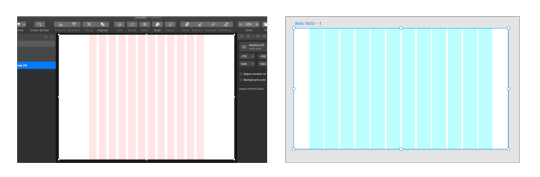
A grid layout designed in Sketch (left) and Adobe XD (right)
Once a grid system is implemented, most design elements should be positioned squarely within it. This approach ensures that shapes line up evenly and makes for a more appealing appearance. In addition to being visually attractive, a predictable grid gives developers a distinct target to shoot for when writing styles.
Unfortunately, this basic pattern can be deceptively difficult to code accurately. Frameworks like Bootstrap are often used to create grid layouts, but they come with downsides like added page weight and a lack of fine-grained control. CSS grid offers a better solution for the front-end perfectionist. Let's look at an example.

A 14-column grid layout
The design above is a good application for grid. There is a 14-column pattern with multiple elements positioned within it. While the boxes all have different widths and offsets, they all adhere to the same grid. This layout can be made with flexbox — and even floats — but that would likely involve some very specific math to get a pixel-perfect result across all breakpoints. And let’s face it: many front-end developers don’t have the patience for that. Let’s look at three CSS grid layout strategies for doing this kind of work more easily.
Strategy 1: A basic grid
See the Pen Basic Grid Placement by chris geel (@RadDog25) on CodePen.
The most intuitive way to write an evenly spaced 12-column layout would probably be some variation of this. Here, an outer container is used to control the outside gutter spacing with left and right padding, and an inner row element is used to restrain content to a maximum width. The row receives some grid-specific styling:
display: grid; grid-template-columns: repeat(12, 1fr); grid-gap: 20px;
This rule defines the grid to consist of 12 columns, each having a width of one fractional unit (fr). A gap of 20px between columns is also specified. With the column template set, the start and end of any child column can be set quite easily using the grid-column property. For example, setting grid-column: 3/8 positions that element to begin at column three and span five columns across to column eight.
We can already see a lot of value in what CSS grid provides in this one example, but this approach has some limitations. One problem is Internet Explorer, which doesn’t have support for the grid-gap property. Another problem is that this 12-column approach does not provide the ability to start columns at the end of gaps or end columns at the start of gaps. For that, another system is needed.
Strategy 2: A more flexible grid
See the Pen More Flexible Grid Placement by chris geel (@RadDog25) on CodePen.
Although grid-gap may be a no go for IE, the appearance of gaps can be recreated by including the spaces as part of the grid template itself. The repeat function available to grid-template-columns accepts not just a single column width as an argument, but repeating patterns of arbitrary length. To this end, a pattern of column-then-gap can be repeated 11 times, and then the final column can be inserted to complete the 12-column / 11 interior gap layout desired:
grid-template-columns: repeat(11, 1fr 20px) 1fr;
This gets around the IE issue and also allows for columns to be started and ended on both columns or gaps. While being a nice improvement over the previous method, it still has some room to grow. For example, what if a column was to be positioned with one side spanning to the outer edge of the screen, and the other fit within the grid system? Here’s an example:

A grid Layout with an that's item flush to the outer edge
In this layout, the card (our left column) begins and ends within the grid. The main image (our right column) begins within the grid as well, but extends beyond the grid to the edge of the screen. Writing CSS for this can be a challenge. One approach might be to position the image absolutely and pin it to the right edge, but this comes with the downside of taking it out of the document flow (which might be a problem if the image is taller than the card). Another idea would be to use floats or flexbox to maintain document flow, but this would entail some tricky one-off calculation to get the widths and spacing just right. Let’s look at a better way.
Strategy 3: An even more flexible grid
See the Pen Right Edge Aligned image with grid by chris geel (@RadDog25) on CodePen.
This technique builds on the idea introduced in the last revision. Now, instead of having the grid exist within other elements that define the gutter sizes and row widths, we’re integrating those spaces with the grid’s pattern. Since the gutters, columns, and gaps are all incorporated into the template, child elements can be positioned easily and precisely on the grid by using the grid-column property.
$row-width: 1140px; $gutter: 30px; $gap: 20px; $break: $row-width + 2 * $gutter; $col-width-post-break: ($row-width - 11 * $gap) / 12; .container { display: grid; grid-template-columns: $gutter repeat(11, calc((100% - 2 * #{$gutter} - 11 * #{$gap})/12) #{$gap}) calc((100% - 2 * #{$gutter} - 11 * #{$gap})/12) $gutter; @media screen and (min-width: #{$break}) { grid-template-columns: calc(0.5 * (100% - #{$row-width})) repeat(11, #{$col-width- post-break} #{$gap}) #{$col-width-post-break} calc(0.5 * (100% - #{$row-width})); } }
Yes, some math is required to get this just right. It’s important to have the template set differently before and after the maximum width of the row has been realized. I elected to use SCSS for this because defining variables can make the calculation a lot more manageable (not to mention more readable for other developers). What started as a 12-part pattern grew to a 23-part pattern with the integration of the 11 interior gaps, and is now 25 pieces accounting for the left and right gutters.
One cool thing about this approach is that it can be used as the basis for any layout that adheres to the grid once the pattern is set, including traditionally awkward layouts that involve columns spanning to outside edges. Moreover, it serves as a straightforward way to precisely implement designs that are likely to be handed down in quality mockups. That is something that should make both developers and designers happy!
There are a couple of caveats...
While these techniques can be used to crack traditionally awkward styling problems, they are not silver bullets. Instead, they should be thought of as alternative tools to be used for the right application.
One situation in which the second and third layout patterns are not appropriate are layouts that require auto placement. Another would be production environments that need to support browsers that don’t play nice with CSS grid.
The post Some CSS Grid Strategies for Matching Design Mockups appeared first on CSS-Tricks.
Some CSS Grid Strategies for Matching Design Mockups published first on https://deskbysnafu.tumblr.com/
0 notes
Text
What Is Flame

Flame: in order for the fire to undergo rapid combustion action, the flammable substance must reach the combustion temperature and contact with oxygen for the reaction. In order for a match to burn, we apply it on a flammable surface and bring the matchhead to the burning heat with the energy of the friction. As a result, we see the flame, arriving at a flaming combustion reaction. All right, I'm gonna ask anybody, “what's a flame?” when we ask the question, if he has chemical knowledge, he can tell us the formula of a flaming combustion reaction. But that's not the answer that will satisfy us. We want to know what it is, not the description of the flame.

How the flame scatters light and heat around it ?
How does it emit light and heat around it, why is it cone-shaped, how does it act like it “dances”, why is it orange-colored? Personally, they were simple questions I never got a satisfactory answer to, all of them. Now, in short and simple terms, we will explain this phenomenon to those who, like me, are curious.

This is the recipe for combustion, CH4+2O2⟶CO2+2H2O.
In the appropriate conditions, with inputs in the appropriate environment, carbon dioxide and water are formed as a result of flaming combustion. So what kind of dynamic does the fascinating, wonderful feast of light and Heat have that provides? Substances that reach certain temperatures radiate. They emit light in infrared, ultraviolet or visible light. The factors that determine this radiation depend on the chemical personality of the substances that enter the combustion reaction, the colors that occur as a result of the radiation, the degree of the combustion. Without entering the black body radiation, depending on the degree of the burning flame, let's talk about which colors it beams. It is always said that blue and its shades are cold, and red and its shades are warm. But, in terms of physics, not so much. The point where a candle or match flame is the hottest is the bottom. As it turns out, those hottest spots also glow blue. It is on a scale of 1000-1400 °C. In the reactions here, the vibration on a molecular basis is excessive. So the wavelength they emit is narrower and closer to purple, shining blue. 800-1000 °C, the body part of the flame is more orange. Because the vibration is less, it is close to red, i.e. wider wavelength. That's roughly why the stars that move away from us shift Red. As the path of light increases, the wavelength also turns red. Towards the end of the flame, the color appears to darken and fade. Sulfur and potassium chlorate at the end of the match are rubbed against the red phosphorus mixture with the glass powder next to the matchbox to target the heating. Potassium chlorate contains oxygen to ignite sulfur. Otherwise, the two surfaces cannot come into contact with oxygen, suffocate and degrade due to excessive contact while rubbing.
The flame contains millions of chemical reactions.
Sulfur, potassium chlorate and glass dust, which increases friction a little, contact with the oxygen in the air and maintain the flame. The flame contains millions of chemical reactions. Usually in a candle flame, an empty, flame-free area occurs between the candle's litter and the Blue-radiating region. This area is the area where the candle evaporates by heat and the trash does not burn yet. That is, the non-flame part continuously creates evaporation and delivers the fuel that feeds the flame to the burning part. Subsequently, the air in the non-flame area cannot continuously evaporate, creating oxygen contact. The oxygen atoms heated by the flammable material crash into each other and rearrange themselves. As a result of this arrangement, new formations such as carbon dioxide, water or ash emerge. This is chemical degradation. In combustion, the electrons of the atoms remaining in the chaos jump through the orbit by passing to the excited level. Then, giving off this jump energy, they fall back to their old orbits. In the meantime, the jump energy is emitted into the environment as light and heat.
Excitation energy

The higher the arousal energy, the hotter the heat packet given to the environment, and the closer the wavelength of the light packet to the Blue. That's why the bottom of the flame is blue. Not every carbon atom or carbon-based molecule that emerges during the flame turns into carbon dioxide. Some, from the chaos in the flame, come together to create work and institution. When a metal rod is inserted into a candle flame, the black stain on the stick is the soot. These processes occur in the body of the flame and they glow on an orange scale with the energy they receive from the environment. The colour of the body of the flame is caused by this. When an external factor, such as a cold metal rod, is inserted into the body where the heat is generated, this bright soot clings to the cold metal, sharing the heat energy into the iron and cutting off the radiation. So, those bright soot particles turn to their own color, black. Gravity pulls the cold air down, allowing the hot air to go up. Hot air balloons, that's how they fly. It gives the flame its characteristic dance and shape by compressing it from the body of the flame towards the end of the cycle of cold air drawn down and hot air coming up around the flame. In this period of time, the carbon dioxide and water vapor also pull up, soot leaves the bright body in the middle and causes the brightness to fade towards the end.
Flame in non-gravity environment

In a non-gravity environment, the flame, predictably, burns globally. Because, the energy of the flame performs the events mentioned in the region where it reacts. The fuel of the flame is formed at the center and the energy grows globally until it consumes all types of combustion by being evenly distributed, without any gravitational effects. even on your computer, you can discover what is happening in different parts of the flame. Light a candle and hold a cold spoon of iron in your hand. Hold the cold spoon slightly over the candle flame. On the back of the spoon, you can see the condensing water vapor. Cool the spoon again and insert it into the body of the flame and remove it, there you can see the heat. Cool the spoon, this time through the bottom of the candle flame. You can see the steam of the candle that hasn't burned yet, concentrated on the back of the spoon. We have gone beyond the description of this overwhelming, destructive and creative reaction that mankind has seen around it for as long as it can remember, and it is both frightening and fascinating. We learned the parts of the flame that we were really curious about, how it shines, how it emits heat and energy, without too much technique. It's the most primitive center of quantum physics around us. It radiates heat and light with quantum bundles, providing a hypnotic beauty. As you can see, the flame has a fascinating nature. Read the full article
#Excitationenergy#flame#Flameinnon-gravityenvironment#Howtheflamescatterslightandheataroundit?#whatisflame
0 notes