#AssessmentTaskThree
Photo
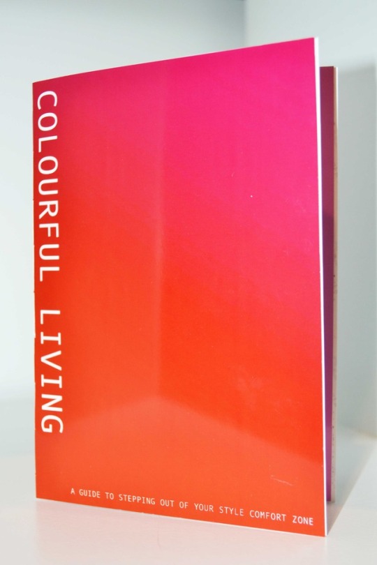
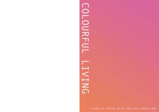
Title of Artwork: Colourful Living: A Guide To Stepping Out of Your Style Comfort Zone
Artist Statement, Reflection & Influences
After reflecting on the five curated experiments that I conducted exploring that relationship between colour, self expression and emotion, I decided to create a short publication as my final artwork. This publication presented a series of suggestions for an individual wishing to step out of their style comfort zone; providing ideas with the intention of allowing an individual to add more brightness, colour and play, and in turn, joy to their life.
This small publication is intended to be printed and distributed into the community through zine fairs and shared spaces, in order to allow the community to interact with this guide and try out the suggestions provided. I also intend to continue this project at a later date, expanding and refining this concept in the hope of actually producing a zine for distribution.
Each experiment was referenced when deciding and creating the final artwork publication “COLOURFUL LIVING: A Guide To Stepping Out Of Your Comfort Zone”, influencing the artwork either conceptually or physically.
Experiment one provided me not only with the photographic medium that is predominately used in the final artwork, but also with a number of photographs that I later used in the page spreads.
Experiment two allowed me to broaden my understanding of colour psychology, which informed my choices in styling the outfits photographed and the colours used in the text and backgrounds of pages; as well as providing me with a number of colour swatches that were used in the colour palette page spread.
Experiments three and four, which involved designing and creating a selection of colourful and sparkly jewelry pieces, provided me with the idea of displaying these creations in some manner of book or publication. Some of these jewelry pieces can be seen throughout the pages of the final artwork.
Experiment five was a continuation of experiment two, where I referred to each colour meaning graphic when choosing the colour palette of the segments in my sequin mood tracker. In other words, my findings from experiment two were put into practice in experiment five; and although they weren’t as directly reflected in my final artwork when compared to experiments 1, 3 and 4, they did inform my understanding of how colour and self expression interact with one another.
Process:
This final artwork involves a small publication containing photographs and graphics created in Adobe Photoshop and Illustrator, which provide suggestions in dressing more colourfully and freely.
Once I had taken and edited the photographs and put them into a two page spread layout, I printed them out using a printing service. I am disappointed in the quality of these prints, as the service I used messed up the colours, making them inconsistent and over-saturated. This can be seen particularly in the front and back covers, which were intended to be a pastel gradient, but somehow ended up being printed quite darkly.
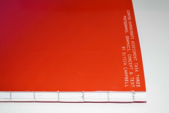
To print out the full pages without the edges cut off, I had to print each page with a white border. After I cut the borders off with a craft cutter and ruler, I folded each down the centre so that each side of the fold was a page. I used a mixture of Coptic and Kettle stitching to bind each page together into a book; this was a long and frustrating process due to the thread becoming tangled.
As I was only able to print the pages on one sided photo paper, I was presented with the problem of having many blank pages in between each printed page, so I attempted to solve this by sticking each back side together. This unfortunately messed up the neatly bound spine, as can be seen in the photos.
Page Descriptions:
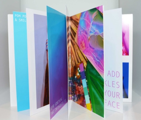
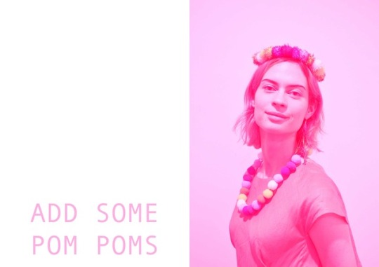
Page Spread One: ADD SOME POM POMS
· Left Side: Pink text with suggestion
· Right Side: Product photo showing pom pom headdress and necklace that was created in experiment 3; edited in Adobe Photoshop with a pink tint.
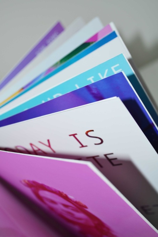
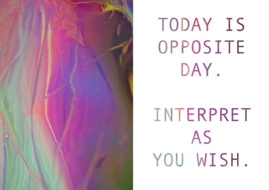
Page Spread Two: TODAY IS OPPOSITE DAY, INTERPRET AS YOU WISH.
· Left Side: Close-up photograph of holographic fabric texture, photo sourced from experiment 1.
· Right Side: Text created by manipulating same photograph in Adobe Photoshop, using the layer, text and clipping mask tools.
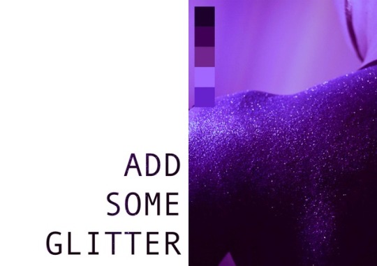
Page Spread Three: ADD SOME GLITTER
· Left Side: Text created by manipulating glitter photograph in Adobe Photoshop. The details in the text are hard to see due to the placement of the text over the photograph, and the poor quality of the printing.
· Right Side: Photograph of an individual with their back covered in glitter. I covered my sister’s back in glitter at night, which was a very messy process, and then photographed it in the dark, using an LED colour-changing light strip to get coloured lighting effects. Out of the many photos and associated colour ways obtained, I decided to digitally manipulate the green glitter and lighting into a purple tint, as the pink lighting setting gave the glitter a patchy effect.
Page Spread Four: PRODUCT PHOTO AND SUGGESTIONS
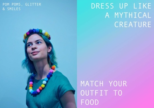
· Left Side: Product photograph of two pom pom jewelry pieces, where the actual colours of the pom poms can be seen clearly, albeit a bit saturated, rather than the pink tinted photograph on page 1. The text on this page reads ‘Pom Poms, Glitter and Smiles’, and is used not only as a describer, but also a suggestion.
· Right Side: Features two style suggestions over a blue to pink gradient background. The top suggestion reads ‘Dress up like a mythical creature’ such as a fairy, mermaid, elf, dragon, etc; and the bottom suggestion reads ‘Match your outfit to food’ such as dressing in watermelon colours, or in bright green like a lime. This page was created in Adobe Photoshop.
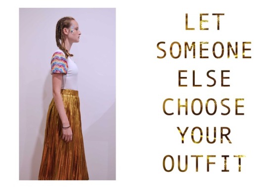
Page Spread Five: LET SOMEONE ELSE CHOOSE YOUR OUTFIT.
· Left Side: The left page shows a photograph of my sister in an outfit that I chose, which is significantly different to her usual style and comfort zone, as she prefers to dress in sports wear. Surprisingly, she enjoyed branching out into something much more colourful and formal. The outfit, hair and makeup was styled and applied by myself. I am unhappy with the quality of this photograph, as I was unable to adequately rid the image of the shadows, even though I attempted to do so multiple times in Photoshop. The white mesh top was hand sequined by myself previously.
· Right Side: This suggestion involves an element of trust and chance, as an individual must trust another person to pick out an outfit, and to wear, it, regardless of whether or not it is something they would usually wear. The image used in the text comes from my first experiment, and is a close up photograph of the gold skirt shown in the photograph to the left.
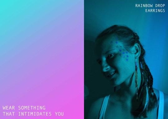
Page Spread Six: WEAR SOMETHING THAT INTIMIDATES YOU
· Left Side: Similar to page 4, this page is a suggestion page and a product photo. The suggestion reads ‘Wear something that intimidates you’ and was created in Photoshop.
· Right Side: This page shows a product photograph of a rainbow drop earring prototype that I created in experiment 4. I decorated my sister’s face with star sequins and also plaited her hair with iridescent Angelina fibres, which look very sparkly in real life. I have used fused Angelina fibres in previous textiles projects, and quite enjoy the visual effect created when it comes into contact with light. For this photograph, I used a non-flash setting and lit up my sister’s profile with an LED colour-changing light strip.
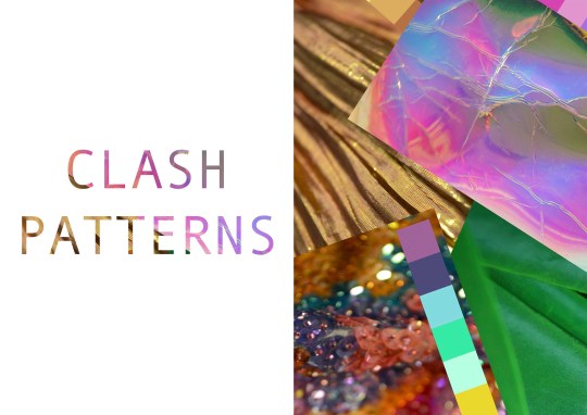
Page Spread Seven: CLASH PATTERNS
· Left Side: Text ‘Clash Patterns’ created using Photoshop and the digital collage found on the right side.
· Right Side: Shows a digital collage created by using photographs edited in Photoshop from experiment 1.
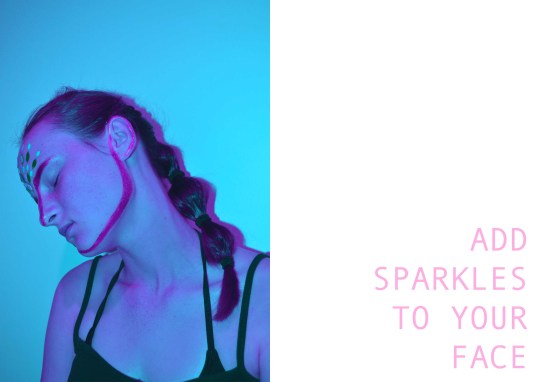
Page Spread Eight: ADD SPARKLES TO YOUR FACE
· Left Side: This page was unfortunately poorly printed, so the photo was not rendered to the colour accuracy and quality that I expected. I created this photograph by decorating my sister’s face with a selection of sequins, and by drawing an outline across her jawline, ear, nose and eyebrow with a metallic gold solution. I then edited the photograph in Photoshop to have a two-toned blue and pink tint.
· Right Side: Shows the corresponding suggestion ‘Add some sparkles to your face’ in a pastel pink colour.
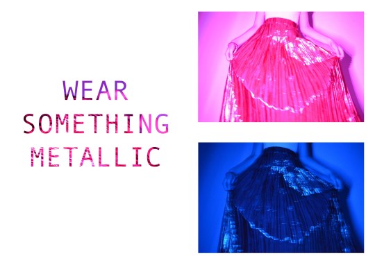
Page Spread Nine: WEAR SOMETHING METALLIC
· Left Side: The text was created by manipulating the pink photograph on the right side of the page in Photoshop.
· Right Side: This page includes two photographs of the golden skirt seen in previous pages, however the colours have been drastically altered using the LED colour-changing light strip. I decided to leave these photos unedited, simply combining them on a page, so that they are true to the colours captured on my camera.
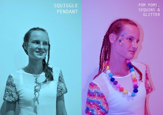
Page Spread Ten: PRODUCT PHOTOS:
· Left Side: This photograph shows one of the squiggle pendants that was created in experiment 3.
· Right Side: The text, which reads ‘Pom Poms, Sequins and Glitter’ can be interpreted as a suggestion, where the audience is encouraged to style an outfit using pom poms, sequins and glitter. This photograph shows the pom pom necklace, as well as makeup and a sequined white shirt that I had made previously.
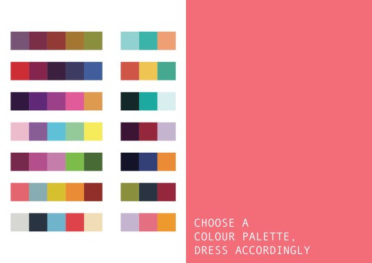
Missing Page: COLOUR PALETTE
· I somehow forgot to print one of the page spreads, which included a page of colour palettes, and a page of text that read ‘Choose a colour palette, dress accordingly’. I will show an image of this page spread in the post instead.
2 notes
·
View notes
Photo


ASSESSMENT TASK THREE: EXPERIMENT FOUR
Jewellery Experiments Focus:
Similar to clothes, accessories also play a large part in styling an outfit to bring more colour and brightness to an individual’s day. I decided to make a series of jewellery pieces as experiments, using bright colours and sparkly beads and sequins.
Playing around with materials, I created a collection of earrings, a bracelet, pendants, headdresses and necklaces. I would have preferred to have made more, however, due to the intricate and time consuming nature of beading and the fact that I was too sick to work for a week, I was unable to do so.
This collection of colourful jewellery spanned over two experiments, one of which being more childlike and playful in nature, using pom poms and pipe cleaners as the primary materials; the other involving more intricate and delicate designs and beading materials.
INTRICATE BEADS
Rainbow Anemone Bracelet:
Although this particular design is not new to me, as I have created a number of beaded anemones before, the act of making it into a piece of jewellery is new to me, as I had previously incorporated them into the beading on a gown. To create this 3D bead sculpture, I first sewed a small blue Sodalite (mineral) bead onto the middle of a piece of black backing fabric, and then beaded around this in concentric circles, each of which following the colour spectrum. To create the tentacles of the anemone, I then beaded branch-like strands of beads emerging from the outer two circles, ending them with rainbow riso beads.
Once the anemone had been beaded and the ends were secured, I cut the circle out of the fabric, and cut another piece the same size. Using a length of thick black ribbon, I positioned the extra circle in the middle and hand sewed them together. This cord was then adhered to the back of the beaded anemone using superglue. I’m quite pleased with this first attempt at making an anemone into a bracelet.
Rainbow Drop Earrings:
After the two failed earrings (see below), I decided to try a more basic approach, taking out the fabric part, and simply beading an earring prototype using long strands of Delica beads in a rainbow pattern. I was unable to make this into a pair of earrings as I have run out of the majority of the colours used and buy most of my Delica beads down the south coast (I couldn’t get more in time).
Failed Experiments:
I was disappointed with two of my experimental earrings, as they ended in failure. The first failure involved using the wrong superglue to bind the backing to the fabric part of the earring; whereas the second involved stitching the fabric part and backing erratically.
The Rainbow Cloud earring experiment failed due to the application of superglue. This superglue had been a success with the previous experiment (the beaded anemone bracelet) and I did not expect it to seep through the backing material (creating dissatisfactory splotching) and fail to adhere both pieces of fabric together.
This glue proved to be even more damaging, as when I returned to the piece a day later, the exterior and interior colour and lustre coating of the Delica beads (the beads hanging in rainbow strands) had been seemingly eaten away by the chemicals in the superglue. This damage can be seen in the photograph. To compare the damage this glue did to the beads, you can refer to the other jewellery experiments, where the beads did not come into contact with the superglue.
The second failed experiment was the mushroom fabric earring, and this failure was entirely my fault as I did not put enough attention into sewing. After considering the failure of gluing two pieces of fabric together, I decided to try sewing them instead. This technique, however, was not fulfilled satisfactorily, as I was slightly delirious and didn’t put enough attention or care into what thread or stitch I used.
Although these two earring experiments failed, I do intend to recreate them more successfully in the future, using different materials and techniques, as I do like the basic pattern of them, particularly the rainbow cloud.
4 notes
·
View notes
Photo


ASSESSMENT TASK THREE: EXPERIMENT THREE
Jewellery Experiments Focus:
Similar to clothes, accessories also play a large part in styling an outfit to bring more colour and brightness to an individual’s day. I decided to make a series of jewellery pieces as experiments, using bright colours and sparkly beads and sequins.
Playing around with materials, I created a collection of earrings, a bracelet, pendants, headdresses and necklaces. I would have preferred to have made more, however, due to the intricate and time consuming nature of beading and the fact that I was too sick to work for a week, I was unable to do so.
This collection of colourful jewellery spanned over two experiments, one of which being more childlike and playful in nature, using pom poms and pipe cleaners as the primary materials; the other involving more intricate and delicate designs and beading materials.
POM POMS AND SQUIGGLES
Pink and Purple Squiggle Earrings and Pendants:
Materials:
Colourful tube cord; pipe cleaners; beading thread; bugle beads; delica beads; sequins; titanium aura quartz point; strawberry quartz point.
I’ll admit that the design of the squiggle earrings/pendants came to me when I was slightly delirious from sickness, so maybe thats why such a bizarre design came out of my head. I created three squiggle earrings/pendants with different colour ways: pink and green; blue; and pink and purple.
I created the base by inserting a pipe cleaner into the tube cord and twining it around a pencil to get the curled shape. This was then hand beaded onto. The beading process was a little difficult due to the shape of the base and the tiny beads I was sewing onto it, but I made it work.
Pom Poms
I created three overall pom pom pieces, however only two are shown here. One piece was a very sparkly headdress, the other was a rainbow necklace. These were very easy to make, although I did get stabbed by my needle a lot as I didn’t have any way to see where the needle would break through the other side of the pom pom.
(the other part of the jewellery experiments will be posted next as experiment 4)
4 notes
·
View notes
Photo


ASSESSMENT TASK THREE: EXPERIMENT TWO
For my second experiment, I decided to make a number of colour gradient reference cards that to aid me in my future experiments. I have included the colour meanings underneath each circle gradient, that I will use to refer to in my experiments involving colour and its associations with emotions and moods.
3 notes
·
View notes
Photo


ASSESSMENT TASK THREE: EXPERIMENT ONE
Assessment Task Focus:
For my third assessment, my weekly topic is Experimentation. Rather than continue on with the specific concepts behind my previous assessment tasks, which involved gender identity and restrictions, and the coexistence of nature and industrialism; I have decided to explore self expression through colour.
I intend to explore the relationship between colour and self expression through a number of experiments, before creating my finished artwork/designed object, based off my findings.
Colour and texture plays a significant role in the way I choose to dress and practice art, often influencing my emotions in a positive manner. I wanted to further explore this in this assessment task, hopefully adding more joy and brightness to not only my own life, but to others as well.
Experiment One:
For my first experiment, I wanted to experiment with documenting fabric and colours that bring me joy.
I decided to take photographs of some of my favourite clothing pieces, removing them from their context by only showing close-up shots of each fabric's colour and texture. I decided to focus solely on fabric textures , rather than patterns.
Once I had accumulated a number of photos, I uploaded them into Adobe Illustrator and made colour swatches using the shape and eyedropper tool to extract specific colours from each fabric. These colour swatches may be used later in this assessment task.
The sequin photographs are taken from a jacket that I hand embellished over a 2 year period. I also found it interesting that in each photograph that I took of the holographic fabric, the colours and reflection of light altered slightly, offering an endless colour spectrum to play with and admire.
2 notes
·
View notes
Photo


ASSESSMENT TASK THREE: EXPERIMENT FIVE
Embellished Mood Tracker
For this experiment, I wanted to explore how colour can be used to document how mood changes over a period of time. I decided to do so by using a circular embroidery hoop and piece of fabric as my base, each day being shown as a segment. The first day starts in the peach coloured eastern segment, and goes around clockwise.
I chose the colours and types of beads and sequins according to my mood on each day, using colour theory/psychology as a basis. Some key days to note included the yellow and orange sequin day, which was the day when I presented my Luminosity assessment task, I was quite satisfied about how it turned out. The pink and green was when I went to Finders Keeper's with a new friend; and the pink and blue was when I attended a large family gathering.
I intend to continue on with the concept of mood tracking through colourful sequins and beads, though I want to set it out in a more linear table structure, with different hours of the day.
East- Pink and Orange: (opaque pink cup sequin, orange seed bead)
Orange and Rainbow: (transparent orange cup sequin, rainbow riso bead)
Purple, pink, blue: creativity, magic, (flat purple sequin, pink/blue seed bead
Yellow and Orange: happiness, creativity, joy, energy
Turquoise/blue: joy, peace, creativity, confidence, contentment
Pink and Blue: love and confidence
Pink and Green: growth and friendship
Pink and yellow: energy, sunshine, balance, love
Blue: restful, healing
Purple and Indigo: creativity, magic, concentration, exhaustion.
Pink and Orange: physically weak, lack of energy
Green: restful
Blue: healing,
Purple and Blue: healing, creativity.
0 notes
Last Seen Blogs

harikrishnashop-blog
My Style

quanartdrawing
Quan Art Drawing

cinnameownsweets
do you wanna dance and hold my hand?

kittydisk
THE TRUTH IS OUT THERE

pakistan-journal
Pakistan Journal