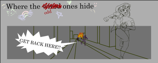
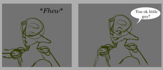
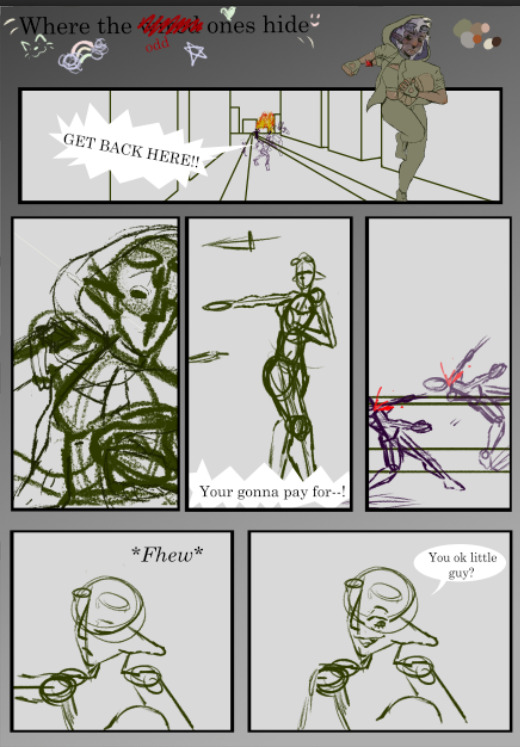
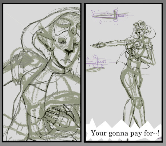
#Background Patterns Thumbnail Options
Explore tagged Tumblr posts
Visit Tumblr Blog
Explore Tumblr blogs with no restrictions, modern design and the best experience.
Last Seen Tumblr Blogs


Fun Fact
US Tumblr user growth rate is estimated to slow down to 4.1%.
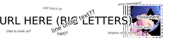
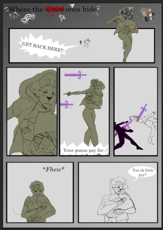
Text
…make reply icons?
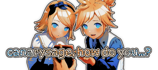
reply icons (or as i call em, replycons) are a weird kind of edit. they’re in the same genre as rentry or carrd graphics—i.e., that you can do whatever you want with no real rules. that said, these are some guidelines i follow
i. make your canvas much wider than it is tall
there’s no exact measurement for this. my reply icons for this blog are 600x150, but they’re fairly uniquely small. the general consensus at least amongst my peers is about a 4:1 or 3:1 ratio will work best.
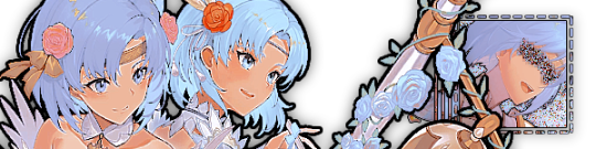
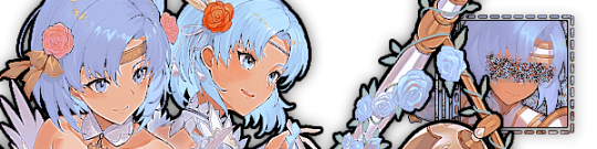
the reason why your replycons should be wider than longer is because it keeps them from taking up a lot of space. here’s mine as an example:

enough space to be visible, but not so much as to be obnoxious. that should generally be your goal.
ii. collect a wide variety of expressions
this’ll be limited depending on your characters, but it’s best to have a good variety of expressions. i also save my files with whatever the expression is to me for easier searching but you don’t have to do that LOL
also, i feel obligated to mention it, but you don’t have to stick with just one character. you can use a whole group, either an in-game group (i.e. leo/need) or a visual group (i.e. blonde characters.) they don’t even really need to match, though it’ll look better if they do. with this blog and my old ones, i used a variety of characters with the same color palette so i could get the expressions i wanted.
iii. just make the damn thing
ah, the worst part of all editing—actually editing. god fucking damn it. now that you’ve got your canvas and your character(s) it’s time to grit your teeth and make some replycons
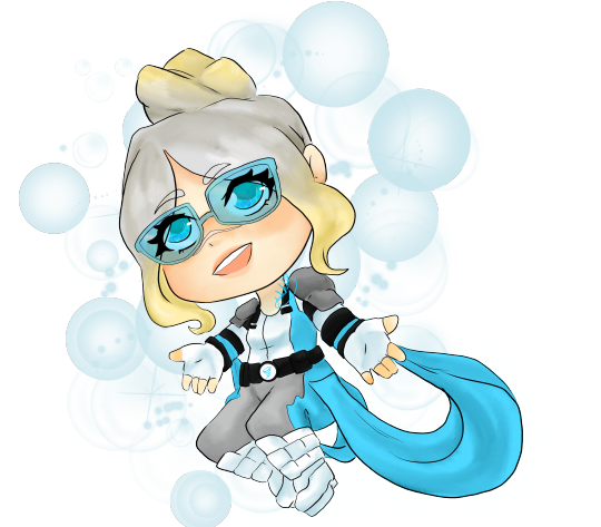
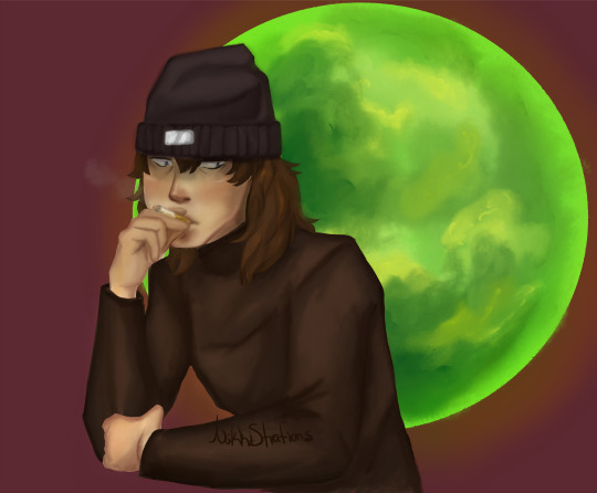
first thing i usually do is narrow down a theme. this can be as simple as a color or as complex as something like “cybercore” or whatever -core scratches your brain. for these replycons, my theme is just attempting to match the rest of my blog layout. god fucking speed.
it can sometimes help to make a thumbnail like this ^ but that’s 100% optional. i like to do it for tutorial purposes and it helps me to get my thoughts from my brain and into photopea. your thumbnail need not make sense nor be cohesive. it’s just for you to know
a good way to start is to make a shape and make it interesting—i usually make a shape and give it a border and some fun lines, rp style, but you don’t have to do that. all of those things can be done with just the shape tool. you can also find existing icon masks on tumblr or resource rentries (make sure you credit properly!!) and you can find some templates, like mine!
once you’ve got a theme and a base, start adding shit.

^ pretty easy base. i pixelated the lines around her eyes and added eyes, and added a stroke and drop shadow to the shape to make it easier to see! if you’d like, you can stop there. but i think it needs a background and some details so i’m going to keep going
background complete! for this i just used a color fill and went rasterize > filter > noise > add noise but you can add whatever you like—patterns, wallpapers, solid colors, etc. it’s up to you! i also added a small stroke around my character png so as to distinguish her from the background a little further :)
this one is a little blank on the left side so i’m gonna add some text and details!!

there we are. i added the cd png to break up the monotony of my base, added text because it’s my personal preference, and added a chibi so the text is distinguished! if you do add text, make sure it’ll be readable in any modes—light and dark. i typically add both a black and white stroke for this, and a drop shadow can help a lot, too!
an important thing to note here is any extraneous images of the character you add can’t be too distracting to the main image. if i had, for example, done this:
the new png is obviously too distracting, right? it takes up too much space and completely draws the eye away. this is even more true when the base and the png have conflicting expressions, like so:
because now i can’t tell what emotion you’re conveying—is the replycon happy or sad? what part do i focus on??
so it’s best to keep any extraneous decals pretty simple, for the sake of clarity. it’s also best to remember that english-speakers read from left to right, and native speakers are conditioned to interpret most things that way. you’ll want to draw the eye in that direction as you work, and not the other way around. hope that makes sense lmfao
iv. save as a psd
once you’ve got all your layers and details situated, make sure that you save your replycon as a psd. this is imperative, because it enables you to make new reply icons as the occasion arises, or you can recycle the basic components for a new theme!
if you’re unsure on how to save as a psd, click file in the upper left-hand corner and then ‘save as a psd.’ i recommend labeling it so you can file it more easily; i’m naming this file cobaltpegasi replycons, which is an easy template—just stick your url in instead.
once you’ve done that, keep adding expressions until you have a suitable amount of replycons! i usually made about five to ten to start with and then add new expressions as i see fit, but you can do whatever works best for you.
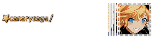
also, when saving your replycons, it helps to sort them by what emotion you think they convey. for example, my canarysage replycons are sorted by character and then by emotion—so this one is labeled “len smug” because that’s how it seems to me
you don’t have to do that, but i find it helps a lot when trying to find specific ones, especially if you have a lot.
v. go forth and use them
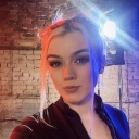
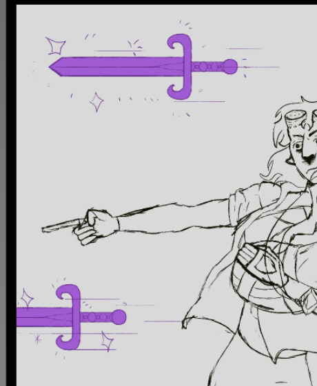
now that you’ve got your replycons done, you can use them! go forth and clear out those week old requests in your inbox (🤨) or whatever it is you want to do with them. that is all. canarysage signing off <3
…so that’s how you do it.
93 notes
·
View notes
Note
If you don’t mind me asking, how do you make your icons?

i don't mind at all!! i'm always glad to help!! i use photoshop, so what works for me might not work for you if you're using different software. although, as long as you're using something with Layer Mask, Clipping Mask, and Stroke functions, it should be fine.
what you need is a transparent icon mask, a background (a simple pattern or pride flag works best for me) and a transparent image of the character.


set your pattern layer above your icon mask layer, and set it as a clipping mask. (in photoshop, right click on the pattern layer, and "create clipping mask")
bring in the character, scale and position them as you'd like. then, optionally but recommended, add a "stroke" outline to both your character and the icon mask. (in photoshop, right click the layer, this is under blending options.)


select the "inner bounds" of your icon mask, i usually do this by using the magic wand tool on the icon mask layer. then, on your image layer, use your selection to make a vector mask (on ps, click the "vector mask" symbol here.)


you should end up with something like this! click on the layer mask thumbnail (the white shape with the black background), get a white pen, and colour in white over any extra parts you want to "pop out". (colour in black does the opposite, it's useful if you want to "erase" or clean up.)


and there ya go! icons! there's a couple other things you can do, like adding adjustment layers to filter the image or change the colours, but i'm not sure if that's possible in all softwares, and it's far from necessary.


27 notes
·
View notes
Text


Moodring Cute Shopify Theme
Our new Shopify theme Moodring is here. 🙌 With a creative design and a cool color-changing background, the theme is sure to wow visitors and make your store stand out! The theme comes with 100 fun icons, 22 quirky background patterns, 19 sections, 4 page templates, 4 menu layouts, Quick View, email popup, and more.
The theme also comes with a ton of options, from changing colors to turning elements on/off, so that you can tweak the theme and get it looking exactly how you want. No templates required! Save time and do all your editing entirely within Shopify's site editor.
NOTE (PLEASE READ): Everything you see on the demo site comes with the theme and does not require any plugins or apps. All colors, including the background, icons, and patterns, can be changed, or you can upload your own custom grpahics. Shopify OS 2.0 compatible. If you want to recreate the demo logo, a free Canva template is included in the instructions. This theme only works with Shopify.
1.3 Update (8/9/23): Added custom font upload setting, added products to the Mega Menu, added latest OS 2.0 features (complementary products, inventory status, display product rating, new filters, etc.), added a countdown timer, added "special instructions" custom field, and fixed iOS 16 menu bug.
1.1 Update (4/7/22): Added padding settings to all sections, added option to turn on thumbnails on product pages, added predictive search, added Featured Product section, added setting to change column number for collections, added control for ticker speed
1.1.1 Update (8/4/22): Added option to upload custom patterns and icons. Added setting to turn header social media icons on/off.
1.2 Update (11/11/22): Added font size option. Download Link: https://psdmonsters.com/moodring-cute-shopify-theme/
#Shopify#Shopify Theme#Shopify Theme Store#Shopify Template#Shopify Customization#Shopify Experts#Shopify 20#Shopify Design
3 notes
·
View notes
Text
Graphic Design Trends (2021–2025) – The Era of Bold, Digital Expression

Welcome to the roaring (digital) twenties! The design landscape between 2021 and 2025 was shaped by a world rebuilding after a global pandemic, a tech boom that refuses to slow down, and the relentless scroll of social media. Designers adapted, rebelled, and redefined beauty, all while juggling Figma tabs.
Let’s break it down.
🔮 1. Maximalism Takes the Stage
Forget “less is more.” In the early '20s, the pendulum swung hard toward maximalism. Loud colors, clashing patterns, excessive layering—if it looked like visual chaos, you were probably on-trend.
Why? After lockdown minimalism and clean lines, people craved energy, personality, and joy in visual form. Brands wanted to stand out in crowded feeds, not blend in.
🧠 Common traits:
Bright neons and saturated palettes
Busy compositions with purpose
Mixed typography (sometimes 4 fonts in one poster—yes, really)
Design as visual rebellion
🌐 2. 3D & CGI Integration
With tools like Blender, Cinema 4D, and even browser-based engines like Spline, 3D went mainstream. Designers embraced realistic textures, fluid morphing animations, and 3D characters that blurred the line between illustration and sculpture.
These assets weren't just eye candy—they brought depth, playfulness, and next-gen branding to websites and digital campaigns.
🛠️ Pro tip: Even Canva added 3D assets. That’s when you know it’s real.
📺 3. Y2K Aesthetic Revival
The early 2000s called—and we definitely picked up. Chrome gradients, glossy UI buttons, pixel art, and glitchy visuals were reborn with a digital twist. This Y2K revival hit Gen Z right in the nostalgia (even if they weren’t born yet in 2000).
📼 Expect to see:
Lens flares and liquid metal text
Checkerboard backgrounds
Cyber-dystopian meets Barbie-core
Notable example: Spotify’s genre art and album covers, especially for hyperpop.
🌈 4. Inclusive, Purpose-Driven Visuals
Social movements translated into visual design. Brands didn’t just want to be seen—they wanted to be seen doing good. Diversity, accessibility, and authenticity became essential—not optional.
👥 This meant:
Diverse skin tones in illustrations
Gender-neutral icons and avatars
Subtitles and text contrast for accessibility
Ethical stock photography and custom character designs
Design had to feel real, not staged.
🎨 5. Flat 2.0 / Semi-Flat Design
Flat design made a comeback, but this time, it had shadows, gradients, and a touch of depth. Called Flat 2.0, it merged the cleanliness of flat design with a touch of realism—perfect for responsive UI and UX design.
Think: Google’s Material Design meets Gen Z TikTok energy.
📱 6. Social-First Design Thinking
Designers started treating Instagram carousels and TikTok covers like gallery walls. Motion graphics, thumb-stopping thumbnails, and infographics reigned supreme. Tools like Figma, Canva, and Adobe Express made social storytelling design more accessible than ever.
🎯 Everything had to pop on a 6.1-inch screen… or be scroll-fodder.
🧬 7. AI-Assisted Design
AI tools like DALL·E, Midjourney, and ChatGPT started influencing the design process—not replacing creativity, but accelerating it. Designers used AI for:
Moodboarding
Generating mockup concepts
Writing UX microcopy
Color palette generation
Cue the existential questions: Am I still a designer if I prompt instead of draw? (Yes, friend. You’re just evolving.)
📡 8. Dynamic Brand Systems
Brands started ditching static logos and embracing dynamic identities. Spotify’s logo? Always the same. But the surrounding graphic language? Always shifting to match mood, genre, or audience.
This approach allowed for flexibility across platforms, especially when brands needed to adapt globally and contextually.
🤯 Unique Fact of the Day
In 2023, Adobe reported that motion design demand rose 78% in just one year. Why? Social platforms prioritized video content, and brands wanted thumb-stopping animations—even for logos. This was the era of "If it moves, it wins."
🧪 Creative Challenge
Pick any two trends above and design a visual that blends them. Example: Y2K color palettes with dynamic brand identity. Or flat 2.0 + 3D mashup. The goal? Make something uncomfortably bold.
Post it. Be loud. Get weird.
https://letterhanna.com/graphic-design-trends-2021-2025-the-era-of-bold-digital-expression/
0 notes
Text
Chatori Clips: Your Gateway to Bite-Sized Entertainment
In today's digitally-driven world, where attention spans are becoming shorter and time is valuable, Chatori Clips has emerged as the top destination for fans of entertainment who are looking for quick exciting and captivating material. The platform's unique approach is offering carefully selected short-form content that pack maximum entertainment into only a short amount of time.
A Fresh Take on Digital Entertainment
Chatori Clips is distinctive from the crowd of entertainment options in the digital market by focusing its attention on what matters most to modern viewers: quality content that fits seamlessly into their hectic lives. The name itself expresses its essence "Chatori" suggests a tasteful selection, while "Clips" emphasizes the bite-sized nature of the content it offers.
The user-friendly interface of the website welcomes visitors with a dynamic grid of thumbnail previews, each promising a unique entertainment experience. From hilarious comedy sketches and memorable film moments to trending dancing challenges and viral hits, Chatori Clips offers a varied selection of categories that cater to varied tastes and preferences.
Content That Captures Attention
What differentiates Chatori Clips apart is its focus on quality over quantity. The platform's content team uses rigorous selection procedures to ensure that each video on the site has the highest quality entertainment standards. Videos typically span from 15 seconds to 3 minutes, making them perfect for quick viewing during breaks during commutes, when people need a bit of entertainment.
Content categories on the platform include:
Popular Entertainment Highlights: judiciously selected moments from television, movies, shows, and web-based series that convey memories of unforgettable scenes, without having viewers watch complete series or films.
Viral Sensations: A collection of popular videos that have grabbed the internet's attention. It also saves users from the hassle of searching through different platforms to find the most talked-about content.
Comedy Shorts Comedy Shorts: Original and licensed comedy clips that offer quick laughs and memorable punchlines, perfect for sharing with friends and your family.
Music and Dance: Short music videos including dance performances, choreography clips that showcase talent and creativity in condensed formats.
User Experience and Accessibility
Knowing that today's users consume content on a variety of devices, Chatori Clips offers a fluid design that can be easily adjusted to different screen sizes. Whether accessed on smartphones, tablets or desktops, the platform maintains its intuitive navigation and smooth playback.
The website has advanced search and filtering options that allow users to find the content that matches their interests. The sophisticated system of recommendation is able to learn about viewing patterns to suggest relevant videos, creating the perfect entertainment experience for every user.
Community and Social Integration
Chatori Clips isn't just a viewing platform for the passive it's also a community where people who love entertainment can connect and share their favourite moments. The platform offers social features that allow users to:
Share videos directly to top social media sites Create customized playlists of their most-loved clips Engage with other users by posting comments and retweeting Follow the creators of content and channels they like
Technical Innovation
In the background, Chatori Clips makes use of cutting-edge technologies to assure high-quality video delivery and performance. Advanced compression algorithms maintain quality of the video while reducing loading times, and adaptive streaming technology guarantees smooth playback regardless of the speed of the connection.
Mobile-First Approach
Realizing that the majority of users consume content in short form on their mobile devices, Chatori Clips has developed an approach that is mobile-first. The mobile app for the platform has additional features, such as offline watching, push notifications of new content, and vertical video optimization for a more natural viewing on mobile devices.
Looking to the Future
As the digital entertainment landscape continues to change, Chatori Clips remains committed to advancing and adjusting. The platform is constantly updating its content and features in response to feedback from users as well as emerging trends in digital entertainment.
Plans for future development include:
Integration of augmented reality (AR) features to provide enhanced viewing experiences
Expanding the production of original content
Application of AI powered content suggestions
Introduction of interactive features which allow users to take part in content creation
Conclusion
In a time where entertainment options are numerous but time is short, Chatori Clips has successfully found its niche through offering top-quality and short-form entertainment content. By combining thoughtful content curation along with an easy-to-use interface, the platform continues to attract viewers seeking rapid, exciting entertainment.
You may be looking for laughter during your coffee break, wanting to keep up with the latest trends in viral media or simply looking for some entertainment Chatori Clips provides an efficient solution for modern viewers. While the platform continues to expand and develop and evolve, it will remain dedicated to its main goal offering premium entertainment that's perfectly sized to meet the demands of today's busy lifestyle.
1 note
·
View note
Note
I agree with the other anon about some of the designs being hard to see, maybe you can find a different sweatshirt mockup that’s folded that you can zoom in more for the thumbnail? Also I’d recommend changing the background images, the circle/diamond pattern doesn’t really do anything to help the clothing items stand out and feels distracting instead. Maybe you could do different solid colors/textures depending on what era the item is for? (Purple sparkles for speak now, handwritten notes for ttpd, red knit for red etc etc) that way as someone scrolls through your items they can clearly tell what era everything is for?
Yeah I’ve thought of that it’s tough bc the mock ups on the embroidery site are slim to none. I guess I could just do the circle & get rid of the diamond? Like the circle for the era color. I tend to not do era color sometimes and whatever looks good with the product itself. Buttttt the company I use for regular sweatshirts doesn’t have a folded option for mock ups
0 notes
Text
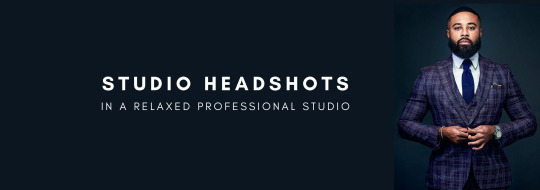
Looking for a Photographer to Capture Your Company’s Headshots? Here’s a Step-by-Step Guide to Help You Organize the Process Efficiently.

1. Budget
Start by determining how much you’re willing to invest in your company’s headshots. If you only need casual lifestyle photos or a few thumbnails for a small team page, you might be able to manage with your phone. However, for photos that are crucial to your website’s design, high-resolution professional images are essential. Typically, the cost of a professional shoot includes a pre-production consultation, the photographer’s services (often with an assistant), travel costs, and editing (post-production). Since it’s difficult to provide a per-person rate without all the details, photographers often offer pricing for the entire package.
• Can you handle it yourself?
• Do you have a friend who can offer a discount or do it for free?
• Invest within your means—professional photos can serve you well for the next five years.
2. Photoshoot Schedule
It’s best to plan your shoot at least 1-2 weeks in advance. This gives ample time for preparation and allows you to share sample photos that inspire you from our portfolio. This helps us understand your vision and preferences.
• Schedule the shoot at least 1-2 weeks ahead
• Block out extra time in your calendar, as the session may take longer than anticipated
3. Studio vs. On-Location Shoot
You’ll need to choose whether you’d prefer to shoot in your office or at a photography studio. A studio setting may offer a better deal since it avoids travel expenses. However, if you have many employees needing headshots, it may be more convenient to hold the shoot in your office.
• Studio offers a more controlled setup
• Office shoots are more convenient, especially for larger teams
• Lower cost without travel expenses
• Interested in an outdoor setting?
4. Background and Final Look
Planning allows time for your team to prepare and helps ensure you have a clear idea of the final look and background for the headshots. The choice of background is crucial—if your website has a specific style, be sure to communicate that to your photographer. If you’re unsure about the background or style, we’re here to guide you in making the best decision. You can also browse our Corporate Page to see examples of different background options you may like.
What Type of Photos Do You Need?
• Headshots
• Full-body
• Waist-up
• Horizontal, vertical, or square?

Why Do You Need the Photos?
• Website
• Social media
• Print materials
• Ads
What Message Do You Want to Convey?
• Friendly and approachable
• Fun and creative
• Modern and dynamic
• Professional, serious, and competitive
5. Choosing the Right Spot in Your Office
Selecting the right location in your office for the shoot is key. Photographers typically use portable equipment, so they don’t need much space and can even set up in a hallway. While natural light isn’t necessary, as photographers bring their lighting, a dedicated space like a conference room is preferable for your team’s comfort. Some employees may appreciate privacy to feel more at ease during the shoot.
• Can be set up in a hallway
• Conference rooms are ideal
• Natural light isn’t required
• No need for a freight elevator or nearby outlets
6. Confirming the Number of People
To stay organized, create and print a final list of all participants. It’s also helpful to create a timesheet with designated slots for each person to streamline the process.
• Print a list of names
• Create a schedule with time slots
7. Outfits for the Shoot
Depending on your company’s style, you can opt for a traditional corporate look (jacket and tie for men, blouse or dress for women) or a more modern, casual “startup” style. While older rules may suggest avoiding stripes, busy patterns, or layers of the same colour, modern cameras can handle these well, so feel free to wear what suits your vision.
• Do you have a corporate colour?
• Ensure clothes are pressed and clean
• Try on your outfit beforehand
• Avoid baggy or ill-fitting clothing
• Bring extra jackets, shirts, and ties for flexibility
• If wearing glasses, ensure they have an anti-glare coating
• Have a nice watch? Consider whether it should be featured
• Get a fresh haircut
• Make sure to rest well before the shoot
8. Makeup and Hair Services
While individual photoshoots often include makeup and hair services, this is usually different for corporate shoots with multiple people. If you opt for makeup services, make sure to schedule sufficient time for touch-ups. Otherwise, ensure participants arrive camera-ready.
• Prepare a mirror
• Bring finishing powder
• Keep a lint roller and blotting paper handy
9. Reminder for Your Team
Send out reminders the day before the shoot to ensure everyone is prepared and well-rested. Avoid scheduling shoots after corporate events to ensure participants look fresh.
• Send a reminder the day before
• Encourage participants to rest well
• Avoid scheduling the shoot after corporate dinners
10. Photographer’s Information
Ensure your photographer is registered with your building’s security to avoid delays. If required, confirm whether the photographer needs a Certificate of Insurance (COI).
• Register the photographer with security
• Do you need a COI?
11. Setup Time
Photographers typically need about 20 minutes to set up. To ensure everything is ready, we usually arrive 30 minutes before the shoot. It’s always nice to offer water or snacks while we get everything in place.
• Allocate extra time for setup
• Consider offering refreshments
12. Tips to Relax and Feel Comfortable During the Shoot
We understand that photoshoots can be nerve-wracking, especially in a corporate setting, but our photographers guide clients every step of the way. If you’re unsure about posing or feel self-conscious, don’t worry—it’s completely normal. We’ll help you with everything, from what to do with your hands to finding the most flattering angles. We also like to play light music and keep the atmosphere relaxed with casual conversation and a few jokes.
• Guidance on how to pose and where to place your hands
• Tips on the best angles for you
13. Test Photo
Before the official shoot begins, we’ll take a series of test photos to ensure everything looks perfect. You’ll have the chance to confirm with your supervisor or manager if they approve the look before we proceed.
• Take test photos
• Confirm with your boss before starting
14. Timing
On average, it takes around 7 minutes per person—approximately 5 minutes for men and 10 minutes for women, depending on the setup.
• 5 minutes per man
• 10 minutes per woman
15. Selecting the Final Photos
We bring a computer to every photo shoot and connect it to the camera so you can review the images in real-time. This way, each person can choose their favourite shot for retouching.
• Select your best photo on-site
• An external screen is available for easier viewing
• If pressed for time, we can select photos for you
16. Photo Editing Process
Our retouching process includes adjusting skin texture, removing imperfections, brightening teeth, editing hair, adjusting outfits, and even body sculpting if necessary. We also correct backgrounds and can coordinate with your web designer to match any style requirements for your website.
• Imperfection removal
• Outfit adjustments
• Body sculpting if necessary
• Background corrections
• Black and white and cropped versions can be provided
17. Extra Options
If needed, we can also offer additional services like candid shots, group photos, or even product photography and video testimonials. Just let us know what you need!
• Candid and group shots
• Product shots
• Video testimonials
18. Turnaround Time
Our typical turnaround time is 5-7 days for editing, but if you have a tight deadline, we can expedite the process at no extra cost. We’ll send you a link to download all the digital files once the editing is complete.
• 5-7 day turnaround for 30 people
• Same-day edits are available if necessary
19. How to Receive Your Photos
We’ll send you a link to preview and download the images. Be sure to check whether your corporate system blocks services like Dropbox or if email delivery is more suitable.
• Is Dropbox blocked on your company’s computers?
• Can you receive large files via email?
SMILE :) IT’S DONE!
Preparing in advance makes a huge difference, so take care of the little details to ensure your photoshoot runs smoothly!
0 notes
Text
5 Easy Tips to Customize SharePoint Image Galleries
Adding an image gallery component to SharePoint can be a great way to showcase photos, graphics, or other visual media. However, the default SharePoint image gallery may only sometimes fit your specific needs.
In this article, we'll cover five helpful tips to customize the default image gallery component in SharePoint Online and adapt it to your requirements.
Whether you want to change branding colors, resize thumbnails, modify image spacing, or alter the overall layout, these tips will show you how.
1. Switch Between Gallery Layout Options
SharePoint offers three main layout options for image galleries:
Slideshow - Images display one at a time in full-size
Grid - Images display in an evenly-spaced grid pattern
Carousel - Images rotate through horizontally in a slideshow-style carousel
To change the layout:
Go to your SharePoint site and edit the page with the image gallery web part.
In the web part toolbar, click the ellipses (...) icon.
Select Gallery Layout and choose your desired option.
The carousel or slideshow styles work great for hero images or featured content. The grid layout makes better use of space for multiple smaller images.
2. Adjust Gallery Image Sizing and Spacing
In a SharePoint image gallery, you can customize the display of thumbnails in a grid layout:
Thumbnail Size - Pixel width/height of each thumbnail
Spacing - Amount of space between thumbnails
Columns - Number of columns to display per row
To modify these settings:
Edit the page and select the image gallery web part.
Open the web part toolbar and click Web Part Settings.
Under Images, adjust the values for Size, Spacing, and Columns.
Reducing spacing and columns allows you to fit more thumbnails without needing to shrink them too drastically.

3. Add Custom Branding Elements
You can introduce custom branding to your SharePoint image gallery to match company colors or themes:
Colors - Set background/text colors
Icons - Replace default icons
Logos - Add a header logo
To apply custom branding:
Download theme assets like images, CSS, etc.
Upload files to Site Contents document library.
Edit gallery web part > Web Part Appearance > Customize.
Adjust background, text colors, add CSS overrides.
Add element ID tags to insert logos/icons.
Even small branding tweaks make the gallery feel more integrated into your unique site.
4. Build Custom Galleries from Scratch
For full customization control, you can build your image gallery web part from scratch:
Create HTML image gallery markup yourself
Style it with custom CSS
Add any desired functionality with JavaScript
Embed gallery in web part HTML editor
Some key elements to include:
Container div for gallery
Image thumbnail grid layout
Lightbox plugin for overlays
Image titles/captions
Control buttons
Going fully custom allows unlimited adaptations but requires more effort. Great for advanced users with specific needs.
5. Use Third-Party Gallery Extensions
If you want robust gallery features but don't have coding expertise, gallery extensions are a great option:
Column Slider - Add image sliders in columns
Filter - Filter images by tags/categories
Lightbox - Expand images into full-screen overlays
Videos - Embed videos in your galleries
SEO - Optimize galleries for search engines
Learn how to customize SharePoint Online image galleries with 5 simple tips for modifying default layouts, adding custom branding, changing thumbnail sizes, and more.
0 notes
Text
Newsmag News Magazine Newspaper v5.4.3.1 Theme
https://themesfores.com/product/newsmag-news-magazine-newspaper-theme/ Newsmag News Magazine Newspaper v5.4.3.1 Theme The Newsmag is a Blog, News, and Magazine theme and template is excellent for a personal blog, news, newspaper, magazine, publishing or review site. It also supports videos from YouTube and features a rating system. It uses the best clean SEO practices, and on top of that, it’s fast, simple, and easy to use. News mag supports responsive Google Ads and AdSense. Build your WordPress website without any coding skills. 14+ Unique Pre-built Websites. Designed to be simple, easy to use, and load fast, Newsmag Theme is packed with powerful features that help you start your website in minutes and make it successful. You Can Make Explore Beautiful Website: Newsmag 5 News Magazine Scandal Magazine Good Food Clear Voice Car News Sound Square Animals Magazine Travel News Fashion News Tech News Video News Spor News Classic Blog Theme features: Optimized for mobile Accelerated Mobile Pages (AMP) Responsive Google AdSense Responsive ads support Inline Google AdSense or other ads Ads on AMP Auto YouTube, DailyMotion, and Vimeo thumb downloader Unlimited sidebars Changelog: Version 5.2.1 – June 2nd, 2022 new: WordPress 6.0 compatibility; new: Added Facebook Login functionality; new: Option to exclude posts from specific tag on blocks (-slug); new: Captcha on comment submit; new: Option to disable the sticky menu on the Mobile Theme; new: Option to set the background color for mobile navigation toolbar from Theme Panel; misc: Added the WhatsApp social icon; misc: Raw Html ACE editor; misc: Added show posts/comments options on Authors Box; misc: Video Popup Ad – Added do_shortcode() support; misc: Added home.php template on Mobile Theme – used by page_for_posts blog misc: We’ve updated the Revolution Slider plugin to the latest version; misc: ‘Review’ schema now works with points and percents; misc: Added nofollow option in Theme Panel for block thumbnail; misc: Added Subtitle, Source and Via on CPT Settings; misc: Exclude current post from blocks; fix: Column Text and Text with Title issue on WordPress 6.0; fix: MegaMenu with subcategories issue on WordPress 6.0; fix: Don’t download video thumb if featured image is set; fix: Added some texts to Translations; fix: Losing style on buddypress templates fix: Fatal error on YouTube playlist; fix: Menu/search gradient (opacity) issues on AMP; fix: Fatal error in specific conditions; fix: Pattern for the Category number in the widget; fix: Comment moderation message on the Mobile Theme; fix: Remove Login/Register HTML when the user is logged in; fix: theme.json issue on Mobile Theme fix: List Menu – The menu hover color option now also applies for the current menu element classes; fix: Missing theme meta boxes (conflict with some plugins) fix: Missing subcategories in widgets filter. Please note: that any digital products presented on the themesfores website do not contain malicious code, viruses, or advertising. https://themesfores.com/product/newsmag-news-magazine-newspaper-theme/ #NewspaperThemes #WordpressTheme
0 notes
Text
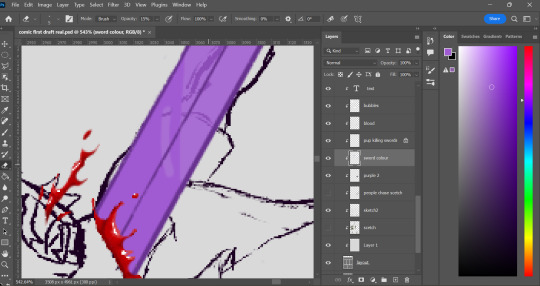
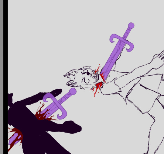
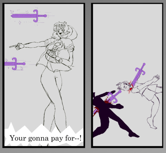
in the website Step-by-Step Guide: My Comics Process (comicsforbeginners.com) the steps to making a comic are: 1: Script, 2: Thumbnails, 3: Rough sketches, 4: Borders and lettering, 5: Borders and balloons, 6: Sketching, 7: Inking, 8: Scanning and clean-up, 8.1: Colouring (optional) and 9: Repeal and replace.
i started my comic in a similar way to this process, starting with a script of sorts. i didn't have a full story written out, i still don't, but i knew the knew the story, even as it changed due to doing more research i know i will need to write the story out eventually, but i know how it starts and ends.
one difference however i don't think i made any thumbnails for my first page though i did toy with a different starting point, but i found it didn't flow how i wanted it to so i changed it into the comic im working on now. i do however have some thumbnail like pencil sketches of other parts of the story as well as a few more pages continuing the time line at the start.
once i figured out the comic panel layout i started my basic sketches, being rough and quick meant i did have to re draw a couple of them just to make them give the look and feel i wanted it to. using reference pictures for this part was vey important as to make the characters look fluid and real, in fact the drawings that i re did were where i didn't use a reference making the pictures look stiff and not believably like my character was a real person.


i written in the sketch what i wanted the people to say i used the basic font as a place holder and i plan to find a better font for the final product.
i need to finish all the background sketches but i have the basic sketch done.
another differnce is that i sketch straight onto the computor whereas this artist draws on paper and scans in their picturesad inks them digitally.
i was going to do clean line work but i prefer the sketchy look over clean lines i feel it makes my work mor fluid.
once i was happy with the sketches i have now started with the colour thought i did do this part a bit out of order to start with but now im doing it in a more concise pattern.

0 notes
Text
Version 541
youtube
windows
zip
exe
macOS
app
linux
tar.gz
I had a good week. There's a mix of all sorts of work.
full changelog
highlights
Thanks to a user, we are adding support for two more filetypes today: QOI, which is a png alternative, and Procreate, an Apple image project file. QOIs have full support, Procreate files just have thumbnails.
If you use one of the darkmode styles on Windows and your tooltips suddenly got too dark to read a couple weeks ago, please check out the new 'alternate-tooltip-colour' variants of the styles in the options. It should fix you up for now. Try switching back when we move up to a new version of Qt again--it is a bug on their end.
There's two new checkboxes in options->media to ignore 'uninteresting' import and modified times. By default, if the modified time is very close to when a file was added to 'my files', I hide it in the media viewer. If you would prefer to always see it, you can now set this.
Importing massive apngs is now significantly faster.
The parsing system has a new 'String Joiner', which does string concatenation. It can glue the strings together with any custom text, including the empty string for pure concatenation, and it can join groups in 1-2 1-2 1-2 or 1-2-3 1-2-3 style patterns too.
The Client API can now fetch the siblings and parents of tags. If you want to get into siblings and parents but have never done it before, it can get complicated, so brace for impact.
file storage upgrades
I started on this work this week, but it is all boring behind the scenes stuff so far. I'm happy with the progress though, and I'd like, in the nearish future, to have:
- lower file access latency when you have millions of files
- the ability to say 'store no more than 200GB in this folder'
- background migration of files rather than the current block-the-whole-program-for-ages 'move files now' system
I'll keep chipping away at this over the next few weeks. I feel good about it.
next week
More like this. Catchup on older issues and pushing on file storage.
1 note
·
View note
Text

Forest Friends Dress for Kids and Toddlers
awh yeaaaaah back with some cottagecore content once again lmao. basically, you know the super cute rabbit pattern that came on some of the build/buy stuff with cottage living? I love it, but wanted some different colour options, and rather than dick about in photoshop I just redrew it myself, made the drawings a bit more vibrant, and did a bunch of background colours. Anyway, I figured it would make a cute dress, so made a matching set for kiddos and toddlers!
It comes with 3 dress patterns (beige background, green background and charcoal background), each with 17 different undershirt colours. And I'm sharing the patterns, too, in case anyone wants to use them!
Details, downloads and swatch previews under the cut :)
@maxismatchccworld @emilyccfinds @mmfinds @mmoutfitters
Huge thanks to everyone who helped test them! You're all literal angels tysm!
Details
Matching dress set for children and toddlers. BGC!
Three different dress pattern options, each with 17 undershirt options - so, 51 swatches in total.
Custom thumbnail, disabled for random, correct colour tags.
Dress Swatch Previews
Obviously not all 51 swatches because that would be mad lmao asdfgh but here are all the undershirt options. Each one is available with white, charcoal, and green patterned dresses.
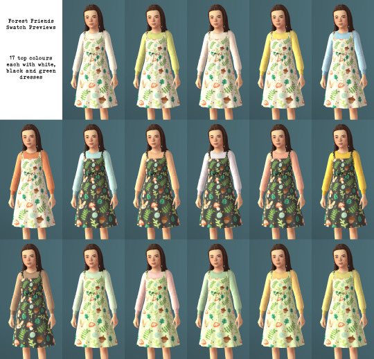
Bonus Patterns
Sharing the patterns I made, too! Available both as PNGs and Photoshop pattern files. Feel free to use them however you want, just please credit back if you do :)

Aaaand I think that's it lmao, sorry for the ridiculously long post! I really enjoyed this one, and I hope some of you like them, too! And as always, please let me know if there's any issues!
Download: SFS │ Patreon (both 100% free for everyone)
#TS4 cc#sims 4 cc#ts4 cc#sims 4 maxis match#maxis match cc#my cc#sims 4 custom content#sims 4 cute cc#ts4 cute cc#simblr#ts4cc#sims 4 clothes#ts4 clothes#cas cc#ts4 cas#sims 4 cas#sims 4 cas cc#ts4 cas cc#sims 4 kids cc#sims 4 child cc#ts4 kids#ts4 kids cc#ts4 child cc#sims 4 childrens cas#sims 4 kids clothes#ts4 kids clothes#sims 4 toddlers#toddler cc#ts4 toddler cc#sims 4 cottagecore
1K notes
·
View notes
Text
Commission Info and Types
Payments are accepted via Paypal and CashApp
I reserve the right to turn away commissions for any reason.
Terms:
All commissions are for personal use only, I do not condone the commercialization of my art.
Art takes time, especially with my being in school at the moment. Usually, art can be made and finished anywhere between 3 days to 1.5 weeks, but delays may happen due to school projects or personal issues. Any and all delays will be communicated when they occur.
I have never encountered a refund issue before, as all of my clients thus far have left happy with their commissions. I keep my clients updated on their commissions from showing them concept sketches to making sure that it is what they want, to asking if they have anything they want or need to be adjusted in the finished piece before the final cut is sent to them.
Instructions to the Buyer:
I can draw any character from any fandom so long as there exist references, just note there are obviously going to be style differences.
If you want an original character, then I will be needing references for them, too. Most often, already drawn up designs are preferred.
I can work with inspo pics, too, as long as there is some for body type, hair, and outfit. I do prefer to discuss these types of comms before-hand, though. Please, see my socials and choose your preferred way to contact me for them. Any extra information I may need I will ask you for in discussions.
Commission Types: Under the cut with example images
Full Body, Flat Color:
Full body art, flat colors (no shading) of any character you like (canon existing or OC).
Single-color backgrounds only, but simple patterns can be negotiated.
Price: $25
Add-Ons:
Add Character +$15
(Examples TBA)
Full Body, Full Color:
A full body line art + full color art of a character of your choice.
Additional characters are charged extra. Simple, single-color background included in the base price.
Price: $50
Add-Ons:
Add Character +$15
Complex Background +$20
Background Add-Ons (Flowers, etc) +10

Chibi Character:
Any character of your choice, drawn as a chibi! These commissions are fully colored. SImple backgrounds like in the examples are options, but not required.
Price: $15


Single Character Sketch:
A digital sketch of any character (canon existing or OC)
Price: $15
Add-Ons:
Add Character +$6 per character


Sketch Page:
A page of digital sketches of a character of your choosing (canon existing or OC)
Price: $35
The following commissions are paintings! Please note that they will take more time than other commission types, so please be patient if you commission them from me.
Character Painting, Bust:
A bust painting - full color - of a character of your choosing (canon existing or OC)
Price: $40

Character Painting, Full Body:
A full body, full color painting of a character of your choice (canon existing or OC). Single-color/simple backgrounds are included in the base price.
Price: $80
Add-Ons:
Add Character +$40
Add to Background (Flowers, etc) +$20
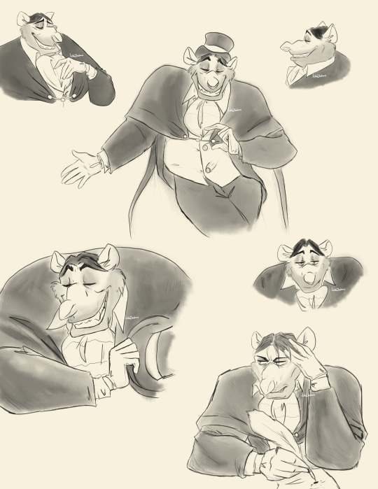
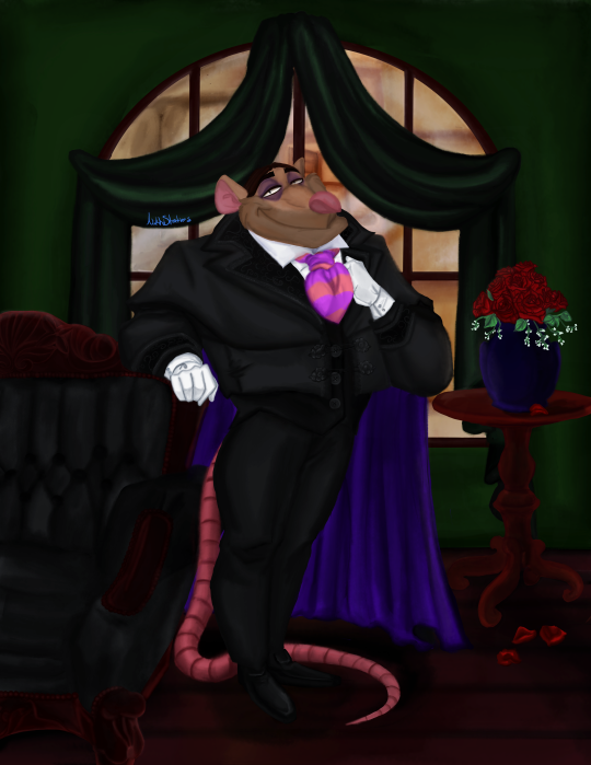
Complex Background (Ratigan example) +$30

Object Painting:
A digital painting of objects or a concept suggested by you! You tell me what you want to whatever specifications you have, and I will draw up some thumbnails before painting for you to choose from.
Price: $70

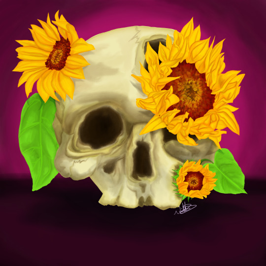

#nikkistrations#commission#commissions#commissions open#skull#skulls#painting#frog#bakugou#ratigan#mina ashido#origianl characters#tfp wheeljack#beast wars#self insert#kny oc#chibi#chibi chibi#magical girl#commission art#art commisions#the great mouse detective#paypal#cashapp#emergency commissions
7 notes
·
View notes
Text
I’ve been doing a lot of recolors (most of them for my own entertainment, and a lot of them of other CC that I needed in just a hue lighter/brighter/bluer etc, which I won’t share), so I thought I’d make a simple tutorial for how to do recolors.
First of all, you’re going to need Sims 4 Studio (You need to register to be able to download the program).
Once you have that set up, you can instantly work on every item that is in the game. (If you want to recolor CC, you need to put a copy of the original CC file into the folder Documents/Sims 4 Studio/Mods. Please me mindful that creators almost never allow you to recolor their stuff without giving credit to them; if you intend to share your recolors with others, make sure you give due credit!)
Next, I’m going to show you how to open items in S4S.
This is the main interface

You’re always want to check the first option to do recolors. For CAS items, it’s “Create CAS Standalone”. Then, click on the blue button above.
Next, you’ll get a list of filters that you can apply to find the item you want. (Again, note that if you want to recolor CC, that CC needs to be in the S4S/Mods folder, and you can filter for “Custom” under Content)

I’m going to pick this simple black T-Shirt. If you want to export several swatches, hold CTRL while selecting the other swatches of the same shirt.
Next, you’ll be asked to save your package. I have a folder selected for all my CC, and I name my items “RhiannonAR_itemname_recolor”.
Next, you can see all the textures used in the item.
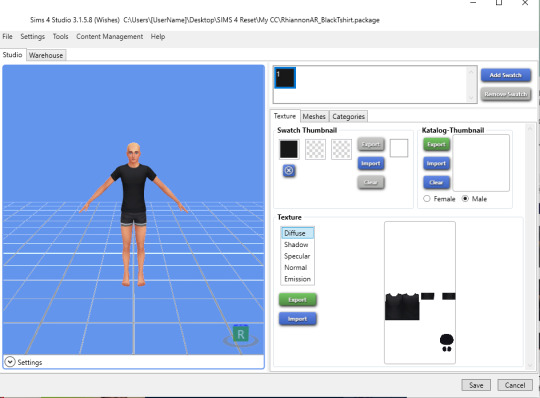
You’ll want to export the “Diffuse��� texture, which is the color and pattern. There are secondary textures that are overlays for shadows etc. You can ignore those.
Sometimes, however, an item will have two main textures, especially BB items. E.g. a bed would have one texture for the bed frame and one for the mattress. If you only want to change the bedding, you export whatever you need to recolor. You’ll see this if you click through the available textures.
Export the texture as PNG file.
Now you can open that PNG in Photoshop or Gimp or - something I highly recommend using if you don’t have Photoshop - photopea.com, which is basically an online clone of Photoshop
Once opened, you’ll see this:
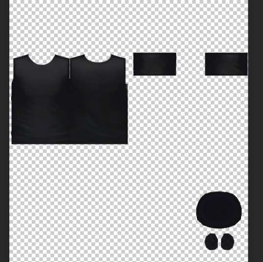
The circles a the bottom are the insides of the sleeves and the shirt itself. If you don’t drastically change the color, you can ignore those.
Right now, we’re just going to add a print.
I’m going to search for an image of a shark with a transparent background now. Transparent background will make it easier to copy the image without having to cut anything. A good idea is to search for “clipart” and then download it directly from the source. There are many platforms with free art and textures that you can use.
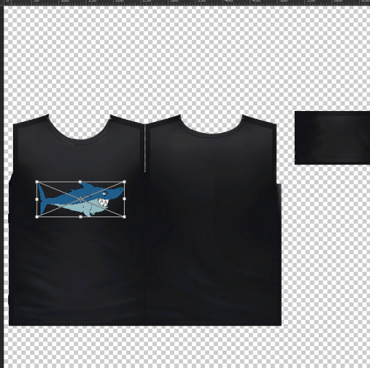
(At this point, if you’re not familiar with placing and editing items in graphics programs such as PS, it might be a good idea to look for a tutorial on this)
Save your image as PNG under a different file name.
Go back to S4S and import

You can zoom in your model by scrolling, move by holding the scroll wheel, and tilt and rotate by right clicking.
You can now also edit the thumbnail, either importing an image or just changing the color. I’m always too lazy to make thumbnail images, so I just do colors. I’ve just added two more colors.
If you want to make more swatches, just click “add swatch” and repeat the process. The prog will copy the last swatch as template for the next.
I wanted to make another swatch with the bi pride flag, but it was too big.

So I just went back and made it a little smaller (also, it’s a VERY good idea to save the PSD file of your project).

That’s better.
Next, you could go through the categories and e.g. change the color for the catalogue (when you filter for colors in CAS), or make the t-shirt suitable for evening wear etc. You can also disallow it for random if you like.

Lastly, SAVE the project and then go into the folder you saved it in, and copy (or move, but I always copy) that into your Sims 4 Mods folder. I have a sub-folder there called “My CC”.
If you’ve realized you actually wanted to export another swatch as base to edit, you have to repeat the process and select a different one. I am now using the blue swatch as base, but then I’m going back to my previous project in the main menu of S4S and am adding the new swatches there.
The easiest way to just change the color of something is by adjusting “Hue/Saturation”

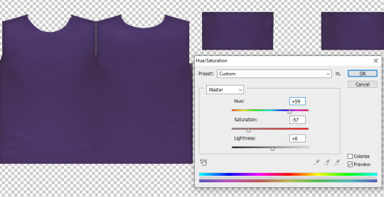
Depending on how often you do that, however, and how drastic the adjustments are, it can get pixelated and fuzzy.
An alternative is to create a layer with a color as overlay for the original texture. For that, hold CTRL and click on image of the original layer:

It will then automatically outline all the objects. Make a new layer - the mask will remain active - and then fill the areas with the paint bucket tool.
Then, you can play around with that layer. Hue or Color always works well.

You could also change the opacity of the layer to make it less vibrant. Or you could even fill the layer with a pattern.

Now you have a texture to the fabric. You can experiment a lot here.
I’m leaving it as it was.
AND NOW, since you have a solid fill color, when you go to “Hue/Saturation”, you will get no fuzziness.

I also added the bi flag again. But that doesn’t go with this horrid rust color, lol.
Now I’ve gone and desaturated the base layer, and then added the color fill one as “overlay”

Again, this is something where you can play around a lot to see what works best.
If you want to have light, pastel colors, you need to work with the white base. So it’s always a good idea to select several swatches at the beginning, export them all, and then see what you can use best.

I’ve added the swatch to my project and saved it.
Lastly, if you want to recolor items that have many different areas and textures, you’re gonna have to put more effort into it. Quick selection, eraser, and how to work with multiple layers will be important tools to learn. But with these basics, you’ll have a good starting point.
Hope you enjoyed this tutorial and found it helpful. :-)
13 notes
·
View notes
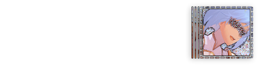
Photo

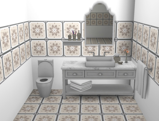

Fancy Tiles Set
This is a set of 8 fancy floor tiles with matching wall tiles in various styles and colours. I have colour matched the background paint on the walls to colours found in each of the tiles, each tile has 3 background colour options. The thumbnails have been coordinated for easier set locating. To see all of the swatches please visit my patreon here.
Drop this and let the whole world feel it...
As with all of my creations, if you find any issues, please let me know.
All of these patterns where pulled from the free resources section of freepik.com
My Recolours (patreon, always free)
To view all of my wallpaper kit sets please click here
@mmfinds @mmoutfitters
215 notes
·
View notes
Text
Art Commissions and My Etsy Shop
I have an Etsy shop. I'm offering digital art commissions, and have some games that I need gone as soon as possible.
My badge commissions can range from $15-$40 dollars, with the price indicating the complexity. Black and white don't count towards color limits.
$15 dollars nets you a simple badge, with a max of one color and doesn't have a guaranteed background slot; best for linearts/color your own. $20 nets you a basic badge, with a max of three colors and doesn't have a guaranteed background slot; best for lightly detailed characters or for art done in various shades of one color. $25 nets you a moderate badge, with a max of six colors and a guaranteed background slot; best for moderately detailed characters or for complex color pallets. $30 nets you a detailed badge, with a max of eight colors and a guaranteed background slot; great for decently detailed characters or complex backdrops. $35 nets you a complex badge, with ten or more colors and a guaranteed background slot; great for sparkledogs and other very colorful characters. $40 Nets you a Surprise Me! or Artistic Liberty badge, with Surprise Me! meaning I do the maximum complexity badge, complete with badge and text, that I feel comfortable doing that best fits your character. The Artistic Liberty option means that you give me a few key details, like which direction you want your character to face and if you want a background, and I'll add any other details that best fit your character.
Examples of some badges I've made for myself below.


My art, logo, symbol, and thumbnail/banner commissions can range from $10 to $38, with size and type of art being what determines the price. Thumbnail/banner options are out of stock, though. Under the examples for my art, I'll explain the prices for having your art/logo/symbol printed out to be shipped to you.
Px means pixel, in case you didn't know. Tiny: 500 px by 500 px max size. Best for small icons, shapes, and small markings. This is hard to make details look crisp, but when done right, can be scaled to larger sizes as you need it. Small: 1000 px by 1000px max size, 600 px by 600 px min size. Best for icons, large symbols, and patterns Medium: 2000 px by 2000 px max size, 1100 px by 1100 px min size. Great for Youtube banners and most art pieces. Large: 3000 px by 3000px max size, 2100 px by 2100 px min size. Great for large art pieces that you'll print out and frame. Extra Large: 3000 px by 3000px max size, 2100 px by 2100 px min size. Great for large murals and banners you print out. Custom: This is for sizes larger than Extra Large ONLY. Suprize Me! just means that I make the most complex/largest piece based on what you want.
Examples of art/logos/symbols I've made blow.

If you want your art/logo/symbol printed/laminated/framed and shipped to you, I can do that too! Price varies based on whether you want it printed, printed and laminated, or printed and framed, though custom framing isn't available at this time. Museum grade glass is only available for custom frames (when custom framing is back in stock), and a laminated piece can't be framed due to the lamination's glossiness interfering with the frame's glass.
Print only is $30 dollars, lamination is $40, a basic frame is $100 dollars, a custom frame is $200, and if you want a custom frame with museum grade glass, that'll be $300.
I have no examples of framed/printed art at this time, sorry.
I hope you enjoy what I have to offer and come check out my shop! I'm currently offering a 15% off on orders over $50, so please come check out my shop!
38 notes
·
View notes