#Basis Grotesque Mono
Explore tagged Tumblr posts
Visit Tumblr Blog
Explore Tumblr blogs with no restrictions, modern design and the best experience.
Last Seen Tumblr Blogs


Fun Fact
China blocked Tumblr because of pornography and censorship problems in 2013.
Text
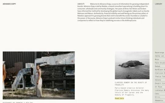
Advance Copy
#Advance Copy#source of information#independent#brands#library#podcast#white#typography#type#typeface#font#Basis Grotesque Mono#Marr Sans#2023#Week 29#website#web design#inspire#inspiration#happywebdesign
3 notes
·
View notes
Photo

Beautiful → Site of the Day for September 17, 2021
Fonts: Gascogne, Basis Grotesque, Basis Grotesque Mono
5 notes
·
View notes
Photo


RESEARCH: SPACE MONO
1) Space Mono is an original fixed-width type family designed by Colophon Foundry for Google Design. It supports a Latin Extended glyph set, enabling typesetting for English and other Western European languages.Developed for editorial use in headline and display typography, the letterforms infuse a geometric foundation and grotesque details with qualities often found in headline typefaces of the 1960s (See: Microgramma, Eurostile), many of which have since been co-opted by science fiction films, television, and literature.Typographic features include old-style figures, superscript and subscript numerals, fractions, center-height and cap-height currency symbols, directional arrows, and multiple stylistic alternates. (source)
2.) Space Mono — whose name inverts its own typographic classification — is precisely that, a typeface drawn to be innately fixed-pitch that comprises Regular, Italic, Bold, and Bold Italic cuts, commissioned for the 2016 update of Google Fonts. This monospace-first, monospace-only brood was hatched in the summer of 2015, on the heels of a sans-serif family called Basis, which we created at Colophon Foundry UK — again, an instance of a proportional-first, monospace-after progression. Included in Basis’s 16-cut system was the most extensive monospaced component we’d drawn to date: a Regular, its Italic counterpart, and Bold and Bold Italic pairings.
The monospaced cuts reacted to Basis’s grotesque forms in such a way that they still garnered a grotesque classification. A monospace type, however, doesn’t describe its character or distinctions, but rather its function and construction. And while that construction often dictates form (an ‘m’ may get smushed into its container; an ‘i’ extended outwards with foot and bar), we find it interesting that despite these formal constraints, monospaced type is widely used in editorial settings to give a certain style or feel rather than hit a specific character count or meet a technical limitation. (source)
1 note
·
View note
Photo

Jules Forrest → Site of the Day for November 18, 2019
Fonts: Value Serif, Basis Grotesque, Apercu Mono
1 note
·
View note
Photo

Sandhurst Retail → Site of the Day for July 28, 2019
Fonts: Ivar, Basis Grotesque Mono
1 note
·
View note
Photo

Dental Select → Site of the Day for April 24, 2019
Fonts: Basis Grotesque, Basis Grotesque Mono
1 note
·
View note
Photo

Alessandro Grespan → Site of the Day for November 13, 2017
Fonts: Basis Grotesque Mono
2 notes
·
View notes
Photo

Henry Slaughter → Site of the Day for January 24, 2020
Fonts: Basis Grotesque Mono, Basis Grotesque, GT Super
0 notes
Photo

Netil Radio → Site of the Day for May 9, 2017
Fonts: Bonobo, Basis Grotesque Mono
0 notes