#Blacks Corner Letterpress
Text


Staff Pick of the Week
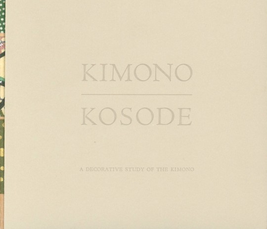
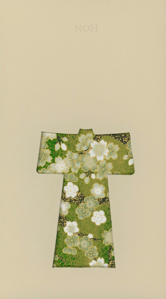
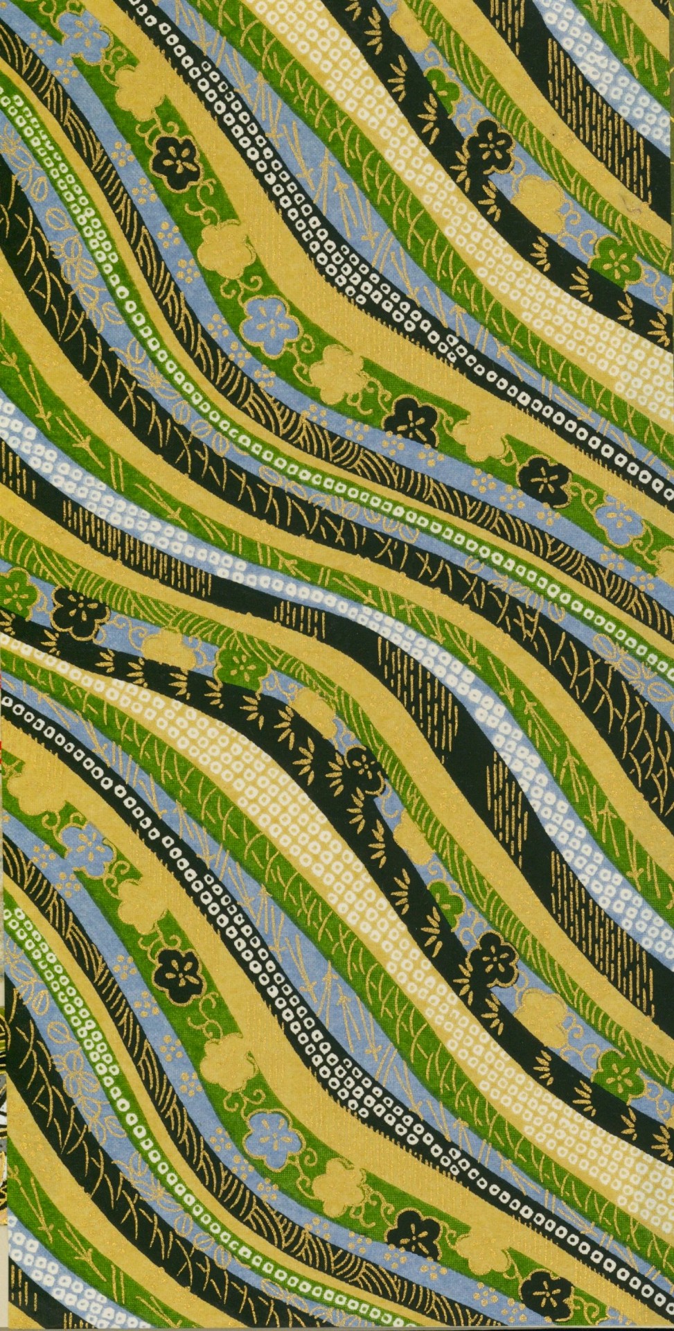
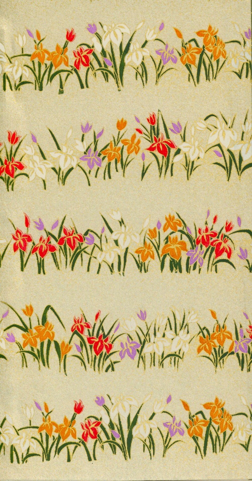
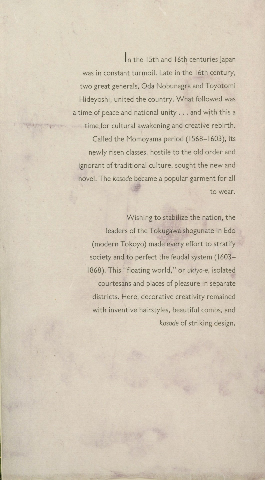
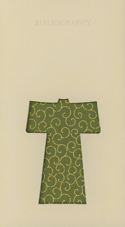
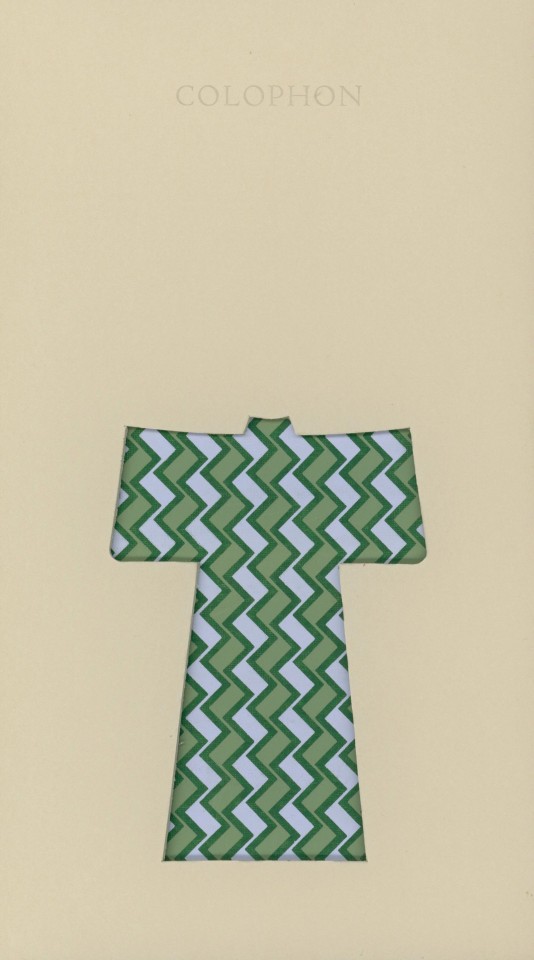
For today’s staff pick, I want to share another book from the collection of our late friend Dennis Bayuzick, entitled Kimono| Kosode: A Decorative Study of the Kimono. Designed and bound by Carol Schwartzott (b. 1945), this book uses Japanese Chiyogami paper as the ‘fabric’ for the kimonos between archival boards throughout the book. The book explains to readers the history of the Japanese kimono’s creation and augments the information with beautiful decorative elements. Each fold-out includes a cut-out kimono as well as a heading and short section about the topic introduced in the heading. Another interesting feature of this book is its binding; it uses a piano-hinge binding designed by Hedi Kyle (b. 1937) and the patterned paper can also be seen wrapped around the dowels that make up the binding.
The book discusses the origins of the kimono, which was once called a kosode, and goes into detail about the historical periods when the garment gained popularity, explaining how “[with] each period in history, the kosode evolved, adapting its design and decorative elements to current style…”
Printed in an edition of 125 copies by Blacks Corner Letterpress with Monotype Gill Sans Light cast by the Bixler Press & Letterfoundry, this book was created for the Library Fellows of the National Museum of Women in the Arts in Washington DC in December of 2001.
View more Staff Picks.
View other books from the collection of Dennis Bayuzick.
– Sarah S., Special Collections Graduate Intern.
#staff pick of the week#kosode#kimono#national museum of women in the arts#Dennis Bayuzick#Carol Schwartzott#Japanese Chiyogami paper#japan#piano binding#Hedi Kyle#Blacks Corner Letterpress#Monotype Gill Sans Light#Bixler Press & Letterfoundry#Sarah S.
85 notes
·
View notes
Text
SOUTHERN HOSPITALITY AND SONG: A FUN-FILLED TOURIST ITINERARY FOR MUSIC LOVERS IN NASHVILLE

Nashville is often hailed as "Music City," beckoning music enthusiasts from all corners of the globe and just down the street to revel in its rich musical tapestry. From one end of this town to the other, Nashville is a testament to the honor of being the birthplace of country music. With Lower Broadway serving as the epicenter of Nashville’s live music nightlife, The Stage is an iconic venue, inviting visitors to experience the magic of Southern hospitality and song. In this guide, we will craft a little fun-filled itinerary centered around The Stage, ensuring that your journey through Nashville’s musical attractions creates a harmonious blend of live music, a festive atmosphere, and the unique charm that makes Music City truly special.
Music, Museums, and So Much More
Visitors often ask the locals they encounter to name a few places that speak to the essence of what is truly Nashville. If The Stage is your starting point, just about anyone familiar with Nashville will suggest heading west from downtown to midtown and visiting a Nashville treasure- Centennial Park with its very own replica of the Parthenon. This enormous museum built with towering columns is home to beautiful artwork and a golden statue of the Greek goddess Athena.
You don’t need to travel to Athens when a version of this landmark is in the middle of Nashville. The park’s perfectly manicured lawns and gardens are a perfect way to take in the city’s beauty. And just a couple of streets across West End Avenue lies Vanderbilt University. Its sprawling campus in the heart of Music City is a quiet haven in the center of our bustling metropolis. Capture some photos and enjoy the serene surroundings before moving on to your next destination.
In this same area, visitors can experience the neighborhoods that make up Music Row, the heart of Nashville's music industry. Discover the historic recording studios, record labels, and landmarks that have shaped the careers of countless songwriters and musicians. Take in the vibrant energy and history that permeates the air because this is where the magic is made.
Turn Back Around and Head East down West End and Broadway
No matter your mode of transportation- by car, foot, bus, or scooter- heading east, you have a straight shot back to downtown, Lower Broadway, and Nashville nightlife. Along the way, you will see the historic Union Station Hotel with its opulent décor and old-world charm. One building down from the hotel is the Frist Art Museum, ready to invite visitors to enjoy a range of amazing exhibits.
Venture a little further downtown, and the Bridgestone Arena is impossible to miss. While home to Nashville's own NHL team, the Predators, this venue hosts numerous concerts throughout the year. And just a couple streets down from Bridgestone, you will soon hear the twang of guitars and singing voices infused with the emotions of country, rock, and the blues. Lower Broadway is a sea of honkytonks providing visitors with what they want the most from their stay in Nashville- live music, crowded dance floors, and the clink of glasses as folks enjoy a cold beer and warm friendship.
Some Daytime Tourist Sites before the Nashville Nightlife
The Lower Broadway area is home to many music venues, clubs, restaurants, hotels, and retail shops. A few essential Nashville places include the Johnny Cash Museum and the Country Music Hall of Fame. One will allow you to immerse yourself in the life and legacy of the Man in Black, and the other will take you on a journey about the history of country music and its legendary performers.
Hatch Show Print is another must-see icon that reveals the visual history of Nashville's music scene. Explore this letterpress shop, known for creating timeless posters and artwork for legendary musicians. Pick up a unique souvenir to commemorate your musical journey.
The Sun Starts to Set and the Music Begins to Rise
When evening descends on Nashville, we recommend returning to where you began, at The Stage on Lower Broadway. This honky-tonk gem is renowned for its vibrant atmosphere and top-notch live performances. Sip on your favorite beverage, find a spot on the dance floor, and get ready to be swept away by the electrifying energy of the live music at The Stage. Let the music transport you to a world where every note celebrates Nashville's musical soul. Don't be shy—hit the floor and dance the night away to the infectious rhythms and heartfelt songs from some of Nashville’s finest performers.
The Best Travel Tips for Music Lovers
We have two suggestions for music lovers. Visit Nashville. And when you arrive, your first destination should be The Stage. Vibrant honky-tonks line Lower Broadway and you will discover the unique character of each venue, but always remember The Stage might just be your first and last stop for a night filled with festivities as you soak in the lively atmosphere that defines Nashville's honky-tonk scene. No trip to Nashville is complete without a visit to The Stage, a legendary venue that echoes with live country music morning, noon, and night.
Nashville's musical attractions, coupled with the unique charm of The Stage, offer an unparalleled experience for music lovers. From exploring the historic Music Row to dancing the night away on Lower Broadway at The Stage, every moment in Music City is a celebration of Southern hospitality and song. Let the melodies guide you through the streets of Nashville, and may your journey be filled with the infectious rhythms and warmth that define this extraordinary city.
0 notes
Text

Pastel Night mix Craft Style colour blank business cards
#namecards #craftcards #paperlove #shabbychic #handmade #wedding #pocketletters #placecards #notecards #letterpress #countrystyle #atc #savethedate #creative #earringcards
0 notes
Text
Wedding Invitation Etiquette

Your wedding invitations are one of the most important elements in your day because they provide guests with crucial information (as does your wedding website, which you should definitely create if you haven't already). And while some details of your wedding don't follow a strict set of rules, your invitations (for the most part) do. Here are some answers to your most pressing wedding-invite-related questions.
1. When should we send out our wedding invitations?
Traditionally, invitations go out six to eight weeks before the wedding—that gives guests plenty of time to clear their schedules and make travel arrangements if they don't live in town. If it's a destination wedding, give guests more time and send them out three months ahead of time. Most couples also send out save-the-date cards. They go out at six to eight months.
2. When should we make the deadline for RSVPs?
Make your RSVP date two to three weeks before your wedding date to allow enough time for you to get a final head count to the caterer (one week before) and to finalize your seating chart. If some guests still haven't responded by your deadline, give them a quick call and ask for their RSVPs (still via mail) so you have all their information.
3. Where do we include information about our wedding website?
Your wedding website should be included on your save-the-date. A simple "KelseyandJon.com," is all you really need. If you'd like (or if you don't have save-the-dates), you can include the web address in the formal invitations with an insert, a small card that informs guests they can find more details online.
4. Can we include our registry info on our invitations or save-the-dates?
In a word, no. Including registry info on the wedding invitations or save-the-dates is still considered impolite because it can come off as though you're asking for gifts. Go ahead and put your registry info directly on your wedding website. (The Knot All-in-One Registry allows you to include links from all of the places you are registered). You can also tell your wedding party, parents and close friends where you're registered, and let them fill guests in.
5. We're having an adults-only wedding (no kids). How can we make sure this is clear to our guests?
Address your invitations correctly—to each guest by name, not "and guest"—and guests should understand that the invite is meant for only those mentioned. If you find that some reply with their children's names added, give them a call and explain you're having an adults-only wedding and you hope they can still attend. If there are a lot of kids in your family, you may want to consider hiring or arranging for a babysitter. It's definitely not required, but it's a nice gesture. Just be sure to include this information on the wedding website.
6. How do we let guests know our dress code?
The easiest way to get your point across is to include a dress code in the lower right-hand corner of the invite or on a reception card. "Black tie," "cocktail attire" or "casual attire" are all acceptable. Your invitation design will also clue guests in.
An ultra-formal, traditional invite with letterpress and calligraphy will give guests a hint to the formal nature of the event, whereas a square invite with a playful font and bright colors would fit a much more casual style. Another way is to direct guests to your wedding website, where you can go into more detail about the weekend events and dress code in a more informal forum.
7. Do we have to invite every guest with a date or a "plus-one"?
No, you don't have to. If a guest isn't married or in a serious relationship, it's perfectly acceptable to invite them solo. Most guests will understand that without "and Guest" or another name on the invitation means they aren't invited with a plus-one. While it's always nice to invite everyone with a guest if you're having a small wedding, your family and friends should understand your reasoning.
What should you do if a guest RSVPs for two? Call them up and explain you're having an intimate wedding and, unfortunately, you were not able to invite everyone with a guest. If you realize that nearly everyone will be coupled up, extend a plus-one invitation to your few single friends and family.
8. Where do you put the return address on wedding invitations?
The return address usually goes on the back flap of the envelope. Also, the return address used should be that of the person(s) whom you've designated to receive response cards, be it your parents or you (traditionally, whoever is hosting the wedding handles response cards). Don't forget that the RSVP envelope should also be printed with this address (and should include postage).
9. If our wedding reception is for immediate family only, is it okay to invite people to the ceremony only?
Not really. Everyone who attends the ceremony (or bridal shower, engagement party or wedding reception) should be invited to the wedding—that means the ceremony and the reception. In your case, by inviting guests to one and not the other, you're basically saying you want them there for the actual ceremony but you either don't want to pay for their plate at your party or don't care enough to have them there to actually celebrate your newlywed status.
10. I invited my friend and her boyfriend (by name on the invite) to the wedding, but they recently broke up. Now she wants to bring a friend I don't like—can I tell her no?
Because you worded the invitation correctly by having her boyfriend's name on the envelope (rather than "and guest"), you have every right to say no. As a rule, invitations are nontransferable when people are invited by name. Try explaining you're not friendly with her proposed guest and you'd prefer the wedding be limited to very good friends and family. If you invited all of your single friends sans dates, let her know she won't be the only one coming solo (in case that's her worry).
1 note
·
View note
Link
Check out this listing I just added to my Poshmark closet: Anthropologie Pilcro and the Letterpress No 29 Serif Cut Skinny Corduroy Pants.
0 notes
Text
Fic: The Collector (Darth Maul x Reader)

Title: The Collector
Author: nxctuary / the Wishmonger*
Pairing: Darth Maul x Reader / Darth Maul x You (no y/n, AFAB Fem)
Rating: Explicit
Word Count: 15,275
Inspired by: This and this, and then it took a twist. ☺️
Summary: An obscure book shop, a rare volume, and a bookseller of particular predilections: one does not broker deals with the devil when the price is so dear, but your client is demanding, and you're not one to shy away from negotiation.
Some people value wealth. Others... only power.
Warnings: Degradation, humiliation, spanking, crawling, oral sex/face fucking, power exchange, nipple torture, dominance play, fingering, spanking, p in v, hate fucking, objectification, hair-pulling, praise kink, hard D/s, hard Dom!Maul, orgasm delay/denial, clothing used as light restraints, real-world occult references
You should read this fic if: You enjoy any of the above, have a love of books, an interest in occult grimoires and arcane artifacts from antiquity, love the lore from Legends, enjoy a hard Dom!Maul, or have an affinity for him in a tailored suit.
🖤❤️🖤 A preview of the fic is included beneath the cut, or you may jump directly to Ao3 to read it in its entirety. 🖤❤️🖤
Excerpt from "The Collector":
The book shop sits just around the corner from the main avenue, nestled between a wine bar that gets too loud on the weekends, and an alley that snakes through the business district’s less savoury enterprises. Its little black awning ignores the breeze, and the gaslight sconce out front flickers as you approach, the light drift of snow on duracrete sifting ghostly whorls around your high heels.
This is the right place. You’ve checked the linen business card twice: it bears a name and this address, matching the hand-painted sign in silver foiled letters on the door. They’re tiny. Unobtrusive. Perfectly rendered with crisp edges, and bears the same aesthetic sentiments as the card:
Simple and elegant, and crafted from a heavy black cardstock with a letterpress imprint. Expensive. When you flip it over, you see the note again that visits are, “By appointment only,” and consider again that this might turn into a rather costly meeting — both for your professional career, and for what’s at stake for you if you do not obtain the tome in this bookseller’s possession.
Maul deals in rare editions and obscure titles, only. The sort that go to auction when the first printings become so hard to obtain that a buyer will send someone like you to broker the negotiation. You’ve never failed to secure a volume before, no matter how obscure and old, but some books take on a will of their own, occasionally: they do not want to be found.
You may be specialized, and paid a handsome fee for the lengths you go to… but this title in particular is a little out of your depth:
A book so obscure the trail of information that has led you to this particular shop might as well render its existence in halftone; hazed with sensationalist narratives that speak of curses and the unfortunate and untimely endings of its previous owners — an artifact conceived only in whispers, the rumours about shared only in hushed exchanges for fear of being overheard by the wrong ears:
A true dark archive.
Doing your research was about as productive as rhapsodizing where it came from. You’d thought it a story itself the first time you’d heard of it, but the occult collection stolen from the Library of Krayiss was always just a myth.
Or perhaps not… if your buyer is to be believed, and your buyer was very particular about handling a negotiation with this particular source:
The seller is little more than a shadow himself; a figure of legend in the rare collections world, recently moved to this corner of Coruscant to set up his establishment. To find him, you must know of him — and your contact only offered a weak sketch of who he is; the stories surrounding the artifacts in his collection more sensational even than the stories about where he came from.
The rest? Well, let’s just say you’re worth your salt:
You’ve done your homework. And you understand a man of his particular… predilections.
Anything is obtainable, regardless the price.
Read the whole thing on Ao3 >
#Darth Maul#Darth Maul x Reader#Darth Maul x You#Maul x Reader#Maul x You#AFAB Reader#no y/n#Darth Maul Smut#Darth Maul Fanfic#Darth Maul Fanfiction#Bookshop AU#Dark Academia AU#Occult AU#Star Wars Smut#Nightbrother#Zabrak#Sith#Sith Lords#Sorzus Syn#content warning: Sidious#Star Wars smut#Star Wars fanfic#Sith Smut
195 notes
·
View notes
Photo

Business Cards, Edward Ruscha, 1968, Minneapolis Institute of Art: Prints and Drawings
Softcover book with faux wood-grain commercial paper stock cover; black and white photograph collaged to front cover with black paper mounting corners; 21 photographic illustrations and one reproduction of a photograph staped to paper; 32 pp.; Latigo (leather cord) binding. Text in manuscript facsimile, with date-stamps. This copy: First (and only) edition.
Size: 8 7/8 x 5 5/8 x 3/8 in. (22.5 x 14.3 x 0.95 cm)
Medium: Offset printing, letterpress; bound volume
https://collections.artsmia.org/art/32509/
3 notes
·
View notes
Photo

Job, a Drama by Oskar Kokoshka, Oskar Kokoschka, 1917, Minneapolis Institute of Art: Prints and Drawings
binding: hard cover with marbled papers and vellum spine & corners; endpapers: cream laid paper
Size: 17 15/16 x 12 9/16 in. (45.56 x 31.91 cm)
Medium: Lithographs in black and in sanguine, letterpress; bound volume
https://collections.artsmia.org/art/6084/
5 notes
·
View notes
Text
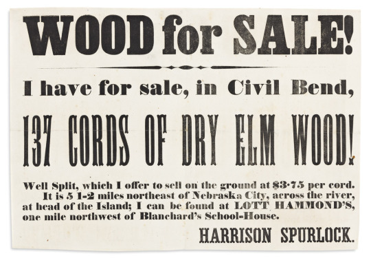
“Wood for Sale!" broadside referencing an important Underground railroad stop in Civil Bend. Letterpress broadside, 8 x 11 1/2 inches; trimmed, folds, minimal foxing. No place, circa 1860.
This broadside references "Blanchard's School-House" in Civil Bend, Iowa as a nearby landmark. Ira Blanchard (1809-1872) was an abolitionist who settled in this ephemeral river-bottom village in 1849. He built a schoolhouse and encouraged some local Black children to attend. Hostile arsonists torched the school in 1850, but it was rebuilt in 1851. Blanchard's home, being on the banks of the Missouri River across from Nebraska, was a heavily frequented stop on the Underground Railroad. The famed John Brown brought a "cargo" of escapees there once in February 1859.
In this broadside, one Harrison Spurlock of Civil Bend advertises the availability of "137 Cords of Dry Elm Wood" available at "Lott Hammond's, one mile northwest of Blanchard's School-House." The author was likely William Henry Harrison Spurlock (1836-1911), and his associate was Lott Hammond (1815-1870); both lived in the Civil Bend area at the time of the 1860 census. Civil Bend, in Fremont County at Iowa's far southwestern corner, was never a large settlement and is now considered a ghost town.
Swann Galleries
1 note
·
View note
Text


I was thinking of doing a collage and planned it out in my sketchbook. I did a mini collage with images I planned on using in the bigger collages. I planned on doing two collages, one black and white collage and one bigger collage in colour and wanted to print onto the collage.
I used the letterpress to print “Smoking Kills”, onto the collage. I forgot to use gloves so my hands got destroyed, a lesson learned :(

The black and white collage is a smaller collage than the coloured one. I used it as a practise run for the bigger one. I practised printing on it and used it to plan out and practise the layout of the collage, playing around with the images to create new images.
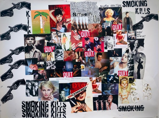
My final collage includes images that I printed out, tore out of magazines and newspapers. I also included images of my friends smoking, and tore up cigarette boxes and included them in the collage. In the bottom right corner I burned holes through a pair of lungs I cut out, and included common phrases I hear in the smoking area everyday.
I printed the creation of adam inspired print onto the collage, and also repeated the “Smoking Kills” using the letterpress. I really enjoyed doing these collages.
8 notes
·
View notes
Photo


[image description: 3 photos of a combination letterpress & hand-inked illustration print, and a photo of the forme of handset type used to print the letterpress elements. the illustration is of a person on a black background, their curly hair backlit, wearing a wide-shouldered and wide-lapeled jacket and trousers. the motion of their dangling earring and bent knees imply a snapshot of dancing. The letterpress printed element is the pattern on the jacket and pants: a decorative border that’s simply blocks of fine lines, arranged in a slightly randomized combination of concentric squares, encircling and intersecting with each other, some printed in silver and some in pink. over that are a few plain, long lines of cyan, and scattered over that is a scattering of paler cyan boxes. This pattern is continuous and flatly applied across all the fabric in the illustration: it doesn’t bend or break across seam lines, folds, or across lines between the jacket and the pants. the forme of handset lead type is an assemblage of relief printing pieces, with different types of pieces to turn corners, align different directions, or fill negative space with no printing surface. each color in the print requires a different arrangement of pieces, assembled and then disassembled to reclaim the pieces for use in a different forme. end description.]
it is difficult for me to remember that i did this one desPITE the fact i haven’t even finished inking the whole edition yet because i uuuh finished inking exactly three of them just in time to include footage of the whole process for a presentation about these combination prints for the Book Arts Guild—and then diverted completely to finish editing the presentation—and now that that’s posted i am finally, slowly finishing inks on the rest in downtime. haha jk what’s downtime i am not free i am simply avoiding important emails
there’s a lot more info in that video about process & some thoughts about this one in particular! but in brief, i watched a recording of the Purple Rain concert tour, which i don’t pretend to know much about but my gaydar went haywire about Wendy Melvoin; im a huge sucker for big sparkly blocks of a matching suit set; pink & blue bring joy to my color cones, etc.
the whole presentation is here; the Q&A afterward from the meeting wasn’t recorded (sorry, i didn’t know that’s how it was done ahead of time) but my askbox is always open for questions about printing process! i mean it’s just open. but i only know important stuff about printing.
edition available on etsy
#happ. gnu yrrrrrr everyone.#letterpress#letterpress printing#handset type#lead type#printmaking#relief print#finished works
11 notes
·
View notes
Photo

High-End Business Cards Impress your customers with Stunning Business Cards. Naturally sophisticated, these card’s pulp-like quality and the textured surface will effortlessly coincide with any minimal card design. We offer up to 4 spot colours on each side of this card stock. Weighing at 1.5mm, this card stock is also great for embossing, debossing, and letterpress. Foil stamping is also available as you can see on one side with black Letterpress on the other. What this card stock is not suitable for: full bleed designs, gradients, and the use of several colours. The opposite side round corner cut with gold foiled edges presents the impressive finishing details of these new Luxury Cards for Andronis. Andronis Exclusive But if you want to create a business card that wows, you might ask Masterfold Limited #masterfold #luxury #quality #branding #design #businesscard #andronisexclusive #andronis #santorini #oia (at Andronis Luxury Suites, Santorini Islands,Greece) https://www.instagram.com/p/CMxdlnPn8lM/?igshid=c2e2t3ru4xz3
1 note
·
View note
Photo

“Style Endures” print release TODAY at 10AM PDT at https://store.obeygiant.com/collections/prints. Listen to @obeygiant “I'll be releasing this "Style Endures" letterpress print to #helpsavejuice! Releasing today, June 18th at 10AM PDT, on my site, store.obeygiant.com, where a portion of proceeds will be donated to @juicemagazine to help keep them in print. There will be four colorways available: black, magenta, cyan and yellow. Running a print mag is always a tough business for love, not money, but is especially challenging during a pandemic. Juice is in financial distress, and I want to help and pay my proper respects to style in skateboarding, but also paying my respects to authentic voices in skateboard culture who chronicle the past and the future. Juice has been a voice for core skateboarding, music, and art for 25 years. Let's help support to keep them in print! Visit the link in @juicemagazine bio for more details, to support their GoFundMe, and to view the full statement from Terri Craft, the owner of Juice Magazine. Thanks for caring! -Shepard Style Endures, 4 colorways: Black, Magenta, Cyan & Yellow. 14.5 x 19 inches. Letterpress on cream cotton paper with hand-deckled edges. Original photo by Hugh Holland. Signed by Shepard Fairey and Hugh Holland. Numbered edition of 115. $85. Proceeds go to Juice Magazine. Obey publishing chop in lower left corner. Available on Thursday, June 18th @ 10 AM PDT at https://store.obeygiant.com/collections/prints. Max order: 1 per order. International customers are responsible for import fees due upon delivery. Orders may be delayed due to COVID19. ALL SALES FINAL. https://www.instagram.com/p/CBlXZxSFApA/?igshid=vuav40p8k9h9
1 note
·
View note
Text
Circuitry and Dust
shopkeeper AU (demisexual antique store owner Cas & electrician-handyman-arcade owner Dean) // secretly requited feelings, fluff and pining + a talking bird
☆
The weather in town was reasonably decent at this time of year. Shattered sunlight breezed across the paved street and glowed in shiny little puddles, the patches of light racing each other from Mr. Winter’s barbershop – that was the one with the bench outside – to the Barnes & Noble directly opposite. The clouds bubbled like science experiments in slow-motion, hurried across the sky by a brisk wind. The air carried a chill; that was why everyone wore a fleece coat while they did their Friday-evening shopping.
Three walls along from the bookstore, there was a small and inconspicuous shop, brown-bricked, with a wooden sign above that read ‘Mr. Antiquarian’ in a golden old-style serif. The shop’s front comprised of an unpolished window split into angled thirds, lead-lined, with three asymmetrically-placed frames of bullseye glass amongst the plain frames. As a whole, the shopfront was dirty and quiet enough that it tended to blur out of people’s awareness, and their eyes would skip straight from the barbershop on the left to the gaming room and Internet cafe on the right.
Mr. Antiquarian’s front door, now pushed by a hand, swung open and hit a bell. The bell’s tinkle was lively and cheerful, but was barely audible over the sound of the shop itself. From the left came a tuneless tonking noise as a grandfather clock struck off the hour, and at the same time an exotic bird trilled unseen, an old kettle wheeeeeeeeeeeeeeeeew’ed sharply, a radio played white noise at a middling volume, and something clattered in the back of the shop. This was the shop’s usual ambience.
Now that he was inside, Dean Winchester stood motionless beside the snuff boxes closest to the door, noting the addition of a new one, Civil War era. It caught the murky light through the window, and it shone a brighter silver than all the others in its display case.
The room was filled with things. Clocks, furniture, teddy bears, books, jewellery. There was probably one of everything, everything ever invented. It was like a zoo exhibition of the inanimate – or, the very animate, if the talkative myna bird inside an original Victorian cage was to be counted.
“I’ll be – ah! – with you in a moment; feel free to browse,” a deep voice called, bustling and strained, from somewhere in the vicinity of the stacked mattresses. This was Castiel, he ran the shop. Well... he kind of existed to serve the shop. The shop malfunctioned at least six times a day; there were usually more problems than customers.
“It’s me,” Dean called, standing on his tiptoes to see over the cabinet of teacups. “I skipped out early, I was hoping I could finish your circuit map tonight.”
“AH!” Another tumbling thump came from a distant corner, and Dean’s eyes moved in time to see a lit chandelier begin to swing from its entwined cable and chain. The lights flickered, then died, and that entire corner of the shop was left in darkness. The chandelier continued to swing, squeaking as it did.
“Blast,” Castiel said.
Dean grinned, then began to make his way to where Castiel was. This place was a maze, layered with miscellaneous objects. Usually the piles were set heaviest at the bottom and lighter at the top, but Dean had once come across a wickerwork picnic basket wearing an entire letterpress machine as a hat. The items were harder to arrange than they were to navigate; the turnover rate here was remarkably decent, and Dean came by every day, so he always knew where the new paths would be. Thankfully, Castiel worked using the same logic of arrangement as Dean did, but with his prime interest being random discarded junk as opposed to fiddly bits of wire and electrical tape.
Dean found Castiel dusting off his hands, looking like he’d fallen victim to a cartoon explosion. The air around him smelled chalky and burnt, and his entire front was soot-black, cravat askew. When Castiel lifted his eyes, he met Dean’s gaze then glanced towards a new crate on the floor. The carpet around it was decorated with a black powder starburst.
“Gunpowder,” Castiel explained, then sighed. “It’s going to take a lot of careful vacuuming to get this cleaned up. She could’ve warned me when she dropped it off. Honestly, these people. They think I’m some...” He waved his blackened hands around, slim fingers grasping for words which didn’t come.
“They think you’re a rescue home for abandoned, unidentified attic relics,” Dean suggested. “Like a friendly thirty-something grandpa who hoards everyone else’s crap.”
“Exactly!” Castiel yapped, thrusting his finger in Dean’s direction. Dean leaned out of his way so the gunpowder wouldn’t soil his pristine Iron Man t-shirt. Castiel noticed him recoil, and he lowered his finger. More sadly, he said, “Exactly.”
☆
keep reading (23k)
#Destiel#Destiel fanfic#Destiel fic#DeanCas#Elmie writes things#Circuitry and Dust#post of postiness#Elmie makes things
43 notes
·
View notes
Text
Can't Miss Wedding Invitation Styles
This year , the most popular wedding invitations are inspired by the world that surrounds us. The colors are both striking and subtle and patterns that create an instant impression and styles which blend traditional and modern with a modern, unique style are all fantastic designs. Wedding invitations create the mood for the wedding of your dreams when pick from a wide selection of awe-inspiring wedding invitation designs from today's most popular designers. Look over the best designers providing for your wedding invitation needs in 2009. - acrylic wedding invitations
Vera Wang
The bold prints and the delicate, delicate patterns are incorporated in the designer Vera Wang's wedding invites. Wang mixes traditional and contemporary in a way that is without shame, unself-consciously fun and unquestionably contemporary. With the Vera Wang Retro Verso line, Wang turns tradition on its head, printing each side of an invitation juxtaposing bold prints and delicate designs for wedding invites that stand out and are unique.
The Vera Wang Retro Verso Dual Sided Gingko Wedding Invitations are simple that is embodied. One side has a bold impression of the beautiful fan-shaped biloba gingko leaf with reverse print. The reverse of the invitation is on the reverse with an elegant spray of leaves made of gingko, traced along the border. Perfect for the modern bride who would like to pay homage to the past. This is a great option for weddings with an Oriental wedding.
Vera Wang's William Arthur Black and Pink Paisley Letterpress Wedding Invitations are a delight to the eye. retro and modern in their use of color. The two hues of pink and black play off each with a floral paisley design in bold black, adorned with pink-colored accents. The envelope is lined with pink and hand-stamps the ensemble , which is playful and Art Deco at the same simultaneously.
Anna Griffin
Its Retro Verso and Letterpress wedding invitation collections by Vera Wang are absolute can't skip wedding invitations for the modern bride. The designer Anna Griffin focuses on the classic, experimenting with the use of satin embossing and layers of panels to create an atmosphere of luxury and timeless elegance.
O Anna Griffin Celadon Repousse Wedding Invitations: Anna Griffin offers a elegant and refined square invitation that is bordered by the botanical design in a light green. The ivory central panel is adorned with an embossed border, and is secured with satin ribbons at every corner. This invitation is a display of timeless elegance and is not trapped in the lock-steps of traditional engraving. Elegant, elegant and certainly wedding-related, it is the ideal choice for an invitation to the most formal of weddings.
O Anna Griffin Platinum Toile Wedding Invitations: Gorgeous invitations that will save your money, is there something more appealing? These Platinum-toile wedding invitations of Anna Griffin. Anna Griffin line is only available as blank. Each invitation comes with ivory with a border of platinum that is personalized with your wedding invitation's message and a vellum gatefold sleeve to wrap around it , and an appropriate bow to make the most beautiful wedding invite. Create a romantic look in your wedding invitation or announcement by selecting this design or any from Anna Griffin's additional floral-printed designs of invitations for weddings.
Custom Mix 'n' Match Wedding Invitations
Are you searching for wedding invites which can be totally and uniquely yours? Custom Mix and Match Wedding Invitations will fit the right description. You can select your print colors, pick the color of the envelope linings, and even pick the design the enclosures. In reality, there are so many options for customizing your invitations so that the wedding invites you send out will be sure to be unique. one of a one of a kind. - acrylic wedding invitation
Custom Mix 'n' Match 7 x 7 Pocket Fold Invitations
Contemporary style and classical elegance are incorporated in this unique wedding invitation design. There are 90 different colors of paper, including a selection of metallic hues ranging from lapis blue to pearl white. The options for customizations on Mix match wedding invitations are colors of liner as well as the color of the backing paper and the color that the panel for the invitation. The pocket fold is modern and elegantly sleek, perfect for brides with the sense of timeless elegance.
Reagan 3-Layer Wedding Invitations
What if the only thing that is made of layers is wedding cakes? The Reagan 3-Layer wedding invitation comes as part of the custom Mix and Mix wedding invitations collection. The 3-layer panel invitation is customizable by a wide range of paper and ink colors and paper colors, making your wedding invitations one of a original designs. Select two different colors for the backing as well as one color for the panel and one ink color and personalize it with your preferred style of writing and choose an envelope that will complement or the invitations.
Your wedding day is yours and a time where your personal style is expected to have a say. Your guests should be invited to the wedding with fashion, in your personal style. You can do this with the perfect wedding invitation that draws your guests' attention from the very beginning.
For More Info: Clear wedding invitations
0 notes
Photo
Business Cards, Edward Ruscha, 1968, Minneapolis Institute of Art: Prints and Drawings
Softcover book with faux wood-grain commercial paper stock cover; black and white photograph collaged to front cover with black paper mounting corners; 21 photographic illustrations and one reproduction of a photograph staped to paper; 32 pp.; Latigo (leather cord) binding. Text in manuscript facsimile, with date-stamps. This copy: First (and only) edition.
Size: 8 7/8 x 5 5/8 x 3/8 in. (22.5 x 14.3 x 0.95 cm)
Medium: Offset printing, letterpress; bound volume
https://collections.artsmia.org/art/32509/
5 notes
·
View notes
Last Seen Blogs

glittrdyke
a dumb bitch


amillaressurgir
gomezadriana

t0esniffer69
enn

incorrectmtvscreamquotes-blog
MTV's Scream