#Braille usability testing
Explore tagged Tumblr posts
Visit Tumblr Blog
Explore Tumblr blogs with no restrictions, modern design and the best experience.
Last Seen Tumblr Blogs


Fun Fact
Users from the US are the majority of Tumblr visitors.
Text
Improve Accessibility and UX with Expert Support from iBraille LLC
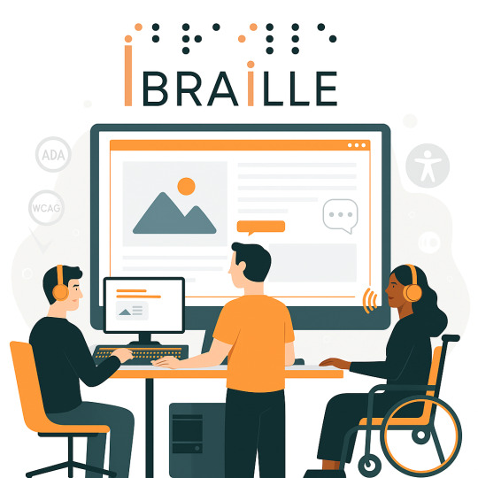
At iBraille LLC, we believe every user deserves an inclusive and seamless digital experience. Web accessibility isn’t just about legal compliance—it’s about ensuring equal access for everyone, including individuals with disabilities.
Our expert team offers in-depth web accessibility audits, Braille usability testing, and user experience (UX) evaluations tailored to real-world needs. Through hands-on testing and consulting, we help businesses of all sizes identify hidden barriers and implement meaningful, user-first solutions.
From enhancing navigation to achieving ADA compliance and ensuring compatibility with screen readers and Braille displays, we’re here to guide you every step of the way.
Don't overlook a valuable audience. Improve your website’s accessibility and user experience with iBraille LLC.
Reach out for a consultation today—and start building a more inclusive digital space for all.
#digital accessibility#accessibility consultants#ibraille llc#expert consultant#user experience#Braille usability testing
0 notes
Text
Summary #6
Don Norman's
Cliff Kuang explains how design has shifted from being user-friendly to prioritizing user engagement. Initially, the emphasis in design was on streamlining technology and tackling tangible problems. Many designs, like social media apps, aim to make money by using tactics like endless scrolling and ads to attract users. He stresses the importance of ensuring that good design benefits people instead of controlling them. He urges designers to return to the initial aim of developing tools that enhance people's lives. A practical illustration contrasts the straightforward interface of old computers with the crowded, advertisement-laden screens of modern smartphones. It serves as a reminder of the distance we've wandered.
Take-away
Design should focus on serving people, not manipulating them.
Modern design often puts profit ahead of what viewers (people) need.
Simple interface create better experience.
Empathy is key to good design.
The Palm Beach ballot controversy
It shows how lousy design can confuse people and affect election results. Ballots should be straightforward and easy to use, but this design must be revised. This situation highlights how we often overlook good design in public systems. Design is about appearance and making things work well for everyone. Designers should support more transparent, more accessible systems in voting and public services.
RGD Accessibility 2
This handbook explains why accessible design is essential for everyone. It offers practical tips for making straightforward and easy designs in digital, print, and physical formats. These tips include choosing readable fonts and using high-contrast colours. The handbook emphasizes starting accessibility early in projects and testing designs for all users. It encourages designers to work with clients to prioritize accessibility while being creative. The goal is to create incredible designs that everyone can use.
Take-aways
Making things easier to access is great for everyone.
Plan it early.
Keep it simple.
Enjoy your design.
REAL WORLD EXAMPLE: Tylenol bottle label


I have often had difficulty reading on the bottles, and it got my attention to consider what could be improved. I have some suggestions for improving the accessibility of the Tylenol bottle label! First, increasing the font size and using high-contrast colours would help those with vision issues. A more precise layout with separate sections for English and French would also make it easier to read. Adding Braille and highlighting critical information, like dosage instructions, could enhance usability. A QR code linking to audio instructions is a great addition. These changes would make the label more inclusive for everyone.
sources:
RGD.ca - Design Issues: The State of the Ballot, JP Williams. Accessibility: A Practical Handbook on Accessible Graphic Design, RGD.
FastCompany.com - I Wrote a Book on user-friendly design. What I see today horrifies me, Don Norman.
0 notes
Text
Unlocking Inclusivity: Key Principles for Crafting NDIS-Compatible Websites
In the digital age, accessibility isn’t just a buzzword—it’s a fundamental aspect of creating websites that cater to diverse audiences. Nowhere is this more crucial than in the context of the National Disability Insurance Scheme (NDIS), where ensuring that websites are NDIS-compatible is essential for providing equitable access to information and services. In this blog post, we’ll explore some key principles that web designers in Melbourne can follow to ensure their websites are inclusive and accessible to all, regardless of ability.
Understanding the Importance of Accessibility
Before delving into the principles of creating NDIS-compatible websites, it’s important to understand why accessibility matters. For individuals with disabilities, barriers to accessing digital content can significantly impact their ability to participate fully in society. By designing websites with accessibility in mind, we can break down these barriers and ensure that everyone, regardless of their abilities, can navigate and interact with online content effectively.
Principle 1: Prioritize Clear and Intuitive Navigation
One of the first principles of creating NDIS-compatible websites is to prioritize clear and intuitive navigation. This navigation means logically organizing content, using descriptive headings and labels, and providing multiple navigation options to accommodate different user preferences. By making it easy for users to find what they’re looking for, you can enhance the overall user experience and ensure that individuals with disabilities can navigate your website with ease.
Principle 2: Ensure Compatibility with Assistive Technologies
Another crucial principle is to ensure compatibility with assistive technologies, such as screen readers, braille displays, and voice recognition software. This technology involves designing websites with semantic HTML markup, providing alternative text for images, and implementing keyboard navigation functionality. By doing so, you can ensure that individuals using assistive technologies can access and interact with your content effectively, regardless of their disability.
Principle 3: Design for Scalability and Flexibility
Scalability and flexibility are also key principles of a compatible NDIS web design. This principle means designing websites that can adapt to a wide range of devices, screen sizes, and input methods. By using responsive design techniques and building websites with flexible layouts, you can ensure that your content looks and functions seamlessly across different devices and platforms, enhancing accessibility for all users.
Principle 4: Provide Accessible Multimedia Content
When incorporating multimedia content into your website, it’s important to ensure that it’s accessible to individuals with disabilities. This accessibility means providing captions and transcripts for videos, audio descriptions for images, and ensuring that multimedia players are compatible with assistive technologies. By making multimedia content accessible, you can ensure that all users can engage with your content effectively, regardless of their abilities.
Principle 5: Test and Iterate
Finally, testing and iteration are essential principles of creating NDIS-compatible websites. Once you’ve implemented accessibility features, it’s important to test your website with real users, including individuals with disabilities, to identify any usability issues or barriers to access. By gathering feedback and continuously iterating on your design, you can ensure that your website remains inclusive and accessible to all users.
Incorporating Additional Principles for NDIS-Compatible Websites
Beyond the foundational principles outlined earlier, several additional considerations can further enhance the accessibility and inclusivity of NDIS-compatible websites. Let’s explore these principles in more detail:
Principle 6: Provide Clear and Concise Content
In addition to clear navigation, it’s essential to ensure that the content on your website is presented clearly and concisely. This navigation includes using plain language, avoiding jargon, and breaking up large blocks of text into smaller, digestible chunks. By making your content easy to understand, you can ensure that individuals with cognitive or language-related disabilities can access and comprehend the information provided.
Principle 7: Offer Multiple Means of Communication

Communication is key to ensuring that individuals with disabilities can engage with your website effectively. In addition to text-based content, consider incorporating alternative means of communication, such as video messaging, live chat support, or online forums. Providing multiple channels for communication allows users to choose the method that best suits their needs and preferences, enhancing accessibility and inclusivity.
Principle 8: Design for Cognitive Accessibility
Cognitive disabilities, such as dyslexia or attention deficit disorder, can present unique challenges when navigating online content. To accommodate individuals with cognitive disabilities, consider incorporating features such as simplified navigation menus, consistent page layouts, and clear visual cues. Additionally, providing options for customizable font sizes and colour schemes can further enhance cognitive accessibility and ensure that all users can engage with your content comfortably.
Principle 9: Foster Inclusive Community Engagement

Creating an inclusive online community is essential for fostering a sense of belonging and empowerment among individuals with disabilities. Consider incorporating features such as user-generated content, peer support forums, or virtual events specifically tailored to the needs and interests of NDIS participants. By providing opportunities for community engagement, you can create a supportive online environment where individuals with disabilities can connect, share resources, and advocate for their needs.
Principle 10: Stay Educated and Up-to-Date
The field of accessibility is constantly evolving, with new technologies and best practices emerging regularly. As a web designer, it’s essential to stay educated and up-to-date on the latest developments in accessibility standards and guidelines. This development may involve attending workshops, participating in online forums, or joining professional organizations dedicated to accessibility and inclusive design. By staying informed, you can ensure that your websites remain NDIS-compatible and compliant with the latest accessibility standards.
0 notes
Text
Writing Initiative
I will keep all writing initiatives on this one post, and edit this post to keep updating it as I move forward, I left off on Initiative 5.
Writing Initiative #6 Which piece did you present to the class today? How does it relate to the other pieces previously presented? Describe 2–3 specific strengths your classmates found in your work and their reasons for identifying them. Describe 1–2 specific ways your classmates thought you could improve this work going forward. Consider the remaining outcome you still need to present in the remaining classes; why have you put this one off to the last?
Writing Initiative #6
Today, I presented a 4D idea that utilizes my keyboard to generate an audio translation of a letter. This concept aims to explore the intersection of written communication and auditory perception, offering a unique sensory experience for the audience.
In relation to the other pieces previously presented, this work builds upon the theme of experimental writing and interactive storytelling. While previous initiatives may have focused on visual or textual elements, this project adds an auditory dimension, enriching the overall narrative experience.
Specific strengths identified by my classmates include:
Innovation: Many classmates appreciated the innovative approach of integrating keyboard input with audio translation. They found the concept to be creative and engaging, offering a fresh perspective on the concept of written communication.
Accessibility: Some classmates noted the potential for this project to enhance accessibility for individuals with visual impairments or literacy challenges. They appreciated the inclusive nature of the audio translation feature, which could make written content more accessible to a wider audience.
Ways to improve this work suggested by my classmates include:
User Experience: Some classmates suggested refining the user interface and interaction design to make the experience more intuitive and user-friendly. They recommended conducting usability testing and gathering feedback to optimize the functionality of the keyboard-to-audio translation system.
Audio Quality: A few classmates expressed concerns about the quality and clarity of the audio output. They suggested experimenting with different audio synthesis techniques and sound processing algorithms to improve the fidelity and naturalness of the generated speech.
Regarding why I have put this particular outcome off to the last presentation, it may be because I wanted to ensure that I had thoroughly explored and developed the concept before presenting it to the class. By saving it for the final presentation, I could incorporate any feedback and insights gained from earlier initiatives to refine and enhance the project further. Additionally, presenting this work last allows me to end the series of presentations on a high note, showcasing the culmination of my creative exploration and experimentation throughout the writing initiative.
Writing Initiative #7 Which piece did you present to the class today? How does it relate to the other pieces previously presented? Describe 2–3 specific strengths your classmates found in your work and their reasons for identifying them. Describe 1–2 specific ways your classmates thought you could improve this work going forward. Consider the remaining outcome yet to be presented in a couple of weeks; why have you put it off the longest? Describe your reasons for presenting this outcome last. Finally, you have now had a chance to present each of your projects (2D, 3D, 4D, Experimental, Reflective) in process to the class. Produce an image of each one and describe how an aspect of your word is manifested in each piece.
Writing Initiative #7
Today, I presented my experimental piece, which involves creating a book of poems in Braille. This project explores the intersection of literature, accessibility, and sensory experience, offering a tactile journey through the world of poetry.
In relation to the other pieces previously presented, this work continues the theme of experimental exploration and innovation. While previous initiatives may have focused on digital technologies or interactive elements, this project delves into the realm of tactile communication and alternative forms of expression.
Specific strengths identified by my classmates include:
Inclusivity: Many classmates appreciated the inclusive nature of the project, which aims to make poetry accessible to individuals with visual impairments. They found the use of Braille to be a creative and meaningful way to bridge the gap between sighted and non-sighted readers.
Sensory Experience: Some classmates praised the immersive and tactile nature of the book of Braille poems. They noted how the physicality of the Braille text adds a layer of depth and richness to the reading experience, engaging the sense of touch in addition to the sense of sight.
Ways to improve this work suggested by my classmates include:
Diversity of Content: Some classmates suggested diversifying the content of the book to include a wider range of poetic styles, themes, and voices. They recommended incorporating poems from different cultural backgrounds and perspectives to make the collection more inclusive and representative.
Interactive Elements: A few classmates proposed incorporating interactive elements or multimedia features into the book to enhance the reader's engagement and immersion. They suggested adding audio descriptions or tactile illustrations to complement the Braille text and enrich the overall sensory experience.
Considering the remaining outcome yet to be presented in a couple of weeks, which is likely the Reflective piece, I may have put it off the longest because it requires introspection and analysis of my creative process and learning journey throughout the writing initiative. By presenting this outcome last, I can reflect on my experiences with each project and distill key insights and lessons learned to share with the class. Additionally, presenting the Reflective piece last allows me to contextualize and summarize my overall creative exploration and growth over the course of the initiative.
0 notes
Text
The Importance of Section 508 Accessibility Compliance
Congress changed the Rehabilitation Act of 1973 in 1998 so that Federal organizations have to make sure that people with disabilities can use their electronic and information technology. Section 508 accessibility is only needed for Federal agencies, but it should be important for all companies because not having information makes it harder to get and use technology quickly and easily. Section 508 was put into law to get rid of problems with information technology, give people with disabilities more freedom, and support the development of technologies that will help reach these goals. The General Services Administration has been put in charge of educating government workers and building the infrastructure needed to help them comply with Section 508. Section 508 compliance can be checked through the way the government buys things, and there are also specific standards that products can be changed to meet.

Why Section 508 Accessibility Is Important
The web should be open to everyone, just like all public places should be. The US Department of Justice said that the Internet is, in fact, a place where the people can gather. The Americans with Disabilities Act (ADA) says that people can't treat people with disabilities badly. The ADA says that all "public accommodations" and the services they offer must be accessible. Even though Section 508 doesn't require private websites to comply unless they receive federal funds or are under contract with a federal agency, not following Section 508 is the same as having services that aren't available to people with disabilities. Companies that get government money or contracts must follow Section 508 because, according to the ADA, not doing so would be against federal law.
The US Department of Health and Human Services says that 10% of the population, or 28,000,000 people, are deaf or hard of hearing, 11,400,000 people have vision problems that can't be fixed with glasses, and 1,100,000 people are legally blind. Businesses shouldn't just follow Section 508 because they may have to, but because it's the right thing to do.
Standards and methods for accessibility in Section 508
Part of the guidelines for accessibility under Section 508:
Videos or other multimedia goods must have closed captioning or video descriptions that can be turned on and off.
Telecommunications Products: People who are deaf or hard of hearing need to be able to use them. This means that hearing aids, TTYs, and other gadgets that make listening easier need to work together.
Internet Information and Applications: Text labels are needed for people who can't see to use refreshable Braille displays and screen readers to view web graphics.
Software applications and operating systems need to be accessible to people who can't see by letting them use the computer in other ways.
As technology changes, so will the guidelines and, as a result, the ways to comply with Section 508. Section 508 standards can be tested in more than one way. Vision Australia and the Paciello Group both have a Web Accessibility Toolbar that you can use. There are things like "Disable CSS," "Toggle Images," and "Contrast Analyzer" on the toolbar. The basic features of ADA compliance websites can also help make sure that Section 508 is followed. Testing web pages with pictures turned off, big fonts, and different color schemes can help you figure out what people with disabilities will see. Make sure the page is easy to get to with just the keyboard. This is another good test to do. Since people with disabilities might not be able to use a mouse, being able to use a keyboard is important for exploring the Internet. Downloading a free screen reader to hear how a website would sound if it was read out loud is a good way to test if the content would make sense.
There are still a lot of businesses that need to make sure they follow Section 508 usability. Even though companies that aren't hired by a federal agency can't be sued for compliance, people with disabilities aren't getting any better because of it. Compliance with Section 508 is very important for the well-being of people with disabilities. As if it wasn't hard enough to live in a world that wasn't made for them, following Section 508 can make it easier for them to use everyday things.
0 notes
Text
Empowering Digital Accessibility: The iBraille LLC Advantage
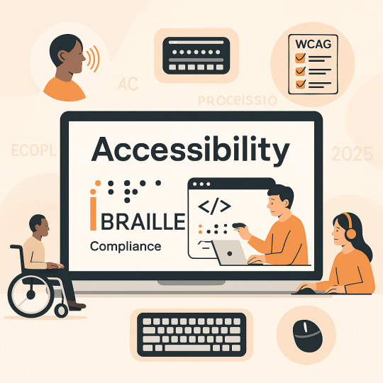
In today’s connected world, digital accessibility isn’t just a requirement—it’s a responsibility. With over 2.2 billion people worldwide living with visual impairments, creating inclusive digital environments is essential to delivering equitable experiences for all users.
At iBraille LLC, we’re redefining what it means to be accessible. Specializing in Braille and usability testing, our expert consultants bring real-world experience and deep industry knowledge to help your organization meet and exceed digital accessibility standards.
Why iBraille LLC?
Hands-On Testing: We go beyond checklists and automated scans, performing thorough, user-focused evaluations to detect genuine barriers in digital accessibility.
Expert Consultants: Our team includes individuals who rely on accessible technology every day—providing insights automated tools can’t.
Future-Proof Compliance: Stay ahead of evolving regulations and ensure long-term digital accessibility compliance.
Sustainable Inclusion: We help you embed accessibility into your workflows, not just as a one-time fix, but as a lasting commitment.
What We Offer:
Comprehensive digital accessibility audits for websites, web apps, and mobile platforms
Assistive technology compatibility testing
Accessibility training for developers and teams
Strategy consulting for long-term compliance and inclusion
Physical and environmental accessibility consulting
Whether you're starting your digital accessibility journey or looking to improve existing efforts, we’re here to support your goals with actionable solutions and expert guidance.
Experience the iBraille Difference
Partner with iBraille LLC and take a meaningful step toward digital inclusion. Let’s build a digital world that works for everyone—together.
Ready to lead in digital accessibility? Visit iBraille LLC to get started.
#digital accessibility#accessibility consultants#ibraille llc#expert consultant#Assistive technology
0 notes
Text
Identiv-Powered CVS Spoken Rx Wins NFC Forum 2022 Innovation Award
Identiv-powered CVS Spoken Rx is an NFC-enabled solution for digital health accessibility for the visually impaired Tweet this According to the CDC, around 12 million people 40 and over in the U.S. are visually impaired, including one million who are blind. Spoken Rx is the first of its kind in-app experience and smart tag prescription label developed for a national retail pharmacy, CVS. Designed for those with visual impairments and those who cannot read standard print labels, the technology allows patients to have their prescription information read aloud and makes the CVS Pharmacy app accessible to the visually impaired community. “The small fonts on prescription bottles and side-effect pamphlets can cause big problems for individuals with serious vision complications, as well as for far-sighted customers who have difficulty reading such small print. Yet there is no federal rule requiring pharmacies to give patients more accessible options,” said Amir Khoshniyati, VP and GM Transponders, Identiv. “Spoken Rx is more than a convenience. It can provide life saving information to prevent medication confusion for a person who cannot read a label.” Enabled by NFC technology, the Spoken Rx feature provides critical prescription medication information to visually impaired individuals in English and Spanish, adding to the existing braille, audio, and large-print accessible prescription label options already available through the CVS website. Developed in collaboration with the American Council of the Blind, Spoken Rx is available at all CVS pharmacy locations nationwide, including more than 1,700 pharmacy locations within Target. The Spoken Rx solution makes it easy for all patients to stay connected to health resources, refill prescriptions, and make appointments for vital health services like vaccinations and testing. More and more people are using Spoken Rx for the convenience of everyday prescription reading on-the-go. “It also offers a greater level of independence and inclusivity for blind and visually impaired patients as they can use the same app offered to all CVS customers,” adds Khoshniyati. The Spoken Rx feature is available in the CVS Pharmacy app and is accessible using Voiceover for iOS, or self-voicing with Siri or Google Assistant on a smartphone. It is available at no extra cost to patients. Identiv has a proven track record for delivering solutions in the pharmaceutical market for the visually impaired. The majority of U.S. pharmacies utilize Identiv’s innovative NFC tags through various custom applications and platforms supporting the visually impaired community. “We are committed to creating solutions for digital health accessibility. Innovating simplified and convenient life products is a very important cause for Identiv.” The NFC award entries were reviewed and selected by a jury of global leaders and industry experts. Entries were judged on their innovation, commercial potential, and usability as well as on the quality of design and implementation. Spoken Rx will be featured as part of the NFC Forum Product Showcase. Additionally, Spoken Rx was recently named a finalist in the IoT Evolution Expo 2022 Awards and the winner of the AIM 2022 Case Study Competition. About Identiv Identiv, Inc. is a global leader in digitally securing the physical world. Identiv’s platform encompasses RFID and NFC, cybersecurity, and the full spectrum of physical access, video, and audio security. Identiv is a publicly traded company, and its common stock is listed on the NASDAQ Stock Market LLC in the U.S. under the symbol “INVE”. For more information, visit identiv.com. Media Contact:[email protected] SOURCE Identiv https://ift.tt/HTEh5Vj https://ift.tt/0VhTo56
#Saas#softwaresystems#productdevelopment#software#practice#optimization#accuracy#efficiency#productivity#softwareprojects#cracksthecode
0 notes
Text
Firefox For Mac - About Menu

Firefox Menu Add
Firefox Mac Menu Bar Missing
OldVersion.com provides free. software downloads for old versions of programs, drivers and games. So why not downgrade to the version you love? Because newer is not always bett. Open the Firefox menu and choose Customize; from there, you can drag and drop shortcuts to certain features—including edit tools, your browsing history, and private browsing—into the toolbar.
Firefox 84.0.2 - Fast, safe Web browser. Download the latest versions of the best Mac apps at safe and trusted MacUpdate.
Oct 30, 2009 Here is our browser with the “Menu Bar” showing full-time. Nice, but what if we could have a “built-in” on/off switch for the “Menu Bar”? Installing the extension is quick and easyand there are no options for you to worry with. As soon as you restart Firefox the “Menu Bar” is already hidden as shown below (nice!).
Just hit the left or right “Alt Key”it acts just like a toggle switch. The “Menu Bar’ will also auto-hide whenever you click inside the webpage or outside of the browser itself. Sweet and simple! The Hide Menubar extension lets you enjoy having the Menu Bar there when you need but keeps it out of your way when you do not.

For the better part of two decades, Mozilla has been building browsers that are highly accessible for users with disabilities. While we’ve worked to ensure that people with a wide range of disabilities can participate on the web, much of our engineering effort has been focused on improvements for screen readers, an assistive technology that allows blind users to engage with computers through synthesized speech or a braille display.
On Windows, Firefox supports the two most popular screen readers, NVDA and JAWS. On Linux, Firefox works with the Orca screen reader. On Android, Firefox users have their pick of Google’s Talkback or Samsung’s Voice Assistant. And on iOS, Firefox users can work with the built-in VoiceOver screen reader.


That brings us to macOS. About 15 years ago, Apple introduced a built-in screen reader to macOS called VoiceOver. There were a couple of efforts to get Firefox working with VoiceOver but it never reached a usable state. Mac was the one major Firefox platform that simply wasn’t accessible to blind users.
Firefox Menu Add
At the beginning of 2020, we set out to fix that. Three members of the accessibility engineering team, Morgan, Eitan, and Marco, put together a one year plan to deliver solid VoiceOver screen reader support on macOS. In February, the team started work in earnest. Best free mac apps. The first steps were to build tools for reverse engineering the under-documented macOS and VoiceOver APIs. Over the next ten versions of Firefox, the team would implement VO features, fix bugs, and perform all kinds of testing to verify that features and fixes were working as expected and to document the remaining gaps.
Now here we are at Firefox 85 Beta and we’re almost done. Firefox supports all the most common VoiceOver features and with plenty of performance. Users should be able to navigate through most web content and all of the browser’s primary interface without problems. But we’re not quite done yet. The web is huge and the browser interface is wide and deep so we need more people putting Firefox and VoiceOver to the test and letting us know what’s working and not working before we can call it done.
This is where you come in. If you’re a part time or full time screen reader user on macOS, we’d love for you to update to Firefox 85 Beta and give it a spin with VoiceOver. We expect you’ll find it pretty solid but there are a few known issues, like VoiceOver search not working, and Firefox sub-menus and tree views expanded/collapsed state not being announced. And there are no doubt use cases we haven’t considered or tested so you may find additional bugs or feature gaps and we’re counting on you to tell us all about those so we can complete this work as soon as possible. Please report any bugs you find to Bugzilla and if you’d like to chat about what’s working and not working for you, you can find us on Matrix. We look forward to hearing from you.
Icloud Activation Bypass Tool Version 1.4 Download iCloud Activation Bypass Tool Version 1.4 It is outstanding among other iCloud bypass tools; It is linked directly to your device’s iOS server to complete the activation lock. Icloud activation bypass tool. Bypass MacOS iCloud Activation Lock Tool This tool will help you to remove Activation Lock on an iCloud locked Mac which is stuck on Activation Lock Screen with no need to enter the correct Apple ID and password. MacOS Computers are supported: iMac introduced in 2020; iMac Pro; Mac Pro introduced in 2019; Mac Mini introduced in 2018. Bypass Icloud Tool For Mac free download - Bypass Proxy Client, WinZip Mac, Free Snipping Tool, and many more programs.
Firefox Mac Menu Bar Missing
What’s next? We’re going to watch for your feedback and address any significant issues that you surface. With your help, in a release or two we’ll be able to call VoiceOver support complete and we can move on to other features and fixes from our roadmap.
0 notes
Text
Usability Testing for Voice Content
It’s an important time to be in voice design. Many of us are turning to voice assistants in these times, whether for comfort, recreation, or staying informed. As the interest in interfaces driven by voice continues to reach new heights around the world, so too will users’ expectations and the best practices that guide their design.
Voice interfaces (also known as voice user interfaces or VUIs) have been reinventing how we approach, evaluate, and interact with user interfaces. The impact of conscious efforts to reduce close contact between people will continue to increase users’ expectations for the availability of a voice component on all devices, whether that entails a microphone icon indicating voice-enabled search or a full-fledged voice assistant waiting patiently in the wings for an invocation.
But voice interfaces present inherent challenges and surprises. In this relatively new realm of design, the intrinsic twists and turns in spoken language can make things difficult for even the most carefully considered voice interfaces. After all, spoken language is littered with fillers (in the linguistic sense of utterances like hmm and um), hesitations and pauses, and other interruptions and speech disfluencies that present puzzling problems for designers and implementers alike.
Once you’ve built a voice interface that introduces information or permits transactions in a rich way for spoken language users, the easy part is done. Nonetheless, voice interfaces also surface unique challenges when it comes to usability testing and robust evaluation of your end result. But there are advantages, too, especially when it comes to accessibility and cross-channel content strategy. The fact that voice-driven content lies on the opposite extreme of the spectrum from the traditional website confers it an additional benefit: it’s an effective way to analyze and stress-test just how channel-agnostic your content truly is.
The quandary of voice usability
Several years ago, I led a talented team at Acquia Labs to design and build a voice interface for Digital Services Georgia called Ask GeorgiaGov, which allowed citizens of the state of Georgia to access content about key civic tasks, like registering to vote, renewing a driver’s license, and filing complaints against businesses. Based on copy drawn directly from the frequently asked questions section of the Georgia.gov website, it was the first Amazon Alexa interface integrated with the Drupal content management system ever built for public consumption. Built by my former colleague Chris Hamper, it also offered a host of impressive features, like allowing users to request the phone number of individual government agencies for each query on a topic.
Designing and building web experiences for the public sector is a uniquely challenging endeavor due to requirements surrounding accessibility and frequent budgetary challenges. Out of necessity, governments need to be exacting and methodical not only in how they engage their citizens and spend money on projects but also how they incorporate new technologies into the mix. For most government entities, voice is a completely different world, with many potential pitfalls.
At the outset of the project, the Digital Services Georgia team, led by Nikhil Deshpande, expressed their most important need: a single content model across all their content irrespective of delivery channel, as they only had resources to maintain a single rendition of each content item. Despite this editorial challenge, Georgia saw Alexa as an exciting opportunity to open new doors to accessible solutions for citizens with disabilities. And finally, because there were relatively few examples of voice usability testing at the time, we knew we would have to learn on the fly and experiment to find the right solution.
Eventually, we discovered that all the traditional approaches to usability testing that we’d executed for other projects were ill-suited to the unique problems of voice usability. And this was only the beginning of our problems.
How voice interfaces improve accessibility outcomes
Any discussion of voice usability must consider some of the most experienced voice interface users: people who use assistive devices. After all, accessibility has long been a bastion of web experiences, but it has only recently become a focus of those implementing voice interfaces. In a world where refreshable Braille displays and screen readers prize the rendering of web-based content into synthesized speech above all, the voice interface seems like an anomaly. But in fact, the exciting potential of Amazon Alexa for disabled citizens represented one of the primary motivations for Georgia’s interest in making their content available through a voice assistant.
Questions surrounding accessibility with voice have surfaced in recent years due to the perceived user experience benefits that voice interfaces can offer over more established assistive devices. Because screen readers make no exceptions when they recite the contents of a page, they can occasionally present superfluous information and force the user to wait longer than they’re willing. In addition, with an effective content schema, it can often be the case that voice interfaces facilitate pointed interactions with content at a more granular level than the page itself.
Though it can be difficult to convince even the most forward-looking clients of accessibility’s value, Georgia has been not only a trailblazer but also a committed proponent of content accessibility beyond the web. The state was among the first jurisdictions to offer a text-to-speech (TTS) phone hotline that read web pages aloud. After all, state governments must serve all citizens equally—no ifs, ands, or buts. And while these are still early days, I can see voice assistants becoming new conduits, and perhaps more efficient channels, by which disabled users can access the content they need.
Managing content destined for discrete channels
Whereas voice can improve accessibility of content, it’s seldom the case that web and voice are the only channels through which we must expose information. For this reason, one piece of advice I often give to content strategists and architects at organizations interested in pursuing voice-driven content is to never think of voice content in isolation. Siloing it is the same misguided approach that has led to mobile applications and other discrete experiences delivering orphaned or outdated content to a user expecting that all content on the website should be up-to-date and accessible through other channels as well.
After all, we’ve trained ourselves for many years to think of content in the web-only context rather than across channels. Our closely held assumptions about links, file downloads, images, and other web-based marginalia and miscellany are all aspects of web content that translate poorly to the conversational context—and particularly the voice context. Increasingly, we all need to concern ourselves with an omnichannel content strategy that straddles all those channels in existence today and others that will doubtlessly surface over the horizon.
With the advantages of structured content in Drupal 7, Georgia.gov already had a content model amenable to interlocution in the form of frequently asked questions (FAQs). While question-and-answer formats are convenient for voice assistants because queries for content tend to come in the form of questions, the returned responses likewise need to be as voice-optimized as possible.
For Georgia.gov, the need to preserve a single rendition of all content across all channels led us to perform a conversational content audit, in which we read aloud all of the FAQ pages, putting ourselves in the shoes of a voice user, and identified key differences between how a user would interpret the written form and how they would parse the spoken form of that same content. After some discussion with the editorial team at Georgia, we opted to limit calls to action (e.g., “Read more”), links lacking clear context in surrounding text, and other situations confusing to voice users who cannot visualize the content they are listening to.
Here’s a table containing examples of how we converted certain text on FAQ pages to counterparts more appropriate for voice. Reading each sentence aloud, one by one, helped us identify cases where users might scratch their heads and say “Huh?” in a voice context.
BeforeAfterLearn how to change your name on your Social Security card.The Social Security Administration can help you change your name on your Social Security card.You can receive payments through either a debit card or direct deposit. Learn more about payments.You can receive payments through either a debit card or direct deposit.Read more about this.In Georgia, the Family Support Registry typically pulls payments directly from your paycheck. However, you can send your own payments online through your bank account, your credit card, or Western Union. You may also send your payments by mail to the address provided in your court order.
In areas like content strategy and content governance, content audits have long been key to understanding the full picture of your content, but it doesn’t end there. Successful content audits can run the gamut from automated checks for orphaned content or overly wordy articles to more qualitative analyses of how content adheres to a specific brand voice or certain design standards. For a content strategy truly prepared for channels both here and still to come, a holistic understanding of how users will interact with your content in a variety of situations is a baseline requirement today.
Other conversational interfaces have it easier
Spoken language is inherently hard. Even the most gifted orators can have trouble with it. It’s littered with mistakes, starts and stops, interruptions, hesitations, and a vertiginous range of other uniquely human transgressions. The written word, because it’s committed instantly to a mostly permanent record, is tame, staid, and carefully considered in comparison.
When we talk about conversational interfaces, we need to draw a clear distinction between the range of user experiences that traffic in written language rather than spoken language. As we know from the relative solidity of written language and literature versus the comparative transience of spoken language and oral traditions, in many ways the two couldn’t be more different from one another. The implications for designers are significant because spoken language, from the user’s perspective, lacks a graphical equivalent to which those scratching their head can readily refer. We’re dealing with the spoken word and aural affordances, not pixels, written help text, or visual affordances.
Why written conversational interfaces are easier to evaluate
One of the privileges that chatbots and textbots enjoy over voice interfaces is the fact that by design, they can’t hide the previous steps users have taken. Any conversational interface user working in the written medium has access to their previous history of interactions, which can stretch back days, weeks, or months: the so-called backscroll. A flight passenger communicating with an airline through Facebook Messenger, for example, knows that they can merely scroll up in the chat history to confirm that they’ve already provided the company with their e-ticket number or frequent flyer account information.
This has outsize implications for information architecture and conversational wayfinding. Since chatbot users can consult their own written record, it’s much harder for things to go completely awry when they make a move they didn’t intend. Recollection is much more difficult when you have to remember what you said a few minutes ago off the top of your head rather than scrolling up to the information you provided a few hours or weeks ago. An effective chatbot interface may, for example, enable a user to jump back to a much earlier, specific place in a conversation’s history.An effective chatbot interface may, for example, enable a user to jump back to a much earlier, specific place in a conversation’s history. Voice interfaces that live perpetually in the moment have no such luxury.
Eye tracking only works for visual components
In many cases, those who work with chatbots and messaging bots (especially those leveraging text messages or other messaging services like Facebook Messenger, Slack, or WhatsApp) have the unique privilege of benefiting from a visual component. Some conversational interfaces now insert other elements into the conversational flow between a machine and a person, such as embedded conversational forms (like SPACE10’s Conversational Form) that allow users to enter rich input or select from a range of possible responses.
The success of eye tracking in more traditional usability testing scenarios highlights its appropriateness for visual interfaces such as websites, mobile applications, and others. However, from the standpoint of evaluating voice interfaces that are entirely aural, eye tracking serves only the limited (but still interesting from a research perspective) purpose of assessing where the test subject is looking while speaking with an invisible interlocutor—not whether they are able to use the interface successfully. Indeed, eye tracking is only a viable option for voice interfaces that have some visual component, like the Amazon Echo Show.
Think-aloud and concurrent probing interrupt the conversational flow
A well-worn approach for usability testing is think-aloud, which allows for users working with interfaces to present their frequently qualitative impressions of interfaces verbally while interacting with the user experience in question. Paired with eye tracking, think-aloud adds considerable dimension to a usability test for visual interfaces such as websites and web applications, as well as other visually or physically oriented devices.
Another is concurrent probing (CP). Probing involves the use of questions to gather insights about the interface from users, and Usability.gov describes two types: concurrent, in which the researcher asks questions during interactions, and retrospective, in which questions only come once the interaction is complete.
Conversational interfaces that utilize written language rather than spoken language can still be well-suited to think-aloud and concurrent probing approaches, especially for the components in the interface that require manual input, like conversational forms and other traditional UI elements interspersed throughout the conversation itself.
But for voice interfaces, think-aloud and concurrent probing are highly questionable approaches and can catalyze a variety of unintended consequences, including accidental invocations of trigger words (such as Alexa mishearing “selected” as “Alexa”) and introduction of bad data (such as speech transcription registering both the voice interface and test subject). After all, in a hypothetical think-aloud or CP test of a voice interface, the user would be responsible for conversing with the chatbot while simultaneously offering up their impressions to the evaluator overseeing the test.
Voice usability tests with retrospective probing
Retrospective probing (RP), a lesser-known approach for usability testing, is seldom seen in web usability testing due to its chief weakness: the fact that we have awful memories and rarely remember what occurred mere moments earlier with anything that approaches total accuracy. (This might explain why the backscroll has joined the pantheon of rigid recordkeeping currently occupied by cuneiform, the printing press, and other means of concretizing information.)
For users of voice assistants lacking scrollable chat histories, retrospective probing introduces the potential for subjects to include false recollections in their assessments or to misinterpret the conclusion of their conversations. That said, retrospective probing permits the participant to take some time to form their impressions of an interface rather than dole out incremental tidbits in a stream of consciousness, as would more likely occur in concurrent probing.
What makes voice usability tests unique
Voice usability tests have several unique characteristics that distinguish them from web usability tests or other conversational usability tests, but some of the same principles unify both visual interfaces and their aural counterparts. As always, “test early, test often” is a mantra that applies here, as the earlier you can begin testing, the more robust your results will be. Having an individual to administer a test and another to transcribe results or watch for signs of trouble is also an effective best practice in settings beyond just voice usability.
Interference from poor soundproofing or external disruptions can derail a voice usability test even before it begins. Many large organizations will have soundproof rooms or recording studios available for voice usability researchers. For the vast majority of others, a mostly silent room will suffice, though absolute silence is optimal. In addition, many subjects, even those well-versed in web usability tests, may be unaccustomed to voice usability tests in which long periods of silence are the norm to establish a baseline for data.
How we used retrospective probing to test Ask GeorgiaGov
For Ask GeorgiaGov, we used the retrospective probing approach almost exclusively to gather a range of insights about how our users were interacting with voice-driven content. We endeavored to evaluate interactions with the interface early and diachronically. In the process, we asked each of our subjects to complete two distinct tasks that would require them to traverse the entirety of the interface by asking questions (conducting a search), drilling down into further questions, and requesting the phone number for a related agency. Though this would be a significant ask of any user working with a visual interface, the unidirectional focus of voice interface flows, by contrast, reduced the likelihood of lengthy accidental detours.
Here are a couple of example scenarios:
You have a business license in Georgia, but you’re not sure if you have to register on an annual basis. Talk with Alexa to find out the information you need. At the end, ask for a phone number for more information.
You’ve just moved to Georgia and you know you need to transfer your driver’s license, but you’re not sure what to do. Talk with Alexa to find out the information you need. At the end, ask for a phone number for more information.
We also peppered users with questions after the test concluded to learn about their impressions through retrospective probing:
“On a scale of 1–5, based on the scenario, was the information you received helpful? Why or why not?”
“On a scale of 1–5, based on the scenario, was the content presented clear and easy to follow? Why or why not?”
“What’s the answer to the question that you were tasked with asking?”
Because state governments also routinely deal with citizen questions having to do with potentially traumatic issues such as divorce and sexual harassment, we also offered the choice for participants to opt out of certain categories of tasks.
While this testing procedure yielded compelling results that indicated our voice interface was performing at the level it needed to despite its experimental nature, we also ran into considerable challenges during the usability testing process. Restoring Amazon Alexa to its initial state and troubleshooting issues on the fly proved difficult during the initial stages of the implementation, when bugs were still common.
In the end, we found that many of the same lessons that apply to more storied examples of usability testing were also relevant to Ask GeorgiaGov: the importance of testing early and testing often, the need for faithful yet efficient transcription, and the surprising staying power of bugs when integrating disparate technologies. Despite Ask GeorgiaGov’s many similarities to other interface implementations in terms of technical debt and the role of usability testing, we were overjoyed to hear from real Georgians whose engagement with their state government could not be more different from before.
Conclusion
Many of us may be building interfaces for voice content to experiment with newfangled channels, or to build for disabled people and people newer to the web. Now, they are necessities for many others, especially as social distancing practices continue to take hold worldwide. Nonetheless, it’s crucial to keep in mind that voice should be only one component of a channel-agnostic strategy equipped for content ripped away from its usual contexts. Building usable voice-driven content experiences can teach us a great deal about how we should envisage our milieu of content and its future in the first place.
Gone are the days when we could write a page in HTML and call it a day; content now needs to be rendered through synthesized speech, augmented reality overlays, digital signage, and other environments where users will never even touch a personal computer. By focusing on structured content first and foremost with an eye toward moving past our web-based biases in developing our content for voice and others, we can better ensure the effectiveness of our content on any device and in any form factor.
Eight months after we finished building Ask GeorgiaGov in 2017, we conducted a retrospective to inspect the logs amassed over the past year. The results were striking. Vehicle registration, driver’s licenses, and the state sales tax comprised the most commonly searched topics. 79.2% of all interactions were successful, an achievement for one of the first content-driven Alexa skills in production, and 71.2% of all interactions led to the issuance of a phone number that users could call for further information.
But deep in the logs we implemented for the Georgia team’s convenience, we found a number of perplexing 404 Not Found errors related to a search term that kept being recorded over and over again as “Lawson’s.” After some digging and consulting the native Georgians in the room, we discovered that one of our dear users with a particularly strong drawl was repeatedly pronouncing “license” in her native dialect to no avail.
As this anecdote highlights, just as no user experience can be truly perfect for everyone, voice content is an environment where imperfections can highlight considerations we missed in developing cross-channel content. And just as we have much to learn when it comes to the new shapes content can take as it jumps off the screen and out the window, it seems our voice interfaces still have a ways to go before they take over the world too.
Special thanks to Nikhil Deshpande for his feedback during the writing process.
0 notes
Text
What Testers Want in Their Accessibility Testing Tool Kits?
The concept that software should be usable through the widest viable target audience has been round for extra than twenty years, yet for quite some time it remained from the mainstream of analyzing and development efforts.
This was converting in current years. We've seen digital and variety addition come to be social priorities. On top of the implied social contract, we additionally now have state legal contracts, together with stage 508 of the Rehabilitation Act over the united states and Canadian provincial legislations, which outline access requirements for authorities and public region software program. This units a trending example for the overall marketplace.
Very similar to designers, business analysts, and developers, testers want to get new professional abilities inside the availability domain.
Why tools Are Crucial for Accessibility testing
Testers identify issues with applications based on their psychological models, reports, and feelings. However how can we test a product correctly on behalf a person who has specific senses and intellectual models?
One manner is getting to know accessibility certain oracles efficiently, heuristic principles so you can be capable of identify and comprehend limitations which may be encountered by humans with disabilities. Any other vital technique is using equipment to change your very own perception and cognition so which you may model the usage styles of your customers.

Screen Readers
Humans with inventive and prescient impairment use screen readers, software testing applications that analyze the textual content displayed on a screen the use of a speech synthesizer or Braille display. The user may send directions through urgent distinct combinations of keys to teach the speech synthesizer what to say, to examine or describe out a phrase or full screen of textual content, announce the region of the computer's cursor, and extra.
Copy To Clipboard
Screen readers are available as commercial and as free or open source software program, and there are also integrated options for windows, macOS, iOS, and Android.
HTML Checking Tools
Because the call indicates, HTML checking tools experiment web pages content and check syntax towards the regulations encoded in them. The rules are all primarily based at the global popular Web Content Accessibility Guidelines, or WCAG.
There's an extensive sort of these tools on the market, with unfastened and open source options in addition to high priced enterprise merchandise. They are to be had as standalone applications, online packages, API integrations, and diverse browser accessories.
Readability Analyzers
For humans who've a limited capacity to method and memorize statistics, make decisions, or pay attention for an extended time period, overly complex language may be difficult or frustrating. This category additionally consists of human beings in disturbing or distracting situations or who are not fluent within the language. To assist those users, software testing tools program have to present information in a clean and organized manner, remind humans about critical points, and permit verifying and correcting. Those characteristics collectively are referred to as readability.
0 notes
Text
A Beginners Guide To Aria Markup

Accessibility is a major issue in today’s online world. These days, having a website that many people struggle to navigate is considered unacceptable. ARIA markup is a step in the right direction. It’s an answer to the question how you can make your website more usable for those with disabilities. What is ARIA? A set of code attributes that expand HTML’s capabilities and make it easy to optimize your site for screen readers. It does this by making parts of your website visible to assistive technology, that otherwise, these devices wouldn’t be able to interact with at all. Ready to include ARIA in your website? Or just curious to learn more about it? In this article, we’ll explain what ARIA is, how to make your site accessible, and give you the resources to learn more about this invaluable technology.
Why Make Your Site Accessible?
Some people might wonder: why care about web accessibility? Is it really worth putting in the resources to learn specifications like ARIA? Is creating an accessible website really making much of an impact? Disability Isn’t Uncommon In actuality, yes. Disability isn’t so rare. 18.7% of Americans have a disability of some form. While not all of these will impair their ability to interact with the web, that’s still a staggering number, and it only includes people from the US. 3.3% of Americans also have a vision impairment. This means they could have trouble seeing websites and may rely on tools like screen readers. That’s also a significant percentage of your potential user base and includes the elderly and those with temporary disabilities. People with impairments need the Internet just as much as everyone else. Many use it to shop, socialize, and find information. Sometimes it’s their primary, or even their sole way, of doing so. 54% of disabled people are online, and while this number is smaller than compared to the general population, it’s still a significant portion. Plus, it’s 2019. In this day and age, we should strive to include every user group as well as we can. Giving people with disabilities unrestricted access to browse the web should be a major goal for any web developer. Plus, it even comes with personal benefits. Accessibility Overlaps With Good Web Design and SEO A site that follows accessibility standards is often one that’s using good web design principles, works better on mobile devices, and ranks high in SEO. For instance, one of the WCAG standards includes not auto-playing long clips of audio without a way to stop the sound. This is already a big no-no for web designers. Another standard is providing enough color contrast between elements. Colors that blend together on a website are often an indication of a bad palette. As a consequence, following accessibility guidelines leads to a site that looks better and is more user-friendly. Can anybody say win-win?

Accessibility is also an important part of SEO. Shirking it can lead to ranking penalties from Google and other search engines. But adding alt text to your images, including keyboard controls in interactive elements, and using headings both help disabled visitors and give you an SEO boost.

As you can see, making your site accessible is a good idea as it has an impact on all user groups. If designing a website that offers everyone a good experience is your aim, then you should do everything you can to avoid excluding people with impairments. One thing you can do is implement ARIA into your design, so people with screen readers can better find their way through your site. What are Screen Readers? A screen reader is a program that reads the content of a page or document out loud while allowing you to navigate it using the keyboard. Anyone can download one onto their computer, and there are a variety of programs available free or paid. Some of them also help navigate the desktop and other programs as well as websites. They may enlarge text and images for the visually impaired, and some can output to a refreshable braille display. This guide explains how screen readers work. Without screen readers, visually impaired people would struggle to use a computer and the Internet, or be unable to use them at all. ARIA markup plays a big part in how these tools function. It provides extra information, giving them more options and the ability to interact with parts of the UI that would otherwise be invisible to them. But what exactly is ARIA, and how can you improve your website by including it? Let’s give a quick breakdown on this specification and how it works.
What is ARIA?
ARIA stands for Accessible Rich Internet Applications. It is a set of attributes that provide extra context for how a web page is laid out and what’s inside it. In other words, they give more information about parts of the UI, such as popup alerts, menus, or even whole sections of the page. If you have ever looked at a website with the browser developer tools, you might have seen it before. To quote the Mozilla documentation: “The complementary landmark role is used to designate a supporting section that relates to the main content, yet can stand alone when separated.” So, basically, this part of the markup lets screen readers know about what part of the layout they are dealing with. Consequently, ARIA allows you to create accessible interfaces and widgets without even changing how they look or act on the front end. Most people won’t be able to even tell the markup is present. But add a little code, and screen readers will be able to seamlessly interact with your interface. When is ARIA Really Necessary? By default, screen readers can understand most HTML and HTML5 elements. If you have a very simple, static site, you may not need to implement ARIA at all. But some Javascript, dynamic, and interactive elements can’t be seen by screen readers, and this is where the markup comes in. On the other hand, you shouldn’t use ARIA when what you’re defining is already accessible. For instance, the HTML element is recognized by screen readers. It doesn’t need to have a button ARIA role. You should only include roles when you’re not using HTML elements that are supported by assistive devices. In the same vein, technically I don’t need to add the complementary role to an aside element above as they both describe the same thing. However, you find this markup quite often as it is above. Still confused? Let’s talk a little more about how ARIA works.
Understanding ARIA
Things can get very complex with ARIA, and it’s easy to get overwhelmed. But the basics of it are fairly easy to break down. Once you understand those, learning more advanced concepts will be a snap. ARIA markup is made up of three attributes: roles, states, and properties. ARIA Roles Roles define elements on a page, such as buttons and checkboxes. They help screen readers tell what parts of a page do, and they have four different sub-categories: landmark, document, widget, and abstract roles. Landmark roles — Separate a site into different sections, like main content, navigation, and complementary areas. This can help visitors get their bearings and more easily find what they’re looking for on a page.Document roles — Describe specific sections within a page, such as articles, documents, lists, and rows.Widget roles — Define elements and interfaces. Tabs, textboxes, alerts, and buttons are some of the elements ARIA can describe. When HTML doesn’t define these elements, or you’re using a widget made of many different parts, widget roles can help.Abstract roles — These are utilized by the browser. You don’t need to worry about them.States and Properties States and properties work similarly to each other. Properties once set rarely change, as they only describe relationships with other elements. States are dynamic and can change on their own or with user interaction. An example of a state is aria-busy, which tells the screen reader that the element is updating. Another is aria-pressed, which indicates that a button has been pushed. These are elements which can actively change. On the other hand, properties include attributes like aria-valuemax which sets the maximum number in a range selector, or aria-haspopup which indicates that an element will trigger a popup. These are not likely to update. And that’s the basics of ARIA. Much simpler once it’s broken down, right? But you’d be surprised how much you can do with it. To learn more, try the official WAI-ARIA documentation, or Google’s beginner introduction for developers.
Testing for ARIA Accessibility
Once you’ve implemented ARIA, you might want to make sure that everything is running smoothly. How does your site really look on assistive devices? The most obvious way is to download a free screen reader like NVDA, blindfold yourself, and go to town. This will give you the full experience.
You can also skip the blindfold and just hover the elements you want to check ARIA attributes on, but you’ll miss out on key info like how difficult it is to find those elements. Even this isn’t a perfect representation of what it’s like to use a screen reader as it takes a lot of practice to learn, so it’s best to ask actual users to test drive your website. There are also many inspector tools like Firefox’s Accessibility Inspector that let you see information about selected elements. WAVE points out various errors, including those with ARIA. Finally, this ARIA widget checklist makes a great audit for while you’re designing.
Other Ways to Make Your Site Accessible
ARIA markup is just the beginning when it comes to web accessibility. There are many other standards you should follow to make your site usable by people with vision, hearing, mobility, and other impairments. Here are a few examples of just a handful of guidelines you should follow. Website content is responsive and works while zoomed in.The site and its elements can be used with only a keyboard.Text is properly contrasted against the background.All non-text content has text alternatives, including audio and video captions/transcripts.Ensure that most images have descriptive alt text, and decorative images have empty alt text.No information is conveyed solely through sight, sound, or color.Avoid auto-playing audio without providing a mute button.Automatically moving elements can be paused or stopped.That’s only a handful of what you can do to make your site truly accessible. If this feels like too much, try the simple accessibility checklist. Use it as a basis for your design before moving onto the more detailed WCAG guidelines.
Making Your Site Usable for Everyone
Avoiding accessibility can have a negative impact on your user base and even your reputation. People with disabilities make up a large percentage of web users, and it’s important to ensure that the majority of the Internet isn’t closed off to them. By implementing accessibility standards including ARIA markup, you’re both giving screen reader users the ability to see more of the web, and allowing your website to grow as large as possible. Once you know how to include specifications like ARIA, accessibility will seem a lot less confusing. Making your site easier to use for everyone means more people willing to stick around, so there’s no reason not to use ARIA if your site needs it. Many themes also offer it out of the box by now. These standards don’t just help people with disabilities; they help everyone. Accessibility guidelines often overlap with good web design practices and are quick to implement once you know them. So remember to include ARIA when you’re developing a website. It’s better for you and for all your users. Do you ever have trouble navigating websites? What could web designers and developers do to improve the situation? Let us know your experiences with online accessibility (or lack thereof) in the comments! Read the full article
0 notes
Text
10 Ways to Make Your Website Accessible
Every website owner wants to attract as many visitors as possible. However, few take the steps necessary to ensure their site can be used by everyone. There are millions of users out there who rely on sites being accessible, and if you don’t take the time to understand their needs, everyone will be missing out.
Fortunately, accessibility isn’t difficult to implement. You just need to understand the underlying issues that can make a site hard or impossible to use by certain people. Once you do, you can take steps to avoid those mistakes and make your site welcoming to all visitors.
In this article, we’ll look at what website accessibility actually involves and why it’s so important. We’ll also outline the most important accessibility guidelines and show you how to implement them on your site. Let’s get going!
A Brief Introduction to Web Accessibility
Ideally, everyone should be able to use any website on the internet. It shouldn’t matter if they have a condition that affects their capabilities or what hardware and software they need to use. This is the main tenet behind the concept of web accessibility.
The fact is that millions of internet users have special needs, disabilities, and impairments that can make it difficult or even impossible for them to use certain types of websites. By designing your site with these challenges in mind, you can ensure that it’s welcoming to as many users as possible.
While there are a lot of disabilities and conditions that can affect the way people use websites, let’s take a look at some of the most common categories of impairments:
Visual Impairment: This includes a partial or total inability to see or to perceive color contrasts.
Hearing Impairment: Some users have a reduced ability to hear.
Motor Skills/Physical Disabilities: Users may have difficulty moving parts of their bodies, including making precise movements (such as when using a mouse).
Photosensitive Seizures: Conditions such as epilepsy can cause seizures that are often triggered by flashing lights.
Cognitive Disabilities: There are also many conditions that affect cognitive ability, such as dementia and dyslexia.
To work around these issues, many people use assistive technologies to browse the internet. This includes screen readers that vocalize the text on each page, speech recognition software that converts speech into text, Braille terminals, and even alternative keyboards that accommodate special needs.
As such, it’s possible for almost anybody to browse the web. What’s more, you can make their experiences significantly better by designing your site with accessibility in mind.
Create a Website for All
With automatic updates and strong security defenses, DreamPress takes server management off your hands so you can focus on what really matters: building a site that can be enjoyed by every user.
Choose Your Plan
Why Making Your Website Accessible Should Be a Priority
As you can imagine, the benefits to the user of making your site accessible are huge. This is an important thing to do simply from a humanistic perspective, as it ensures that you don’t shut out people with disabilities.
Of course, improving accessibility on your site provides you with a lot of benefits as well. Crucially, it immediately expands your potential audience. The math should be evident here. If more users are able to use your site, you’ve just grown your potential user base exponentially. This could put you one step ahead of competitors who may not have taken the same steps towards accessibility.
By thinking in terms of accessibility, you can also benefit all your visitors, not just those who fit the categories we listed earlier. Many of the considerations involved in making your site more accessible will also improve its overall design and usability. Plus, you’ll be making your site more flexible and “future-proof” along the way.
Finally, it’s important to note that many countries have laws regarding web and software accessibility. As such, you may be legally required to match specific accessibility standards.
Thankfully, you’re not alone. The Web Accessibility Initiative project has been working since 1997 to help improve accessibility online. Be sure to check out the Web Content Accessibility Guidelines, also known as WCAG, on their site. These guidelines specifically outline steps you can take to make your site more user-friendly.
Similarly, WordPress has its own Make WordPress Accessible team that focuses specifically on the platform. There are also countless other community-driven projects, such as A11Y, that provide guidance and resources to help you create highly accessible websites.
10 Ways to Make Your Website Accessible
Now we’re going to look at a few ways you can make your website more accessible right away.
First, we should mention that one of the most important things you need to do is choose the right Content Management System (CMS) to run your site on.
When it comes to accessibility, few CMSes can top WordPress. As such, we’ll be referencing a number of solutions specific to the WordPress platform throughout this guide (although you can find accessibility tools for nearly any CMS).
1. Make Sure Your Site Is Keyboard-Friendly
This step is also the most important. Put simply: for a website to be accessible, it must work without the use of a mouse. This is because many assistive technologies rely on keyboard-only navigation. As such, it must be possible to use all of your site’s major features via a keyboard and nothing else. This includes accessing all pages, links, content, and so on.
The most common way of navigating using a keyboard is with the Tab key. This will jump between areas on a page that can have “keyboard focus,” which includes links, buttons, and forms. Therefore, your goal should be to ensure that all web content and navigation can be accessed using Tab.
This is easy to test — simply use your own site without a mouse. If you find that you can’t access certain elements or that navigating is difficult, you can pinpoint those issues and address them. To help you out with this, WebAIM provides a handy guide for keyboard accessibility design.
Be Awesome on the Internet
Join our monthly newsletter for tips, tricks, and how-to content to build your dream website!
Sign Me Up
2. Make Sure All Content Is Easily Accessible
In addition to making your site keyboard-friendly, you also need to ensure that all content on the page is actually accessible. While this is usually not a problem, it can be an issue when a page contains dynamic content.
In short, content is dynamic if it can change without the page it’s on reloading. This can become a problem if the site doesn’t inform assistive tools of the change. For example, many screen readers will only “read” the site as it appears when it first loads. As such, you need to make it aware when something shifts, or the user will miss the new content.
One way you can do this is by using ARIA landmarks. These are tags you add to content in order to clearly define it on the page. You can tag dynamic content as a “live region,” which enables screen readers and similar devices to understand the content as it changes.
ARIA is also useful for making navigation more straightforward as it lets users skip directly to specific content. This way, they won’t have to tab through every menu item just to get to your main content and can easily pass over other link-heavy sections. The same effect can be achieved using skip-to-main links, which are invisible links that let users skip menus. However, ARIA tends to be more flexible and efficient.
The Make WordPress Accessible handbook contains a section on ARIA landmarks that you may want to check out. It’s also worth noting that all WordPress themes with the accessibility-ready tag will have ARIA landmarks added by default.
3. Add Alt Text to All Images
When adding images to WordPress, you’ve probably noticed this field.
Here, you can enter the alternative text for an image. This text acts as a replacement for the image if it fails to load.
However, alt text (sometimes called alt attributes, alt descriptions, or alt tags) is also accessed by screen readers to “read” the picture. You can, therefore, use this field to describe an image, giving context to users who would otherwise miss it.
As if that weren’t enough, alt text can also help you improve your site’s SEO, giving search engines more information to crawl. Just make sure to write descriptive summaries of each image, and try to include your keywords whenever it makes sense.
4. Choose Your Colors Carefully
We often talk about color blindness as if it’s a, no pun intended, black-and-white issue. However, it’s more of a spectrum since different people perceive colors in unique ways (remember The Dress)? As such, you need to make sure the colors you select on your site contrast well to ensure that everyone can distinguish between various elements on the page.
The most pressing issue is making sure text stands out against the background. Ideally, you should set a dark color against a light one, making sure that they don’t bleed into each other.
Let’s say you want to use a blue color scheme. You’d want to avoid creating a palette where the shades are too similar in hue and saturation, like this:
This is very difficult to read. Instead, a clearer color contrast works much better.
You’ll also want to avoid clashing colors that could cause eye strain. Check out this headache-inducing album cover if you don’t believe us.
There are plenty of online tools you can use to find and test color combinations. WebAIM has one, and we also like Contrast Checker because it gives you a score in real-time. The latter tool also enables you to switch to monochrome to get a rough idea of how effective any given combination is.
5. Use Headers to Structure Your Content Correctly
Another key task to make your site accessible is structuring your content by using headers carefully. Doing this will make your content much easier to understand and digest and improves flow.
Additionally, clear headers also help screen readers interpret your pages. This makes it much easier to provide in-page navigation. It’s also simple to do as you only need to ensure you use the correct heading levels in your content.
For instance, you should only use one H1 per page – usually as the page title. This can be followed by subheadings starting with H2, which can then be nested further with H3, followed by H4. These should always be used in order so you should avoid using an H4 directly after an H2 (and so on).
6. Design Your Forms for Accessibility
Forms are a useful addition to most sites but must be designed carefully. What’s most important is to ensure that each field is clearly labeled. You should also aim to place the labels adjacent to the respective fields. While a sighted user can easily match a label to the corresponding field or option, this may not be obvious for someone using a screen reader.
You should also aim to provide instructions and information in a clear way that the user can easily understand. To create accessible forms in WordPress, you can use a tool like the Caldera Forms builder. This is a plugin specifically focused on accessibility, which will make your job much easier.
7. Don’t Use Tables for Anything Except Tabular Data
When it comes to displaying data, tables are handy. They make it much easier for all users, including those using assistive technology, to parse a large amount of data. To get the maximum benefit, however, you’ll want to keep your tables as simple as you can.
In addition, it’s best to avoid using tables for anything but tabular data. For example, you should never use a table for layouts, lists, or anything else. This can be confusing to screen readers and similar devices.
If you do need to create more complex tables, you can follow this guide from W3. It shows you how to code a table while maintaining accessibility standards.
8. Enable Resizable Text That Doesn’t Break Your Site
Most devices and browsers will enable users to resize text, which can be helpful for those with visual impairments. However, if you don’t build your site to support this feature, resizing text could break your design or make it difficult to interact with your site.
A good practice is to avoid absolute units, such as specifying text size using pixels. Instead, use relative sizes, which enable the text to scale depending on other content and screen size.
You should also never turn off user scalability as this will make it difficult for users to resize the text at all.
To make sure your site meets these criteria, test your font sizes thoroughly by increasing the zoom level in your own browser. If you notice that content becomes difficult to read or navigate, you can check out this guide by WebAIM that discusses font size.
9. Avoid Automatic Media and Navigation
Automatically-playing media files have been a bane of internet users since the days of MySpace. As annoying as it can be to have music or videos start when a page loads, this is an even bigger issue in terms of accessibility.
For example, figuring out how to turn off the media can be difficult when using a screen reader, while other users could simply be confused or even frightened by the sudden noise. You should, therefore, avoid including elements that start without the user first prompting them.
It’s also best to avoid automatic navigation, such as carousels and sliders. This can be incredibly frustrating if the viewer needs more time to absorb all the information before moving on to the next slide or section.
Related: Leveling the Web: 12 Questions with Accessibility Expert Gian Wild
10. Create Content With Accessibility in Mind
Finally, we come to the core of your site: its content. While designing your site for accessibility is hugely important, you should bear the same considerations in mind when creating content.
This means paying attention to relatively minor things, such as always fully writing out acronyms, to more important points, like making sure you give all your links unique, descriptive names and anchor text.
If you’ve read through this entire tutorial, you’ll already have a clear idea of the potential issues that can cause certain users trouble. Keep in mind that — just as your site should usable by anybody — your content should be approachable and readable no matter who discovers it.
Web Content Accessibility Matters
Making sure your site is welcoming to as many people as possible should be a top priority. There’s no reason to exclude anybody, especially since it’s relatively easy to avoid doing so. Not only will your users thank you, but you’ll also likely see benefits in the form of increased traffic and conversions.
By taking the time to understand the possible flaws in your design and content, you can make sure your site is optimized for accessibility today.
At DreamHost, our mission is to empower people to get online. That means we take accessibility seriously. If you’re ready to set up a site, consider DreamPress, our managed WordPress hosting solution. With automatic updates and strong security defenses, DreamPress takes server management off your hands so you can focus on what really matters: creating a site that can be used (and enjoyed) by everyone. Learn more about plan options today.
The post 10 Ways to Make Your Website Accessible appeared first on Website Guides, Tips and Knowledge.
from Website Guides, Tips and Knowledge https://www.dreamhost.com/blog/make-your-website-accessible/
0 notes
Link
Are you sure everyone on the web can easily access your website? ‘Cause if it is not accessible to everyone, you are losing some great business opportunities!
This article is going to put some shades on this “web accessibility” term. Also, you will get to know why it holds so much importance in today’s digital market.
So, What Does “Web Accessibility” Refer To?
In simpler words, “web accessibility” is an effective way to ensure “everyone on the web” can effortlessly access and use any forms of digital media. It can be a website, or it can be any software application as well.
Now, why did I focus on the part “everyone on the web”?
Well, you have to understand that people with any physical disability or cognitive limitations use the web too. A recently made research report highlights that in the United Kingdom; nearly 11 million people have some kind of disability. And it does not mean that every one of them cannot just use the web!
Of course, many disables use the internet. And they too are part of the audience that seeks favors through digital services. Hence, it is the responsibility of the trades to consider them and craft a hassle-free journey for them on the web.
This is why paying mind to the web reachability practice while building a website makes sure that everyone can get the most out of the website and interact with the site smoothly.
How The User Experience Gets Affected By Disability?
To guarantee properly done accessibility, reaching the root of what is causing the hindrance, what is stopping the flawless access is kind of essential. Only then figuring out the base of the issues and coming up with the right way out to resolve the barrier becomes easier.
So, here is a list of some accessibility challenges.
Users with visual impairment may face problems while reading a text. Maybe the size of the text needs to be increased. Or maybe they need screen readers!
Users, who suffer from color blindness, cannot distinguish between the colors. They face problems in distinguishing text blocks and its background.
Users with dyslexia suffer from not being able to read and spell properly.
There are users out there who feel troubled to click on any link or any small navigation icons.
You add video and audio content to your website to keep your visitors engaged. But people with hearing troubles cannot access it!
Any users who come under the aforementioned categories need assistive technologies so that they can browse the web easily.
A Sneak Peek to Some Assistive Technologies
Continuing from the above point, I would like to draw your attention to some advanced technologies that help disable users to get a smooth web browsing experience.
Braille Terminals or Braille Keyboards
Screen Reader Software
Speech Recognition Software
Sign Language or using subtitles for videos on a website
Screen Magnification Software
Keyboard Overlays
Now, Why Is Web Accessibility Necessary?
See, today, the Internet and Web are crucial parts of everyone’s lives, and it doesn’t need any special explanation. These are the valuable resources that we all need in our lives.
Be it for the government or business organizations, be it for employment or for students to learn better, be it for the healthcare industry to simply recreational activities – to do anything, we access these resources.
Now, do you think it should be accessible to only the people who do not have any kind of disabilities? Of course not!
You have to keep in mind two factors i.e. an equal opportunity for everyone along with giving everyone the same access. You need to understand that internet access is not considered as a privilege. Rather, it is a right for everyone. And by abiding by the principles of web design that supports accessibility, you can make sure of the fact that your digital presence is accessible to anyone irrespective of their abilities.
Other than this, there are some business benefits of web accessibility too.
A Competitive Advantage in the Market
Honestly, most of the websites built out there are not accessible to “everyone”! In such a scenario, if you make your website keeping the web accessibility factor in mind, it can reach a broader target audience.
Reshaping a shopping website for the disabled buyers out there will increase client numbers on the website, as well as the popularity of it. All because the website is usable for both enabled and disabled audiences.
This is definitely an added advantage for you over your competitors who are still not giving that much importance to the web accessibility.
Better Accessibility Ensures Better Usability
The accessibility of your website is high- means; more people can visit and navigate through your website. And when the website traffic is high, the chances of business conversion are high too. The math here is as simple as that!
These accessibility and usability, even though these two are different from each other, they kind of have the same objectives. And the objective is to devise engaging and impressive user experience. These two factors ensure that your website functions properly and delivers a seamless UX to the visitors.
Americans with Disabilities Act
In the US, this law protects the rights of disabled ones. So, ignoring them as a potential audience can have the same impact as violating the law. And this is absolutely wrong. To abide by this rule and to avert the legal consequences, trades should consider the disabled ones too.
Things to Consider While Making Your Website Accessible to Everyone
So far, you got to know what web accessibility is and how it holds a major significance in the website development and design industry. Now, find out how you can do it i.e. making the website accessible to everyone.
Title Tag
You already know how important the title tag is for SEO purposes. This is crucial for letting Google know and understand “about the web page”. Now, while integrating web accessibility too, this title tag plays a major role.
The ‘Screen Readers’ prefer having a title tag. It aids the disabled who use screen readers to access a site.
Using Default HTML Tags
Disables need such tech-help that aid them to go through a site. They prefer taking assistance from ‘Screen Readers’. Now, this device follows a specific method while going through every component on a page along with the texts. When it fails to decipher an element, the one using the device fails to comprehend it too resulting in a poor experience for the users.
Opting for HTML tags that are set by default is a way out to this problem.
Keyboard Navigation
A site that anyone can navigate seamlessly with just a keyboard is an example of how actually it should be devised.
However, there is an issue with such navigation buttons that are animated. Usually, screen readers cannot understand that. So, it is advisable not to use such buttons as the dropdowns to ensure better accessibility.
Do Not Forget to Use Subtitles
According to the recent practices, applying audio and video elements to entertain and interact with the visitors on the site is a popular practice. With this, the structure of a website will not fail.
Now, how about a user who has hearing problems? This is why you should always include subtitles.
With video transcription, the website enables Google to read the transcriptions. This allows for better rankings on the SERPs.
Are There Any Tools Available to Check Web Accessibility?
Yes, you can find some effective tools today that can help you to understand whether you are doing the web accessibility right or not.
Among many freely available tools, here are a few globally popular names.
A11Y Compliance Platform
Dynomapper
Automated Accessibility Testing Tool
Accessibility Checklist
Accessibility Checker and more.
Tools are available, fine! But buzz sessions with experts are also required to handle the tools in the proper way and analyze the outcomes. Their inputs and guidance are valuable too as they are dealing in the industry for years and have deeper insights to build a site that is accessible to everyone irrespective of their physical abilities.
0 notes
Text
Usability Testing for Voice Content
It’s an important time to be in voice design. Many of us are turning to voice assistants in these times, whether for comfort, recreation, or staying informed. As the interest in interfaces driven by voice continues to reach new heights around the world, so too will users’ expectations and the best practices that guide their design.
Voice interfaces (also known as voice user interfaces or VUIs) have been reinventing how we approach, evaluate, and interact with user interfaces. The impact of conscious efforts to reduce close contact between people will continue to increase users’ expectations for the availability of a voice component on all devices, whether that entails a microphone icon indicating voice-enabled search or a full-fledged voice assistant waiting patiently in the wings for an invocation.
But voice interfaces present inherent challenges and surprises. In this relatively new realm of design, the intrinsic twists and turns in spoken language can make things difficult for even the most carefully considered voice interfaces. After all, spoken language is littered with fillers (in the linguistic sense of utterances like hmm and um), hesitations and pauses, and other interruptions and speech disfluencies that present puzzling problems for designers and implementers alike.
Once you’ve built a voice interface that introduces information or permits transactions in a rich way for spoken language users, the easy part is done. Nonetheless, voice interfaces also surface unique challenges when it comes to usability testing and robust evaluation of your end result. But there are advantages, too, especially when it comes to accessibility and cross-channel content strategy. The fact that voice-driven content lies on the opposite extreme of the spectrum from the traditional website confers it an additional benefit: it’s an effective way to analyze and stress-test just how channel-agnostic your content truly is.
The quandary of voice usability
Several years ago, I led a talented team at Acquia Labs to design and build a voice interface for Digital Services Georgia called Ask GeorgiaGov, which allowed citizens of the state of Georgia to access content about key civic tasks, like registering to vote, renewing a driver’s license, and filing complaints against businesses. Based on copy drawn directly from the frequently asked questions section of the Georgia.gov website, it was the first Amazon Alexa interface integrated with the Drupal content management system ever built for public consumption. Built by my former colleague Chris Hamper, it also offered a host of impressive features, like allowing users to request the phone number of individual government agencies for each query on a topic.
Designing and building web experiences for the public sector is a uniquely challenging endeavor due to requirements surrounding accessibility and frequent budgetary challenges. Out of necessity, governments need to be exacting and methodical not only in how they engage their citizens and spend money on projects but also how they incorporate new technologies into the mix. For most government entities, voice is a completely different world, with many potential pitfalls.
At the outset of the project, the Digital Services Georgia team, led by Nikhil Deshpande, expressed their most important need: a single content model across all their content irrespective of delivery channel, as they only had resources to maintain a single rendition of each content item. Despite this editorial challenge, Georgia saw Alexa as an exciting opportunity to open new doors to accessible solutions for differently abled citizens. And finally, because there were relatively few examples of voice usability testing at the time, we knew we would have to learn on the fly and experiment to find the right solution.
Eventually, we discovered that all the traditional approaches to usability testing that we’d executed for other projects were ill-suited to the unique problems of voice usability. And this was only the beginning of our problems.
How voice interfaces improve accessibility outcomes
Any discussion of voice usability must consider some of the most experienced voice interface users: people who use assistive devices. After all, accessibility has long been a bastion of web experiences, but it has only recently become a focus of those implementing voice interfaces. In a world where refreshable Braille displays and screen readers prize the rendering of web-based content into synthesized speech above all, the voice interface seems like an anomaly. But in fact, the exciting potential of Amazon Alexa for differently abled citizens represented one of the primary motivations for Georgia’s interest in making their content available through a voice assistant.
Questions surrounding accessibility with voice have surfaced in recent years due to the perceived user experience benefits that voice interfaces can offer over more established assistive devices. Because screen readers make no exceptions when they recite the contents of a page, they can occasionally present superfluous information and force the user to wait longer than they’re willing. In addition, with an effective content schema, it can often be the case that voice interfaces facilitate pointed interactions with content at a more granular level than the page itself.
Though it can be difficult to convince even the most forward-looking clients of accessibility’s value, Georgia has been not only a trailblazer but also a committed proponent of content accessibility beyond the web. The state was among the first jurisdictions to offer a text-to-speech (TTS) phone hotline that read web pages aloud. After all, state governments must serve all citizens equally—no ifs, ands, or buts. And while these are still early days, I can see voice assistants becoming new conduits, and perhaps more efficient channels, by which differently abled users can access the content they need.
Managing content destined for discrete channels
Whereas voice can improve accessibility of content, it’s seldom the case that web and voice are the only channels through which we must expose information. For this reason, one piece of advice I often give to content strategists and architects at organizations interested in pursuing voice-driven content is to never think of voice content in isolation. Siloing it is the same misguided approach that has led to mobile applications and other discrete experiences delivering orphaned or outdated content to a user expecting that all content on the website should be up-to-date and accessible through other channels as well.
After all, we’ve trained ourselves for many years to think of content in the web-only context rather than across channels. Our closely held assumptions about links, file downloads, images, and other web-based marginalia and miscellany are all aspects of web content that translate poorly to the conversational context—and particularly the voice context. Increasingly, we all need to concern ourselves with an omnichannel content strategy that straddles all those channels in existence today and others that will doubtlessly surface over the horizon.
With the advantages of structured content in Drupal 7, Georgia.gov already had a content model amenable to interlocution in the form of frequently asked questions (FAQs). While question-and-answer formats are convenient for voice assistants because queries for content tend to come in the form of questions, the returned responses likewise need to be as voice-optimized as possible.
For Georgia.gov, the need to preserve a single rendition of all content across all channels led us to perform a conversational content audit, in which we read aloud all of the FAQ pages, putting ourselves in the shoes of a voice user, and identified key differences between how a user would interpret the written form and how they would parse the spoken form of that same content. After some discussion with the editorial team at Georgia, we opted to limit calls to action (e.g., “Read more”), links lacking clear context in surrounding text, and other situations confusing to voice users who cannot visualize the content they are listening to.
Here’s a table containing examples of how we converted certain text on FAQ pages to counterparts more appropriate for voice. Reading each sentence aloud, one by one, helped us identify cases where users might scratch their heads and say “Huh?” in a voice context.
Before After Learn how to change your name on your Social Security card. The Social Security Administration can help you change your name on your Social Security card. You can receive payments through either a debit card or direct deposit. Learn more about payments. You can receive payments through either a debit card or direct deposit. Read more about this. In Georgia, the Family Support Registry typically pulls payments directly from your paycheck. However, you can send your own payments online through your bank account, your credit card, or Western Union. You may also send your payments by mail to the address provided in your court order.
In areas like content strategy and content governance, content audits have long been key to understanding the full picture of your content, but it doesn’t end there. Successful content audits can run the gamut from automated checks for orphaned content or overly wordy articles to more qualitative analyses of how content adheres to a specific brand voice or certain design standards. For a content strategy truly prepared for channels both here and still to come, a holistic understanding of how users will interact with your content in a variety of situations is a baseline requirement today.
Other conversational interfaces have it easier
Spoken language is inherently hard. Even the most gifted orators can have trouble with it. It’s littered with mistakes, starts and stops, interruptions, hesitations, and a vertiginous range of other uniquely human transgressions. The written word, because it’s committed instantly to a mostly permanent record, is tame, staid, and carefully considered in comparison.
When we talk about conversational interfaces, we need to draw a clear distinction between the range of user experiences that traffic in written language rather than spoken language. As we know from the relative solidity of written language and literature versus the comparative transience of spoken language and oral traditions, in many ways the two couldn’t be more different from one another. The implications for designers are significant because spoken language, from the user’s perspective, lacks a graphical equivalent to which those scratching their head can readily refer. We’re dealing with the spoken word and aural affordances, not pixels, written help text, or visual affordances.
Why written conversational interfaces are easier to evaluate
One of the privileges that chatbots and textbots enjoy over voice interfaces is the fact that by design, they can’t hide the previous steps users have taken. Any conversational interface user working in the written medium has access to their previous history of interactions, which can stretch back days, weeks, or months: the so-called backscroll. A flight passenger communicating with an airline through Facebook Messenger, for example, knows that they can merely scroll up in the chat history to confirm that they’ve already provided the company with their e-ticket number or frequent flyer account information.
This has outsize implications for information architecture and conversational wayfinding. Since chatbot users can consult their own written record, it’s much harder for things to go completely awry when they make a move they didn’t intend. Recollection is much more difficult when you have to remember what you said a few minutes ago off the top of your head rather than scrolling up to the information you provided a few hours or weeks ago. An effective chatbot interface may, for example, enable a user to jump back to a much earlier, specific place in a conversation’s history.An effective chatbot interface may, for example, enable a user to jump back to a much earlier, specific place in a conversation’s history. Voice interfaces that live perpetually in the moment have no such luxury.
Eye tracking only works for visual components
In many cases, those who work with chatbots and messaging bots (especially those leveraging text messages or other messaging services like Facebook Messenger, Slack, or WhatsApp) have the unique privilege of benefiting from a visual component. Some conversational interfaces now insert other elements into the conversational flow between a machine and a person, such as embedded conversational forms (like SPACE10’s Conversational Form) that allow users to enter rich input or select from a range of possible responses.
The success of eye tracking in more traditional usability testing scenarios highlights its appropriateness for visual interfaces such as websites, mobile applications, and others. However, from the standpoint of evaluating voice interfaces that are entirely aural, eye tracking serves only the limited (but still interesting from a research perspective) purpose of assessing where the test subject is looking while speaking with an invisible interlocutor—not whether they are able to use the interface successfully. Indeed, eye tracking is only a viable option for voice interfaces that have some visual component, like the Amazon Echo Show.
Think-aloud and concurrent probing interrupt the conversational flow
A well-worn approach for usability testing is think-aloud, which allows for users working with interfaces to present their frequently qualitative impressions of interfaces verbally while interacting with the user experience in question. Paired with eye tracking, think-aloud adds considerable dimension to a usability test for visual interfaces such as websites and web applications, as well as other visually or physically oriented devices.
Another is concurrent probing (CP). Probing involves the use of questions to gather insights about the interface from users, and Usability.gov describes two types: concurrent, in which the researcher asks questions during interactions, and retrospective, in which questions only come once the interaction is complete.
Conversational interfaces that utilize written language rather than spoken language can still be well-suited to think-aloud and concurrent probing approaches, especially for the components in the interface that require manual input, like conversational forms and other traditional UI elements interspersed throughout the conversation itself.
But for voice interfaces, think-aloud and concurrent probing are highly questionable approaches and can catalyze a variety of unintended consequences, including accidental invocations of trigger words (such as Alexa mishearing “selected” as “Alexa”) and introduction of bad data (such as speech transcription registering both the voice interface and test subject). After all, in a hypothetical think-aloud or CP test of a voice interface, the user would be responsible for conversing with the chatbot while simultaneously offering up their impressions to the evaluator overseeing the test.
Voice usability tests with retrospective probing
Retrospective probing (RP), a lesser-known approach for usability testing, is seldom seen in web usability testing due to its chief weakness: the fact that we have awful memories and rarely remember what occurred mere moments earlier with anything that approaches total accuracy. (This might explain why the backscroll has joined the pantheon of rigid recordkeeping currently occupied by cuneiform, the printing press, and other means of concretizing information.)
For users of voice assistants lacking scrollable chat histories, retrospective probing introduces the potential for subjects to include false recollections in their assessments or to misinterpret the conclusion of their conversations. That said, retrospective probing permits the participant to take some time to form their impressions of an interface rather than dole out incremental tidbits in a stream of consciousness, as would more likely occur in concurrent probing.
What makes voice usability tests unique
Voice usability tests have several unique characteristics that distinguish them from web usability tests or other conversational usability tests, but some of the same principles unify both visual interfaces and their aural counterparts. As always, “test early, test often” is a mantra that applies here, as the earlier you can begin testing, the more robust your results will be. Having an individual to administer a test and another to transcribe results or watch for signs of trouble is also an effective best practice in settings beyond just voice usability.
Interference from poor soundproofing or external disruptions can derail a voice usability test even before it begins. Many large organizations will have soundproof rooms or recording studios available for voice usability researchers. For the vast majority of others, a mostly silent room will suffice, though absolute silence is optimal. In addition, many subjects, even those well-versed in web usability tests, may be unaccustomed to voice usability tests in which long periods of silence are the norm to establish a baseline for data.
How we used retrospective probing to test Ask GeorgiaGov
For Ask GeorgiaGov, we used the retrospective probing approach almost exclusively to gather a range of insights about how our users were interacting with voice-driven content. We endeavored to evaluate interactions with the interface early and diachronically. In the process, we asked each of our subjects to complete two distinct tasks that would require them to traverse the entirety of the interface by asking questions (conducting a search), drilling down into further questions, and requesting the phone number for a related agency. Though this would be a significant ask of any user working with a visual interface, the unidirectional focus of voice interface flows, by contrast, reduced the likelihood of lengthy accidental detours.
Here are a couple of example scenarios:
You have a business license in Georgia, but you’re not sure if you have to register on an annual basis. Talk with Alexa to find out the information you need. At the end, ask for a phone number for more information.
You’ve just moved to Georgia and you know you need to transfer your driver’s license, but you’re not sure what to do. Talk with Alexa to find out the information you need. At the end, ask for a phone number for more information.
We also peppered users with questions after the test concluded to learn about their impressions through retrospective probing:
“On a scale of 1–5, based on the scenario, was the information you received helpful? Why or why not?”
“On a scale of 1–5, based on the scenario, was the content presented clear and easy to follow? Why or why not?”
“What’s the answer to the question that you were tasked with asking?”
Because state governments also routinely deal with citizen questions having to do with potentially traumatic issues such as divorce and sexual harassment, we also offered the choice for participants to opt out of certain categories of tasks.
While this testing procedure yielded compelling results that indicated our voice interface was performing at the level it needed to despite its experimental nature, we also ran into considerable challenges during the usability testing process. Restoring Amazon Alexa to its initial state and troubleshooting issues on the fly proved difficult during the initial stages of the implementation, when bugs were still common.
In the end, we found that many of the same lessons that apply to more storied examples of usability testing were also relevant to Ask GeorgiaGov: the importance of testing early and testing often, the need for faithful yet efficient transcription, and the surprising staying power of bugs when integrating disparate technologies. Despite Ask GeorgiaGov’s many similarities to other interface implementations in terms of technical debt and the role of usability testing, we were overjoyed to hear from real Georgians whose engagement with their state government could not be more different from before.
Conclusion
Many of us may be building interfaces for voice content to experiment with newfangled channels, or to build for differently-abled people and people newer to the web. Now, they are necessities for many others, especially as social distancing practices continue to take hold worldwide. Nonetheless, it’s crucial to keep in mind that voice should be only one component of a channel-agnostic strategy equipped for content ripped away from its usual contexts. Building usable voice-driven content experiences can teach us a great deal about how we should envisage our milieu of content and its future in the first place.
Gone are the days when we could write a page in HTML and call it a day; content now needs to be rendered through synthesized speech, augmented reality overlays, digital signage, and other environments where users will never even touch a personal computer. By focusing on structured content first and foremost with an eye toward moving past our web-based biases in developing our content for voice and others, we can better ensure the effectiveness of our content on any device and in any form factor.
Eight months after we finished building Ask GeorgiaGov in 2017, we conducted a retrospective to inspect the logs amassed over the past year. The results were striking. Vehicle registration, driver’s licenses, and the state sales tax comprised the most commonly searched topics. 79.2% of all interactions were successful, an achievement for one of the first content-driven Alexa skills in production, and 71.2% of all interactions led to the issuance of a phone number that users could call for further information.
But deep in the logs we implemented for the Georgia team’s convenience, we found a number of perplexing 404 Not Found errors related to a search term that kept being recorded over and over again as “Lawson’s.” After some digging and consulting the native Georgians in the room, we discovered that one of our dear users with a particularly strong drawl was repeatedly pronouncing “license” in her native dialect to no avail.
As this anecdote highlights, just as no user experience can be truly perfect for everyone, voice content is an environment where imperfections can highlight considerations we missed in developing cross-channel content. And just as we have much to learn when it comes to the new shapes content can take as it jumps off the screen and out the window, it seems our voice interfaces still have a ways to go before they take over the world too.
Special thanks to Nikhil Deshpande for his feedback during the writing process.
Usability Testing for Voice Content published first on https://deskbysnafu.tumblr.com/
0 notes
Text
3Q: Collaborating with users to develop accessible designs
Academic researchers and others have long struggled with making data visualizations accessible to people who are blind. One technological approach has been 3D printing tactile representations of data, in the form of raised bar graphs and line charts. But, often, the intended users have little say in the actual design process, and the end result isn’t as effective as planned.
A team of MIT researchers hopes to fix that. They used a collaborative project with staff and students at the Perkins School for the Blind as a case study of the accessible design process, and generated a list of “sociotechnical” considerations to guide researchers in similar work. A paper detailing the work appears in the journal IEEE Transactions on Visualization and Computer Graphics. Co-authors Alan Lundgard, a graduate student in the Department of Electrical Engineering and Computer Science (EECS); Crystal Lee, a graduate student in the Program in Science, Technology, and Society; and EECS and Computer Science and Artificial Intelligence Laboratory professor Arvind Satyanarayan spoke with MIT News about the case study and their findings.
Q: How did you land on this idea to record “sociotechnical considerations,” and what are some notable examples?
Lundgard: Crystal and I met during an intersession workshop in participatory design, where researchers collaboratively designed products with and for particular communities. We worked with the Perkins School to co-design a 3D-printed visualization of a time-series chart for people who are blind. Coming from MIT, there was this idea that we’d come up with a high-tech, flashy solution — but, it turns out, that wasn’t really the best approach. In that regard, I think a first-order sociotechnical consideration is, what degree of technological intervention is necessary, if any? Could the intervention take a more social approach without the need for a fancy technological design? Would a low-tech solution meet the needs of the community better than a high-tech solution?
Another big consideration is planning and communicating the extent of the collaboration, which is especially important when collaborating with marginalized communities. That means researchers clearly communicating their intentions and goals. As researchers, are we aiming to produce academic research, or a design solution that is immediately adoptable within the community? What is the duration of the project and what are the available resources? Failing to communicate clearly can leave community collaborators out of the loop in ways that are actively harmful.
Lee: We realized there were tons of intermediate steps before you start to even design a product. What does collaboration actually mean and what does participatory design look like? We got frustrated at certain junctures thinking about what product to make. While we talked to teachers, occupational therapists, and the Perkins School staff, we’d come up with a prototype and realize it was an idea that didn’t actually meet the needs of the community. Thinking through these tensions helped us come up with a list of sociotechnical considerations for other researchers and collaborators who may feel these same frustrations when working on co-design projects.
One notable consideration from our case study: As researchers, don’t assume that your resources are the same as the community’s resources. For example, don’t make something for a small school if it requires a $300,000 3D printer that only MIT can afford. In our 3D-printed visualization, we at first tried to use a cheap and accessible 3D printer that’s often available in libraries. But, this affordability imposed other constraints. For example, using the inexpensive printer, it was hard to actually make something legible in braille, because the resolution is too low to be useful. It can’t capture the detail you need to accurately represent the data. So, using the affordable printer, our graph failed to meet certain accessibility guidelines. On the other hand, MIT’s high-resolution, industrial-grade printer isn’t affordable or available to the Perkins School — or most schools, for that matter — which is hugely constraining if the design is supposed to satisfy the students’ daily needs.
Satyanarayan: It’s also very important to compensate participants fairly, especially with marginalized communities. In participatory design, we don’t treat folks we work with as target users. Rather, they are collaborators throughout the process, and with specific skills. For instance, people who are blind have far more experience reading braille. We consider that a highly specialized skill that should be compensated accordingly. A key tenet of participatory design is recognizing that people in the community have lived experience that is valuable and necessary for a design to be successful.
Q: In your paper, you say you hope to avoid pitfalls of “parachute research.” What is that and why is it important to address?
Lundgard: “Parachute research” is where researchers — particularly from wealthy universities — drop into a community; take advantage of local infrastructure, expertise, and resources; write an academic paper; and then take off. That is, after publishing a research paper, they completely disengage from the community. That’s harmful to community members who engage in the collaboration in good faith and help to facilitate the research, sometimes without reciprocal benefits.
Lee: In accessible design, you often make a prototype based on some abstract knowledge of what a given community may want. Then, the people in that community evaluate the efficacy of the prototype, instead of being directly involved in the design process. But that can diverge from creating solutions that are beneficial for the communities the designers are purporting to help. In our paper, we didn’t just build something, test it, and report on it — we thought it would be more important to contribute guidelines for approaching similar participatory design problems.
Q: What does the future look like for you and for your work?
Lee: I’m starting a collaboration with Massachusetts Association for the Blind and Visually Impaired. They have a large group of senior citizens who are experiencing blindness later in life, and have to learn to interact with technology in different ways. Understanding how people interact with technology ethnographically will be necessary for understanding accessibility — in technology, in the built environment, and in digital infrastructure. That’s a big part of my research moving forward.
Lundgard: Really, our paper is not just about data visualization, but also about how to approach accessible design more generally. In that sense, our paper tees up how to do future work, with a concise set of guidelines that researchers — ourselves and others — can apply to different problems. For example, I’ve recently encountered researchers at a loss for how to describe their visualizations in ways that make them more accessible. When visualizations appear in, say, textbooks, scientific publications, or educational materials, they might appear as braille translations of the image, but more often they appear as textual descriptions. But what is the best way to describe a visualization? Does it make more sense to refer to its visual or statistical properties? Maybe we can collaboratively come up with different encodings that are more intelligible to someone who’s not used to interpreting information visually.
Satyanarayan: Along those lines, one thread is captioning online visualizations. There’s a lot of work to do in figuring out what’s important to caption to present some high-level insight of what the visualization is saying, as well as find a way to automatically generate those captions. That’s a deep technological solution. But we still have to make sure our sociotechnical considerations are adhered to.
Looking long-term, we’re interested in alternative ways of encoding data that are usable and accessible to people who are blind. Before braille, text was embossed on paper, but that’s not really how people who are blind process language. Louis Braille, who was blind himself, came up with something vastly different that became the standard way for blind people to read text. We first need to take a step back and understand the audience for and with whom we are designing, and work directly with them.
To do that, we have to address several things. How do people who are blind think about data? I was introduced to data through line graphs and bar charts. What is the equivalent for people who don’t process information visually? Once we answer those questions, we can start thinking about what the best way to encode data, because we’re not sure 3D-printing a line chart is the best solution.
3Q: Collaborating with users to develop accessible designs syndicated from https://osmowaterfilters.blogspot.com/
0 notes
Text
The last official way to get a free Windows 10 upgrade is ending soon
Microsoft's initial announcement of the upgrade offer, way back in January 2015. (credit: Microsoft)
For the first year of its availability, Microsoft offered a free upgrade to Windows 10 for users of non-enterprise versions of Windows 7 and 8. For most people, that scheme ended last July, but one group of Windows users continued to be eligible for a free upgrade even after that cut-off point: those using assistive technology such as screen readers, Braille screens, or other usability aids.
At the time, there was no end-date for when those users would have to upgrade. But now, as spotted by Ed Bott, there is: December 31, 2017. After then, even users of assistive technology won't be eligible for a free upgrade.
What that means in practice, however, is less than clear. The limitations of the upgrade offer have never been meaningfully enforced. Paul Thurrott has been testing the ability to perform clean installations of Windows 10 (using the media creation tools from Microsoft) with Windows 7 or Windows 8 license keys, and this continues to work even with the latest Fall Creators Update. There's no verification that you're actually using assistive technology or anything like that; you can just enter the key, and the software installs and activates normally.
Read 1 remaining paragraphs | Comments
The last official way to get a free Windows 10 upgrade is ending soon published first on http://ift.tt/2tWwSNR
0 notes