#ButtonStyles
Explore tagged Tumblr posts
Visit Tumblr Blog
Explore Tumblr blogs with no restrictions, modern design and the best experience.
Last Seen Tumblr Blogs


Fun Fact
Post activity is at the highest at 4:00 pm EDT; notes peak at 10:00 pm EDT.
Text
Types of Coat Buttons
Understanding the different types of coat buttons is essential to making the best choice for your coat. Let's explore the most common types and their specific uses.
Functional Buttons
Functional button coat go beyond mere decoration; they serve a practical purpose. Here’s a closer look at these essential buttons:
Dress Buttons: Typically found on formal coats and jackets, dress buttons are designed to enhance the garment’s elegance and sophistication.
Military Buttons: Characterized by intricate designs, military buttons are ideal for coats with a classic or historical style, adding a distinctive touch.
Shank Buttons: These button coat are attached with a small stem, making them perfect for thicker fabrics or where additional space is required, ensuring both functionality and ease of use.
Decorative Buttons
Decorative buttons add flair and personality to your coat. While they may not always serve a functional purpose, they are excellent for enhancing the overall appearance of your coat:
Novelty Buttons: Available in various shapes and designs, novelty buttons range from quirky to elegant, allowing you to make a bold fashion statement.
Covered Buttons: Crafted from the same fabric as the coat, covered button coats offer a seamless and sophisticated look, blending effortlessly with the garment.
Gemstone Buttons: Embellished with gemstones or crystals, these button coats add a touch of luxury and sparkle, elevating the coat’s appearance to a new level of elegance.
Choosing the right button coat can significantly impact your coat's style and functionality, so understanding these options will help you make the best choice.
This guide will equip you with the knowledge to take your garment construction skills to the next level and create clothes that look and feel truly professional.
0 notes
Text
Crafting Button Styles with CSS: A Comprehensive Guide

Introduction
Welcome to our comprehensive guide on crafting button styles with CSS! Buttons are integral elements in web design, serving as crucial interactive components for user engagement. In this guide, we will delve into the art of button styling using Cascading Style Sheets (CSS), exploring various techniques to enhance the visual appeal and functionality of buttons on your website. Whether you're a beginner or an experienced developer, join us on this journey to elevate your button design skills and create a more captivating user experience.
Understanding Basic Button Styling

When it comes to crafting visually appealing buttons, understanding the basics of CSS styling is essential. Let's explore the foundational properties that contribute to the overall look and feel of buttons on your website. 1. Background Color: The background color of a button is a key visual element. Choose a color that aligns with your website's design and brand identity. Use the background-color property to set the desired color. 2. Border: Define the border of your button using the border property. You can set the border width, style, and color. Experiment with different border styles, such as solid, dashed, or dotted, to achieve the desired look. 3. Padding: Adjusting the padding ensures that the content within the button is appropriately spaced. Use the padding property to control the space between the button's content and its border. 4. Text Styling: Customize the text inside the button using CSS properties such as color, font-size, and font-weight. Ensure that the text is easily readable and complements the button's overall design. 5. Hover Effects: Implementing hover effects adds interactivity to buttons. Use the :hover pseudo-class to define styles that activate when users hover over the button. This can include changes in background color, border, or text color. 6. Button Size: Adjust the size of your button by setting the width and height properties. Consider the overall layout of your webpage and the importance of the button when determining its size. By mastering these basic styling techniques, you lay the foundation for creating buttons that are not only visually appealing but also align with the aesthetics of your website. Let's move on to more advanced techniques in the next sections, building upon these fundamentals to create buttons that captivate and engage your audience. CSSbutton:hover { box-shadow: 4px 4px 8px #888888; } button { transition: background-color 0.3s ease-in-out; } button { transition: background-color 0.3s ease-in-out; transition-delay: 0.1s; } button { font-size: 3vw; } HTMLSearch Advanced Button Styling Techniques See the Pen Button Collection by alphardex (@alphardex) on CodePen. Now that you've mastered the basics, let's explore advanced techniques to take your button styling to the next level. 1. Box Shadows for Depth: Add depth to your buttons by incorporating box shadows. This technique creates a subtle lift, making buttons visually appealing. Here's an example: CSSbutton { box-shadow: 4px 4px 8px #888888; } 2. Smooth Transitions: Enhance user experience with smooth transitions. This not only adds a polished touch but also makes interactions more delightful. You can control the transition timing using the transition property: CSSbutton { transition: background-color 0.3s ease-in-out; } Experiment with different properties, delays, and timing functions for desired effects. 3. Responsive Typography: Ensure your buttons adapt gracefully to different devices by employing fluid typography. Here's an example of making the font size responsive: CSSbutton { font-size: 3vw; } Adjust the size based on the viewport width for a more responsive design. Implementing These Techniques Feel free to incorporate these techniques into your guide, building upon the foundational knowledge you've already shared. Demonstrating these advanced styling methods will empower your readers to create buttons that are not only visually stunning but also highly engaging. Advanced Button Styling Techniques (Continued) 4. Gradient Backgrounds: Experiment with gradient backgrounds to add a modern and dynamic touch to your buttons. Here's an example: CSSbutton { background: linear-gradient(to right, #ff8a00, #da1b60); } Adjust the color stops and direction based on your design preferences. 5. Custom Border Radius: Instead of standard sharp corners, consider applying a custom border radius to create softer, rounded edges. This can contribute to a more friendly and inviting button appearance: CSSbutton { border-radius: 10px; } 6. Icon Integration: Enhance the visual appeal by incorporating icons alongside text within the buttons. This can be achieved using pseudo-elements or inline SVGs: CSSbutton::before { content: '1F50D'; /* Unicode for a magnifying glass icon */ margin-right: 8px; } Adjust the icon content and styling according to your design requirements. 7. Focus States for Accessibility: Ensure your buttons are accessible by providing clear focus states. This is crucial for users navigating your site using keyboards or assistive technologies: CSSbutton:focus { outline: 2px solid #4285f4; /* Adjust the color based on your design */ } Customize the outline properties for a visually distinct focus indicator. Practical Implementation Encourage readers to experiment with these techniques in a sandbox environment or directly on their websites. Providing examples and real-world scenarios can help them understand how to apply these advanced styling methods effectively.
FAQ
Explore the frequently asked questions regarding button styling with CSS. Find answers to common queries and gain additional insights into crafting visually appealing and accessible buttons for your website. - Q: How can I create a button with a custom background color? A: To set a custom background color for your button, use the CSS property background-color and specify the desired color value. - Q: What is the purpose of the :hover pseudo-class in button styling? A: The :hover pseudo-class is used to define styles that should be applied when users hover over a button. It's commonly used to add interactive and visual effects. - Q: How can I ensure my buttons are accessible to users with disabilities? A: Implement accessibility features such as clear focus states, ARIA attributes, semantic HTML, and sufficient contrast ratios. Test your buttons with screen reader software to ensure compatibility. - Q: What are the benefits of using Flexbox for button alignment? A: Flexbox simplifies the alignment and distribution of space within a container, making it easier to create responsive and well-aligned button layouts. - Q: Can I apply different styles to buttons based on the device or screen size? A: Yes, you can use media queries in CSS to apply specific styles based on the characteristics of the user's device. This allows you to create responsive designs for various screen sizes. - Q: How do I customize button transitions for a smoother user experience? A: Utilize the CSS transition property to control the timing and duration of transitions. Experiment with different properties, delays, and timing functions to achieve desired effects. Explore these FAQs to troubleshoot common issues and gain a deeper understanding of the nuances of crafting effective button styles with CSS.
Conclusion
Congratulations on completing our comprehensive guide on crafting button styles with CSS! We've covered a range of topics, from the basics of button styling to advanced techniques like box shadows, hover states, and responsive design. As you wrap up this journey, here are key takeaways to reinforce your learning: - Foundational Knowledge: Master the fundamental properties like background-color, border, and padding for effective button styling. - Enhancing Visual Appeal: Explore advanced techniques such as box shadows to add depth and create visually appealing buttons. - Interactivity and Feedback: Implement hover and active states to provide users with clear visual feedback during interactions with your buttons. - Seamless Transitions: Customize button transitions using the transition property, adding a polished touch to your website's user experience. - Responsive Design: Design buttons that adapt gracefully to different devices by employing percentage-based sizing, media queries, and fluid typography. - Accessibility Matters: Prioritize accessibility with features like focus states, ARIA attributes, and keyboard navigation, ensuring your buttons are inclusive for all users. By incorporating these techniques into your web design workflow, you're well-equipped to create buttons that not only look great but also provide a seamless and enjoyable experience for your users. Remember to test and iterate, considering user feedback and staying updated on evolving web design trends. Now, go ahead and apply your newfound skills to craft stunning and user-friendly buttons on your website! Read the full article
0 notes
Link
SPECIFICATIONSBrand Name: NoEnName_NullDecoration: ButtonAge: MIDDLE AGECraft of Weaving: OtherThickness: Standardwhether full opening: NoMaterial: POLYESTERMaterial: SPANDEXClosure Type: Covered ButtonStyle: vintageHooded: NoHign-concerned Chemical: NoneOrigin: Mainland ChinaCN: GuangdongSeason: Autumn/WinterPattern T
0 notes
Text
CustomButton in SwiftUI
– How to make an iOS App
Kathiresan Murugan
View On WordPress
#ButtonStyle#CustomButton#forum#how to make an ios app#Ios#iOS 13#kathir#kathiresan#kathiresan murugan#KathiresanMurugan#ktr#ktr kathir#ktrkathir#swift#SwiftUI#Tutorial#Tutorials#video#Xcode#YouTube
1 note
·
View note
Photo

Hsppy with how these have turned out 🙂 #buttonstyle #facecoverforsale currently in my #estyshop #busysewingbee #neverenoughtime #adultsizemasks #childrensmasks #maskswithelastic #masksforsale #maskmakingday https://www.instagram.com/p/CG7OMIAnyTN/?igshid=gzsbgdmfxfzp
#buttonstyle#facecoverforsale#estyshop#busysewingbee#neverenoughtime#adultsizemasks#childrensmasks#maskswithelastic#masksforsale#maskmakingday
0 notes
Text
Crear un modal en Flutter con 2 botones
Crear un modal en Flutter con 2 botones aparece primero en nuestro https://jonathanmelgoza.com/blog/crear-un-modal-en-flutter/
Hoy hablamos sobre cómo crear un modal en Flutter con dos botones de opción, cancelar y confirmar, te dejo una función lista, para integrar en tus proyectos r��pidamente y te explico lo que hacemos para que no te pierdas de nada.
Recientemente, he estado trabajando en un proyecto de aplicación móvil multiplataforma.
La elección tomada fue Flutter por su simplicidad y el gigante detrás de esta tecnología.
En este proyecto he tenido que experimentar mucho con esta tecnología, por lo que próximamente estaré subiendo más snippets de código.
Hoy les hablaré un poco sobre una funcionalidad que recientemente tuve que implementar y que creo es muy necesaria en cualquier proyecto.
Veremos como crear un modal en Flutter con dos botones de acción: cancelar y eliminar.
Por supuesto puedes cambiar estas opciones, pues la estructura es la misma, puedes hacer por ejemplo un cancelar y confirmar.
Como te he comentado antes he puesto el código en una función para que sea más fácil integrar en tus proyectos.
Solo debes de tomar en cuenta a partir del código del botón que abre el modal para llamar la función.
onPressed: () async showConfirmDelete(context); ,
Lo único que hacemos es llamar a una función y mandar como parámetro nuestro contexto.
Ahora vemos la función principal de este post.
showConfirmDelete(BuildContext context) Widget cancelButton = ElevatedButton( child: Text("Cancelar"), style: ButtonStyle( backgroundColor: MaterialStateProperty.all<Color>(primarycolor), shape: MaterialStateProperty.all( RoundedRectangleBorder( borderRadius: BorderRadius.circular(16), ), ), ), onPressed: () print("Cancelando.."); Navigator.of(context).pop(); , ); Widget continueButton = ElevatedButton( child: Text("Eliminar"), style: ButtonStyle( backgroundColor: MaterialStateProperty.all<Color>(redcolor), shape: MaterialStateProperty.all( RoundedRectangleBorder( borderRadius: BorderRadius.circular(16), ), ), ), onPressed: () print("Eliminando.."); // Otras acciones de eliminar , ); // set up the AlertDialog AlertDialog alert = AlertDialog( title: Text("Eliminar cuenta"), content: Text("¿Estás seguro de eliminar permanentemente tu cuenta?"), actions: [ cancelButton, continueButton, ], ); // show the dialog showDialog( context: context, builder: (BuildContext context) return alert; , );
Lo primero que hacemos es crear nuestros dos botones de acción: cancelar y eliminar.
Agregamos un pequeño estilo, en mi caso el botón de Eliminar lo he puesto en rojo.
Puedes notar que para simplemente salir del modal para por ejemplo el botón de cancelar usamos:
Navigator.of(context).pop();
Nuestro modal lo creamos con AlertDialog donde podemos personalizar el título y contenido, además de por supuesto agregar los botones que creamos antes.
Como puedes ver no es nada complicado, pero es muy útil en proyectos de apps móviles con Flutter.
Si este artículo sobre cómo crear un modal en Flutter te ha sido de utilidad, no olvides compartirlo en tus redes sociales y dejarnos un comentario en la sección de abajo si tienes cualquier duda respecto a este tema, será un placer ayudarte.
¡Hasta luego!
3 notes
·
View notes
Text
SwiftUI Jam
Last weekend was the first (and hopefully annual!) SwiftUI Jam, which I had a lot of fun taking part in. For a completely remote event I found it to have a surprisingly communal feel, with lots of great discussions and tips flowing through Discord all weekend.
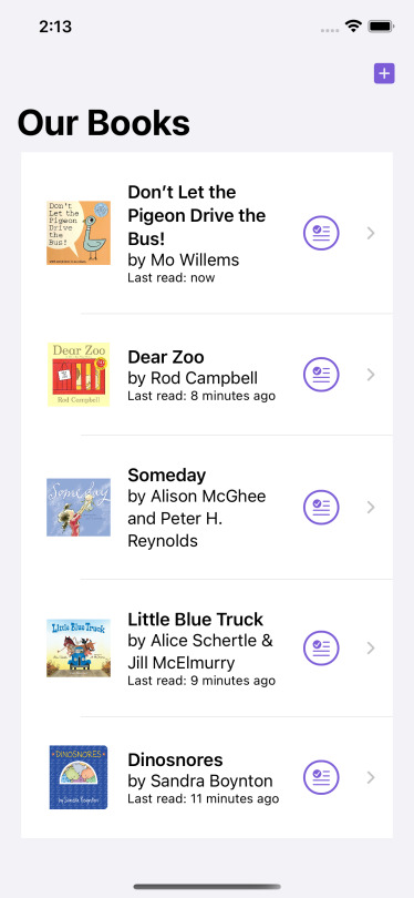
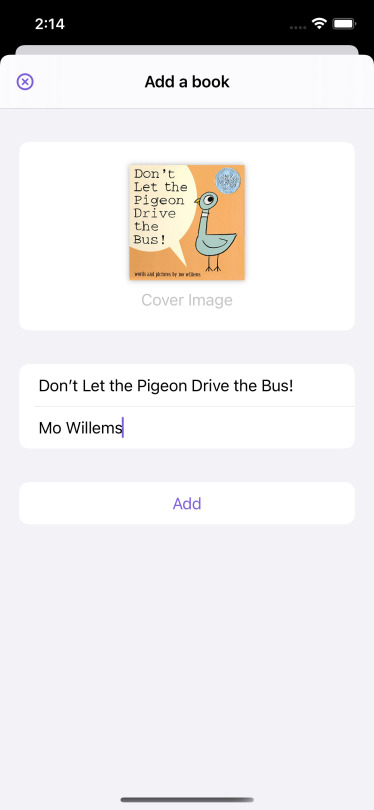
My project for the jam was an app I brainstormed that same weekend with my wife, Emily, based on one of her ideas: a toddler book reading tracker. Most reading tracker apps aren’t designed for super short books that you’re reading over and over and over again, day after day, and we thought it would be fun to be able to see how our son’s interest in books develops over time. When we read to him, we’re reading between 5-20 books a day, and he often seems to go through phases of obsession with certain books (he’s now at the stage where he brings us the books we’re going to read) that might be fun to track & chart.
Another thing I liked about this idea was that I could see a clear path from a weekend’s work on a prototype to shipping a minimum viable product and future updates post-jam. Here’s what I wrote as a feature list at the start of the jam:
List of books with number of times read & date last read
Flow for adding a new book (stretch goal: isbn scanner and lookup)
Flow for marking a book as just read
Flow for marking a book as read with a past date
Stretch goal: an Apple Watch app, since I often don’t have my phone with me when reading to 👶.
I didn’t end up getting to any of my stretch goals, or the flow for adding past read dates, but I did get the other main features built and fully functioning, and had a lot of fun while working on them.
Some technical takeaways…
While I’ve now used SwiftUI for just about every new screen and UI component I built for Picky over the last six months, they were all embedded within UIKit view controllers and working with a pure SwiftUI app has a different feel to it, especially when it comes to data flow.
While you get some really nice out of the box functionality when using Core Data, it really is showing its Objective-C origins and just doesn’t feel right with Swift (especially optionals). I think I’m going to explore some options for how to more naturally integrate it with some sort of middle layer to hide some of the rough edges from my pretty SwiftUI code.
I barely scratched the surface of what it can do, but the ButtonStyle protocol is a really neat way to customize controls.
I didn’t end up having any time to play with animations but I saw a lot of really inspiring work from other folks taking part in the jam. Definitely making it a goal of mine to really put SwiftUI’s powerful animation potential to use.
If you’re curious my somewhat hacky code (remember, this was a project done in one weekend, primarily while 👶 was asleep) is here on GitHub.
Lastly, here are a few screenshots to give you an idea of where I ended up at the end of the weekend:


3 notes
·
View notes
Text
Introduction to Material Design 3 in Flutter
When Material Design 3 introduces there are a few changes to code levels you have to make to reflect in the UI.
In this article, we will learn how to use Material 3 in the Flutter project with the new material design that Google is developing. As we all know, Flutter 3.3 is out now and supports the latest Material 3 design by Google.
ThemeData
As part of the migration to Material Design 3, a new useMaterial3 flag to ThemeData will allow applications to opt-in to Material Design 3 changes that are coming to many of the components across the library.
No components are currently affected, but as we transfer each component to Material Design 3, they will use this flag to determine which defaults they should use.
class MyApp extends StatelessWidget { const MyApp({Key? key}) : super(key: key); // This widget is the source of your application. @override Widget build(BuildContext context) { return MaterialApp( title: 'Flutter Sample', theme: ThemeData( useMaterial3: true, primarySwatch: Colors.blue, ), home: const MyHomePage(title: 'Flutter Sample Home Page'), ); } }
Components
The following Flutter components have been updated to Material Design 3 colors, text styles and shapes generated from the Material Design 3 token database:
Buttons
The common buttons (ElevatedButton, TextButton, and OutlineButton) need to be modified to the most recent design specification as part of the transition to Material Design 3.
Color: Dynamic color compatibility and new color mappings. Now, labels and icons have the same hue.
Icons: 18dp is the new standard size for leading and trailing icons.
Shape: New minimum width, greater height, and fully rounded corner radius
Typeface: The button text is in sentence case; there are no ALL CAPS.
Types: The term “contained button” has been replaced by the terms “elevated button,” “filled button,” and “filled tonal button.”
Example Of Elevated Button
Elevated Button ElevatedButton( child: const Text('Enabled Button'), onPressed: () { debugPrint("Elevated button clicked") }, )
Example Of Outlined Button
OutlinedButton( onPressed: () { debugPrint('Received click'); }, child: const Text('Outlined Button'), )
Example Of Text Button
Text Button TextButton( style: ButtonStyle( foregroundColor: MaterialStateProperty.resolveWith<Color?>( (Set<MaterialState> states) { if (states.contains(MaterialState.selected)) { return Colors.white; } return null; // defer to the defaults }, ), backgroundColor: MaterialStateProperty.resolveWith<Color?>( (Set<MaterialState> states) { if (states.contains(MaterialState.selected)) { return Colors.indigo; } return null; // defer to the defaults }, ), ), onPressed: () { // TODO: handle Text Button }, child: const Text('Text Button'), )
FloatingActionButton
On a screen, the FAB symbolizes the most significant activity. It makes important acts possible.
The floating action buttons in Flutter come in three sizes: FAB, small FAB, and large FAB.
Example Of Floating Action Button
FloatingActionButton( onPressed: () { // Add your onPressed code here! }, child: const Icon(Icons.add), )
Small Floating Action Button
FloatingActionButton.small( onPressed: () { // Add your onPressed code here! }, child: const Icon(Icons.add), )
Large Floating Action Button
FloatingActionButton.extended( onPressed: () { // Add your onPressed code here! }, label: const Text('Add'), icon: const Icon(Icons.add), )
IconButton
As part of the Material Design 3 specification there are updates to the Icon button’s visuals as optional support for toggle states, as well:
The updated IconButton will appear like the common buttons(TextButton, OutlinedButton etc) without text.
Example Of Filled Icon Button
IconButton( icon: const Icon(Icons.filter_drama), onPressed: onPressed, style: IconButton.styleFrom( foregroundColor: colors.onPrimary, backgroundColor: colors.primary, disabledBackgroundColor: colors.onSurface.withOpacity(0.12), hoverColor: colors.onPrimary.withOpacity(0.08), focusColor: colors.onPrimary.withOpacity(0.12), highlightColor: colors.onPrimary.withOpacity(0.12), ))
Example Of Filled Tonal Icon Button
Filled Tonal Icon Button IconButton( icon: const Icon(Icons.filter_drama), onPressed: onPressed, style: IconButton.styleFrom( foregroundColor: colors.onSecondaryContainer, backgroundColor: colors.secondaryContainer, disabledBackgroundColor: colors.onSurface.withOpacity(0.12), hoverColor: colors.onSecondaryContainer.withOpacity(0.08), focusColor: colors.onSecondaryContainer.withOpacity(0.12), highlightColor: colors.onSecondaryContainer.withOpacity(0.12), ), )
Example Of Outlined Icon Button
Outlined Icon Button IconButton( icon: const Icon(Icons.filter_drama), onPressed: onPressed, style: IconButton.styleFrom( focusColor: colors.onSurfaceVariant.withOpacity(0.12), highlightColor: colors.onSurface.withOpacity(0.12), side: onPressed == null ? BorderSide( color: Theme.of(context) .colorScheme .onSurface .withOpacity(0.12)) : BorderSide(color: colors.outline), ).copyWith( foregroundColor: MaterialStateProperty.resolveWith( (Set states) { if (states.contains(MaterialState.pressed)) { return colors.onSurface; } return null; }), ), )
Card
Card Widget in Flutter come in three different variations: elevated, filled, and outlined.
A card is identifiable as a single, contained unit, can hold anything from images to headlines, supporting text, buttons, lists, and other components.
Color: Compatibility with dynamic color and new color mappings
Elevation: Lower elevation by default, with no shadow
Three different forms of official cards: raised, filled, and outlined
Example Of Elevated Card
Card( child: SizedBox( width: 300, height: 100, child: Center(child: Text('Elevated Card')), ), )
Example Of Filled Card
Filled Card Card( elevation: 0, color: Theme.of(context).colorScheme.surfaceVariant, child: const SizedBox( width: 300, height: 100, child: Center(child: Text('Filled Card')), ), )
Example Of Outlined Card
Card( elevation: 0, shape: RoundedRectangleBorder( side: BorderSide( color: Theme.of(context).colorScheme.outline, ), borderRadius: const BorderRadius.all(Radius.circular(12)), ), child: const SizedBox( width: 300, height: 100, child: Center(child: Text('Outlined Card')), ), )
Chips
In contrast to buttons, which are persistent, chips indicate possibilities in a given environment.
Four different chip types exist: assist, filter, input, and suggestion
Color: Compatibility with dynamic color and new color mappings
Shape: Rectangle with corners
Types: Assist chips and suggestion chips are two different categories of action chips. Currently, a subset of choice chips are filter chips.
Chip( avatar: const CircleAvatar(child: Text('FA')), label: const Text('Flutter Agency'), onDeleted: () { // TODO: handle delete action }, )
Dialog
Dialogs can convey information, demand a response, or guide users through a process. Basic and full-screen dialogues are the two different varieties.
Color: Compatibility with dynamic color and new color mappings.
Layout: Greater padding utilized for increased corner-radius and title size
Position: Option for custom basic dialog positioning.
Shape: Increased corner-radius
Typography: Larger and darker headline
Example
OutlinedButton( onPressed: () { Navigator.of(context).restorablePush(_dialogBuilder); }, child: const Text('Open Dialog'), ) static Route _dialogBuilder( BuildContext context, Object? arguments) { return DialogRoute( context: context, builder: (BuildContext context) { return AlertDialog( title: const Text('Basic dialog title'), content: const Text( 'A dialog is a kind of modal window that\n' 'views in front of app content to\n' 'provide critical information, or prompt\n' 'for a decision to be made.'), actions: [ TextButton( style: TextButton.styleFrom( textStyle: Theme.of(context).textTheme.labelLarge, ), child: const Text('Disable'), onPressed: () { Navigator.of(context).pop(); }, ), TextButton( style: TextButton.styleFrom( textStyle: Theme.of(context).textTheme.labelLarge, ), child: const Text('Enable'), onPressed: () { Navigator.of(context).pop(); }, ), ], ); }, ); }
Also, Read This Post:
AppBar
Color: Color: Compatibility with dynamic color and new color mappings
Elevation: A color fill rather than a drop shadow establishes separation from the content.
Typography: Larger default text
Layout: Larger default height
Types: There are currently four sizes for top app bars: small, medium, and large.
Example
Scaffold( appBar: AppBar( actions: [ TextButton( style: style, onPressed: () {}, child: const Text('Action 1'), ), TextButton( style: style, onPressed: () {}, child: const Text('Action 2'), ), ], ), ); MaterialApp( theme: ThemeData( useMaterial3: true, colorSchemeSeed: const Color(0xff6750A4) ), home: Material( child: CustomScrollView( slivers: [ SliverAppBar.large( leading: IconButton(icon: Icon(Icons.menu), onPressed: () {}), title: const Text('Large App Bar'), actions: [ IconButton(icon: const Icon(Icons.more_vert), onPressed: () {}), ], ), // Just some content much enough to have unique object to scroll. SliverToBoxAdapter( child: Card( child: SizedBox( height: 1200, child: Padding( padding: const EdgeInsets.fromLTRB(8, 100, 8, 100), child: Text( 'Here be scrolling content...', style: Theme.of(context).textTheme.headlineSmall, ), ), ), ), ), ], ), ), )
Also, Read This Post:
Color
ColorScheme
Comes with an updated/expanded color scheme to grant more flexibility.
There are two deprecated colors for ColorScheme: primaryVariant and secondaryVariant. They need to be removed from the 5 constructors and the copyWith method. I then map references of these properties to primaryContainer and secondaryContainer.
As part of the migration to Material Design 3, this PR adds new APIs to make it easy to generate new Material Design 3 ColorSchemes from just a single color.
The new APIs are as follows:
ColorScheme.fromSeed()
You can construct a complete Material Design 3 ColorScheme derived from the tones of a single seed color with:
final lightScheme = ColorScheme.fromSeed(seedColor: Colors.green); final darkScheme = ColorScheme.fromSeed(seedColor: Colors.green, brightness: Brightness.dark);
Typography / Iconography
Material Design 3 comes with an updated/expanded typography scale to allow for more flexibility. We will be updating the text theme to support Renaming existing text styles so they are grouped into 5 categories with small, medium, large size and Add a new Typography constructor that provides updated default values for each text style for Material Design 3.
Conclusion
A whole ColorScheme no longer needs to be explicitly created, and the dynamic color is naturally supported on devices; Material Design 3 is a little simpler. You’ll like being able to use actual brand color in the app theme design now that you can. By combining Material 3 with the Flutter application, you can build consistent and unified UI experiences across web, desktop, and mobile platforms.
The Flutter developers have been putting a lot of effort into giving Flutter complete Material 3 functionality. As seen above, you can already move your current Material 2 app to Material 3. You can follow the app development of Flutter widgets that don’t yet have Material 3 support if you use them. Moreover, if you are looking for dedicated developers who can work on your project, you can hire flutter developer for the hourly-based model or fixed projects. We are delighted to help you.
Frequently Asked Questions (FAQs)
1. What is Material Design in Flutter development?
Material design in Flutter is an adaptable design system. Hence, with the help of the Material design system, we can develop the Flutter widgets.
2. How can I access material 3 in the Flutter framework?
To enable Material 3, first, define the theme of ThemeData in the MaterialApp class and will set its useMaterail3 property to true. By using this functionality, you select Use Material 3.
3. Why is the MaterialApp class used in Flutter?
MaterialAppclass is the predefined class and the core component of Flutter. It accesses all the other components and widgets which Flutter SDK gives.
Source: https://flutteragency.com/material-design-3-in-flutter/
0 notes
Text

Different Styles of Buttons for Jackets: Classic, Modern, and Decorative Options
This article provides a comprehensive guide to understanding and selecting different styles of buttons for jackets. Here's a breakdown of each section and what you can expect to learn:
1. Introduction to Different Styles of Buttons for Jackets
Buttons might seem like a small detail, but they play a significant role in the overall style and functionality of your outerwear. Whether you're refreshing an old favorite or customizing a new piece, understanding the different styles of buttons for jackets can make a big difference.
2. Classic Button Styles for Jackets
Styles Covered:
Metal Buttons: Think brass or silver-toned buttons that add a bit of shine. They're perfect for military-inspired jackets and coats, and they also work well on blazer buttons. The weight and durability of metal buttons make them a great choice for heavy fabrics.
Leather Buttons: Leather buttons give a rugged, vintage look. They're often seen on tweed jackets and rustic outerwear. Leather ages beautifully, adding character over time, and they can be a great choice for a button coat as well.
Horn Buttons: Made from real or imitation horn, these buttons have a natural, earthy appeal. They're commonly found on blazers and sports jackets, giving them a sophisticated edge. Horn buttons are a classic choice for blazer buttons.
3. Modern Button Styles for Jackets
Styles Covered:
Snap Buttons: Easy to use, great for casual jackets like bombers and parkas.
Plastic Buttons: Versatile and lightweight, suitable for fashion-forward and lightweight jackets.
Magnetic Buttons: Innovative and provide a smooth closure, often used in modern blazers.
4. Decorative Button Styles for Jackets
Styles Covered:
Jeweled Buttons: Add sparkle and are ideal for evening wear and special occasions.
Embossed Buttons: Feature intricate designs or logos for a unique touch.
Fabric-Covered Buttons: Match the button fabric with the jacket fabric for a cohesive look.
5. Functional Button Styles for Jackets
Styles Covered:
Toggle Buttons: Useful for duffle coats and winter jackets, easy to fasten even with gloves.
Zipper Buttons: Combine zippers with buttons for additional security, common in outdoor wear.
Hook and Eye Buttons: Discreet closures often used in formal jackets and blazers.
6. How to Choose the Right Button Style for Your Jacket
Considerations:
Jacket's Purpose: Casual vs. formal needs and weather conditions.
Fabric Type: Matching button styles with heavy or light fabrics.
Personal Style: Aligning button choices with individual fashion preferences.
Practicality: Ensuring ease of use and durability for frequent wear.
Understanding the different styles of buttons for jackets can help you make informed choices and elevate your wardrobe. Whether you're looking for classic elegance, modern functionality, or decorative flair, there's a button style out there for you. So go ahead, refresh that old jacket or customize a new one with the perfect buttons.
Remember, the right button can make all the difference in the world. It’s a small detail, but it can transform your entire look, whether you're selecting blazer buttons or choosing a style for a button coat. So take your time, choose wisely, and let your jacket buttons reflect your unique style and personality.
Happy styling!
#JacketButtons#BlazerButtons#FashionTips#ButtonStyles#ButtonCoat#Blazer#FashionTrends#DecorativeButtons#ModernFashion
0 notes
Text
Click, Boom, Wow: Adding Click Effects to Buttons with CSS

Introduction
Welcome to the world of interactive web design, where every click can be a moment of delight for your users. In this blog post, we'll explore the art of adding captivating click effects to buttons using the power of CSS. Whether you're a seasoned web developer or just getting started, this guide will walk you through the process of creating buttons that not only respond to user interactions but also leave a lasting impression. Get ready to make your buttons go from a simple click to a memorable experience—Click, Boom, Wow!
Understanding Click Effects

Click effects are a crucial element in modern web design, providing a visual and interactive response to user actions. By understanding the dynamics of click effects, you can significantly enhance the user experience on your website. Let's delve into the details of what click effects are and why they matter. What are Click Effects? Click effects refer to the visual and sometimes auditory responses that occur when a user interacts with a clickable element on a website. These effects serve both functional and aesthetic purposes, providing feedback to users and making the overall interaction more engaging. Importance of Click Effects: - User Engagement: Click effects capture the user's attention and create a sense of responsiveness, making the interaction more engaging. - Intuitive Feedback: They offer immediate feedback, informing users that their action has been recognized, which is especially crucial for buttons and interactive elements. - Aesthetics and Branding: Well-designed click effects contribute to the overall aesthetics of a website and can be tailored to match the brand's visual identity. Common Types of Click Effects: 1. Ripple Effect: Mimicking the ripples caused by a drop in water, this effect radiates from the point of interaction, creating a dynamic visual impact. 2. Shadow and Depth: Applying shadows or depth changes to the clickable element, giving the illusion of physical interaction and depth. 3. Color Changes: Altering the color of the button or element upon interaction to visually signify the click action. Implementation with CSS: Implementing click effects involves utilizing CSS properties and, in some cases, CSS animations. For example, you can use the :hover pseudo-class or JavaScript event listeners to trigger the effects. CSS Properties for Click Effects Property Description box-shadow Applies a shadow effect to the element. background-color Changes the background color of the element. transform Applies 2D or 3D transformations to the element. Understanding the intricacies of click effects and their implementation sets the foundation for creating buttons that not only respond functionally but also contribute to the visual appeal of your website.
Basic Button Click Effects
Now that we've grasped the concept of click effects, let's dive into the world of basic button click effects. These simple yet effective interactions can elevate the user experience and add a touch of dynamism to your website. 1. Hover Effects: One of the simplest ways to add a click effect is by incorporating a hover effect. When a user hovers over a button, you can change its color, add a shadow, or alter its size to visually indicate interactivity. 2. Background Transitions: Smooth transitions in the background color of a button can create a subtle and visually appealing click effect. Use the CSS transition property to control the speed and timing of the color change. 3. Box Shadows: Applying box shadows to buttons can give the illusion of depth and interaction. As the user clicks, the shadow can intensify, providing a tactile feel to the button. 4. Scaling Effect: Implementing a scaling effect on button click adds a dynamic element. Use the CSS transform property with the scale() function to smoothly enlarge or shrink the button on click. 5. Border Effects: Modifying the border of a button upon clicking can create a distinctive effect. You can increase the border width, change its color, or even make it glow using the :active pseudo-class. CSS Properties for Basic Click Effects Effect Type CSS Property Description Hover Effects :hover Triggered when the mouse is over the button. Background Transitions transition Creates a smooth transition effect on property changes. Box Shadows box-shadow Adds a shadow effect to the element. Scaling Effect transform: scale() Enlarges or shrinks the element based on the scaling factor. Border Effects :active Applied when the button is in an active state (clicked). Experimenting with these basic button click effects not only enhances user interaction but also provides a foundation for more intricate designs in the world of CSS-powered web interactions.
Advanced Click Effects
See the Pen Button Click Effects by Adam (@adamjtew) on CodePen. Ready to take your button interactions to the next level? Advanced click effects add a touch of sophistication and creativity to your website, making user interactions not just functional but visually stunning. Let's explore some advanced techniques to make your buttons truly stand out. 1. Particle Animation: Introduce a mesmerizing particle animation that emanates from the clicked point. This effect utilizes CSS and JavaScript to create a dynamic burst of particles, adding a sense of magic to the user's interaction. 2. 3D Transformations: Bring depth and dimension to your buttons with 3D transformations. By using the transform property in conjunction with the rotateX or rotateY functions, you can create an illusion of buttons flipping or tilting upon click. 3. Morphing Shapes: Transform the shape of your buttons during interaction. Using CSS transitions and keyframes, you can smoothly morph a button from a square to a circle or any custom shape, providing a visually captivating effect. 4. Liquid Click Effects: Create a liquid-like ripple effect that expands from the clicked point. This advanced animation, achieved through CSS and JavaScript, adds a dynamic and organic feel to button interactions. 5. Glowing and Pulsating Effects: Make your buttons come alive with glowing and pulsating animations. Using CSS animations and keyframes, you can create a subtle or vibrant glow that pulsates around the button, drawing attention to the interaction. Technologies for Advanced Click Effects Effect Type Technology Used Description Particle Animation CSS + JavaScript Creates a burst of particles upon button click. 3D Transformations CSS Applies 3D transformations for a visually dynamic effect. Morphing Shapes CSS Transitions + Keyframes Smoothly morphs the button shape during interaction. Liquid Click Effects CSS + JavaScript Creates a liquid-like ripple effect expanding from the clicked point. Glowing and Pulsating Effects CSS Animations + Keyframes Adds a glowing and pulsating animation to the button. Embrace the world of advanced click effects to not only provide intuitive feedback but also to infuse a sense of wonder and sophistication into your website's user experience.
Responsive Design for Click Effects
Ensuring that your click effects seamlessly adapt to various devices and screen sizes is a crucial aspect of providing a consistent and enjoyable user experience. In this section, we'll explore the importance of responsive design for click effects and how to implement it effectively. 1. Flexible Units and Media Queries: Utilize relative units such as percentages or ems instead of fixed pixels to ensure that your click effects scale appropriately on different screen sizes. Implement CSS media queries to adjust the styling and animations based on the device's characteristics. 2. Touch and Hover Considerations: Recognize the differences between touch and hover interactions. While desktop users might experience hover effects, mobile and tablet users rely on touch. Design your click effects to be touch-friendly, ensuring a seamless transition between touch and hover states. 3. Fluid Grids and Layouts: Implement fluid grids and layouts that expand or contract based on the screen size. This ensures that your buttons and click effects occupy the appropriate amount of space on different devices, maintaining a visually appealing layout. 4. Retina-Ready Graphics: Optimize your click effect graphics for high-resolution displays. Use SVG graphics or high-density images to ensure that the visual elements of your click effects remain crisp and clear, enhancing the overall visual experience. 5. Testing Across Devices: Perform thorough testing across a variety of devices and browsers to identify any inconsistencies in your click effects. Address issues promptly to provide a uniform and polished experience to users regardless of the device they are using. Responsive Design Techniques for Click Effects Technique Description Flexible Units and Media Queries Uses relative units and media queries to adapt click effects to different screen sizes. Touch and Hover Considerations Differentiates between touch and hover interactions, ensuring compatibility with various input methods. Fluid Grids and Layouts Implements fluid grids and layouts for responsive resizing of buttons and click effects. Retina-Ready Graphics Optimizes graphics for high-resolution displays to maintain visual clarity. Testing Across Devices Conducts thorough testing to identify and address inconsistencies in click effects across different devices. By prioritizing responsive design principles, you ensure that your click effects enhance user interactions on a wide range of devices, contributing to a positive and consistent user experience.
Optimizing Performance
While captivating click effects enhance user engagement, it's crucial to optimize their performance to maintain a smooth and efficient website. In this section, we'll explore strategies for ensuring that your click effects not only look impressive but also contribute to an optimal browsing experience. 1. CSS Minification and Compression: Minify and compress your CSS files to reduce their size. This ensures faster loading times for your website, as smaller file sizes lead to quicker downloads. Utilize tools that automatically remove unnecessary characters and whitespace from your CSS code without affecting its functionality. 2. Image Optimization: Optimize images used in your click effects by compressing them without compromising quality. Use image formats such as WebP for better compression efficiency. This not only reduces the load on the server but also improves the overall page loading speed. 3. Lazy Loading: Implement lazy loading for elements with click effects that are not immediately visible on the user's screen. This technique delays the loading of off-screen elements, prioritizing the initial rendering of the visible content and improving perceived performance. 4. Minimize JavaScript Execution: If JavaScript is involved in triggering your click effects, ensure that the code is optimized and executes efficiently. Minimize unnecessary calculations and consider deferring the execution of non-essential scripts to enhance overall page responsiveness. 5. Browser Caching: Leverage browser caching to store static assets locally on the user's device. This reduces the need to fetch resources from the server on subsequent visits, leading to quicker loading times. Configure cache headers appropriately to balance freshness and efficiency. Performance Optimization Techniques Technique Description CSS Minification and Compression Minifies and compresses CSS files to reduce their size for faster loading. Image Optimization Optimizes images by compressing them without compromising quality. Lazy Loading Delays the loading of off-screen elements to prioritize visible content. Minimize JavaScript Execution Optimizes JavaScript code to reduce unnecessary calculations and improve execution speed. Browser Caching Utilizes browser caching to store static assets locally for quicker loading on subsequent visits. By implementing these performance optimization techniques, you can ensure that your click effects not only enhance user interaction but also contribute to an efficient and enjoyable browsing experience.
Adding Personalization with Click Effects
Personalizing click effects on your website goes beyond mere interactivity; it creates a unique and memorable experience for users. In this section, we'll explore how to infuse a personalized touch into your click effects, making your website stand out and leaving a lasting impression. 1. Theme Integration: Align your click effects with the overall theme and aesthetics of your website. Ensure that the color schemes, animations, and styles complement the branding, creating a cohesive and personalized visual identity. 2. User Preferences: Allow users to customize their click experience through preference settings. This could include options to choose different click effect styles, speeds, or even disable certain effects for a tailored interaction that suits individual preferences. 3. Dynamic Content Updates: Integrate click effects with dynamic content updates. For example, if your website features user-generated content or real-time data, make the click effects responsive to these changes, providing a personalized and up-to-date experience for the user. 4. User-Initiated Customization: Empower users to initiate and control specific click effects. This could involve interactive elements that users can manipulate, such as draggable buttons or customizable animations, giving them a sense of control and personalization. 5. Personalized Feedback: Use click effects to provide personalized feedback based on user actions. For instance, a successful form submission could trigger a celebratory animation, creating a positive and personalized response to the user's interaction. Elements for Adding Personalization Personalization Element Description Theme Integration Aligns click effects with the overall theme and branding of the website. User Preferences Allows users to customize click effects based on their preferences. Dynamic Content Updates Integrates click effects with real-time content changes for a personalized experience. User-Initiated Customization Empowers users to control and customize specific click effects. Personalized Feedback Provides feedback through click effects tailored to user actions. By incorporating these personalized elements into your click effects, you not only enhance user engagement but also create a website experience that feels tailor-made for each individual visitor.
Accessibility Considerations
Ensuring that your click effects are accessible to users with diverse needs and abilities is a fundamental aspect of responsible web design. In this section, we'll explore key considerations to make your click effects inclusive and usable for everyone. 1. Focus States and Keyboard Navigation: Ensure that your click effects are compatible with keyboard navigation. Users who rely on keyboards or assistive technologies should be able to access and trigger the click effects easily. Implement visible focus states to indicate the currently focused element for enhanced navigation. 2. ARIA Roles and Attributes: Use ARIA (Accessible Rich Internet Applications) roles and attributes to enhance the accessibility of your click effects. Assign appropriate roles to clickable elements and provide descriptive labels to convey the purpose of each interactive element for screen reader users. 3. Adjustable Timing and Animation: Allow users to adjust the timing and speed of click effects or provide an option to disable them altogether. Some users may require more time to process animations, and providing control over these aspects enhances the overall accessibility of your website. 4. Color Contrast and Visibility: Ensure sufficient color contrast between clickable elements and their background to accommodate users with visual impairments. Use bold and distinct colors to make click effects visible, and avoid relying solely on color changes to convey information. 5. Compatibility with Assistive Technologies: Test your click effects with various assistive technologies, including screen readers and voice command systems. Ensure that the interactive elements are correctly interpreted and that users can understand and engage with the click effects through these technologies. Accessibility Considerations for Click Effects Consideration Description Focus States and Keyboard Navigation Ensures compatibility with keyboard navigation and provides visible focus states for enhanced accessibility. ARIA Roles and Attributes Utilizes ARIA roles and attributes to enhance the accessibility of interactive elements for screen reader users. Adjustable Timing and Animation Allows users to control the timing and speed of click effects, catering to different cognitive processing speeds. Color Contrast and Visibility Ensures sufficient color contrast and uses bold colors to make click effects visible for users with visual impairments. Compatibility with Assistive Technologies Tests click effects with various assistive technologies to ensure correct interpretation and interaction. Read the full article
0 notes
Link
0 notes
Link
INDIE PLAID SOFT SLEEVES SNAP JACKET
0 notes
Link
0 notes
Text
[Flutter]ButtonStyleの引数「shape」を使う方法
どうも、ちょげ(@chogetarou)です。 ButtonStyleの引数「shape」を使う方法を紹介します。 方法 ButtonStyleの引数「shape」を使うには、MaterialStatePropertyクラスを指定します。 具体的には、「MaterialStateProperty.all<クラス>(クラス)」のように指定します。 MaterialStatePropertyStateクラスに指定するクラスは、実際の形を指定するためのものです。 例えば、角丸の四角形の形を指定するRoundedRectangleBorderクラスの場合は、次のようになります。 MaterialStateProperty.all<RoundedRectangleBorder>( RoundedRectangleBorder( borderRadius:…

View On WordPress
0 notes
Text
How to use the ElevatedButton widget in Flutter?

This article will give examples of using the ElevatedButton widget in Flutter, starting with the most fundamental usage. It is the perfect example written by our Flutter experts, who have vast experience developing Flutter apps.
One of the buttons in Material Design in Flutter web is called Elevated Button has the feature of rising in elevation as the user presses it. Use the ElevatedButton widget in Flutter if you need to construct a Material Design elevated button.
When tapped by the user, these buttons’ primary feature is a small elevation of their surface toward the screen. Simply put, elevated buttons are raised, non-deprecated buttons without a clearly defined button style.
There are two parameters. It goes without saying that you must transmit a Widget as a child, usually a Text or an Icon widget. Additionally, you must pass the onPressed callback, which is triggered when a button is pressed by the user.
A static factory function ElevatedButton.icon makes it simpler for you to create an elevated button that has both Icon and Text widgets. For each icon and label, you must pass a Widget rather than a child.
This constructor can be used to create an ElevatedButton.
ElevatedButton({Key? key,required VoidCallback? onPressed,VoidCallback? onLongPress,ValueChanged<bool>? onHover,ValueChanged<bool>? onFocusChange,ButtonStyle? style,FocusNode? focusNode,bool autofocus = false,Clip clipBehavior = Clip.none,MaterialStatesController? statesController,required Widget? child})</bool></bool>
What are the properties of an ElevatedButton?
1. autofocus:
It delivers a boolean value that corresponds to the button’s initial focus of Flutter.
2. clipBehaviour :
Whether or not the content is clipped is determined by clipBehavior.
3. focusNode:
Depicts the widget’s focus node.
4. ButtonStyle style:
Determines how the button will be styled
5. onLongPress :
When the button is long-pressed by the user, an action is to be taken called onLongPress.
6. enabled :
Gives a boolean value for the button’s activity called “enabled”
7. hashcode :
The button’s hashcode is determined by the hashcode.
8. onFocusChanged :
When a button’s focus changes, a method called onFocusChanged is called.
9. onHover :
The action that will be carried out when the user hovers over the button.
Also, Read This Post:
Example:
import 'package:flutter/material.dart'; void main() { runApp(const MyApp()); } class MyApp extends StatelessWidget { const MyApp({super.key}); @override Widget build(BuildContext context) { return const MaterialApp( home: MyHomePage(), ); } } class MyHomePage extends StatefulWidget { const MyHomePage({ super.key, }); @override State<myhomepage> createState() => _MyHomePageState(); } class _MyHomePageState extends State<myhomepage> { @override Widget build(BuildContext context) { return Scaffold( body: Column( mainAxisAlignment: MainAxisAlignment.center, crossAxisAlignment: CrossAxisAlignment.center, children: [ ElevatedButton( style: ElevatedButton.styleFrom( minimumSize: const Size(88, 36), padding: const EdgeInsets.symmetric(horizontal: 16), shape: const RoundedRectangleBorder( borderRadius: BorderRadius.all(Radius.circular(2)), ), ), onPressed: () {}, child: const Text('Looks like a RaisedButton'), ), ElevatedButton( style: ElevatedButton.styleFrom(), onPressed: () {}, child: const Text('ElevatedButton with custom foreground/background'), ), ElevatedButton( style: ElevatedButton.styleFrom(backgroundColor: Colors.red), onPressed: null, child: const Text('ElevatedButton with custom disabled colors'), ), ElevatedButton( style: ButtonStyle( backgroundColor: MaterialStateProperty.resolveWith<color>( (Set<materialstate> states) { if (states.contains(MaterialState.disabled)) return Colors.red; return Colors.blue; // Defer to the widget's default. }), foregroundColor: MaterialStateProperty.resolveWith<color>( (Set<materialstate> states) { if (states.contains(MaterialState.disabled)) return Colors.blue; return Colors.blue; // Defer to the widget's default. }), ), onPressed: null, child: const Text('ElevatedButton with custom disabled colors'), ), ElevatedButton( style: ButtonStyle( elevation: MaterialStateProperty.resolveWith<double>( (Set<materialstate> states) { if (states.contains(MaterialState.pressed)) return 16; return 10; }), ), onPressed: () {}, child: const Text('ElevatedButton with a custom elevation'), ) ], )); } } </materialstate></double></materialstate></color></materialstate></color></myhomepage></myhomepage>
Output:

Conclusion :
So, in this article, we learned how to use the ElevatedButton widget. You can change and update this Flutter code according to your requirement. I hope you liked reading this.
Flutter is the best choice to develop your business apps. Adopt a Flutter app development company to build your dream Flutter mobile application.
Frequently Asked Questions (FAQs)
1. Which is the essential argument for an ElevatedButton in Flutter?
You can make the ElevatedButton in the Flutter by calling the constructor. Usually, there are two kinds of parameters. First, you must pass the widget as a child and the text or icon. You also have to give the onPressed Callback that is called when the user presses the button.
2. How do you increase the size of a widget in Flutter app development?
You can utilize the LayoutBuilder, which will fetch a parent widget’s dimension and will adjust the children’s widget dimension according to the parent.
3. How do you give the style to an ElevatedButton in a Flutter project?
You can not provide the style to ElevatedButtons in Flutter. You cannot modify the button’s color, font size, etc. Explicitly like raised buttons. You can pass the text or icons as a child widget to them.
Originally Published At: https://flutteragency.com/elevatedbutton-widget-in-flutter/
0 notes
Text
Trusha Dresses Baggy Style Jeans for Girls or Women
Trusha Dresses Baggy Style Jeans for Girls or Women
Price: (as of – Details) Shop from Trusha Dresses a wide range of Jeans. Perfect for your everyday use, you could pair it with a stylish t-shirt or shirt complete the look. Fit Type: Regular FitButton: 1 ButtonStyle: Baggy StylePrint: As It isBack Pocket: Yes & Knee Side Pocket alsoFront Pocket: Yes

View On WordPress
0 notes