#CSSConversion
Explore tagged Tumblr posts
Visit Tumblr Blog
Explore Tumblr blogs with no restrictions, modern design and the best experience.
Last Seen Tumblr Blogs


Fun Fact
Mobile US users spent an average of 115.8 minutes on Tumblr app monthly.
Text
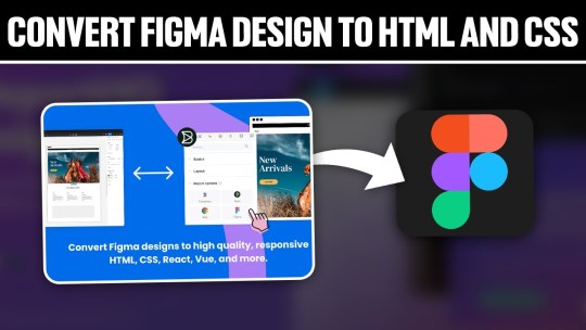
Converting Figma Designs to HTML and CSS: A Complete Tutorial

Introduction
Welcome to our comprehensive tutorial on converting Figma designs to HTML and CSS. In today's web development landscape, the seamless integration between design tools and the coding process is crucial for creating visually stunning and functional websites. This tutorial aims to guide you through the process of translating your Figma designs into clean, responsive, and optimized HTML and CSS code.
Understanding Figma Designs
Figma stands as a powerful collaborative interface design tool, empowering designers to create visually compelling and interactive user interfaces. Before diving into the conversion process, it's essential to grasp the intricacies of Figma designs and their significance in the web development workflow. Figma Features: - Vector Editing: Figma allows designers to create and edit vector graphics, ensuring scalable and high-quality designs. - Collaboration: With real-time collaboration features, multiple team members can work on the same project simultaneously, fostering efficient teamwork. - Prototyping: Designers can create interactive prototypes, offering a holistic view of user flows and interactions within the application. - Component-Based Design: The use of components ensures consistency across designs, making it easier to translate into code. Understanding the structure of a Figma design is crucial for an accurate conversion to HTML and CSS. Design elements such as layers, groups, and artboards play a pivotal role in maintaining the hierarchy and visual integrity of the design when translated into code. Figma-to-Code Workflow: - Design Exploration: Designers create and iterate on the user interface, defining styles, layouts, and interactions within Figma. - Export Assets: Export design assets such as images, icons, and SVGs for use in the HTML and CSS files. - HTML Structure: Translate the visual layout into a well-structured HTML document, ensuring a logical and semantic flow of content. - CSS Styling: Apply styles to HTML elements based on the design specifications, including typography, colors, and spacing. - Responsive Design: Ensure that the design adapts seamlessly to different screen sizes, considering mobile and desktop layouts. Developers must pay attention to the details within Figma designs, from font choices to spacing and color schemes, to faithfully recreate the designer's vision in the final web product. Stay tuned as we guide you through the step-by-step process of setting up your development environment and translating these designs into code in the upcoming sections of this tutorial.
Setting Up the Development Environment
Before embarking on the journey of converting Figma designs to HTML and CSS, it's crucial to establish a well-configured development environment. This ensures a smooth and efficient workflow throughout the coding process. Here's a detailed guide on setting up your environment: 1. Choose a Code Editor: Select a code editor that suits your preferences and needs. Popular choices include Visual Studio Code, Sublime Text, and Atom. A code editor with robust features and extensions can significantly enhance your productivity. 2. Version Control: Implement version control using Git to track changes and collaborate seamlessly. Platforms like GitHub or GitLab provide hosting solutions for your code repositories, facilitating teamwork and code management. 3. Project Structure: Organize your project structure thoughtfully. Create folders for assets, stylesheets, scripts, and HTML files. This ensures a clean and maintainable codebase, making it easier to locate and update specific elements. 4. Install Node.js: Node.js is essential for running various build tools and package managers. Install Node.js and npm (Node Package Manager) to manage project dependencies efficiently. This step is crucial for automating tasks and optimizing your workflow. 5. CSS Preprocessors: Consider using CSS preprocessors like Sass or Less to enhance your stylesheets with features like variables, mixins, and nesting. These preprocessors contribute to cleaner and more maintainable code. 6. Browser Developer Tools: Familiarize yourself with the developer tools available in web browsers. These tools aid in debugging, inspecting elements, and testing your website across different devices and screen sizes. 7. Responsive Design Testing: Explore tools for testing responsive designs. Platforms like BrowserStack or built-in browser tools allow you to simulate your website on various devices, ensuring a consistent and user-friendly experience. Tool Purpose Visual Studio Code Code editing and debugging Git & GitHub Version control and collaboration Node.js & npm Package management and task automation By meticulously configuring your development environment, you lay the foundation for a successful Figma-to-HTML/CSS conversion. In the next sections, we'll delve into the specifics of structuring HTML from Figma and styling with CSS, bringing your designs to life on the web.
Structuring HTML from Figma
Once your development environment is set up, the next crucial step in converting Figma designs to HTML and CSS is to create a well-structured HTML document. Proper HTML structuring not only ensures a logical flow of content but also lays the groundwork for seamless styling and responsiveness. Let's dive into the details: 1. Analyzing the Design: Thoroughly examine your Figma design to identify key sections and components. Create a mental map of the layout, including header, main content, sidebar, and footer. This analysis guides the HTML structure you'll implement. 2. Semantic HTML Elements: Embrace semantic HTML elements to convey the meaning of your content. Use , , , , , , and to represent different parts of your webpage. 3. Dividing Into Components: Identify design components that can be treated as separate entities. Convert these into reusable HTML components, making your code modular and easy to maintain. Utilize classes and IDs for styling and JavaScript interactions. 4. Navigation and Links: Implement navigation elements using the appropriate HTML tags. Use for the navigation bar and for links. Ensure proper linking between pages and sections of your website. 5. Form Elements: If your design includes forms, structure them using HTML form elements. Utilize , , , and other form-related tags to create a user-friendly and accessible form structure. HTML Structure Example: HTML Element Purpose Top section containing the site's logo and navigation. Main content area, housing articles, sections, and other content. Side section, often used for related content or advertisements. Bottom section with copyright information and additional links. Optimizing for Accessibility: Consider accessibility by incorporating proper heading structures (
,
, etc.), alt attributes for images, and other accessibility best practices to ensure your website is inclusive and user-friendly. By carefully structuring your HTML based on the Figma design, you set the stage for a seamless transition to CSS styling. In the upcoming sections, we'll explore the intricacies of styling with CSS, ensuring your web pages look as visually appealing as the original design.
Styling with CSS
With the HTML structure in place, the next pivotal step in converting Figma designs to a functional website is styling with CSS. CSS brings your design to life by defining the visual presentation and layout. Let's delve into the details of effectively styling your HTML elements: 1. External Stylesheets: Organize your styles by using external stylesheets. Create a separate CSS file and link it to your HTML document. This separation enhances maintainability and allows for a cleaner project structure. 2. Selectors and Properties: Utilize CSS selectors to target specific HTML elements and apply styles. Common properties include color, font-size, margin, padding, and more. Use meaningful class and ID names for clarity. 3. Typography: Define font styles for headings, paragraphs, and other text elements. Specify font families, sizes, and weights to achieve a consistent and visually appealing typography throughout your website. 4. Colors and Backgrounds: Implement the color scheme from your Figma design using CSS. Use hexadecimal or RGB values to set colors for text, backgrounds, borders, and other elements. Consider gradients and images for background styles. 5. Box Model: Understand and apply the box model to control the spacing and layout of elements. Adjust margins, padding, and borders to achieve the desired visual hierarchy and spacing between elements. 6. Flexbox and Grid: Embrace Flexbox and Grid layout models for efficient and responsive designs. These CSS features simplify the positioning and alignment of elements, ensuring a flexible and dynamic layout on different screen sizes. 7. Media Queries: Implement media queries to create responsive designs. Define breakpoints where the layout or styling should adapt to different screen sizes. This ensures a seamless user experience on both desktop and mobile devices. CSS Property Purpose color Defines the text color. font-size Sets the size of the font. margin Specifies the outside spacing of an element. padding Determines the inside spacing of an element. Testing and Debugging: Regularly test your styles across different browsers to ensure consistency. Use browser developer tools to inspect and debug your CSS code, addressing any layout or styling issues that may arise. By mastering the art of styling with CSS, you bring your Figma design to life on the web. The next section will guide you through handling interactivity and dynamic elements, enhancing the user experience of your website.
Handling Interactivity and Dynamic Elements
As we progress in converting Figma designs to HTML and CSS, it's essential to introduce interactivity and dynamic elements to create a more engaging user experience. This section focuses on incorporating JavaScript and other techniques to breathe life into your web pages: 1. JavaScript Integration: Integrate JavaScript into your project to add interactivity. Utilize event listeners to respond to user actions such as clicks, mouseovers, and form submissions. JavaScript enables you to manipulate the DOM (Document Object Model) dynamically. 2. Animation Effects: Enhance user engagement by incorporating animation effects. CSS animations and transitions can be used for subtle enhancements, while JavaScript libraries like GreenSock Animation Platform (GSAP) provide advanced animation capabilities for more complex scenarios. 3. Form Validation: Implement client-side form validation using JavaScript to enhance user experience and reduce server load. Validate user inputs for correctness before submitting the form, providing real-time feedback to users. 4. Dynamic Content Loading: Load content dynamically to improve page load times. Use JavaScript to fetch data from external sources and update specific sections of your page without requiring a full page reload. This technique enhances the perceived performance of your website. 5. Interactive Components: Create interactive components based on Figma designs. Convert buttons, sliders, modals, and other elements into interactive components using a combination of HTML, CSS, and JavaScript. Ensure a seamless transition between states for a polished user experience. Technique Purpose Event Listeners Respond to user actions like clicks and key presses. CSS Animations Create visually appealing animation effects. Form Validation Ensure accurate and validated user input. Dynamic Content Loading Improve page load times by loading content on demand. Accessibility Considerations: When adding interactivity, ensure your website remains accessible. Provide alternative text for dynamic content, focus states for interactive elements, and consider keyboard navigation for users who rely on assistive technologies. Testing Across Browsers: Thoroughly test the interactivity and dynamic elements across different browsers to ensure a consistent experience for all users. Address any compatibility issues that may arise during testing. By mastering the handling of interactivity and dynamic elements, your website moves beyond static design, offering users a dynamic and engaging online experience. The final section will cover optimizing your Figma-to-HTML/CSS project for performance, ensuring a fast and responsive web presence.
Optimizing for Performance
As we near the completion of our Figma-to-HTML/CSS journey, optimizing your project for performance is crucial to ensure a fast and responsive web presence. Efficient optimization practices not only enhance user experience but also contribute to better search engine rankings. Let's explore key strategies for optimizing performance: 1. Minification: Minify your HTML, CSS, and JavaScript files to reduce their size. Minification involves removing unnecessary whitespace, comments, and unused code, resulting in smaller file sizes and faster loading times for your web pages. 2. Image Optimization: Optimize images to strike a balance between quality and file size. Use image compression tools to reduce the size of images without compromising visual integrity. Consider using responsive images to deliver different sizes based on the user's device and screen resolution. 3. Lazy Loading: Implement lazy loading for images and other non-essential resources. Lazy loading defers the loading of certain elements until they are about to come into the user's viewport. This technique improves initial page load times, especially for content-heavy websites. 4. Content Delivery Network (CDN): Utilize a Content Delivery Network to distribute your static assets across servers worldwide. CDN ensures that users can access resources from servers geographically closer to them, reducing latency and accelerating content delivery. 5. Browser Caching: Leverage browser caching to store static files on the user's device. Cached files can be reused for subsequent visits, reducing the need to download them again. Set appropriate expiration dates for cacheable resources. Optimization Technique Purpose Minification Reduce file sizes by removing unnecessary characters and whitespace. Image Optimization Balance image quality and file size for faster loading times. Lazy Loading Defer the loading of non-essential resources until they are needed. CDN Accelerate content delivery by distributing assets across global servers. Performance Monitoring: Regularly monitor your website's performance using tools like Google PageSpeed Insights or Lighthouse. These tools provide insights into areas that need improvement, helping you fine-tune your optimization strategies. Mobile Optimization: Optimize your website for mobile devices by implementing responsive design practices. Test your website on various mobile devices to ensure a seamless and fast user experience for mobile users. By implementing these optimization strategies, you'll not only enhance the performance of your Figma-to-HTML/CSS project but also provide users with a faster and more enjoyable browsing experience. In conclusion, let's summarize the key takeaways from our tutorial.
Common Challenges and Solutions
While converting Figma designs to HTML and CSS is a rewarding process, developers often encounter common challenges. Addressing these challenges proactively ensures a smoother workflow and a successful translation of design to code. Let's explore these challenges and their solutions: 1. Design-to-Code Consistency: Challenge: Maintaining consistency between the Figma design and the coded website can be challenging, leading to discrepancies in layout, spacing, and styling. Solution: Create a style guide based on the Figma design to establish a reference for fonts, colors, and spacing. Regularly compare the coded elements with the Figma design to ensure consistency. 2. Responsive Design Complexity: Challenge: Adapting the design to different screen sizes and resolutions can be complex, especially when dealing with intricate layouts. Solution: Implement a mobile-first approach and use CSS media queries to progressively enhance the design for larger screens. Test thoroughly across various devices to identify and address responsiveness issues. 3. Browser Compatibility: Challenge: Different browsers may interpret CSS and JavaScript differently, leading to compatibility issues. Solution: Test your website on multiple browsers and versions, addressing any inconsistencies. Utilize browser prefixes for CSS properties and consider using feature detection libraries to handle browser-specific quirks. 4. Performance Bottlenecks: Challenge: Performance issues, such as slow loading times and unoptimized assets, can impact the user experience negatively. Solution: Employ optimization techniques discussed earlier, including minification, image optimization, lazy loading, and content delivery networks (CDN). Regularly monitor and analyze your website's performance to identify and resolve bottlenecks. Challenge Solution Design-to-Code Consistency Create a style guide and regularly compare coded elements with the Figma design. Read the full article
0 notes